Restaurant P and L Dashboard in Excel is a powerful, ready-to-use Excel dashboard designed for restaurant owners, managers, and financial professionals who need to track profitability, revenue, costs, and operational performance across their restaurant business. This fully interactive template includes 5 dynamic dashboard pages, a structured data sheet, and a support sheet with pivot tables — giving you complete financial visibility within Microsoft Excel 📊🍽️.
Running a restaurant business demands constant attention to revenue streams, cost of goods sold, labor expenses, and waste management. Without a centralized reporting system, critical financial insights often remain buried in scattered spreadsheets. The Restaurant P and L Dashboard in Excel solves this problem by bringing all your restaurant’s profit and loss data into one interactive, auto-refreshing dashboard.
Key Features of Restaurant P and L Dashboard in Excel
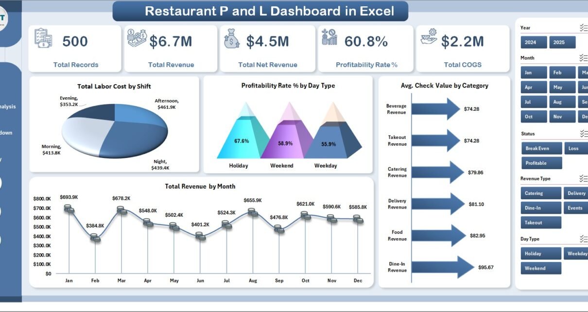
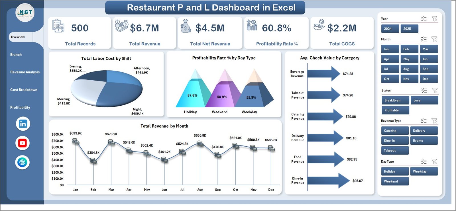
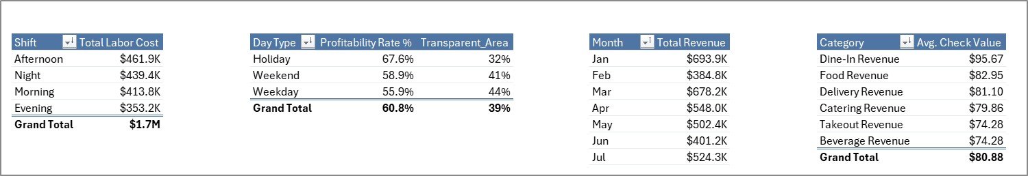
This dashboard includes 5 interactive analytical pages that cover every aspect of restaurant financial performance. The template tracks 5 key metrics on the Overview page — Total Records, Total Revenue, Total Net Revenue, Profitability Rate %, and Total COGS — alongside 4 visual charts for shift-wise labor costs, day type profitability, category-wise check values, and monthly revenue trends.
The dashboard uses pivot-powered dynamic charts that auto-refresh when data is updated. Built-in slicers enable instant filtering across all pages, allowing managers to drill down into specific branches, time periods, or food categories within seconds. No VBA or macros are required — everything runs on standard Excel formulas and pivot tables.
For restaurant owners managing multiple locations, the Branch Performance page compares Total Revenue, Total Labor Cost, Total Waste, and Total Covers across different restaurant branches. This helps identify top performers and underperforming outlets that need attention.
Dashboard Pages Explained
1. Overview Page
The Overview page serves as the executive snapshot of your restaurant’s financial health. It displays KPI cards for Total Records, Total Revenue, Total Net Revenue, Profitability Rate %, and Total COGS. Four charts provide visual analysis: Total Labor Cost by Shift shows how staffing costs vary across different shifts, Profitability Rate % by Day Type highlights which days generate the best margins, Avg. Check Value by Category reveals which menu categories bring the highest revenue per transaction, and Total Revenue by Month tracks seasonal revenue patterns. Multiple slicers on this page allow instant data filtering.
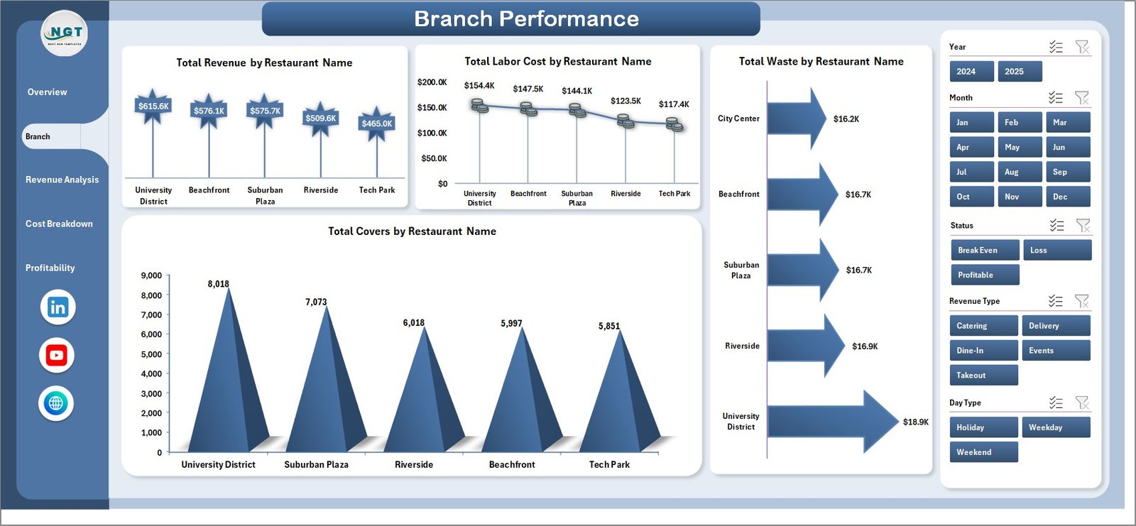
2. Branch Performance Page
This page provides a comparative view of all restaurant branches. It includes four analytical charts: Total Revenue by Restaurant Name compares income across outlets, Total Labor Cost by Restaurant Name identifies branches with the highest staffing expenses, Total Waste by Restaurant Name highlights where food waste is most significant, and Total Covers by Restaurant Name shows customer traffic distribution. This page is essential for multi-location restaurant operators who need to benchmark branch-level performance.
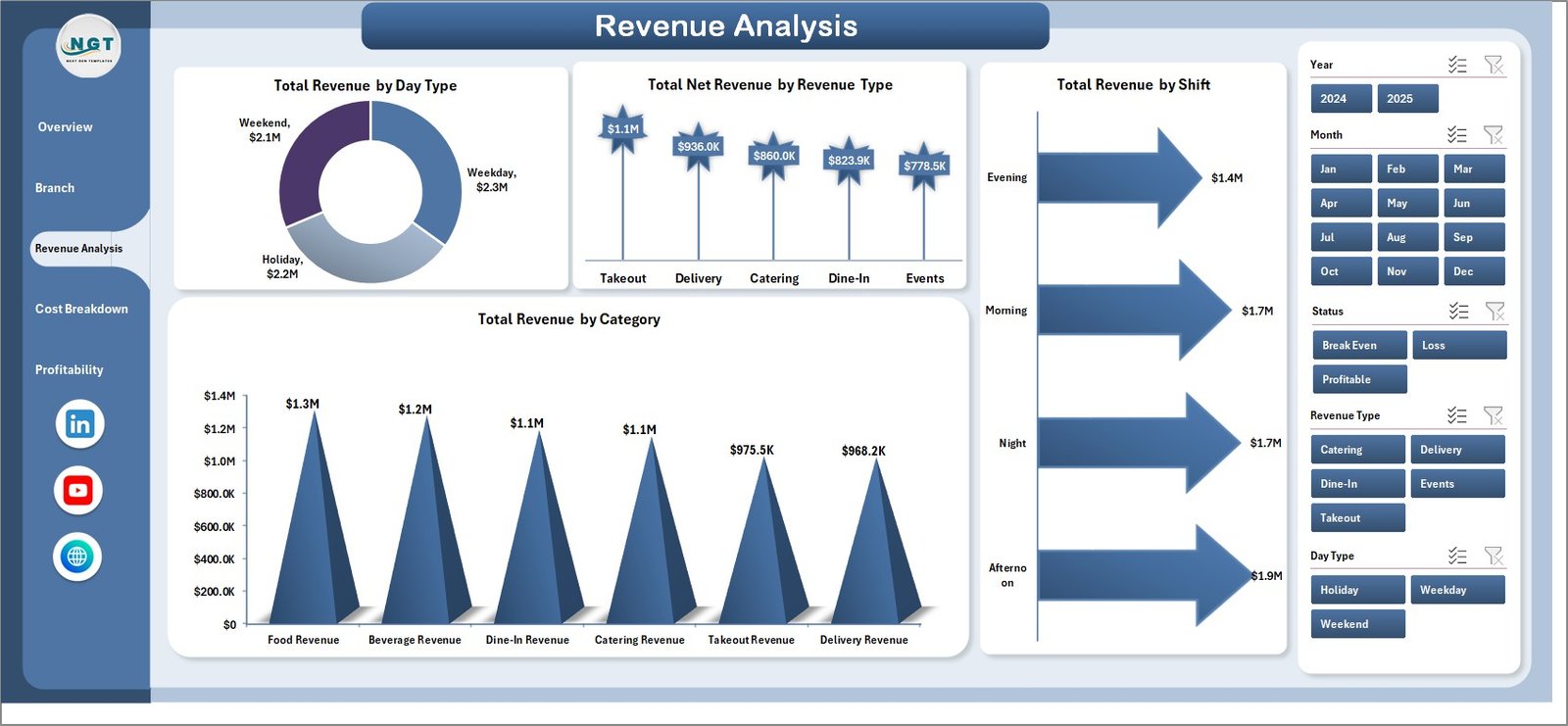
3. Revenue Analysis Page
The Revenue Analysis page breaks down income streams with four focused charts: Total Revenue by Day Type shows weekday vs weekend performance, Total Net Revenue by Revenue Type differentiates between revenue sources, Total Revenue by Shift identifies the most profitable service periods, and Total Revenue by Category reveals which menu categories drive the most sales.
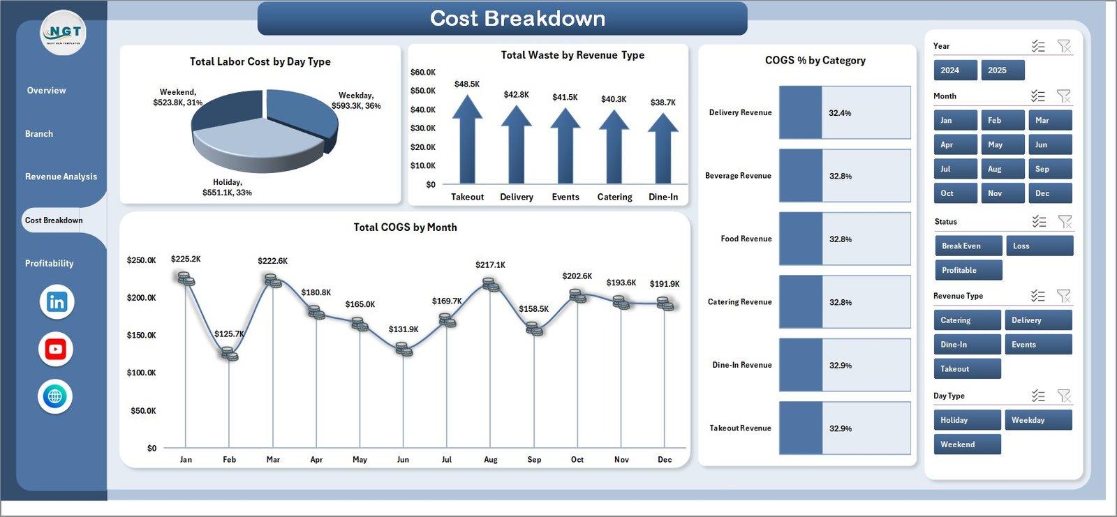
4. Cost Breakdown Page
This page delivers deep cost analysis through four charts: Total Labor Cost by Day Type helps optimize staffing schedules, Total Waste by Revenue Type identifies where waste correlates with revenue patterns, COGS % by Category tracks which menu categories have the highest ingredient costs, and Total COGS by Month monitors cost trends over time. Together, these insights help restaurant managers reduce unnecessary expenses and improve profit margins.
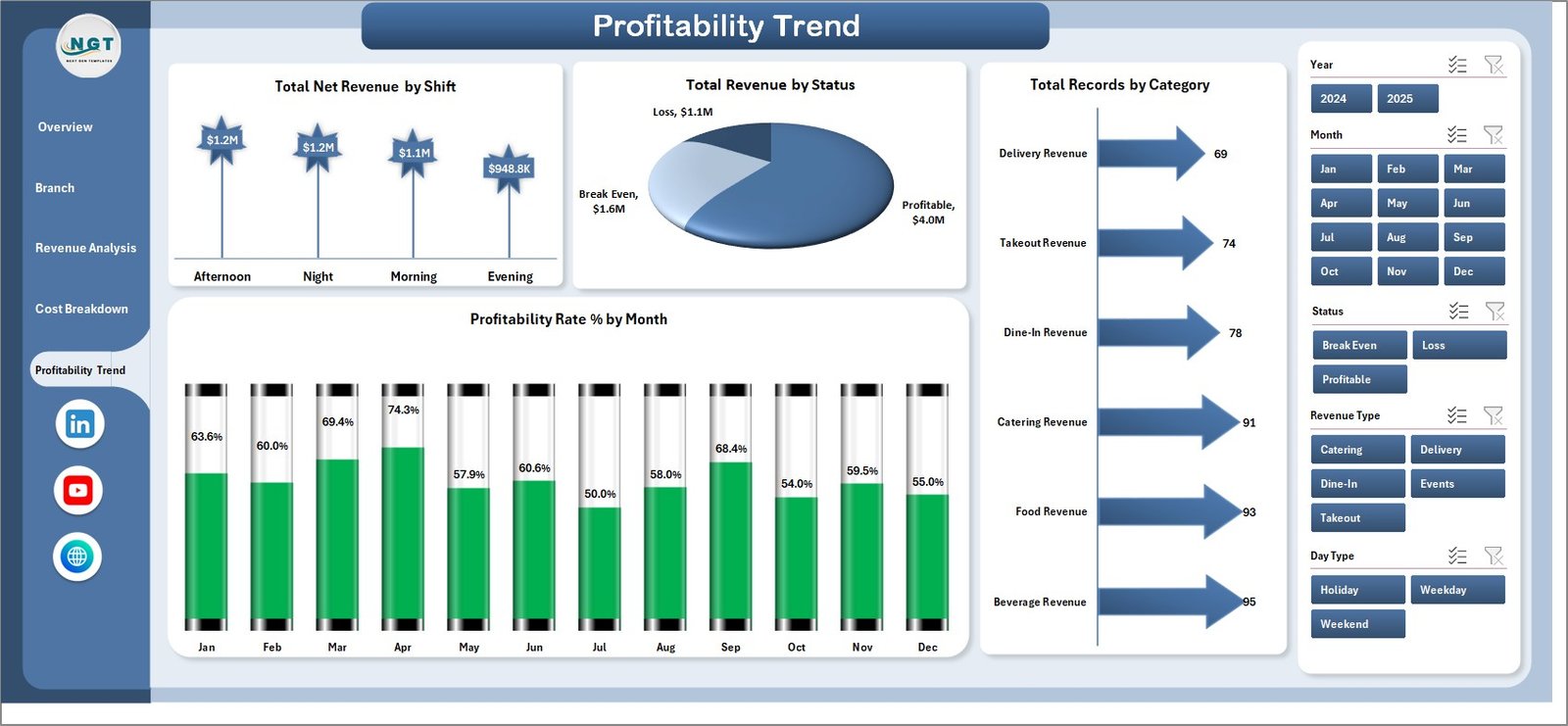
5. Profitability Trend Page
The Profitability Trend page focuses on long-term financial health with four charts: Total Net Revenue by Shift, Total Revenue by Status, Total Records by Category, and Profitability Rate % by Month. This page helps restaurant owners understand how profitability evolves over time and identify seasonal patterns that impact the bottom line.
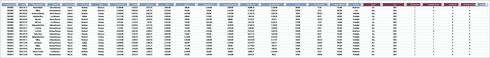
6. Data Sheet
The Data Sheet is where you enter your restaurant’s P&L transaction records. Simply add your data in the same format as the sample dataset provided, and the entire dashboard will auto-update when you refresh the pivot tables. Fields include Restaurant Name, Revenue, Net Revenue, COGS, Labor Cost, Waste, Covers, Category, Shift, Day Type, Revenue Type, Status, and Month.
7. Support Sheet
The Support Sheet contains all the pivot tables that power the dashboard’s charts and KPI cards. After updating your data in the Data Sheet, go to the Data tab in the Excel Ribbon and click Refresh All — all pivots will recalculate and all charts will update automatically. You can keep this sheet hidden during everyday use.
Advantages of Restaurant P and L Dashboard in Excel
This dashboard eliminates manual reporting by automating all calculations through pivot tables. Restaurant managers save hours of work every week because charts and KPIs update with a single click. The branch comparison feature enables multi-location operators to identify revenue leakage and cost inefficiencies across outlets instantly.
The cost breakdown analysis helps control labor expenses, food waste, and COGS by making these metrics visible at a glance. Monthly profitability trends support better forecasting and seasonal planning. Because the dashboard works entirely in Microsoft Excel, no additional software licenses or technical expertise are required — making it accessible to any restaurant professional.
Opportunities for Improvement
While this dashboard provides comprehensive P&L analysis, restaurant businesses with very large datasets spanning multiple years might benefit from upgrading to the Restaurants and Food Services Dashboard in Power BI for enhanced scalability. Additionally, users who need customer satisfaction or online review tracking alongside financial data might consider supplementing this dashboard with a separate KPI scorecard solution.
Best Practices for Using the Restaurant P and L Dashboard
Update your data weekly or monthly to keep the dashboard current. Use the slicers to create focused views for management meetings — for example, filter by a single branch or a specific month to present targeted insights. Always click Refresh All after updating data to ensure all pivot tables recalculate properly. Consider hiding the Support Sheet to keep the workbook clean and professional when sharing with stakeholders.
For complementary restaurant analytics, explore the Coffee Chains Dashboard in Excel for coffee business analysis, the Food and Beverage Dashboard in Google Sheets for cloud-based analytics, and the Catering Services KPI Dashboard in Excel for catering-specific KPI tracking.
Explore Relevant Templates
🔹 Coffee Chains Dashboard in Excel — Comprehensive analytics for coffee chain businesses with multi-outlet comparison.
🔹 Food and Beverage Dashboard in Google Sheets — Cloud-based F&B dashboard with real-time collaboration.
🔹 Restaurants and Food Services Dashboard in Power BI — Advanced restaurant analytics with Power BI interactivity.
🔹 Food Delivery KPI Scorecard in Excel — Track food delivery performance with MTD/YTD analysis.
🔹 Food Service KPI Scorecard in Google Sheets — Cloud-based KPI tracking for food service teams.
Frequently Asked Questions
What is the best Excel template for tracking restaurant profit and loss?
The Restaurant P and L Dashboard in Excel is designed specifically for restaurant P&L tracking. It includes 5 interactive dashboard pages that monitor Total Revenue, Total Net Revenue, COGS, Labor Cost, Waste, and Profitability Rate % across multiple branches, shifts, day types, and food categories.
How do I track restaurant profitability by branch in Excel?
The Branch Performance page in this dashboard compares Total Revenue, Total Labor Cost, Total Waste, and Total Covers across all your restaurant branches. Simply enter your branch-level data in the Data Sheet and refresh the dashboard to see instant branch-wise comparisons.
Can I use this dashboard without VBA or macros?
Yes. The Restaurant P and L Dashboard in Excel is 100% formula and pivot-table based. No VBA or macros are needed. It works in Microsoft Excel 2016 and later versions without enabling macros.
What data fields are needed for this restaurant dashboard?
You need restaurant transaction data with fields including Restaurant Name, Revenue, Net Revenue, COGS, Labor Cost, Waste, Covers, Category, Shift, Day Type, Revenue Type, Status, and Month. A sample dataset is pre-loaded so you can see the exact format required.
How does the dashboard help reduce restaurant costs?
The Cost Breakdown page tracks Total Labor Cost by Day Type, Total Waste by Revenue Type, COGS % by Category, and Total COGS by Month. These visualizations help managers identify exactly where costs are highest, enabling targeted cost-reduction strategies across staffing, procurement, and operations.
Is this template suitable for restaurant chains with multiple locations?
Absolutely. The dashboard is built for multi-location analysis. The Branch Performance page and slicer-based filtering allow you to compare profitability, costs, and revenue across all your restaurant locations from a single Excel file.
Conclusion
The Restaurant P and L Dashboard in Excel transforms complex restaurant financial data into clear, actionable, and visually engaging insights. With 5 interactive pages covering revenue analysis, cost breakdowns, branch comparisons, and profitability trends, this template empowers restaurant professionals to make data-driven decisions that improve margins and reduce waste.
👉 Click here to Purchase the Restaurant P and L Dashboard in Excel
🎥 Visit our YouTube channel to learn step-by-step video tutorials
👉 Youtube.com/@PK-AnExcelExpert