Efficient shipping and cargo operations matter more than ever. Logistics companies manage thousands of shipments, multiple ports, many customer types, and a long list of operational costs. As the data grows, managers need a clear view of performance so they make fast decisions. A Shipping & Cargo Dashboard in Power BI solves this challenge with a simple, interactive, and powerful reporting system.
In this detailed guide, you will learn what this dashboard is, how it works, why businesses need it, and how every page of the dashboard helps you track shipping and cargo performance. You will also learn the advantages, best practices, and answers to common questions. Let’s explore how Power BI transforms logistics reporting.
Click to Purchases Shipping & Cargo Dashboard in Power BI
What Is a Shipping & Cargo Dashboard in Power BI?
A Shipping & Cargo Dashboard in Power BI is a ready-to-use analytics solution that shows all logistics data in one place. It tracks profit margins, cargo types, operation cost, freight cost, in-transit percentages, customer types, shipping lines, ports, and monthly trends. Because Power BI updates the visuals instantly, you always see the latest numbers.
The dashboard contains multiple pages, slicers, dynamic visuals, and comparison charts. You select a port, customer type, shipping line, or month, and all charts respond with the exact data you want. This helps you measure performance easily without checking several files.
Why Do You Need a Shipping & Cargo Dashboard in Power BI?
Logistics operations run continuously, so decisions must happen fast. A dashboard helps your team stay informed because it:
-
Shows all KPIs in one view
-
Tracks trends instantly
-
Supports cost control
-
Increases visibility of profit levels
-
Reduces manual work
-
Helps teams work with clarity
When you use Power BI, you gain complete control over your shipping and cargo operations. You understand the cost structure, measure customer profitability, check port-wise performance, and analyze shipping line performance with just a few clicks.
How Does the Shipping & Cargo Dashboard Work in Power BI?
The dashboard contains 5 powerful pages, each focused on a specific part of logistics performance. Every page includes slicers so you filter data by customer, cargo type, port, or shipping line. Because all visuals update in real time, you see accurate insights immediately.
Let’s explore each page in detail.
Page 1: Overview Page – What Can You Track Here?
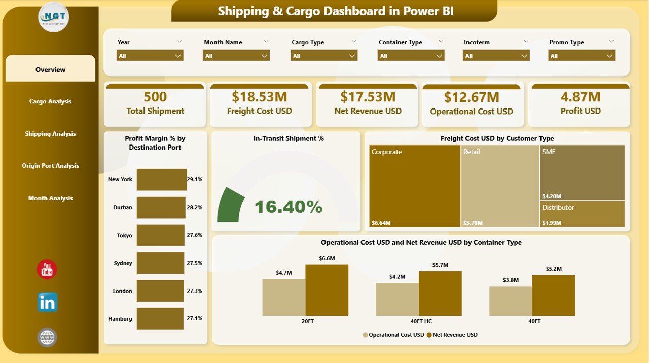
The Overview Page works as the control center. You see the most important numbers and charts in one place. It helps you understand business performance in just a few seconds.
Key Components of the Overview Page
-
Interactive Slicers
You choose filters like destination port, customer type, month, or cargo type. All visuals update instantly, which improves decision-making. -
Four KPI Cards
You see the essential values:-
Profit Margin %
-
In-Transit Shipment %
-
Freight Cost USD
-
Operation Cost USD
-
These cards highlight the overall performance at a glance.
Charts Included in the Overview Page
✔ Profit Margin % by Destination Port
This chart shows which destination ports give the highest profits. You compare ports instantly and make smart routing decisions.
✔ In-Transit Shipment %
This tells you how much cargo is still on the way. You track delays and predict arrival times better.
✔ Freight Cost USD by Customer Type
This chart helps you understand which customer types cost more. It helps you make pricing decisions with confidence.
✔ Operation Cost USD and Net Revenue USD by Container Type
This comparison helps you measure profitability for each container type.
The Overview Page gives you a complete picture without moving between files. As a result, managers save time and make confident decisions.
Click to Purchases Shipping & Cargo Dashboard in Power BI
Page 2: Cargo Analysis – How Do You Analyze Cargo Performance?
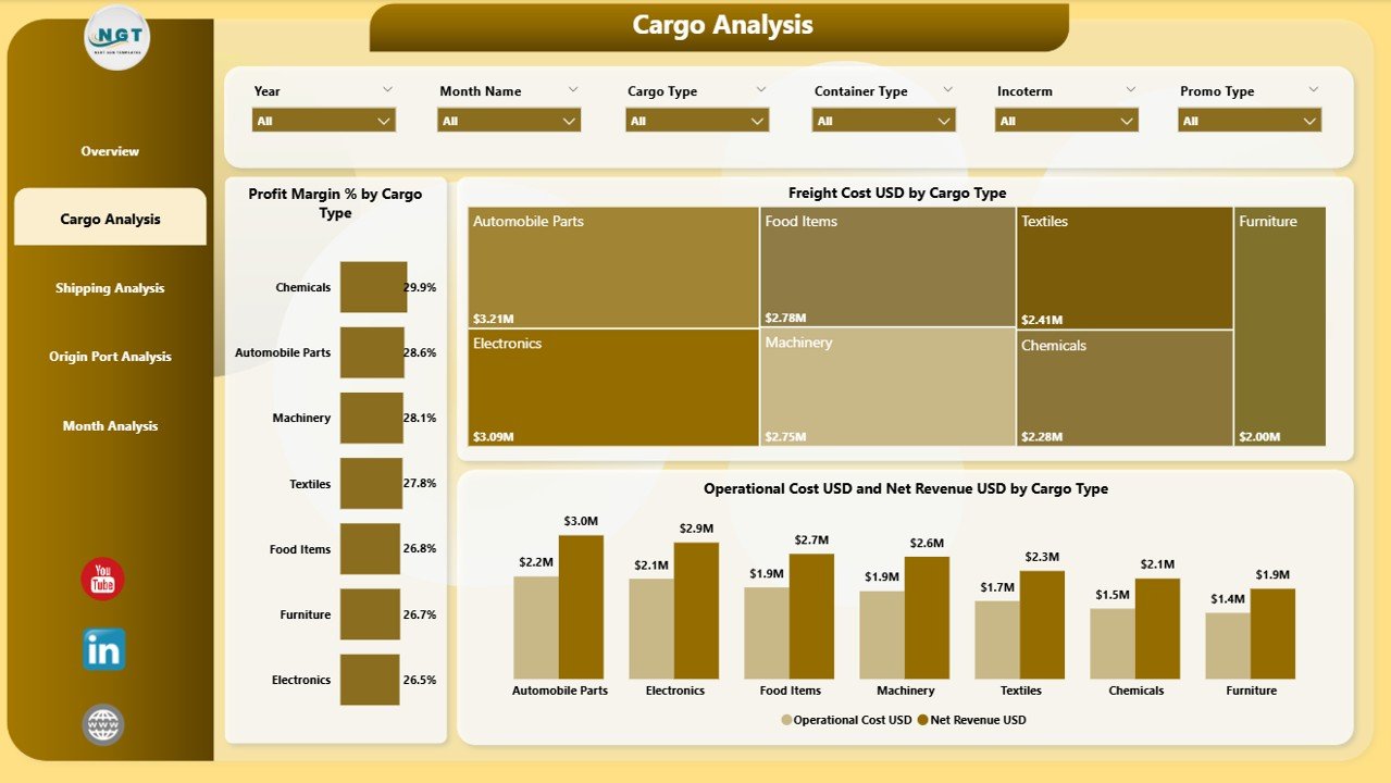
The Cargo Analysis Page helps you study the financial performance of every cargo type. You get a clear view of profit, cost, and revenue so you understand which cargo type works best for your business.
What You Get on the Cargo Analysis Page
-
Slicers for filtering cargo category
-
Three powerful charts
Charts on the Cargo Analysis Page
✔ Profit Margin % by Cargo Type
You compare profitability across different cargo categories. This helps you focus on cargo types that bring better results.
✔ Freight Cost USD by Cargo Type
You understand which cargo creates higher freight expenses. Because of this insight, you control cost more effectively.
✔ Operation Cost USD and Net Revenue USD by Cargo Type
This chart shows how much it costs to operate each cargo type versus how much revenue it generates. You spot low-margin cargo instantly.
This page helps you make smart cargo decisions because you track both cost and profit with a single click.
Page 3: Shipping Analysis – How Does Shipping Line Performance Affect Your Business?
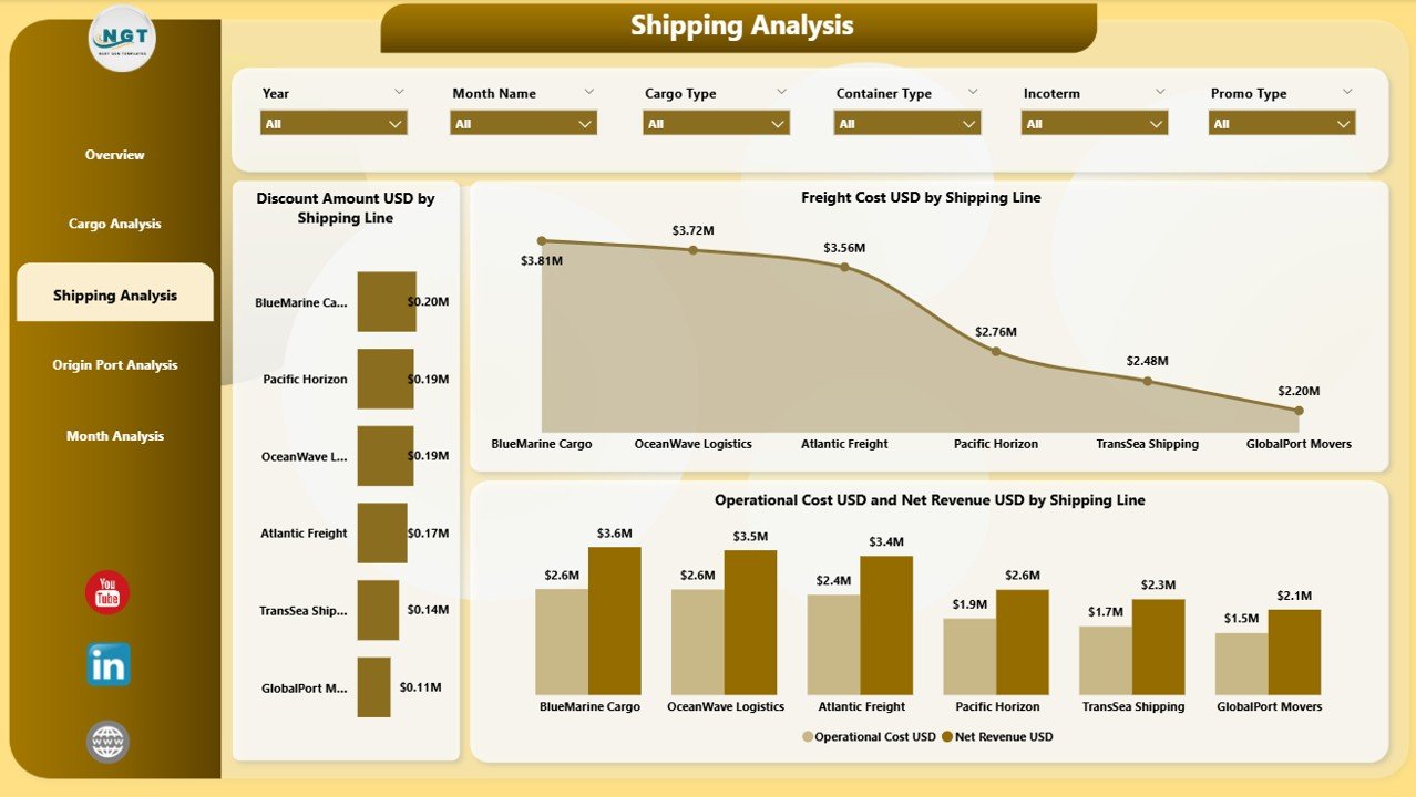
Every shipping line performs differently. Some create more profit, while others add cost. The Shipping Analysis Page helps you measure this difference.
What You Get on the Shipping Analysis Page
-
Slicers for selecting the shipping line
-
Three performance-based charts
Charts on This Page
✔ Discount Amount USD by Shipping Line
You see which shipping lines offer discounts and how those discounts affect overall profitability.
✔ Freight Cost USD by Shipping Line
This helps you compare freight expenses across shipping partners.
✔ Operation Cost USD and Net Revenue USD by Shipping Line
This combined chart gives a clear view of cost vs. revenue for each shipping line.
This page helps you choose the best shipping partners and optimize cost.
Page 4: Origin Port Analysis – How Do Ports Influence Profitability?
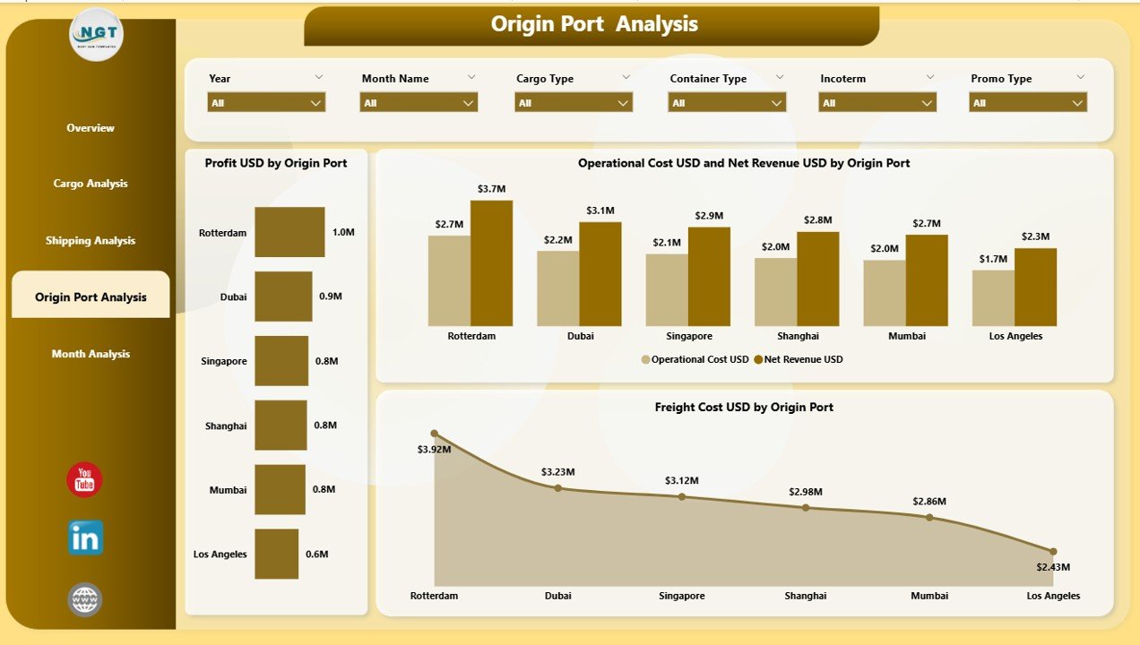
The Origin Port Analysis Page shows the financial contribution of every origin port. You understand how each port affects profit, cost, and operations.
Charts on the Origin Port Analysis Page
✔ Profit USD by Origin Port
You identify ports that generate higher profit so you increase their shipping share.
✔ Freight Cost USD by Origin Port
This chart gives insights into freight spending for each port.
✔ Operation Cost USD and Net Revenue USD by Origin Port
This helps you understand the operational impact of each port.
You gain full clarity on which ports support your business growth and which ports create more expenses.
Page 5: Monthly Trends – Why Are Monthly Trends Important?

Monthly analysis helps you see seasonal patterns, cost changes, and profit movement. The Monthly Trends Page shows month-wise performance so you plan better.
Charts on the Monthly Trends Page
✔ Profit USD by Month
You see which months perform better, so you prepare resources accordingly.
✔ Freight Cost USD by Month
You compare month-to-month costs to track increases or decreases.
✔ Operation Cost USD and Net Revenue USD by Month
This chart gives full visibility of revenue versus cost every month.
Businesses grow faster when they monitor trends regularly. Monthly trends help you control budget and improve forecasting.
Advantages of Using a Shipping & Cargo Dashboard in Power BI
Click to Purchases Shipping & Cargo Dashboard in Power BI
Using this dashboard gives you several advantages. Here are the key benefits:
1. Faster Decision-Making
You check live data in seconds. This helps you react quickly to delays, cost changes, or performance issues.
2. Clear Visibility Across Operations
You view ports, shipping lines, cargo types, and customer types on one screen. This improves coordination between teams.
3. Better Profit Tracking
You understand which routes, ports, or cargo types create more profit. You focus on high-margin opportunities.
4. Cost Optimization
You measure freight cost, operation cost, and discounts with accuracy. You reduce unnecessary expenses easily.
5. Improved Customer Service
You track performance by customer type. This helps you offer better pricing and service.
6. Smart Forecasting
Monthly trends and historical data help you predict future performance accurately.
7. Easy to Use
Power BI offers a user-friendly design. Managers use the dashboard without any technical knowledge.
8. Real-Time Insights
You always see updated numbers because Power BI refreshes the visuals automatically.
Best Practices for Using the Shipping & Cargo Dashboard in Power BI
To get maximum value from the dashboard, follow these best practices:
1. Update Data Regularly
Make sure the data source stays updated. This helps the dashboard show accurate insights.
2. Use Slicers Smartly
Always filter ports, shipping lines, cargo types, or customer categories before analyzing results.
3. Monitor High-Cost Areas
Check freight and operation costs often. This helps you reduce expenses quickly.
4. Review Monthly Trends
Monthly charts show patterns. Use them to plan resources, budgets, and staffing.
5. Compare Profit vs. Cost
Always check revenue against costs. This shows true profitability.
6. Create Alerts
You set threshold values for cost and revenue. Alerts help you identify issues early.
7. Train Your Team
Teach your logistics and finance teams how to use Power BI filters, bookmarks, and drilldowns.
8. Use Bookmarks for Quick Navigation
Bookmarks help you save filtered views. You use them for fast reporting.
9. Export Visuals for Weekly Reports
Power BI allows exporting visuals as images or PDFs. Use this for meetings or email updates.
10. Review Shipping Line Performance Monthly
Shipping lines influence cost and delivery time. Analyze them every month to get better contracts.
Conclusion
A Shipping & Cargo Dashboard in Power BI helps logistics companies track performance with ease. You view profit margins, revenue, freight cost, and operational cost on a single platform. Every page gives meaningful insights so you make smart decisions, reduce cost, and improve customer satisfaction.
When your data stays organized, your business grows faster. With Power BI, you gain the clarity you always wanted in your shipping and cargo operations.
Frequently Asked Questions (FAQs)
1. What is a Shipping & Cargo Dashboard in Power BI?
It is a complete analytics dashboard that tracks shipment performance, profit, cost, cargo type, shipping lines, and port performance.
2. Who can use this dashboard?
Logistics managers, shipping companies, cargo handlers, freight forwarders, port authorities, and supply chain teams use this dashboard.
3. Why is Power BI useful for shipping analytics?
Power BI gives real-time visuals, easy filtering, and interactive dashboards. You track performance without manual reports.
4. Can I track profit and cost in this dashboard?
Yes, you track profit, freight cost, operation cost, discount amount, and net revenue on different pages.
5. Does the dashboard help reduce cost?
Yes, the dashboard shows high-cost shipping lines, ports, and cargo types. This helps you control cost.
6. Can I filter data easily?
Yes, slicers help you filter by customer type, cargo type, origin port, destination port, month, and shipping line.
7. How does the Monthly Trends page help?
It shows profit, cost, and revenue month-wise so you identify seasonal patterns and plan better.
8. Do I need technical skills to use Power BI?
No, Power BI offers an easy interface. Anyone can use the dashboard with minimal training.
9. Can this dashboard support business forecasting?
Yes, monthly trends and historical data help you predict future performance.
10. Why should I use a dashboard instead of Excel reports?
A dashboard updates instantly, looks cleaner, allows interaction, and gives deeper insights than manual Excel files.
Visit our YouTube channel to learn step-by-step video tutorials