Introduction
The Soil Testing Services Dashboard in Power BI is a ready-to-use, dynamic dashboard designed for quick and insightful analysis of soil testing data. By simply updating your data file and refreshing the Power BI report, you can monitor various critical metrics, empowering decision-makers with real-time information visualized through interactive charts and slicers.
Key Features of Soil Testing Services Dashboard in Power BI
- Multiple well-organized pages focusing on different data perspectives.
- High-level summary cards providing instant snapshot metrics such as Total Tests, Number of Samples, Turnaround Time, Revenue, and Pending Tests.
- Interactive charts coupled with multiple slicers allow quick filtering and detailed analysis.
- Easy data refresh from the Home tab after data file update, keeping reports current.
Click to buy Soil Testing Services Dashboard in Power BI
Dashboard Pages Explanation
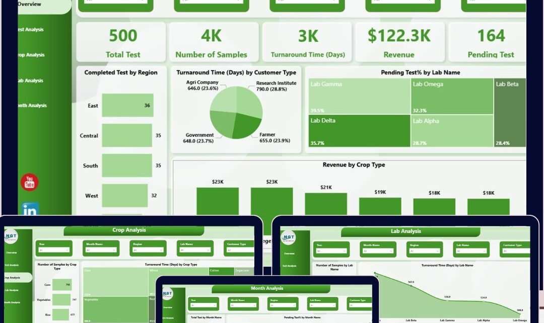
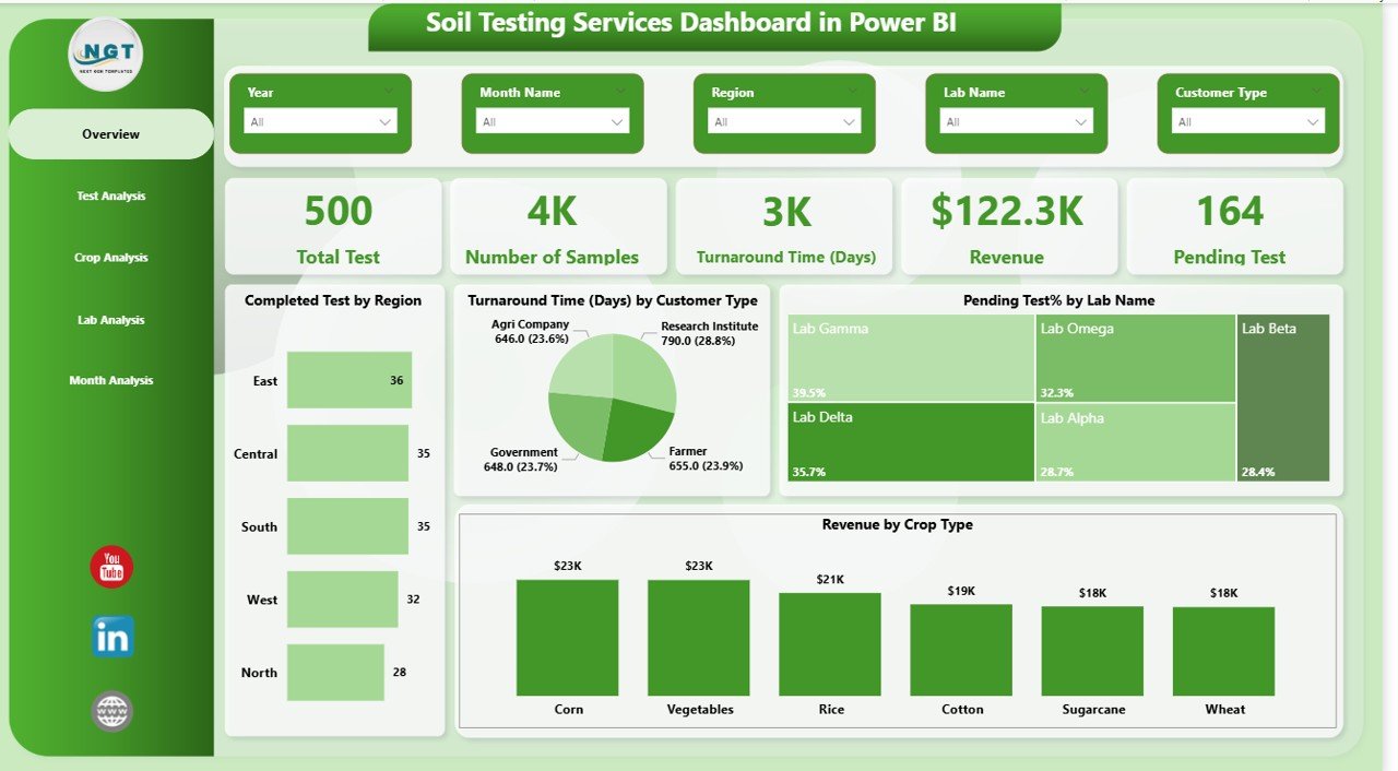
1 – Overview Page
This page provides key high-level indicators via cards and offers multiple visual insights using interactive charts and slicers.
- Cards:
- Total Test: Displays the total number of soil tests conducted.
- Number of Sample: Shows the overall sample count analyzed.
- Turnaround Time (Days): Presents average time taken to complete tests.
- Revenue: Summarizes total revenue generated from tests.
- Pending Test: Indicates tests still in progress or awaiting completion.
- Charts:
- Completed Test by Region (Bar Chart): Visualizes the number of completed tests across different regions, aiding in regional performance comparison.
- Turnaround Time by Customer Type (Pie Chart): Breaks down the average turnaround time based on different customer categories for targeted service analysis.
- Pending Test % by Lab Name: Shows the proportion of pending tests per lab, highlighting areas with backlogs.
- Revenue by Crop Type: Illustrates which crops contribute most to revenue, assisting in business focus.
 Soil Testing Services Dashboard in Power BI
2 – Test Analysis
This tab focuses on detailed analysis of tests by type to reveal insights on performance and revenue.
- Turnaround Time by Test Type (Bar Chart): Compares average time taken per test category.
- Revenue by Test Type (Tree Map): Presents financial performance segmented by test types.
- Number of Sample by Test Type (Column Chart): Displays volume of samples processed per test category.
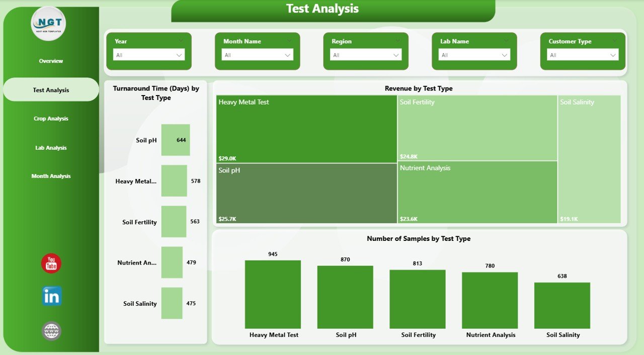 Test Analysis in Soil Testing Services Dashboard
3 – Crop Analysis
This page analyzes soil testing data based on crop types to identify trends and areas of importance.
- Number of Sample by Crop Type (Bar Chart): Highlights which crops have the highest sample submissions.
- Turnaround Time by Crop Type (Tree Map): Visualizes average processing time by crop categories.
- Total Test by Crop Type (Column Chart): Shows total tests performed per crop.
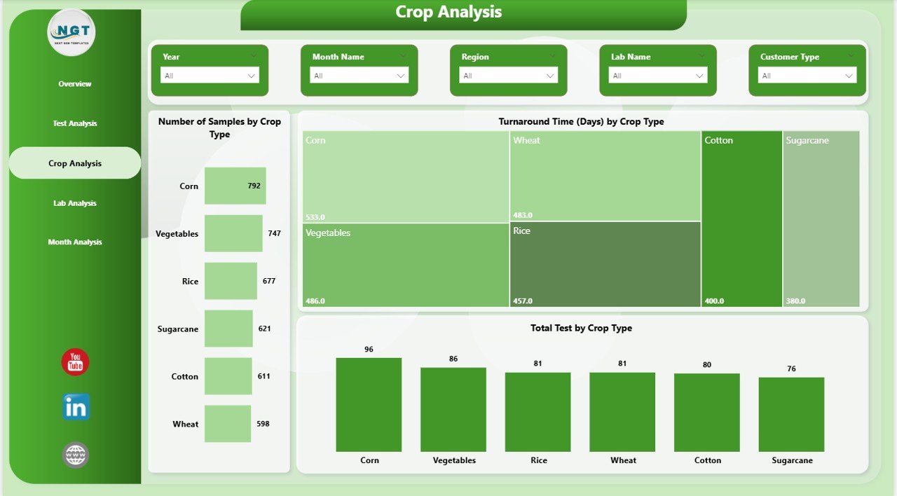 Crop Analysis in Soil Testing Services Dashboard
4 – Lab Analysis
This tab provides insights related to lab performance and revenue generation.
- Number of Sample by Lab Name (Bar Chart): Compares sample volumes processed by each lab.
- Turnaround Time by Lab Name (Area Chart): Tracks average testing duration for labs to identify bottlenecks.
- Revenue by Lab Name (Column Chart): Displays the financial contribution of each lab.
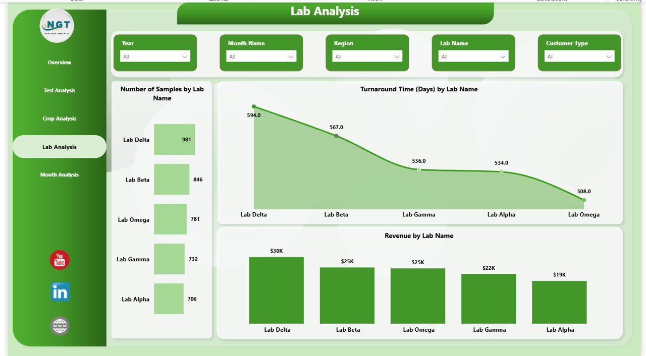 Lab Analysis in Soil Testing Services Dashboard
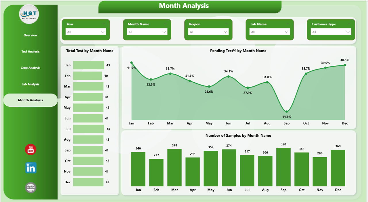
5 – Monthly Trends
Analyzes key soil testing metrics over time to identify monthly changes and trends.
- Total Test by Month Name (Bar Chart): Tracks the volume of tests conducted month-wise, identifying peak periods.
- Pending Test % by Month Name (Area Chart): Shows trends in pending tests across months for workload management.
- Number of Samples by Month Name (Column Chart): Displays monthly sample counts to observe seasonal variations.
Advantages of Soil Testing Services Dashboard in Power BI
- Enables quick decision-making with real-time data visualization.
- Reduces manual report generation efforts by automating data refresh.
- Helps identify performance gaps across regions, labs, and crops.
- Improves business forecasting through trend and revenue analysis.
- Facilitates targeted operational improvements based on detailed metrics.
Opportunities for Improvement
- Add predictive analytics for forecasting soil test demand and turnaround times.
- Integrate geographic maps to visualize region-wise soil quality trends.
- Include customer satisfaction scores linked with turnaround time and quality.
- Enable drill-through capabilities for granular details on any chart.
- Automate alerts for exceeding turnaround times or pending test backlogs.
Best Practices
- Regularly update data files and refresh dashboards to maintain accuracy.
- Use slicers effectively to drill down into specific segments or time frames.
- Validate data quality before loading into Power BI to avoid misleading reports.
- Train users on interpreting charts and using filters for better insights.
- Schedule periodic reviews of dashboard KPIs to adapt to evolving business needs.
FAQs
- Can I customize the dashboard visuals? Yes, Power BI allows customization of charts and layout as per your requirements.
- How often should I refresh the dashboard? Refresh frequency depends on data updates; daily refresh is recommended for real-time insights.
- Is it compatible with Excel data sources? Absolutely, you can link Excel files as data sources and refresh seamlessly.
- Can I share this dashboard with my team? Yes, you can publish it to Power BI service for collaborative access.
- What data file formats does it support? Typically supports Excel, CSV, and database connections compatible with Power BI.
Conclusion
The Soil Testing Services Dashboard in Power BI is a powerful tool to simplify and enhance the monitoring of soil testing operations. With its intuitive design, comprehensive metrics, and easy data update process, it serves as an indispensable asset for agricultural businesses and testing labs. Leveraging this dashboard enables better management of testing workflows, revenue tracking, and timely delivery, ultimately leading to data-driven agricultural improvements.
For more detailed insights and a step-by-step demo, visit Microsoft’s official Power BI page.
Visit our YouTube channel to watch the demo: Youtube.com/@NextGenTemplates
Click to buy Soil Testing Services Dashboard in Power BI