In today’s fast-paced business environment, organizations rely heavily on technology to plan, monitor, and evaluate performance. Technology investments, project execution, issue resolution, and resource utilization are all critical areas that require close attention. To manage these aspects effectively, companies turn to dashboards—interactive tools that provide quick insights, highlight trends, and support decision-making.
One of the most accessible and powerful tools for building such dashboards is Microsoft Excel. A Technology Dashboard in Excel combines familiar spreadsheet features with interactive visuals, enabling teams to track budgets, project progress, issues, and performance metrics—all in one place.
This article will explore the structure, features, benefits, and best practices of a Technology Dashboard in Excel. By the end, you’ll know how this dashboard can improve transparency, accountability, and efficiency in technology operations.
Click to Purchases Technology Dashboard in Excel
What is a Technology Dashboard in Excel?
A Technology Dashboard in Excel is a ready-to-use analytical tool designed to monitor performance across different dimensions like departments, categories, projects, and timelines. It helps decision-makers answer key questions:
-
How is the budget performing compared to actual spend?
-
Which department or category has the most variance in hours?
-
How many issues have been resolved by each team?
-
Are projects meeting their targets on time?
-
What trends are emerging month by month?
The dashboard provides a centralized view of data, allowing managers, analysts, and executives to make informed decisions without navigating through multiple reports.
Key Features of the Technology Dashboard in Excel
The Technology Dashboard is structured into five main analytical pages, each supported by data sheets and navigation controls. Let’s explore these pages in detail:
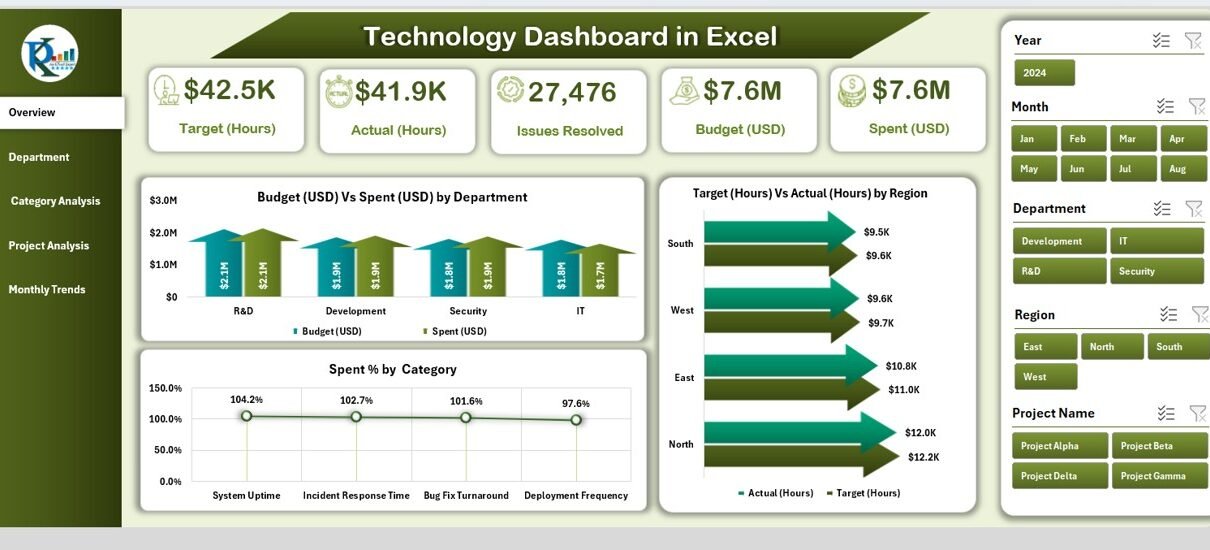
Overview Page
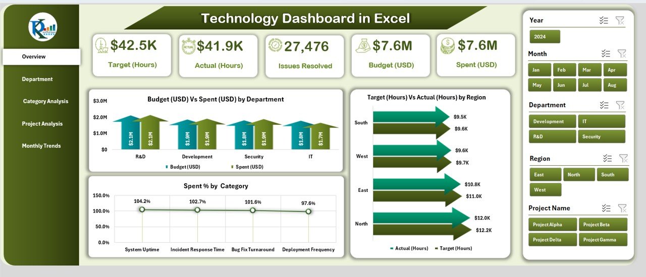
The Overview Page acts as the central hub of the dashboard. It offers a quick snapshot of essential performance indicators through cards and charts.
-
Cards: Five summary cards highlight key metrics such as total budget, actual spend, variance, resolved issues, and utilization.
Charts:
- Budget (USD) vs Spend (USD) by Department – Tracks how each department uses allocated funds.
- Target (Hours) vs Actual (Hours) by Region – Compares planned hours against actual effort.
- Spend % by Category – Breaks down total spending across different categories.
This page is perfect for top management as it delivers a high-level overview with minimal clicks.
Department Analysis
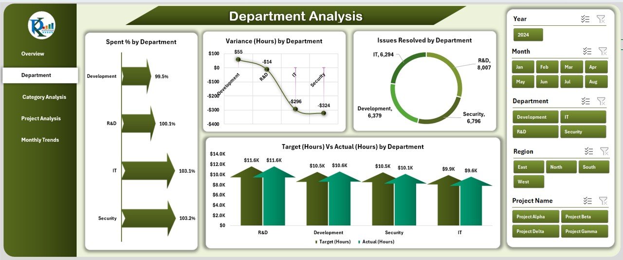
The Department Analysis Page focuses on departmental performance. It is useful for heads of IT, operations, and support teams who want to assess their unit’s efficiency.
Charts:
- Spend % by Department – Shows each department’s contribution to total spending.
- Variance (Hours) by Department – Highlights where teams are over- or under-utilizing resources.
- Issues Resolved by Department – Measures problem-solving effectiveness.
- Target (Hours) vs Actual (Hours) by Department – Reveals alignment with planned workloads.
This view promotes accountability by making it easy to compare performance across departments.
Category Analysis
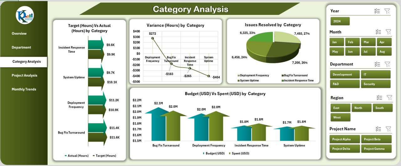
The Category Analysis Page drills down into expense and effort categories such as hardware, software, support, and training.
Charts:
- Target (Hours) vs Actual (Hours) by Category – Measures how effort is distributed across categories.
- Issues Resolved by Category – Evaluates problem-solving in each category.
- Variance (Hours) by Category – Tracks discrepancies in planned vs actual hours.
- Budget (USD) vs Spend (USD) by Category – Keeps spending in check.
This page is highly beneficial for procurement and finance teams who want visibility into how funds are allocated and utilized.
Project Analysis
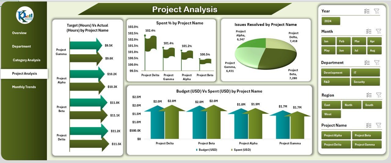
The Project Analysis Page evaluates project-level performance. For project managers, this is a goldmine of insights.
Charts:
- Target (Hours) vs Actual (Hours) by Project Name – Tracks adherence to project plans.
- Issues Resolved by Project Name – Measures project efficiency in resolving technical problems.
- Spend % by Project Name – Shows financial commitment by project.
- Budget (USD) vs Spend (USD) by Project Name – Prevents cost overruns.
This view helps ensure projects remain within scope, schedule, and budget.
Monthly Trends
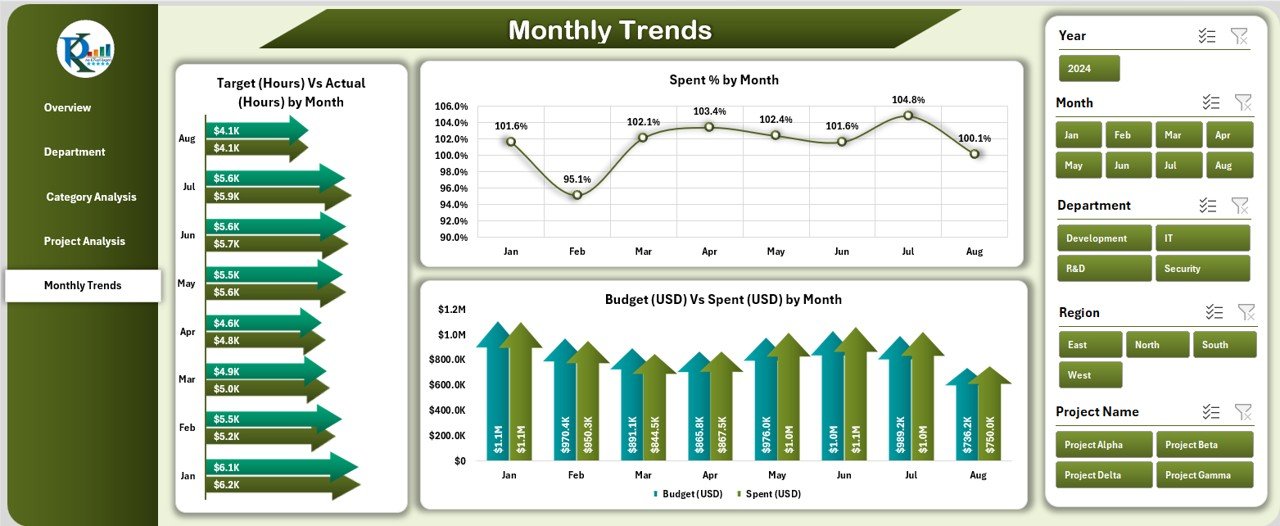
The Monthly Trends Page highlights performance over time. It is essential for monitoring progress, identifying seasonal patterns, and forecasting.
Charts:
- Target (Hours) vs Actual (Hours) by Month – Assesses effort distribution.
- Spend % by Month – Examines spending behavior over months.
- Budget (USD) vs Spend (USD) by Month – Detects overspending or underspending trends.
This temporal analysis supports long-term planning and resource allocation.
Support Sheets
In addition to analytical pages, the dashboard includes data and support sheets.
-
Data Sheet: Stores raw data such as budgets, project details, and issue logs.
-
Support Sheet: Holds lists, formulas, and reference tables to power drop-downs and calculations.
These sheets ensure that dashboards remain dynamic, accurate, and easy to update.
Click to Purchases Technology Dashboard in Excel
Advantages of a Technology Dashboard in Excel
Using a Technology Dashboard in Excel brings several benefits to organizations:
✅ Cost-Effective – No expensive software licenses required.
✅ User-Friendly – Works in a familiar Excel environment.
✅ Customizable – Tailor charts, KPIs, and visuals to your unique needs.
✅ Data Transparency – Provides a single source of truth for all stakeholders.
✅ Improved Decision-Making – Helps managers act quickly on insights.
✅ Performance Tracking – Monitors progress across departments, categories, and projects.
✅ Scalable – Can grow with the organization by adding more metrics or datasets.
Opportunities for Improvement
While Excel dashboards are powerful, they also have limitations. Here are a few areas where organizations can improve:
📌 Automation – Use Power Query or VBA macros to automate data refresh.
📌 Integration – Connect the dashboard with external data sources like SQL or ERP systems.
📌 Collaboration – Move the file to cloud platforms like OneDrive or SharePoint for real-time collaboration.
📌 Visualization – Enhance charts with conditional formatting, color coding, and slicers for better interaction.
📌 Data Security – Protect sensitive information with passwords and restricted access.
Best Practices for Building a Technology Dashboard in Excel
To maximize the value of your Technology Dashboard, follow these best practices:
-
Define Clear KPIs – Identify what you need to measure before building visuals.
-
Keep It Simple – Avoid overcrowding pages with too many charts.
-
Use Consistent Formatting – Apply uniform colors, fonts, and chart types.
-
Add Interactive Controls – Use slicers, filters, and drop-downs for better navigation.
-
Ensure Data Accuracy – Regularly validate raw data before analysis.
-
Update Frequently – Refresh data on a regular schedule to keep insights current.
-
Document the Dashboard – Provide notes or a guide for users to understand functionality.
Conclusion
A Technology Dashboard in Excel is a versatile and powerful tool for tracking budgets, hours, projects, and issue resolution. With its five-page structure—Overview, Department Analysis, Category Analysis, Project Analysis, and Monthly Trends—it delivers actionable insights to managers and executives.
By following best practices, improving automation, and integrating external data, organizations can transform this dashboard into a central decision-making tool. Whether you are a CIO, project manager, or analyst, this dashboard can save time, reduce costs, and increase transparency.
Frequently Asked Questions (FAQs)
1. Who can use a Technology Dashboard in Excel?
Anyone involved in technology management—such as CIOs, project managers, IT leads, and finance teams—can use this dashboard.
2. Do I need advanced Excel skills to use the dashboard?
No. The dashboard is designed for ease of use with prebuilt charts and navigation. However, basic Excel knowledge helps.
3. Can I customize the dashboard to fit my company’s needs?
Yes. You can add or modify charts, KPIs, and filters to match your organization’s requirements.
4. How often should I update the data in the dashboard?
Ideally, update the data weekly or monthly, depending on the volume and pace of your projects.
5. Can the dashboard handle large datasets?
Yes, but performance may slow down with very large files. Using Power Query can improve efficiency.
6. Is Excel the only option for building a Technology Dashboard?
No. Tools like Power BI, Tableau, and Google Data Studio also offer dashboarding capabilities, but Excel remains cost-effective and widely accessible.
Visit our YouTube channel to learn step-by-step video tutorials