In today’s fast-paced digital world, the telecommunications industry forms the backbone of global connectivity. From high-speed internet and mobile networks to data centers and fiber-optic infrastructure, telecom companies handle massive amounts of data every day.
To manage these complex operations efficiently, organizations need accurate insights, real-time monitoring, and data-driven decision-making. That’s exactly where the Telecommunications Infrastructure KPI Dashboard in Power BI comes into play.
This interactive dashboard provides a comprehensive view of performance metrics across network infrastructure, helping leaders track operational efficiency, reliability, and growth in real time. Whether you’re managing cell tower maintenance, service uptime, bandwidth utilization, or energy consumption, this dashboard gives you everything you need to monitor, analyze, and act — all in one place.
Click to Purchases Telecommunications Infrastructure KPI Dashboard in Power BI
What Is a Telecommunications Infrastructure KPI Dashboard in Power BI?
A Telecommunications Infrastructure KPI Dashboard is a visual performance-monitoring tool built using Microsoft Power BI, designed to track and analyze key performance indicators (KPIs) within telecom networks and operations.
It collects data from an Excel source or a live database and converts it into interactive visuals, allowing telecom engineers, managers, and executives to make informed decisions instantly.
The dashboard tracks metrics related to:
-
Network availability and uptime
-
Service quality and downtime frequency
-
Tower and equipment maintenance
-
Bandwidth and resource utilization
-
Energy efficiency and cost control
With Power BI’s powerful data-visualization capabilities, this dashboard delivers a complete picture of infrastructure performance, helping teams quickly identify issues and optimize resources.
Structure of the Dashboard
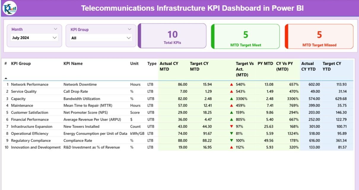
The Telecommunications Infrastructure KPI Dashboard in Power BI consists of three interactive pages, each serving a distinct purpose.
Summary Page
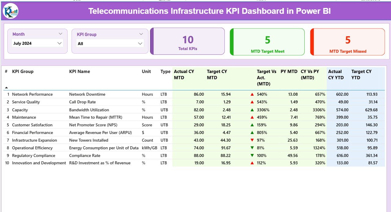
The Summary Page serves as the main control center of the dashboard. It displays a top-level overview of key metrics, ensuring that users can instantly evaluate the overall performance of their telecom network.
Key Components:
-
Month and KPI Group Slicers: Allow users to filter the data by specific months or KPI categories.
Performance Cards: Three cards highlight essential summary values:
- Total KPIs Count
- MTD Target Met Count
- MTD Target Missed Count
These visuals provide a snapshot of current performance against goals.
KPI Table Breakdown:
Below the cards, a detailed KPI table provides granular insight into performance data. The table includes the following columns:
-
KPI Number: Sequential identifier for each KPI.
-
KPI Group: Category (e.g., Network Uptime, Energy Use, Maintenance).
-
KPI Name: The specific indicator being tracked.
-
Unit: The measurement unit (%, Hours, Units, etc.).
-
Type: Indicates whether “Lower the Better (LTB)” or “Upper the Better (UTB).”
-
Actual CY MTD: Current Year Month-to-Date performance.
-
Target CY MTD: Current Year MTD target.
-
MTD Icon: Visual indicator (▲ green for met, ▼ red for missed).
-
Target vs. Actual (MTD): Performance ratio (Actual ÷ Target).
-
PY MTD: Previous Year MTD data for comparison.
-
CY vs. PY (MTD): Growth comparison between Current and Previous MTD.
-
Actual CY YTD: Current Year Year-to-Date performance.
-
Target CY YTD: Target values for YTD.
-
YTD Icon: Visual indicator for YTD performance (▲ or ▼).
-
Target vs. Actual (YTD): Ratio for YTD performance (Actual ÷ Target).
-
PY YTD: Previous Year YTD value.
-
CY vs. PY (YTD): Comparative growth between years.
This page gives a comprehensive operational picture that lets telecom teams identify weak areas, measure progress, and act immediately.
Click to Purchases Telecommunications Infrastructure KPI Dashboard in Power BI
KPI Trend Page
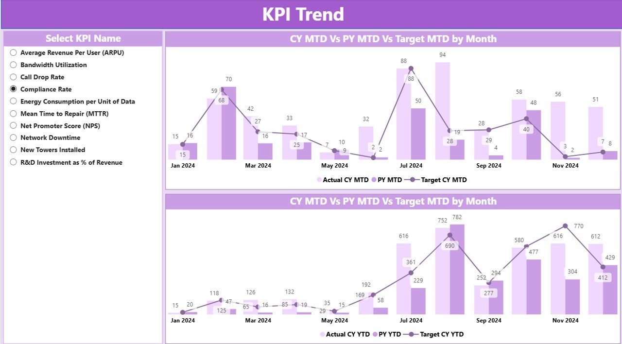
The KPI Trend Page focuses on the historical and time-based analysis of KPIs. It helps track how each metric evolves over time — a critical feature for forecasting and trend detection.
Features:
-
KPI Name Slicer: Users can select a specific KPI to visualize its data.
Two Combo Charts:
- The first chart shows the Current Year (CY) vs. Previous Year (PY) vs. Target (MTD) trends.
- The second chart represents CY vs. PY vs. Target (YTD) trends.
By observing these trends, telecom leaders can:
-
Spot early warning signs for deteriorating metrics.
-
Detect seasonal variations in performance.
-
Predict future network or operational needs.
This view transforms raw data into actionable insight for continuous improvement.
KPI Definition Page
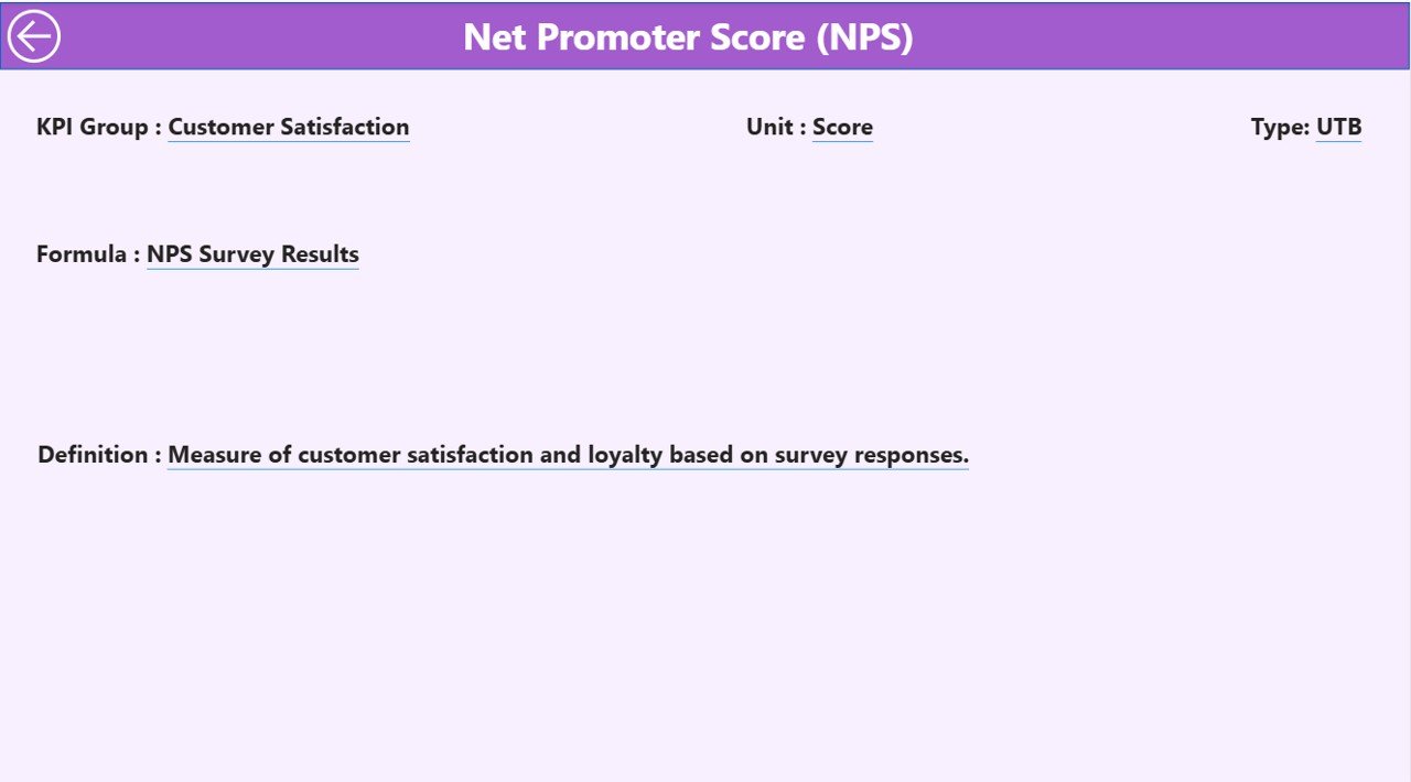
The KPI Definition Page is a hidden drill-through page that provides detailed explanations of each KPI.
When users right-click a KPI in the Summary Page, they can drill through to view:
-
KPI Formula
-
KPI Definition
-
Measurement Unit
-
Type (LTB or UTB)
This ensures everyone across the organization understands what each KPI represents and how it’s calculated — promoting transparency and standardization.
A Back button on the top-left corner enables users to return easily to the main dashboard.
Data Source: Excel Integration
The dashboard draws its power from structured Excel sheets that act as data sources. Each sheet plays a specific role in feeding Power BI visuals.
1️⃣ Input_Actual Sheet
Used to record actual performance values.
Columns include:
-
KPI Name
-
Month (use the first day of each month)
-
MTD (Month-to-Date value)
-
YTD (Year-to-Date value)
2️⃣ Input_Target Sheet
Contains target performance data for the same KPIs.
Columns mirror those of the actuals sheet:
-
KPI Name
-
Month
-
MTD
-
YTD
3️⃣ KPI Definition Sheet
Defines every KPI used in the dashboard with the following fields:
-
KPI Number
-
KPI Group
-
KPI Name
-
Unit
-
Formula
-
Definition
-
Type (LTB or UTB)
This data structure ensures consistent reporting and easy updates.
Why Do Telecom Companies Need KPI Dashboards?
Telecommunication networks are vast and complex, involving multiple assets, regions, and departments. Monitoring them manually is inefficient and prone to error. A KPI dashboard offers visibility, precision, and control.
Key Reasons:
-
Real-Time Visibility: Enables managers to view live network performance.
-
Data-Driven Decisions: Replaces intuition with facts and figures.
-
Improved Efficiency: Identifies underperforming areas quickly.
-
Enhanced Accountability: Makes performance transparent across teams.
-
Predictive Insights: Helps forecast issues before they escalate.
In short, Power BI dashboards turn data into strategic intelligence.
How the Dashboard Works
The dashboard uses Power BI’s data modeling and visualization engine to transform Excel inputs into powerful insights.
-
Data Loading: Excel data is imported into Power BI.
-
Data Modeling: Relationships are built between Actuals, Targets, and Definitions.
-
Calculations: DAX (Data Analysis Expressions) formulas calculate performance percentages, comparisons, and growth rates.
-
Visualizations: Charts, slicers, and icons convert numbers into intuitive visuals.
-
Drill-Through: Users explore KPI details on demand.
This seamless process eliminates manual reporting and ensures instant access to accurate metrics.
Key KPIs to Track in Telecommunications Infrastructure
Here are some of the most valuable KPIs tracked in this dashboard:
-
Network Uptime (%) – Measures the reliability of the network.
-
Mean Time to Repair (MTTR) – Average time to fix an issue.
-
Energy Consumption per Tower (kWh) – Tracks energy efficiency.
-
Bandwidth Utilization (%) – Measures how effectively bandwidth is used.
-
Customer Complaints per 1000 Users – Indicates service quality.
-
Maintenance Compliance (%) – Percentage of planned maintenance completed.
-
Capital Utilization (%) – Efficiency of asset investment.
-
Downtime Frequency – Counts network outages.
-
Data Transmission Speed (Mbps) – Measures throughput performance.
-
Operational Cost per Site (USD) – Tracks cost efficiency.
These KPIs help telecom leaders evaluate both performance and sustainability.
Advantages of Telecommunications Infrastructure KPI Dashboard in Power BI
Implementing this dashboard brings measurable value across the organization.
Key Benefits:
✅ Instant Visibility: See all performance metrics in one dashboard.
📊 Real-Time Decision-Making: Access live data for immediate corrective action.
📉 Performance Tracking: Compare actual results with targets and previous years.
⚡ Efficiency Boost: Identify delays, resource waste, or recurring network issues.
🔍 Transparency: Standardized KPI definitions promote accountability.
📈 Continuous Improvement: Trend analysis helps refine operations.
🌿 Sustainability Insights: Track energy use and cost efficiency to support green initiatives.
🧭 Strategic Planning: Data insights assist in infrastructure expansion and resource allocation.
With Power BI, every number tells a story that drives operational excellence.
Click to Purchases Telecommunications Infrastructure KPI Dashboard in Power BI
Opportunities for Improvement
Even the best dashboards can evolve over time. Here are a few enhancement ideas:
-
Integrate IoT Data: Automate updates directly from sensors and field devices.
-
Add Predictive Analytics: Use AI models to forecast outages or capacity needs.
-
Mobile Accessibility: Create mobile-friendly versions for on-the-go monitoring.
-
Cross-System Integration: Link with CRM, ERP, or network monitoring tools.
-
User Training: Regularly train staff on dashboard interpretation and updates.
Continuous refinement ensures the dashboard remains relevant and actionable.
Best Practices for Using Telecommunications Infrastructure KPI Dashboard
Following best practices ensures you get the most from your Power BI dashboard.
✅ Recommended Practices:
-
Keep KPI Definitions Clear: Avoid ambiguity by documenting formulas.
-
Automate Data Updates: Use Power BI refresh scheduling to sync Excel data daily.
-
Focus on Actionable KPIs: Track only metrics that influence key outcomes.
-
Maintain Data Accuracy: Validate Excel inputs regularly.
-
Use Color Consistency: Stick to green for good, red for poor, yellow for warning.
-
Encourage User Feedback: Involve end-users for usability improvements.
-
Use Role-Based Access: Restrict sensitive KPIs to authorized users.
-
Schedule Monthly Reviews: Evaluate dashboard relevance and layout quarterly.
By adhering to these guidelines, organizations can maintain clarity, accuracy, and engagement.
How to Implement This Dashboard in Your Organization
Step-by-Step Process:
-
Prepare Excel Data:
Populate Actual, Target, and Definition sheets with clean data. -
Import into Power BI:
Load these sheets into Power BI and establish relationships. -
Create DAX Measures:
Build measures for Actual vs. Target and CY vs. PY comparisons. -
Design the Dashboard:
Add visuals — cards, tables, combo charts, and slicers. -
Test Interactivity:
Validate slicers, drill-throughs, and filters. -
Publish and Share:
Share the dashboard via Power BI Service for collaboration.
Following this process ensures a smooth rollout that delivers immediate value.
Real-World Applications
Telecommunication firms and infrastructure companies can use this dashboard in multiple ways:
-
Network Operations: Monitor uptime, outages, and repair efficiency.
-
Maintenance Planning: Track compliance and predict maintenance cycles.
-
Energy Management: Analyze energy usage across sites.
-
Finance Teams: Compare operational costs against budgets.
-
Management Reporting: Present monthly performance in board meetings.
Each department benefits from unified, data-driven insights.
Conclusion
The Telecommunications Infrastructure KPI Dashboard in Power BI transforms complex telecom data into easy-to-understand visuals that empower better decisions.
It helps telecom operators, network engineers, and management teams monitor, analyze, and improve infrastructure performance — all while maintaining transparency and efficiency.
By combining Excel’s flexibility with Power BI’s visualization power, organizations can achieve real-time visibility, enhanced productivity, and data-driven control over their telecom operations.
❓ Frequently Asked Questions (FAQs)
1. What is the purpose of the Telecommunications Infrastructure KPI Dashboard?
It provides real-time insights into network performance, maintenance, and efficiency to help telecom managers make informed decisions.
2. Can this dashboard be customized?
Yes, Power BI dashboards are fully customizable. You can modify KPI names, visuals, filters, and themes to match your organization’s requirements.
3. How often should I update the Excel data?
You should refresh it monthly or set up an automatic refresh if linked to live databases or APIs.
4. What skills are needed to use this dashboard?
Basic Power BI knowledge and familiarity with Excel are sufficient. The dashboard is user-friendly and designed for non-technical users too.
5. Can this dashboard integrate with other systems?
Absolutely. It can connect to databases, APIs, IoT sensors, and cloud storage for real-time updates.
6. What types of KPIs are best suited for telecom monitoring?
KPIs such as network uptime, energy consumption, repair time, and bandwidth utilization provide valuable performance insights.
7. Is this dashboard suitable for large telecom enterprises?
Yes, it’s scalable. You can manage thousands of towers or data points seamlessly by connecting to enterprise-grade databases.
Visit our YouTube channel to learn step-by-step video tutorials