The textiles and apparel industry operates in a highly competitive, cost-sensitive, and volume-driven environment. Every day, manufacturers track production output, product cost, selling price, sales value, and regional performance. However, when data spreads across multiple Excel sheets, clarity disappears.
Therefore, a Textiles & Apparel Manufacturing Dashboard in Excel becomes essential. It converts raw production and sales data into structured, visual, and actionable insights. Instead of spending hours preparing reports, decision-makers instantly understand what is working and what needs improvement.
In this article, you will learn what a Textiles & Apparel Manufacturing Dashboard in Excel is, how it works, its structure, key features, analytical pages, advantages, best practices, and frequently asked questions. Moreover, this guide explains how a ready-to-use Excel dashboard helps textile and apparel businesses improve efficiency, control costs, and increase profitability.
Click to Purchases Textiles & Apparel Manufacturing Dashboard in Excel
What Is a Textiles & Apparel Manufacturing Dashboard in Excel?
A Textiles & Apparel Manufacturing Dashboard in Excel is a visual reporting and analysis tool designed to monitor manufacturing and sales performance in one centralized file. It combines charts, KPIs, slicers, and tables to present complex data in a simple format.
Instead of reviewing multiple reports, users analyze cost per unit, sales value, selling price, production output, and regional performance from a single dashboard. Additionally, Excel dashboards allow interactive filtering, which helps users focus on specific plants, regions, product categories, or months.
As a result, managers gain faster insights, better control, and stronger decision-making capabilities.
Why Choose Excel for Textiles & Apparel Manufacturing Dashboards?
Excel remains a preferred choice for textile and apparel manufacturers for several reasons. First, Excel is widely available and easy to use. Second, it supports powerful features like Pivot Tables, Pivot Charts, slicers, and formulas. Third, Excel dashboards remain flexible and customizable.
Moreover, Excel dashboards do not require advanced technical skills. Production managers, finance teams, and business owners can easily update data and refresh reports. Therefore, Excel becomes a cost-effective and practical solution for manufacturing analytics.
Overview of the Textiles & Apparel Manufacturing Dashboard in Excel
In this article, we have created a ready-to-use Textiles & Apparel Manufacturing Dashboard in Excel. This dashboard is designed for Excel desktop application users and focuses on clarity, usability, and performance analysis.
Page Navigator for Easy Navigation
One of the most useful features of this dashboard is the Page Navigator. Located on the left side, it allows users to move quickly between different analytical pages. As a result, users avoid scrolling or searching for sheets, which saves time and improves user experience.
Dashboard Structure
This dashboard includes five analytical pages, each focusing on a specific business perspective:
-
Overview Page
-
Product Type Analysis
-
Product Category Analysis
-
Region Analysis
-
Month Analysis
Each page includes right-side slicers for interactive filtering and multiple charts for deep insights.
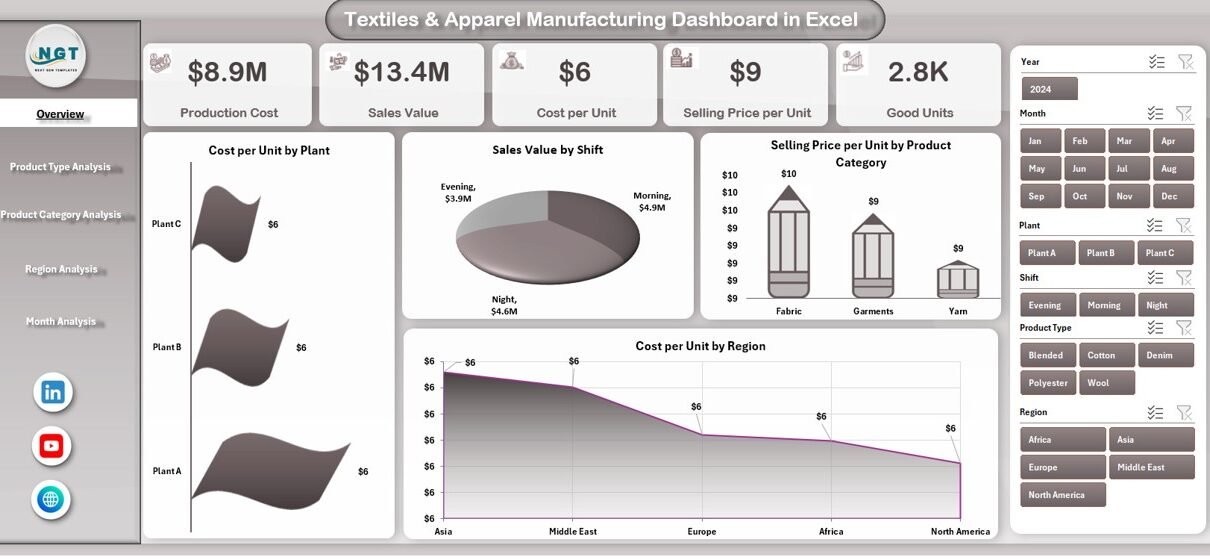
Overview Page – How Does It Summarize Business Performance?
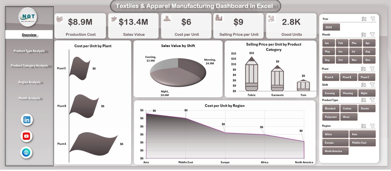
The Overview Page acts as the central control panel of the dashboard. It provides a high-level summary of manufacturing and sales performance.
Key Elements of the Overview Page
On this page, users find:
-
Right-side slicers for dynamic filtering
-
Four KPI cards for quick performance checks
-
Four insightful charts
KPI Cards on the Overview Page
The four cards display critical metrics at a glance. These cards help decision-makers quickly understand performance without reading detailed reports.
Charts on the Overview Page
The Overview Page includes the following charts:
-
Cost per Unit by Plant
This chart compares production efficiency across different plants. It highlights cost variations and identifies high-cost locations. -
Sales Value by Shift
This chart shows how sales perform across different shifts. As a result, managers identify the most productive working hours. -
Selling Price per Unit by Product Category
This visualization compares pricing strategies across product categories. -
Cost per Unit by Region
This chart highlights regional cost differences and helps optimize supply chain decisions.
Together, these charts provide a comprehensive snapshot of operational and financial performance.
Click to Purchases Textiles & Apparel Manufacturing Dashboard in Excel
Product Type Analysis – How Does Performance Vary by Product Type?
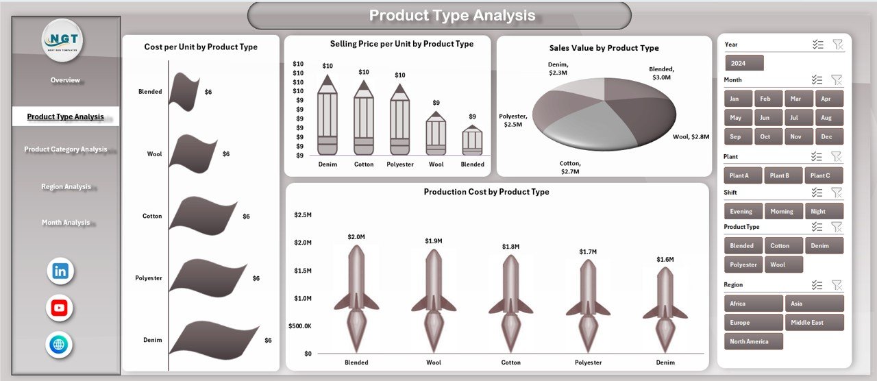
The Product Type Analysis page focuses on evaluating performance across different product types. Since textile and apparel manufacturers often produce multiple product lines, this analysis becomes extremely valuable.
Features of the Product Type Analysis Page
-
Right-side slicers for quick filtering
-
Four product-type-focused charts
Charts on the Product Type Analysis Page
-
Cost per Unit by Product Type
This chart identifies which product types incur higher production costs. -
Sales Value by Product Type
This visualization highlights top-performing product types in terms of revenue. -
Selling Price per Unit by Product Type
This chart compares pricing strategies across product types. -
Cost per Unit by Product Type
This analysis helps balance pricing, cost, and profitability.
With these insights, managers adjust production planning and pricing strategies effectively.
Product Category Analysis – How Profitable Are Different Categories?
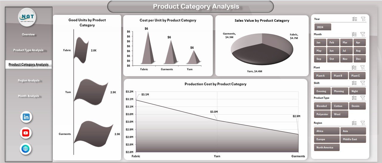
The Product Category Analysis page focuses on category-level performance. Since product categories often have different cost structures and demand patterns, this analysis supports smarter decisions.
Features of the Product Category Analysis Page
-
Interactive right-side slicers
-
Four detailed category-level charts
Charts on the Product Category Analysis Page
-
Good Units by Product Category
This chart measures production output and quality across categories. -
Cost per Unit by Product Category
This visualization highlights cost efficiency at the category level. -
Sales Value by Product Category
This chart shows which categories generate the highest revenue. -
Production Cost by Product Category
This analysis helps identify cost-intensive categories.
As a result, manufacturers focus resources on high-value and high-margin categories.
Region Analysis – How Does Performance Differ Across Regions?
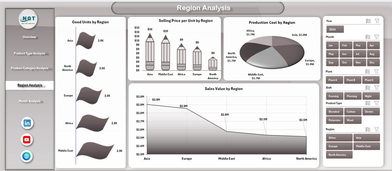
The Region Analysis page helps manufacturers understand geographic performance differences. Since regions vary in labor cost, logistics, and demand, this analysis becomes critical.
Features of the Region Analysis Page
-
Right-side slicers for region-based filtering
-
Four region-specific charts
Charts on the Region Analysis Page
-
Good Units by Region
This chart measures production output across regions. -
Selling Price per Unit by Region
This visualization highlights regional pricing strategies. -
Product Cost by Region
This chart identifies high-cost regions. -
Sales Value by Region
This analysis compares regional revenue contribution.
Therefore, businesses optimize regional operations and pricing models.
Click to Purchases Textiles & Apparel Manufacturing Dashboard in Excel
Month Analysis – How Does Performance Change Over Time?
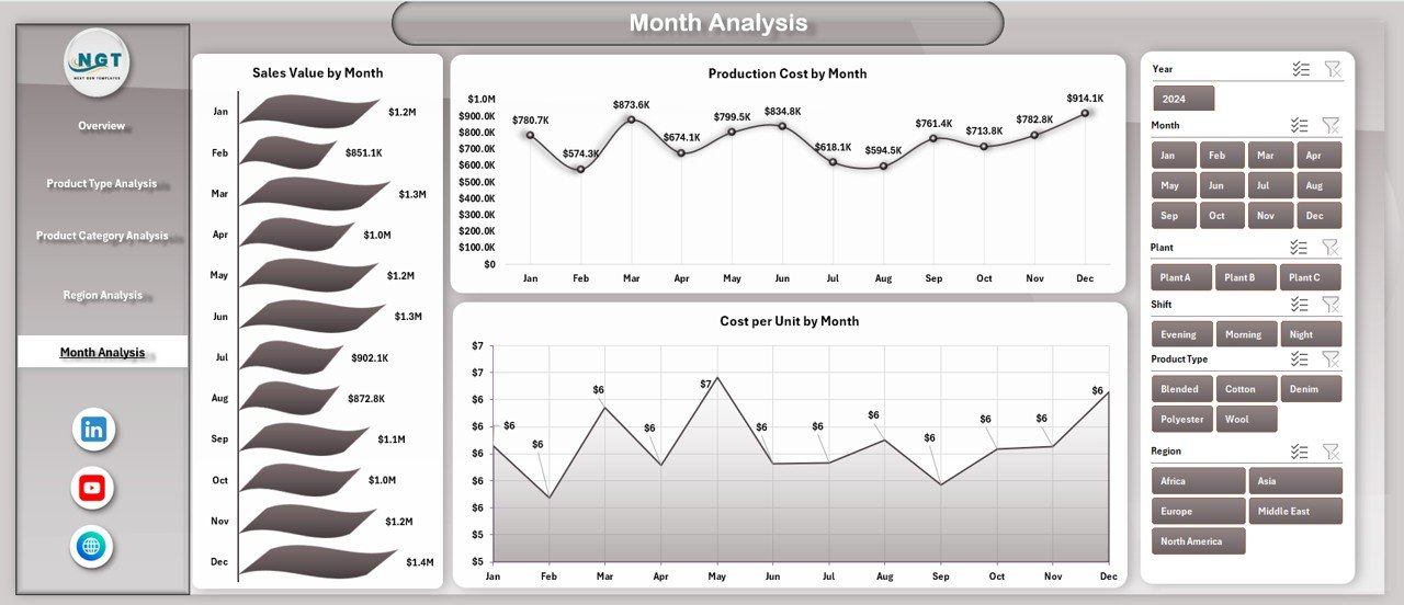
The Month Analysis page focuses on time-based trends. Seasonal demand, cost fluctuations, and production cycles often affect textile and apparel businesses.
Features of the Month Analysis Page
-
Right-side slicers for month selection
-
Three time-series charts
Charts on the Month Analysis Page
-
Sales Value by Month
This chart tracks revenue trends over time. -
Product Cost by Month
This visualization highlights cost fluctuations. -
Cost per Unit by Month
This chart shows efficiency trends.
With this analysis, businesses forecast demand, plan budgets, and manage costs proactively.
Advantages of Textiles & Apparel Manufacturing Dashboard in Excel
Why Should Manufacturers Use This Dashboard?
Using a Textiles & Apparel Manufacturing Dashboard in Excel offers several advantages:
-
📊 Centralized Reporting – All key metrics appear in one file
-
⏱️ Time Savings – Faster analysis and reporting
-
💰 Cost Control – Better visibility into production and unit costs
-
📈 Improved Decision-Making – Data-driven insights support strategy
-
🔄 Interactive Analysis – Slicers allow dynamic filtering
-
🧩 Easy Customization – Modify charts, KPIs, and layouts easily
-
📂 Excel-Based – No additional software required
Therefore, manufacturers gain both operational and financial benefits.
Best Practices for the Textiles & Apparel Manufacturing Dashboard in Excel
How Can You Get the Most Value from This Dashboard?
To maximize the effectiveness of this dashboard, follow these best practices:
-
✅ Keep source data clean and structured
-
✅ Update data regularly to maintain accuracy
-
✅ Use consistent units and naming conventions
-
✅ Review cost-related charts frequently
-
✅ Combine dashboard insights with operational reviews
-
✅ Train teams to use slicers and filters effectively
-
✅ Archive historical data for trend comparison
By following these practices, the dashboard remains reliable and impactful.
Who Can Use This Dashboard?
This dashboard benefits a wide range of professionals:
-
Textile and apparel manufacturers
-
Production managers
-
Plant managers
-
Operations teams
-
Finance and cost controllers
-
Business owners
-
Supply chain managers
Whether you run a single plant or multiple facilities, this dashboard adapts to your needs.
How Does This Dashboard Support Better Business Decisions?
This dashboard supports better decisions by:
-
Highlighting cost inefficiencies early
-
Revealing high-performing products and regions
-
Supporting pricing strategy evaluation
-
Enabling month-wise trend analysis
-
Improving production planning
As a result, organizations respond faster to market and operational changes.
Conclusion
The Textiles & Apparel Manufacturing Dashboard in Excel transforms complex manufacturing data into clear, actionable insights. It combines cost analysis, sales performance, regional evaluation, and time-based trends into a single, easy-to-use Excel file.
Moreover, its structured layout, interactive slicers, and powerful charts make it suitable for both daily monitoring and strategic planning. By using this dashboard, textile and apparel manufacturers improve efficiency, control costs, and drive sustainable growth.
If you want a simple yet powerful analytics solution, this ready-to-use Excel dashboard is an excellent choice.
Frequently Asked Questions (FAQs)
What is a Textiles & Apparel Manufacturing Dashboard in Excel?
It is an Excel-based reporting tool that tracks production, cost, sales, and performance metrics using charts and slicers.
Can beginners use this Excel dashboard?
Yes. The dashboard uses simple Excel features and requires no advanced technical skills.
Can I customize this dashboard?
Yes. You can add KPIs, charts, or modify layouts based on business needs.
Does this dashboard support monthly analysis?
Yes. The Month Analysis page tracks sales value, product cost, and cost per unit over time.
Is this dashboard suitable for multiple plants?
Yes. The dashboard includes plant-wise, region-wise, and product-wise analysis.
Do I need Excel macros to use this dashboard?
No. This dashboard works with standard Excel features like Pivot Tables and slicers.
Visit our YouTube channel to learn step-by-step video tutorials
Click to Purchases Textiles & Apparel Manufacturing Dashboard in Excel