The toy industry moves fast. Trends change quickly. Seasonal demand rises sharply. Retail pressure increases daily. Therefore, toy manufacturers must track production, quality, sales, and delivery metrics in real time.
However, many factories still rely on scattered Excel sheets and manual reports. As a result, managers miss early warning signs. Production delays increase. Defect rates rise. Inventory costs grow.
That is exactly why a Toy Manufacturing KPI Dashboard in Power BI transforms operations.
Click to Purchases Toy Manufacturing KPI Dashboard in Power BI
In this detailed guide, you will learn:
-
What a Toy Manufacturing KPI Dashboard in Power BI is
-
Why toy manufacturers need it
-
Dashboard structure and pages
-
KPI tracking logic (MTD & YTD)
-
Advantages of using this dashboard
-
Best practices for implementation
-
Frequently asked questions
Let us explore everything step by step.
What Is a Toy Manufacturing KPI Dashboard in Power BI?
A Toy Manufacturing KPI Dashboard in Power BI is a ready-to-use performance monitoring solution designed for toy factories and production units.
It captures data in an Excel file. Then, it transforms that raw data into powerful visual insights inside Power BI.
Instead of reviewing multiple files, managers can:
-
Track production efficiency
-
Monitor quality metrics
-
Compare targets vs actuals
-
Analyze monthly and yearly trends
-
Evaluate current year vs previous year performance
Therefore, decision-makers gain clarity. Moreover, they act faster and improve profitability.
Why Do Toy Manufacturers Need a KPI Dashboard?
The toy industry faces unique challenges:
-
Seasonal demand spikes (festivals, holidays)
-
Strict safety compliance standards
-
High raw material cost fluctuations
-
Tight delivery timelines
-
Increasing retail competition
Because of these challenges, factories must monitor performance daily. However, manual tracking slows decisions.
On the other hand, a Power BI dashboard:
-
Consolidates data
-
Highlights underperforming KPIs
-
Shows trend comparisons
-
Supports proactive planning
As a result, production teams stay ahead instead of reacting late.
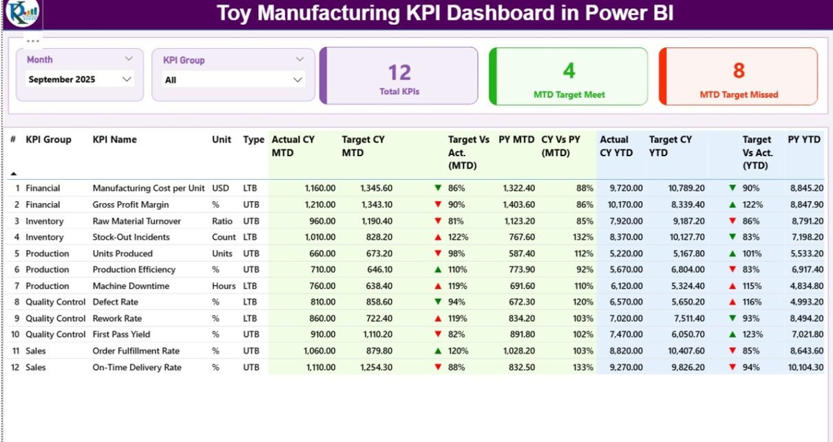
Key Features of Toy Manufacturing KPI Dashboard in Power BI
This dashboard contains 3 structured pages inside the Power BI Desktop file. Each page serves a clear purpose.
Let us break them down.
1️⃣ Summary Page – The Control Center
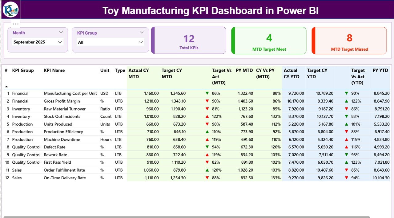
The Summary Page acts as the main dashboard view. It gives a high-level performance overview.
🔹 Top Section – Slicers and KPI Cards
At the top, you will find:
-
Month Slicer
-
KPI Group Slicer
Therefore, users can filter results instantly.
Additionally, three KPI cards display:
-
Total KPIs Count
-
MTD Target Meet Count
-
MTD Target Missed Count
Because of this, managers immediately see how many KPIs perform well and how many need attention.
🔹 Detailed KPI Performance Table
Below the cards, a detailed KPI table provides complete transparency.
The table includes:
-
KPI Number – Sequence number of KPI
-
KPI Group – Production, Quality, Sales, Inventory, etc.
-
KPI Name – Name of performance metric
-
Unit – Percentage, Units, Cost, Hours, etc.
-
Type – LTB (Lower the Better) or UTB (Upper the Better)
Then, performance metrics appear:
MTD Metrics
-
Actual CY MTD
-
Target CY MTD
-
MTD Icon (▲ Green / ▼ Red)
-
Target vs Actual (MTD %)
-
PY MTD
-
CY vs PY (MTD %)
YTD Metrics
-
Actual CY YTD
-
Target CY YTD
-
YTD Icon (▲ Green / ▼ Red)
-
Target vs Actual (YTD %)
-
PY YTD
-
CY vs PY (YTD %)
How Does the Dashboard Calculate Performance?
Click to Purchases Toy Manufacturing KPI Dashboard in Power BI
The dashboard uses clear formulas:
-
Target vs Actual (%) = Actual ÷ Target
-
CY vs PY (%) = Current Year ÷ Previous Year
Because of these comparisons, managers understand:
-
Are we meeting targets?
-
Are we improving year over year?
Therefore, the dashboard encourages data-driven decisions.
2️⃣ KPI Trend Page – Performance Over Time
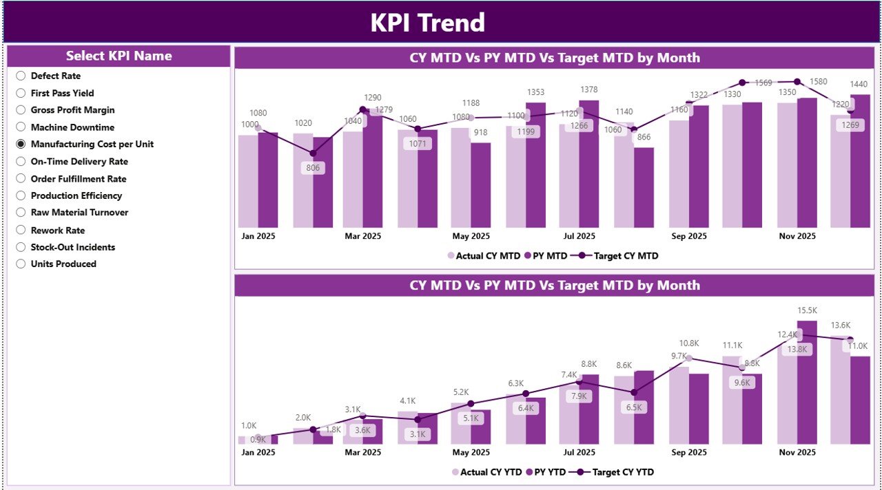
The KPI Trend page focuses on historical comparison.
Here, you will find:
-
Two combo charts
-
KPI Name slicer
Combo Chart 1 – MTD Analysis
It shows:
-
Current Year Actual
-
Previous Year Actual
-
Target
Therefore, managers can see whether performance improves or declines monthly.
Combo Chart 2 – YTD Analysis
This chart compares:
-
Current Year YTD
-
Previous Year YTD
-
YTD Target
As a result, leadership gains long-term visibility.
3️⃣ KPI Definition Page – Drill-Through Details
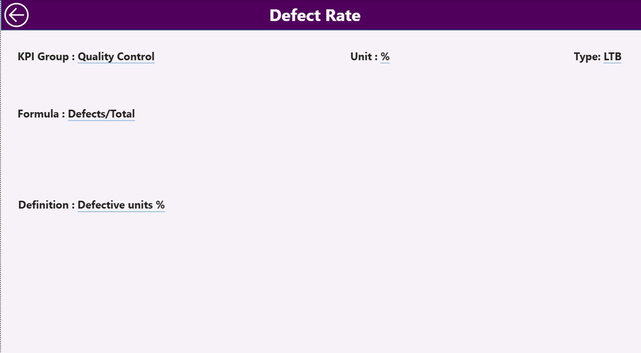
This hidden page contains:
-
KPI Formula
-
KPI Definition
-
KPI Group
-
Unit
-
KPI Type
From the Summary page, users can drill through to view KPI details.
Then, users click the back button at the top-left corner to return.
Because of this feature, transparency increases across teams.
Excel Data Structure – The Backbone of the Dashboard
The Power BI dashboard connects to an Excel file.
This file contains three worksheets.
1️⃣ Input_Actual Sheet
Users must fill:
-
KPI Name
-
Month (first date of month)
-
MTD Number
-
YTD Number
Therefore, this sheet captures real performance.
2️⃣ Input_Target Sheet
Users must enter:
-
KPI Name
-
Month (first date of month)
-
MTD Target
-
YTD Target
Because of this structure, Power BI compares actual vs target easily.
3️⃣ KPI Definition Sheet
This sheet includes:
-
KPI Number
-
KPI Group
-
KPI Name
-
Unit
-
Formula
-
Definition
-
Type (LTB / UTB)
As a result, the dashboard remains organized and scalable.
What KPIs Should Toy Manufacturers Track?
Click to Purchases Toy Manufacturing KPI Dashboard in Power BI
Toy factories should track multiple KPI groups:
Production KPIs
-
Production Volume
-
Machine Utilization Rate
-
Downtime Hours
-
Production Efficiency
Quality KPIs
-
Defect Rate
-
Rework Percentage
-
Customer Complaints
Inventory KPIs
-
Raw Material Turnover
-
Finished Goods Inventory Days
Sales KPIs
-
Order Fulfillment Rate
-
On-Time Delivery Rate
Therefore, companies get a complete operational view.
Advantages of Toy Manufacturing KPI Dashboard in Power BI
Now, let us explore the major benefits.
1️⃣ Real-Time Decision Making
The dashboard updates instantly when Excel data changes. Therefore, managers act faster.
2️⃣ Improved Production Efficiency
Because the dashboard highlights underperforming KPIs, teams focus on problem areas quickly.
3️⃣ Clear Target Tracking
MTD and YTD comparisons ensure goal alignment.
4️⃣ Better Quality Control
Defect trends appear clearly. As a result, quality teams reduce rejection rates.
5️⃣ Seasonal Demand Planning
Toy demand spikes during festivals. However, the dashboard helps forecast capacity better.
6️⃣ Transparent KPI Ownership
Each KPI links to clear definitions. Therefore, teams understand expectations.
Best Practices for Toy Manufacturing KPI Dashboard
To maximize results, follow these best practices.
✔ Keep KPI Definitions Clear
Avoid confusion. Write short and precise definitions.
✔ Update Data Monthly
Enter MTD and YTD values consistently.
✔ Limit KPIs to What Matters
Do not overload the dashboard. Focus on critical KPIs.
✔ Review Trends Regularly
Monthly review meetings improve accountability.
✔ Separate LTB and UTB KPIs Properly
Because LTB KPIs require lower values (e.g., defect rate), interpretation differs.
✔ Validate Excel Data Before Upload
Clean data ensures accurate Power BI visuals.
How Does This Dashboard Improve Profitability?
Let us connect performance to profit.
-
Reduced defect rate lowers rework cost.
-
Better machine utilization increases output.
-
Improved delivery rate boosts customer satisfaction.
-
Optimized inventory reduces holding cost.
Therefore, better KPI tracking directly improves margins.
Who Should Use This Dashboard?
This solution works best for:
-
Toy factory owners
-
Production managers
-
Quality managers
-
Operations heads
-
Supply chain managers
-
Financial controllers
Because the dashboard centralizes insights, every department benefits.
Why Power BI Instead of Manual Reports?
Manual reports:
-
Consume time
-
Contain errors
-
Lack visuals
-
Delay decisions
However, Power BI:
-
Automates calculations
-
Provides dynamic visuals
-
Supports drill-through analysis
-
Handles large datasets
Therefore, companies scale reporting easily.
Conclusion
The toy manufacturing industry demands speed, accuracy, and efficiency. However, manual tracking slows growth.
A Toy Manufacturing KPI Dashboard in Power BI simplifies performance management. It connects Excel data to dynamic visuals. It compares MTD and YTD performance. It highlights target achievement. It enables drill-through analysis.
Most importantly, it empowers managers to act with confidence.
If you want structured production monitoring, better quality control, and stronger profitability, this dashboard delivers measurable impact.
Frequently Asked Questions (FAQs)
Click to Purchases Toy Manufacturing KPI Dashboard in Power BI
1️⃣ What is the purpose of a Toy Manufacturing KPI Dashboard?
It tracks production, quality, sales, and inventory KPIs in one centralized Power BI report.
2️⃣ Do I need advanced Power BI knowledge to use it?
No. You only update Excel sheets. The dashboard updates automatically.
3️⃣ What does LTB and UTB mean?
LTB means Lower the Better (e.g., defect rate).
UTB means Upper the Better (e.g., production volume).
4️⃣ How often should I update the data?
You should update data monthly. However, some factories update weekly.
5️⃣ Can I add more KPIs later?
Yes. You can add new KPIs in the Excel definition sheet.
6️⃣ Does the dashboard support year-over-year comparison?
Yes. It compares Current Year vs Previous Year for both MTD and YTD.
7️⃣ Can this dashboard help reduce production cost?
Yes. By identifying inefficiencies early, you reduce waste and downtime.