In today’s highly competitive media landscape, TV channels cannot rely on guesswork or delayed reports. Instead, they must track performance daily, compare results against targets, and respond quickly to changing viewer behavior. Therefore, a TV Channels KPI Dashboard in Power BI becomes an essential tool for broadcasters, media managers, and analytics teams.
A TV Channels KPI Dashboard in Power BI converts raw operational data into clear, visual, and actionable insights. Moreover, it helps decision-makers understand what is working, what needs improvement, and where corrective action is required. Instead of manually reviewing spreadsheets, teams can focus on strategic growth and content optimization.
In this detailed guide, you will learn what a TV Channels KPI Dashboard in Power BI is, how it works, its features, advantages, best practices, and common questions. Additionally, this article explains how you can use Excel as a data source and Power BI as a visualization engine to build a robust and scalable KPI monitoring system.
Click to Purchases TV Channels KPI Dashboard in Power BI
What Is a TV Channels KPI Dashboard in Power BI?
A TV Channels KPI Dashboard in Power BI is an interactive reporting solution designed to track and visualize key performance indicators (KPIs) related to television channel operations. These KPIs may include viewership metrics, revenue-related indicators, advertising efficiency, content performance, and operational effectiveness.
Instead of working with disconnected Excel sheets, this dashboard brings all KPIs into one centralized Power BI report. As a result, stakeholders gain a real-time or near-real-time view of performance across months, years, and KPI categories.
Furthermore, Power BI enables slicing, drilling, and comparison across Month-to-Date (MTD) and Year-to-Date (YTD) values. Consequently, users can monitor short-term performance while keeping long-term goals in focus.
Why Do TV Channels Need a KPI Dashboard?
TV channels operate in a fast-moving environment where viewer preferences, advertising demand, and competition change constantly. Therefore, traditional static reports no longer support effective decision-making.
A TV Channels KPI Dashboard in Power BI solves this challenge by offering:
-
Centralized KPI tracking across departments
-
Target vs Actual comparisons for performance monitoring
-
Year-over-Year analysis to identify trends
-
Visual indicators that highlight performance gaps instantly
Moreover, when management teams view data visually, they understand insights faster and act more confidently.
How Does a TV Channels KPI Dashboard in Power BI Work?
A TV Channels KPI Dashboard in Power BI typically follows a simple yet powerful workflow:
-
Data Entry in Excel
First, teams enter actual values, targets, and KPI definitions in structured Excel sheets. -
Data Modeling in Power BI
Next, Power BI connects to Excel and builds relationships between actuals, targets, and KPI metadata. -
Visualization and Analysis
Finally, Power BI displays KPIs using tables, cards, icons, and combo charts for MTD and YTD analysis.
Because of this structured approach, the dashboard remains easy to maintain, scalable, and user-friendly.
Click to Purchases TV Channels KPI Dashboard in Power BI
What Are the Key Pages in the TV Channels KPI Dashboard in Power BI?
This TV Channels KPI Dashboard in Power BI includes three powerful report pages, each serving a specific purpose.
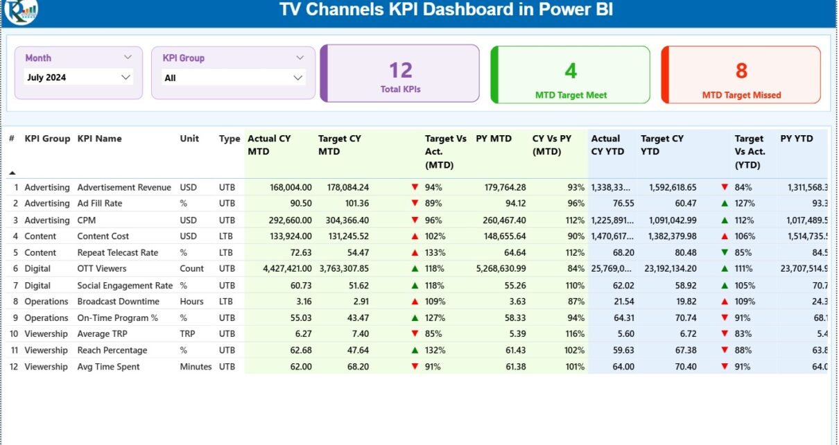
1. Summary Page: How Does It Help in Daily Monitoring?

The Summary Page acts as the main control center of the dashboard. Here, users get a complete overview of all KPIs at once.
What Slicers Are Available on the Summary Page?
At the top of the Summary Page, you will find:
-
Month slicer – Select any month to view MTD and YTD performance
-
KPI Group slicer – Filter KPIs by category or department
As a result, users can quickly narrow their focus without scrolling through unnecessary data.
What KPI Cards Are Displayed?
The Summary Page displays three high-level KPI cards:
-
Total KPIs Count
-
MTD Target Met Count
-
MTD Target Missed Count
These cards immediately communicate overall performance status. Therefore, management can identify whether performance trends move in the right direction.
What Details Does the KPI Table Show?
Below the cards, a detailed KPI table provides in-depth performance metrics.
Key Columns Explained
-
KPI Number
Displays the sequence number of each KPI. -
KPI Group
Represents the category or functional group of the KPI. -
KPI Name
Shows the name of the performance indicator. -
Unit
Indicates the measurement unit, such as percentage, count, or value. -
Type (LTB / UTB)
Defines whether the KPI follows Lower the Better or Upper the Better logic.
How Are MTD KPIs Tracked?
For Month-to-Date (MTD) performance, the dashboard shows:
-
Actual CY MTD – Current year actual MTD value
-
Target CY MTD – Target MTD value
-
MTD Icon – ▲ or ▼ icon with green or red color
-
Target vs Actual (MTD) – Percentage comparison
-
PY MTD – Previous year MTD value
-
CY vs PY (MTD) – Current vs previous year comparison
Because of icons and percentages, users instantly understand whether KPIs perform above or below expectations.
How Are YTD KPIs Tracked?
For Year-to-Date (YTD) performance, the dashboard includes:
-
Actual CY YTD
-
Target CY YTD
-
YTD Icon
-
Target vs Actual (YTD)
-
PY YTD
-
CY vs PY (YTD)
Therefore, users can compare short-term progress with long-term trends.
Click to Purchases TV Channels KPI Dashboard in Power BI
2. KPI Trend Page: How Do Trends Improve Decision-Making?

The KPI Trend Page focuses on performance over time.
What Charts Are Used on the KPI Trend Page?
This page includes two combo charts:
-
MTD Trend Chart
Shows Actual (CY), Previous Year, and Target MTD values. -
YTD Trend Chart
Shows Actual (CY), Previous Year, and Target YTD values.
Because combo charts combine bars and lines, trends become easy to interpret.
How Can Users Filter KPI Trends?
A KPI Name slicer appears on the left side of the page. Users select a KPI and instantly view its trend.
As a result, analysts can:
-
Identify seasonal patterns
-
Compare targets vs actuals
-
Spot declining or improving KPIs early
3. KPI Definition Page: Why Is It Important?

The KPI Definition Page acts as a drill-through reference page.
What Information Does It Show?
This page displays:
-
KPI Formula
-
KPI Definition
-
KPI Type (LTB or UTB)
-
Unit of measurement
Because this page stays hidden, users access it only when needed.
How Does Drill-Through Improve Usability?
From the Summary Page, users can right-click a KPI and drill through to the definition page. Consequently, confusion reduces and KPI interpretation remains consistent across teams.
What Is the Role of Excel Data in This Dashboard?
This TV Channels KPI Dashboard in Power BI uses Excel as its data source, which keeps the solution simple and flexible.
What Are the Excel Sheets Used?
1. Input_Actual Sheet
In this sheet, users enter:
-
KPI Name
-
Month (first date of the month)
-
MTD Actual value
-
YTD Actual value
2. Input_Target Sheet
Here, users enter:
-
KPI Name
-
Month
-
MTD Target value
-
YTD Target value
3. KPI Definition Sheet
This sheet includes:
-
KPI Number
-
KPI Group
-
KPI Name
-
Unit
-
Formula
-
Definition
-
Type (LTB or UTB)
Because of this structure, Excel data remains organized and easy to update.
Advantages of TV Channels KPI Dashboard in Power BI
Using a TV Channels KPI Dashboard in Power BI offers several strong advantages.
1. Centralized Performance Monitoring
Instead of multiple reports, teams track all KPIs in one dashboard.
2. Faster Decision-Making
Visual indicators and slicers reduce analysis time.
3. Clear Target Accountability
Target vs Actual comparisons highlight performance gaps.
4. Historical Performance Comparison
CY vs PY analysis helps identify long-term trends.
5. User-Friendly Interface
Even non-technical users can explore insights easily.
Best Practices for the TV Channels KPI Dashboard in Power BI
To maximize value, follow these best practices.
Use Clear KPI Definitions
Always document formulas and logic in the KPI Definition page.
Maintain Data Consistency
Ensure KPI names remain consistent across all Excel sheets.
Update Data Regularly
Frequent updates improve accuracy and trust.
Use Meaningful KPI Groups
Group KPIs logically, such as Revenue, Viewership, or Operations.
Limit KPI Overload
Track only actionable KPIs to maintain clarity.
How Can This Dashboard Support Strategic Decisions?
A TV Channels KPI Dashboard in Power BI supports decisions related to:
-
Content planning and scheduling
-
Advertising performance evaluation
-
Budget allocation
-
Operational efficiency improvements
-
Long-term channel growth strategies
Because leaders see data clearly, they act confidently.
Click to Purchases TV Channels KPI Dashboard in Power BI
Conclusion: Why Should TV Channels Use a KPI Dashboard in Power BI?
A TV Channels KPI Dashboard in Power BI transforms raw data into meaningful insights. It helps TV channels track MTD and YTD performance, compare targets with actuals, and understand trends through intuitive visuals.
Moreover, by combining Excel data entry with Power BI analytics, this dashboard offers flexibility, clarity, and scalability. As competition intensifies in the broadcasting industry, such dashboards become essential tools for sustainable success.
Frequently Asked Questions (FAQs)
What is a TV Channels KPI Dashboard in Power BI used for?
A TV Channels KPI Dashboard in Power BI helps track, analyze, and visualize key performance indicators related to TV channel operations.
Can Excel be used as a data source for Power BI?
Yes, Excel works perfectly as a data source and allows easy data entry and updates.
What does MTD and YTD mean in the dashboard?
MTD means Month-to-Date performance, while YTD means Year-to-Date performance.
What is the difference between LTB and UTB KPIs?
LTB means Lower the Better, and UTB means Upper the Better performance logic.
Who can use this dashboard?
Channel managers, analysts, finance teams, and executives can use this dashboard.
Is this dashboard suitable for non-technical users?
Yes, the dashboard uses simple visuals, slicers, and icons for easy understanding.
Can KPIs be added or modified later?
Yes, users can add or update KPIs by editing the Excel data sheets.
Does the dashboard support trend analysis?
Yes, the KPI Trend page shows MTD and YTD trends using combo charts.
How often should data be updated?
Ideally, teams should update data monthly or as frequently as business needs require.
Is Power BI Desktop enough to use this dashboard?
Yes, Power BI Desktop is sufficient for building and viewing this dashboard.
Click to Purchases TV Channels KPI Dashboard in Power BI
Visit our YouTube channel to learn step-by-step video tutorials