In today’s rapidly changing world, water utilities face increasing pressure to manage resources efficiently, ensure water quality, reduce risks, and meet growing consumer demand. However, handling water utility data through manual reports and scattered spreadsheets often leads to delays, errors, and poor decision-making. Therefore, utilities now require a modern, visual, and centralized analytics solution.
That is exactly where a Water Utilities Dashboard in Power BI becomes essential.
This detailed article explains what a Water Utilities Dashboard in Power BI is, why it is important, how it works, its dashboard structure, key features, advantages, best practices, and frequently asked questions. Moreover, the language stays simple, clear, and practical, so anyone can understand and implement it easily.
Click to Purchases Water Utilities Dashboard in Power BI
What Is a Water Utilities Dashboard in Power BI?
A Water Utilities Dashboard in Power BI is a ready-to-use business intelligence solution designed to monitor, analyze, and visualize water utility performance data in an interactive and user-friendly way.
Instead of relying on static reports, utility managers can use this dashboard to track water demand, distribution, contamination risks, treatment performance, and consumer usage patterns in real time. As a result, decision-makers gain instant visibility into operational efficiency, risk levels, and resource allocation.
Moreover, Power BI connects seamlessly with Excel, databases, and other data sources. Therefore, water utilities can update data regularly without technical complexity.
Why Do Water Utilities Need a Power BI Dashboard?
Water utilities operate in a complex environment where safety, efficiency, and sustainability matter equally. However, traditional reporting methods fail to provide timely insights. That is why a Power BI dashboard becomes critical.
Key Reasons Water Utilities Need This Dashboard
-
Water demand continues to increase every year
-
Infrastructure risks require constant monitoring
-
Contamination incidents need early detection
-
Regulatory compliance demands accurate reporting
-
Decision-makers need real-time visibility
Therefore, a Water Utilities Dashboard in Power BI helps utilities respond faster, reduce risks, and improve service quality.
How Does a Water Utilities Dashboard in Power BI Work?
The dashboard works by transforming raw operational data into meaningful visual insights.
Step-by-Step Working Process
-
Data Collection
Utilities collect data related to water demand, distribution, sources, treatment plants, and consumer types. -
Data Integration
Power BI connects with Excel files or databases that store this data. -
Data Modeling
Measures and calculations such as risk ratings, critical percentages, and total records are created. -
Visualization
Interactive charts, cards, and slicers display key metrics clearly. -
Analysis & Decision-Making
Users analyze trends, compare performance, and take informed actions.
As a result, utilities shift from reactive management to proactive planning.
What Are the Key Features of a Water Utilities Dashboard in Power BI?
This dashboard comes with a well-structured five-page layout, each page focusing on a specific aspect of water utility operations. Let us explore each page in detail.
Overview Page: What Insights Does the Overview Page Provide?
The Overview Page acts as the control center of the dashboard. It provides a high-level summary of critical water utility metrics.
Key Elements of the Overview Page
Interactive Slicers
Users can filter data by time, region, or utility, which ensures focused analysis.
KPI Cards
-
Critical % – Highlights high-risk areas
-
Total Records – Shows overall data volume
Charts on the Overview Page
-
Critical % – Identifies risk severity
-
Contamination Cases by Water Source – Shows contamination exposure
-
Risk Rating by Utility Name – Compares utilities
-
Water Distributed by Region – Tracks regional supply
Therefore, decision-makers can instantly understand overall system health.
Click to Purchases Water Utilities Dashboard in Power BI
Water Source Analysis Page: How Does It Improve Source-Level Decisions?
The Water Source Analysis Page focuses on analyzing performance and risks associated with different water sources such as rivers, groundwater, reservoirs, and desalination plants.
Key Charts on This Page
-
Water Demand by Water Source
-
Risk Rating by Water Source
-
Water Distributed by Water Source
Because water sources vary in quality and availability, this page helps utilities optimize sourcing strategies and reduce dependency risks.
Consumer Analysis Page: Why Is Consumer-Level Analysis Important?
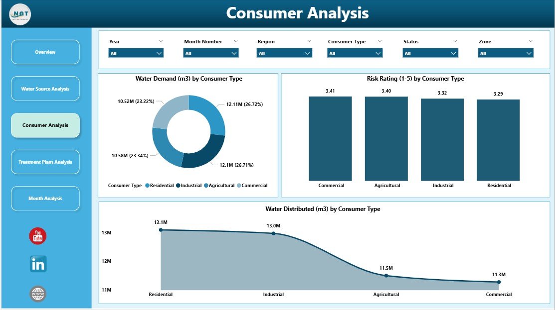
The Consumer Analysis Page provides insights into water usage and risk patterns across different consumer categories.
Key Charts on This Page
-
Water Demand by Consumer Type
-
Risk Rating by Consumer Type
-
Water Distributed by Consumer Type
Consumer types may include residential, commercial, industrial, and agricultural users. Therefore, utilities can adjust pricing, supply, and conservation programs effectively.
Treatment Plant Analysis Page: How Does It Support Treatment Efficiency?
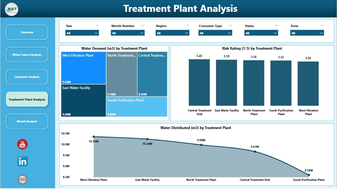
The Treatment Plant Analysis Page focuses on treatment operations and risk management.
Key Charts on This Page
-
Water Demand by Treatment Type
-
Risk Rating by Treatment Type
-
Water Distributed by Treatment Type
This page helps utilities identify underperforming treatment processes and prioritize upgrades or maintenance activities.
Click to Purchases Water Utilities Dashboard in Power BI
Monthly Trends Page: Why Are Trends Important for Water Planning?
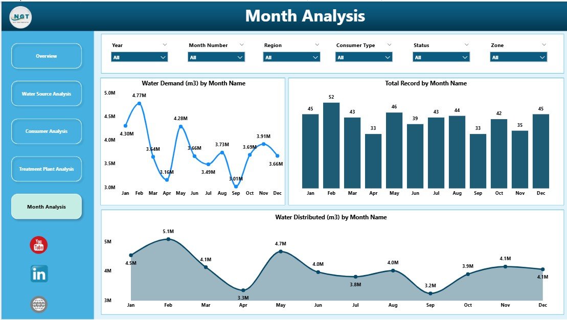
The Monthly Trends Page highlights time-based patterns that support forecasting and long-term planning.
Key Charts on This Page
-
Water Demand by Month
-
Total Records by Month
-
Water Distributed by Month
As a result, utilities can identify seasonal demand spikes and plan infrastructure capacity accordingly.
What KPIs Can You Track in a Water Utilities Dashboard in Power BI?
A Water Utilities Dashboard can track a wide range of KPIs, including:
-
Water Demand Volume
-
Water Distributed
-
Contamination Cases
-
Risk Rating Scores
-
Critical Percentage
-
Consumer Usage Patterns
-
Treatment Efficiency
-
Monthly and Regional Trends
Therefore, utilities gain complete operational visibility.
Advantages of a Water Utilities Dashboard in Power BI
Implementing this dashboard delivers measurable benefits across operations, compliance, and planning.
1. Centralized Data Visibility
All water utility data appears in one dashboard. Therefore, teams avoid confusion and duplication.
2. Faster Decision-Making
Interactive visuals enable quick analysis. As a result, managers respond faster to risks.
3. Improved Risk Management
Risk ratings and critical percentages highlight problem areas early.
4. Better Resource Allocation
Utilities can optimize water distribution based on demand and availability.
5. Enhanced Transparency
Clear visuals improve reporting for regulators and stakeholders.
6. Reduced Manual Effort
Automated updates eliminate repetitive reporting tasks.
Click to Purchases Water Utilities Dashboard in Power BI
Who Can Use a Water Utilities Dashboard in Power BI?
This dashboard serves multiple roles within water utilities and related organizations.
Primary Users
-
Water Utility Managers
-
Operations and Maintenance Teams
-
Risk and Compliance Officers
-
Environmental Analysts
-
Government and Regulatory Authorities
-
Sustainability and ESG Teams
Therefore, the dashboard supports both operational and strategic needs.
Best Practices for the Water Utilities Dashboard in Power BI
To maximize value, utilities should follow proven best practices.
1. Maintain Clean and Accurate Data
Always validate data before loading it into Power BI.
2. Use Consistent KPI Definitions
Ensure all teams follow the same KPI logic.
3. Update Data Regularly
Schedule frequent data refreshes to maintain accuracy.
4. Use Slicers Wisely
Limit slicers to relevant filters to avoid confusion.
5. Focus on Actionable Insights
Design visuals that support decisions, not just reporting.
6. Train End Users
Provide basic training so users fully leverage dashboard features.
How Does This Dashboard Support Sustainability and Compliance?
Water utilities must align operations with sustainability goals and regulations. This dashboard supports:
-
Efficient water usage monitoring
-
Reduced contamination risks
-
Transparent reporting
-
Data-driven sustainability initiatives
As a result, utilities strengthen environmental responsibility.
What Challenges Can a Water Utilities Dashboard Solve?
This dashboard addresses several common challenges:
-
Fragmented data sources
-
Delayed reporting
-
Limited visibility into risks
-
Poor demand forecasting
-
Inefficient resource allocation
Therefore, utilities gain operational control and confidence.
How Is Power BI Better Than Traditional Reporting Tools?
Compared to static Excel reports, Power BI offers:
-
Interactive dashboards
-
Real-time insights
-
Advanced visual analytics
-
Easy sharing and collaboration
-
Scalable data handling
Thus, Power BI becomes a superior analytics platform for water utilities.
Conclusion: Why Should You Use a Water Utilities Dashboard in Power BI?
A Water Utilities Dashboard in Power BI transforms how utilities monitor, analyze, and manage water systems. Instead of relying on outdated reports, utilities gain real-time visibility into demand, distribution, risks, and trends.
By using this dashboard, organizations improve efficiency, reduce risks, support sustainability, and make smarter decisions. Therefore, any modern water utility aiming for operational excellence should adopt this solution.
Frequently Asked Questions (FAQs)
What is a Water Utilities Dashboard in Power BI used for?
It helps monitor water demand, distribution, risks, contamination, and operational performance using interactive visuals.
Can non-technical users use this dashboard?
Yes. The dashboard uses simple visuals and slicers, so anyone can use it easily.
Does the dashboard support real-time data?
Yes. Power BI supports scheduled and real-time data refreshes.
Can this dashboard work with Excel data?
Absolutely. Power BI integrates seamlessly with Excel files.
Is this dashboard suitable for small utilities?
Yes. Both small and large utilities can scale this dashboard as needed.
How often should data be updated?
Ideally, data should be updated daily or weekly depending on operational needs.
Visit our YouTube channel to learn step-by-step video tutorials