Workplace safety remains one of the most critical priorities for every organization, regardless of industry. Employees expect a safe working environment. Management teams aim to reduce incidents, avoid compliance penalties, and protect productivity. However, safety data often sits in scattered Excel files, emails, or manual reports. As a result, leaders struggle to see the real picture.
That is exactly where a Workplace Safety KPI Dashboard in Power BI becomes a powerful solution.
This in-depth, SEO-friendly guide explains what a Workplace Safety KPI Dashboard in Power BI is, why it matters, how it works, and how each dashboard page supports proactive safety management. Moreover, you will learn its advantages, best practices, implementation tips, and frequently asked questions. By the end, you will clearly understand how this dashboard can transform raw safety data into actionable insights.
Click to Purchases Workplace Safety KPI Dashboard in Power BI
What Is a Workplace Safety KPI Dashboard in Power BI?
A Workplace Safety KPI Dashboard in Power BI is an interactive reporting and analytics solution designed to track, analyze, and monitor key safety performance indicators from a centralized platform.
Instead of reviewing multiple spreadsheets for incidents, near misses, training compliance, and audits, this dashboard consolidates everything into a single Power BI report. As a result, safety managers, EHS teams, and leadership teams gain real-time visibility into safety performance.
Moreover, Power BI allows dynamic filtering, visual indicators, and trend analysis. Therefore, teams can quickly identify risks, track progress against targets, and take corrective action before incidents occur.
Why Do Organizations Need a Workplace Safety KPI Dashboard?
Organizations operate in environments where safety regulations grow stricter every year. At the same time, employee expectations around safety continue to rise. However, many companies still rely on manual reporting.
Here is why a Workplace Safety KPI Dashboard in Power BI becomes essential:
-
Safety data grows rapidly across sites, departments, and time periods
-
Manual reporting delays decision-making
-
Leaders need real-time visibility into risks
-
Compliance audits demand accurate and consistent reporting
-
Proactive safety management reduces costs and incidents
Therefore, a centralized dashboard helps organizations move from reactive safety reporting to proactive safety management.
How Does a Workplace Safety KPI Dashboard in Power BI Work?
The Workplace Safety KPI Dashboard in Power BI works by connecting structured Excel data to an interactive Power BI report.
First, users capture actual and target safety data in Excel. Then, Power BI transforms this data into visuals, tables, and trend charts. Finally, slicers and filters allow users to analyze safety performance by month, KPI group, or specific KPI.
As a result, the dashboard delivers both high-level summaries and detailed KPI-level insights.
What Are the Key Pages in a Workplace Safety KPI Dashboard in Power BI?
This ready-to-use dashboard includes three structured pages, each designed for a specific purpose.
1) What Does the Summary Page Show?
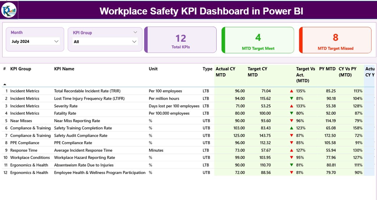
The Summary Page serves as the main landing page of the dashboard. It provides an instant overview of workplace safety performance.
Key Elements of the Summary Page
Top Slicers
-
Month slicer to select the reporting period
-
KPI Group slicer to filter safety categories
These slicers ensure that all visuals update dynamically based on user selection.
KPI Cards
-
Total KPIs Count
-
MTD Target Meet Count
-
MTD Target Missed Count
These cards give leadership a quick snapshot of overall safety performance.
Detailed KPI Table on the Summary Page
Below the cards, the dashboard displays a detailed KPI table with the following fields:
-
KPI Number – Sequential identifier for each KPI
-
KPI Group – Safety category such as incidents, training, compliance, or audits
-
KPI Name – Name of the safety metric
-
Unit – Unit of measurement
-
Type – LTB (Lower the Better) or UTB (Upper the Better)
MTD Performance Metrics
-
Actual CY MTD – Current Year actual month-to-date value
-
Target CY MTD – Current Year target month-to-date value
-
MTD Icon – ▲ or ▼ icons in green or red to indicate target achievement
-
Target vs Actual (MTD) – Percentage calculated as Actual / Target
-
PY MTD – Previous Year month-to-date value
-
CY vs PY (MTD) – Percentage comparison of Current Year vs Previous Year
YTD Performance Metrics
-
Actual CY YTD – Current Year actual year-to-date value
-
Target CY YTD – Current Year target year-to-date value
-
YTD Icon – ▲ or ▼ icons for YTD performance
-
Target vs Actual (YTD) – Percentage calculated as Actual / Target
-
PY YTD – Previous Year year-to-date value
-
CY vs PY (YTD) – Comparison of Current Year vs Previous Year YTD
As a result, the Summary Page delivers a complete safety performance snapshot in one screen.
2) What Insights Does the KPI Trend Page Provide?
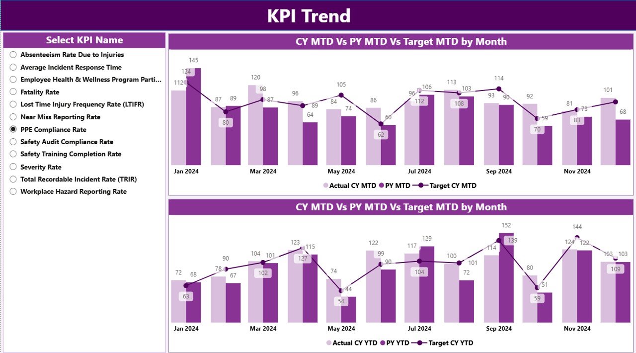
The KPI Trend Page focuses on performance over time. While the Summary Page shows current status, the Trend Page explains why performance looks the way it does.
Key Features of the KPI Trend Page
-
KPI Name slicer on the left side
-
Two combo charts:
-
MTD Actual vs Target vs Previous Year
-
YTD Actual vs Target vs Previous Year
-
These charts allow users to:
-
Identify seasonal safety patterns
-
Compare current performance with historical trends
-
Evaluate whether improvements remain consistent
Therefore, safety teams can move beyond static numbers and understand long-term behavior.
3) Why Is the KPI Definition Page Important?
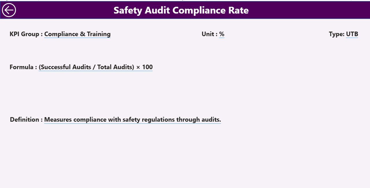
The KPI Definition Page acts as a reference and governance layer for the dashboard.
Purpose of the KPI Definition Page
-
Explains each KPI clearly
-
Displays KPI Formula
-
Defines KPI calculation logic
-
Shows whether the KPI is LTB or UTB
This page works as a drill-through page. Users can right-click from the Summary Page and navigate to KPI details. Moreover, the page remains hidden to keep the dashboard clean.
To return to the main page, users simply click the back button on the top-left corner.
As a result, the dashboard maintains clarity, consistency, and transparency.
What Excel Data Is Required for the Workplace Safety KPI Dashboard?
Click to Purchases Workplace Safety KPI Dashboard in Power BI
The dashboard uses Excel as the data source, which keeps data entry simple and flexible.
1) Input_Actual Sheet
In this sheet, users enter actual safety performance data:
-
KPI Name
-
Month (use the first date of the month)
-
MTD Actual value
-
YTD Actual value
This structure ensures consistent aggregation in Power BI.
2) Input_Target Sheet
In this sheet, users enter safety targets:
-
KPI Name
-
Month (first date of the month)
-
MTD Target value
-
YTD Target value
Targets allow the dashboard to calculate achievement percentages and status indicators.
3) KPI Definition Sheet
This sheet defines the KPIs used across the dashboard:
-
KPI Number
-
KPI Group
-
KPI Name
-
Unit
-
Formula
-
Definition
-
Type (LTB or UTB)
As a result, KPI definitions remain standardized across reports.
What KPIs Can You Track in a Workplace Safety Dashboard?
Organizations can customize the dashboard to track various safety KPIs, such as:
-
Total Recordable Incident Rate (TRIR)
-
Lost Time Injury Frequency Rate (LTIFR)
-
Near Miss Reporting Rate
-
Safety Training Completion Rate
-
Audit Compliance Percentage
-
Corrective Action Closure Rate
-
PPE Compliance Rate
-
Unsafe Act Observations
Therefore, the dashboard adapts easily to different industries and regulatory requirements.
Advantages of Workplace Safety KPI Dashboard in Power BI
A Workplace Safety KPI Dashboard in Power BI delivers multiple benefits for organizations of all sizes.
1) Centralized Safety Visibility
All safety KPIs appear in one dashboard. As a result, teams avoid switching between files and reports.
2) Faster Decision-Making
Visual indicators and trend charts highlight risks immediately. Therefore, leaders act faster.
3) Proactive Risk Management
Trend analysis helps identify early warning signs before incidents occur.
4) Improved Compliance Reporting
Standardized KPIs and definitions support audit readiness and regulatory compliance.
5) Enhanced Accountability
Clear targets and performance indicators increase ownership across departments.
6) Scalable and Flexible Design
Excel-based inputs and Power BI visuals allow easy customization and scaling.
How Does Power BI Improve Workplace Safety Reporting?
Power BI enhances safety reporting through:
-
Interactive slicers
-
Conditional formatting icons
-
Automated calculations
-
Drill-through capabilities
-
Dynamic trend analysis
As a result, safety reporting becomes engaging, accurate, and insightful.
Best Practices for the Workplace Safety KPI Dashboard in Power BI
Click to Purchases Workplace Safety KPI Dashboard in Power BI
To get maximum value from your dashboard, follow these best practices.
1) Define Clear Safety KPIs
Choose KPIs that align with regulatory requirements and business goals.
2) Standardize KPI Definitions
Ensure all users understand how KPIs get calculated.
3) Update Data Regularly
Maintain consistent monthly updates to keep insights relevant.
4) Use LTB and UTB Logic Correctly
Clearly mark whether lower or higher values indicate better performance.
5) Review Trends, Not Just Current Status
Always analyze MTD and YTD trends to understand long-term patterns.
6) Train Users on Dashboard Interpretation
Educate teams on how to read charts, icons, and percentages.
Who Can Benefit from a Workplace Safety KPI Dashboard?
This dashboard supports multiple stakeholders, including:
-
Safety Managers
-
EHS Teams
-
Plant Managers
-
HR Teams
-
Compliance Officers
-
Executive Leadership
Therefore, it becomes a shared decision-making tool across the organization.
How Does This Dashboard Support a Safety-First Culture?
A strong safety culture requires visibility, accountability, and transparency. This dashboard supports all three.
-
Visibility through real-time metrics
-
Accountability through target tracking
-
Transparency through KPI definitions
As a result, employees and leaders stay aligned on safety goals.
What Makes This Dashboard Different from Traditional Safety Reports?
Traditional reports rely on static tables and delayed updates. In contrast, this Power BI dashboard offers:
-
Interactive exploration
-
Visual performance indicators
-
Instant comparisons
-
Drill-down analysis
Therefore, safety reporting becomes more actionable and engaging.
How Can Organizations Implement This Dashboard Successfully?
Implementation remains straightforward:
-
Define safety KPIs
-
Prepare Excel input files
-
Load data into Power BI
-
Review visuals and trends
-
Share insights with stakeholders
Because the dashboard uses Excel as a source, even small teams can implement it quickly.
Conclusion
A Workplace Safety KPI Dashboard in Power BI transforms how organizations manage safety performance. Instead of reacting to incidents after they occur, teams gain the ability to monitor trends, compare targets, and act proactively.
With structured Excel inputs, interactive Power BI visuals, and standardized KPI definitions, this dashboard supports smarter decisions, stronger compliance, and a safer workplace. Ultimately, it helps organizations protect their people while improving operational performance.
Frequently Asked Questions (FAQs)
1) What is a Workplace Safety KPI Dashboard in Power BI?
It is an interactive Power BI report that tracks and analyzes workplace safety KPIs using structured data.
2) Can this dashboard work with Excel data?
Yes, the dashboard uses Excel files as its primary data source.
3) What does LTB and UTB mean in safety KPIs?
LTB means Lower the Better, while UTB means Upper the Better.
4) Can organizations customize the KPIs?
Yes, organizations can add, remove, or modify KPIs easily.
5) How often should safety data be updated?
Monthly updates work best for MTD and YTD analysis.
6) Who should use this dashboard?
Safety managers, EHS teams, leadership, and compliance teams benefit the most.
7) Does the dashboard support trend analysis?
Yes, it includes MTD and YTD trend charts for performance comparison.
8) Is this dashboard suitable for multiple industries?
Yes, it adapts easily to manufacturing, construction, healthcare, logistics, and more.
Visit our YouTube channel to learn step-by-step video tutorials