Urban mobility changes rapidly, and bike and scooter sharing systems continue to grow across major cities. Operators handle huge volumes of trip data every hour—weather conditions, membership types, trip durations, vehicle types, city-wise availability, and seasonal trends. Therefore, companies need a smart and simple way to track performance. A Bike & Scooter Sharing Dashboard in Power BI gives teams a clear, interactive, and real-time view of their operational performance.
This article explains everything you need to know about this dashboard. You will learn how it works, why it matters, what each page includes, and how you can use Power BI to monitor your bike and scooter sharing business with confidence. You will also discover its advantages, best practices, and answers to your most common questions.
Let’s begin the journey toward smarter mobility analytics.
Click to Purchases Bike & Scooter Sharing Dashboard in Power BI
What Is a Bike & Scooter Sharing Dashboard in Power BI?
A Bike & Scooter Sharing Dashboard in Power BI tracks all performance indicators related to shared mobility. It brings together trip data, fare information, user behavior, weather impact, trip duration, and promotional performance in a single visual interface. As a result, you get a complete view of your business without switching between multiple files or reports.
You can monitor:
-
Gross and net fare
-
Trip volume
-
Ongoing trip percentages
-
Weather effects
-
City-wise performance
-
Vehicle type usage
-
Promotional outcomes
-
Monthly trends
Because all visuals update in real time, decision-makers can identify growth opportunities instantly. This dashboard becomes a powerful digital tool for operations managers, city planners, finance teams, and mobility startups.
Why Do Businesses Need a Power BI Dashboard for Shared Mobility?
Bike and scooter sharing services run on data. Every trip creates important information. Without a proper dashboard, teams struggle to understand patterns or predict business changes. A Power BI dashboard solves this problem.
Here’s why businesses need it:
-
It organizes huge volumes of trip and fare data
-
It allows instant performance comparison
-
It highlights issues that need quick action
-
It helps leaders plan fleet expansion
-
It supports pricing and promotional decisions
-
It improves customer satisfaction through insights
As urban mobility increases, companies that analyze their data perform better. This dashboard gives you that competitive edge.
Key Features of the Bike & Scooter Sharing Dashboard in Power BI
This Power BI dashboard contains 5 powerful pages, each designed to explain a different part of your business. The structure makes the dashboard simple to understand and easy to use.
Let’s explore each page.
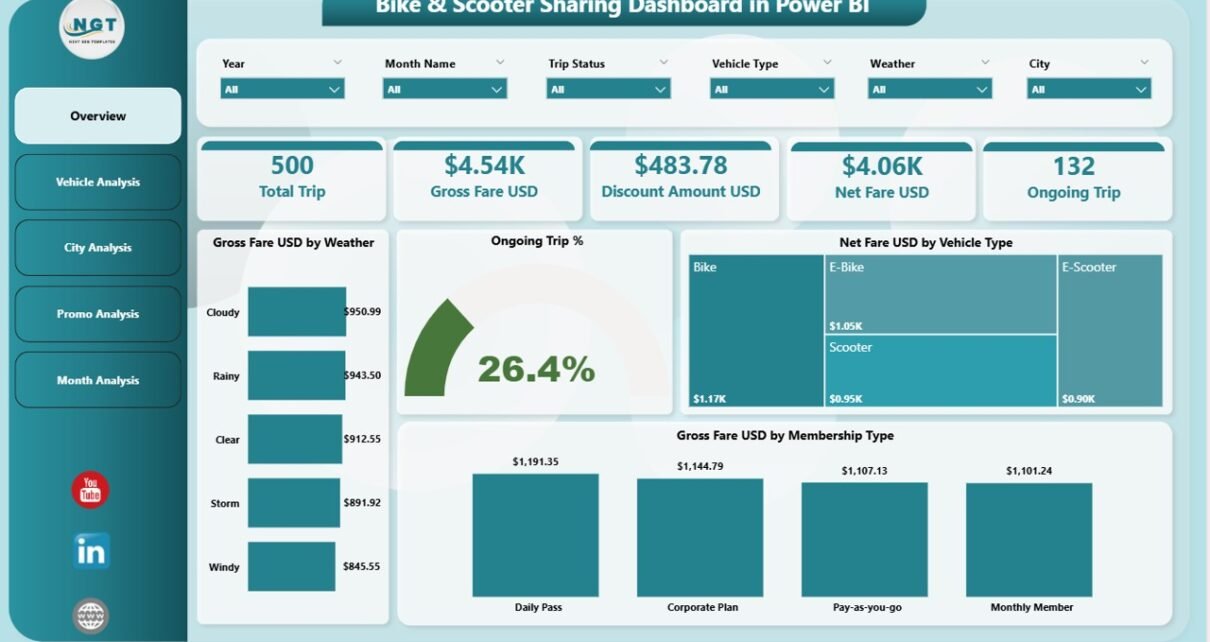
1. Overview Page – What Does It Show?
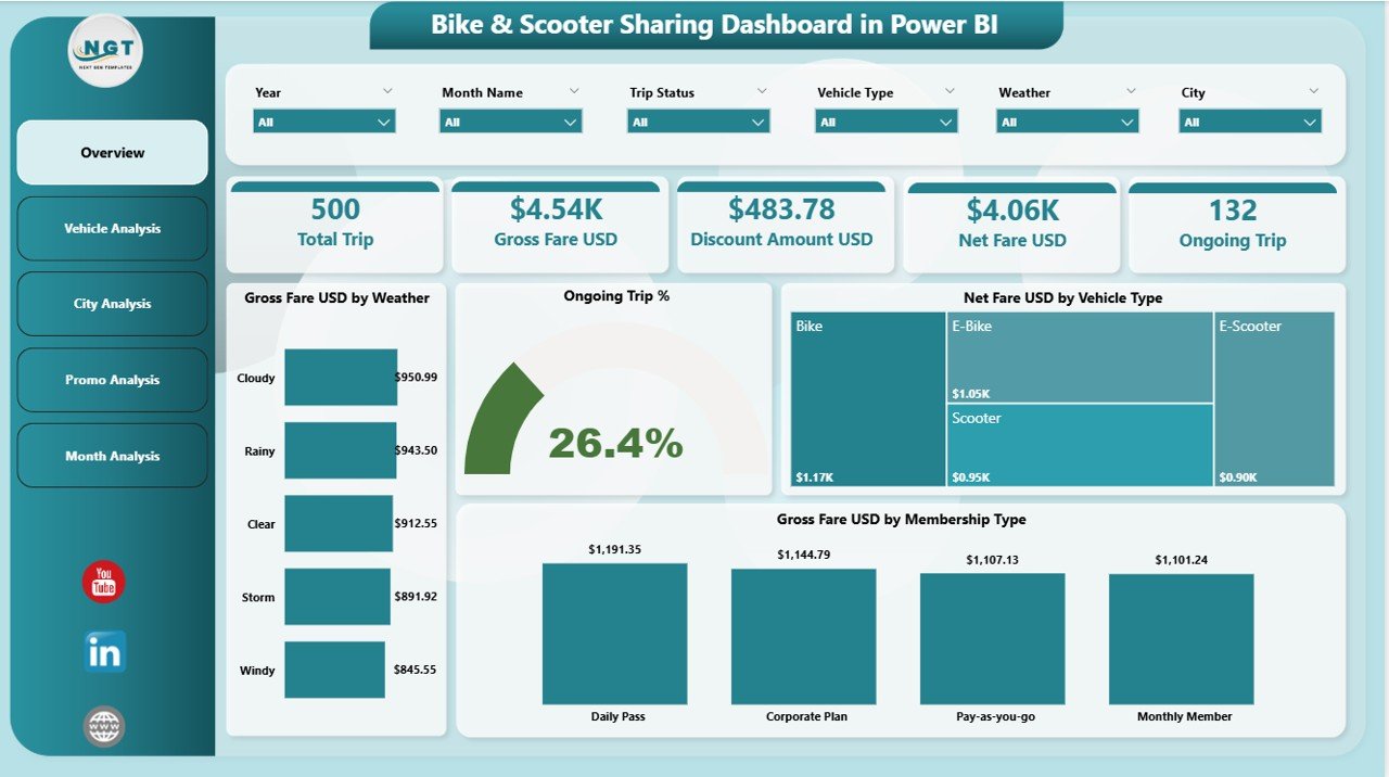
The Overview Page gives a quick summary of all major KPIs. You can view the most important information at a glance, which helps you make fast decisions.
Key elements on the overview page:
✔ 4 Main KPI Cards
These cards display the top indicators needed for daily monitoring.
✔ 4 Insightful Charts
Each chart provides a unique view of business behavior.
Charts on the Overview Page:
-
Gross Fare (USD) by Weather
This chart shows how weather influences your earnings. Clear weather often increases trips, while extreme conditions reduce them. -
Ongoing Trip (%)
This shows the percentage of ongoing trips at any moment. It helps you track real-time activity. -
Net Fare (USD) by Vehicle Type
This compares how different vehicles—bikes and scooters—perform financially. -
Gross Fare (USD) by Membership Type
This helps you evaluate revenue from casual users vs. monthly or annual members.
Because this is the main page, you can understand your system’s health without moving to another section. Everything feels clean, simple, and visual.
Click to Purchases Bike & Scooter Sharing Dashboard in Power BI
2. Vehicle Analysis Page – What Can You Learn?
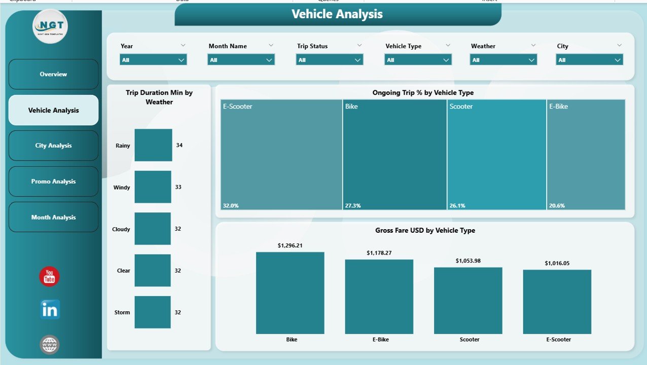
The Vehicle Analysis Page explains how different vehicle types perform in various conditions. Operators can use this information to improve fleet planning.
Charts in the Vehicle Analysis Page:
-
Trip Duration (Min) by Weather
This shows how weather affects trip duration. For example, sunny conditions may lead to longer leisure trips. -
Ongoing Trip (%) by Vehicle Type
This explains which vehicles customers prefer during different times of the day. -
Gross Fare (USD) by Vehicle Type
You can understand which vehicle type generates higher revenue.
As a result, the fleet team can decide which vehicles to purchase more often and which ones need better distribution across cities.
3. City Analysis Page – Why Is It Important?
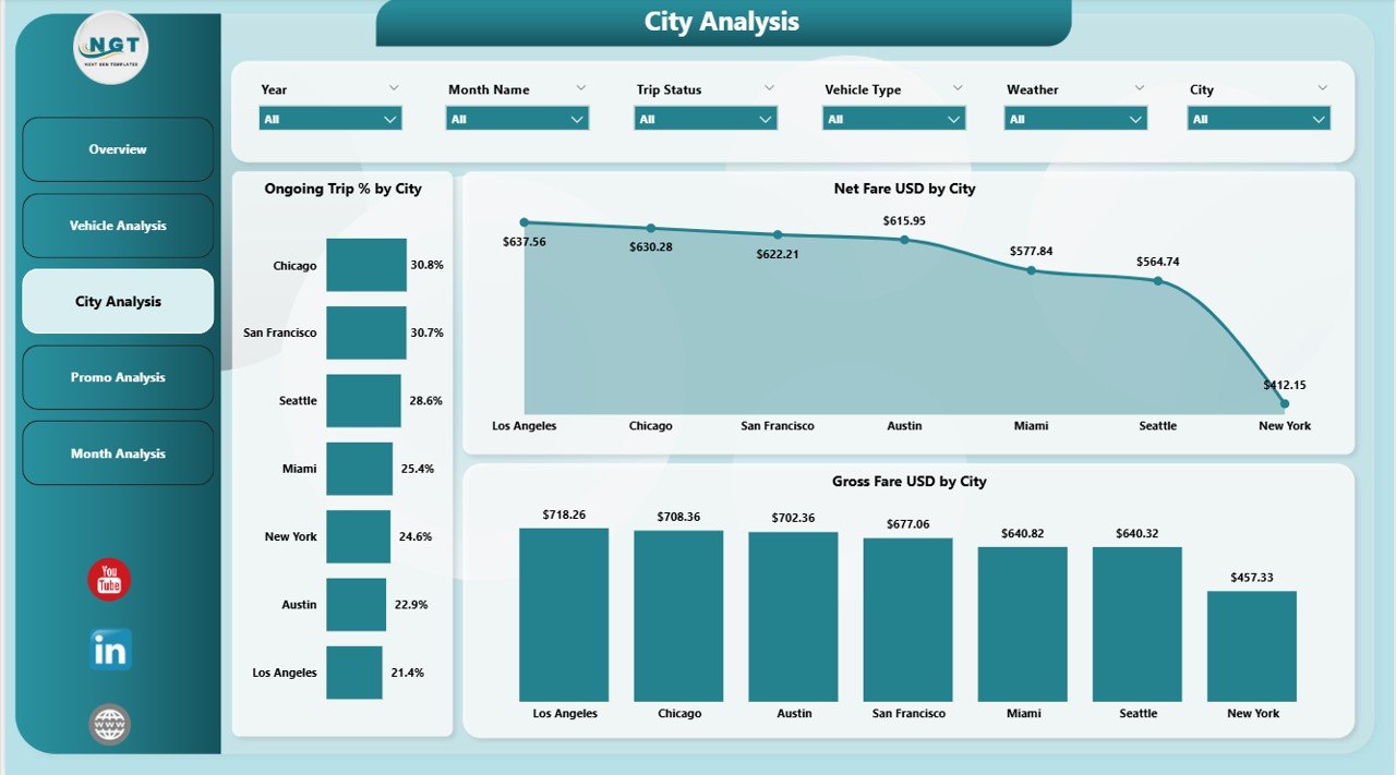
Different cities perform differently. The City Analysis Page shows how each city behaves in terms of trip volume and revenue. Because mobility behaviors vary, these insights help teams make location-based decisions.
Charts on the City Analysis Page:
-
Ongoing Trip (%) by City
This reveals which city has the highest active users. -
Net Fare (USD) by City
This helps you track earnings from each city. -
Gross Fare (USD) by City
This shows the total revenue generated from all trips in a city.
This type of detailed view helps management decide where to expand, where to improve promotions, and where to increase fleet size.
4. Promo Analysis Page – How Do Promotions Impact Performance?
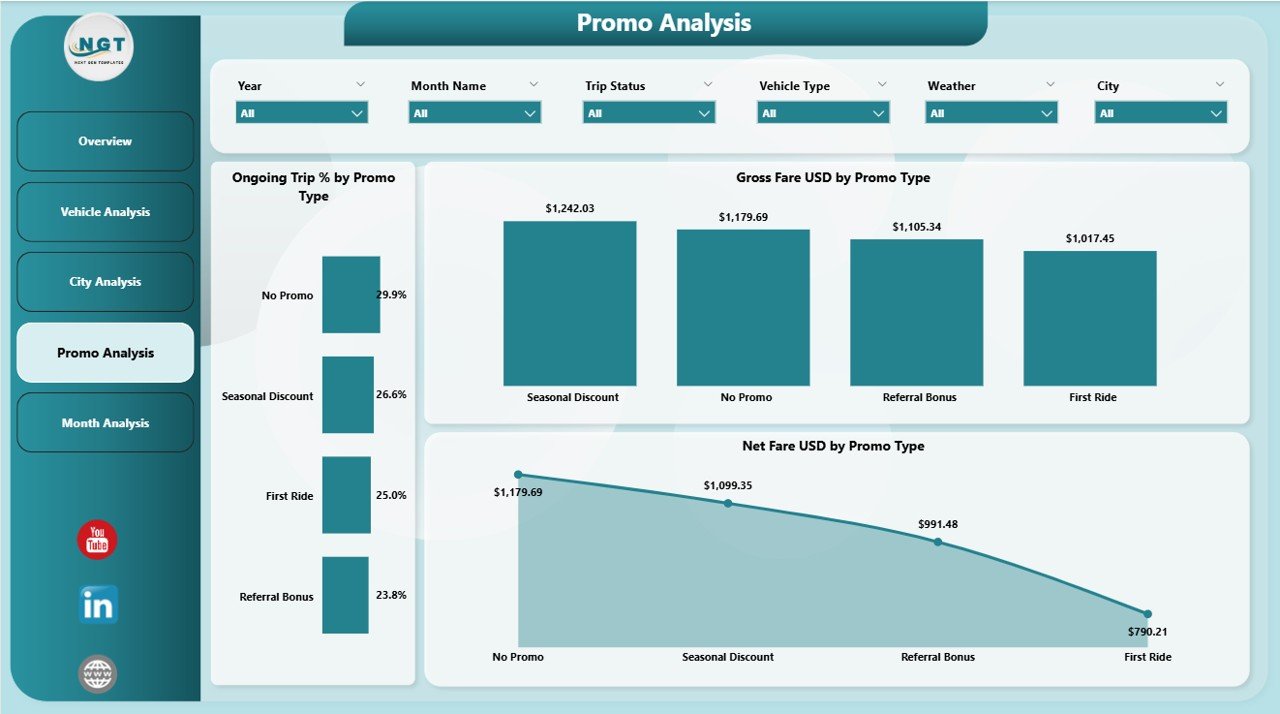
Promotions influence user decisions. Whether you offer discounts, coupons, referral bonuses, or festival offers, these directly change trip behavior. The Promo Analysis Page tracks how well your promotions perform.
Charts on the Promo Analysis Page:
-
Ongoing Trip (%) by Promo Type
This shows which promotion type triggers more trips. -
Net Fare (USD) by Promo Type
This highlights the impact of promotions on actual revenue. -
Gross Fare (USD) by Promo Type
This gives a complete view of revenue generated under each promotion.
Because promotions reduce prices, this page helps you check whether discounts still bring enough profit.
5. Monthly Trends Page – What Patterns Can You See?
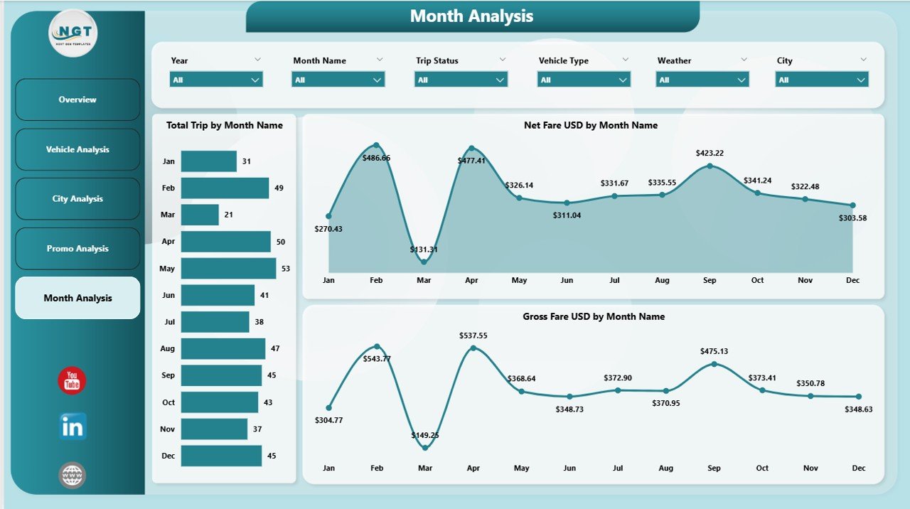
Seasonal patterns play a huge role in shared mobility. The Monthly Trends Page helps you understand changes across the year.
Charts on the Monthly Trends Page:
-
Total Trip by Month
You can compare the busiest and slowest months easily. -
Net Fare (USD) by Month
This shows actual profit trends month by month. -
Gross Fare (USD) by Month
This gives a broader view of monthly revenue.
Because travel patterns change by season, month-wise trends help plan future strategies.
How Does This Dashboard Support Business Growth?
This Power BI dashboard supports growth in many ways. It creates one source of truth for all your operations. Teams no longer rely on raw spreadsheets or manual reports.
You can:
-
Monitor real-time performance
-
Compare demand across cities
-
Track fare growth
-
Improve customer experience
-
Plan fleet distribution
-
Optimize promotions
-
Identify weather-related patterns
-
Study user behavior trends
When you combine these insights, you can predict future business needs and make decisions with confidence.
Advantages of a Bike & Scooter Sharing Dashboard in Power BI
Click to Purchases Bike & Scooter Sharing Dashboard in Power BI
Power BI dashboards give mobility businesses a powerful advantage. Let’s look at some of the biggest benefits.
1. Better Decision-Making
With real-time visuals, managers take faster and smarter decisions. The dashboard simplifies complex data and gives instant clarity.
2. Improved Fleet Optimization
Because you can see which vehicles perform well, you can plan fleet distribution across locations. You also know when to increase or decrease certain vehicle types.
3. Clear Understanding of Weather Impact
Weather directly affects demand. This dashboard shows clear patterns so you can plan promotional strategies during low-demand days.
4. Strong City-Wise Insights
Since each city behaves differently, city-level insights help you:
-
Improve marketing
-
Adjust fleet size
-
Manage user demand
-
Analyze competition
5. Better Revenue Tracking
The dashboard highlights net and gross revenue from multiple angles—vehicle type, city, weather, membership, and month. Revenue teams get full transparency.
6. Promotion Performance Visibility
You can track how promotions affect trips and revenue. This avoids unnecessary discounts and helps you create meaningful offers.
7. Time Saving and Automation
Manual reporting wastes time. The dashboard updates automatically and saves effort across teams.
Best Practices for Using the Bike & Scooter Sharing Dashboard in Power BI
To get maximum value from your dashboard, follow these best practices.
1. Refresh Data Daily
Daily data refresh keeps the dashboard accurate. You can also set hourly refresh if your platform supports it.
2. Use Filters Wisely
Filters help you see deeper insights. Use filters for:
-
Month
-
Vehicle Type
-
City
-
Promo Type
-
Weather
This creates meaningful comparisons.
3. Monitor Seasonal Patterns
Demand changes in different seasons. Study patterns for:
-
Holidays
-
Festival seasons
-
Rainy days
-
Weekends vs. weekdays
These insights help you plan targeted campaigns.
4. Compare Vehicle Types Regularly
Always compare performance between bikes and scooters. This will help you plan purchases and optimize your fleet.
5. Track Promotion ROI
Promotions attract users, but they can reduce revenue if not used wisely. Track their performance to avoid high losses.
6. Use Monthly Trends for Planning
Monthly trends reveal long-term behavior. Use them to plan:
-
Budget
-
Marketing campaigns
-
Pricing changes
-
Fleet expansion
7. Share the Dashboard With All Teams
Share the dashboard with:
-
Operations
-
Marketing
-
Finance
-
Customer support
-
Fleet management
Everyone can take better decisions with clear data.
Conclusion
Shared mobility grows faster every year, and companies must rely on strong analytics to stay competitive. The Bike & Scooter Sharing Dashboard in Power BI offers a complete performance view across weather conditions, cities, promotions, vehicle types, and monthly trends. It simplifies complex data, supports smarter decisions, and helps leaders understand patterns that drive business success.
When you use this dashboard every day, you gain clarity, control, and confidence in your operations. You can optimize fleet usage, improve customer experience, boost revenue, and plan smarter promotional campaigns. Power BI makes mobility analytics simple and powerful.
This dashboard becomes more than just a report—it becomes a strategic tool for growth.
Frequently Asked Questions (FAQs)
1. What is a Bike & Scooter Sharing Dashboard in Power BI?
It is a visual analytics tool that tracks trips, revenue, city performance, promotions, and seasonal patterns for shared mobility services.
2. Who can use this dashboard?
Operations managers, marketing teams, city planners, financial analysts, fleet managers, and mobility startup founders can use it.
3. Why does weather impact shared mobility performance?
Weather influences user behavior. Clear days increase trips, while rainy or extreme days reduce usage.
4. How does the dashboard help with fleet planning?
It shows revenue and trip volume by vehicle type and city. This helps teams decide where to place more bikes or scooters.
5. Can Power BI update the dashboard automatically?
Yes. You can schedule automatic refreshes daily or hourly depending on your data source.
6. Does this dashboard help improve promotions?
Yes. The Promo Analysis Page shows which promotions bring higher trips and revenue.
7. What data sources can be used?
You can connect Excel files, cloud databases, API data, or internal systems to Power BI.
8. Is this dashboard useful for small operators?
Yes. Even small operators can use it to plan operations and track performance.
9. Does the dashboard show monthly trends?
Yes. The Monthly Trends Page shows trips and revenue month-wise for better planning.
10. Can this dashboard improve decision-making?
Yes. It provides real-time insights, which help teams take informed and faster decisions.
Visit our YouTube channel to learn step-by-step video tutorials