Metro rail networks grow every year as cities expand and demand for public transportation rises. Because of this rapid growth, project teams must monitor dozens of KPIs every month. When teams track these KPIs well, they reduce delays, control costs, improve safety, and speed up project execution. However, manual reporting slows teams down and often creates confusion.
You solve this problem quickly when you use a Metro Rail Projects KPI Dashboard in Excel. It gives clear visibility of performance, highlights gaps, and supports faster project decisions. In this article, you will understand how this dashboard works, how each worksheet helps you, and how you can use it to drive better results.
Click to buy Metro Rail Projects KPI Dashboard in Excel
What Is a Metro Rail Projects KPI Dashboard in Excel?
A Metro Rail Projects KPI Dashboard in Excel is a structured analytics template that tracks operational, financial, safety, and project execution KPIs of metro rail development. You use it to measure actual performance, compare it with targets, view trends, and understand year-to-year progress.
Because the dashboard works on Excel, you don’t need special tools or complex software. You get a simple, user-friendly solution that your team can update every month.
This dashboard covers project progress, ridership trends, asset performance, safety KPIs, revenue KPIs, construction progress, contractor performance, and much more. Moreover, it updates instantly when you change the selected month or KPI.
Why Do Metro Rail Projects Need a KPI Dashboard?
Metro rail projects involve many activities such as construction, track installation, rolling stock management, signaling, civil work, operations planning, and safety control. You cannot track all of this using separate files. You need one unified view.
A KPI dashboard helps because:
- It shows everything in one place
- It reduces reporting time
- It supports real-time decision-making
- It highlights deviations instantly
- It helps teams work with shared goals
Because of these benefits, every metro rail operator and project team uses KPI dashboards for monthly reviews.
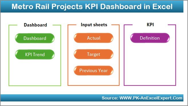
Key Features of the Metro Rail Projects KPI Dashboard in Excel
We designed this dashboard with 7 powerful worksheets. Each sheet has a clear purpose, smooth navigation, and simple data entry steps.
Let’s walk through each one.
Summary Page – The Navigation Hub
The Summary Page works as the home screen of your dashboard. You get six navigation buttons, and each button takes you directly to an important sheet. Because of this layout, you never scroll through tabs to find a page.
This page helps you:
- Jump quickly between dashboard sections
- Save time during monthly review meetings
- Guide new users who are unfamiliar with the file
Since the Summary Page works like an index, it creates a smooth user experience.
Click to buy Metro Rail Projects KPI Dashboard in Excel
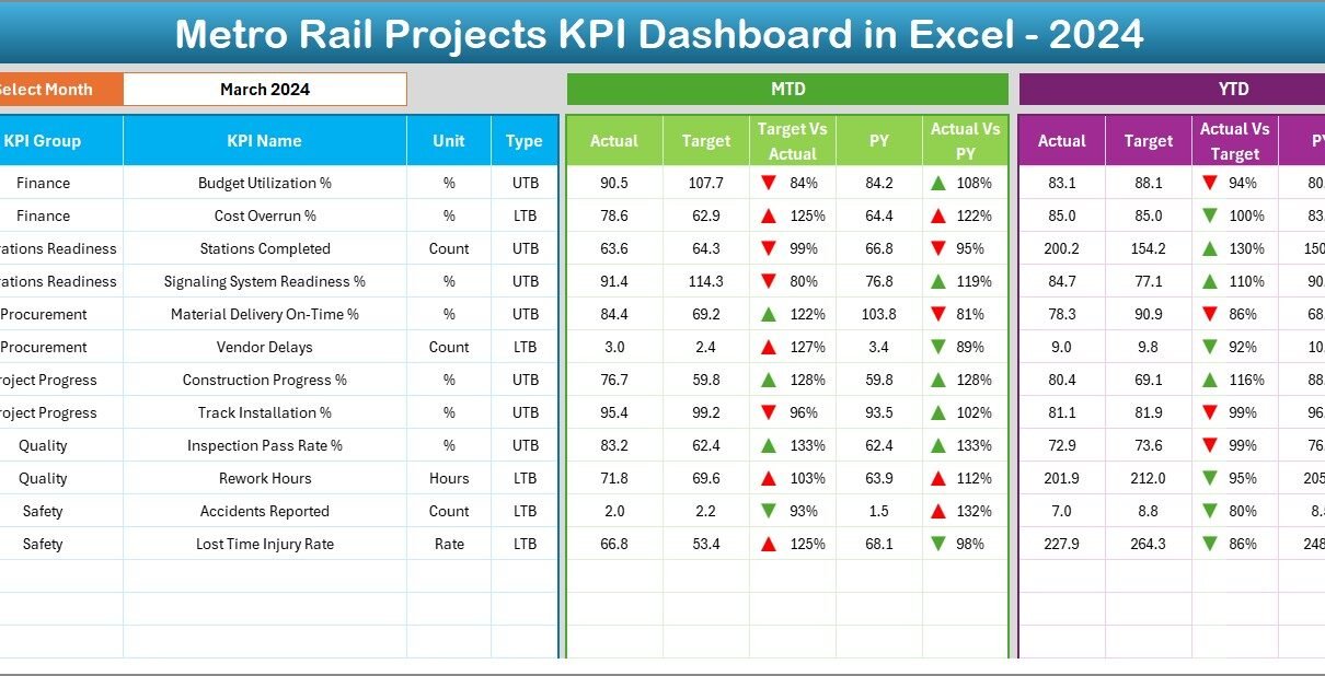
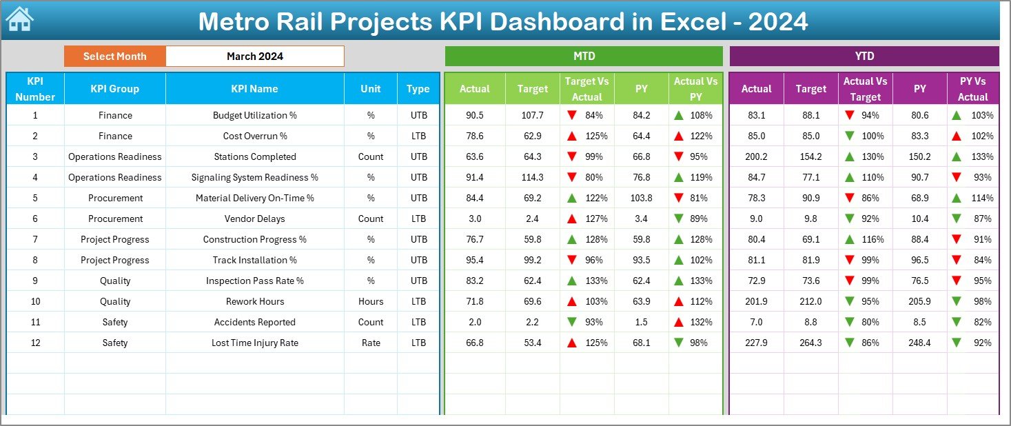
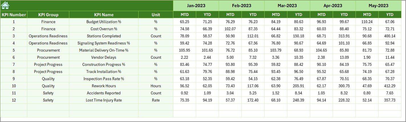
Dashboard Sheet – The Main Performance View
The Dashboard sheet is the heart of your KPI analysis. On this page, you see every important KPI for Metro Rail Projects.
You also get a drop-down in cell D3 to select the month. Once you choose the month, all values update instantly. Because of this feature, the dashboard works like a real-time reporting tool.
This sheet shows:
MTD (Month-to-Date) View
- Actual performance
- Target performance
- Previous Year performance
- Target vs Actual comparison
- Actual vs PY comparison
- Up/down arrows with conditional formatting
YTD (Year-to-Date) View
- Actual totals
- Target totals
- Previous Year totals
- Target vs Actual
- PY vs Actual
- Visual arrows that show improvements or declines
This structure helps you understand:
- Whether KPIs move in the right direction
- Whether the team meets targets
- Whether performance improves compared to last year
Because the Dashboard tab shows both MTD and YTD numbers, you understand short-term and long-term trends instantly.
Click to buy Metro Rail Projects KPI Dashboard in Excel
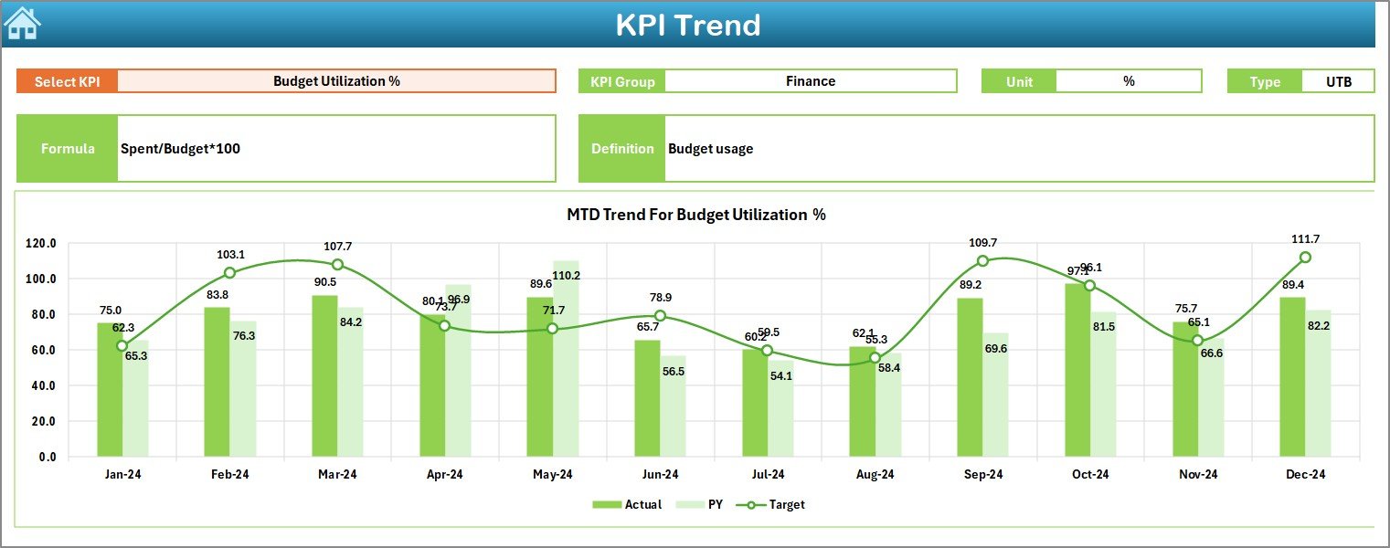
Trend Sheet – KPI Trend Analysis Made Easy
The Trend sheet gives a deeper insight into one KPI at a time. You choose the KPI name from a drop-down in cell C3.
Once you select the KPI, you see:
- KPI Group
- Unit of measurement
- Type of KPI (Lower is better / Higher is better)
- Formula
- Definition
You also get two trend charts:
- MTD Trend Chart
- YTD Trend Chart
These trend charts display Actual, Target, and Previous Year values. Because of this, you understand the direction of the KPI over many months.
You also see patterns such as:
- Slow improvements
- Sudden spikes
- Seasonal trends
- Performance gaps
- Continuous decline
Teams use this page heavily during monthly and quarterly performance reviews.
Click to buy Metro Rail Projects KPI Dashboard in Excel
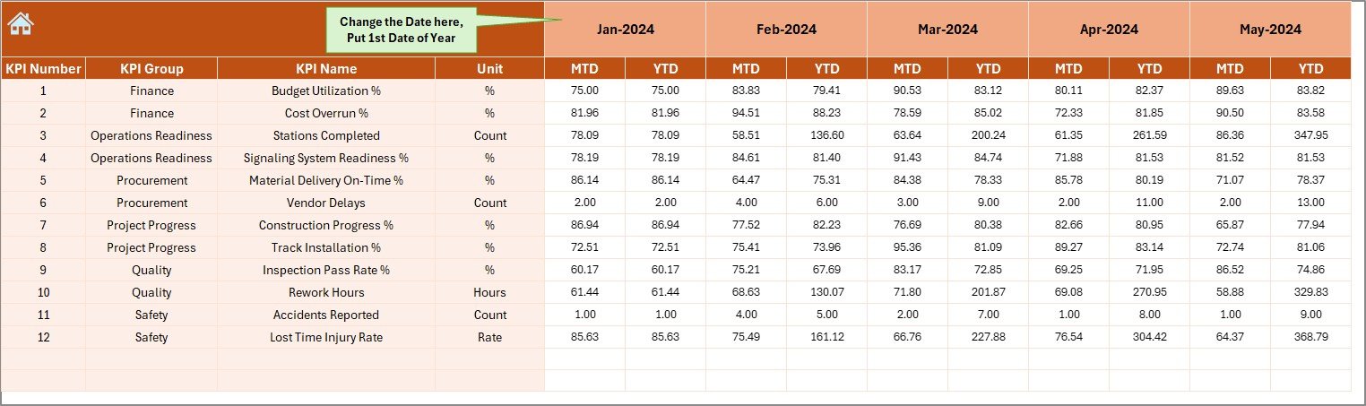
Actual Numbers Input Sheet – Enter Monthly Performance Easily
This sheet allows you to enter the actual performance values for each KPI.
You select the first month of the year in cell E1, and the sheet automatically adjusts the remaining months. Because of this smart design, you don’t need to change the layout manually every year.
You enter:
- MTD Actual
- YTD Actual
The entire dashboard reads these values directly, so you never update values on the Dashboard sheet manually.
Click to buy Metro Rail Projects KPI Dashboard in Excel
Target Sheet – Enter Target Values for Each KPI
This sheet stores target values for all KPIs. You fill:
- Monthly Target (MTD)
- Cumulative Target (YTD)
Because targets drive KPI comparisons, this sheet helps management set expectations clearly.
You can revise targets anytime to match budget changes, operational constraints, or revised yearly plans.
Click to buy Metro Rail Projects KPI Dashboard in Excel
Previous Year Numbers Sheet – Compare Year-on-Year Performance
This sheet stores the previous year’s values for each KPI. You fill them in the same structure as the current year’s numbers.
You use this page to understand whether performance moves in the right direction compared to last year.
This helps you:
- Identify improvement areas
- Understand long-term patterns
- Highlight year-on-year growth
Stakeholders love this comparison because it gives a clear picture of progress.
Click to buy Metro Rail Projects KPI Dashboard in Excel
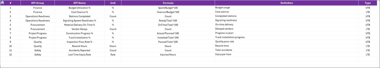
KPI Definition Sheet – Build a Reliable KPI Dictionary
Every project team needs a clear understanding of each KPI. Otherwise, different teams may calculate KPIs differently.
This sheet solves that issue.
You enter:
- KPI Name
- KPI Group
- Unit
- Formula
- Definition
Because of this page, the entire team works with consistent KPI definitions. You also avoid conflicts during audits, reviews, or inter-department discussions.
Click to buy Metro Rail Projects KPI Dashboard in Excel
Why Should You Use a Metro Rail Projects KPI Dashboard in Excel?
Metro rail projects face challenges such as:
- High construction cost
- Tight deadlines
- Safety requirements
- Complex vendor contracts
- Large workforce
- Constant public scrutiny
Because of these risks, teams must track KPIs accurately. A dashboard helps teams stay aligned with project goals and take faster decisions.
Top KPIs You Can Track in Metro Rail Projects
Although KPIs vary by project stage, most metro projects track the following categories:
- Construction KPIs
- Tunneling progress
- Pier completion
- Station construction progress
- Track installation progress
- Rolling stock procurement status
- Operations KPIs
- Train frequency
- Train punctuality
- Passenger ridership
- Trip completion rate
- Safety KPIs
- Lost time injury frequency rate
- Safety incidents
- Near-miss events
- Revenue KPIs
- Fare revenue
- Non-fare revenue
- Monthly revenue collection
- Asset Health KPIs
- Escalator uptime
- Elevator uptime
- Signaling system availability
- Project Cost KPIs
- Monthly expenditure
- Budget variance
- Contractor billing progress
With this dashboard, you visualize every KPI clearly and make informed decisions.
Advantages of a Metro Rail Projects KPI Dashboard in Excel
You get many benefits when you use this dashboard. Below are the most important ones.
You Get Instant Performance Visibility
Decision-makers understand performance in seconds when all KPIs appear on one dashboard. Because of this visibility, teams fix issues faster.
You Reduce Reporting Time
Excel automates calculations and comparisons. You only update actuals, targets, and previous-year data. The dashboard does everything else.
You Improve Accuracy of KPI Calculations
Since the KPI Definition sheet stores each formula clearly, your entire team calculates KPIs in the same way. This consistency improves reliability.
You Strengthen Monthly Reviews
The Trend sheet and Dashboard sheet help managers review KPIs effectively in monthly and quarterly performance meetings.
You Support Better Decision-Making
Teams take better decisions when they see Actual vs Target and Actual vs Previous Year comparisons. Clear up/down arrows highlight areas that need immediate attention.
You Create a Standard Reporting Framework
This dashboard works as a reusable template for all metro project departments. You don’t create separate files for each KPI set.
How to Use the Metro Rail Projects KPI Dashboard in Excel
You can follow these simple steps to use the dashboard effectively.
Step 1: Enter KPI Definitions
Go to the KPI Definition sheet and add:
- KPI names
- Units
- KPI groups
- KPI formulas
- KPI descriptions
This creates your KPI dictionary.
Step 2: Enter the First Month of the Year
Go to the Actual Numbers Input sheet and update cell E1. The dashboard adjusts months automatically.
Step 3: Enter Actual Values Monthly
Fill MTD and YTD numbers every month in the Actual Numbers Input sheet.
Step 4: Enter Targets
Update the Target sheet with monthly and cumulative target values.
Step 5: Enter Previous Year Values
Fill the previous year’s data in the Previous Year Numbers sheet for accurate comparisons.
Step 6: View Performance on the Dashboard Sheet
Go to the Dashboard sheet and select any month. All KPIs update instantly.
Step 7: Use the Trend Sheet for Deep Analysis
Select any KPI to view its trend and performance direction.
Best Practices for the Metro Rail Projects KPI Dashboard in Excel
Follow these practices to get the most value from your dashboard.
- Use Consistent KPI Definitions
Define KPIs clearly and ensure every team follows the same formulas.
- Update Data Regularly
Enter new data at the end of every month to keep reports fresh.
- Use Conditional Formatting Carefully
Use arrows, colors, and indicators to draw attention to critical gaps.
- Validate Data Before Updating
Check accuracy before entering numbers. Even small mistakes affect trends.
- Avoid Overloading the Dashboard with Too Many KPIs
Focus on the KPIs that matter most for decision-making.
- Protect Formula Cells
Lock cells that contain calculations to avoid accidental editing.
- Keep Backup Copies
Maintain backups before major updates to ensure data safety.
Conclusion
Metro Rail Projects KPI Dashboard in Excel helps project teams work faster, smarter, and more accurately. Because of its simple structure and powerful analytics, you track operational, financial, and safety KPIs with confidence. You convert raw numbers into meaningful insights and improve the overall performance of your metro project.
This dashboard works for monthly reviews, executive reporting, contractor performance analysis, and long-term trend tracking. If you use it well, you improve decision-making, reduce delays, and keep your metro project on the right path.
Frequently Asked Questions (FAQs)
- What is a Metro Rail Projects KPI Dashboard in Excel?
It is an Excel-based reporting tool that tracks key performance indicators related to metro rail construction, operations, safety, and revenue.
- Who can use this dashboard?
Project managers, construction teams, safety teams, operations departments, finance teams, and executive leadership use this dashboard.
- Do I need advanced Excel knowledge to use it?
No, you only enter data in the input sheets. The dashboard updates automatically.
- Can I add more KPIs to the dashboard?
Yes, you can add new KPIs by updating the KPI Definition sheet and input sheets.
- Can I customize the charts and layout?
Yes, you can modify colors, add logos, or adjust chart styles without breaking the dashboard logic.
- Does this dashboard work for multi-year analysis?
Yes, you can store multiple years of data and analyze long-term trends.
- Why should a metro project team use a KPI dashboard?
It improves visibility, reduces reporting time, and helps teams make better decisions based on data.
- How often should I update the dashboard?
You should update it every month to maintain accurate reporting.
Visit our YouTube channel to learn step-by-step video tutorials
Watch the step-by-step video tutorial: