In today’s fast-moving financial environment, treasury teams must make decisions quickly and accurately. However, when cash positions, liquidity data, funding metrics, and risk indicators remain scattered across spreadsheets, decision-making becomes slow and risky. Therefore, organizations increasingly rely on a Treasury Management KPI Dashboard in Power BI to gain real-time visibility and control.
A Treasury Management KPI Dashboard in Power BI transforms raw treasury data into meaningful, visual, and actionable insights. Moreover, it allows finance leaders to track performance daily, compare actual results with targets, and identify risks early. Instead of manually preparing reports, treasury teams can focus on strategy, optimization, and risk mitigation.
In this in-depth article, you will learn what a Treasury Management KPI Dashboard in Power BI is, how it works, why it matters, and how each dashboard page supports effective treasury operations. Additionally, you will discover its advantages, best practices, use cases, and frequently asked questions. By the end, you will clearly understand how this dashboard becomes a powerful decision-support system for treasury management.
Click to buy Treasury Management KPI Dashboard in Power BI
What Is a Treasury Management KPI Dashboard in Power BI?
A Treasury Management KPI Dashboard in Power BI is an interactive reporting and analytics solution designed to track, monitor, and analyze key treasury performance indicators. It helps treasury professionals evaluate cash flow efficiency, liquidity position, funding performance, and year-on-year trends in a single centralized view.
Instead of reviewing static reports, users can interact with slicers, charts, and tables to explore treasury performance by month, KPI group, or specific metrics. As a result, treasury leaders gain faster insights and stronger control over financial operations.
Because this dashboard uses Excel as a data source and Power BI as the visualization engine, it offers flexibility, scalability, and ease of maintenance. Moreover, it suits organizations of all sizes, from mid-sized firms to large enterprises.
Why Do Treasury Teams Need a KPI Dashboard in Power BI?
Treasury management involves critical financial decisions that impact liquidity, profitability, and risk. Therefore, treasury teams must rely on accurate and timely data.
A Treasury Management KPI Dashboard in Power BI helps because:
- It centralizes treasury data in one place
- It improves visibility into cash and liquidity KPIs
- It reduces manual reporting effort
- It enables faster and data-driven decisions
- It improves accountability across treasury functions
Moreover, when treasury KPIs remain visible and measurable, organizations reduce financial risk and improve financial discipline.
What Are the Key Features of the Treasury Management KPI Dashboard in Power BI?
This ready-to-use Treasury Management KPI Dashboard in Power BI includes three structured pages, each designed to answer specific business questions clearly and effectively.
How Does the Summary Page Work in the Treasury Management KPI Dashboard?
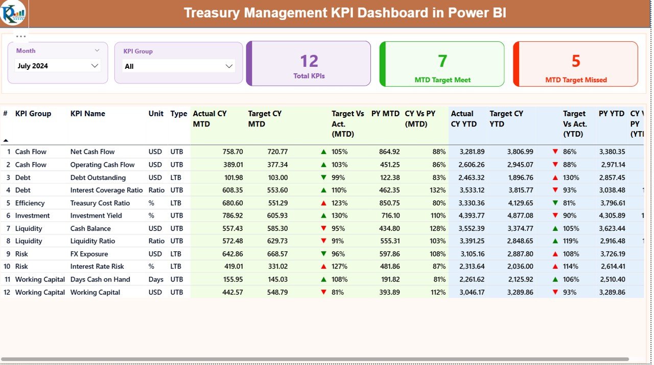
Summary Page
The Summary Page acts as the main control center of the dashboard. It provides an instant overview of treasury performance across all KPIs.
At the top of the page, you can see:
- Month Slicer – Allows users to select a specific month
- KPI Group Slicer – Enables filtering by treasury KPI categories
Because of these slicers, the entire dashboard updates dynamically based on your selection.
What KPI Cards Are Displayed on the Summary Page?
The Summary Page displays three high-level KPI cards:
- Total KPIs Count – Shows the total number of treasury KPIs tracked
- MTD Target Meet Count – Indicates how many KPIs met targets for the selected month
- MTD Target Missed Count – Highlights how many KPIs missed targets
These cards provide an immediate performance snapshot, which helps treasury managers focus on problem areas quickly.
What Details Appear in the Treasury KPI Table?
Below the KPI cards, the dashboard displays a detailed treasury KPI table with the following columns:
- KPI Number – Sequential identifier for each KPI
- KPI Group – Category or classification of the treasury KPI
- KPI Name – Name of the treasury metric
- Unit – Measurement unit, such as %, USD, or days
- Type – Indicates whether the KPI is LTB (Lower the Better) or UTB (Upper the Better)
How Are MTD KPIs Tracked on the Summary Page?
The Summary Page tracks Month-to-Date (MTD) performance using the following columns:
- Actual CY MTD – Actual value for the current year MTD
- Target CY MTD – Target value for the current year MTD
- MTD Icon – Displays ▲ or ▼ icons with green or red colors to indicate performance status
- Target vs Actual (MTD) – Percentage comparison using the formula:
Actual MTD / Target MTD - PY MTD – Previous year MTD value
- CY vs PY (MTD) – Comparison using the formula:
Current Year MTD / Previous Year MTD
Because of these metrics, treasury teams can quickly evaluate short-term performance and spot deviations early.
How Are YTD KPIs Tracked on the Summary Page?
In addition to MTD metrics, the Summary Page also tracks Year-to-Date (YTD) performance:
- Actual CY YTD – Current year actual YTD value
- Target CY YTD – Current year target YTD value
- YTD Icon – Visual indicator for YTD target performance
- Target vs Actual (YTD) – Percentage using:
Actual YTD / Target YTD - PY YTD – Previous year YTD value
- CY vs PY (YTD) – Comparison using:
Current Year YTD / Previous Year YTD
As a result, treasury leaders gain both short-term and long-term performance insights in one view.
Click to buy Treasury Management KPI Dashboard in Power BI
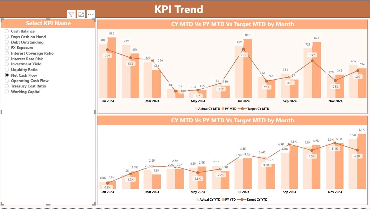
KPI Trend Page
Why Is Trend Analysis Important in Treasury Management?
Treasury decisions depend not only on current values but also on historical patterns. Therefore, trend analysis plays a critical role in identifying risks, improvements, and anomalies.
What Does the KPI Trend Page Show?
The KPI Trend Page displays two combo charts:
- MTD Trend Chart – Shows Actual Current Year, Actual Previous Year, and Target values for MTD
- YTD Trend Chart – Shows Actual Current Year, Actual Previous Year, and Target values for YTD
Additionally, a KPI Name slicer appears on the left side of the page. This slicer allows users to select a specific treasury KPI and instantly view its performance trend.
Because of this setup, treasury teams can:
- Compare current performance against historical data
- Identify seasonal patterns
- Detect performance volatility
- Support forecasting and planning
Click to buy Treasury Management KPI Dashboard in Power BI
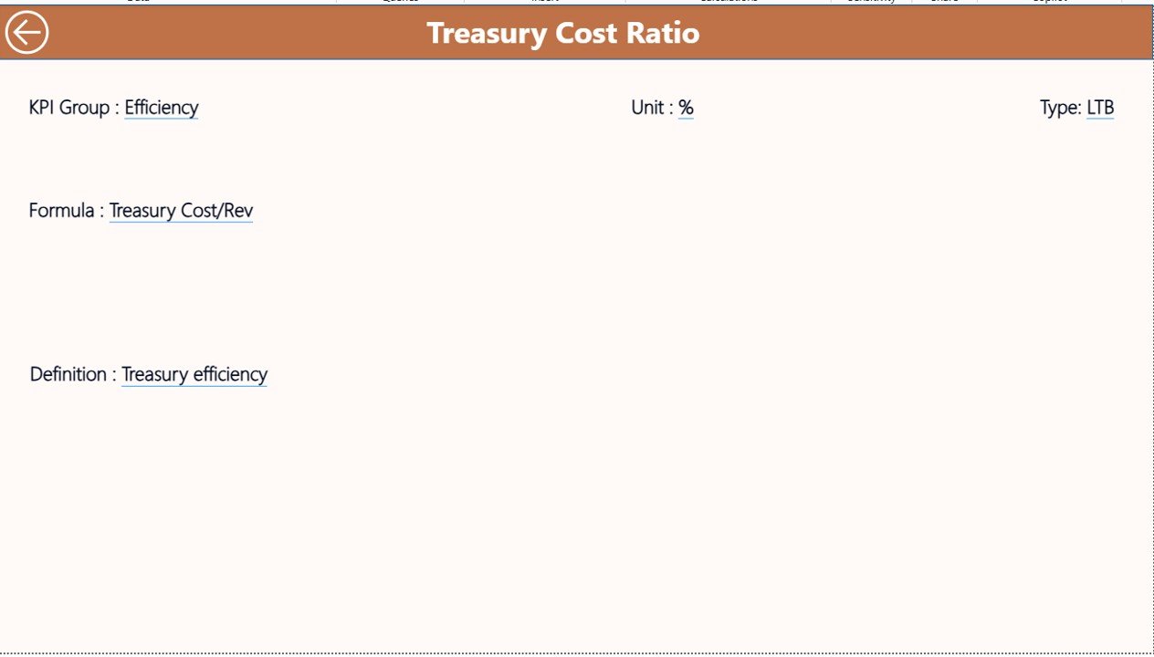
KPI Definition Page
Why Do Treasury Teams Need KPI Definitions?
Clear KPI definitions prevent confusion and misinterpretation. Therefore, the KPI Definition Page plays a vital role in ensuring consistency and transparency.
How Does the KPI Definition Page Work?
The KPI Definition Page functions as a drill-through page and remains hidden from direct navigation. Users can access it by drilling through from the Summary Page.
This page displays:
- KPI Number
- KPI Group
- KPI Name
- Unit of Measurement
- KPI Formula
- KPI Definition
- KPI Type (LTB or UTB)
Moreover, a Back button appears in the top-left corner, allowing users to return to the Summary Page easily.
How Does Excel Data Support the Treasury Management KPI Dashboard?
Why Use Excel as a Data Source?
Excel remains one of the most flexible and widely used data tools in finance. Therefore, this dashboard uses Excel as its data source, which ensures easy data entry and maintenance.
Click to buy Treasury Management KPI Dashboard in Power BI
What Are the Excel Worksheets Used in This Dashboard?
The Excel data file includes three structured worksheets:
Input_Actual Sheet
In this sheet, users enter:
- KPI Name
- Month (use the first date of the month)
- MTD Actual Value
- YTD Actual Value
Input_Target Sheet
In this sheet, users enter:
- KPI Name
- Month (use the first date of the month)
- MTD Target Value
- YTD Target Value
KPI Definition Sheet
In this sheet, users define:
- KPI Number
- KPI Group
- KPI Name
- Unit
- Formula
- Definition
- KPI Type (LTB or UTB)
Because of this structure, data updates remain simple, consistent, and scalable.
Advantages of a Treasury Management KPI Dashboard in Power BI
A Treasury Management KPI Dashboard in Power BI delivers several strategic benefits:
- Centralized treasury performance monitoring
- Real-time MTD and YTD visibility
- Clear target vs actual comparison
- Easy year-on-year performance analysis
- Reduced manual reporting effort
- Improved treasury decision-making
- Enhanced risk identification
- Strong audit and governance support
Moreover, the dashboard improves collaboration between treasury, finance, and leadership teams.
What Are the Best Practices for Treasury Management KPI Dashboard in Power BI?
To get maximum value from this dashboard, follow these best practices:
- Define clear and measurable treasury KPIs
- Maintain consistent KPI definitions across teams
- Update Excel input data regularly
- Review MTD and YTD performance frequently
- Use trend analysis for forecasting
- Focus on exception-based management
- Align KPIs with treasury strategy
- Train users on KPI interpretation
By following these practices, organizations ensure reliable insights and sustainable treasury performance.
Who Can Benefit from a Treasury Management KPI Dashboard?
This dashboard benefits a wide range of roles, including:
- Treasury Managers
- Finance Controllers
- CFOs
- Financial Analysts
- Risk Management Teams
- Corporate Finance Teams
Additionally, organizations across industries can adopt this dashboard without complex customization.
Conclusion: Why Should You Use a Treasury Management KPI Dashboard in Power BI?
A Treasury Management KPI Dashboard in Power BI provides clarity, control, and confidence in treasury operations. It replaces fragmented spreadsheets with a unified, interactive, and visual reporting system. Moreover, it empowers treasury teams to act faster, manage risks better, and align financial decisions with business goals.
When treasury KPIs remain visible, measurable, and comparable, organizations strengthen financial discipline and improve long-term performance. Therefore, this dashboard serves not just as a reporting tool, but as a strategic asset for modern finance teams.
Frequently Asked Questions (FAQs)
What is a Treasury Management KPI Dashboard in Power BI?
A Treasury Management KPI Dashboard in Power BI is an interactive analytics solution that tracks and visualizes treasury performance metrics such as liquidity, cash flow, and target achievement.
Why should treasury teams use Power BI for KPI dashboards?
Power BI provides interactive visuals, dynamic filtering, and real-time insights, which help treasury teams make faster and better decisions.
Can this dashboard work with Excel data?
Yes, this dashboard uses Excel as its primary data source, which makes data entry and maintenance simple.
What KPIs can be tracked using this dashboard?
Treasury teams can track cash position, liquidity ratios, funding efficiency, target achievement, and year-on-year performance.
Is this dashboard suitable for small organizations?
Yes, the dashboard works for both small and large organizations because of its flexible and scalable design.
How often should the data be updated?
Treasury teams should update the Excel data monthly or more frequently based on reporting requirements.
Visit our YouTube channel to learn step-by-step video tutorials
Watch the step-by-step video tutorial:
Click to buy Treasury Management KPI Dashboard in Power BI