Modern agriculture increasingly depends on data, insights, and timely advisory services. Farmers, agritech companies, cooperatives, and advisory platforms must continuously evaluate costs, yields, risks, and profitability. However, without a structured analytical system, advisory impact often remains unclear.
That is exactly why a Crop Advisory Platforms Dashboard in Excel becomes an essential tool.
In this detailed and SEO-friendly guide, you will learn what a Crop Advisory Platforms Dashboard in Excel is, why it matters, how it works, and how each analytical page supports smarter agricultural decisions. Moreover, this article covers advantages, best practices, and frequently asked questions to help you use this dashboard effectively.
Click to Purchases Crop Advisory Platforms Dashboard in Excel
What Is a Crop Advisory Platforms Dashboard in Excel?
A Crop Advisory Platforms Dashboard in Excel is a ready-to-use analytical template that helps track the financial, operational, and risk impact of agricultural advisory services.
Instead of analyzing scattered farm records, cost sheets, and yield reports, this dashboard consolidates all advisory-related data into a single interactive workbook built in Microsoft Excel.
As a result, stakeholders gain:
-
Clear visibility into advisory impact
-
Comparison of costs before and after advisory
-
Crop-wise, region-wise, and advisory-type insights
-
Monthly trend analysis for performance monitoring
Do Crop Advisory Platforms Need a Dashboard?
Crop advisory platforms operate across multiple crops, regions, advisory channels, and seasons. Therefore, tracking performance manually becomes inefficient and error-prone.
Because of that, many platforms face:
-
Difficulty measuring advisory effectiveness
-
Limited visibility into cost savings
-
Challenges in identifying high-risk crops or regions
-
Delayed performance insights
A Crop Advisory Platforms Dashboard in Excel solves these challenges by providing centralized, visual, and actionable analytics.
How Does a Crop Advisory Platforms Dashboard in Excel Work?
The dashboard uses structured datasets combined with dynamic Excel calculations and charts.
Workflow Overview
-
Users update advisory, cost, revenue, and yield data
-
Excel calculates savings, profit, and margins
-
Dashboard visuals update automatically
-
Decision-makers analyze trends and risks
Therefore, teams spend less time preparing reports and more time improving advisory outcomes.
What Are the Key Components of the Crop Advisory Platforms Dashboard in Excel?
This dashboard includes five analytical pages, a page navigator, and supporting data sheets.
Page Navigator: How Does It Improve Usability?
The Page Navigator, located on the left side, allows users to move easily across different analytical pages.
Benefits of the Page Navigator
-
Faster navigation
-
User-friendly experience
-
Reduced dependency on technical expertise
Because of this feature, even non-technical users can explore insights confidently.
Click to Purchases Crop Advisory Platforms Dashboard in Excel
1) Overview Page: How Does It Provide a High-Level Performance Summary?
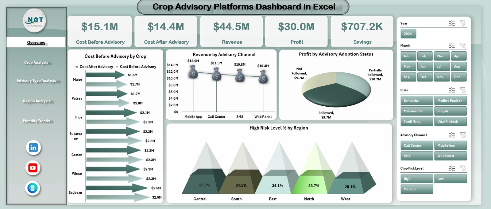
The Overview Page serves as the executive summary of the dashboard.
Interactive Slicer
A right-side slicer allows users to filter data dynamically based on relevant dimensions.
KPI Cards on the Overview Page
The dashboard displays five key performance cards:
-
Cost Before Advisory
-
Cost After Advisory
-
Revenue
-
Profit
-
Savings
These cards instantly show the financial impact of advisory services.
Charts on the Overview Page
The page includes four insightful charts:
-
Cost Before Advisory vs Cost After Advisory by Crop
-
Revenue by Advisory Channel
-
Profit by Advisory Adoption Status
-
High-Risk Level (%) by Region
Because of these visuals, decision-makers can quickly understand where advisory services create the most value.
2) Crop Analysis Page: How Can You Evaluate Crop-Wise Advisory Impact?
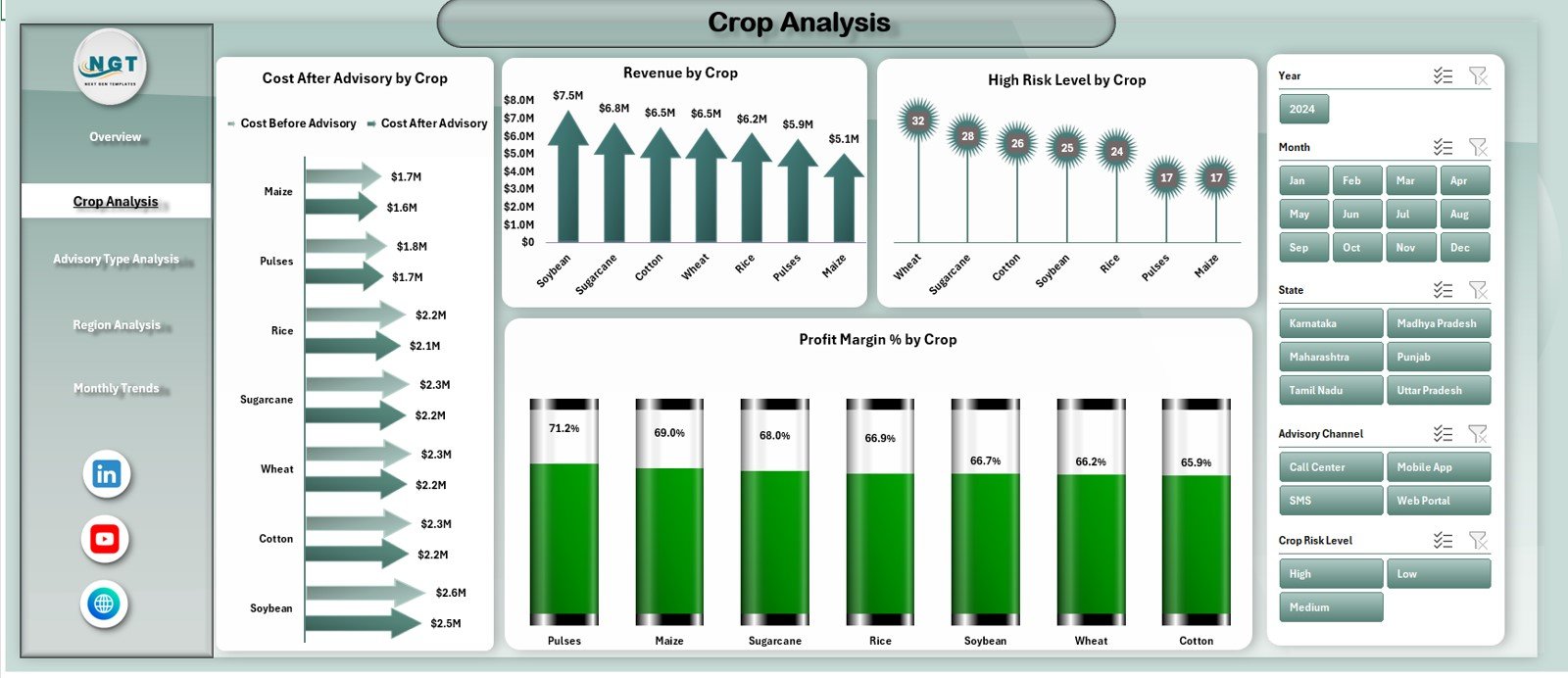
The Crop Analysis Page focuses on performance comparison across different crops.
Right-Side Slicer
Users can filter results dynamically to focus on specific crops or conditions.
Charts Included in Crop Analysis
This page includes four analytical charts:
-
Cost Before Advisory vs Cost After Advisory by Crop
-
Revenue by Crop
-
High-Risk Level (%) by Crop
-
Profit Margin (%) by Crop
These insights help platforms identify:
-
Crops benefiting most from advisory
-
Crops with high risk exposure
-
Profitability differences across crop types
3) Advisory Type Analysis: How Do Different Advisory Methods Perform?
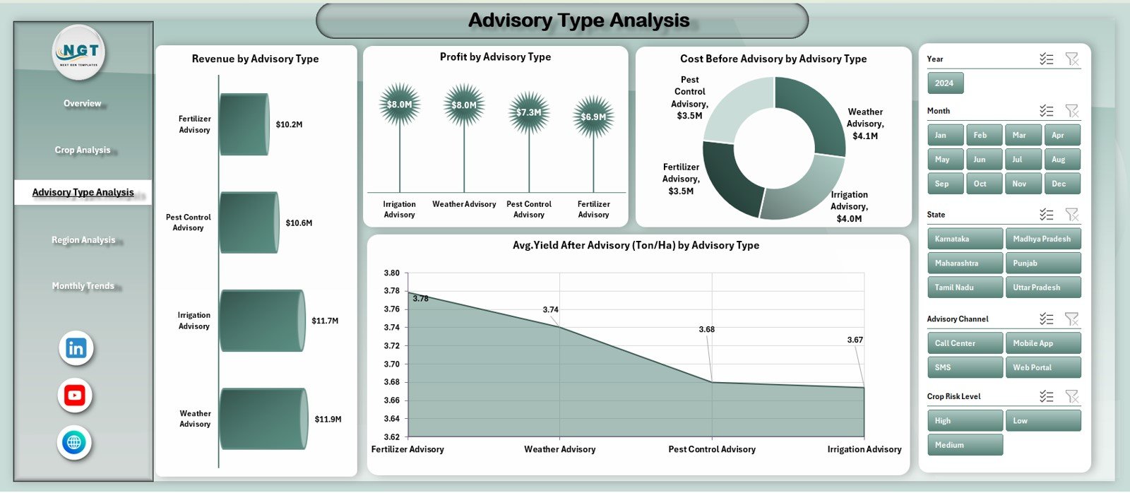
The Advisory Type Analysis Page evaluates the effectiveness of various advisory approaches.
Right-Side Slicer
Users can filter by advisory type for focused analysis.
Charts Included in Advisory Type Analysis
This page displays four charts:
-
Revenue by Advisory Type
-
Profit by Advisory Type
-
Cost Before Advisory by Advisory Type
-
Average Yield After Advisory (Ton/Ha) by Advisory Type
Because of these insights, platforms can:
-
Optimize advisory strategies
-
Focus on high-impact advisory types
-
Improve yield outcomes
4) Region Analysis: How Can You Compare Regional Performance?
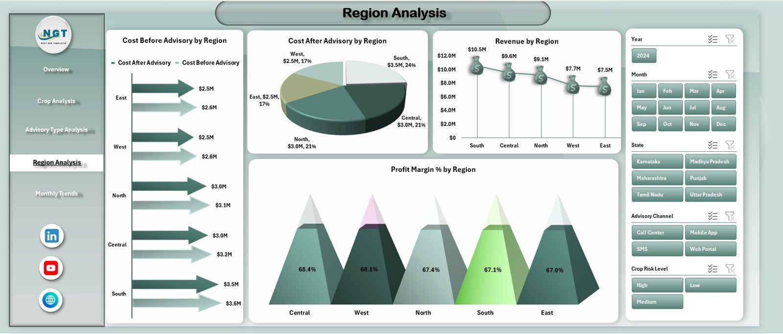
The Region Analysis Page highlights geographical performance differences.
Right-Side Slicer
This slicer allows users to filter insights by region.
Charts Included in Region Analysis
The page includes four charts:
-
Cost After Advisory vs Cost Before Advisory by Region
-
Cost After Advisory by Region
-
Revenue by Region
-
Profit Margin (%) by Region
These visuals help identify:
-
Regions with the highest advisory impact
-
Areas with cost inefficiencies
-
Regional risk and profitability trends
5) Monthly Trends Page: How Do Performance Metrics Change Over Time?
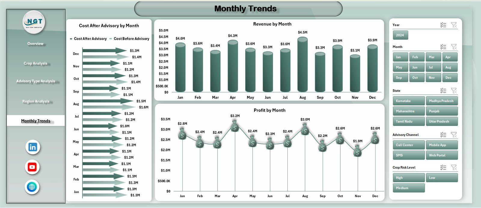
The Monthly Trends Page focuses on time-based analysis.
Right-Side Slicer
Users can adjust filters to analyze trends across months.
Charts Included in Monthly Trends
This page includes three trend charts:
-
Cost After Advisory vs Cost Before Advisory by Month
-
Revenue by Month
-
Profit by Month
Because of monthly analysis, stakeholders can:
-
Track seasonal variations
-
Monitor advisory consistency
-
Evaluate long-term impact
Support Sheet and Data Sheet: Why Are They Important?
Data Sheet
The Data Sheet stores raw advisory, cost, revenue, yield, and risk data used by the dashboard.
Support Sheet
The Support Sheet helps manage calculations, mappings, and reference values to ensure dashboard accuracy.
This separation keeps the dashboard clean and reliable.
Click to Purchases Crop Advisory Platforms Dashboard in Excel
What Metrics Can Be Tracked in a Crop Advisory Platforms Dashboard?
This dashboard supports a wide range of agricultural and financial metrics, such as:
-
Cost before advisory
-
Cost after advisory
-
Savings generated
-
Revenue
-
Profit and profit margin
-
Yield after advisory
-
High-risk level (%)
-
Advisory adoption status
You can easily extend the dashboard as advisory programs grow.
Advantages of Crop Advisory Platforms Dashboard in Excel
Why Should Agritech and Advisory Organizations Use This Dashboard?
🌱 Clear Advisory Impact Measurement
Quantify cost savings and yield improvement easily.
📊 Centralized Agricultural Analytics
All performance data stays in one dashboard.
💰 Improved Profitability Insights
Understand revenue, profit, and margin trends clearly.
⚠ Better Risk Monitoring
Identify high-risk crops and regions quickly.
📈 Strong Trend Analysis
Track monthly and seasonal performance patterns.
🧠 Smarter Decision-Making
Data-driven insights improve advisory strategies.
How Does This Dashboard Support Sustainable Agriculture?
By comparing costs before and after advisory, the dashboard helps:
-
Reduce unnecessary input usage
-
Improve yield efficiency
-
Lower operational risks
-
Promote data-driven farming practices
As a result, advisory platforms align financial performance with sustainability goals.
Best Practices for the Crop Advisory Platforms Dashboard in Excel
How Can You Maximize Dashboard Effectiveness?
✔ Keep Data Updated Regularly
Frequent updates ensure accurate insights.
✔ Use Consistent Crop and Region Names
Standardization improves reporting accuracy.
✔ Review Cost and Yield Together
Savings should align with productivity improvements.
✔ Monitor High-Risk Levels Closely
Early detection helps prevent losses.
✔ Train Users on Filters and Slicers
Better understanding leads to better decisions.
✔ Validate Data Before Analysis
Reliable data produces reliable insights.
Click to Purchases Crop Advisory Platforms Dashboard in Excel
Who Can Benefit from a Crop Advisory Platforms Dashboard in Excel?
This dashboard is ideal for:
-
Agritech companies
-
Crop advisory platforms
-
Farmer producer organizations (FPOs)
-
Agricultural cooperatives
-
Research institutions
-
Sustainability teams
Because it runs on Excel, it suits both small programs and large advisory networks.
How Does This Dashboard Improve Advisory Program ROI?
The dashboard clearly shows:
-
Where advisory reduces costs
-
Which crops and regions generate the highest returns
-
Which advisory types deliver the best outcomes
Therefore, organizations can optimize investments and scale successful advisory models.
Click to Purchases Crop Advisory Platforms Dashboard in Excel
Conclusion: Why Is a Crop Advisory Platforms Dashboard in Excel a Game-Changer?
A Crop Advisory Platforms Dashboard in Excel transforms agricultural advisory data into clear, actionable insights. It helps measure advisory impact, control costs, reduce risks, and improve profitability.
By combining structured data with interactive visuals, this dashboard empowers agritech organizations to make smarter, faster, and more sustainable decisions.
In today’s data-driven agriculture ecosystem, this dashboard is not optional—it is essential.
Frequently Asked Questions (FAQs)
What is the main purpose of a Crop Advisory Platforms Dashboard in Excel?
It helps track advisory impact on costs, yield, revenue, profit, and risk across crops and regions.
Do I need advanced Excel skills to use this dashboard?
No. Basic Excel knowledge is enough to update data and review insights.
Can I add more crops or regions?
Yes. The dashboard is fully scalable.
How often should the dashboard be updated?
Monthly updates work best, although seasonal updates also suit agricultural cycles.
Can this dashboard support sustainability reporting?
Yes. It supports cost efficiency, yield improvement, and risk reduction analysis.
Is this dashboard suitable for large agritech platforms?
Yes. It supports multi-crop, multi-region, and multi-advisory analysis.
Click to Purchases Crop Advisory Platforms Dashboard in Excel
Visit our YouTube channel to learn step-by-step video tutorials