Managing finances without clear visibility always creates confusion. Many organizations track revenue, expenses, and profit in separate Excel files. As a result, leaders struggle to understand the complete financial picture. That is exactly where a Financial Summary Dashboard in Power BI makes a real difference.
This detailed guide explains what a Financial Summary Dashboard in Power BI is, why businesses need it, how it works, its page-wise structure, advantages, best practices, and frequently asked questions. Moreover, the article uses simple language, clear explanations, and practical examples so you can apply the ideas immediately.
Click to Purchases Financial Summary Dashboard in Power BI
What Is a Financial Summary Dashboard in Power BI?
A Financial Summary Dashboard in Power BI is a centralized reporting and analytics solution that combines revenue, expense, and profit data into one interactive view. Instead of switching between multiple reports, decision-makers monitor financial performance from a single dashboard.
Because it runs on Microsoft Power BI, the dashboard offers interactive slicers, dynamic charts, and real-time insights. Therefore, finance teams gain clarity, accuracy, and speed while analyzing financial data.
Why Do Businesses Need a Financial Summary Dashboard in Power BI?
Many businesses still depend on manual reports. However, manual reporting creates delays and errors. Moreover, it hides trends that could improve profitability.
A Financial Summary Dashboard in Power BI solves these problems by:
-
Bringing revenue, expenses, and profit into one place
-
Showing trends and patterns clearly
-
Supporting data-driven decisions
-
Saving time and effort in reporting
As a result, leadership teams act faster and plan better.
How Does a Financial Summary Dashboard in Power BI Work?
The dashboard works by connecting financial data from sources such as Excel, SQL databases, or ERP systems. After data modeling, Power BI transforms raw numbers into meaningful visuals.
Because Power BI supports slicers, users filter data by month, department, category, or responsible person. Consequently, every stakeholder sees insights relevant to their role.
What Are the Key Pages in a Financial Summary Dashboard in Power BI?
This Financial Summary Dashboard contains five powerful pages, each designed to answer a specific business question.
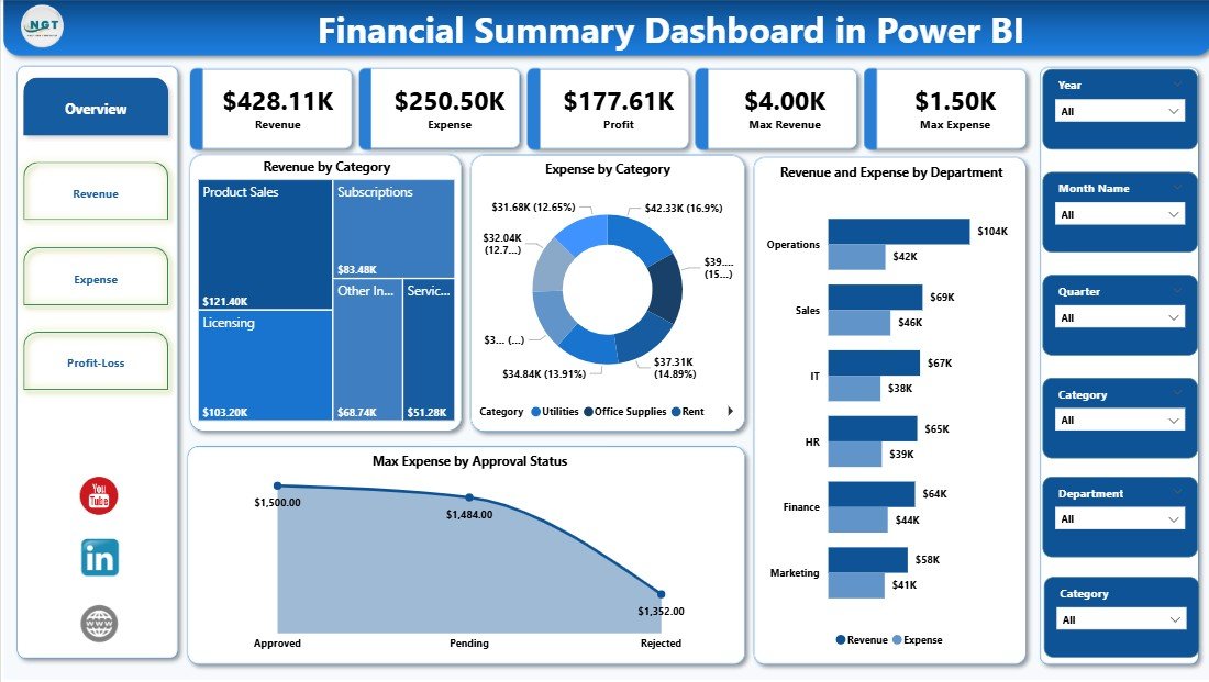
What Is Shown on the Overview Page?
The Overview Page acts as the entry point of the dashboard. It provides a quick snapshot of financial performance.
Key Elements of the Overview Page
-
Interactive slicers to filter data by time or category
-
Four KPI cards that summarize critical financial numbers
-
Revenue by Category chart
-
Expense by Category chart
-
Revenue and Expenses by Department visualization
-
Maximum Expenses by Approved Status analysis
Because everything appears on one screen, executives understand financial health instantly.
How Does the Revenue Analysis Page Help Decision-Making?

The Revenue Analysis Page focuses only on income trends. As a result, teams identify growth opportunities faster.
Visuals Included on the Revenue Analysis Page
-
Revenue by Month to track seasonal patterns
-
Revenue by Responsible Person to measure accountability
-
Revenue by Department to compare performance across teams
Because slicers control the entire page, users explore revenue from different angles without creating new reports.
Click to Purchases Financial Summary Dashboard in Power BI
What Insights Does the Expense Analysis Page Provide?

The Expense Analysis Page highlights where money goes. Therefore, finance teams quickly identify cost overruns.
Charts Available on the Expense Analysis Page
-
Expenses by Month to monitor spending trends
-
Expenses by Responsible Person to track accountability
-
Expenses by Department to control departmental budgets
As a result, organizations reduce unnecessary costs and improve efficiency.
How Does the Profit Analysis Page Improve Financial Planning?
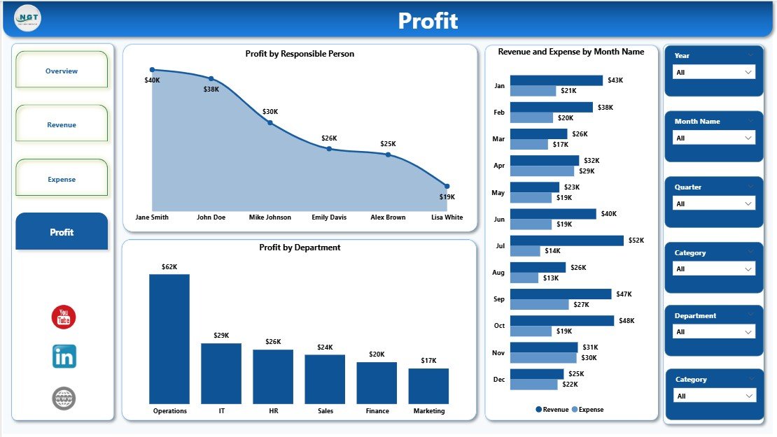
The Profit Analysis Page combines revenue and expense data. Because of this, it delivers the most strategic insights.
Key Charts on the Profit Analysis Page
-
Profit by Responsible Person
-
Revenue and Expenses by Month
-
Profit by Department
This page clearly shows which teams or departments generate the most profit. Therefore, leadership allocates resources wisely.
What Are the Main Benefits of Using a Financial Summary Dashboard in Power BI?
Using a Financial Summary Dashboard in Power BI delivers measurable value across the organization.
Advantages of Financial Summary Dashboard in Power BI
-
📊 Centralized Financial View – All key metrics appear in one place
-
⏱️ Faster Reporting – Automated dashboards replace manual work
-
🔍 Improved Accuracy – Data models reduce calculation errors
-
📈 Better Trend Analysis – Visuals reveal patterns quickly
-
🤝 Cross-Team Transparency – Everyone works with the same data
-
💡 Smarter Decisions – Real-time insights guide strategy
Because of these advantages, companies gain a competitive edge.
How Does Power BI Improve Financial Visibility Compared to Excel?
Excel works well for basic analysis. However, Excel struggles with large datasets and real-time updates.
Power BI improves financial visibility by:
-
Handling large volumes of data efficiently
-
Providing interactive visuals instead of static charts
-
Supporting real-time data refresh
-
Offering secure sharing across teams
As a result, finance teams move beyond spreadsheets and focus on insights.
Who Can Use a Financial Summary Dashboard in Power BI?
This dashboard suits multiple roles across an organization.
Ideal Users Include
-
Finance Managers
-
CFOs and Executives
-
Department Heads
-
Business Analysts
-
Startup Founders
Because the dashboard remains intuitive, even non-technical users navigate it easily.
Click to Purchases Financial Summary Dashboard in Power BI
How Can Organizations Customize the Financial Summary Dashboard?
Customization plays a major role in dashboard success. Fortunately, Power BI allows extensive flexibility.
Organizations can:
-
Add new KPIs
-
Modify charts and measures
-
Create department-specific views
-
Adjust color themes and branding
Therefore, the dashboard grows with business needs.
What Are the Best Practices for the Financial Summary Dashboard in Power BI?
Following best practices ensures accuracy, usability, and performance.
Best Practices for the Financial Summary Dashboard in Power BI
-
✅ Keep KPIs simple and relevant
-
✅ Use consistent date formats across datasets
-
✅ Limit visuals per page to avoid clutter
-
✅ Apply clear naming conventions
-
✅ Use slicers wisely to enhance analysis
-
✅ Validate data regularly for accuracy
-
✅ Optimize measures for faster performance
By following these practices, dashboards remain reliable and user-friendly.
How Often Should Financial Data Be Updated in Power BI?
Most organizations update financial data daily or weekly. However, the ideal frequency depends on business size and transaction volume.
Because Power BI supports scheduled refresh, teams always see the latest numbers.
What Challenges Can Occur While Building a Financial Summary Dashboard?
Every analytics project faces challenges. However, proper planning reduces risks.
Common Challenges Include
-
Poor data quality
-
Inconsistent data sources
-
Overloading dashboards with visuals
-
Lack of clear KPIs
By addressing these issues early, teams ensure long-term success.
How Does a Financial Summary Dashboard Support Strategic Planning?
Strategic planning requires reliable financial insights. This dashboard supports planning by:
-
Highlighting profit drivers
-
Identifying cost reduction opportunities
-
Comparing departmental performance
-
Supporting forecasting discussions
As a result, leaders plan with confidence.
Conclusion: Why Should You Use a Financial Summary Dashboard in Power BI?
Click to Purchases Financial Summary Dashboard in Power BI
A Financial Summary Dashboard in Power BI transforms raw financial data into actionable insights. It eliminates guesswork, improves transparency, and supports smarter decisions. Because it combines revenue, expenses, and profit in one place, organizations gain complete financial clarity.
Whether you manage a startup or a large enterprise, this dashboard empowers you to control finances effectively and grow sustainably.
Frequently Asked Questions About Financial Summary Dashboard in Power BI
What is the main purpose of a Financial Summary Dashboard in Power BI?
The main purpose involves providing a consolidated view of revenue, expenses, and profit to support informed decision-making.
Can beginners use a Financial Summary Dashboard in Power BI?
Yes. The dashboard uses intuitive visuals and slicers, so beginners understand insights easily.
Does the dashboard support real-time data?
Yes. Power BI supports scheduled and real-time data refresh based on the data source.
Can I integrate Excel data into this dashboard?
Yes. Power BI integrates seamlessly with Excel files and other data sources.
Is Power BI suitable for small businesses?
Absolutely. Small businesses benefit from affordable, scalable, and powerful analytics.
How secure is financial data in Power BI?
Power BI offers role-based access, data encryption, and secure sharing options.
Can I customize this dashboard for my organization?
Yes. You can modify KPIs, visuals, and layouts according to business needs.
Visit our YouTube channel to learn step-by-step video tutorials