Courier and logistics businesses operate in a highly competitive, time-sensitive environment. Every shipment, delivery route, and customer interaction directly impacts cost, service quality, and profitability. Therefore, companies must track performance accurately and consistently. This is where a Courier Services KPI Dashboard in Excel becomes an essential management tool.
In this detailed guide, you will learn what a Courier Services KPI Dashboard in Excel is, why it matters, how it works, its structure, key KPIs, advantages, best practices, and frequently asked questions. Moreover, this article explains how a ready-to-use Excel dashboard helps courier companies transform raw operational data into clear and actionable insights.
Click to buy Courier Services KPI Dashboard in Excel
What Is a Courier Services KPI Dashboard in Excel?
A Courier Services KPI Dashboard in Excel is a structured and interactive reporting tool designed to track and analyze key performance indicators related to courier and delivery operations. Instead of reviewing multiple spreadsheets, managers can monitor all critical KPIs in one centralized dashboard.
Moreover, Excel allows courier companies to calculate MTD (Month-to-Date) and YTD (Year-to-Date) metrics automatically. As a result, operations teams gain visibility into short-term execution and long-term performance at the same time.
In addition, Excel dashboards remain flexible, cost-effective, and widely accessible. Therefore, courier businesses of all sizes can adopt them without investing in complex BI tools.
Why Do Courier Companies Need a KPI Dashboard?
Courier services manage high volumes of daily transactions. As operations scale, manual tracking becomes inefficient and error-prone. Therefore, a KPI dashboard plays a critical role in performance management.
Key Reasons to Use a Courier KPI Dashboard
- It centralizes operational and financial data
- It highlights delivery delays and service gaps
- It tracks performance against targets clearly
- It supports faster and data-driven decisions
- It improves accountability across teams
Moreover, a KPI dashboard helps courier companies identify trends early. As a result, managers can fix issues before they impact customer satisfaction or revenue.
What KPIs Are Commonly Tracked in Courier Services?
Courier operations involve speed, accuracy, cost control, and customer experience. Therefore, KPIs must reflect all these dimensions.
Operational KPIs
- Total Shipments Processed
- On-Time Delivery Percentage
- Average Delivery Time
- Failed or Returned Deliveries
- Re-delivery Rate
Financial KPIs
- Revenue per Shipment
- Cost per Delivery
- Profit Margin Percentage
- Fuel and Transportation Costs
Customer Service KPIs
- Customer Satisfaction Score
- Complaints per 1,000 Deliveries
- Repeat Customers Percentage
Because these KPIs directly affect service quality and profitability, tracking them in one Excel dashboard ensures complete visibility.
How Does a Courier Services KPI Dashboard in Excel Work?
A Courier KPI Dashboard in Excel follows a structured data flow. First, users enter actual numbers, targets, and previous-year data. Then, Excel formulas calculate performance automatically. Finally, pivot tables and charts visualize the results.
Moreover, users can change the selected month using a drop-down. As a result, all dashboard values update instantly without manual recalculation.
Structure of the Courier Services KPI Dashboard in Excel
This ready-to-use dashboard includes 7 well-structured worksheets, each designed for a specific purpose. Let’s explore them in detail.
Summary Page – How Does the Index Page Help?
The Summary Page acts as the index of the dashboard. Instead of scrolling through multiple tabs, users can navigate easily.
Key Highlights of the Summary Page
- Clean index layout
- Six navigation buttons
- One-click access to each worksheet
Because of this design, users save time and avoid confusion. Moreover, it improves usability for non-technical users.
Click to buy Courier Services KPI Dashboard in Excel
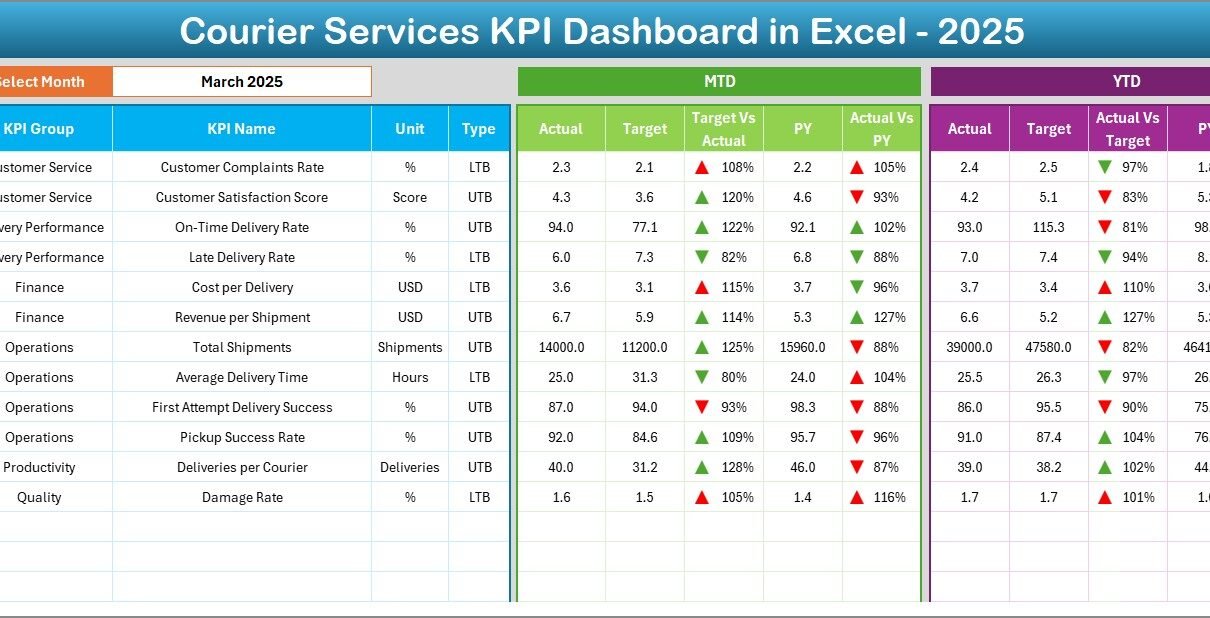
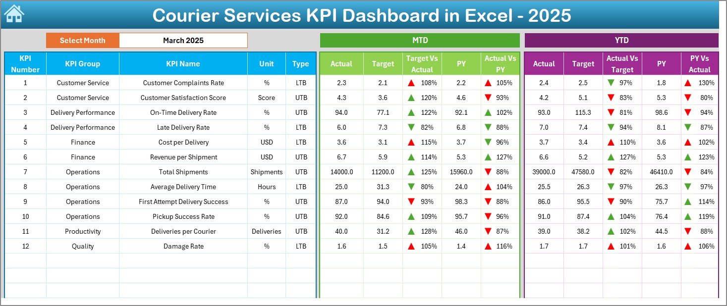
Dashboard Sheet – What Information Does It Show?
The Dashboard Sheet serves as the heart of the Courier Services KPI Dashboard in Excel.
Key Features of the Dashboard Sheet
- Month selection drop-down in cell D3
- Automatic refresh of all KPIs
- MTD Actual, Target, and Previous Year values
- YTD Actual, Target, and Previous Year values
Additionally, the dashboard uses conditional formatting with up and down arrows. As a result, users can instantly identify performance trends.
Visual Indicators Included
- Green arrows for positive performance
- Red arrows for negative performance
Because visuals replace long tables, decision-makers understand performance faster.
Click to buy Courier Services KPI Dashboard in Excel
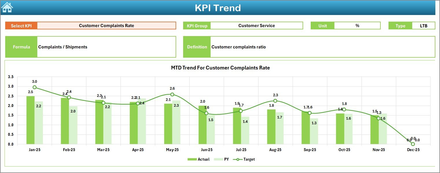
Trend Sheet – How Can You Analyze KPI Trends?
The Trend Sheet focuses on deep KPI analysis over time. Instead of reviewing static numbers, users explore performance movement.
Key Capabilities of the Trend Sheet
- KPI selection drop-down in cell C3
- Displays KPI Group, Unit, and Type (UTB or LTB)
- Shows KPI Formula and Definition
- MTD and YTD trend charts
Moreover, the dashboard plots Actual, Target, and Previous Year trends together. Therefore, users can compare performance patterns visually.
Click to buy Courier Services KPI Dashboard in Excel
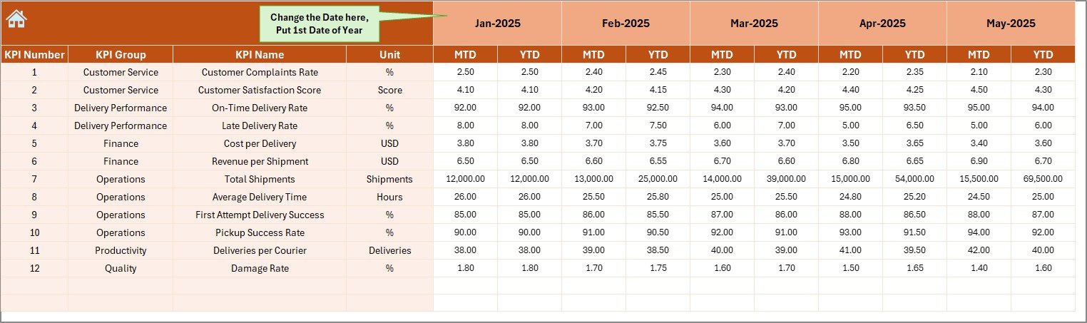
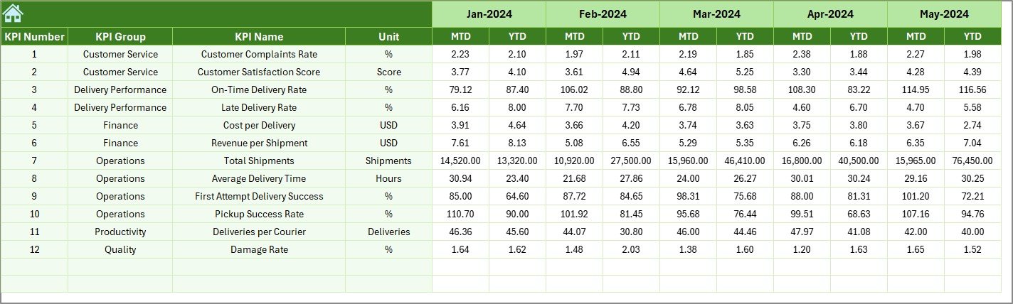
Actual Numbers Input Sheet – Where Do You Enter Data?
The Actual Numbers Input Sheet stores real operational data.
How This Sheet Works
- Select the starting month of the year in cell E1
- Enter actual MTD and YTD values
- Monthly updates flow automatically into the dashboard
Because data entry remains separate from visuals, the dashboard stays clean and error-free.
Click to buy Courier Services KPI Dashboard in Excel
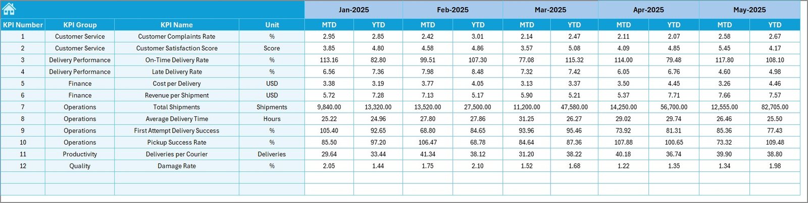
Target Sheet – How Are Goals Defined?
The Target Sheet defines expected performance levels.
Key Points of the Target Sheet
- Monthly MTD targets
- Cumulative YTD targets
- KPI-wise target planning
Since targets drive performance accountability, this sheet plays a critical role in monitoring success.
Click to buy Courier Services KPI Dashboard in Excel
Previous Year Numbers Sheet – Why Is Historical Comparison Important?
The Previous Year Numbers Sheet stores last year’s data for comparison.
Benefits of Including Previous Year Data
- Identifies performance improvement or decline
- Highlights seasonal trends
- Supports YoY (Year-over-Year) analysis
Because courier demand often fluctuates seasonally, this comparison adds valuable context.
Click to buy Courier Services KPI Dashboard in Excel
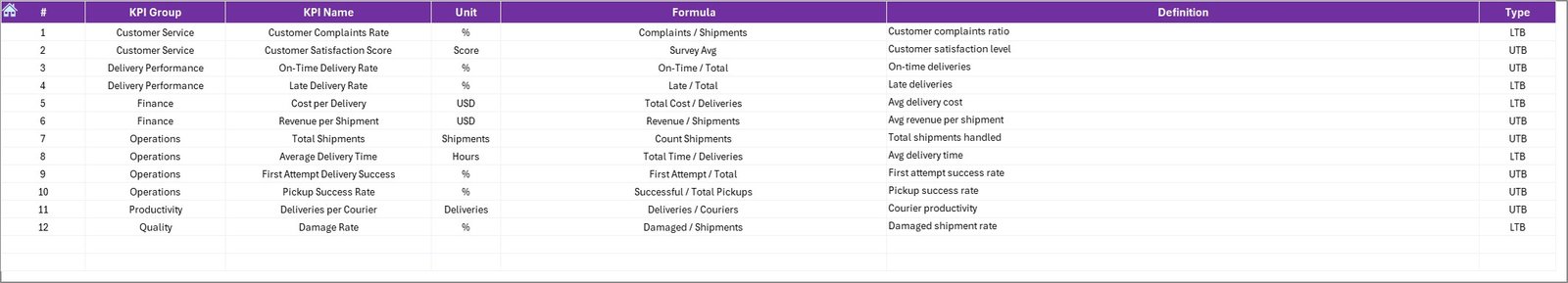
KPI Definition Sheet – Why Is Documentation Necessary?
The KPI Definition Sheet ensures clarity and consistency.
Information Captured in This Sheet
- KPI Name
- KPI Group
- Unit of Measurement
- Formula
- KPI Definition
As a result, all stakeholders interpret KPIs the same way. Moreover, this reduces reporting disputes.
What Type of Analysis Can You Perform Using This Dashboard?
A Courier Services KPI Dashboard in Excel supports multiple levels of analysis.
Performance Analysis
- On-time delivery vs target
- Cost efficiency tracking
- Revenue growth monitoring
Trend Analysis
- Month-wise KPI movement
- Seasonal delivery patterns
- Long-term performance shifts
Comparative Analysis
- Actual vs Target
- Current Year vs Previous Year
- MTD vs YTD performance
Because all analysis comes from one data model, reports remain consistent and reliable.
Advantages of a Courier Services KPI Dashboard in Excel
Why Should Courier Companies Use This Dashboard?
- Centralized KPI tracking
- Real-time performance visibility
- Easy customization in Excel
- No additional software cost
- Improved decision-making speed
Moreover, Excel dashboards reduce dependency on IT teams. As a result, operations managers control their own reporting.
Who Can Benefit from This Dashboard?
A Courier Services KPI Dashboard in Excel benefits multiple roles:
- Operations Managers
- Fleet and Delivery Supervisors
- Finance Teams
- Business Analysts
- Courier Company Owners
Because the dashboard remains simple and visual, both technical and non-technical users can use it effectively.
How Does This Dashboard Improve Decision-Making?
This dashboard converts raw data into insights. Therefore, leaders no longer rely on assumptions.
Key Decision Support Benefits
- Early identification of delivery delays
- Cost optimization opportunities
- Performance gap analysis
- Better resource allocation
As a result, courier businesses become more agile and competitive.
Best Practices for the Courier Services KPI Dashboard in Excel
To maximize value, follow these best practices:
Data Management Best Practices
- Enter data consistently every month
- Validate inputs before analysis
- Use standardized KPI definitions
Dashboard Usage Best Practices
- Review MTD performance weekly
- Track YTD trends monthly
- Compare with previous year regularly
Design Best Practices
- Avoid overcrowding the dashboard
- Use conditional formatting wisely
- Keep navigation simple
When followed correctly, these practices ensure long-term dashboard reliability.
How Can This Dashboard Scale with Business Growth?
As courier operations grow, the dashboard can scale easily.
- Add new KPIs in the KPI Definition Sheet
- Extend data ranges for new months
- Customize charts for regional or fleet-level views
Because Excel remains flexible, the dashboard evolves with business needs.
Conclusion: Why Is a Courier Services KPI Dashboard in Excel Essential?
A Courier Services KPI Dashboard in Excel acts as a performance compass for delivery businesses. It brings clarity, structure, and accountability to operations. Moreover, it simplifies complex data into actionable insights.
By tracking MTD, YTD, targets, and historical performance in one place, courier companies improve efficiency, reduce costs, and enhance customer satisfaction. Therefore, adopting a ready-to-use KPI dashboard in Excel becomes a smart and practical decision for any courier business.
Frequently Asked Questions (FAQs)
What is a Courier Services KPI Dashboard in Excel?
It is an Excel-based performance tracking tool that monitors delivery, cost, revenue, and service KPIs in one centralized dashboard.
Can small courier companies use this dashboard?
Yes, the dashboard suits both small and large courier businesses because Excel is scalable and easy to use.
Does the dashboard support MTD and YTD analysis?
Yes, it tracks both MTD and YTD actuals, targets, and previous-year values.
Can I customize KPIs in this dashboard?
Yes, you can add, remove, or modify KPIs using the KPI Definition Sheet.
Do I need advanced Excel skills to use it?
No, basic Excel knowledge is enough to operate and maintain the dashboard.
How often should data be updated?
Ideally, update data monthly. However, high-volume operations may update it weekly.
Visit our YouTube channel to learn step-by-step video tutorials
Watch the step-by-step video tutorial:
Click to buy Courier Services KPI Dashboard in Excel