The courier and logistics industry moves fast. Every parcel, every delivery route, and every customer promise depends on speed, accuracy, and cost control. Therefore, courier companies must track performance continuously and clearly. However, when teams rely only on raw Excel sheets or scattered reports, decision-making becomes slow and risky.
That is why a Courier Services KPI Dashboard in Power BI becomes a powerful and practical solution. It converts courier operational data into clear visuals, interactive KPIs, and actionable insights. Moreover, it helps managers track Month-to-Date (MTD), Year-to-Date (YTD), targets, and previous-year performance in one centralized dashboard.
In this detailed guide, you will learn what a Courier Services KPI Dashboard in Power BI is, why it matters, how it works, its structure, pages, KPIs, advantages, best practices, and frequently asked questions. Additionally, you will understand how a ready-to-use Power BI dashboard improves efficiency, accountability, and profitability in courier operations.
Click to buy Courier Services KPI Dashboard in Power BI
What Is a Courier Services KPI Dashboard in Power BI?
A Courier Services KPI Dashboard in Power BI is an interactive business intelligence dashboard designed to monitor and analyze key performance indicators related to courier and delivery operations. Instead of checking multiple reports, managers can view all critical KPIs on a single screen.
Moreover, Power BI allows courier companies to connect Excel data, apply business logic, and visualize performance instantly. As a result, decision-makers understand operational health without manual calculations.
In addition, this dashboard supports:
- MTD and YTD tracking
- Target vs Actual analysis
- Current Year vs Previous Year comparisons
- Visual indicators for quick decision-making
Because of these capabilities, courier companies gain control over delivery efficiency, service quality, and operational costs.
Why Do Courier Companies Need a KPI Dashboard in Power BI?
Courier businesses operate under strict timelines and service-level agreements. Therefore, even small inefficiencies can increase costs and reduce customer satisfaction.
A Courier Services KPI Dashboard in Power BI helps because:
- It shows performance in real time
- It highlights problem areas immediately
- It reduces dependency on manual Excel analysis
- It supports faster and smarter decisions
Moreover, when leadership teams track KPIs visually, they align teams better and improve accountability across operations.
How Does a Courier Services KPI Dashboard in Power BI Work?
The dashboard uses Excel as the data source and Power BI Desktop for visualization and analysis. First, operational data is entered into structured Excel sheets. Then, Power BI reads the data, applies calculations, and displays results dynamically.
Because of slicers and interactive visuals, users can:
- Filter data by Month
- Filter KPIs by KPI Group
- Drill through to KPI definitions
- Compare MTD, YTD, targets, and previous-year values
As a result, the dashboard remains flexible, scalable, and easy to maintain.
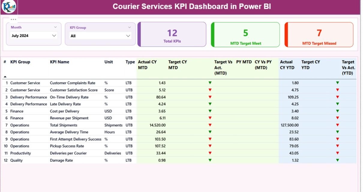
What Are the Key Pages in the Courier Services KPI Dashboard in Power BI?
This ready-to-use dashboard contains three powerful pages, each designed for a specific analytical purpose.
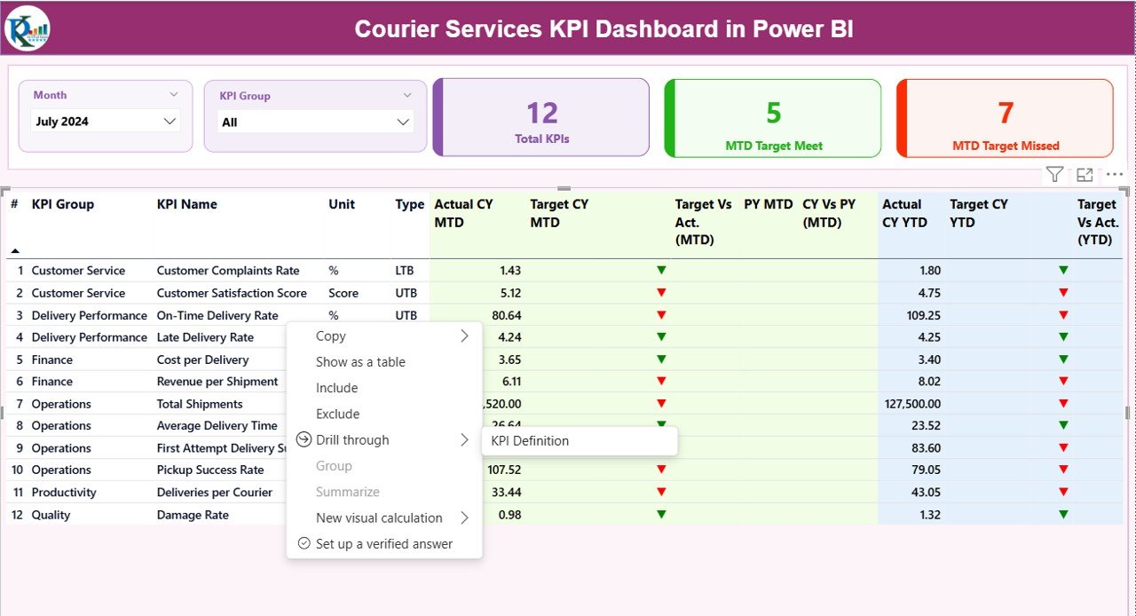
Summary Page
The Summary Page works as the main control center of the dashboard. Here, decision-makers see overall courier performance at a glance.
Top Section: Slicers and KPI Cards
At the top, the dashboard includes:
- Month slicer to select the reporting month
- KPI Group slicer to filter KPIs by category
Additionally, three KPI cards display:
- Total KPIs Count
- MTD Target Met Count
- MTD Target Missed Count
Because of these cards, users instantly understand overall performance health.
Detailed KPI Table on the Summary Page
Below the cards, the dashboard displays a detailed KPI table with rich insights.
The table includes:
- KPI Number – Sequential number of the KPI
- KPI Group – Category or functional group of the KPI
- KPI Name – Name of the performance metric
- Unit – Unit of measurement
- Type – UTB (Upper the Better) or LTB (Lower the Better)
MTD Performance Columns
- Actual CY MTD – Current year actual MTD value
- Target CY MTD – Current year target MTD value
- MTD Icon – Green ▲ or Red ▼ to show target achievement
- Target vs Actual (MTD) – Actual ÷ Target percentage
- PY MTD – Previous year MTD value
- CY vs PY (MTD) – Current year vs previous year comparison
YTD Performance Columns
- Actual CY YTD – Current year actual YTD value
- Target CY YTD – Current year target YTD value
- YTD Icon – Visual indicator for YTD performance
- Target vs Actual (YTD) – Actual ÷ Target percentage
- PY YTD – Previous year YTD value
- CY vs PY (YTD) – Current year vs previous year comparison
Because of conditional formatting icons and percentages, users identify strong and weak KPIs immediately.

Click to buy Courier Services KPI Dashboard in Power BI
KPI Trend Page
The KPI Trend Page focuses on performance movement over time. Instead of static numbers, it shows trends and patterns.
Key Features of the KPI Trend Page
- KPI Name slicer on the left
Two combo charts for:
MTD Actual vs Target vs Previous Year
YTD Actual vs Target vs Previous Year
Because of these charts, managers can:
- Identify improvement or decline trends
- Compare current performance with history
- Validate whether strategies are working
Therefore, the KPI Trend page supports strategic planning and performance forecasting.

Click to buy Courier Services KPI Dashboard in Power BI
KPI Definition Page
The KPI Definition Page works as a drill-through and reference page. Although it remains hidden, users can access it from the Summary Page.
This page shows:
- KPI Formula
- KPI Definition
- Unit of measurement
- KPI Type (UTB or LTB)
Because of this page:
- Teams understand KPIs clearly
- New users learn metrics faster
- Reporting remains transparent
To return to the main page, users simply click the Back button at the top left corner.

Click to buy Courier Services KPI Dashboard in Power BI
What Excel Data Is Required for the Dashboard?
The dashboard uses an Excel file with three structured worksheets. These sheets act as the backbone of the Power BI model.
Input_Actual Sheet
The Input_Actual sheet stores actual performance data.
You need to fill:
- KPI Name
- Month (use the first date of the month)
- MTD Actual value
- YTD Actual value
Because this sheet captures real performance, accuracy remains critical.
Click to buy Courier Services KPI Dashboard in Power BI
Input_Target Sheet
The Input_Target sheet stores planned or target values.
You need to fill:
- KPI Name
- Month (first date of the month)
- MTD Target value
- YTD Target value
This sheet enables target vs actual comparisons throughout the dashboard.
KPI Definition Sheet
The KPI Definition sheet defines the structure and meaning of each KPI.
It includes:
- KPI Number
- KPI Group
- KPI Name
- Unit
- Formula
- Definition
- Type (LTB or UTB)
Because of this sheet, the dashboard remains scalable and easy to update.
What Are the Advantages of a Courier Services KPI Dashboard in Power BI?
A Courier Services KPI Dashboard in Power BI delivers measurable business value.
Key Advantages
- Centralized performance tracking across operations
- Real-time insights through interactive visuals
- Improved decision-making speed
- Reduced manual reporting effort
- Clear accountability for KPI owners
- Better target management
- Historical performance comparison
Moreover, Power BI dashboards increase transparency and trust in data.
How Does This Dashboard Improve Courier Operations?
This dashboard improves courier operations by:
- Identifying delivery delays early
- Monitoring service quality continuously
- Tracking cost efficiency
- Supporting data-driven route planning
- Improving SLA compliance
As a result, courier companies increase customer satisfaction and profitability.
Who Can Use a Courier Services KPI Dashboard in Power BI?
This dashboard benefits multiple roles, including:
- Courier company owners
- Operations managers
- Logistics managers
- Regional heads
- Business analysts
- Performance management teams
Because of its simplicity and clarity, both technical and non-technical users can use it confidently.
Best Practices for the Courier Services KPI Dashboard in Power BI
To get maximum value, follow these best practices.
- Maintain Clean and Consistent Excel Data
Always use consistent KPI names, dates, and units. Clean data ensures accurate insights.
- Update Data Regularly
Update actual and target data monthly. Regular updates keep insights relevant.
- Define KPIs Clearly
Use clear formulas and definitions. Clear KPIs avoid confusion and misinterpretation.
- Focus on Actionable KPIs
Track KPIs that drive decisions, not vanity metrics.
- Use KPI Groups Wisely
Group KPIs by operations, delivery, cost, and customer service for better analysis.
- Review Trends, Not Just Numbers
Always analyze KPI trends to understand performance direction.
How Does This Dashboard Compare to Traditional Excel Reports?
Traditional Excel reports often remain static and time-consuming. In contrast, Power BI dashboards:
- Update automatically
- Support interactivity
- Provide better visuals
- Reduce manual errors
- Scale easily with data growth
Therefore, Power BI dashboards outperform static Excel reports for courier analytics.
Conclusion: Why Invest in a Courier Services KPI Dashboard in Power BI?
A Courier Services KPI Dashboard in Power BI transforms courier performance management. It converts raw data into meaningful insights, supports faster decisions, and improves operational efficiency.
Moreover, this ready-to-use dashboard saves time, reduces reporting effort, and ensures transparency across teams. When courier businesses adopt data-driven monitoring, they stay competitive, agile, and customer-focused.
If you want clear visibility into courier performance, this Power BI KPI dashboard becomes an essential business tool.
Frequently Asked Questions (FAQs)
What is a Courier Services KPI Dashboard in Power BI?
It is an interactive dashboard that tracks courier performance metrics such as MTD, YTD, targets, and previous-year comparisons using Power BI.
Which data source does this dashboard use?
The dashboard uses Excel files with Input_Actual, Input_Target, and KPI Definition sheets.
Can I customize KPIs in the dashboard?
Yes, you can add, remove, or modify KPIs by updating the Excel data and KPI Definition sheet.
Does this dashboard support MTD and YTD analysis?
Yes, it fully supports MTD and YTD calculations along with target and previous-year comparisons.
Who should use this dashboard?
Courier company owners, operations managers, logistics teams, and analysts can all benefit from this dashboard.
Is this dashboard suitable for small courier businesses?
Yes, the dashboard works well for both small and large courier operations.
Visit our YouTube channel to learn step-by-step video tutorials
Watch the step-by-step video tutorial:
Click to buy Courier Services KPI Dashboard in Power BI