Courier and logistics operations move fast. Therefore, decision-makers need clear, timely, and accurate insights. However, scattered spreadsheets and static reports slow teams down. That is exactly why a Courier Services Dashboard in Power BI becomes a game-changer.
In this detailed and SEO-friendly guide, you will learn what a Courier Services Dashboard in Power BI is, why it matters, how it works, and how each dashboard page supports better decisions. Moreover, you will explore the advantages, best practices, and frequently asked questions. By the end, you will clearly understand how this dashboard helps courier companies improve efficiency, control costs, and increase revenue.
Click to Purchases Courier Services Dashboard in Power BI
What Is a Courier Services Dashboard in Power BI?
A Courier Services Dashboard in Power BI is an interactive and visual analytics solution that tracks and analyzes courier operations in real time.
Instead of manually reviewing shipment logs, cost sheets, and revenue reports, this dashboard centralizes all courier KPIs into one dynamic view. As a result, managers can instantly monitor shipment performance, delivery efficiency, return rates, and profitability.
Why does this dashboard matter?
Because courier businesses deal with:
-
High shipment volumes
-
Multiple courier partners
-
Different service types
-
Complex cost structures
Therefore, without a centralized dashboard, decision-making becomes slow and reactive.
Why Should Courier Companies Use Power BI for Dashboards?
Power BI offers flexibility, speed, and advanced analytics. Moreover, it transforms raw courier data into meaningful insights.
Key reasons to use Power BI for courier dashboards
-
It connects easily with Excel, databases, and ERP systems
-
It provides real-time interactive slicers and filters
-
It supports drill-down analysis across regions, partners, and months
-
It delivers professional visuals suitable for leadership reporting
Because of these reasons, courier and logistics companies increasingly rely on Power BI dashboards.
What KPIs Does a Courier Services Dashboard Track?
Before diving into dashboard pages, it is important to understand the core KPIs commonly tracked.
Common courier KPIs included
-
Returned Shipment %
-
Average Delivery Days
-
Shipping Cost
-
Revenue
-
Total Shipments
-
Performance by Courier Partner
-
Performance by Service Type
-
Zone-wise operational efficiency
Each KPI directly impacts customer satisfaction, cost control, and business growth.
How Is the Courier Services Dashboard Structured?
This Courier Services Dashboard in Power BI contains five well-structured pages. Each page focuses on a specific analysis area. As a result, users can move from a high-level overview to deep operational insights smoothly.
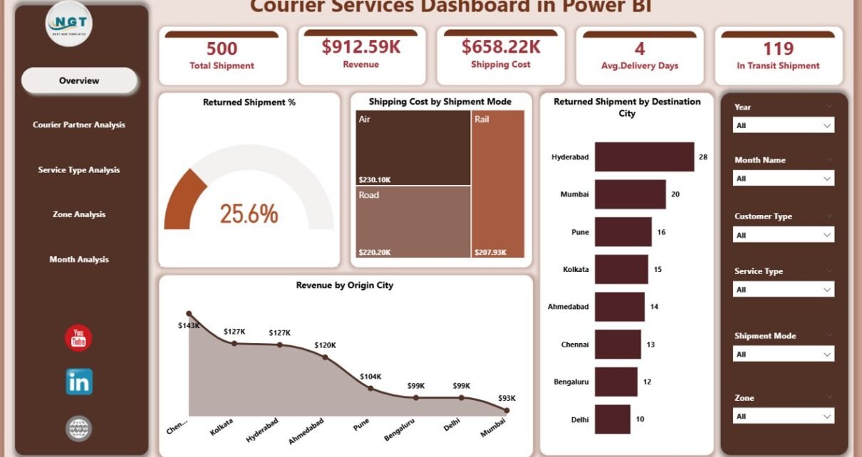
What Does the Overview Page Show?
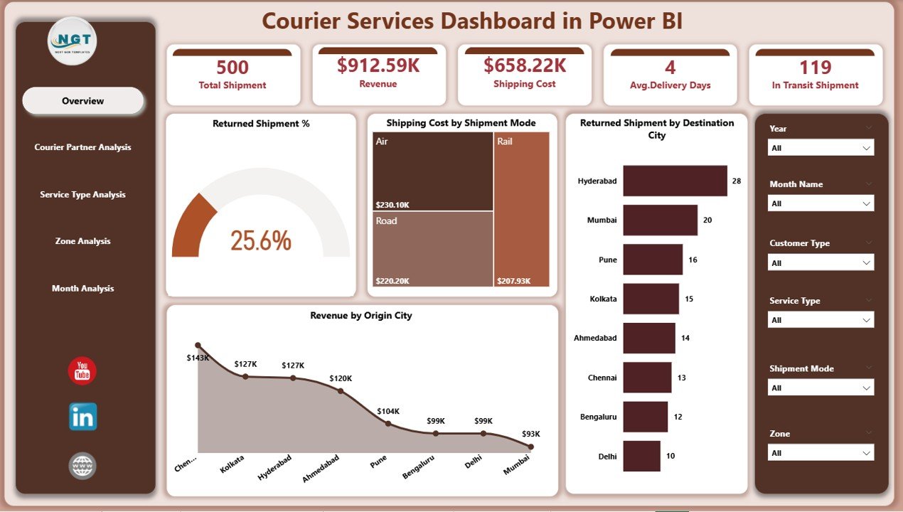
The Overview Page is the main landing page of the dashboard. It provides a snapshot of overall courier performance.
Why is the overview page important?
Because leadership teams want quick answers without digging into details.
Key elements of the Overview Page
-
Interactive slicers for filtering data
-
KPI cards for quick performance tracking
-
High-level charts showing trends and comparisons
KPIs and visuals included
-
Returned Shipment %
-
Shipping Cost by Shipment Mode
-
Returned Shipment by Destination City
-
Revenue by Origin City
Through this page, users immediately understand:
-
Where returns are high
-
Which shipment modes cost more
-
Which cities generate maximum revenue
As a result, managers can take fast corrective actions.
How Does the Courier Partner Analysis Page Help?
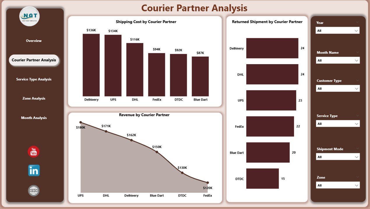
Courier businesses often work with multiple partners. Therefore, performance comparison becomes essential.
Purpose of the Courier Partner Analysis Page
This page evaluates partner-wise operational and financial performance.
Charts included on this page
-
Returned Shipment by Courier Partner
-
Shipping Cost by Courier Partner
-
Revenue by Courier Partner
What insights does this page deliver?
-
Identify underperforming courier partners
-
Compare cost efficiency across partners
-
Analyze revenue contribution by partner
Because of these insights, businesses can:
-
Renegotiate contracts
-
Reward high-performing partners
-
Reduce dependency on inefficient vendors
Why Is Service Type Analysis Critical?

Courier services usually offer multiple delivery options such as standard, express, or same-day delivery. Each service type impacts cost and delivery time differently.
Objective of the Service Type Analysis Page
This page helps evaluate service-level performance.
Visuals included on this page
-
Average Delivery Day by Service Type
-
Shipping Cost by Service Type
-
Revenue by Service Type
How does this page help decision-makers?
-
Identify expensive service types
-
Balance speed versus cost
-
Improve pricing strategies
-
Optimize service offerings
Therefore, businesses can align services with customer expectations and profitability goals.
Click to Purchases Courier Services Dashboard in Power BI
What Does the Zone Analysis Page Reveal?

Geographical performance plays a major role in courier operations. Hence, zone-wise analysis becomes crucial.
Purpose of the Zone Analysis Page
This page measures operational efficiency across zones.
Charts included on this page
-
Average Delivery Day by Zone
-
Shipping Cost by Zone
-
Revenue by Service Zone
Key benefits of zone-wise analysis
-
Detect delivery delays in specific zones
-
Control logistics costs regionally
-
Improve route planning
-
Strengthen regional operations
As a result, businesses can ensure consistent service quality across all zones.
Why Is Month Analysis Important for Courier Businesses?

Courier operations fluctuate due to seasons, festivals, and promotions. Therefore, tracking monthly trends becomes essential.
Objective of the Month Analysis Page
This page focuses on time-based performance analysis.
Visuals included on this page
-
Total Shipment by Month
-
Shipping Cost by Month
-
Revenue by Month
Insights gained from this page
-
Identify peak shipment months
-
Monitor cost spikes
-
Analyze revenue seasonality
-
Improve forecasting and capacity planning
Because of this analysis, management can plan resources proactively.
How Does This Dashboard Improve Decision-Making?
Click to Purchases Courier Services Dashboard in Power BI
This dashboard converts operational data into actionable insights.
Decision areas supported
-
Cost optimization
-
Partner performance management
-
Service pricing strategy
-
Regional performance improvement
-
Revenue growth planning
Therefore, decisions become faster, smarter, and data-driven.
Advantages of Courier Services Dashboard in Power BI
Why should businesses invest in this dashboard?
Here are the major advantages:
-
Centralized data visibility across operations
-
Real-time insights with interactive filters
-
Improved cost control through detailed analysis
-
Better partner accountability
-
Enhanced customer satisfaction through performance tracking
-
Professional reporting for management and stakeholders
Because of these advantages, courier companies gain a strong competitive edge.
Best Practices for Using a Courier Services Dashboard in Power BI
To get maximum value, businesses should follow proven best practices.
1. Maintain clean and accurate data
Ensure data sources are updated and validated regularly.
2. Define KPIs clearly
Align KPIs with business goals and service-level agreements.
3. Use slicers wisely
Enable filtering by partner, zone, service type, and month for flexible analysis.
4. Review the dashboard frequently
Schedule weekly or monthly performance reviews using the dashboard.
5. Train users properly
Educate teams on interpreting visuals and metrics correctly.
Following these best practices ensures consistent and reliable insights.
Who Can Use a Courier Services Dashboard?
This dashboard suits multiple roles across the organization.
Ideal users include
-
Operations managers
-
Logistics heads
-
Finance teams
-
Business owners
-
Strategy and planning teams
Each user benefits from role-specific insights.
How Can This Dashboard Support Business Growth?
Growth depends on efficiency and customer trust. This dashboard supports both.
Growth enablers
-
Reduced operational costs
-
Faster delivery times
-
Improved partner selection
-
Better service planning
-
Higher customer retention
Therefore, the dashboard becomes a strategic growth tool.
Conclusion: Why a Courier Services Dashboard in Power BI Is Essential
Courier businesses operate in a highly competitive and time-sensitive environment. Therefore, relying on manual reports limits growth.
A Courier Services Dashboard in Power BI delivers:
-
Clear visibility
-
Faster decisions
-
Better performance control
-
Scalable analytics
By implementing this dashboard, courier companies transform data into decisions and decisions into results.
Frequently Asked Questions (FAQs)
What is a Courier Services Dashboard in Power BI used for?
It tracks, analyzes, and visualizes courier operations such as shipments, costs, returns, and revenue.
Can this dashboard handle large volumes of courier data?
Yes, Power BI efficiently handles large datasets and updates insights in real time.
Does the dashboard support filtering by partner and region?
Yes, interactive slicers allow filtering by courier partner, zone, service type, and month.
Is this dashboard suitable for small courier companies?
Yes, both small and large courier businesses benefit from structured analytics.
Can this dashboard improve cost management?
Absolutely. It highlights cost drivers and inefficiencies clearly.
How often should the dashboard be reviewed?
Most businesses review it weekly or monthly, depending on shipment volume.
Visit our YouTube channel to learn step-by-step video tutorials