Policy advocacy groups work hard to influence change. They organize campaigns, engage stakeholders, conduct research, and mobilize communities. However, many organizations still track performance using scattered spreadsheets. As a result, leaders struggle to measure real impact.
So, how do you track advocacy performance, campaign outcomes, and stakeholder engagement in one place?
The answer is simple.
You need a Policy Advocacy Groups KPI Dashboard in Excel.
This ready-to-use dashboard helps advocacy organizations monitor key performance indicators with clarity. Moreover, it converts raw data into visual insights. Instead of manually calculating monthly results, you can simply select a month and instantly review performance.
In this detailed guide, you will learn:
-
What a Policy Advocacy Groups KPI Dashboard in Excel is
-
Why advocacy groups need it
-
A complete explanation of all 7 worksheets
-
Key KPIs you can track
-
Advantages of Policy Advocacy Groups KPI Dashboard in Excel
-
Best Practices for the Policy Advocacy Groups KPI Dashboard
-
Frequently Asked Questions with Answers
Let us explore everything step by step.
Click to Purchases Policy Advocacy Groups KPI Dashboard in Excel
What Is a Policy Advocacy Groups KPI Dashboard in Excel?
A Policy Advocacy Groups KPI Dashboard in Excel is a structured performance monitoring tool built in Microsoft Excel. It helps advocacy organizations track campaign effectiveness, outreach efforts, fundraising results, and policy impact.
Instead of reviewing long reports, you can:
-
Monitor Month-to-Date (MTD) performance
-
Track Year-to-Date (YTD) progress
-
Compare Actual vs Target results
-
Compare Current Year vs Previous Year performance
-
Identify underperforming KPIs instantly
Furthermore, the dashboard uses drop-down selections and conditional formatting arrows. Therefore, you can quickly understand whether performance improves or declines.
Why Do Policy Advocacy Groups Need a KPI Dashboard?
Advocacy work focuses on impact. However, without clear measurement, impact remains unclear.
Many advocacy groups face these challenges:
-
Limited visibility into campaign performance
-
Difficulty tracking stakeholder engagement
-
Poor alignment between targets and outcomes
-
Inconsistent reporting formats
-
Delayed performance reviews
As a result, decision-making slows down.
A KPI dashboard solves these problems because it:
-
Centralizes performance data
-
Provides structured monthly reporting
-
Highlights gaps immediately
-
Supports strategic planning
Moreover, donors and board members expect transparency. Therefore, structured KPI reporting builds credibility.
Click to Purchases Policy Advocacy Groups KPI Dashboard in Excel
What Are the 7 Worksheets Inside the Policy Advocacy Groups KPI Dashboard?
This dashboard includes 7 well-structured worksheets. Each sheet serves a specific purpose.
Let us understand them in detail.
1️⃣ What Is the Home Sheet?
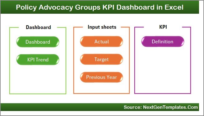
The Home Sheet acts as the index page.
It includes:
-
6 navigation buttons
-
Direct access to key worksheets
-
User-friendly layout
Therefore, instead of searching through sheets, users navigate quickly.
Click to Purchases Policy Advocacy Groups KPI Dashboard in Excel
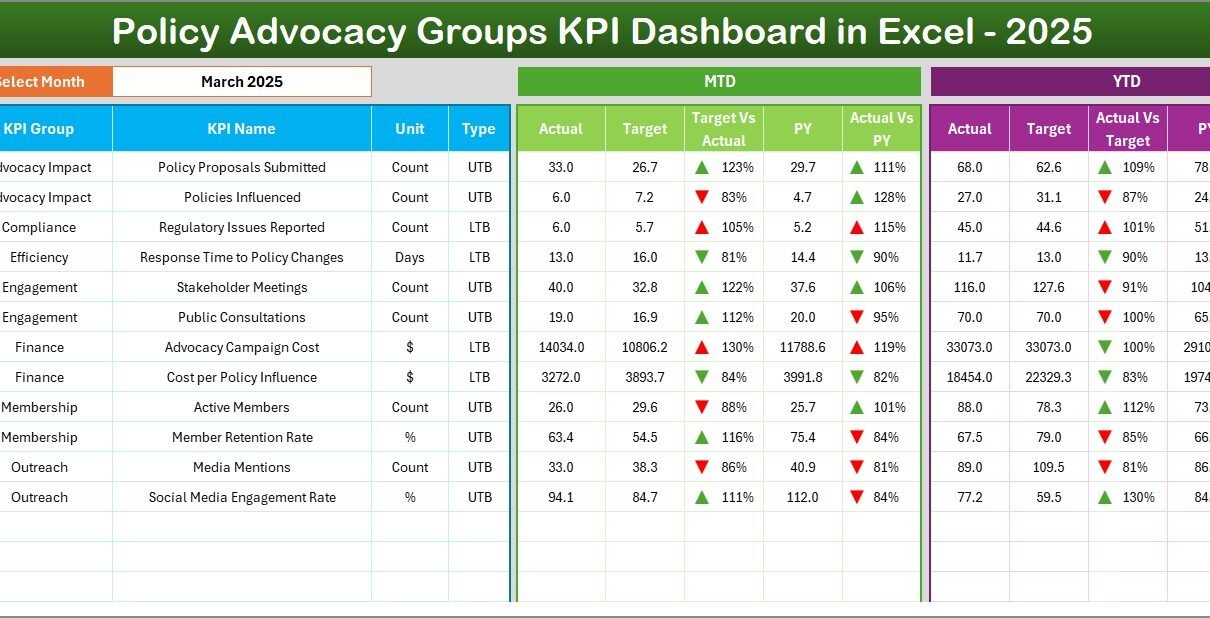
2️⃣ How Does the Main Dashboard Sheet Work?
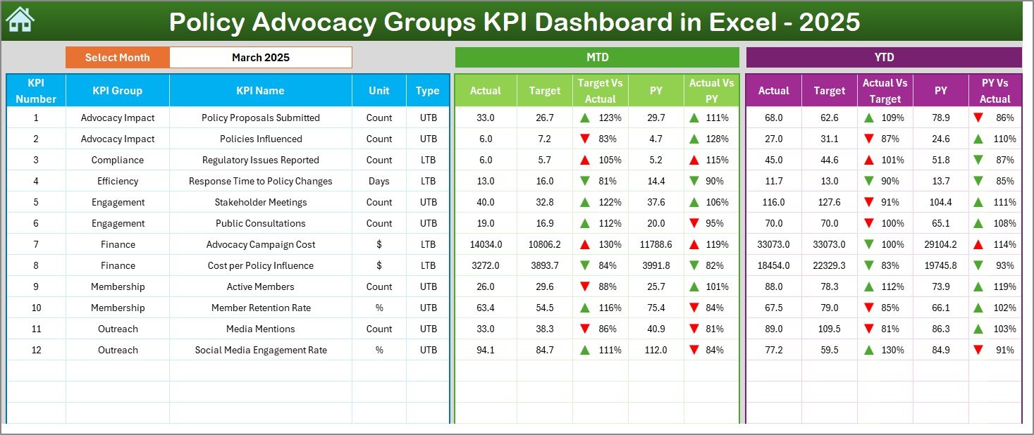
The Dashboard Sheet serves as the core of the system.
🔹 Month Selection
On cell D3, you can select a month from the drop-down. Once selected, the entire dashboard updates automatically.
Therefore, you can analyze monthly performance instantly.
🔹 MTD Performance Section
The dashboard shows:
-
MTD Actual
-
MTD Target
-
MTD Previous Year
-
Target vs Actual comparison
-
PY vs Actual comparison
-
Conditional formatting arrows
These arrows indicate performance direction clearly.
🔹 YTD Performance Section
The YTD section includes:
-
YTD Actual
-
YTD Target
-
YTD Previous Year
-
Target vs Actual
-
PY vs Actual
-
Visual performance indicators
Therefore, you can review both short-term and long-term performance in one view.
Click to Purchases Policy Advocacy Groups KPI Dashboard in Excel
3️⃣ What Is the KPI Trend Sheet?
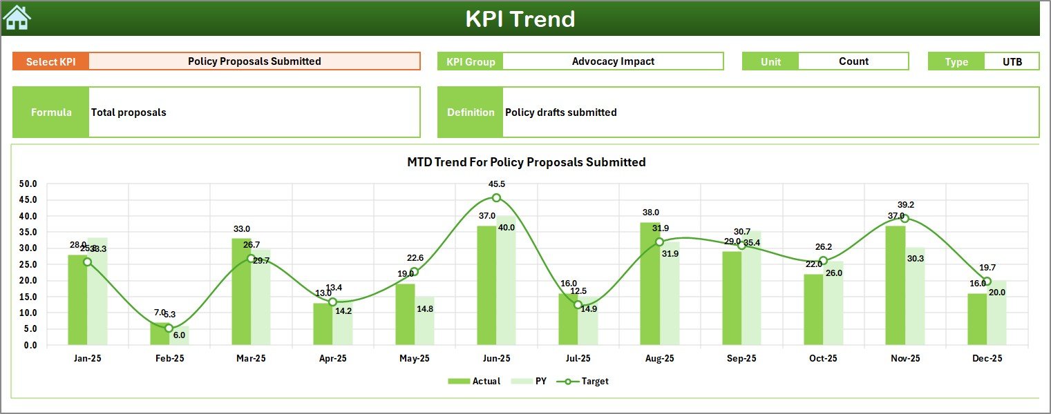
The KPI Trend Sheet provides deeper analysis.
On cell C3, you can select a KPI Name from the drop-down list.
Once selected, the sheet displays:
-
KPI Group
-
Unit
-
Type (Lower the Better / Upper the Better)
-
Formula
-
KPI Definition
Additionally, it shows:
-
MTD Trend Chart (Actual, Target, PY)
-
YTD Trend Chart (Actual, Target, PY)
Therefore, instead of viewing static numbers, you see performance trends over time.
For example:
If social media engagement declines for three consecutive months, the trend chart highlights the decline immediately.
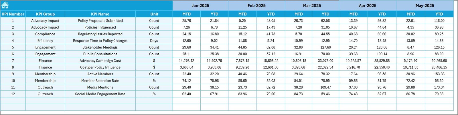
4️⃣ How Do You Enter Actual Numbers?
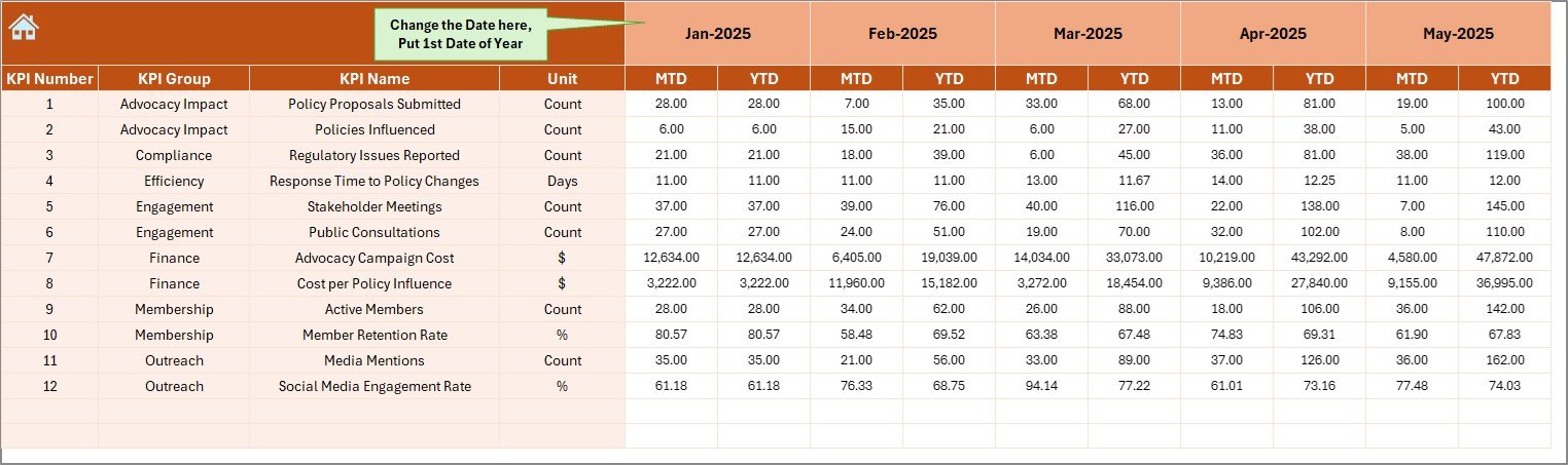
The Actual Numbers Input Sheet allows you to enter performance data.
Key steps:
-
Set the first month of the year in cell E1
-
Enter MTD and YTD actual numbers
-
Maintain structured format
Once updated, the dashboard refreshes automatically.
Therefore, data entry remains simple and organized.
5️⃣ What Is the Target Sheet?
The Target Sheet stores monthly KPI targets.
Here, you enter:
-
Monthly MTD target
-
YTD target
Clear target entry ensures accurate evaluation.
Moreover, it supports accountability across teams.
Click to Purchases Policy Advocacy Groups KPI Dashboard in Excel
6️⃣ Why Use the Previous Year Number Sheet?
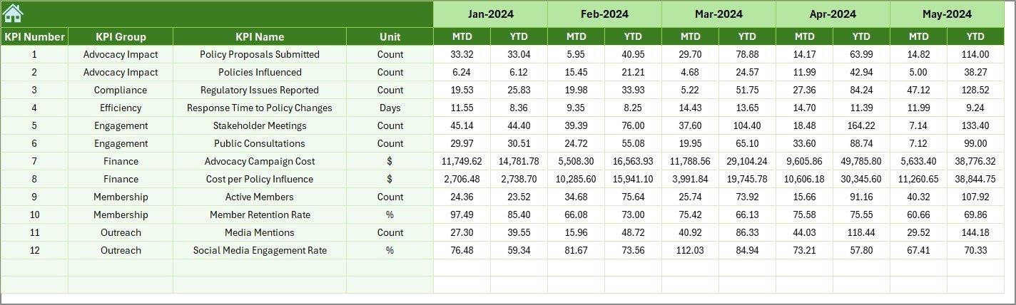
The Previous Year Number Sheet stores last year’s data.
You enter:
-
Previous Year MTD numbers
-
Previous Year YTD numbers
This allows year-over-year comparison.
Therefore, you measure growth and improvement effectively.
7️⃣ What Is the KPI Definition Sheet?
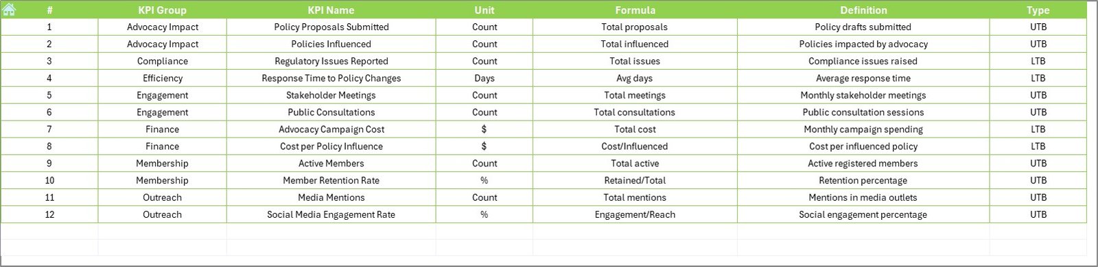
The KPI Definition Sheet defines each KPI clearly.
You enter:
-
KPI Name
-
KPI Group
-
Unit
-
Formula
-
Definition
This sheet improves clarity and ensures consistent reporting.
Which KPIs Can Policy Advocacy Groups Track?
Advocacy groups can track many important KPIs, such as:
-
Campaign Reach
-
Stakeholder Engagement Rate (%)
-
Petition Signatures Collected
-
Policy Meetings Conducted
-
Media Mentions
-
Social Media Engagement Rate
-
Fundraising Amount
-
Volunteer Participation Rate
-
Policy Adoption Rate
-
Event Attendance
For example, if stakeholder engagement drops below target, leadership can adjust outreach strategies immediately.
Click to Purchases Policy Advocacy Groups KPI Dashboard in Excel
Advantages of Policy Advocacy Groups KPI Dashboard in Excel
Let us explore the major benefits.
1️⃣ Centralized Performance Tracking
You store all KPIs in one structured file.
2️⃣ Instant Monthly Insights
Select a month and view updated performance immediately.
3️⃣ Clear Visual Indicators
Up and down arrows show performance direction clearly.
4️⃣ Year-over-Year Comparison
You compare current results with last year’s performance.
5️⃣ Better Strategic Planning
You identify gaps and adjust campaign strategies.
6️⃣ Improved Donor Transparency
Clear KPI reporting builds trust with stakeholders.
7️⃣ Easy Customization
You can add or modify KPIs easily in Excel.
Best Practices for the Policy Advocacy Groups KPI Dashboard
To maximize results, follow these best practices.
1️⃣ Update Data Monthly
Enter actual numbers at the end of each month.
2️⃣ Define KPIs Clearly
Document formulas and definitions properly.
3️⃣ Set Realistic Targets
Avoid unrealistic targets to maintain credibility.
4️⃣ Analyze Trends Regularly
Review KPI Trend sheet consistently.
5️⃣ Ensure Data Accuracy
Double-check numbers before entry.
6️⃣ Share Dashboard with Leadership
Use dashboard during board meetings for clear reporting.
7️⃣ Align KPIs with Strategic Goals
Track KPIs that directly support advocacy objectives.
How Does This Dashboard Improve Advocacy Impact?
This dashboard improves impact because:
-
It increases visibility
-
It strengthens accountability
-
It supports data-driven strategy
-
It highlights performance gaps early
-
It improves donor communication
Consequently, advocacy groups operate more effectively.
Click to Purchases Policy Advocacy Groups KPI Dashboard in Excel
Who Can Benefit from This Dashboard?
This dashboard benefits:
-
Policy Advocacy Groups
-
Non-Profit Organizations
-
NGOs
-
Social Impact Organizations
-
Campaign Managers
-
Fundraising Teams
-
Research Organizations
Moreover, any mission-driven organization can adapt this dashboard.
Conclusion
Advocacy work demands measurable impact. However, manual tracking slows progress and reduces clarity.
The Policy Advocacy Groups KPI Dashboard in Excel provides a structured and practical solution. It centralizes data, simplifies reporting, and improves transparency.
Furthermore, it supports both short-term performance tracking and long-term strategic evaluation.
If you want to track advocacy impact clearly and professionally, this dashboard offers the right solution.
Click to Purchases Policy Advocacy Groups KPI Dashboard in Excel
Frequently Asked Questions with Answers
1️⃣ Do I need advanced Excel skills to use this dashboard?
No. You only need basic Excel knowledge.
2️⃣ Can I customize KPIs?
Yes. You can modify or add KPIs in the KPI Definition sheet.
3️⃣ How often should I update the dashboard?
You should update it monthly.
4️⃣ Can small NGOs use this dashboard?
Yes. It works for both small and large organizations.
5️⃣ Does the dashboard compare previous year performance?
Yes. It includes PY comparison for both MTD and YTD.
6️⃣ Can I present this dashboard to donors?
Yes. The structured format makes it ideal for reporting.
Click to Purchases Policy Advocacy Groups KPI Dashboard in Excel
Visit our YouTube channel to learn step-by-step video tutorials