Solar energy continues to grow rapidly across the world. Governments, private investors, and renewable energy companies invest heavily in solar parks because they want clean, scalable, and cost-effective electricity generation. However, managing solar parks efficiently requires continuous performance monitoring.
Without proper tracking, operators struggle to identify production losses, efficiency gaps, and operational risks. As a result, decision-making becomes slow and reactive.
Therefore, organizations need a structured analytics solution that converts raw operational data into actionable insights.
The Solar Parks KPI Dashboard in Power BI solves this challenge. It provides a ready-to-use, interactive dashboard that helps energy managers track performance indicators, compare targets versus actual results, and analyze trends using dynamic visuals.
In this detailed guide, you will learn:
- What a Solar Parks KPI Dashboard is
- Why solar park operators need KPI tracking
- Dashboard structure and features
- Data architecture using Excel
- Advantages of using Power BI dashboards
- Best practices for implementation
- Frequently asked questions
Click to buy Solar Parks KPI Dashboard in Power BI
What Is a Solar Parks KPI Dashboard in Power BI?
A Solar Parks KPI Dashboard in Power BI is an interactive analytics tool designed to monitor key performance indicators (KPIs) related to solar energy generation and operations.
Instead of analyzing multiple spreadsheets manually, this dashboard centralizes all KPI data into a single visual interface.
It allows users to:
- Track performance month-to-date (MTD) and year-to-date (YTD)
- Compare actual values with targets
- Evaluate performance against previous year results
- Identify underperforming KPIs instantly
- Drill into KPI definitions and formulas
Because the dashboard connects directly with an Excel data source, users can update performance numbers quickly without modifying the Power BI report structure.
Why Is KPI Tracking Important for Solar Parks?
Solar parks operate in dynamic environments. Weather conditions, equipment efficiency, maintenance schedules, and grid performance directly impact energy production.
Therefore, operators must monitor performance continuously.
Key Reasons KPI Monitoring Matters
- Ensures optimal energy generation
- Detects performance deviations early
- Supports predictive maintenance planning
- Improves return on investment (ROI)
- Enhances sustainability reporting
Moreover, KPI dashboards help management teams shift from reactive operations to proactive decision-making.
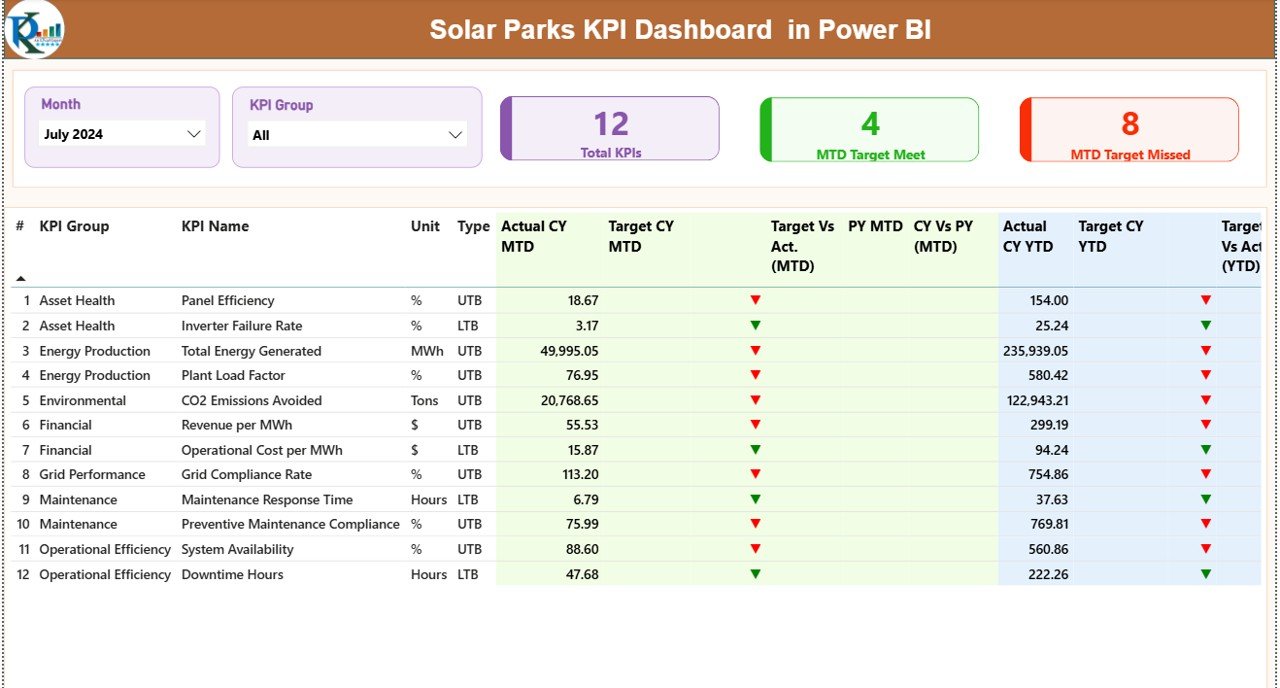
Overview of the Solar Parks KPI Dashboard Structure
The dashboard contains three interactive pages inside the Power BI Desktop file. Each page serves a specific analytical purpose.
Summary Page – The Main Control Center
The Summary Page acts as the primary monitoring interface.
At the top, users find slicers that allow dynamic filtering:
- Month slicer
- KPI Group slicer
These filters instantly update the entire dashboard.
KPI Performance Cards
The dashboard displays three key performance cards:
- Total KPI Count
- MTD Target Meet Count
- MTD Target Missed Count
These cards provide a quick health overview of solar park performance.
Detailed KPI Table
Below the cards, a comprehensive KPI table presents detailed metrics.
Columns Included:
- KPI Number – Sequential KPI identifier
- KPI Group – KPI category classification
- KPI Name – Performance indicator name
- Unit – Measurement unit
- Type – UTB (Upper the Better) or LTB (Lower the Better)
Performance Metrics Displayed
The dashboard shows advanced comparisons:
MTD Metrics
- Actual CY MTD
- Target CY MTD
- MTD Status Icon (▲ Green / ▼ Red)
- Target vs Actual %
- Previous Year MTD
- CY vs PY Comparison %
YTD Metrics
- Actual CY YTD
- Target CY YTD
- YTD Status Icon
- Target vs Actual %
- Previous Year YTD
- CY vs PY Comparison %
Because visual indicators appear instantly, users quickly identify performance trends.
Click to buy Solar Parks KPI Dashboard in Power BI
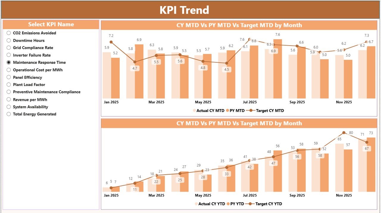
KPI Trend Page – Performance Over Time
While the summary page provides snapshots, the KPI Trend Page focuses on performance evolution.
This page includes:
- Two combo charts
- KPI selection slicer
Users can select any KPI from the slicer and instantly analyze:
- Current Year Actual values
- Previous Year performance
- Target comparisons
- MTD and YTD trends
Consequently, managers understand whether performance improves or declines over time.
Trend analysis helps teams answer important questions:
- Is energy generation improving monthly?
- Are targets realistic?
- Does seasonal variation affect output?
Click to buy Solar Parks KPI Dashboard in Power BI
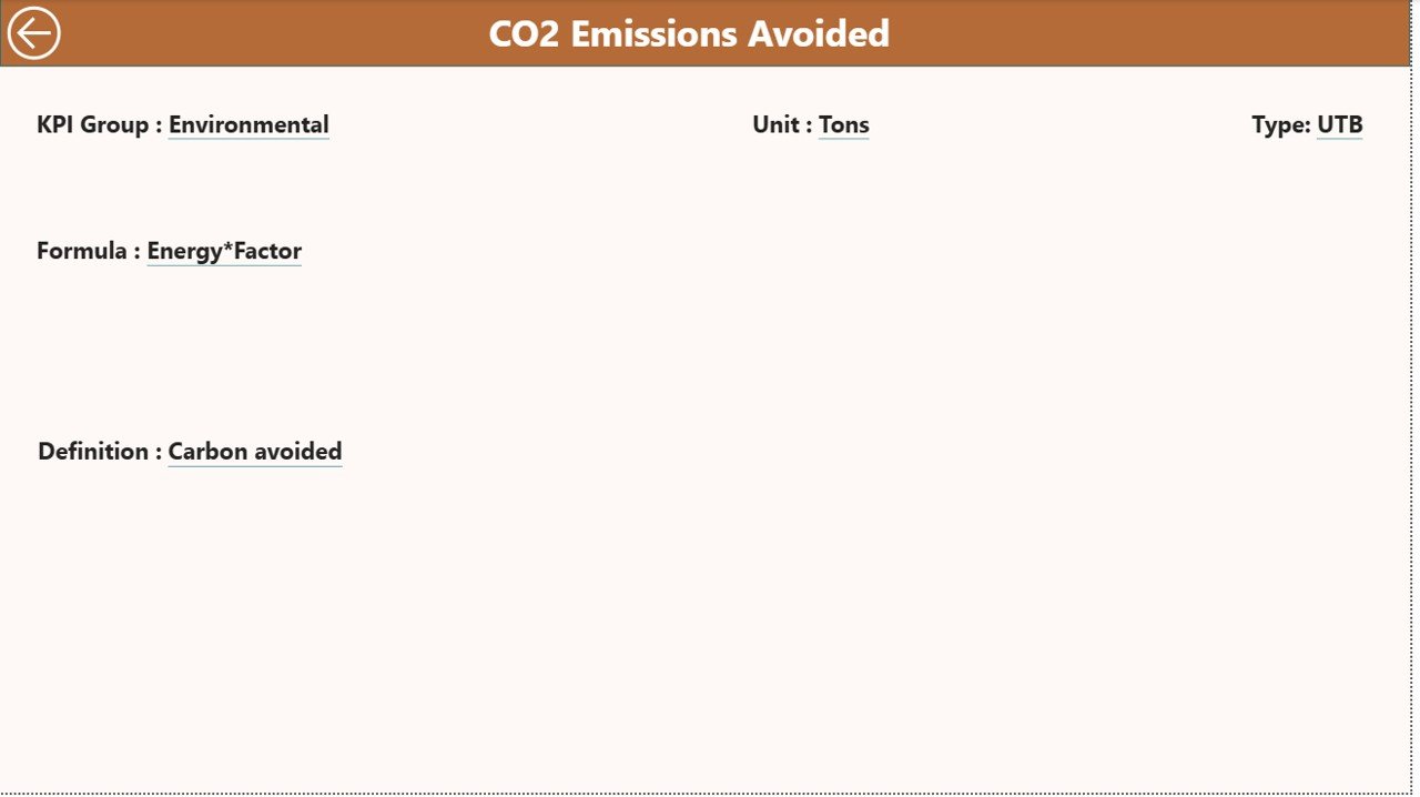
KPI Definition Page – Drill-Through Intelligence
The KPI Definition Page works as a hidden drill-through page.
From the Summary Page, users can drill into detailed KPI information, including:
- KPI Formula
- KPI Definition
- Measurement logic
- KPI Type classification
This feature ensures transparency because users understand how each metric calculates.
A back button allows quick navigation to the main page.
Click to buy Solar Parks KPI Dashboard in Power BI
Excel Data Source Structure
The Solar Parks KPI Dashboard uses Excel as its data backend. This design makes updates simple and user-friendly.
Users only need to maintain three worksheets.
Input_Actual Sheet
This sheet captures actual performance values.
Required Fields:
- KPI Name
- Month (first date of month)
- MTD Value
- YTD Value
Users update monthly performance numbers here.
Click to buy Solar Parks KPI Dashboard in Power BI
Input_Target Sheet
This sheet stores target values.
Fields Include:
- KPI Name
- Month
- Target MTD
- Target YTD
Because targets remain separate from actual data, analysis stays clean and flexible.
KPI Definition Sheet
This sheet defines KPI logic.
Columns:
- KPI Number
- KPI Group
- KPI Name
- Unit
- Formula
- Definition
- Type (UTB or LTB)
This structured setup enables drill-through analysis inside Power BI.
How Does the Dashboard Calculate Performance?
The dashboard uses simple but powerful formulas.
Target vs Actual (MTD/YTD)
Actual ÷ Target
This calculation measures performance achievement percentage.
Current Year vs Previous Year
Current Year Value ÷ Previous Year Value
This comparison highlights growth trends.
Because Power BI calculates automatically, users avoid manual errors.
Advantages of Solar Parks KPI Dashboard in Power BI
Centralized Performance Monitoring
You track all KPIs in one place instead of multiple reports.
Real-Time Insights
As soon as Excel data updates, visuals refresh automatically.
Faster Decision Making
Visual indicators highlight issues instantly.
Interactive Analysis
Filters and slicers allow flexible exploration.
Historical Comparison
You compare performance across years easily.
Improved Operational Efficiency
Managers identify production losses quickly.
Scalable Solution
You can add new KPIs without redesigning the dashboard.
How Does Power BI Improve Solar Park Management?
Power BI transforms raw solar data into meaningful insights.
Key Benefits
- Interactive dashboards improve visibility.
- Automation reduces reporting time.
- Visualization simplifies complex data.
- Drill-through analysis increases transparency.
Furthermore, Power BI supports renewable energy reporting standards, which helps organizations maintain compliance.
Who Can Benefit from This Dashboard?
Many professionals use this dashboard effectively.
Primary Users
- Solar Park Operators
- Renewable Energy Companies
- Energy Analysts
- Plant Managers
- Sustainability Officers
- Operations Teams
- Investors and Stakeholders
Because the dashboard remains easy to use, both technical and non-technical users benefit.
How to Use the Solar Parks KPI Dashboard Step-by-Step?
Step 1: Update Excel Data
Enter actual and target values monthly.
Step 2: Refresh Power BI
Click refresh to update visuals.
Step 3: Select Month
Use slicers to filter analysis.
Step 4: Analyze KPI Status
Check icons and percentages.
Step 5: Review Trends
Open KPI Trend page for deeper insights.
Step 6: Drill Into Definitions
View KPI formulas when needed.
This workflow ensures consistent monitoring.
Best Practices for Solar Parks KPI Dashboard
To maximize dashboard value, follow these best practices.
Define Clear KPIs
Choose measurable and actionable KPIs.
Maintain Data Accuracy
Update Excel sheets regularly.
Standardize KPI Definitions
Ensure teams interpret KPIs consistently.
Review Trends Monthly
Do not rely only on snapshot metrics.
Use Visual Indicators Wisely
Focus attention on critical KPIs.
Align KPIs with Business Goals
Track metrics that support energy output and profitability.
Automate Data Collection
Integrate SCADA or monitoring systems when possible.
Challenges Without a KPI Dashboard
Organizations that avoid dashboards often face:
- Data scattered across files
- Delayed reporting
- Poor visibility into issues
- Manual calculation errors
- Slow decision cycles
Therefore, adopting Power BI dashboards becomes essential for modern solar operations.
Future of Solar Analytics with Power BI
Solar analytics continues evolving rapidly.
Future dashboards may include:
- AI-based forecasting
- Predictive maintenance alerts
- IoT sensor integration
- Real-time weather impact analysis
- Automated anomaly detection
Power BI already supports these innovations through advanced integrations.
Conclusion
Solar parks demand continuous monitoring to achieve maximum efficiency and profitability. However, manual reporting cannot keep pace with modern renewable energy operations.
The Solar Parks KPI Dashboard in Power BI provides a powerful yet simple solution. It centralizes KPI tracking, simplifies performance comparisons, and enables data-driven decisions through interactive visuals.
Because the dashboard connects with Excel, organizations implement it quickly without complex infrastructure.
Ultimately, this dashboard helps solar operators move toward smarter, faster, and more sustainable energy management.
Frequently Asked Questions (FAQs)
- What is a Solar Parks KPI Dashboard?
It is a Power BI dashboard that tracks solar park performance using KPIs such as energy output, targets, and yearly comparisons.
- Do I need advanced Power BI skills to use it?
No. You only update Excel data and refresh the dashboard.
- Can I add new KPIs?
Yes. You can extend the KPI Definition sheet and update visuals accordingly.
- What does UTB and LTB mean?
UTB means Upper the Better, while LTB means Lower the Better.
- How often should I update data?
You should update KPI data monthly or as frequently as required.
- Can this dashboard work for multiple solar parks?
Yes. You can expand datasets to include multiple locations.
- Why compare with previous year data?
Year-over-year comparison reveals growth trends and seasonal performance patterns.
- Is Excel mandatory as a data source?
This version uses Excel, but Power BI can connect to databases as well.
Watch the step-by-step video tutorial:
Click to buy Solar Parks KPI Dashboard in Power BI
Visit our YouTube channel to learn step-by-step video tutorials