Infrastructure projects require precise monitoring, accurate reporting, and consistent performance tracking. However, managing pipeline infrastructure projects using scattered spreadsheets and manual reports often creates confusion and delays. As a result, managers struggle to evaluate project efficiency, monitor operational KPIs, and identify potential risks in time.
Therefore, organizations increasingly use structured KPI dashboards to monitor pipeline infrastructure performance effectively. That is exactly where the Pipeline Infrastructure KPI Dashboard in Excel becomes a powerful analytical solution.
This ready-to-use Excel dashboard helps infrastructure teams track project progress, operational performance, cost efficiency, and safety metrics in a centralized reporting system. Instead of reviewing multiple files, managers can analyze pipeline infrastructure KPIs from a single interactive dashboard.
In this detailed guide, you will learn everything about the Pipeline Infrastructure KPI Dashboard in Excel, including its features, benefits, implementation methods, and best practices.
Click to buy Pipeline Infrastructure KPI Dashboard in Excel
What is a Pipeline Infrastructure KPI Dashboard in Excel?
A Pipeline Infrastructure KPI Dashboard in Excel is a structured performance monitoring tool built in Microsoft Excel that helps organizations track key performance indicators related to pipeline construction, maintenance, safety, and operational efficiency.
Instead of collecting information manually from different reports, this dashboard consolidates all performance metrics into one centralized Excel interface. Consequently, project managers, engineers, and decision-makers can monitor pipeline infrastructure performance in real time.
The dashboard tracks important metrics such as:
- Pipeline construction progress
- Maintenance efficiency
- Downtime analysis
- Safety compliance
- Project cost performance
- Operational productivity
Because Excel supports automation, formulas, and conditional formatting, the dashboard dynamically updates performance insights whenever new data gets entered.
Why Do Pipeline Infrastructure Projects Need a KPI Dashboard?
Pipeline infrastructure projects involve complex operations such as construction planning, safety management, material logistics, maintenance scheduling, and regulatory compliance. Therefore, teams require a structured monitoring system.
Without a KPI dashboard, organizations face several operational challenges.
Common Challenges in Pipeline Infrastructure Monitoring
- Fragmented data stored across multiple spreadsheets
- Delayed reporting and slow decision making
- Difficulty tracking project progress and costs
- Limited visibility into maintenance performance
- Lack of standardized KPI measurement
However, when organizations implement a KPI dashboard in Excel, they gain a centralized reporting platform that simplifies infrastructure performance monitoring.
As a result, management teams can identify inefficiencies early and make faster decisions.
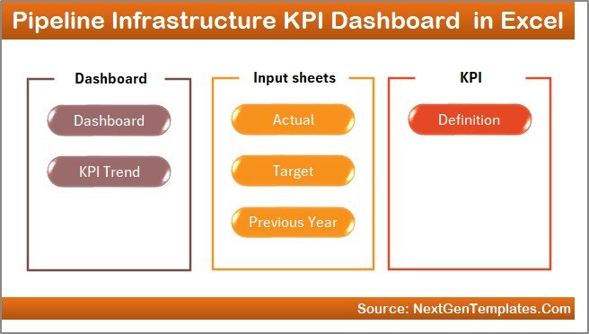
Key Features of the Pipeline Infrastructure KPI Dashboard in Excel
This Pipeline Infrastructure KPI Dashboard in Excel includes seven structured worksheets that work together to deliver comprehensive performance monitoring.
Each sheet performs a specific function that helps transform raw data into meaningful insights.
Summary Page – Navigation Hub of the Dashboard
The Summary Page works as the main navigation interface of the dashboard.
Instead of searching through multiple sheets, users can quickly jump to any worksheet using the navigation buttons available on this page.
Key Features of the Summary Page
- Acts as the index page of the dashboard
- Contains six navigation buttons
- Allows quick access to all worksheets
- Improves dashboard usability and navigation
- Saves time when switching between reports
Therefore, users can navigate the entire dashboard smoothly without wasting time searching for worksheets.
Click to buy Pipeline Infrastructure KPI Dashboard in Excel
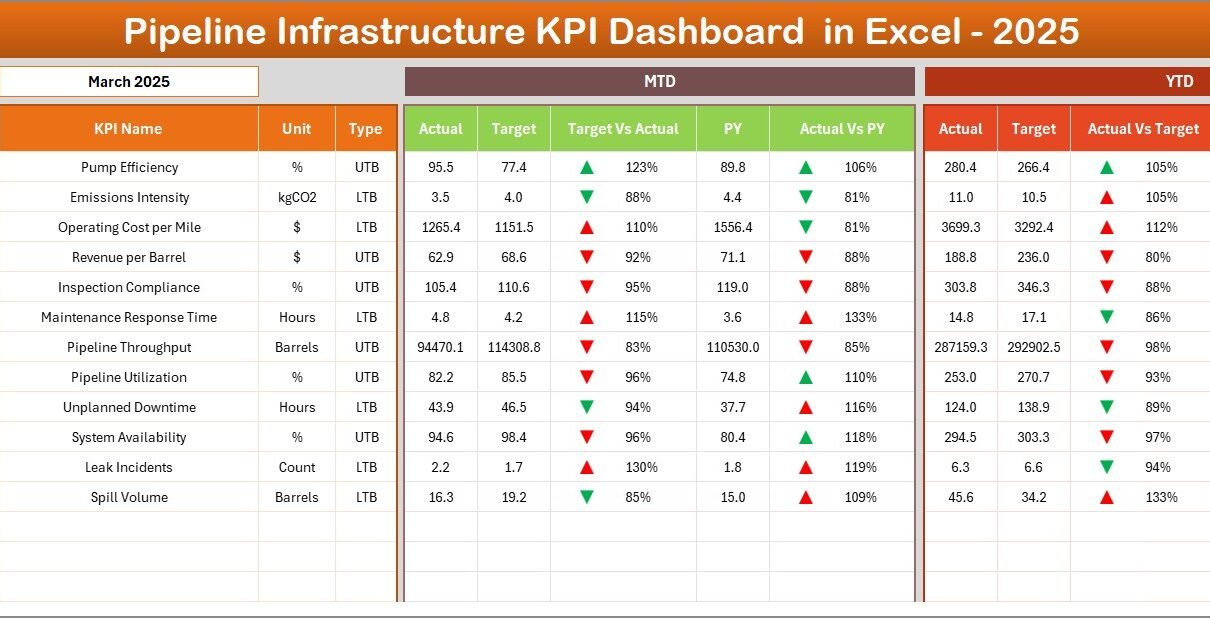
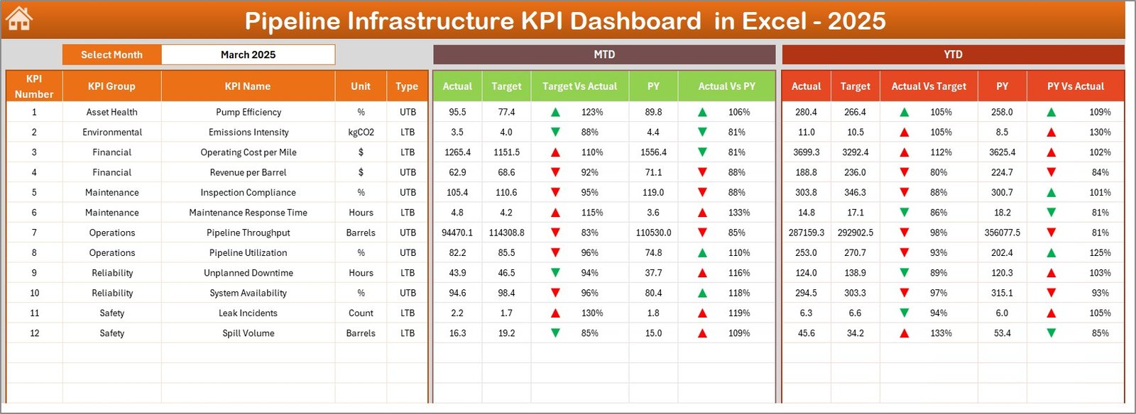
Dashboard Sheet – Main KPI Performance Monitoring Page
The Dashboard Sheet represents the core of the Pipeline Infrastructure KPI Dashboard.
This page displays all important KPI performance indicators in a structured format so managers can evaluate pipeline infrastructure performance quickly.
Month Selection Feature
At cell D3, users can select a specific month from the dropdown menu. Once a month gets selected, the entire dashboard automatically updates.
As a result, users can analyze monthly performance instantly.
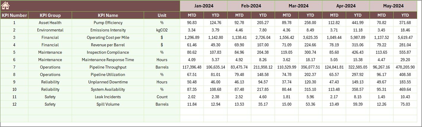
Metrics Displayed on the Dashboard
The dashboard displays the following key metrics:
MTD Performance
- MTD Actual
- MTD Target
- MTD Previous Year
- Target vs Actual comparison
- Previous Year vs Actual comparison
YTD Performance
- YTD Actual
- YTD Target
- YTD Previous Year
- Target vs Actual comparison
- Previous Year vs Actual comparison
Conditional Formatting Indicators
To make the dashboard visually intuitive, it includes conditional formatting indicators such as:
- Up arrows for positive performance
- Down arrows for negative performance
- Percentage variance indicators
Therefore, managers can immediately identify performance improvements or declines.
Click to buy Pipeline Infrastructure KPI Dashboard in Excel
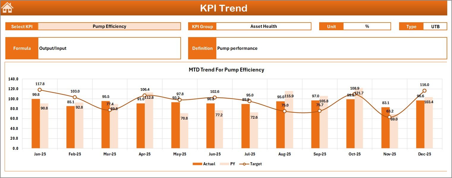
Trend Sheet – KPI Performance Trend Analysis
The Trend Sheet provides detailed performance trend analysis for each KPI.
Instead of analyzing raw numbers, users can evaluate performance trends using interactive charts.
KPI Selection Feature
Users can select the KPI from the dropdown located at cell C3.
Once selected, the sheet displays detailed information related to that KPI.
Information Displayed on the Trend Sheet
The sheet displays:
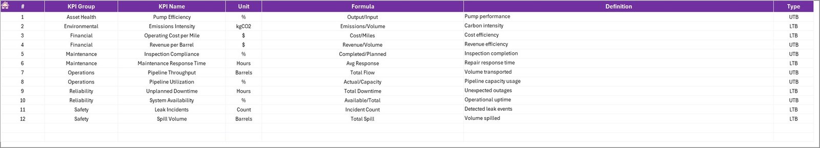
- KPI Group
- KPI Unit
- KPI Type (Lower the Better or Upper the Better)
- KPI Formula
- KPI Definition
Trend Charts Available
This sheet includes two main charts:
- MTD Trend Chart
- YTD Trend Chart
Each chart compares:
- Actual values
- Target values
- Previous year values
As a result, managers can evaluate KPI performance over time and identify patterns quickly.
Click to buy Pipeline Infrastructure KPI Dashboard in Excel
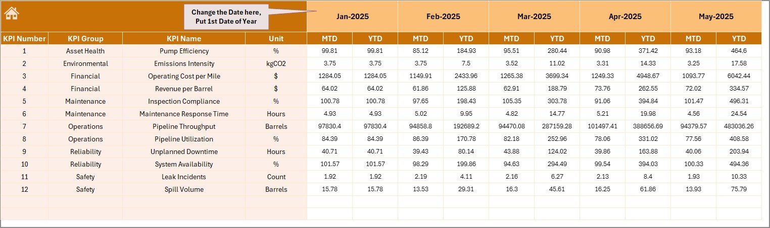
Actual Numbers Input Sheet – Data Entry for Current Performance
The Actual Numbers Input Sheet serves as the main data entry interface for entering operational performance data.
Users must enter the actual KPI values in this sheet for both MTD and YTD performance.
Key Features
- Structured input format for KPIs
- Separate fields for MTD and YTD numbers
- Monthly data tracking
Month Setup
Users must define the first month of the year in cell E1. Once configured, the system automatically updates the monthly timeline.
Therefore, users can maintain consistent monthly performance records.
Click to buy Pipeline Infrastructure KPI Dashboard in Excel
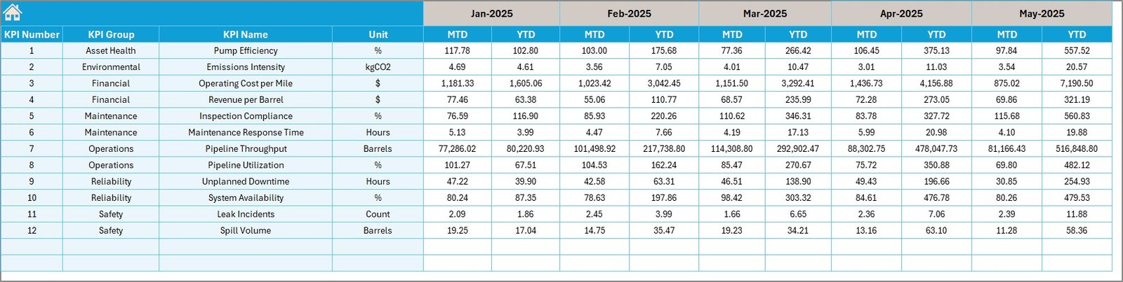
Target Sheet – KPI Performance Targets
The Target Sheet allows organizations to define performance targets for each KPI.
Managers must enter monthly KPI targets in this sheet.
Data to Enter in the Target Sheet
- KPI name
- Monthly MTD target
- Monthly YTD target
Because targets determine performance benchmarks, this sheet helps organizations measure operational efficiency accurately.
Click to buy Pipeline Infrastructure KPI Dashboard in Excel
Previous Year Numbers Sheet – Historical Performance Comparison
The Previous Year Numbers Sheet stores historical KPI data.
Users must enter the same KPI values for the previous year.
Why This Sheet Matters
Historical data enables organizations to:
- Compare performance year over year
- Identify operational improvements
- Detect long-term trends
Consequently, management teams can evaluate whether operational performance improves or declines over time.
Click to buy Pipeline Infrastructure KPI Dashboard in Excel
KPI Definition Sheet – KPI Documentation and Structure
The KPI Definition Sheet acts as the documentation center of the dashboard.
This sheet defines the structure and meaning of every KPI used in the dashboard.
Information Stored in This Sheet
Each KPI includes:
- KPI Name
- KPI Group
- KPI Unit
- KPI Formula
- KPI Definition
Because every KPI gets clearly defined, the dashboard ensures consistent measurement across the organization.
Click to buy Pipeline Infrastructure KPI Dashboard in Excel
Advantages of Pipeline Infrastructure KPI Dashboard in Excel
Organizations gain several operational advantages when they implement this KPI dashboard.
- Centralized KPI Monitoring
Instead of managing multiple reports, organizations monitor all infrastructure KPIs in one dashboard.
- Faster Decision Making
Because the dashboard provides real-time insights, managers can quickly identify performance issues.
- Improved Project Visibility
Pipeline construction teams can monitor project progress, maintenance metrics, and operational efficiency.
- Easy Performance Comparison
The dashboard allows:
- Target vs Actual comparison
- Previous Year vs Current Year comparison
Therefore, teams understand performance gaps quickly.
- Interactive Data Analysis
Because the dashboard includes dropdown filters and charts, users can interact with data easily.
- Simple Excel-Based Implementation
Organizations do not require advanced BI tools. Instead, they can run the dashboard entirely inside Excel.
How Does the Pipeline Infrastructure KPI Dashboard Improve Project Management?
Pipeline infrastructure projects require continuous monitoring.
However, manual reporting often creates delays and errors. Therefore, organizations adopt KPI dashboards to improve project management.
This dashboard helps organizations:
- Monitor infrastructure construction progress
- Track operational performance metrics
- Evaluate maintenance efficiency
- Identify safety compliance issues
- Monitor cost performance
Consequently, project managers gain better operational control.
Best Practices for the Pipeline Infrastructure KPI Dashboard in Excel
Organizations must follow several best practices to ensure maximum dashboard effectiveness.
- Define Clear KPIs
Organizations should clearly define each KPI including:
- KPI formula
- KPI unit
- KPI measurement frequency
- Maintain Accurate Data
Teams must update the Actual Numbers Input Sheet regularly.
Accurate data ensures reliable insights.
- Review KPIs Monthly
Managers should review dashboard performance every month to detect operational trends.
- Set Realistic Targets
Targets must remain achievable and aligned with project goals.
- Use Historical Data for Analysis
Comparing current performance with previous year data helps identify improvement areas.
- Standardize KPI Definitions
The KPI Definition Sheet should remain consistent across departments.
Who Should Use the Pipeline Infrastructure KPI Dashboard?
Many professionals involved in infrastructure projects can benefit from this dashboard.
Primary Users
- Infrastructure project managers
- Pipeline construction companies
- Oil & gas pipeline operators
- Utility infrastructure organizations
- Engineering firms
Secondary Users
- Infrastructure consultants
- Operations managers
- Maintenance supervisors
- Infrastructure analysts
Therefore, the dashboard becomes a valuable decision-making tool for infrastructure management.
How to Implement the Pipeline Infrastructure KPI Dashboard in Excel?
Implementing the dashboard requires a few simple steps.
Step 1 – Define KPIs
First, list all pipeline infrastructure KPIs such as:
- Pipeline installation progress
- Maintenance efficiency
- Cost performance
- Safety compliance
Step 2 – Enter KPI Definitions
Next, document each KPI in the KPI Definition Sheet.
Step 3 – Set Monthly Targets
After that, enter KPI targets in the Target Sheet.
Step 4 – Input Historical Data
Then, add previous year numbers for comparison.
Step 5 – Enter Actual Data
Update monthly performance data in the Actual Numbers Input Sheet.
Step 6 – Analyze Dashboard Insights
Finally, analyze performance using the dashboard charts and indicators.
Conclusion
Pipeline infrastructure projects require constant monitoring to ensure operational efficiency, safety compliance, and cost control. However, traditional reporting methods often create fragmented data and slow decision making.
The Pipeline Infrastructure KPI Dashboard in Excel solves this challenge by providing a centralized, interactive, and easy-to-use performance monitoring system.
Because this dashboard integrates KPI tracking, target comparison, trend analysis, and historical benchmarking, it allows infrastructure teams to evaluate operational performance effectively.
As a result, project managers can make faster decisions, detect performance gaps early, and improve pipeline infrastructure efficiency.
Therefore, organizations that implement structured KPI dashboards gain better visibility, improved project control, and stronger operational outcomes.
Frequently Asked Questions (FAQs)
What is a Pipeline Infrastructure KPI Dashboard?
A Pipeline Infrastructure KPI Dashboard is an Excel-based performance monitoring tool that tracks key metrics related to pipeline construction, maintenance, and operational efficiency.
Why should companies use a KPI dashboard for pipeline infrastructure?
Companies use KPI dashboards because they provide centralized performance tracking, faster reporting, and improved decision-making capabilities.
Can this dashboard work for oil and gas pipeline projects?
Yes. The dashboard works effectively for oil and gas pipeline infrastructure, utility pipelines, and large engineering projects.
Do users need advanced Excel knowledge to use the dashboard?
No. Because the dashboard includes structured worksheets and dropdown selections, users can easily operate it with basic Excel knowledge.
How often should organizations update the KPI dashboard?
Organizations should update the dashboard monthly. However, some operational KPIs may require weekly updates.
Can organizations customize this KPI dashboard?
Yes. Organizations can customize KPIs, formulas, charts, and targets based on their operational requirements.
Visit our YouTube channel to learn step-by-step video tutorials
Watch the step-by-step video tutorial:
Click to buy Pipeline Infrastructure KPI Dashboard in Excel