Airports operate as critical transportation hubs that connect people, businesses, and economies worldwide. Every day, airport authorities manage complex infrastructure such as runways, terminals, cargo facilities, security systems, and passenger services. Because of this complexity, airport management teams must monitor operational performance carefully.
However, many airports still rely on manual reports and disconnected spreadsheets to track infrastructure performance. As a result, decision-makers often struggle to identify operational issues quickly, analyze KPI trends, and compare performance against targets.
Therefore, modern airport authorities increasingly adopt Power BI dashboards to monitor key performance indicators in real time.
One powerful solution is the Airport Infrastructure KPI Dashboard in Power BI. This interactive dashboard allows airport managers to track infrastructure performance, analyze operational KPIs, monitor trends, and compare performance with targets and previous years.
Instead of analyzing multiple reports, decision-makers can view all infrastructure KPIs in one centralized dashboard.
In this comprehensive guide, you will learn:
-
What an Airport Infrastructure KPI Dashboard in Power BI is
-
Why airports need KPI dashboards
-
Key features of the dashboard
-
How the Power BI dashboard works
-
Advantages of using Power BI for airport analytics
-
Best practices for implementation
-
Practical use cases for airport management
Let us explore the details.
Click to Purchases Airport Infrastructure KPI Dashboard in Power BI
What is an Airport Infrastructure KPI Dashboard in Power BI?
An Airport Infrastructure KPI Dashboard in Power BI is an interactive data visualization tool designed to monitor and analyze airport infrastructure performance.
It collects data from structured sources such as Excel files and transforms that data into interactive reports, charts, and KPI indicators.
Airport authorities must monitor many operational metrics such as:
-
Runway utilization
-
Passenger flow
-
Aircraft turnaround time
-
Gate utilization
-
Maintenance efficiency
-
Baggage handling performance
-
Safety incidents
-
Infrastructure maintenance costs
Power BI helps airport authorities visualize these metrics in an easy-to-understand format.
Therefore, managers can analyze performance trends quickly and make better operational decisions.
Click to Purchases Airport Infrastructure KPI Dashboard in Power BI
Why Do Airports Need a KPI Dashboard?
Airport infrastructure involves thousands of operational activities every day. Without a structured monitoring system, it becomes difficult to track performance.
A KPI dashboard provides a clear overview of operational metrics.
Key reasons airports need KPI dashboards
Better performance visibility
Airport managers can monitor infrastructure performance from one centralized dashboard.
Faster decision making
Visual reports allow decision-makers to identify performance issues quickly.
Target monitoring
The dashboard compares actual performance with targets.
Historical performance comparison
Managers can compare current performance with previous year performance.
Operational efficiency
When teams monitor KPIs regularly, they can detect operational inefficiencies early.
Click to Purchases Airport Infrastructure KPI Dashboard in Power BI
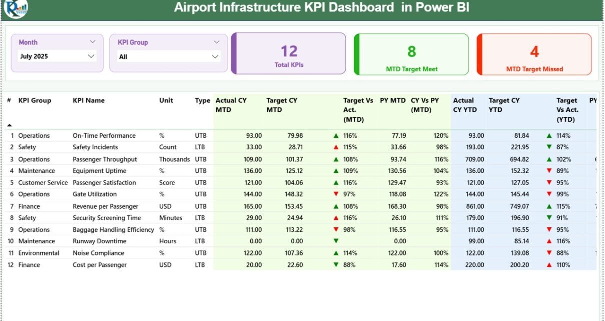
Key Features of Airport Infrastructure KPI Dashboard in Power BI
The Airport Infrastructure KPI Dashboard in Power BI is a ready-to-use analytical solution designed for airport performance monitoring.
The dashboard uses Excel as the data source and Power BI for visualization.
This dashboard contains three main report pages in the Power BI Desktop file.
1. Summary Page (Main Dashboard)
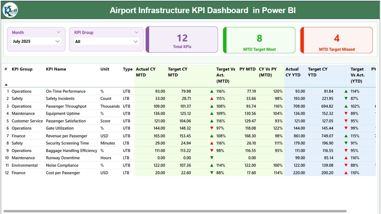
The Summary Page acts as the main performance monitoring dashboard.
It provides a high-level overview of all infrastructure KPIs.
Slicers for Data Filtering
At the top of the dashboard, two slicers help users filter the data.
-
Month slicer
-
KPI Group slicer
Users can filter the dashboard by month or KPI category.
As a result, the dashboard instantly updates all visuals.
KPI Performance Cards
The summary page displays three KPI cards:
-
Total KPIs Count
-
MTD Target Meet Count
-
MTD Target Missed Count
These cards provide a quick performance summary.
Managers can immediately see how many KPIs are performing well and how many require attention.
Detailed KPI Performance Table
Below the KPI cards, the dashboard shows a detailed KPI table with comprehensive performance information.
The table includes the following columns.
KPI Information Columns
KPI Number
The sequence number assigned to each KPI.
KPI Group
The category or group to which the KPI belongs.
KPI Name
The name of the performance indicator.
Unit
The measurement unit used for the KPI.
Type
Indicates the KPI type:
-
UTB (Upper the Better)
-
LTB (Lower the Better)
MTD Performance Metrics
The dashboard tracks Month-To-Date (MTD) performance.
Columns include:
-
Actual CY MTD (Current Year Actual)
-
Target CY MTD (Current Year Target)
KPI Status Indicator
The dashboard displays status icons:
-
▲ Green icon → KPI performing well
-
▼ Red icon → KPI performing below target
These icons help managers quickly identify performance issues.
Target vs Actual (MTD)
This metric calculates the percentage comparison between actual performance and target performance.
Formula:
Actual Number / Target Number
The percentage indicates whether the KPI meets the target.
Previous Year Comparison (MTD)
The dashboard also compares current performance with the previous year.
Columns include:
-
PY MTD (Previous Year Month-To-Date)
-
CY vs PY (MTD)
Formula used:
Current Year MTD / Previous Year MTD
This comparison helps airport managers evaluate growth or decline in performance.
YTD Performance Metrics
The dashboard also tracks Year-To-Date (YTD) performance.
Columns include:
-
Actual CY YTD
-
Target CY YTD
KPI Status Indicator for YTD
Similar to MTD, the dashboard shows icons indicating KPI performance status.
-
▲ Green icon → performance above target
-
▼ Red icon → performance below target
Target vs Actual (YTD)
This metric compares YTD actual performance with YTD target performance.
Formula:
Actual YTD / Target YTD
Previous Year Comparison (YTD)
The dashboard also compares YTD performance with the previous year.
Columns include:
-
PY YTD
-
CY vs PY (YTD)
Formula:
Current Year YTD / Previous Year YTD
Click to Purchases Airport Infrastructure KPI Dashboard in Power BI
2. KPI Trend Page
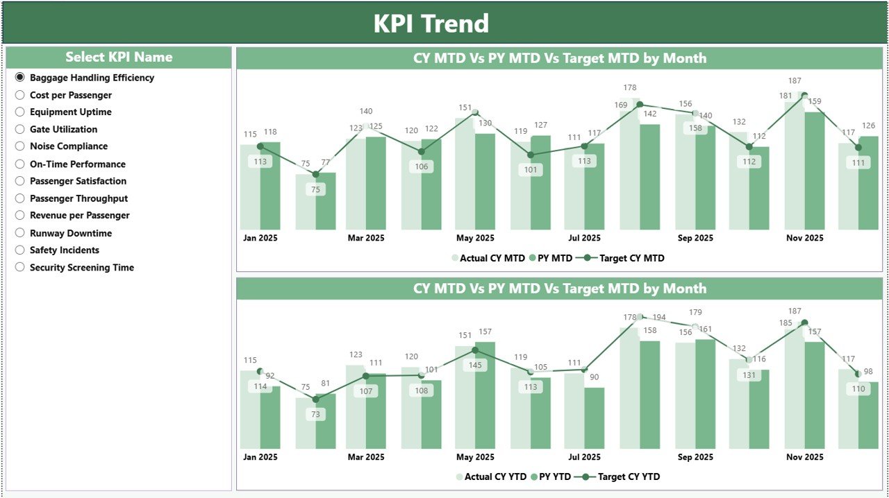
The KPI Trend Page focuses on performance trends for individual KPIs.
This page helps airport managers analyze KPI performance over time.
KPI Selection Slicer
A slicer on the left side allows users to select a specific KPI name.
Once selected, the dashboard displays trend analysis charts.
Trend Analysis Charts
The page includes two combo charts:
1️⃣ MTD Trend Chart
2️⃣ YTD Trend Chart
Each chart compares:
-
Current Year Actual
-
Previous Year
-
Target values
These visual comparisons help airport authorities analyze performance improvements or declines.
3. KPI Definition Page

The KPI Definition Page provides detailed information about each KPI.
This page acts as a drill-through page.
Users can drill through from the Summary Page to view detailed KPI definitions.
KPI Details Displayed
The page displays:
-
KPI Formula
-
KPI Definition
-
KPI Group
-
Unit of measurement
-
KPI Type
Because the page is hidden by default, users can access it through drill-through actions.
To return to the main dashboard, users can simply click the Back button available in the top-left corner.
Click to Purchases Airport Infrastructure KPI Dashboard in Power BI
Excel Data Source for the Dashboard
The Power BI dashboard uses Excel as the data source.
Users must fill three worksheets in the Excel file.
1. Input_Actual Sheet
This sheet captures the actual KPI performance values.
Users must enter the following fields:
-
KPI Name
-
Month (first date of the month)
-
MTD value
-
YTD value
2. Input_Target Sheet
This sheet stores the target values for each KPI.
Users must enter:
-
KPI Name
-
Month
-
Target MTD
-
Target YTD
3. KPI Definition Sheet
This sheet contains the KPI master information.
Users must fill the following details:
-
KPI Number
-
KPI Group
-
KPI Name
-
Unit
-
Formula
-
Definition
-
Type (LTB or UTB)
This information ensures KPI definitions remain consistent across the dashboard.
Click to Purchases Airport Infrastructure KPI Dashboard in Power BI
Advantages of Airport Infrastructure KPI Dashboard in Power BI
Using Power BI dashboards provides many benefits for airport management.
Real-Time Performance Monitoring
Managers can monitor infrastructure KPIs instantly.
Centralized Data Analysis
All KPIs appear in one interactive dashboard.
Better Visualization
Power BI charts and visuals make data easy to understand.
Faster Decision Making
Managers can identify operational issues quickly.
Trend Analysis
Historical data comparisons help identify performance patterns.
Scalable Analytics
Power BI dashboards can easily scale as airports grow.
Improved Reporting
Airport authorities can generate professional reports for stakeholders.
Best Practices for the Airport Infrastructure KPI Dashboard
Organizations should follow some best practices to maximize dashboard effectiveness.
Define KPIs clearly
Each KPI must include a clear formula and definition.
Maintain accurate data
Data accuracy is essential for reliable insights.
Update data regularly
Users should update KPI data monthly.
Align KPIs with strategic goals
KPIs must reflect operational objectives and infrastructure goals.
Use drill-through analysis
Detailed KPI definitions help users understand metrics better.
Train dashboard users
Teams should learn how to interpret dashboard insights effectively.
Click to Purchases Airport Infrastructure KPI Dashboard in Power BI
Use Cases of Airport Infrastructure KPI Dashboard
Airport authorities can use this dashboard in many operational scenarios.
Airport operations management
Monitor daily infrastructure performance.
Infrastructure planning
Analyze utilization trends and plan infrastructure expansion.
Maintenance management
Track equipment performance and maintenance KPIs.
Government reporting
Provide infrastructure performance reports to regulators.
Strategic planning
Analyze historical trends for long-term planning.
How Power BI Improves Airport Infrastructure Analytics
Power BI significantly enhances infrastructure performance monitoring.
First, it integrates multiple data sources.
Second, it visualizes complex operational data.
Third, it allows interactive filtering and drill-through analysis.
As a result, airport authorities gain deeper operational insights.
Therefore, Power BI becomes an essential tool for modern airport management.
Conclusion
Airport infrastructure management requires continuous monitoring of operational KPIs. However, traditional reporting methods often fail to provide real-time insights.
The Airport Infrastructure KPI Dashboard in Power BI provides a powerful and structured solution for airport performance monitoring.
This dashboard helps airport authorities:
-
Track infrastructure KPIs
-
Monitor MTD and YTD performance
-
Compare targets with actual results
-
Analyze historical trends
-
Improve operational decision-making
Because the dashboard integrates Excel data with Power BI visualization, organizations can implement it easily.
As a result, airport management teams gain better control over infrastructure performance and operational efficiency.
Click to Purchases Airport Infrastructure KPI Dashboard in Power BI
Frequently Asked Questions (FAQs)
What is an Airport Infrastructure KPI Dashboard in Power BI?
It is an interactive Power BI dashboard used to monitor airport infrastructure KPIs such as operational efficiency, performance targets, and historical trends.
What data source does this dashboard use?
The dashboard uses Excel files as the data source, where users enter KPI actual values, target values, and KPI definitions.
What are MTD and YTD in KPI dashboards?
-
MTD (Month-To-Date) shows KPI performance for the current month.
-
YTD (Year-To-Date) shows KPI performance from the beginning of the year.
Why should airports use Power BI dashboards?
Power BI dashboards provide interactive data visualization, real-time analytics, and centralized KPI monitoring.
Can this dashboard track multiple KPIs?
Yes. The dashboard can track multiple KPIs across different KPI groups.
Click to Purchases Airport Infrastructure KPI Dashboard in Power BI
Visit our YouTube channel to learn step-by-step video tutorials