Export Promotion Councils (EPCs) play a crucial role in strengthening a country’s export ecosystem. They help exporters expand international trade, identify new markets, support policy initiatives, and promote products globally. However, managing export performance across multiple sectors requires structured monitoring and clear insights.
Many organizations still rely on scattered spreadsheets and manual reports to track export activities. As a result, decision-makers often struggle to understand trends, measure performance, and identify areas that need improvement.
Click to Purchases Export Promotion Councils KPI Dashboard in Power BI
Therefore, organizations increasingly adopt data-driven dashboards to monitor key performance indicators (KPIs). One of the most effective solutions is the Export Promotion Councils KPI Dashboard in Power BI. This interactive dashboard converts complex export data into meaningful visual insights.
Because the dashboard displays KPIs, targets, and trends in one place, leaders can quickly analyze export performance and take timely decisions.
In this article, you will learn everything about the Export Promotion Councils KPI Dashboard in Power BI, including its features, structure, advantages, best practices, and frequently asked questions.
What Is an Export Promotion Councils KPI Dashboard in Power BI?
An Export Promotion Councils KPI Dashboard in Power BI is a visual reporting system designed to track export-related performance metrics. It helps councils monitor activities such as export growth, sector performance, target achievements, and year-over-year trends.
Instead of reviewing dozens of spreadsheets, managers can use the dashboard to view:
-
KPI performance in real time
-
Monthly and yearly export trends
-
Target vs actual comparisons
-
Historical performance analysis
-
Sector or category-based insights
Because the dashboard uses Power BI’s visualization capabilities, it transforms raw export data into easy-to-understand charts, tables, and performance indicators.
As a result, EPC managers and policymakers can monitor export initiatives effectively.
Why Do Export Promotion Councils Need KPI Dashboards?
Export promotion councils manage large volumes of data across multiple industries and international markets. Therefore, they need a reliable way to track performance and evaluate results.
Without a dashboard, organizations face several challenges:
-
Export performance data remains scattered across files
-
Manual reporting consumes time
-
Decision-makers lack real-time insights
-
Trend analysis becomes difficult
However, a KPI dashboard solves these challenges.
Because it consolidates data into a single system, it allows leaders to track export progress efficiently.
Key benefits include
-
Better performance monitoring
-
Faster decision-making
-
Improved transparency
-
Easy target tracking
-
Clear visual insights
Therefore, the Export Promotion Councils KPI Dashboard in Power BI becomes a valuable tool for strategic planning.
Key Features of the Export Promotion Councils KPI Dashboard in Power BI
This ready-to-use Power BI dashboard contains multiple analytical components that help track export performance efficiently.
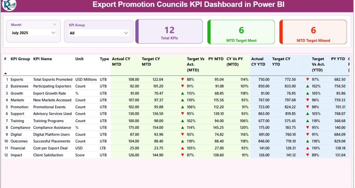
The dashboard includes three main pages, each designed to provide specific insights.
Summary Page – The Main Dashboard Overview
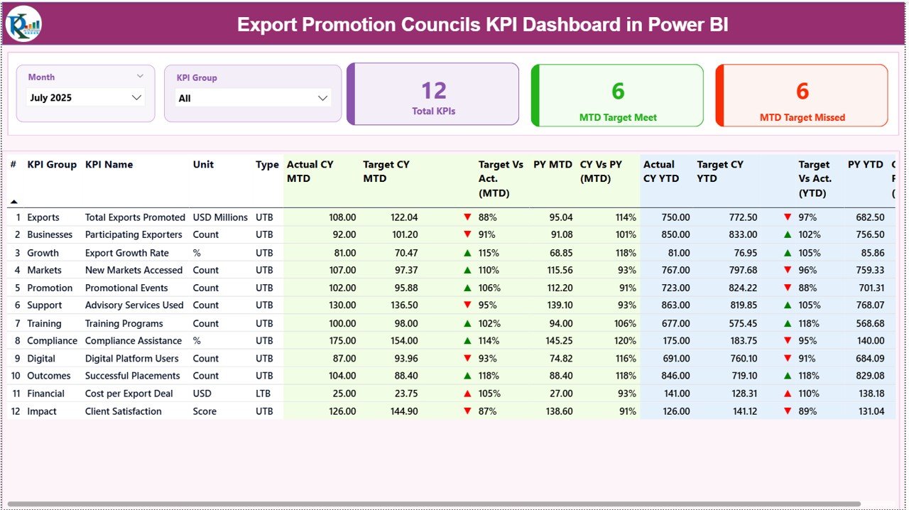
The Summary Page acts as the primary dashboard interface. It displays high-level performance indicators and detailed KPI metrics.
At the top of the page, users can find interactive slicers.
Interactive Slicers
-
Month slicer
-
KPI Group slicer
These filters allow users to analyze data for specific time periods and categories.
KPI Performance Cards
The dashboard also includes three important KPI cards:
-
Total KPIs Count – Displays the total number of KPIs monitored.
-
MTD Target Meet Count – Shows how many KPIs achieved their targets for the month.
-
MTD Target Missed Count – Indicates KPIs that failed to meet targets.
Because these cards provide a quick snapshot, managers can instantly understand performance status.
Detailed KPI Table
Below the KPI cards, the dashboard shows a detailed KPI table containing key performance metrics.
The table includes the following columns:
KPI Number
This column displays the unique sequence number assigned to each KPI.
KPI Group
This column categorizes KPIs into specific groups or performance areas.
KPI Name
This field displays the name of the performance indicator.
Unit
This column shows the measurement unit of the KPI.
Examples may include:
-
Percentage
-
Value
-
Quantity
-
Index score
Type
This indicates whether the KPI follows:
-
LTB (Lower the Better)
-
UTB (Upper the Better)
This classification helps determine how performance is evaluated.
Month-to-Date (MTD) Performance Metrics
The dashboard also provides detailed Month-to-Date (MTD) performance indicators.
Actual CY MTD
This value represents the actual performance for the current year month-to-date.
Target CY MTD
This value represents the target for the current year month-to-date.
MTD Icon
The dashboard uses visual icons to show KPI status:
-
▲ Green arrow – Target achieved
-
▼ Red arrow – Target missed
Because these icons appear instantly, users can easily identify performance gaps.
Target vs Actual (MTD)
This column shows the percentage comparison between actual and target values.
Formula used:
Actual MTD / Target MTD
Therefore, decision-makers can quickly see whether performance meets expectations.
PY MTD
This column displays the previous year month-to-date value for the same KPI.
CY vs PY (MTD)
This column compares the current year MTD performance with previous year performance.
Formula used:
Current Year MTD / Previous Year MTD
Because this comparison highlights growth trends, organizations can measure progress over time.
Year-to-Date (YTD) Performance Metrics
The dashboard also tracks Year-to-Date (YTD) performance metrics.
Actual CY YTD
This value shows the actual KPI performance for the current year YTD.
Target CY YTD
This value represents the YTD target value for the KPI.
YTD Icon
Similar to MTD indicators, icons highlight performance status:
-
▲ Green arrow – Target achieved
-
▼ Red arrow – Target missed
Target vs Actual (YTD)
This column shows the percentage comparison between actual and target YTD values.
Formula used:
Actual YTD / Target YTD
PY YTD
This column displays the previous year YTD performance value.
CY vs PY (YTD)
This column compares the current year YTD performance with previous year YTD performance.
Formula used:
Current Year YTD / Previous Year YTD
Because these insights highlight long-term performance, they help managers track export growth effectively.
Click to Purchases Export Promotion Councils KPI Dashboard in Power BI
KPI Trend Page – Analyze Performance Over Time
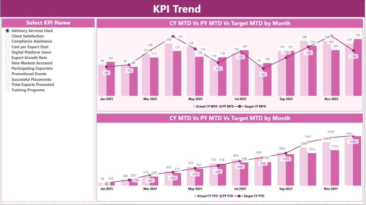
The KPI Trend Page focuses on trend analysis.
Users can view two combo charts that display:
-
Current year performance
-
Previous year performance
-
Target values
These charts analyze both:
-
MTD performance trends
-
YTD performance trends
Additionally, users can select a KPI from the slicer located on the left side.
Once users select a KPI, the dashboard automatically updates the charts.
Therefore, analysts can monitor performance patterns and identify improvements or declines.
KPI Definition Page – Understanding KPI Details
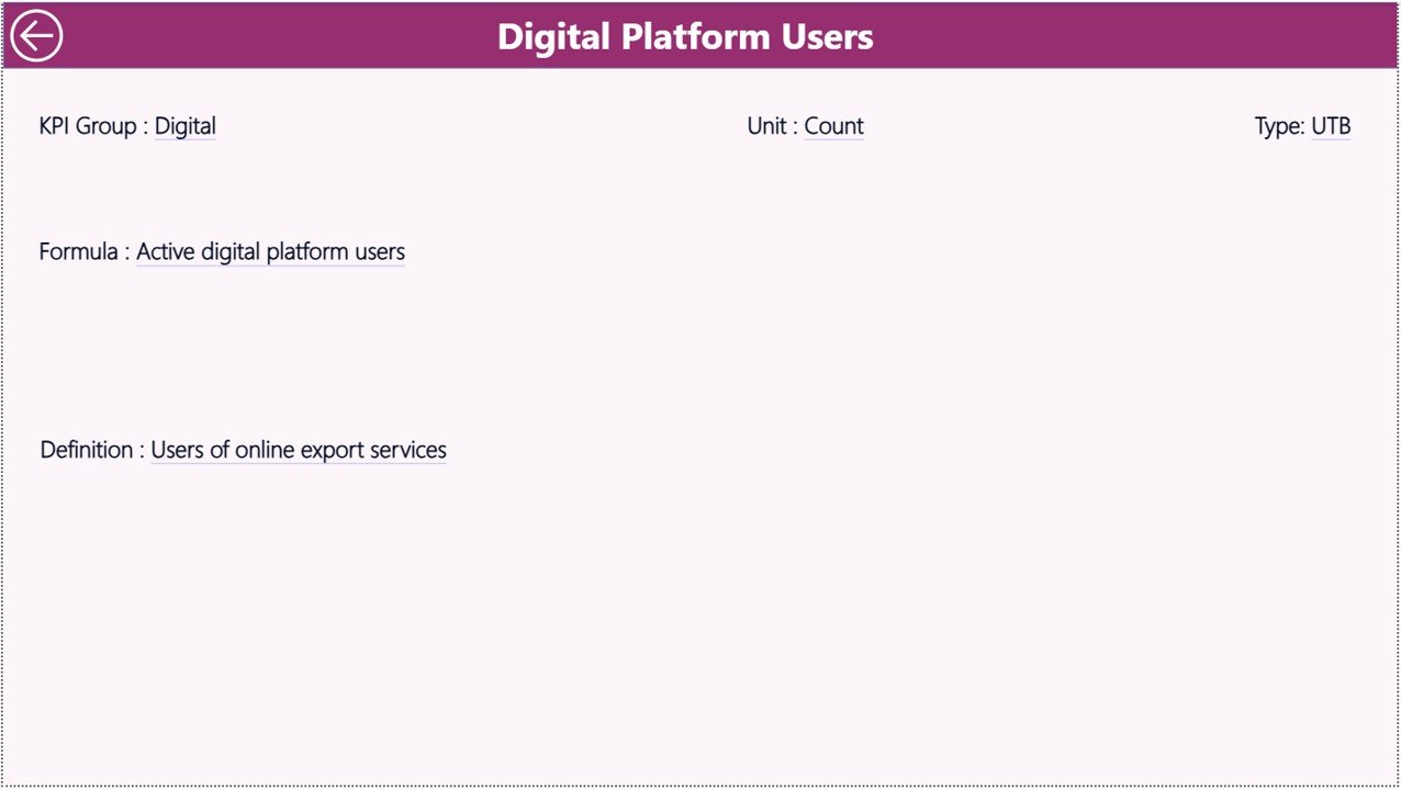
The KPI Definition Page provides detailed explanations of each KPI.
This page remains hidden by default and acts as a drill-through page.
Users can access it directly from the Summary Page.
The page contains important details such as:
-
KPI formula
-
KPI definition
-
KPI category
-
Measurement unit
Because users can drill into KPI definitions, they can clearly understand how each KPI works.
To return to the main dashboard, users simply click the back button located at the top left corner.
Excel Data Source Used in the Dashboard
The dashboard uses an Excel file as the data source.
Users only need to update three worksheets.
After updating the data, Power BI refreshes the dashboard automatically.
Input Actual Sheet
This sheet stores the actual performance values of KPIs.
Users must enter the following fields:
-
KPI Name
-
Month (use the first date of the month)
-
MTD value
-
YTD value
Because the dashboard uses these values, it calculates performance indicators automatically.
Input Target Sheet
This sheet stores target values for each KPI.
Users must enter:
-
KPI Name
-
Month (first date of the month)
-
Target MTD value
-
Target YTD value
Once users enter these values, the dashboard compares targets with actual results.
KPI Definition Sheet
This sheet defines each KPI used in the dashboard.
Users must provide the following information:
-
KPI Number
-
KPI Group
-
KPI Name
-
Unit
-
Formula
-
Definition
-
KPI Type (LTB or UTB)
Because this information supports the dashboard, it ensures KPI clarity and accuracy.
Advantages of Export Promotion Councils KPI Dashboard in Power BI
Organizations gain several benefits when they implement this dashboard.
Improved Export Performance Monitoring
The dashboard provides real-time insights into export KPIs.
Therefore, managers can quickly identify performance gaps.
Faster Decision Making
Visual dashboards simplify data interpretation.
As a result, leaders can make informed decisions faster.
Clear Target Tracking
The dashboard compares targets with actual performance.
Therefore, organizations can easily evaluate progress.
Better Trend Analysis
Trend charts allow users to track export growth over time.
Consequently, councils can evaluate the success of export initiatives.
Enhanced Transparency
The dashboard presents data clearly.
Therefore, stakeholders can understand export performance easily.
Time Savings
Automated reporting eliminates manual spreadsheet analysis.
As a result, analysts save significant time.
Click to Purchases Export Promotion Councils KPI Dashboard in Power BI
Best Practices for Export Promotion Councils KPI Dashboard in Power BI
To maximize the effectiveness of the dashboard, organizations should follow several best practices.
Define Clear KPIs
Organizations should define KPIs that reflect export performance accurately.
Examples include:
-
Export value growth
-
Number of exporters supported
-
International market expansion
-
Trade event participation
Maintain Data Accuracy
Accurate data ensures reliable insights.
Therefore, teams must validate data regularly.
Update Data Frequently
Regular updates ensure that dashboards reflect current performance.
Monthly updates work well for export KPIs.
Use Standard KPI Definitions
Clear definitions prevent confusion.
Therefore, organizations should document each KPI.
Monitor Trends Consistently
Trend analysis helps identify long-term patterns.
Therefore, managers should review KPI trends frequently.
Train Users
Users should understand how to interact with the dashboard.
Training improves adoption and decision-making.
How Does Power BI Improve KPI Monitoring?
Power BI offers powerful features that enhance KPI monitoring.
Interactive Visualizations
Users can explore data through charts, tables, and filters.
Real-Time Data Updates
Dashboards update automatically when new data arrives.
Drill-Through Analysis
Users can view detailed KPI information quickly.
Custom Reporting
Organizations can modify dashboards according to their needs.
Integration with Excel
Because Power BI integrates easily with Excel, organizations can update data quickly.
Who Can Use the Export Promotion Councils KPI Dashboard?
Several organizations benefit from this dashboard.
Export Promotion Councils
They can monitor export initiatives and performance metrics.
Government Agencies
Policy makers can evaluate economic programs.
Trade Organizations
They can track export growth and industry performance.
Economic Development Boards
They can analyze international trade outcomes.
Export Consultants
They can analyze export performance for clients.
Conclusion
Export promotion plays a vital role in economic growth. However, organizations must monitor export activities carefully to achieve success.
Traditional reporting methods often fail to provide clear insights. Therefore, many organizations now rely on data-driven dashboards.
The Export Promotion Councils KPI Dashboard in Power BI offers a powerful solution. It combines KPI monitoring, trend analysis, and performance comparison in one interactive platform.
Because the dashboard presents complex export data in simple visuals, decision-makers can easily evaluate performance and identify improvement opportunities.
Consequently, organizations can strengthen export strategies and drive sustainable economic growth.
Click to Purchases Export Promotion Councils KPI Dashboard in Power BI
Frequently Asked Questions (FAQs)
What is a KPI dashboard in Power BI?
A KPI dashboard in Power BI is a visual reporting tool that tracks key performance indicators using charts, tables, and metrics.
Why do export promotion councils need KPI dashboards?
Export promotion councils manage multiple programs and export initiatives. A KPI dashboard helps them track performance, analyze trends, and evaluate success.
What data is required for this dashboard?
The dashboard requires three Excel sheets:
-
Actual KPI data
-
Target KPI data
-
KPI definitions
Can the dashboard track monthly and yearly performance?
Yes. The dashboard tracks both Month-to-Date (MTD) and Year-to-Date (YTD) performance metrics.
Is Power BI suitable for government organizations?
Yes. Many government agencies use Power BI because it offers secure, scalable, and interactive analytics.
Can the dashboard be customized?
Yes. Organizations can add new KPIs, modify visuals, and adjust calculations according to their needs.
Click to Purchases Export Promotion Councils KPI Dashboard in Power BI
Visit our YouTube channel to learn step-by-step video tutorials