The audio streaming industry has grown rapidly over the last decade. Millions of users listen to music, podcasts, and audiobooks every day using digital streaming platforms. Because of this massive growth, streaming companies must analyze large volumes of data to understand listener behavior, revenue performance, and content trends.
However, many organizations still store their streaming data in multiple spreadsheets, reports, and analytics tools. As a result, it becomes difficult to monitor revenue, track listener engagement, and evaluate platform performance.
Click to Purchases Audio Streaming Services Dashboard in Excel
Therefore, businesses increasingly rely on data dashboards to transform raw streaming data into meaningful insights. One powerful solution is the Audio Streaming Services Dashboard in Excel.
The Audio Streaming Services Dashboard in Excel is a ready-to-use analytics solution that converts streaming data into interactive charts, KPIs, and visual insights. Because Excel automatically updates charts and reports when new data is entered, this dashboard allows companies to monitor performance quickly and make better decisions.
In this article, you will learn everything about the Audio Streaming Services Dashboard in Excel, including its features, structure, advantages, best practices, and frequently asked questions.
What Is an Audio Streaming Services Dashboard in Excel?
An Audio Streaming Services Dashboard in Excel is a data visualization and analytics tool designed to monitor streaming performance using charts, filters, and summary metrics.
This dashboard helps streaming companies analyze important metrics such as:
-
Total revenue
-
Ad revenue
-
Gross revenue
-
Net revenue
-
Total streams
-
Listener engagement
-
Content performance
-
Platform usage
-
Device usage
-
Regional performance
Because the dashboard organizes all important metrics in one place, decision-makers can easily identify trends and optimize their streaming strategy.
For example, a music streaming company can quickly understand:
-
Which region generates the highest revenue
-
Which genre attracts the most listeners
-
Which platform drives the most ad revenue
-
Which device type users prefer
As a result, businesses can improve marketing strategies, optimize content distribution, and increase profitability.
Why Do Audio Streaming Platforms Need Data Dashboards?
Streaming platforms generate massive amounts of data every day. This data includes user interactions, streaming activity, subscription revenue, ad revenue, and content licensing costs.
Without proper analysis tools, companies struggle to extract meaningful insights from this data.
However, dashboards solve this problem by organizing data visually.
Key reasons why streaming platforms need dashboards include:
-
Monitor revenue growth across platforms
-
Track listener engagement trends
-
Analyze content performance
-
Identify popular genres and artists
-
Measure ad performance
-
Track streaming activity across devices
-
Understand regional listener behavior
Therefore, dashboards play a critical role in data-driven decision-making for streaming companies.
Key Features of the Audio Streaming Services Dashboard in Excel
The Audio Streaming Services Dashboard in Excel provides a structured and interactive environment for analyzing streaming data.
One of the main features of this dashboard is the Page Navigator, which appears on the left side of the dashboard. This navigator allows users to quickly move between different analytical pages.
The Excel file contains five analytical pages, each focusing on a specific aspect of streaming performance.
These pages include:
-
Overview Page
-
Content Analysis
-
Revenue Analysis
-
Listener Engagement
-
Month Analysis
Additionally, the dashboard includes Support Sheet and Data Sheet for managing the dataset.
Let us explore each page in detail.
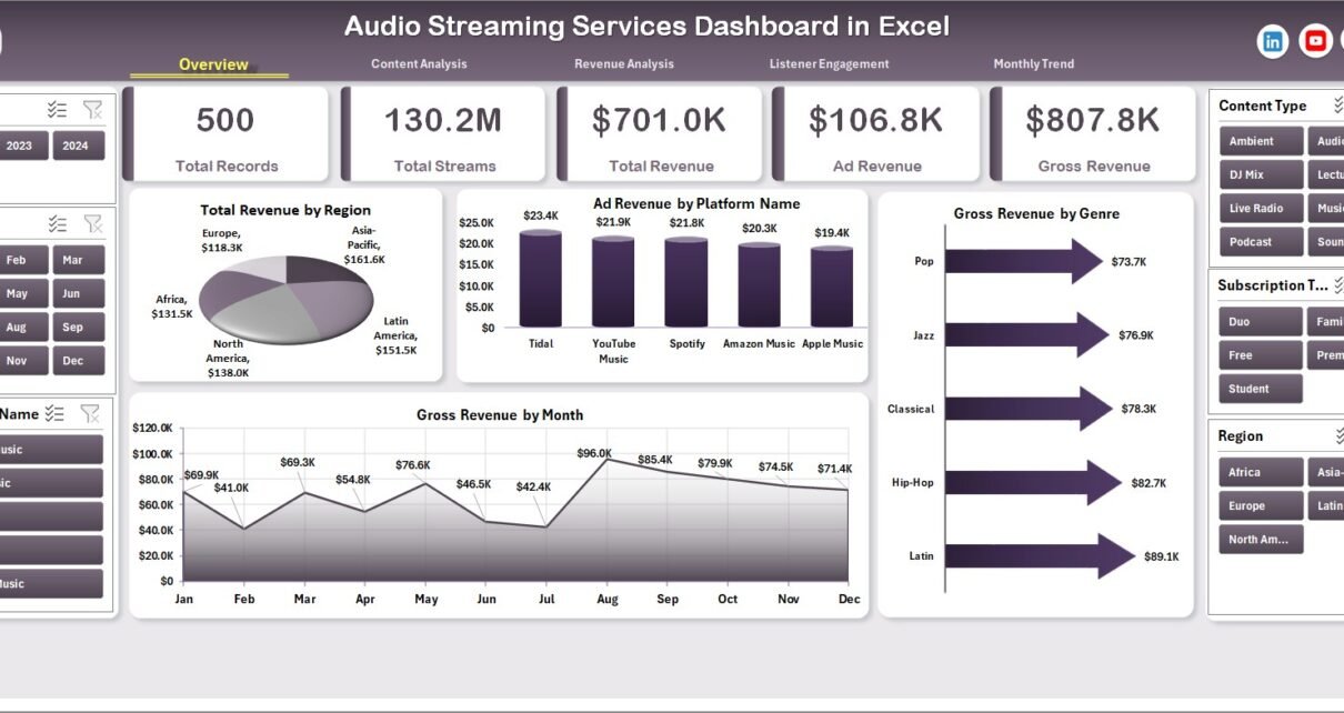
Overview Page: A Quick Snapshot of Streaming Performance
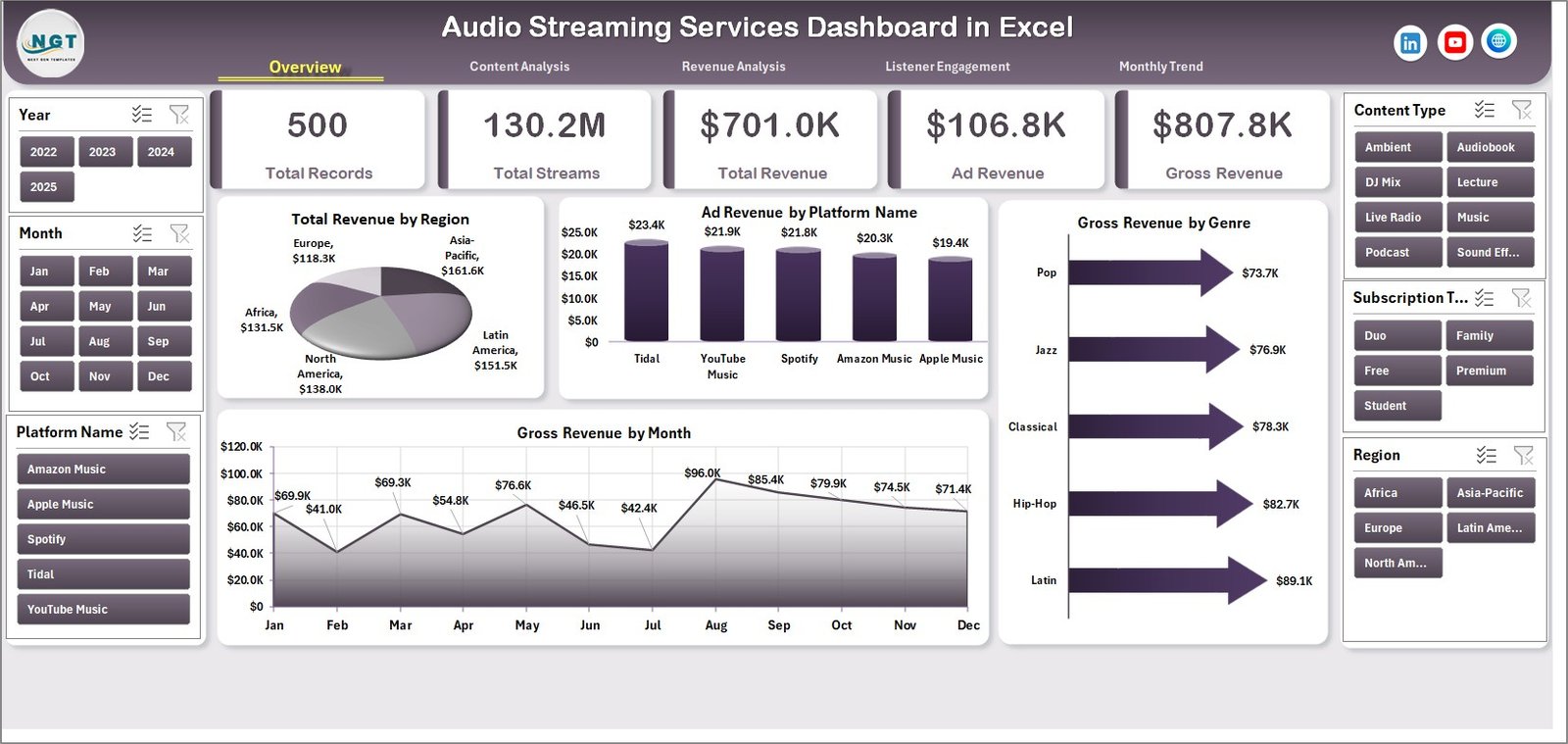
The Overview Page acts as the main summary page of the dashboard.
It provides a high-level view of important revenue metrics across different dimensions.
On this page, you will find a slicer located on the right side. This slicer allows users to filter the data dynamically.
KPI Cards on the Overview Page
The dashboard displays four KPI cards that highlight key metrics. These cards allow users to quickly understand the overall performance.
Charts Available on the Overview Page
Click to Purchases Audio Streaming Services Dashboard in Excel
This page contains four visual charts:
1️⃣ Total Revenue by Region
This chart shows how revenue varies across different regions.
It helps businesses identify which markets generate the most revenue.
2️⃣ Ad Revenue by Platform Name
This chart displays ad revenue generated by different streaming platforms.
For example:
-
Mobile app
-
Web platform
-
Smart TV
-
Desktop application
This analysis helps businesses understand which platforms deliver the best advertising performance.
3️⃣ Gross Revenue by Genre
This chart highlights which music or audio genres generate the most revenue.
Common genres may include:
-
Pop
-
Rock
-
Hip-Hop
-
Classical
-
Podcasts
-
Audiobooks
4️⃣ Gross Revenue by Month
This chart shows monthly revenue trends. It helps companies track seasonal patterns and listener behavior.
Content Analysis Page: Understanding Content Performance
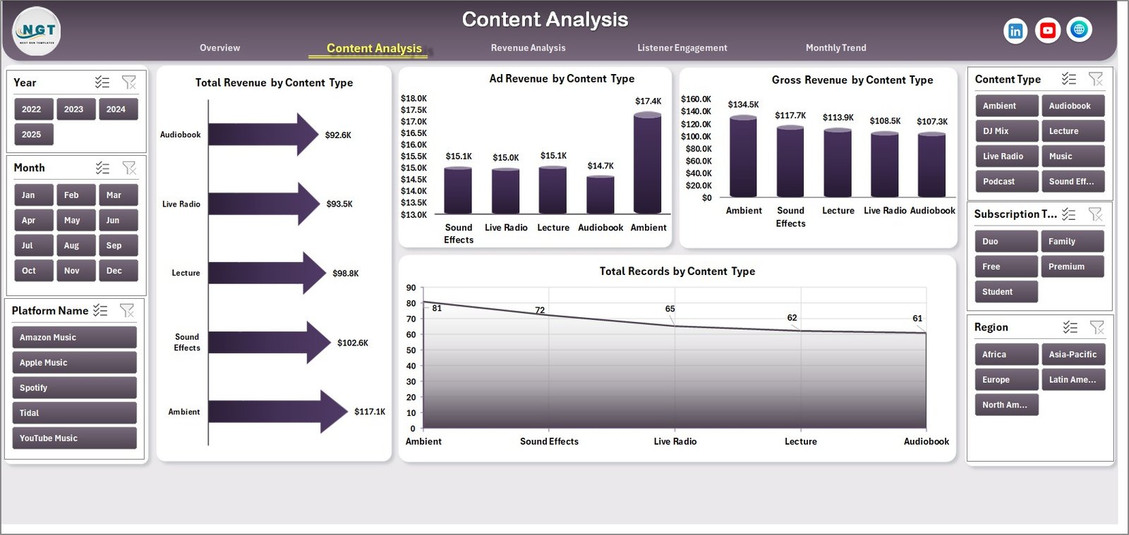
Content plays a critical role in streaming platforms. Therefore, companies must understand how different types of content perform.
The Content Analysis Page helps organizations evaluate revenue and engagement across various content types.
This page also contains a right-side slicer that allows users to filter data easily.
Charts Available on the Content Analysis Page
This page contains four analytical charts:
1️⃣ Total Revenue by Content Type
This chart shows revenue generated by different types of audio content such as:
-
Music
-
Podcasts
-
Audiobooks
-
Radio streams
2️⃣ Ad Revenue by Content Type
This chart highlights how advertising revenue varies across different content categories.
For example, podcasts often generate higher ad revenue due to targeted advertising.
3️⃣ Gross Revenue by Content Type
This chart shows overall earnings generated from each content category.
4️⃣ Total Record by Content Type
This chart displays the number of content records available in each category.
This helps streaming companies evaluate content distribution.
Revenue Analysis Page: Measuring Financial Performance
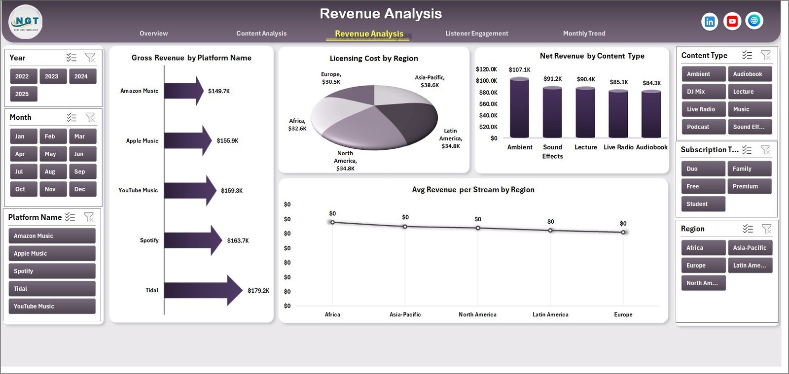
Revenue tracking remains one of the most important tasks for streaming businesses.
The Revenue Analysis Page provides detailed financial insights that help companies understand profitability.
This page includes four powerful analytical charts.
Charts Available on the Revenue Analysis Page
1️⃣ Gross Revenue by Platform
This chart compares revenue generated from different platforms such as:
-
Mobile apps
-
Web browsers
-
Smart TVs
-
Desktop applications
2️⃣ Licensing Cost by Region
Streaming platforms pay licensing fees for music and audio content. Therefore, tracking these costs is essential.
This chart shows licensing expenses across different regions.
3️⃣ Net Revenue by Content Type
Net revenue equals gross revenue minus licensing and operational costs.
This chart highlights profitability across different content categories.
4️⃣ Average Revenue per Stream by Region
This metric shows how much revenue each stream generates in different regions.
It helps companies understand regional monetization performance.
Listener Engagement Page: Analyzing User Behavior
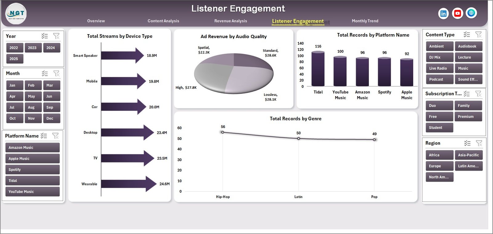
Understanding listener engagement helps streaming companies improve user experience.
The Listener Engagement Page focuses on analyzing streaming activity and user preferences.
This page also includes a right-side slicer for filtering data.
Charts Available on the Listener Engagement Page
1️⃣ Total Streams by Device Type
This chart shows how users access streaming services.
Common device types include:
-
Smartphones
-
Tablets
-
Desktop computers
-
Smart TVs
2️⃣ Ad Revenue by Audio Quality
Audio quality settings can influence ad engagement.
Click to Purchases Audio Streaming Services Dashboard in Excel
For example:
-
Standard quality
-
High quality
-
Lossless audio
This chart analyzes how audio quality impacts ad revenue.
3️⃣ Total Record by Platform Name
This chart shows the number of records associated with each streaming platform.
4️⃣ Total Record by Genre
This chart displays how many records exist for each genre.
This helps companies evaluate genre distribution.
Month Analysis Page: Tracking Monthly Trends
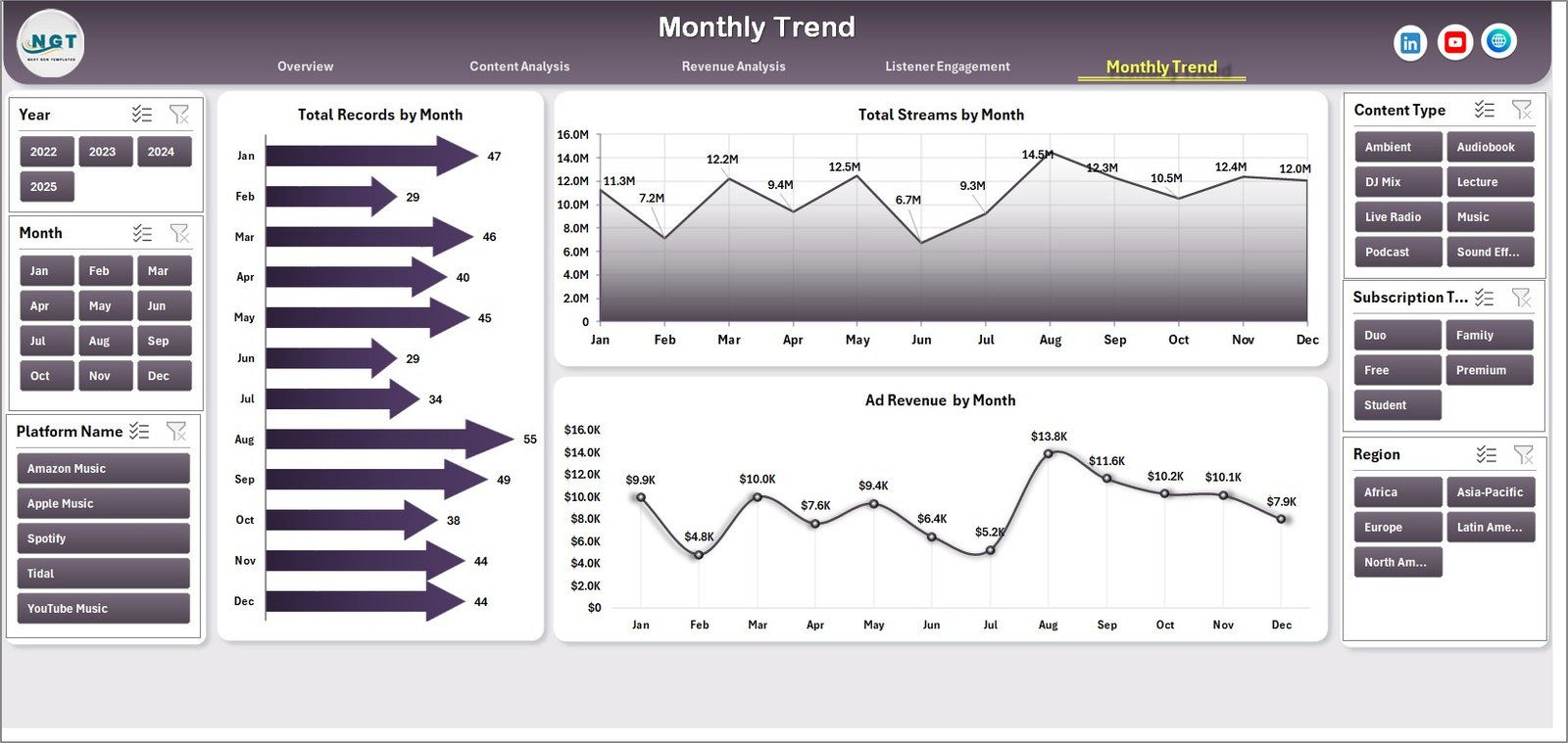
The Month Analysis Page helps businesses monitor trends over time.
This page focuses on month-wise performance metrics.
Charts Available on the Month Analysis Page
1️⃣ Total Records by Month
This chart displays how many records exist for each month.
2️⃣ Total Streams by Month
This chart shows streaming activity over time.
Businesses can identify peak listening periods.
3️⃣ Ad Revenue by Month
This chart highlights monthly advertising revenue trends.
As a result, companies can optimize marketing strategies.
Data Sheet and Support Sheet
The dashboard includes two additional sheets that support the entire system.
Data Sheet
The Data Sheet stores the raw dataset used to generate charts and metrics.
Typical columns may include:
-
Stream ID
-
Platform name
-
Region
-
Genre
-
Content type
-
Device type
-
Audio quality
-
Revenue
-
Ad revenue
-
Licensing cost
-
Date
Users can update the dataset in this sheet. After updating the data, Excel automatically refreshes the dashboard visuals.
Support Sheet
The Support Sheet stores helper calculations, lookup tables, and intermediate formulas.
This sheet helps maintain smooth dashboard functionality.
Advantages of Audio Streaming Services Dashboard in Excel
Using a structured Excel dashboard offers many benefits for streaming platforms.
Centralized Data Analysis
The dashboard brings all streaming data into one centralized interface.
Therefore, users can analyze performance without switching between multiple reports.
Easy Data Visualization
Excel charts convert complex datasets into easy-to-understand visuals.
As a result, decision-makers can quickly identify trends.
Improved Decision-Making
Because the dashboard provides real-time insights, companies can make faster strategic decisions.
Performance Monitoring
The dashboard helps companies monitor:
-
Revenue trends
-
Listener engagement
-
Content performance
-
Platform performance
Easy Customization
Excel dashboards allow easy customization.
Organizations can modify charts, add filters, or include additional KPIs.
Best Practices for the Audio Streaming Services Dashboard in Excel
To get the best results from your dashboard, follow these best practices.
Maintain Clean Data
Always ensure that the data sheet contains accurate and consistent information.
Clean data improves dashboard accuracy.
Update Data Regularly
Update streaming data frequently to keep insights current.
Regular updates ensure reliable analysis.
Use Consistent Naming Conventions
Use consistent names for platforms, regions, and genres.
This prevents duplicate records.
Focus on Key Metrics
Avoid overloading the dashboard with too many charts.
Instead, focus on metrics that impact business decisions.
Validate Data Sources
Always verify the reliability of your data sources.
Accurate data ensures trustworthy insights.
How Can Businesses Use This Dashboard?
Streaming companies can use this dashboard in many ways.
Business Applications
-
Monitor streaming revenue trends
-
Analyze listener behavior
-
Track ad performance
-
Evaluate content performance
-
Optimize marketing strategies
-
Identify popular genres
-
Improve platform performance
Therefore, the dashboard helps companies transform raw data into actionable insights.
Conclusion
Click to Purchases Audio Streaming Services Dashboard in Excel
The Audio Streaming Services Dashboard in Excel provides a powerful and practical solution for analyzing streaming performance.
Because streaming platforms generate large volumes of data, businesses need efficient tools to interpret that information.
This dashboard helps organizations monitor revenue, analyze listener engagement, and evaluate content performance in one interactive system.
Moreover, Excel automatically updates charts when new data is entered. Therefore, users can track performance in real time without complex tools.
Whether you manage a music streaming platform, podcast network, or audiobook service, this dashboard can help you gain deeper insights into your streaming data.
Frequently Asked Questions (FAQs)
What is an Audio Streaming Services Dashboard in Excel?
An Audio Streaming Services Dashboard in Excel is a data visualization tool that analyzes streaming performance using charts, KPIs, and filters.
Who can use this dashboard?
This dashboard is useful for:
-
Music streaming platforms
-
Podcast networks
-
Audiobook platforms
-
Digital media companies
-
Data analysts
What type of data does this dashboard analyze?
The dashboard analyzes streaming data such as:
-
Revenue
-
Ad revenue
-
Streams
-
Content type
-
Platform usage
-
Device type
-
Listener engagement
Can beginners use this dashboard?
Yes. Because the dashboard uses Excel charts and slicers, beginners can easily use it after basic Excel training.
Can the dashboard handle large datasets?
Yes. Excel dashboards can analyze large datasets when the data structure remains optimized.
Visit our YouTube channel to learn step-by-step video tutorials