Global trade has become increasingly complex. Businesses operate across countries, manage international logistics, comply with regulations, and monitor financial performance across multiple markets. Because of these challenges, companies that provide cross-border trade services must track performance metrics carefully.
However, many organizations still rely on manual spreadsheets and scattered reports to monitor trade performance. As a result, decision-makers often struggle to understand real-time performance, identify trends, and evaluate operational efficiency.
Therefore, organizations need structured analytics tools that allow them to monitor key metrics clearly and consistently. This is where the Cross-border Trade Services KPI Dashboard in Power BI becomes extremely useful.
A Cross-border Trade Services KPI Dashboard in Power BI provides a centralized and interactive platform that helps organizations track trade performance indicators such as service efficiency, operational targets, and year-over-year growth. By visualizing KPIs in an easy-to-understand format, businesses can monitor performance quickly and make informed decisions.
In this article, we will explore what a Cross-border Trade Services KPI Dashboard in Power BI is, why businesses need it, how it works, its key features, advantages, best practices, and frequently asked questions.
Click to Purchases Cross-border Trade Services KPI Dashboard in Power BI
What is a Cross-border Trade Services KPI Dashboard in Power BI?
A Cross-border Trade Services KPI Dashboard in Power BI is a business intelligence tool that tracks and visualizes performance metrics related to international trade services.
Companies involved in global trade must track several operational indicators such as service efficiency, transaction processing time, compliance performance, and service delivery quality. Because of the complexity of cross-border operations, monitoring these metrics manually becomes difficult.
Power BI simplifies this process by converting raw data into interactive dashboards, charts, and insights.
Through this dashboard, organizations can:
-
Track operational KPIs
-
Compare actual performance with targets
-
Monitor monthly and yearly progress
-
Analyze trends over time
-
Identify performance gaps quickly
As a result, managers can evaluate business performance and take timely corrective actions.
Why Do Organizations Need a Cross-border Trade Services KPI Dashboard?
Cross-border trade services involve multiple operational layers including customs clearance, documentation, financial transactions, logistics coordination, and regulatory compliance.
Without proper monitoring tools, organizations may face several problems.
Common Challenges Without KPI Dashboards
-
Difficulty tracking performance across regions
-
Lack of visibility into operational targets
-
Delayed identification of performance issues
-
Inefficient reporting processes
-
Limited ability to compare historical data
However, a Power BI dashboard solves these issues by providing a single source of truth for all KPIs.
Benefits of Implementing a KPI Dashboard
-
Centralized KPI monitoring
-
Real-time performance tracking
-
Faster decision-making
-
Improved operational transparency
-
Better strategic planning
Therefore, companies involved in cross-border trade services greatly benefit from structured analytics dashboards.
Key Features of the Cross-border Trade Services KPI Dashboard in Power BI
This dashboard is a ready-to-use Power BI solution that helps organizations track KPI performance efficiently.
The dashboard uses Excel as a data source, where users update KPI values. Once the data refreshes in Power BI, the dashboard updates automatically.
The Power BI file contains three main pages designed to analyze KPIs from different perspectives.
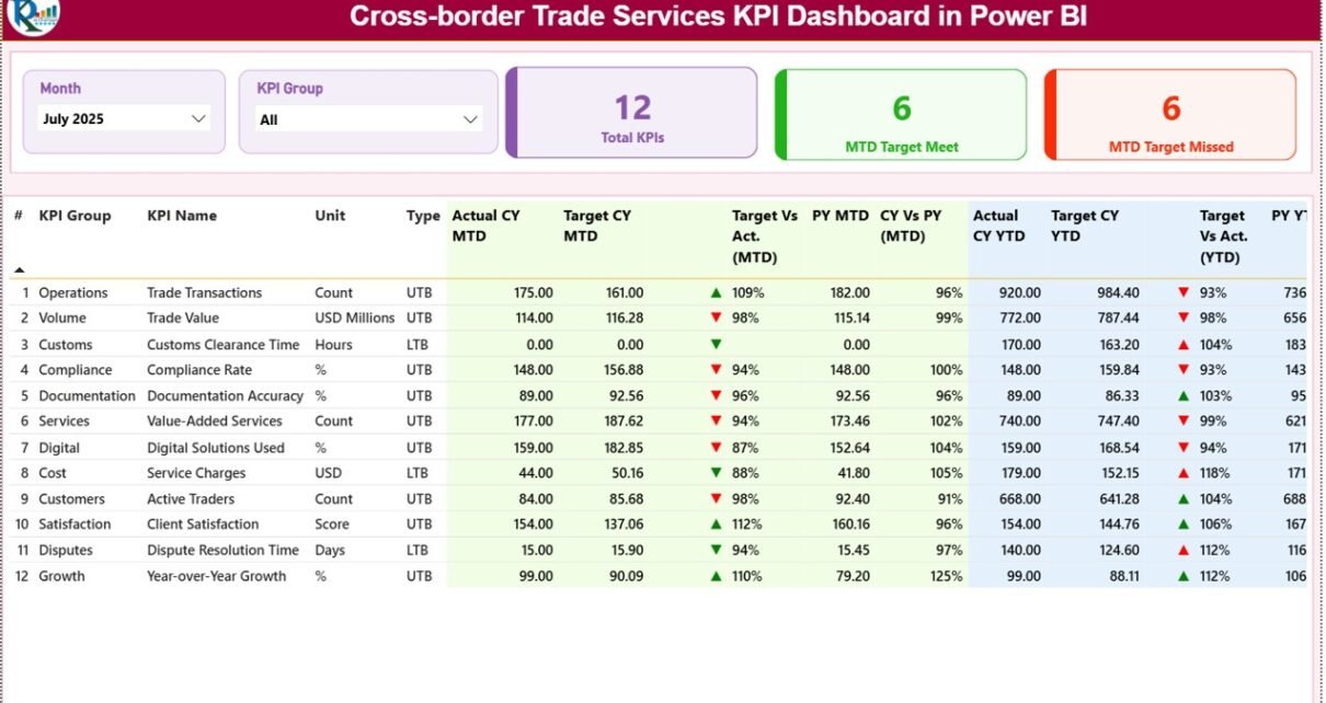
1. Summary Page – The Main Dashboard
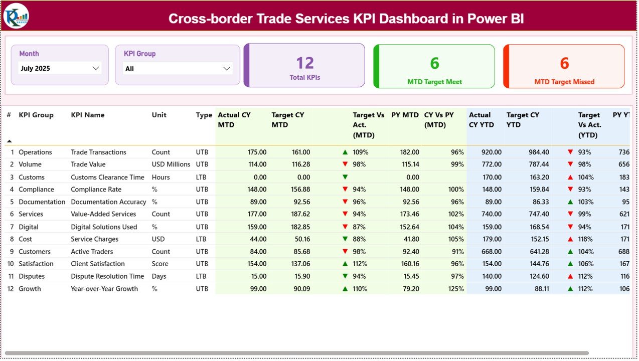
The Summary Page serves as the primary dashboard where users can monitor the overall KPI performance.
At the top of the page, users can find two important slicers:
-
Month slicer – allows filtering KPIs for a specific month
-
KPI Group slicer – filters KPIs by category
These slicers allow users to analyze performance dynamically.
KPI Cards
The dashboard also displays three key KPI cards:
-
Total KPIs Count – total number of KPIs tracked
-
MTD Target Meet Count – number of KPIs meeting targets
-
MTD Target Missed Count – number of KPIs below target
Because of these summary indicators, managers can quickly understand overall performance.
Detailed KPI Table
Below the summary cards, the dashboard shows a detailed KPI table with the following fields:
KPI Number
A unique sequence number assigned to each KPI.
KPI Group
The category or department responsible for the KPI.
KPI Name
The name of the performance metric.
Unit
Measurement unit used to evaluate the KPI.
Type
Indicates whether the KPI is:
-
UTB (Upper the Better)
-
LTB (Lower the Better)
MTD Performance Indicators
The dashboard tracks Month-To-Date (MTD) performance.
Actual CY MTD
Actual KPI value for the current year month-to-date.
Target CY MTD
Target KPI value for the current year month-to-date.
MTD Icon
Green ▲ indicates the target was achieved.
Red ▼ indicates the KPI missed the target.
Target vs Actual (MTD)
Percentage comparison between target and actual values.
Formula used:
Actual MTD / Target MTD
Previous Year Comparison
The dashboard also compares current performance with the previous year.
PY MTD
Month-to-date KPI value from the previous year.
CY vs PY (MTD)
Percentage comparison between current year and previous year performance.
Formula used:
Current Year MTD / Previous Year MTD
YTD Performance Indicators
In addition to monthly analysis, the dashboard tracks Year-To-Date (YTD) performance.
Actual CY YTD
Current year actual KPI value for YTD.
Target CY YTD
Target KPI value for YTD.
YTD Icon
Visual indicator showing performance against target.
Target vs Actual (YTD)
Percentage comparison between target and actual YTD performance.
Formula used:
Actual YTD / Target YTD
Year-over-Year YTD Comparison
PY YTD
Previous year YTD value.
CY vs PY (YTD)
Comparison between current year YTD performance and previous year YTD performance.
Formula used:
Current Year YTD / Previous Year YTD
2. KPI Trend Page – Performance Over Time

The KPI Trend Page allows users to analyze how KPIs evolve over time.
This page contains two combo charts:
-
MTD performance chart
-
YTD performance chart
Each chart compares three values:
-
Current Year Actual
-
Previous Year Actual
-
Target Values
A KPI Name slicer appears on the left side of the page.
Users can select a specific KPI to analyze its performance trend.
As a result, managers can easily detect patterns and evaluate whether performance improves or declines over time.
3. KPI Definition Page – Detailed KPI Information
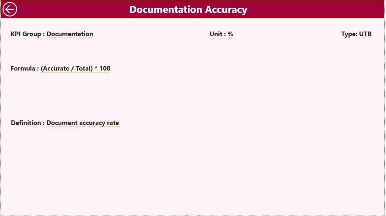
The KPI Definition Page provides additional information about each KPI.
This page remains hidden and works as a drill-through page.
Users can access it directly from the Summary Page by selecting a KPI and drilling through to view its details.
This page includes:
-
KPI Formula
-
KPI Definition
-
Measurement Unit
-
KPI Type
Users can return to the main dashboard by clicking the Back button located in the top-left corner.
This feature ensures that decision-makers fully understand each KPI before evaluating performance.
Click to Purchases Cross-border Trade Services KPI Dashboard in Power BI
Excel Data Source for the Dashboard
The dashboard uses Excel as the data source. Users update KPI data directly in the Excel file.
The Excel workbook contains three worksheets.
1. Input_Actual Sheet
This sheet stores the actual KPI performance data.
Users must enter:
-
KPI Name
-
Month (first date of the month)
-
MTD value
-
YTD value
2. Input_Target Sheet
This sheet stores the target values for each KPI.
Users must enter:
-
KPI Name
-
Month
-
MTD Target
-
YTD Target
3. KPI Definition Sheet
This sheet defines each KPI.
Users must enter:
-
KPI Number
-
KPI Group
-
KPI Name
-
Unit
-
Formula
-
KPI Definition
-
KPI Type (UTB or LTB)
Advantages of Cross-border Trade Services KPI Dashboard in Power BI
Organizations gain several benefits from implementing this dashboard.
Improved Performance Monitoring
Managers can track KPIs quickly and accurately.
Faster Decision Making
Visual dashboards allow executives to identify performance issues instantly.
Centralized Data Analysis
All KPIs remain accessible in a single dashboard.
Better Trend Analysis
Historical comparisons reveal performance patterns.
Improved Accountability
Departments become responsible for KPI performance.
Increased Operational Transparency
Stakeholders can understand operational performance clearly.
Best Practices for the Cross-border Trade Services KPI Dashboard
Organizations should follow best practices to maximize dashboard effectiveness.
Define Clear KPIs
Organizations must define measurable and relevant KPIs.
Maintain Accurate Data
Always update the Excel data source regularly.
Review KPIs Frequently
Managers should review KPI performance monthly.
Train Users Properly
Employees must understand how to interpret dashboard insights.
Align KPIs with Business Goals
KPIs should reflect organizational objectives.
How Does a KPI Dashboard Improve Cross-border Trade Operations?
A KPI dashboard strengthens operational management in multiple ways.
Enhances Visibility
Managers can see performance instantly.
Identifies Operational Bottlenecks
Performance gaps become visible quickly.
Supports Strategic Planning
Historical data helps predict future trends.
Improves Service Quality
Teams can track service performance more effectively.
Conclusion
Cross-border trade services require precise performance monitoring to ensure efficiency, compliance, and service quality. Without structured analytics tools, organizations struggle to track operational performance and identify improvement areas.
However, the Cross-border Trade Services KPI Dashboard in Power BI provides a powerful solution for tracking key performance indicators across monthly and yearly timelines.
With its interactive summary dashboard, KPI trend analysis, and detailed KPI definitions, the dashboard helps organizations monitor performance effectively and make informed decisions.
Moreover, by integrating Excel as the data source, businesses can update KPI data easily while Power BI automatically refreshes the visual insights.
Therefore, organizations that adopt this dashboard can significantly improve operational transparency, strategic decision-making, and overall service performance.
Click to Purchases Cross-border Trade Services KPI Dashboard in Power BI
Frequently Asked Questions (FAQs)
What is a Cross-border Trade Services KPI Dashboard?
It is a Power BI dashboard that tracks performance metrics related to international trade services.
Why should companies use KPI dashboards?
KPI dashboards provide real-time insights, improve decision-making, and help organizations track performance efficiently.
What data source does this dashboard use?
The dashboard uses Excel files as the primary data source.
What are MTD and YTD metrics?
MTD represents Month-To-Date performance, while YTD represents Year-To-Date performance.
Can users customize the dashboard?
Yes. Organizations can customize KPIs, visuals, and filters according to business needs.
Which businesses can use this dashboard?
Logistics companies, international trade firms, financial service providers, and consulting firms involved in cross-border trade can benefit from this dashboard.
Click to Purchases Cross-border Trade Services KPI Dashboard in Power BI
Visit our YouTube channel to learn step-by-step video tutorials