Introduction
The Coding Bootcamps KPI Dashboard in Power BI offers an intuitive way to monitor and analyze key performance indicators for coding bootcamps. This dashboard uses data captured directly from an Excel file and presents insightful visuals and tables, allowing program managers and stakeholders to track performance trends effortlessly. By consolidating data in a centralized Power BI report, the dashboard provides real-time, actionable insights to drive strategic decisions.
Key Features of Coding Bootcamps KPI Dashboard in Power BI
- Data Integration from Excel for seamless updates
- Three comprehensive dashboard pages for detailed analysis
- Interactive slicers for Month and KPI Group filtering
- Visual indicators such as icons and color coding to signal KPI status
- Comparison of current year vs previous year performance (MTD & YTD)
- Drill-through capability to explore KPI definitions and formulas
Dashboard Pages Explanation
Click to Buy Coding Bootcamps KPI Dashboard in Power BI
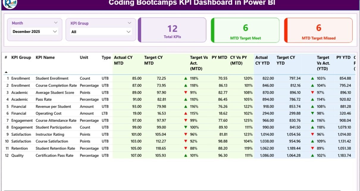
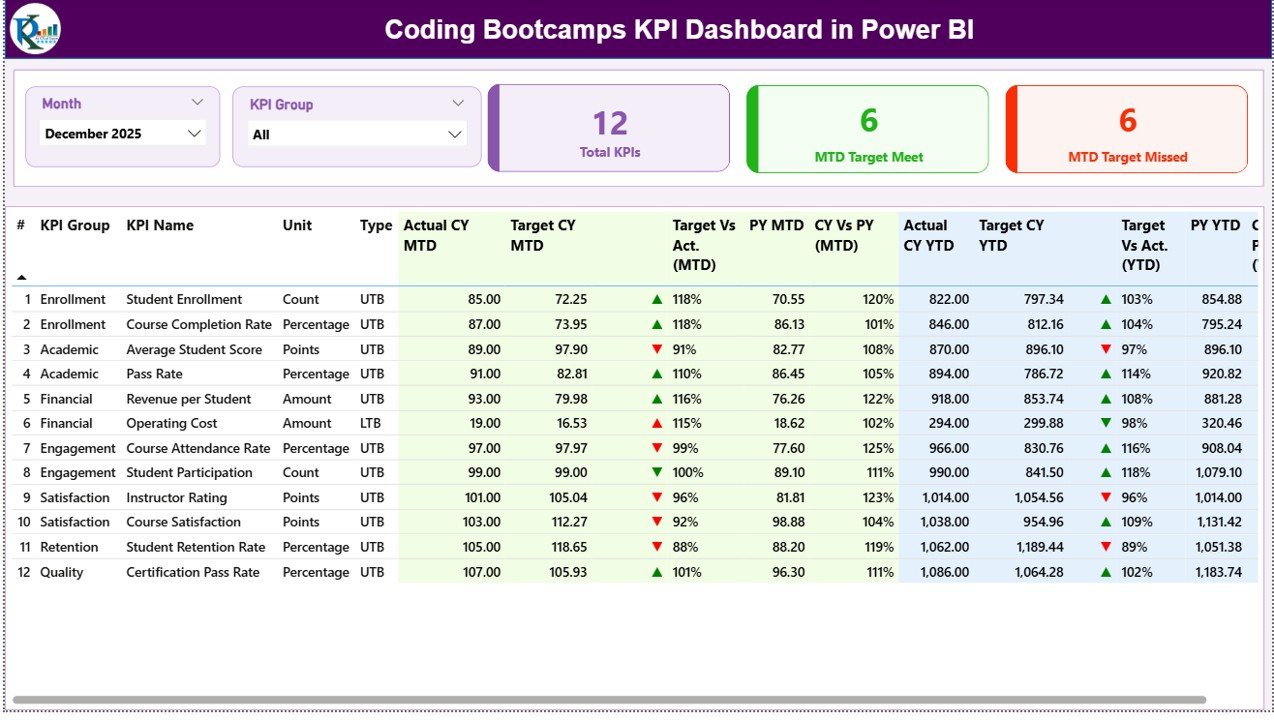
1. Summary Page
The Summary Page serves as the main interface of the dashboard, providing a snapshot of coding bootcamp KPIs for easy consumption.
- Slicers: Month and KPI Group slicers for focused analysis.
- KPIs at a Glance: Three key cards displaying Total KPIs, MTD Target Met Count, and MTD Target Missed Count.
- Detailed Table: Displays the following information for each KPI:
- KPI Number: The sequence or identifier for each KPI.
- KPI Group: The category grouping of each KPI.
- KPI Name: Name/title of the KPI.
- Unit: Measurement unit (e.g., %, hours, count).
- Type: KPI classification – LTB (Lower the Better) or UTB (Upper the Better).
- Actual CY MTD: Actual values recorded for the current year month-to-date.
- Target CY MTD: Target values for the current year month-to-date.
- MTD Icon: Visual indicator (green up-arrow or red down-arrow) signaling KPI status against the target.
- Target Vs Act. (MTD): Percentage ratio of Actual MTD over Target MTD (Actual / Target).
- PY MTD: Previous year’s MTD figure for the same period.
- CY Vs PY (MTD): Comparison ratio of current MTD actual to previous year MTD actual (Current / Previous).
- Actual CY YTD: Year-to-date actual values for the current year.
- Target CY YTD: Year-to-date targets for the current year.
- YTD Icon: Visual status indicator similar to MTD Icon but for year-to-date numbers.
- Target Vs Act. (YTD): Percentage of Actual YTD over Target YTD (Actual / Target).
- PY YTD: Previous year’s YTD value for comparison.
- CY Vs PY (YTD): Ratio of Current Year YTD actual to Previous Year YTD actual.
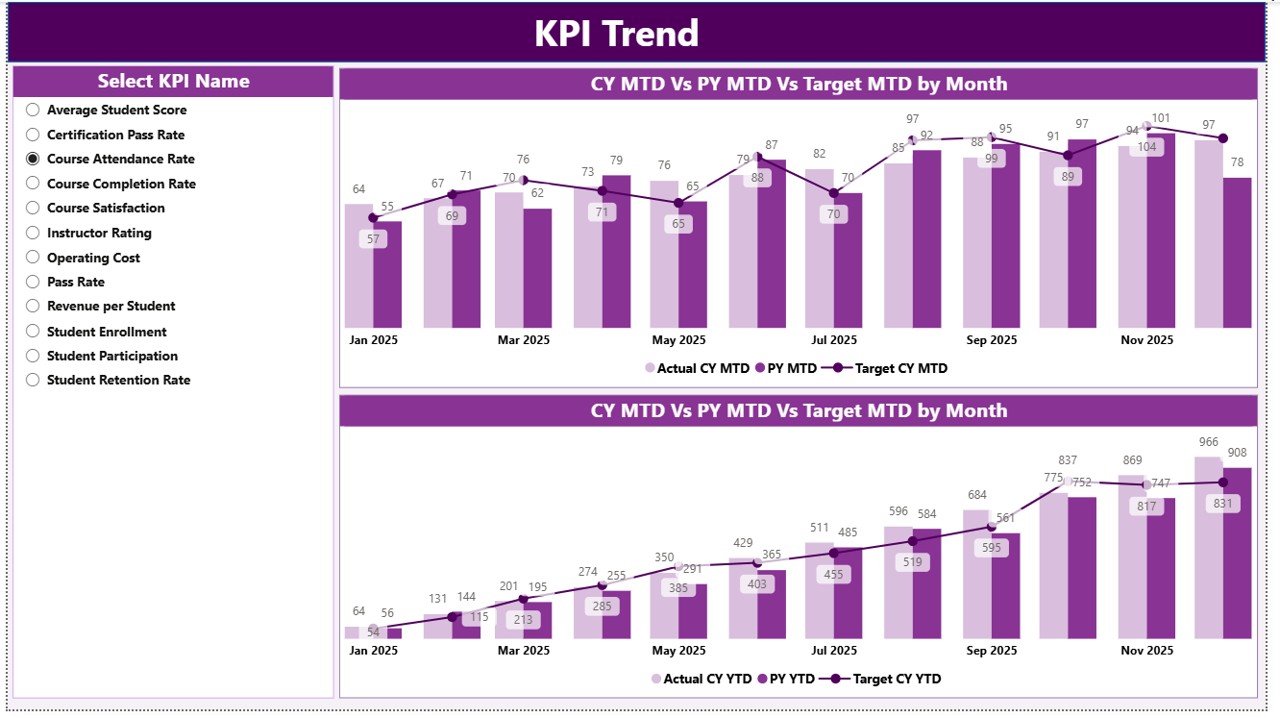
2. KPI Trend Page
Click to Buy Coding Bootcamps KPI Dashboard in Power BI
This page offers visual trend analysis through combo charts. It highlights how KPIs perform over time, comparing actual values vs targets across both current and previous years.
- Two combination charts presenting Actual Numbers for Current Year, Previous Year, and Targets for both MTD and YTD.
- KPI name slicer on the left allows dynamic selection to view trends for specific KPIs.
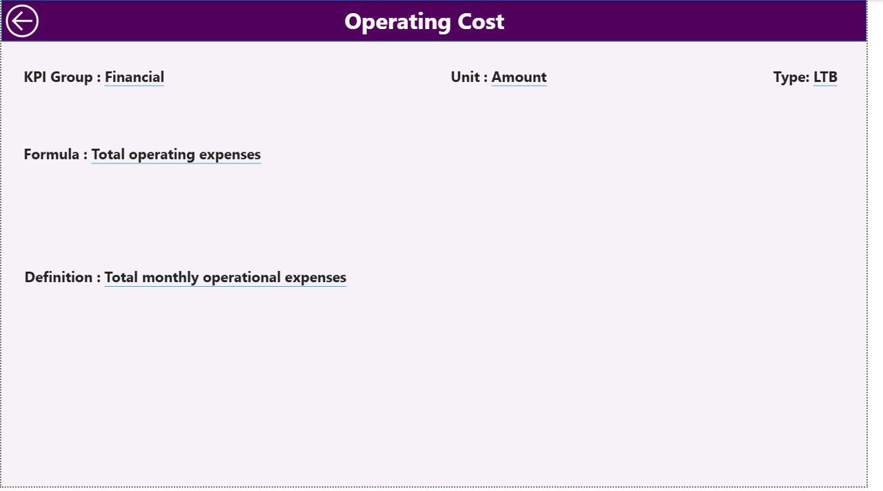
3. KPI Definition Page
This hidden drill-through page provides detailed explanations for each KPI, including formulas and definitions. It helps users understand what the KPIs represent and how they are calculated.
- Accessed by drilling through from the Summary page.
- Includes fields such as KPI Number, KPI Group, Name, Unit, Type, Formula, and detailed Description.
- Simple back button located at the top left corner for easy navigation back to the main page.
Excel Data Integration
Click to Buy Coding Bootcamps KPI Dashboard in Power BI
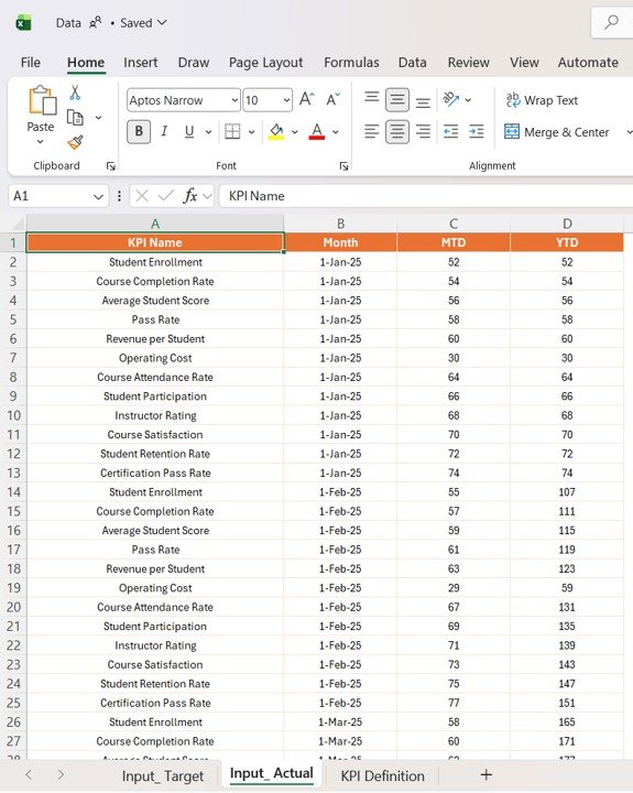
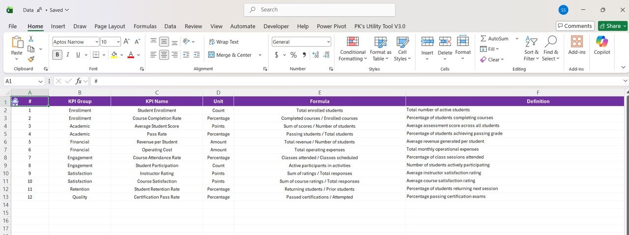
The dashboard pulls data from an Excel file containing three key worksheets:
- Input_ Actual sheet: Fill in actual monthly and YTD values by KPI. The Month field should contain the first date of the month.
- Input_ Target sheet: Fill in target monthly and YTD values similarly.
- KPI Definition sheet: Populate KPI metadata including Number, Group, Name, Unit, Formula, Description, and Type (LTB or UTB).

Advantages of Coding Bootcamps KPI Dashboard in Power BI
Click to Buy Coding Bootcamps KPI Dashboard in Power BI
- Real-time KPI Monitoring: Instant updates on performance metrics with Excel data refresh.
- Visual Clarity: Use of icons, color coding, and charts allows quick grasp of KPI health.
- Historical Comparison: Easily compare current performance with the previous year’s data to identify trends.
- Customizable Filtering: Slicers provide easy data segmentation by month or KPI group.
- Actionable Insights: Drill-through details support deeper understanding of KPIs and facilitate informed decision-making.
Opportunities for Improvement
- Automate Data Refresh: Implement Power Automate workflows to sync Excel and Power BI for near real-time data updates.
- Add Predictive Analytics: Incorporate forecasting capabilities to predict future KPI trends.
- Mobile Optimization: Customize visuals for enhanced usability on mobile devices.
- Expand KPI Coverage: Include more detailed demographics or bootcamp-specific outcomes like job placement rates.
- Interactive Tutorials: Embed help or tutorial videos inside the dashboard for user guidance.
Best Practices
Click to Buy Coding Bootcamps KPI Dashboard in Power BI
- Maintain Clean Data: Ensure Excel data is accurate, consistent, and regularly updated.
- Use Consistent Naming Conventions: Uniform KPI names facilitate clear reporting and analysis.
- Leverage Filters Wisely: Avoid over-filtering which can limit insights; find a balance for interactive exploration.
- Document Calculations: Clearly define formulas and include them in the KPI Definition sheet.
- Test User Navigation: Ensure drill-through and back buttons function intuitively to enhance user experience.
FAQs
What is the main data source for the dashboard?
The dashboard sources data from an Excel file containing actual KPIs, target KPIs, and KPI definitions.
Can I add new KPIs to the dashboard?
Yes, by updating the KPI Definition sheet and corresponding actual and target data, new KPIs can be integrated.
How are the KPI performance icons determined?
Icons (up/down arrows in red/green) indicate whether the KPI is meeting or missing the targets, with color coding based on the KPI type (LTB or UTB).
Is the dashboard suitable for mobile use?
The current design is optimized for desktop Power BI experience. Mobile optimization could be implemented as an improvement.
Conclusion
Click to Buy Coding Bootcamps KPI Dashboard in Power BI
The Coding Bootcamps KPI Dashboard in Power BI is a powerful tool to track, analyze, and visualize key performance indicators effortlessly. With Excel as the backend data source, users can maintain data flexibly and keep insights up to date. The dashboard’s intuitive design combined with drill-through definitions empowers stakeholders to make informed decisions that drive the success of coding bootcamp programs.
Ready to elevate your KPI reporting? Explore this dashboard and harness actionable insights today.
For more detailed tutorials and live demonstrations, Visit our YouTube channel to watch the demo.
For official Power BI resources, visit Microsoft Power BI Documentation.
Click to Buy Coding Bootcamps KPI Dashboard in Power BI