The Dental Practice Dashboard in Excel is a professionally designed analytics template that gives dental clinics, orthodontic offices, and oral healthcare providers a complete visual overview of their practice operations. Built entirely with pivot tables and slicers, this Excel dashboard tracks treatment costs, patient payments, dentist performance, insurance analytics, and patient demographics across 5 interactive pages — all refreshable with a single click. Whether you run a single-chair practice or manage a multi-location dental group, this template turns raw appointment and billing data into actionable insights without requiring any VBA macros or advanced Excel knowledge.
👉 Click here to Purchase the Dental Practice Dashboard in Excel
Key Features of the Dental Practice Dashboard in Excel
This dental analytics template stands out for its depth and ease of use. Here are the major features that make it a must-have for any dental practice looking to embrace data-driven decision-making:
- 5 Interactive Dashboard Pages — Overview, Treatment Analysis, Dentist Performance, Insurance Analysis, and Patient Insights, each packed with dynamic charts and KPI cards.
- 5 KPI Summary Cards — Total Treatment Cost, Total Records, Total Completed, Total Patient Paid, and Avg. Satisfaction displayed prominently on the Overview page.
- Slicer-Based Filtering — Multiple slicers on the Overview page let you filter the entire dashboard by department, treatment type, dentist, month, and more.
- Pivot-Powered Auto-Refresh — Every chart is backed by pivot tables on a dedicated Support Sheet. Update your data and click Refresh All to instantly update the entire dashboard.
- Structured Data Sheet — A clean input sheet with sample data showing exactly how to organize appointments, treatments, billing, and patient information.
- No VBA or Macros Required — Works entirely with standard Excel features, compatible with Excel 2016 and later versions.
- 15+ Charts Across 5 Pages — Covers treatment cost breakdowns, cancellation analysis, dentist productivity, insurance coverage, payment methods, referral sources, and yearly trends.
Dashboard Pages Explained
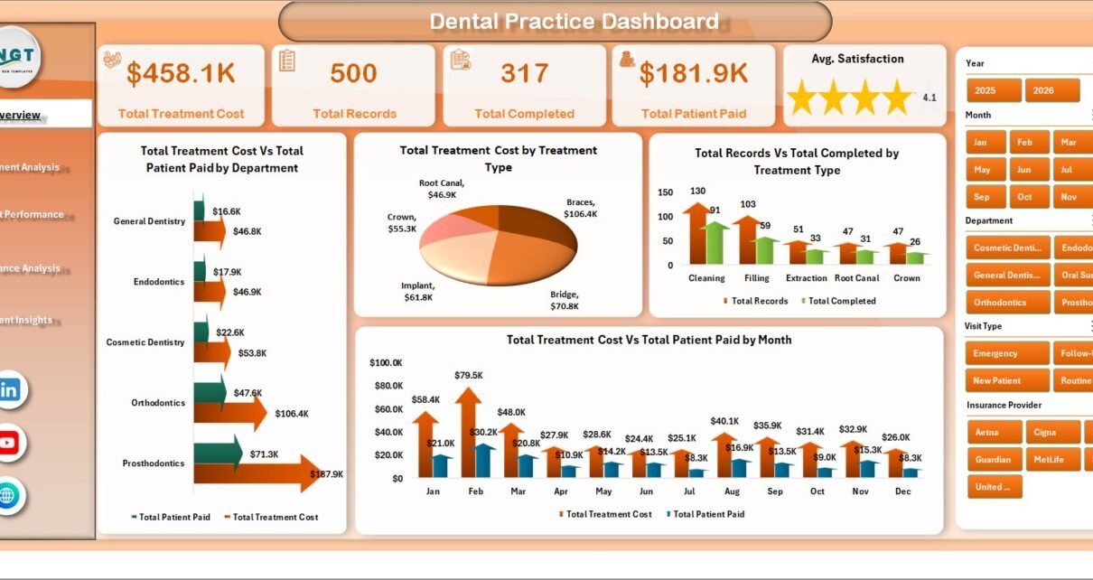
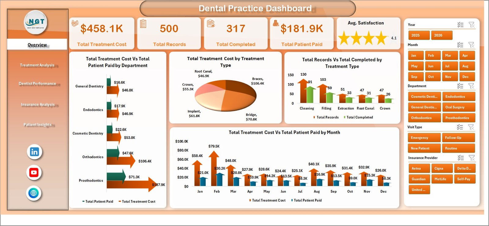
1. Overview Page
The Overview page serves as the command center for your dental practice analytics. At the top, five KPI cards provide an instant snapshot of your practice health: Total Treatment Cost shows the cumulative value of all treatments rendered, Total Records displays the number of patient appointments, Total Completed counts successfully finished treatments, Total Patient Paid reveals actual collected revenue, and Avg. Satisfaction measures patient experience scores.
Below the cards, four powerful charts visualize your data from different angles. The Total Treatment Cost Vs Total Patient Paid by Department chart highlights revenue gaps across your clinical departments. The Total Treatment Cost by Treatment Type chart breaks down which procedures generate the most revenue. The Total Records Vs Total Completed by Treatment Type chart reveals completion rates, and the Total Treatment Cost Vs Total Patient Paid by Month chart tracks your financial performance over time. Multiple slicers allow you to filter all charts simultaneously for quick drill-down analysis.
Dental Practice Dashboard — Overview Page2. Treatment Analysis
The Treatment Analysis page provides a deeper look into how individual treatment types perform across your practice. The Avg. Satisfaction by Treatment Type chart helps you identify which procedures leave patients most satisfied, providing direct feedback for service improvement. The Insurance Coverage % by Treatment Type chart reveals how much of each procedure is typically covered by insurance, which is invaluable for patient billing conversations and financial planning.
The Total Cancelled Vs Total No-Shows by Treatment Type chart is especially useful for spotting scheduling inefficiencies — certain procedures may have higher cancellation rates that need addressing through reminders or policy changes. Finally, the Total Treatment Cost by Dentist chart connects treatment revenue to individual practitioners, providing a bridge to the Dentist Performance page.
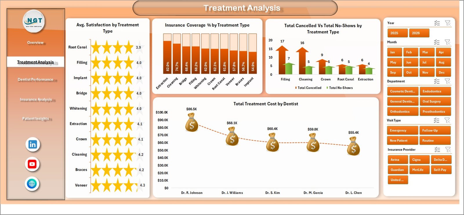 Treatment Analysis
3. Dentist Performance
This page is designed for practice managers who need to evaluate and compare dentist productivity. The Total Completed by Dentist chart ranks your dentists by the number of treatments they have successfully completed. The Avg. Satisfaction by Dentist chart overlays patient satisfaction scores so you can see who delivers the best patient experience alongside high volume.
The Total Records by Dentist chart shows appointment load distribution, helping you balance workloads across your team. The Total Treatment Cost Vs Total Insurance Covered by Insurance Provider chart provides a unique cross-reference between dentist revenue and insurance payer performance. For Google Sheets users, a similar KPI-focused version is available in the Dental Practice KPI Dashboard in Google Sheets.
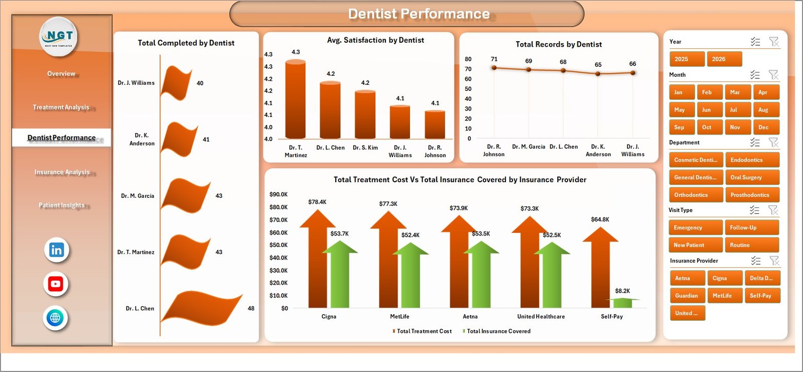 Dentist Performance
4. Insurance Analysis
Understanding your insurance payer mix is critical for dental practice revenue optimization. The Total Records by Insurance Provider chart shows which insurers send you the most patients, helping with network decisions. The Total Treatment Cost by Payment Method and Total Patient Paid by Payment Method charts break down how patients pay — cash, credit card, insurance, or other methods — giving you insight into collection patterns.
The Total Treatment Cost Vs Total Records by Visit Type chart categorizes appointments (new patient, follow-up, emergency, etc.) and compares their revenue contribution and volume. This is essential for understanding which visit types drive the most value for your practice.
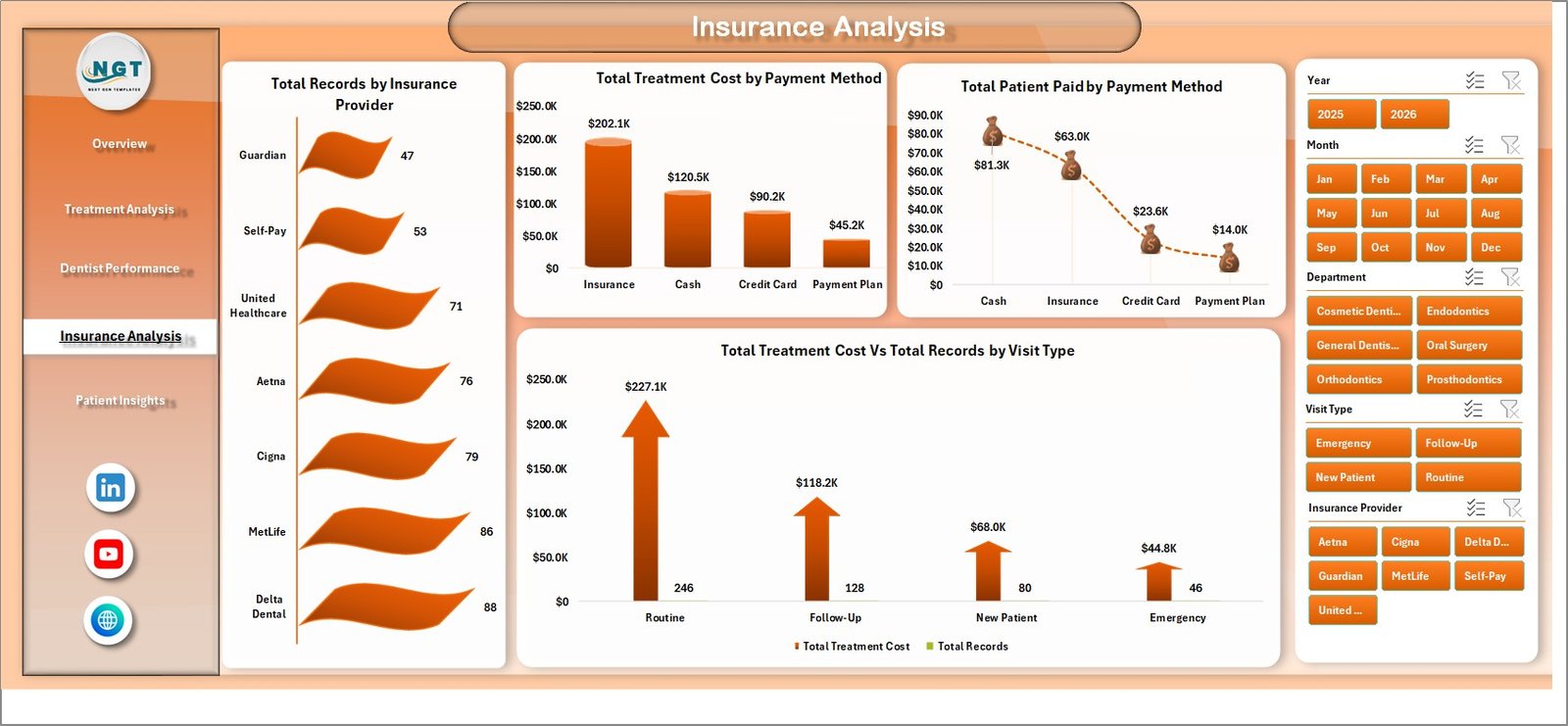 Insurance Analysis
5. Patient Insights
The Patient Insights page focuses on understanding who your patients are and how they found you. The Total Records by Referral Source chart reveals your most effective patient acquisition channels — whether it is Google, word-of-mouth, insurance referrals, or social media. This data directly informs your marketing budget allocation.
The Total Treatment Cost by Gender chart provides demographic segmentation of treatment revenue, while the Total Treatment Cost Vs Total Records by Year chart shows your practice growth trajectory over time. Together, these charts help you build a patient acquisition and retention strategy backed by real numbers. For hospital-level healthcare analytics, also explore the Hospitals Dashboard in Excel.
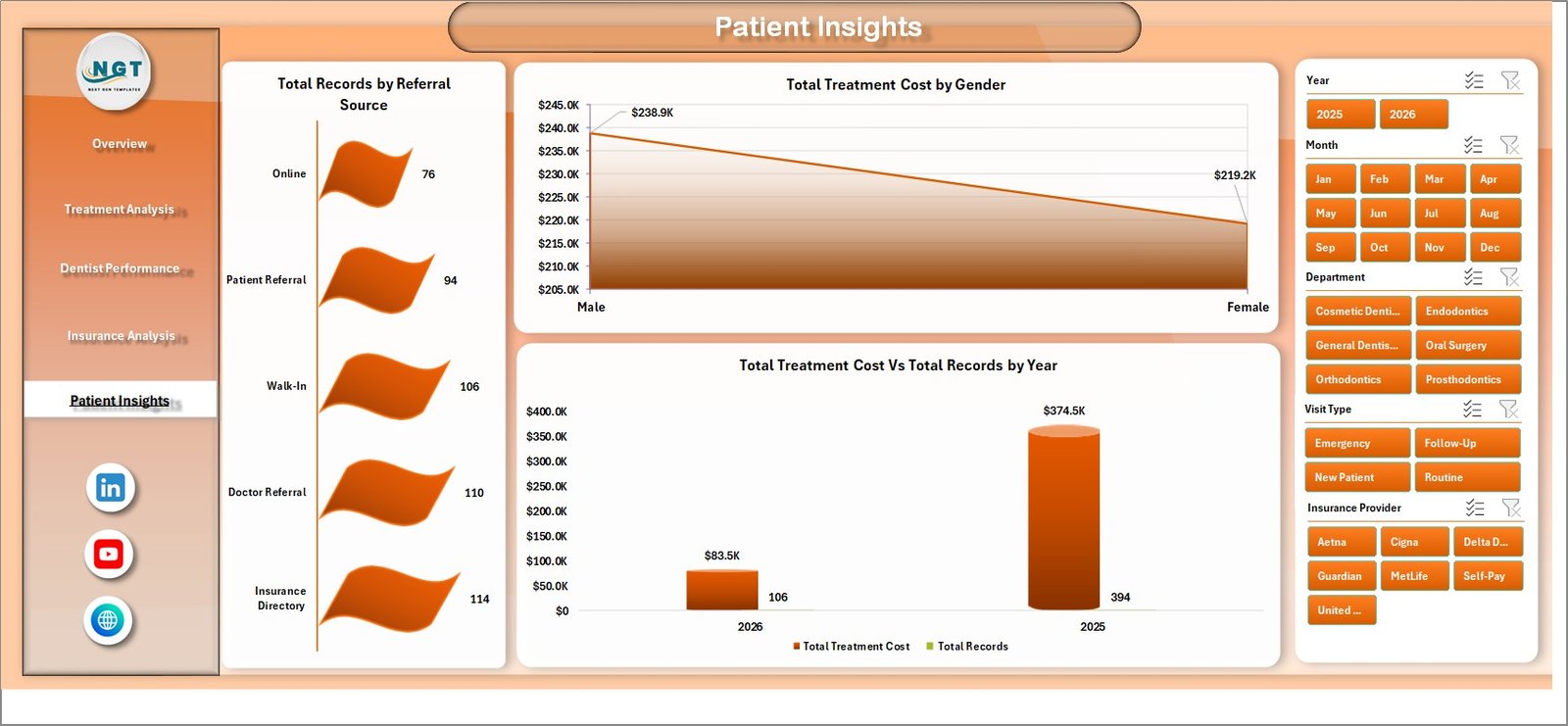 Patient Insights
6. Data Sheet
The Data Sheet is the backbone of the entire dashboard. This is where you enter all your dental practice records — patient names, appointment dates, treatment types, dentist assignments, department codes, insurance details, payment amounts, satisfaction scores, and more. The template comes preloaded with sample data so you can see exactly how to structure your input. All five dashboard pages pull their data exclusively from this sheet.
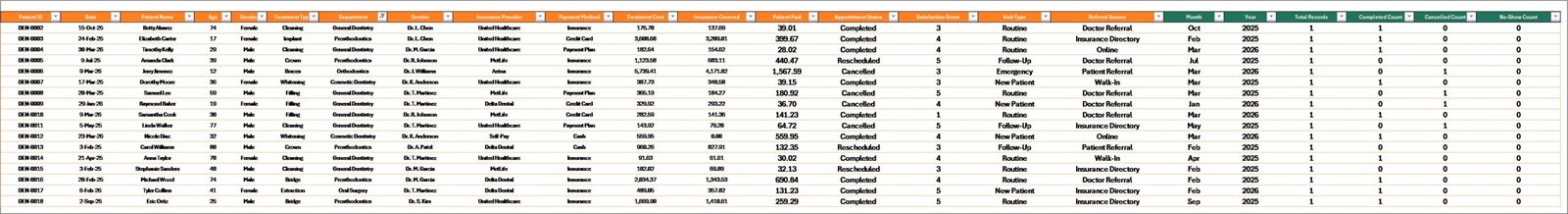 Data Sheet Tab
7. Support Sheet
The Support Sheet contains all the pivot tables that power the dashboard charts. You do not need to modify anything on this sheet — it works entirely behind the scenes. After you update your data in the Data Sheet, simply go to the Data tab in the Excel Ribbon and click Refresh All. Every pivot table recalculates and every chart updates automatically. You can keep this sheet hidden during daily use for a cleaner workbook experience.
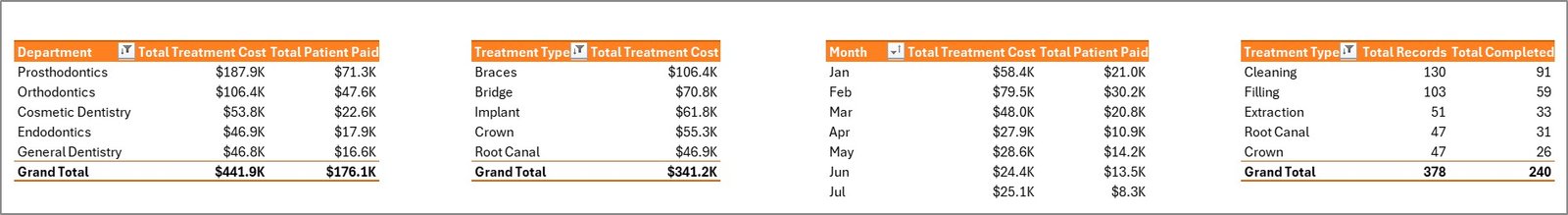 Support Sheet Tab
Advantages of the Dental Practice Dashboard in Excel
- Immediate Visibility — Stop guessing about practice performance. Five KPI cards and 15+ charts give you instant clarity on revenue, patient flow, dentist productivity, and insurance analytics.
- Zero Learning Curve — No VBA, no macros, no complex formulas. If you can paste data into Excel and click Refresh All, you can use this dashboard.
- Fully Customizable — Add new treatment types, dentists, departments, or insurance providers to the Data Sheet and they automatically appear in charts after refresh.
- Cost-Effective Analytics — Get practice management insights without investing in expensive dental software or BI tools. Excel is already on every dental office computer.
- Multi-Dimensional Analysis — Five dedicated pages ensure you can analyze treatments, dentists, insurance, patients, and financials without cluttering a single view.
Opportunities for Improvement
- Appointment Scheduling Integration — Adding a calendar or timeline view could help visualize appointment density and identify scheduling gaps.
- Trend Alerts — Conditional formatting on KPI cards to highlight when satisfaction drops below a threshold or cancellation rates spike would add proactive monitoring.
- Patient Retention Tracking — A dedicated metric for repeat visit rates and patient retention over time would strengthen the Patient Insights page.
- Cost vs. Profit Margins — Including procedure cost data alongside revenue would enable profit margin analysis per treatment type.
Best Practices for Using This Dental Dashboard
- Update Data Weekly — For the most accurate insights, add new records to the Data Sheet at least once a week and refresh all pivot tables.
- Use Slicers First — Before interpreting any chart, use the Overview page slicers to focus on the specific department, time period, or dentist you want to analyze.
- Compare Month-Over-Month — Use the monthly chart on the Overview page to track trends and catch seasonal dips early.
- Share Dentist Performance Reports — Print or share the Dentist Performance page during team meetings to drive accountability and celebrate top performers.
- Monitor Cancellations and No-Shows — The Treatment Analysis page reveals scheduling issues. If certain treatment types have high no-show rates, consider automated reminder systems.
- Review Insurance Mix Quarterly — The Insurance Analysis page helps you evaluate which insurance networks are most profitable. Use this data during annual network contract negotiations.
Explore Relevant Templates
If you find the Dental Practice Dashboard in Excel valuable, you may also want to explore these related templates from NextGenTemplates:
- Dental Services Dashboard in Power BI — Advanced dental analytics with Power BI interactivity for larger practice groups and multi-location reporting.
- Dental Services Dashboard in Excel — A complementary dental template focused on service-level appointment and revenue tracking.
- Dental Services KPI Dashboard in Power BI — KPI-focused dental analytics with Power BI drill-through capabilities.
- Hospitals Dashboard in Excel — Broader healthcare analytics for hospital administration and clinical operations.
- Dental Practice KPI Dashboard in Google Sheets — A Google Sheets alternative for dental practices that prefer cloud-based spreadsheets.
Frequently Asked Questions
What KPIs does the Dental Practice Dashboard in Excel track?
The Dental Practice Dashboard in Excel tracks 5 key performance indicators on the Overview page: Total Treatment Cost, Total Records, Total Completed, Total Patient Paid, and Average Satisfaction. Additional analysis across 4 more dashboard pages covers insurance coverage percentages, cancellation and no-show rates, dentist-level productivity, payment method breakdowns, referral source analysis, and yearly growth trends.
Do I need advanced Excel skills to use this dental dashboard template?
No. This template is built entirely with pivot tables and slicers that work automatically. Simply paste your dental practice data into the Data Sheet tab, go to the Data tab in the Excel ribbon, and click Refresh All. Every chart and KPI card updates instantly. No formulas to write and no VBA macros to enable.
How do I add my own data to the Dental Practice Dashboard?
Open the Data Sheet tab in the workbook. You will see sample records showing the required column format — patient details, treatment types, dentist names, departments, insurance info, payment amounts, satisfaction scores, and appointment dates. Replace the sample data with your own records in the same format, then click Refresh All from the Data tab in the Excel ribbon.
Can I customize the charts or add new treatment types and dentists?
Yes. Since all charts are powered by pivot tables, any new treatment types, dentists, insurance providers, or departments you add to the Data Sheet will automatically appear in the relevant charts after refreshing. You can also modify chart styles, colors, and layouts using standard Excel formatting tools.
Is this template compatible with Google Sheets?
This template is optimized for Microsoft Excel 2016 and later. Pivot-table slicers and certain chart features may not render correctly in Google Sheets or LibreOffice. If you prefer a cloud-based solution, check out the Dental Practice KPI Dashboard in Google Sheets which is specifically designed for Google Sheets.
What is the best Excel template for tracking dental practice performance?
The Dental Practice Dashboard in Excel from NextGenTemplates is one of the most comprehensive options available. It covers treatment analysis, dentist performance evaluation, insurance analytics, and patient demographics across 5 dedicated interactive dashboard pages. With pivot-table auto-refresh and slicer-based filtering, it is ideal for any dental clinic that wants to make data-driven decisions using a tool they already have — Microsoft Excel.
Conclusion
The Dental Practice Dashboard in Excel empowers dental clinics to move beyond spreadsheets full of raw data and into a world of visual, actionable analytics. With 5 interactive dashboard pages covering treatments, dentist performance, insurance, and patient insights, plus a one-click refresh system powered by pivot tables, this template is the most efficient way to monitor and improve your dental practice operations.
👉 Click here to Purchase the Dental Practice Dashboard in Excel
For step-by-step video tutorials on how to use Excel dashboards, visit our YouTube channel:
🎥 Youtube.com/@PK-AnExcelExpert