Running a car dealership on spreadsheets that never talk to each other is exhausting. One workbook tracks monthly sales, another tracks financing, another tracks who owes what — and by Friday the GM is stitching them together by hand to answer three questions: are we making margin, which branch is slipping, and which brand is tying up cash?
The Car Dealership Dashboard in Excel answers all three in a single file. It consolidates every sale record into one Data sheet and then drives 5 interactive pages from a pivot-based engine — so you paste in new data, click Refresh All, and every chart, KPI card, and slicer on every page updates in seconds. No broken formulas. No chart ranges to re-point. No Power BI subscription to renew.
This guide walks through every page, the KPIs powering it, who the template is for, how it stacks up against DealerSocket and VinSolutions, and how to set it up in under 10 minutes.
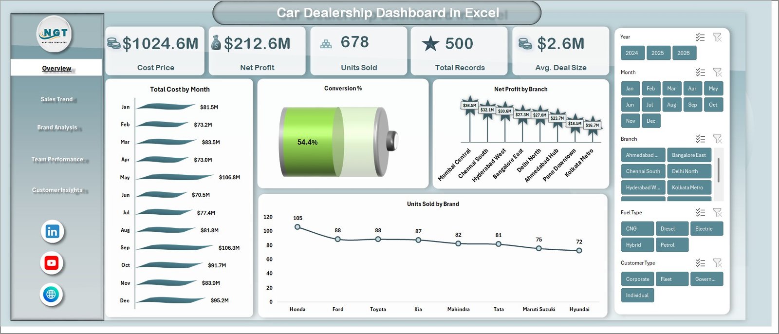
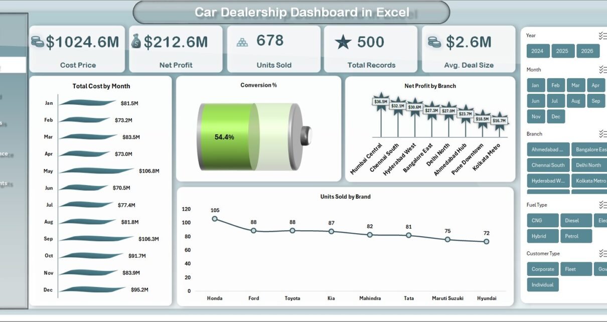
Car Dealership Dashboard in Excel — Overview page
Introduction — Why Dealerships Need a Purpose-Built Dashboard
According to NADA industry reporting, average net margin at US dealerships sits between 2% and 4% — which means a single under-priced SUV segment or a lazy salesperson can erase a week’s profit. Independent dealers and small multi-brand groups rarely justify a $30,000+/year DMS + CRM stack, but they still need branch-level margin visibility, salesperson conversion tracking, and a clear view of which financing mix actually earns money.
The Car Dealership Dashboard in Excel fills that gap. It’s a pivot-driven Excel file with 5 analysis pages, 15+ pre-built charts, and 4 slicers on every page. Setup takes under 10 minutes. Cost is a one-time $17.99. No subscription, no per-user fees, no vendor lock-in.
Key Features of the Car Dealership Dashboard in Excel
The Car Dealership Dashboard in Excel tracks 5 headline KPIs — Cost Price, Net Profit, Units Sold, Total Records, and Avg. Deal Size — across five pages of analysis. Every chart is powered by a pivot table on the Support sheet, so the entire dashboard refreshes with a single click after you paste new data.
The four slicers on every page (Brand, Branch, Fuel Type, Vehicle Type) let a GM isolate Toyota SUV performance at the Wakad branch in one click. The dashboard calculates Profit Margin %, Conversion %, and Total Revenue automatically from the raw Cost Price and Sale Price columns — so finance and sales see the same number without a second report.
Unlike cloud DMS tools that lock your reporting schema, this template is fully editable. Add a Stock Type column for new vs. used split, drop in a new pivot, and your new KPI lives on the dashboard without breaking anything.
Dashboard Pages Explanation
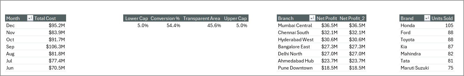
1. Overview Page
The Overview is the dealership’s financial homepage. Five KPI cards at the top show Cost Price, Net Profit, Units Sold, Total Records, and Avg. Deal Size — the numbers a GM wants to see before their first coffee. Below the cards, four charts tell the story of the dealership’s financial health.
Total Cost by Month reveals seasonal inventory swings — useful for timing wholesale buys. Conversion % tracks how efficiently leads turn into sales month-over-month. Net Profit by Branch ranks outlet profitability so you know which branch manager to congratulate and which one to coach. Units Sold by Brand shows which manufacturers move fastest on your lot. The four slicers — Brand, Branch, Fuel Type, Vehicle Type — re-segment every chart and card in one click.
Overview Page
2. Sales Trend Page
The Sales Trend page analyses performance across time. Total Revenue vs. Net Profit by Month places revenue and margin on the same axis so you can spot the months where revenue grew but margin shrank — a classic sign of discount-led selling. Units Sold by Year gives you the multi-year volume picture. Avg. Deal Size by Month surfaces pricing and product-mix shifts. Profit Margin % by Month plots your financial health trend line.
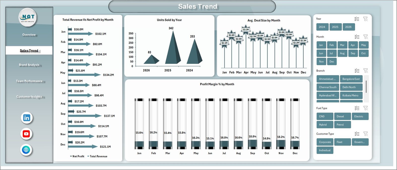
Sales Trend
3. Brand Analysis Page
The Brand Analysis page ranks inventory by manufacturer and segment. Total Revenue vs. Total Cost by Brand reveals which brands actually make money once you factor in what you paid for them. Net Profit by Vehicle Type compares SUV vs. Sedan vs. Hatchback margins — often the single most useful chart for stocking decisions. Total Records by Fuel Type breaks your sales by Petrol, Diesel, Electric, and Hybrid, which is increasingly important as EV demand shifts regional mix.
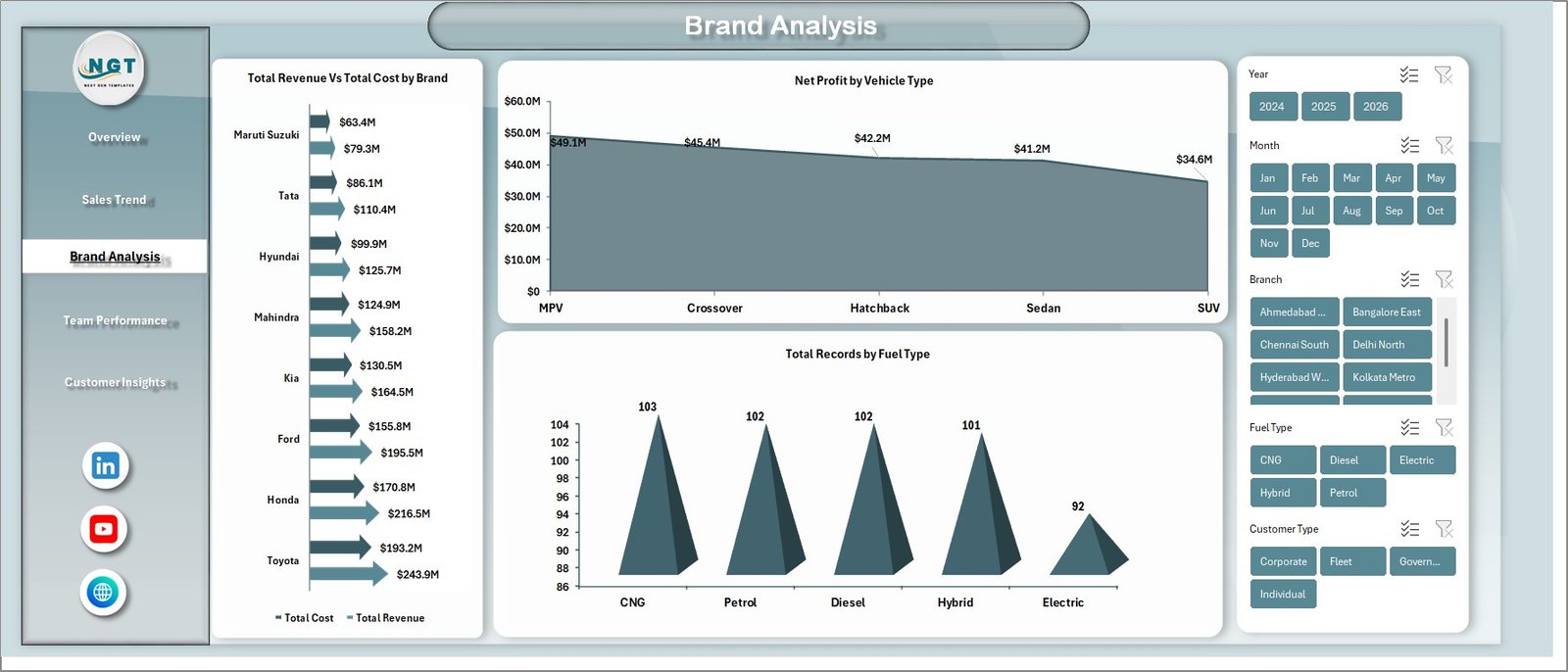
Brand Analysis
4. Team Performance Page
The Team Performance page puts your sales floor under a microscope. Total Revenue vs. Net Profit by Branch shows which outlet manager is actually beating targets — not just hitting volume. Units Sold by Salesperson and Conversion % by Salesperson expose who is closing vs. who is burning through leads. Avg. Deal Size by Branch uncovers branches that are under-pricing — often the hidden driver of thin margins.
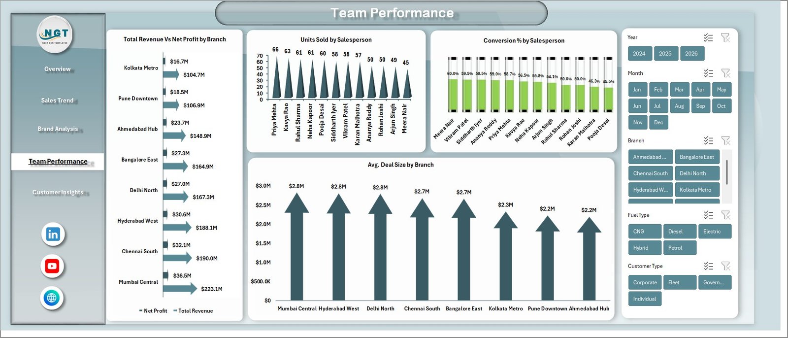
Team Performance
5. Customer Insights Page
The Customer Insights page uncovers who is buying and how they’re paying. Total Revenue by Customer Type splits Individual vs. Corporate buyers — critical for dealerships expanding fleet sales. Total Records by Payment Method shows the cash / card / loan mix. Net Profit by Financing Type compares dealership-financed deals vs. bank loans vs. cash. This is the chart most dealership owners don’t want to look at and absolutely should — financing margin often beats the vehicle margin.
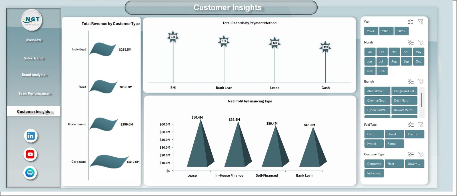
Customer Insights
6. Data Sheet
The Data sheet is the single source of truth. Every sale record goes here — Date, Brand, Model, Vehicle Type, Fuel Type, Branch, Salesperson, Customer Type, Payment Method, Financing Type, Units, Cost Price, Sale Price, Net Profit. Keep the column order intact and the entire dashboard auto-refreshes when you click Data → Refresh All.
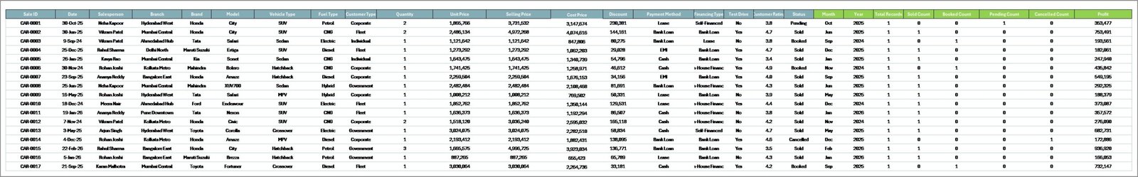
Data Sheet tab
7. Support Sheet
The Support sheet holds every pivot table that feeds the dashboard. After pasting new records, go to the Excel Ribbon → Data → Refresh All and every pivot recalculates. You can hide this sheet (right-click the tab → Hide) before sharing the file with branch managers, without breaking anything — Microsoft’s official PivotTable documentation explains the refresh mechanism if you want to go deeper.
Support sheet tab
Who Should Use This Template
Perfect for:
- Independent used-car dealers tracking 50–500 sales per month across 1–3 branches
- Multi-brand dealership GMs who want Toyota, Hyundai, and Honda performance side-by-side
- Finance managers comparing dealership-financed deals vs. bank loans vs. cash
- Dealership owners who refuse to pay $600+/month per rooftop for DealerSocket when a spreadsheet will do
Not a fit if:
- You run a large franchised auto group needing integrated CDK or Reynolds DMS + F&I menu selling
- You need real-time VIN decoding, OEM incentive feeds, or automated credit bureau pulls
- You have 20+ concurrent users needing role-based permissions and audit trails
Real-World Use Cases
Ramesh runs an independent used-car dealership in Pune with two showrooms and 180 sales a month. Every Friday he used to stitch together three spreadsheets by hand to prep his weekly review. Now he uses the Car Dealership Dashboard in Excel to compare branch-level Profit Margin % in seconds. In the third week of using it, he noticed his Wakad branch was under-pricing SUVs by about 4%, coached his team, and recovered ₹3.2 lakh in margin the following month.
Priya is the F&I manager at a multi-brand Toyota-Honda dealership in Bangalore. Using the Customer Insights page, she spotted that dealership-financed deals were producing 18% margin vs. 11% on cash deals. She reallocated her call-back team to push financing on every walk-in and lifted overall dealership margin by 2.3 points the next quarter — worth more than her entire annual salary.
David owns a 3-rooftop dealership group in Texas. He was quoted $840/month/rooftop for DealerSocket Advanced Reporting — $30,240/year. He kept his DMS for lead and inventory management but replaced the reporting module with the Car Dealership Dashboard in Excel. Year-one savings: ~$29,000. He reinvested it in digital advertising.
Advantages of the Car Dealership Dashboard in Excel
The biggest advantage is cost. A one-time $17.99 purchase vs. $600–1,500 per month per rooftop for a cloud CRM is the difference between a tank of diesel and a down payment on an employee’s bonus. For a 3-rooftop group, the year-one cost difference is roughly $29,000 — real money.
The second advantage is speed to value. Most DMS reporting modules take 4–8 weeks to configure. The Car Dealership Dashboard in Excel is running on your own data in under 10 minutes. You don’t need IT, you don’t need a consultant, you don’t need a training session.
The third advantage is editability. Because every chart is pivot-driven rather than formula-driven, you can add a column to the Data sheet, drop in a new pivot, and ship a new KPI without breaking the rest of the dashboard. Cloud DMS tools lock the reporting schema — this one doesn’t.
Opportunities for Improvement
Let’s be honest about where this template isn’t the right choice. It does not replace a full DMS. If you need VIN decoding, OEM incentive feeds, F&I menu selling, or automated credit bureau pulls, you need a purpose-built system — keep your DealerSocket or VinSolutions and use this dashboard alongside it for reporting only.
It also does not handle real-time multi-user editing the way Google Sheets does. If 8 people need to edit the Data sheet simultaneously, consider the Google Sheets version instead. And it doesn’t generate automated alerts or email summaries — you’ll want to pair it with Power Automate or a VBA macro if that’s a hard requirement.
Best Practices
Keep the Data sheet column order locked. Every pivot depends on it — if you insert a column in the middle, the pivot source range may silently break. Always append new columns at the end.
Hide the Support sheet before sharing the file with branch managers. Right-click the tab → Hide. They get a clean dashboard, you keep the pivot engine tidy.
Refresh once, not repeatedly. Data → Refresh All reprocesses every pivot in the file. Doing it once after a paste is enough — repeated refreshes on large datasets slow things down without adding value.
Pair this dashboard with the Automotive Parts Manufacturing Dashboard in Excel if you also run a parts & service department — the two give you complete upstream-to-retail visibility.
Explore Relevant Templates
Looking to expand your automotive analytics stack? Browse our full library of Excel Dashboard Templates or explore these related tools:
- Automotive Parts Manufacturing Dashboard in Excel — for the parts & service side of the business
- Automotive KPI Scorecard in Excel — MTD/YTD scorecard for leadership reviews
- Used Car Sales KPI Dashboard in Google Sheets — Sheets alternative for collaborative teams
- Fleet Management Dashboard in Power BI — if you also operate a rental or lease fleet
- Automotive KPI Dashboard in Google Sheets — cloud-native version
Frequently Asked Questions
What KPIs does the Car Dealership Dashboard in Excel track?
The Car Dealership Dashboard in Excel tracks 5 header KPIs — Cost Price, Net Profit, Units Sold, Total Records, and Avg. Deal Size — plus derived metrics including Profit Margin %, Conversion %, Total Revenue, and Net Profit broken down by Brand, Branch, Salesperson, Vehicle Type, Fuel Type, Customer Type, Payment Method, and Financing Type.
How long does setup take?
Setup takes under 10 minutes. Open the file, replace sample rows in the Data sheet with your own records in the same column order, and click Data → Refresh All. Every pivot and chart across all 5 dashboard pages updates automatically — no formulas to edit, no ranges to re-point.
How does the Car Dealership Dashboard in Excel compare to DealerSocket or VinSolutions?
The Car Dealership Dashboard in Excel is a one-time $17.99 offline reporting tool. DealerSocket and VinSolutions are $600–1,500/month/rooftop cloud CRMs with full DMS integration, VIN decoding, and F&I workflows. This dashboard replaces the reporting layer, not the full CRM — ideal for independents that already track leads elsewhere.
Can I add custom KPIs to the Car Dealership Dashboard in Excel?
Yes. The dashboard is fully editable. Add a new column to the Data sheet, create a new pivot on the Support sheet, and build a chart on any page. Because the engine is pivot-driven rather than formula-driven, new KPIs slot in without breaking existing ones.
Will this template work for both used-car and new-car dealerships?
Yes. The Car Dealership Dashboard in Excel works for used-car, new-car, and mixed inventory operations. The Brand, Vehicle Type, Fuel Type, and Financing Type dimensions handle both segments. Add a Stock Type column to the Data sheet if you want to split new vs. used analysis explicitly.
What version of Excel is required?
The Car Dealership Dashboard in Excel runs on Microsoft Excel 2016, 2019, 2021, and Microsoft 365 on both Windows and Mac. It does not require Power Pivot, Power Query, or any add-ins — only native pivot tables, charts, and slicers.
Does the dashboard refresh automatically?
The Car Dealership Dashboard in Excel refreshes with one click. After pasting new records into the Data sheet, go to Data → Refresh All in the Excel ribbon and every pivot on the Support sheet reprocesses, updating every chart and KPI card on all 5 pages.
About the Author
Built by PK — Microsoft Certified Professional with 15+ years of Excel, Google Sheets, and Power BI experience. Founder of NextGenTemplates, reaching 300K+ subscribers across YouTube channels. Every template is hand-built and tested before release.
Conclusion
If you’re running a 1- to 3-rooftop dealership and spending Friday afternoons stitching spreadsheets together to answer the same three questions about margin, branches, and brands, the Car Dealership Dashboard in Excel will pay for itself in the first hour. Five pages, five KPIs, one-click refresh, full editability, and no subscription — for a one-time $17.99.
👉 Click here to Purchase the Car Dealership Dashboard in Excel
✅ Instant download · One-time payment · No subscription · Lifetime access
🎥 For step-by-step video tutorials, visit YouTube.com/@PK-AnExcelExpert