The Museum Dashboard in Excel tracks 5 headline KPIs across 5 interactive analysis pages, with 15+ pre-built pivot charts and slicer-driven filters for visitor type, exhibit, channel, ticket type, and event. Setup takes under 10 minutes — paste your visitor and ticketing data into the Data sheet, click Refresh All, and every KPI card and chart rebuilds automatically through native Excel pivot tables. This blog post walks through every page, explains how the dashboard fits into a typical museum operations workflow, and covers the questions buyers most often ask before downloading.
🌍 Used by 8,400+ teams in 40+ countries to replace expensive museum-management SaaS subscriptions with one-time-purchase Excel templates.
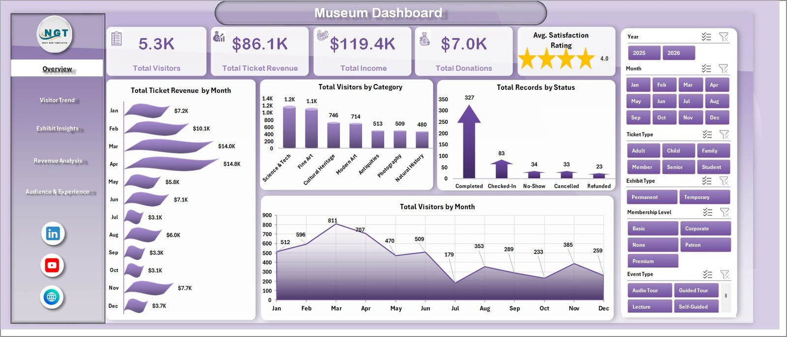
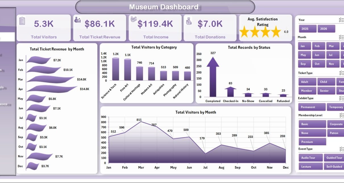
Museum Dashboard in Excel — Overview Page
Introduction
Running a museum or cultural institution today means juggling far more than just exhibit curation. Directors and operations leads track ticket revenue, donations, membership renewals, gift-shop sales, café receipts, visitor satisfaction, no-show rates, channel mix, and tourist demographics — and most of that data lives in three or four different systems. The Museum Dashboard in Excel is built to consolidate all of those signals into a single, refreshable workbook so you can spend less time wrangling reports and more time acting on what they say.
This template is purpose-built for independent museums, regional history sites, science centres, art galleries, and heritage institutions with annual visitor volumes between 5,000 and 500,000. It works on both Windows and Mac, ships with realistic sample data, and uses native Excel pivot tables — no add-ins, no macros, no Power Query learning curve. If you can paste a CSV and click Refresh All, you can run this dashboard.
Key Features of the Museum Dashboard in Excel
📊 5 KPI cards on the Overview page — Total Visitors, Total Ticket Revenue, Total Income, Total Donations, and Average Satisfaction Rating. Every card refreshes the moment you change a slicer or update the Data sheet.
🎨 5 interactive analysis pages — Overview, Visitor Trend, Exhibit Insights, Revenue Analysis, and Audience and Experience. Each page is a standalone view, but slicers carry filter context across pages where it makes sense.
🎟️ Slicer-driven filtering — Visitor Type, Exhibit, Channel, Status, Event Type, and Ticket Type. Drill into school groups visiting the dinosaur exhibit on weekends without writing a single formula.
💰 Multi-revenue tracking — The dashboard separately tracks Ticket Revenue, Donations, Merchandise Sales, and Café Sales, then rolls them up into Total Income — useful for grant reporting, board reviews, and trustee meetings.
🔄 Refresh-All workflow — Replace the sample bookings on the Data sheet with your own POS or ticketing-system export, click Data → Refresh All in the Excel ribbon, and the entire dashboard rebuilds in seconds.
🏛️ Scales with your institution — Tested with up to 50,000 visitor rows without performance issues. Whether you run a single regional history museum or a three-site art museum group, the same template works.
Dashboard Pages Explanation
Page 1 — Overview Page
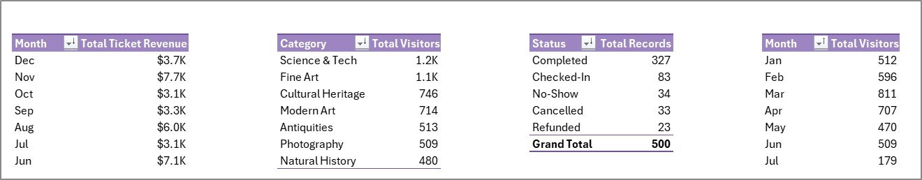
The Overview page presents the museum’s full performance picture in a single screen. Five KPI cards at the top display Total Visitors, Total Ticket Revenue, Total Income, Total Donations, and Average Satisfaction Rating. Four charts beneath them visualize Total Ticket Revenue by Month (the year’s revenue cycle including peak holiday and school-trip seasons), Total Visitors by Category (adults, students, seniors, families, members), Total Records by Status (attended, no-show, cancelled), and Total Visitors by Month (seasonality and footfall trends). Slicers above the cards let you filter the entire page by visitor type, exhibit, channel, or status — making this the fastest way to answer questions like “how did the spring half-term week compare to last year?”
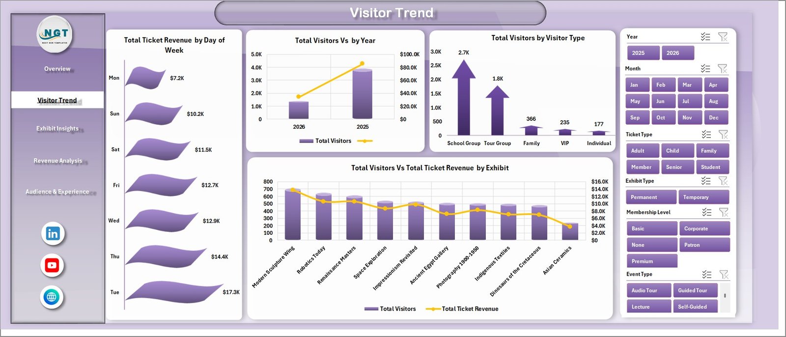
Visitor Trend
Page 2 — Visitor Trend
The Visitor Trend page focuses on attendance momentum and how visitor patterns translate into revenue. Charts include Total Ticket Revenue by Day of Week (weekday vs weekend demand), Total Visitors by Year (multi-year growth), Total Visitors by Visitor Type (adult, student, senior, member, school-group mix), and Total Visitors vs Total Ticket Revenue by Exhibit (which exhibits drive footfall versus which drive revenue per visitor). This page is the foundation for marketing planning, capacity forecasting, and pricing decisions — for example, deciding whether a weekday senior discount actually grew net revenue or just shifted visits.
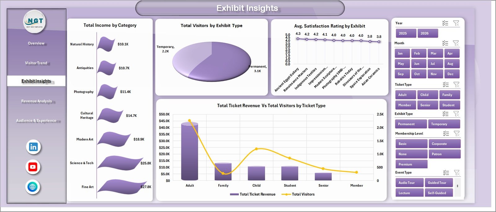
Exhibit Insights
Page 3 — Exhibit Insights
The Exhibit Insights page breaks down performance by exhibit and ticket category. Charts include Total Income by Category, Total Visitors by Exhibit Type (permanent, temporary, special, travelling), Average Satisfaction Rating by Exhibit, and Total Ticket Revenue vs Total Visitors by Ticket Type. This is the page curators and exhibit programmers use most — it makes it obvious which exhibits deliver high satisfaction and high revenue per visitor, which deserve extended runs, and which travelling exhibits are worth booking again next year.
Revenue Analysis
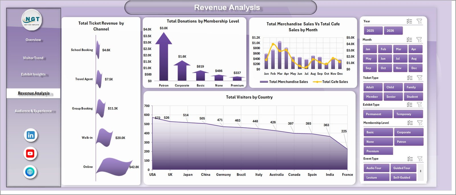
Page 4 — Revenue Analysis
The Revenue Analysis page maps the museum’s entire income stream. Charts cover Total Ticket Revenue by Channel (online, walk-in, group bookings, partner sites like Tiqets, GetYourGuide, or Viator), Total Donations by Membership Level, Total Merchandise Sales vs Total Café Sales by Month, and Total Visitors by Country for tourist demographics. Compare your direct online channel against third-party booking platforms to see how much commission is leaking out, identify which membership tiers actually drive philanthropic revenue, and track ancillary income side-by-side with admissions in a single view.
Audience and Experience
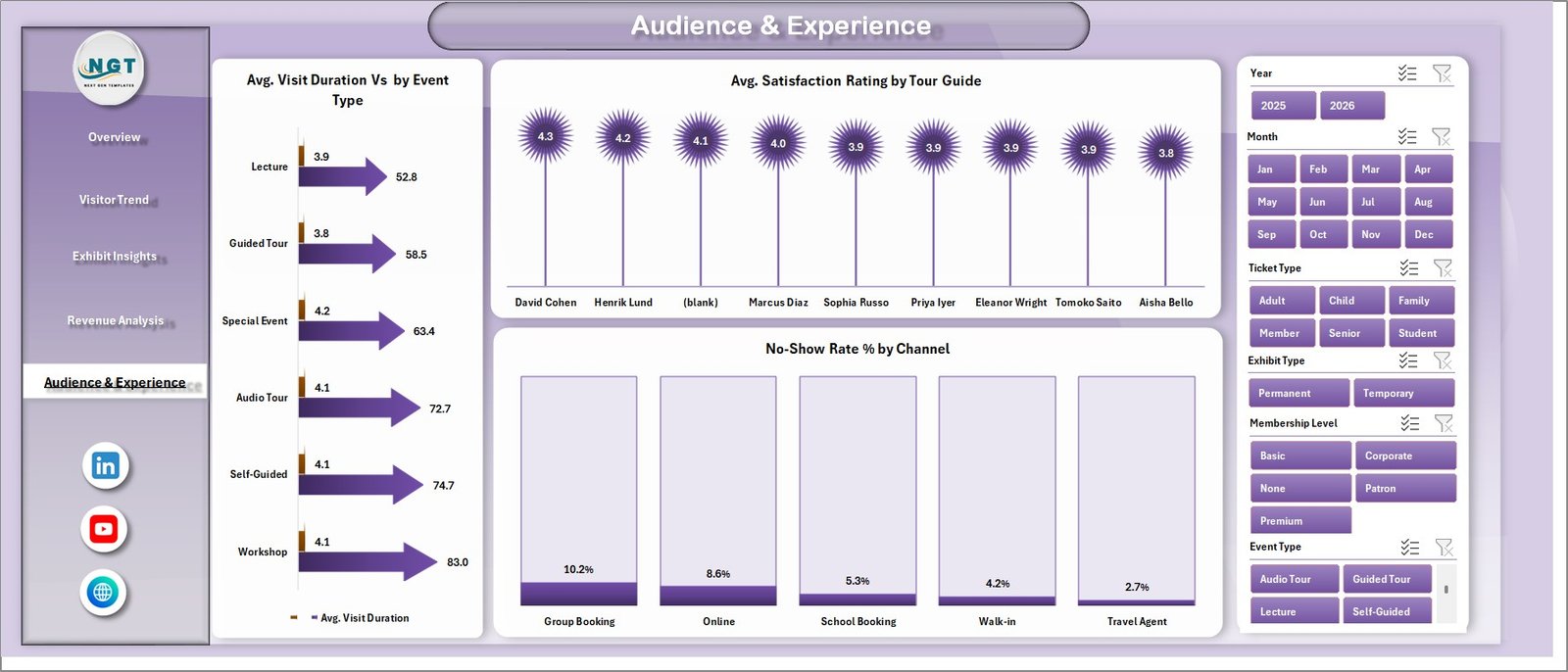
Page 5 — Audience and Experience
The Audience and Experience page profiles visitor behaviour and satisfaction qualitatively. Charts include Average Visit Duration by Event Type, Average Satisfaction Rating by Tour Guide, and No-Show Rate Percent by Channel. Spot which guides consistently exceed satisfaction targets (and deserve to lead bigger groups), which booking channels have the worst attendance reliability (and may need a deposit policy), and how event types differ in dwell time — useful inputs for staffing levels, training investment, and channel-mix decisions.
Data Sheet tab
Data Sheet Tab
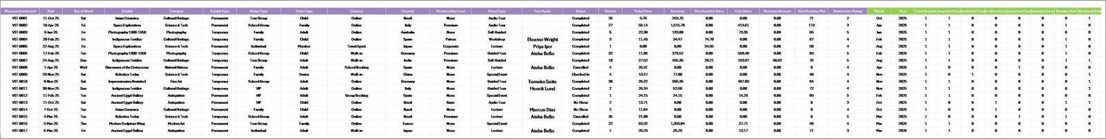
This is the Data sheet — the only tab you need to edit. Add or paste your visitor and transaction records in the same column format (Date, Visitor Type, Exhibit, Ticket Type, Channel, Status, Ticket Revenue, Donations, Merchandise Sales, Café Sales, Satisfaction Rating, Tour Guide, Country, Event Type). Every chart and KPI in the dashboard references this sheet through pivot tables on the Support sheet, so you never edit formulas — you just paste new rows and refresh.
Support sheet tab
Support Sheet
The Support sheet contains all the pivot tables that drive the dashboard charts dynamically. After updating data on the Data sheet, go to the Data tab in the Excel Ribbon and click Refresh All — every pivot and every chart refreshes automatically. You can keep this sheet hidden in production use to give end-users a clean, distraction-free dashboard.
Museum Dashboard in Excel vs. Google Sheets vs. Tessitura / Altru SaaS — Feature Comparison
| Feature | Museum Dashboard in Excel | Google Sheets equivalent | Tessitura / Altru / ACME SaaS |
|---|---|---|---|
| Cost | $17.99 one-time | $0 (DIY, no template) | $99 – $499 / month + setup |
| Platform | Microsoft Excel (Win + Mac) | Google Sheets (browser) | Cloud SaaS (browser + mobile) |
| Setup time | Under 10 minutes | 3-5 hours to recreate manually | 2-8 weeks onboarding |
| Slicer filtering | ✅ Native Excel slicers | Filter Views only | ✅ Built-in filters |
| Works offline | ✅ Yes | ❌ Internet required | ❌ Cloud-only |
| Customizable charts and KPIs | ✅ Fully editable | ✅ Editable | ❌ Vendor-controlled |
| Year-1 cost at 5 users | $17.99 total | $0 | $1,188 – $5,988 |
| Lifetime ownership | ✅ Yes | ✅ Yes | ❌ Subscription only |
| Built-in CRM and donor records | ❌ Analytics layer only | ❌ Manual | ✅ Full CRM |
For museums and cultural institutions that want fast, customizable performance visibility without paying $1,200+/year for SaaS, the Museum Dashboard in Excel sits in the sweet spot.
Who Should Use This Template
✅ Perfect for:
- Museum directors and operations managers preparing monthly board and trustee reports
- Visitor-experience managers tracking satisfaction by exhibit and tour guide
- Curators evaluating exhibit performance before extending or replacing temporary shows
- Marketing leads at cultural institutions analysing channel mix and tourist demographics
- Membership and development officers segmenting donations by membership level
- Independent science centres, art galleries, history museums, and heritage sites with 5,000 – 500,000 annual visitors
❌ Not a fit if:
- You need real-time live-feed integration with your CRM and ticketing system
- You require built-in donor-management or fundraising-CRM features (use Altru or Salesforce NPSP)
- You want mobile-first ticket-scanning apps for entry staff (use ACME or Tessitura)
- You need automated email-marketing workflows triggered by visit data
Real-World Use Cases
Marina is the operations director at a 60,000-visitor regional history museum. Each month she pastes her ticketing-system export and gift-shop POS data into the Data sheet, refreshes, and exports the Overview and Revenue Analysis pages to PDF for her board pack. She used to wrestle with three separate Power BI reports built by an outside consultant — now she owns the whole workflow in one Excel file and a 5-minute monthly refresh. Her board specifically asked for the no-show rate by channel chart after seeing it in one trustee meeting.
Daniel curates temporary exhibits at a mid-size science centre. He uses the Exhibit Insights page to compare visitor counts and satisfaction ratings across permanent, temporary, and travelling exhibits. The data justified extending one temporary show by 6 weeks and gave him concrete numbers when negotiating a higher fee for the next travelling exhibition booking. The template paid for itself the first month it shipped.
Priya leads marketing and partnerships at an art museum group with three locations. She duplicates the Museum Dashboard for each site, then uses the Revenue Analysis page to compare channel-mix performance — particularly to identify how much commission third-party booking platforms cost compared to direct online sales. The Total Visitors by Country chart also gives her concrete data when pitching tourist-board partnerships to capture more international visitors.
Advantages of the Museum Dashboard in Excel
🚀 Time savings on monthly reporting — What used to take a half-day of CSV merging and chart updates becomes a 5-minute paste-and-refresh.
💵 Zero subscription cost — Tessitura, Altru, and ACME charge between $1,000 and $5,000+ per year for similar dashboard layers. The Museum Dashboard in Excel is $17.99 once.
🎯 Grant and trustee-friendly — Each page is sized for A4/Letter PDF export. Print directly into board packs and grant submissions without reformatting.
🔧 Fully customizable — Every sheet is unlocked. Add new KPI cards, change colors to match your brand, add new fields to the Data sheet and they appear in the pivots after one refresh.
📚 Built on standard Excel features — Pivot tables and slicers are documented in Microsoft’s official PivotTable documentation. If you ever need to extend the template, every component uses Microsoft-standard techniques rather than third-party add-ins.
Opportunities for Improvement
Honesty matters when you’re spending operations budget, even at $17.99. A few areas where this dashboard is intentionally not the right answer:
It is not a CRM. If you need to track individual donor records, send membership-renewal reminders, or run fundraising appeals, you still need a system like Altru, DonorPerfect, or Salesforce NPSP. The dashboard analyses what those systems produce — it doesn’t replace them.
It is not a ticketing engine. You won’t sell tickets, scan QR codes at the door, or run timed-entry queues from this workbook. Use it alongside your existing ticketing platform.
It is not real-time. The data refreshes when you refresh — typically once a day or once a week, not minute-by-minute. For live operations dashboards, a Power BI implementation with scheduled refresh or a streaming dashboard would be more appropriate.
It is not multi-user collaborative in the cloud by default. If multiple staff members need to edit simultaneously from different devices, consider using OneDrive co-authoring or move to a Google Sheets equivalent.
Best Practices
1. Standardize your column names early. Whatever you choose for visitor types, exhibit names, and channels in your first import — keep them consistent. Pivot tables treat “Adult” and “adult” as different categories.
2. Refresh on a schedule. Pick a day each week or month and run the same paste → Refresh All → export PDF routine. Predictability builds trust with your board.
3. Hide the Support sheet when sharing the workbook. Right-click the tab → Hide. End-users see a clean dashboard without the pivot-table machinery.
4. Add your own KPIs incrementally. Start with the 5 built-in KPIs, then add 1-2 a quarter as your team agrees on what matters. Don’t try to track everything from day one.
5. Save a snapshot copy each month. The dashboard is dynamic by design — but for trustee reports you usually want an immutable snapshot of what the numbers were at month-end. Save As, append the month, and archive.
Explore Relevant Templates
If the Museum Dashboard fits your workflow, you may also like these culture, heritage, and ticketing templates:
- Museums & Cultural Centres Dashboard in Excel — broader cultural-centre coverage with similar visitor-and-revenue logic.
- Museum Operations KPI Dashboard in Excel — purpose-built KPI scorecard view for operations leads who want a more compact one-page report.
- Heritage Tourism KPI Dashboard in Excel — adjacent template for heritage sites and tourist boards covering visitor flow and tourism economics.
- Arts & Culture KPI Dashboard in Excel — sister template for arts organisations including theatres and performance venues.
- Ticketing and Live Events Dashboard in Excel — complements the Museum Dashboard for institutions running ticketed events and exhibits.
- Also available as: Browse our full Excel Dashboard Templates, Power BI Dashboards, and Google Sheets Dashboards libraries.
Frequently Asked Questions
What KPIs does the Museum Dashboard in Excel track?
The Museum Dashboard in Excel tracks 5 headline KPIs — Total Visitors, Total Ticket Revenue, Total Income, Total Donations, and Average Satisfaction Rating — plus 15+ supporting charts across Visitor Trend, Exhibit Insights, Revenue Analysis, and Audience and Experience pages. All KPIs update automatically when you replace the sample data with your own and click Refresh All.
How does the Museum Dashboard in Excel compare to Tessitura or Altru?
Tessitura and Altru are full museum-management CRMs costing $1,000 – $5,000+ per year with built-in ticketing, membership, and fundraising modules. The Museum Dashboard in Excel is a $17.99 one-time analytics layer — ideal for institutions that already handle ticketing elsewhere and just need a customizable performance dashboard without a multi-year subscription commitment.
How long does setup take?
Setup takes under 10 minutes for most museums. Open the file, paste your visitor and transaction export into the Data sheet matching the column structure, click Data → Refresh All in the Excel ribbon, and the dashboard is live. No formulas to write, no macros to enable, no add-ins to install.
Will the Museum Dashboard in Excel work on Mac?
Yes — the Museum Dashboard in Excel works on both Windows and Mac in Excel 2016, Excel 2019, Excel 2021, and Microsoft 365. Slicers, pivot tables, and pivot charts all function natively. Excel for the web supports it with minor chart-styling differences.
Can I add my own KPIs and charts?
Yes, the Museum Dashboard in Excel is fully unlocked and editable. You can add new KPI cards, modify the slicer fields, create additional pivot charts on the Support sheet, or restyle colors to match your museum’s brand. Any new fields you add to the Data sheet automatically become available in the pivot tables after a refresh.
Does the template include sample museum data?
Yes, the Museum Dashboard in Excel ships with sample visitor data covering ticket revenue, exhibit visits, donations, merchandise sales, café sales, satisfaction ratings, tour guides, channels, and 12 months of activity — so you can see the dashboard fully populated before plugging in your own data.
Is the Museum Dashboard in Excel a one-time purchase?
Yes — $17.99 one-time, no subscription, no per-user fees, no recurring charges. You receive instant download access, lifetime use rights, and free updates to the same template version.
About the Author
Built by PK — Microsoft Certified Professional with 15+ years of Excel, Google Sheets, and Power BI experience. Founder of NextGenTemplates, reaching 300K+ subscribers across YouTube channels including @PK-AnExcelExpert, @NextGenTemplates, and @NeoTechNavigators. Every template is hand-built and tested before release.
Conclusion
The Museum Dashboard in Excel turns the messy reality of museum operations data into a single refreshable workbook covering visitors, ticket revenue, donations, exhibit performance, channel mix, and satisfaction — all the way from the Overview KPI cards down to the no-show rate per booking channel. It is intentionally a focused analytics layer, not a CRM or ticketing engine, which is exactly why it can sit at $17.99 instead of $1,200+ per year.
👉 Click here to Purchase the Museum Dashboard in Excel
✅ Instant download · One-time payment · No subscription · Lifetime access
📅 Last updated: May 2026
Visit our YouTube channel for step-by-step Excel and Power BI tutorials: 👉 YouTube.com/@PK-AnExcelExpert