Franchise operators typically track 8–12 critical performance metrics across revenue, compliance, and customer experience — yet most generic Power BI templates cover only 3 or 4 of those dimensions. The Franchise Performance Dashboard in Power BI closes that gap with 5 dedicated report pages, 14 pre-built visuals, and 5 headline KPI cards covering Total Revenue, Total Operating Cost, Total Royalty Fee, Total Franchises, and Avg Customer Satisfaction. Connect your Excel or CSV data source once and every visual rebuilds automatically.
According to Microsoft Power BI documentation, Power BI Desktop is free to download and use — making it the most accessible BI platform for small-to-midsize franchise networks that want enterprise-grade visuals without paying for Tableau or Qlik licenses.
This post walks through every page of the dashboard, explains the franchise KPIs tracked, and shows how franchise owners, consultants, and finance teams use it in practice.
👉 Click here to Purchase the Franchise Performance Dashboard in Power BI
Key Features of the Franchise Performance Dashboard in Power BI
The dashboard ships as a single .pbix file with no additional plugins or dependencies. Here is what makes it stand apart from generic business dashboards:
Active Rate gauge on the Overview page — Most franchise dashboards show only revenue and cost. This template adds an Active Rate gauge that gives an immediate read on what percentage of your franchise network is actively trading — a critical leading indicator for franchise health that rarely appears in off-the-shelf templates.
Franchise Ranking across three independent dimensions — The Ranking page ranks the top five franchise names by Total Revenue, Avg Compliance Score, and Profit Margin simultaneously. This lets franchise development managers spot high-revenue but low-compliance locations — a combination that rarely surfaces in single-metric reports.
Revenue vs. Marketing Spend by Region — The Regional Analysis page places Total Revenue and Total Marketing Spend side-by-side by region. This comparison reveals which territories convert marketing investment into revenue most efficiently and which regions may be over- or under-resourced.
Franchise Tier segmentation everywhere — Franchise Tier (Gold, Silver, Bronze, or custom tier names from your data) appears as a breakdown dimension on the Overview, Ranking, Financial Health, and Operations pages — allowing tier-level benchmarking across every analysis angle in the report.
Dashboard Pages Explanation
Here is a detailed walkthrough of all five report pages included in the Franchise Performance Dashboard in Power BI.
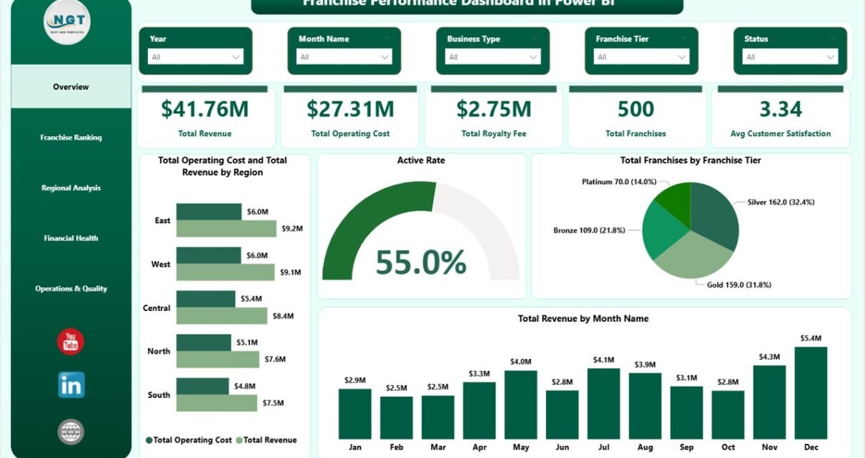
Page 1 — Overview
The Overview page opens with five KPI cards across the top: Total Revenue, Total Operating Cost, Total Royalty Fee, Total Franchises, and Avg Customer Satisfaction. Below the cards, four visuals give the high-level network view: Total Operating Cost and Total Revenue by Region (grouped bar comparing cost vs revenue geographically), Active Rate (gauge showing franchise activation percentage), Total Franchises by Franchise Tier (bar chart), and Total Revenue by Month Name (line chart showing revenue trend over time).
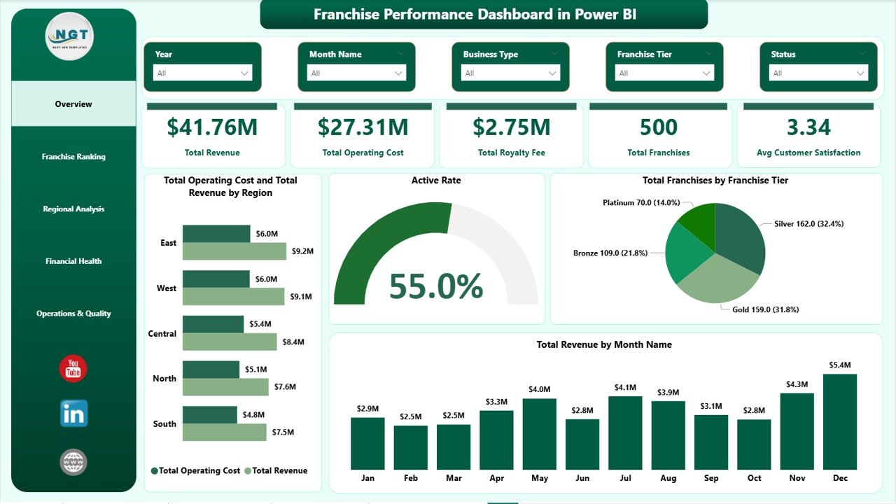
Franchise Performance Dashboard in Power BI — Overview Page
Page 2 — Franchise Ranking
This page is built for peer-comparison and performance reviews. Four visuals rank the franchise network: Total Revenue by Top Five Franchise Name (horizontal bar), Active Franchise Count by Franchise Tier (bar chart), Avg Compliance Score by Top Five Franchise Name (bar chart), and Profit Margin by Top Five Franchise Name (bar chart). Having all four on one page lets managers identify which locations lead on revenue but lag on compliance — the most actionable combination for franchisor intervention.
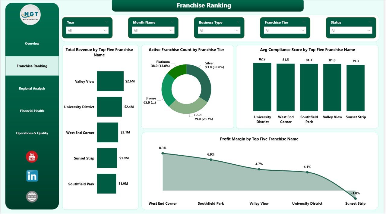
Franchise Ranking
Page 3 — Regional Analysis
Three visuals provide a geographic performance breakdown: Total Revenue and Total Marketing Spend by Region (side-by-side bar), Total Revenue by Region (standalone bar chart), and Total Franchises by Region (bar chart). The marketing-spend-to-revenue ratio by region is the standout analysis here — it surfaces which territories are generating returns on marketing investment and which are not.
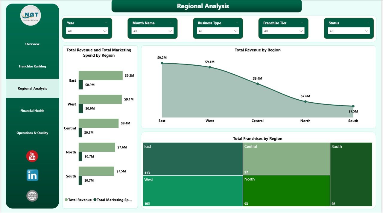
Regional Analysis
Page 4 — Financial Health
Three visuals break down revenue and cost by business dimension: Total Revenue by Business Type (bar chart), Total Revenue and Total Operating Cost by Business Type (grouped bar showing margin context by business model), and Total Revenue by Franchise Tier (bar chart). This page is particularly useful for identifying which business types and tiers generate the widest operating margins — and where cost pressure is highest.
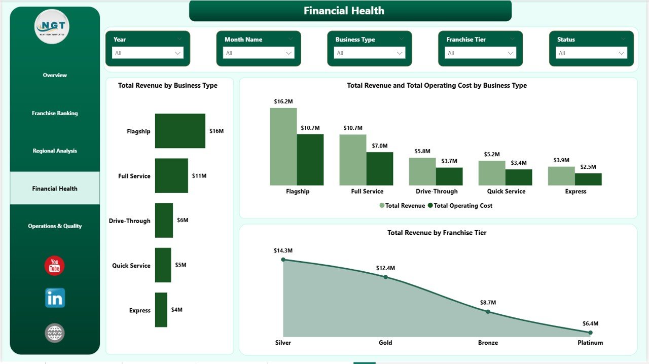
Financial Health
Page 5 — Operations & Quality
Three visuals surface operational and quality metrics: Avg Compliance Score by Franchise Tier (bar chart showing compliance gaps between tiers), Total Franchises by Status (bar chart breaking down Active, Inactive, and Probation units), and Avg Customer Satisfaction by Business Type (bar chart). The combination of compliance scoring and satisfaction by business type gives franchisors the data they need to prioritise support resources before issues escalate to audit stage.
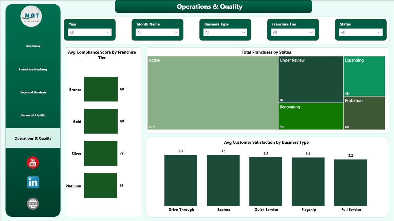
Operations & Quality
Franchise Performance Dashboard in Power BI vs. Tableau / Qlik vs. Paid Franchise SaaS — Feature Comparison
| Feature | Franchise Performance Dashboard in Power BI | Tableau / Qlik Equivalent | FranchiseConnect / Naranga |
|---|---|---|---|
| Cost | $17.99 one-time ✅ | $70–$150 / user / month | $200–$500 / month |
| Platform | Power BI Desktop (free) ✅ | Tableau Desktop / Qlik Sense | Cloud SaaS |
| Setup time | Under 15 min ✅ | 2–8 hrs custom build | 1–4 weeks onboarding |
| Works offline | ✅ Power BI Desktop offline | Limited | ❌ Internet required |
| Customizable fields | ✅ Full DAX & data model edit | ✅ High skill bar | Limited (locked templates) |
| Royalty fee tracking | ✅ Built-in | Build it yourself | Premium tier only |
| Compliance scoring | ✅ Built-in | Build it yourself | Premium tier only |
| Active Rate gauge | ✅ Built-in | Build it yourself | Not available |
| Year-1 cost (5 users) | $17.99 total ✅ | $4,200–$9,000 | $2,400–$6,000 |
For franchise operators who want Power BI-quality analytics without a Tableau license or SaaS subscription, the Franchise Performance Dashboard in Power BI sits in the sweet spot.
Who Should Use This Template
Perfect for:
- Franchise owners managing 2–100 locations who need consolidated revenue, royalty, and satisfaction reporting in one file
- Franchise development managers who present monthly or quarterly performance reviews to franchisors or board stakeholders
- Finance teams at franchisors already using Power BI who need a ready-built franchise reporting layer they can adapt quickly
- Business analysts and consultants delivering Power BI insights to multi-location franchise clients across food, retail, fitness, or services sectors
Not a fit if:
- You manage 500+ locations and need real-time POS API feeds, SOC 2-compliant cloud storage, or enterprise SSO integrations
- Your team doesn’t use Power BI — see the Franchise Performance Dashboard in Excel for a pivot-table-powered alternative
- You need built-in CRM, franchisee contract management, or onboarding workflows beyond analytics dashboards
Real-World Use Cases
Jessica manages operations across 18 franchise locations for a national coffee brand. She connects the Franchise Performance Dashboard in Power BI to her monthly Excel export, publishes it to Power BI Service, and sends her franchisor a single report link every quarter. No slide deck assembly, no manual chart updates — the Franchise Ranking page does the comparison work for her.
Rahul is a franchise consultant advising three different clients in the food and retail sector. He keeps one .pbix file per client, swaps in each client’s data source, and delivers the same professional Regional Analysis and Financial Health view across all engagements — without rebuilding reports from scratch each time a new client comes on board.
Maria heads finance at a 40-location fitness franchise group. The Financial Health page lets her compare Total Revenue vs. Total Operating Cost by Business Type month over month. She uses the Operations & Quality page to flag which franchise tiers have declining compliance scores before they escalate to formal audit — and brings that data to her franchisor brand partner in quarterly reviews.
Advantages of the Franchise Performance Dashboard in Power BI
The dashboard’s biggest structural advantage is the Franchise Tier segmentation running across all five pages. Most generic dashboards segment by region only. This template combines region, tier, and business type simultaneously, which matches how franchise networks actually structure their performance reviews.
The Active Rate gauge on the Overview page is a second differentiator. It converts Total Franchises vs Active Franchise Count into a percentage KPI — giving franchisors an immediate snapshot of network health that pure revenue charts cannot provide.
The cost-to-build comparison is also significant. Building these five analysis pages from scratch in Tableau or Power BI Service typically takes 8–20 hours of BI developer time. The template delivers the same output in under 15 minutes of setup time at a one-time cost of $17.99.
👉 Click here to Purchase the Franchise Performance Dashboard in Power BI
Opportunities for Improvement
The dashboard uses a flat file data model — all franchise records are expected in a single table. Teams with separate fact and dimension tables (e.g., a star schema with separate franchise, region, and date dimension tables) will need to adjust the data model relationships before refreshing the visuals.
There is no built-in row-level security in the current version. If you need different franchise managers to see only their own location’s data via Power BI Service, you would need to configure Power BI RLS roles manually after connecting your data.
The Active Rate gauge uses a calculated measure based on franchise status — teams using different status terminology (e.g., “Operating” instead of “Active”) should update the DAX measure accordingly in Power BI Desktop before publishing.
Best Practices
Keep your source data structure consistent with the sample data column headers. Power BI loads data by column name, so renaming columns in your source file without updating the query will break the visuals. If you need to rename columns, use Power Query’s Rename Column feature inside the Transform Data editor rather than editing the source file directly.
Publish to Power BI Service after connecting your data to enable browser-based access for stakeholders who don’t have Power BI Desktop installed. The free Power BI Service tier allows publishing and personal viewing; Power BI Pro ($10/user/month) is required for sharing dashboards with other users inside your organisation.
Schedule a data refresh via Power BI Service’s Scheduled Refresh feature if your data source is updated regularly. This eliminates the need to manually re-upload data files each reporting cycle.
Explore Relevant Templates
🔹 Franchise Performance Dashboard in Excel — same 5-page analytics using pivot tables and slicers, no Power BI Desktop required
🔹 Driving School Dashboard in Power BI — multi-location service business analytics in Power BI
🔹 Gym Retention Dashboard in Power BI — member retention, revenue, and operational KPIs in Power BI
🔹 Accountancy Practice Dashboard in Power BI — professional services analytics in Power BI
Frequently Asked Questions
What KPIs does the Franchise Performance Dashboard in Power BI track?
The Franchise Performance Dashboard in Power BI tracks 5 headline KPIs: Total Revenue, Total Operating Cost, Total Royalty Fee, Total Franchises, and Avg Customer Satisfaction. Additional metrics include Active Rate, Avg Compliance Score by Franchise Tier, Profit Margin by Top Franchise Name, and Revenue vs. Marketing Spend by Region, across 14 pre-built visuals on 5 report pages.
Do I need a paid Power BI license to use this template?
No. The .pbix file runs entirely on Power BI Desktop, which is free to download from Microsoft. A paid Power BI Pro license ($10/user/month) is only required if you want to publish the report to Power BI Service and share it with other users in your organisation via browser link.
How do I connect my own franchise data?
Open the .pbix file in Power BI Desktop, go to Home → Transform Data → Edit Queries, and replace the sample data source file path with your own Excel or CSV file. Keep the same column names as the sample data, click Close & Apply, and all 14 visuals across the 5 report pages refresh automatically with your data.
How does this compare to FranchiseConnect or Naranga?
FranchiseConnect and Naranga are cloud franchise management platforms costing $200–$500 per month with 1–4 week onboarding timelines. The Franchise Performance Dashboard in Power BI delivers the same revenue, royalty, compliance, and satisfaction analytics at a one-time cost of $17.99, with under 15 minutes of setup time and no per-location fees.
Can I add more pages or DAX measures to the dashboard?
Yes. The .pbix file is fully editable in Power BI Desktop. You can add new report pages, create custom DAX measures, modify existing visuals, or add new data tables. The current data model is a single flat table, so complex star schema additions will require setting up relationships in the Power BI Model view.
Is there a Google Sheets or Excel version?
Yes. The Franchise Performance Dashboard in Excel covers the same 5 analysis pages using pivot tables, slicers, and charts — ideal for teams that prefer Excel without installing Power BI Desktop.
Is this a one-time purchase?
Yes — pay $17.99 once, download instantly, and use the Franchise Performance Dashboard in Power BI forever. No monthly fees, no subscription renewal, no per-user charges.
About the Author
Built by PK — Microsoft Certified Professional with 15+ years of Excel, Google Sheets, and Power BI experience. Founder of NextGenTemplates, reaching 300K+ subscribers across YouTube channels. Every template is hand-built and tested before release.
Conclusion
The Franchise Performance Dashboard in Power BI brings together revenue tracking, royalty fee monitoring, compliance scoring, regional analysis, and customer satisfaction into a single .pbix file — with 5 report pages and 14 pre-built visuals ready to connect to your franchise data in under 15 minutes.
👉 Click here to Purchase the Franchise Performance Dashboard in Power BI
✅ Instant download · One-time payment · No subscription · Lifetime access
📅 Last updated: May 2026
👉 Youtube.com/@PK-AnExcelExpert