Credit unions in the U.S. manage over $2.3 trillion in member assets across more than 4,500 institutions, according to the National Credit Union Administration. Yet most of them still rely on static monthly board books and disconnected spreadsheets to monitor loan funding, savings growth, and branch performance. The Credit Union Dashboard in Power BI closes that gap with 5 KPI cards, 13 visuals, and 4 cross-page slicers in a single .pbix file, ready to refresh on your own data in under 10 minutes.
This guide walks through every page of the dashboard, the KPIs it tracks, the questions it answers for CFOs and branch managers, and where it fits against bigger-budget alternatives like nCino and Jack Henry Symitar analytics. By the end, you’ll have a clear sense of whether the Credit Union Dashboard in Power BI belongs in your monthly reporting stack — and how to make it yours in one Refresh click.
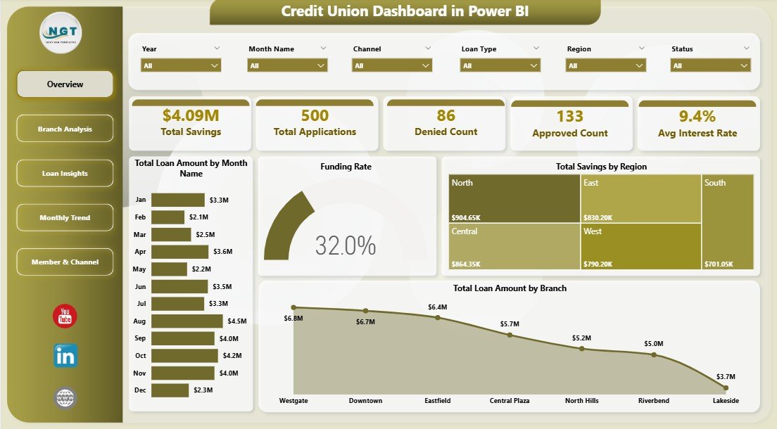
Credit Union Dashboard in Power BI — Overview Page
Key Features of the Credit Union Dashboard in Power BI
The Credit Union Dashboard in Power BI is a self-contained .pbix file engineered around the exact metrics a credit union finance and lending team actually presents at board meetings. Here is what it gives you out of the box:
- 5 portfolio KPI cards on the Overview page: Total Savings, Total Applications, Denied Count, Approved Count, and Avg Interest Rate.
- 13 analytical visuals across loan disbursement, branch comparison, loan-type approval, monthly trend, and member-channel views.
- 4 global slicers (Branch, Region, Loan Type, Member Type) that filter every page simultaneously.
- Funding Rate KPI — the cleanest read on approved-to-funded conversion, broken down by month and by branch.
- Native Power BI exports — one-click PDF and PowerPoint for board books and regulator submissions.
- $17.99 one-time with full editor access and no recurring fees, compared to $30,000+ per year for vendor-hosted credit-union analytics suites.
The dashboard is built on a flat application-level data model, which means you can either rewire it to a DirectQuery source pointing at your core banking system, or simply replace the sample file with a CSV export from your loan origination system. Microsoft Learn covers both modes if you want a refresher.
Dashboard Pages Explanation
The Credit Union Dashboard in Power BI contains five report pages, each engineered for a specific persona. Here is what sits on each one.
1 — Overview Page
The Overview is the landing page for the CFO and the board. At the top, five KPI cards give an instant read on portfolio health:
- Total Savings
- Total Applications
- Denied Count
- Approved Count
- Avg Interest Rate
Below the cards, four visuals show how the portfolio is moving over time and across geography:
- Total Loan Amount by Month Name — reveals seasonality across the lending year so treasury can plan funding.
- Funding Rate — a single citable percentage measuring approved-to-funded conversion, the most useful pipeline-health metric for any credit union.
- Total Savings by Region — deposit concentration by region, useful for liquidity planning and regional marketing allocation.
- Total Loan Amount by Branch — ranks branches on disbursement volume in one glance.
Overview Page
2 — Branch Analysis
The Branch Analysis page is built for branch managers and regional heads. Three visuals make peer comparison effortless:
- Total Applications by Branch — pipeline volume per location, used to size underwriting capacity.
- Total Savings by Branch — deposit base by location, a leading indicator of member loyalty.
- Approval Rate by Branch — flags branches with unusually low or high acceptance, prompting a credit-policy review.
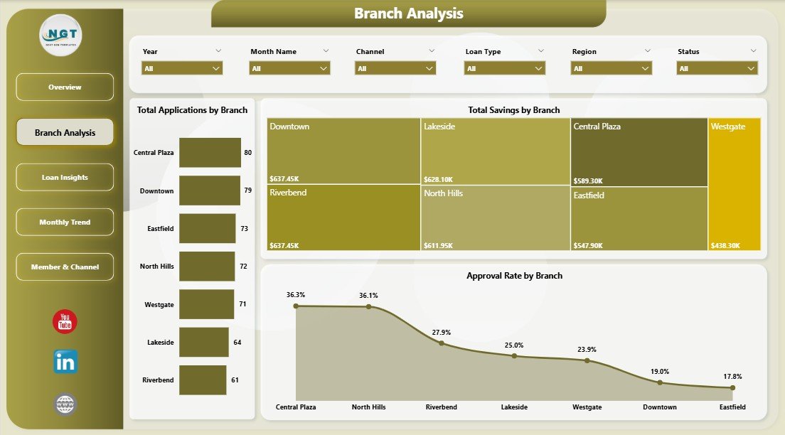
Branch Analysis
3 — Loan Insights
The Loan Insights page slices the loan book by product type. This is the page the lending head opens to spot drift in approval discipline or pricing.
- Approval Rate by Loan Type — shows which products (auto, mortgage, personal, share-secured, etc.) get approved most often.
- Avg Interest Rate by Loan Type — benchmarks pricing across products against your own rate sheet.
- Approval Rate by Month Name — tracks whether underwriting policy is drifting tighter or looser over time.
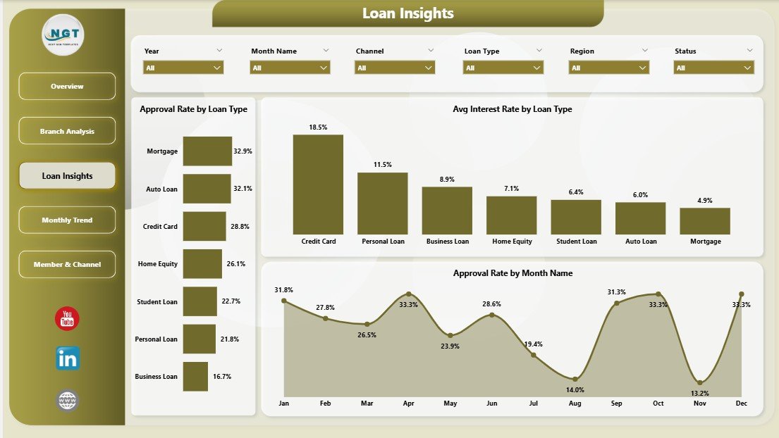
Loan Insights
4 — Monthly Trend
The Monthly Trend page ties activity to time — the lens regulators and boards always ask for.
- Funding Rate by Month Name — tracks how reliably approvals are converting into funded loans across the calendar.
- Total Loan Amount by Quarter — rolls disbursement up for board reporting and year-over-year comparisons.
- Funded Count by Month Name — loan-count trend that complements the dollar view.
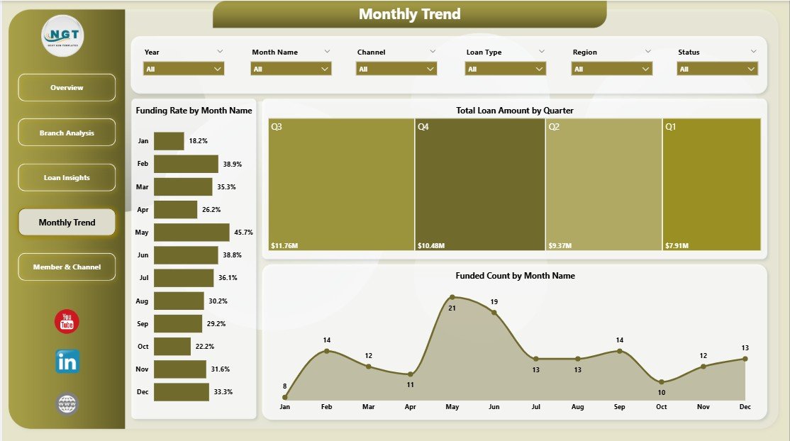
Monthly Trend
5 — Member & Channel
The final page focuses on who is borrowing and how they arrived — the right lens for member services and digital strategy teams.
- Avg Credit Score by Member Type — compares borrower quality across member segments for risk-based pricing.
- Total Applications by Channel — shows whether branch, online, mobile app, or call center is winning the pipeline.
- Approval Rate by Channel — flags whether some channels send through higher-quality applications, useful for refining digital intake forms.
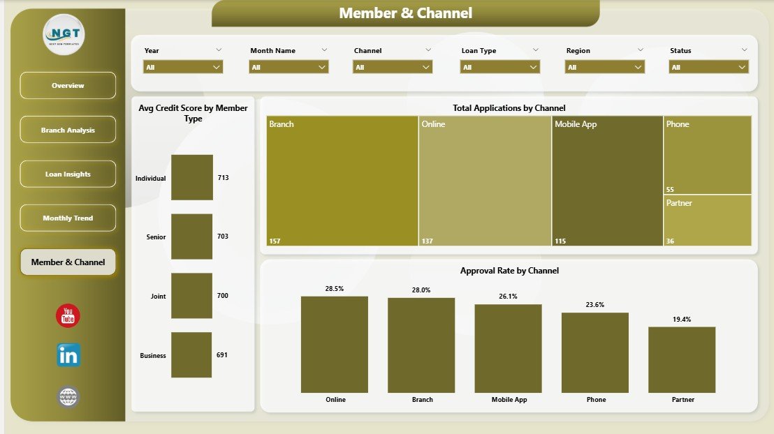
Member & Channel
Credit Union Dashboard in Power BI vs. Tableau Build vs. nCino — Feature Comparison
| Feature | Credit Union Dashboard in Power BI | Tableau Credit Union Build | nCino / Jack Henry Symitar Analytics |
|---|---|---|---|
| Cost | $17.99 one-time | $2,500–$10,000 consultant build | $30,000–$150,000 / year |
| Platform | Power BI Desktop (free) | Tableau Creator $75 / user / month | Vendor-hosted core banking add-on |
| Setup time | Under 10 minutes | 2–6 weeks | 3–9 month implementation |
| Customizable visuals | ✅ Full editor access | ✅ Full editor access | ❌ Vendor templates only |
| Branch / Region / Channel slicers | ✅ Built-in | Build manually | ✅ Built-in |
| Funding Rate KPI | ✅ Included | Build manually | ✅ Included |
| Export to PDF / PowerPoint | ✅ Native | ✅ Native | Limited |
| Year-1 cost at 5 users | $17.99 total | $4,500 + build | $30,000+ |
For credit unions that want regulator-ready loan and savings reporting without the six-figure analytics bill, the Credit Union Dashboard in Power BI sits in the sweet spot.
Who Should Use This Template
Perfect for:
- CFOs and finance leads at credit unions with 1–20 branches reporting monthly to a board.
- Branch managers tracking applications, savings, and approval rate against peer locations.
- Lending heads who need a single view of funding rate, approval rate, and avg interest rate by loan type.
- Power BI analysts at financial cooperatives who want a working template, not a blank canvas.
- Consultants delivering monthly portfolio reviews to community banks and credit unions.
Not a fit if:
- You are a large national bank requiring SOC 2, SSO, and row-level security tied to Azure AD / Entra ID.
- Your team has no access to Power BI Desktop — consider the Excel version instead.
- You need real-time streaming KPIs — this is a refresh-based model, not a streaming dataset.
- You need out-of-the-box live integration with Jack Henry, Fiserv DNA, or Corelation KeyStone (you would need to rewire the data source).
Real-World Use Cases
Maria leads finance at a 6-branch regional credit union. Every Monday she opens the Overview page, screens the Total Savings and Approved Count KPI cards, then uses the Branch slicer to identify the two branches that drove the previous week’s growth. She presents the same dashboard to her board on the second Tuesday of each month, exported as a PDF — replacing the $35,000-per-year hosted analytics suite the credit union was previously paying for.
Devon is a lending head at a single-branch credit union with 4,200 members. He uses the Loan Insights page to compare Avg Interest Rate by Loan Type against his published rate sheet, and the Approval Rate by Month Name visual to confirm his underwriting team isn’t drifting tighter or looser quarter over quarter. The Funding Rate KPI on the Overview page is now his single most-watched metric.
Priya is a Power BI consultant working with three small credit union clients. She uses the Credit Union Dashboard in Power BI as her standard starter template, swapping the data source in under 10 minutes per client. She then customizes the Member & Channel page based on each client’s digital intake mix — saving her roughly six hours of build time per engagement and letting her charge a fixed-fee monthly retainer.
Advantages of the Credit Union Dashboard in Power BI
📌 Cost — A $17.99 one-time purchase replaces $30,000-plus per year for hosted analytics, paying for itself on the first board meeting.
📌 Speed — The data model is already built. Replace the sample file with your own, click Refresh, and every KPI, chart, and slicer updates. You skip the 3–9 month implementation cycle that vendor analytics demand.
📌 Ownership — You hold the .pbix file. No vendor lock-in, no subscription renewal pressure, no per-user pricing creep. Every metric, visual, and color is editable in Power BI Desktop.
📌 Audience-aware design — Five pages map to five real personas (CFO, branch manager, lending head, finance analyst, member services lead) instead of one cluttered tab. Each person opens what they actually need.
📌 Regulator-ready — Native Power BI export to PDF and PowerPoint keeps formatting clean, making NCUA call-report supporting documents and board books a 1-click task.
Opportunities for Improvement
The Credit Union Dashboard in Power BI is built for transparency, so it’s worth being honest about what it doesn’t do out of the box:
- No live core-banking integration — the default model expects a flat file. You can rewire it to DirectQuery against your core banking system, but that’s a one-time setup task.
- No row-level security — if you need branch-by-branch RLS, you’ll need to add it on top of the data model. Microsoft’s RLS guide walks through the steps.
- No member-level PII fields — aggregated metrics only, by design. If you want named-member drill-throughs, you’ll add those.
- No CECL or ALM modeling — this is a portfolio reporting dashboard, not an asset-liability or credit-loss model. Pair it with a dedicated CECL tool for regulatory modeling.
Best Practices
📌 Refresh on a schedule — Publish the report to Power BI Service and set a daily or weekly scheduled refresh so the board view always reflects the latest week.
📌 Lock the data model, not the visuals — Keep the underlying tables and measures stable but let analysts duplicate pages to build custom branch-level views. This protects KPI definitions while letting the team innovate.
📌 Annotate anomalies — When Funding Rate drops 5+ points in a month, add a text box on the Monthly Trend page explaining the cause. Future-you will thank present-you.
📌 Export to PDF before the board pack — PDFs are immutable, which is what regulators and auditors prefer for evidence trails.
📌 Version your .pbix — Save monthly snapshots (e.g., CU_Dashboard_2026-05.pbix) so you can recover a clean view of any prior month.
Explore Relevant Templates
📌 Credit Union Dashboard in Excel — same KPI set, pivot-driven, for teams who live in Microsoft Excel.
📌 Credit Unions Dashboard in Power BI — the earlier-edition Power BI credit union template with a different layout.
📌 Peer-to-Peer Lending KPI Dashboard in Excel — adjacent lending portfolio template for fintech and online lenders.
📌 Loan Portfolio KPI Dashboard in Google Sheets — for teams operating inside Google Workspace.
📌 Credit Rating Agencies Dashboard in Excel — useful for credit unions monitoring counterparty exposure.
📌 Browse the full Power BI Dashboard Templates library.
Frequently Asked Questions
What KPIs does the Credit Union Dashboard in Power BI track?
The Credit Union Dashboard in Power BI tracks 5 portfolio KPIs on the Overview page: Total Savings, Total Applications, Denied Count, Approved Count, and Avg Interest Rate. Funding Rate and Approval Rate KPIs are derived inside the report’s Loan Insights and Monthly Trend pages.
How long does setup take for this Power BI credit union template?
Setup takes under 10 minutes. Download the .pbix file, open it in Power BI Desktop, point the data source to your own loan and savings file using the same column structure, and click Refresh. All 5 pages, 13 visuals, and 4 slicers update automatically.
Do I need a Power BI Pro license to use this dashboard?
No. The Credit Union Dashboard in Power BI works entirely in Power BI Desktop, which is free from Microsoft. Power BI Pro is only required if you want to share the report through Power BI Service workspaces with other licensed users.
How does this compare to nCino or Jack Henry Symitar analytics?
nCino and Jack Henry Symitar analytics typically cost $30,000–$150,000 per year plus implementation. The Credit Union Dashboard in Power BI is a $17.99 one-time purchase you fully own and edit, suitable for credit unions that want regulator-ready reporting without enterprise procurement.
Can I add my own loan types, branches, and regions to this dashboard?
Yes. The Credit Union Dashboard in Power BI is fully customizable in Power BI Desktop. Add or rename loan types, branches, regions, and channels by editing the source data — the Branch, Region, Loan Type, and Member Type slicers update automatically on refresh.
Does this Power BI template include a Funding Rate visual?
Yes. The Overview page includes a Funding Rate KPI visual that measures approved-to-funded conversion. The Monthly Trend page also breaks Funding Rate down by month so you can spot pipeline leakage across the calendar.
About the Author
Built by PK — Microsoft Certified Professional with 15+ years of Excel, Google Sheets, and Power BI experience. Founder of NextGenTemplates, reaching 300K+ subscribers across YouTube channels. Every template is hand-built and tested before release. Visit Youtube.com/@PK-AnExcelExpert for step-by-step video tutorials.
Conclusion
The Credit Union Dashboard in Power BI turns a stack of disconnected loan and savings reports into a single 5-page Power BI file that any credit union finance team can refresh in under 10 minutes. With 5 KPI cards, 13 visuals, 4 slicers, and a Funding Rate metric built in, it delivers the reporting that boards expect and regulators ask for — at $17.99 once instead of $30,000 per year for vendor analytics.
👉 Click here to Purchase the Credit Union Dashboard in Power BI
✅ Instant download · One-time payment · No subscription
📅 Last updated: May 2026