The Convenience Apps Dashboard in Power BI is a ready-to-use report template for app operators who want to track sessions, revenue, paid users, costs, net revenue, app stability, paid conversion, and support quality in one interactive report. The dashboard includes 5 report pages, 5 top-level KPI cards, and 15 chart views designed for monthly product reviews, growth analysis, and customer experience discussions.
Power BI is widely used for business reporting because it can connect, model, visualize, and refresh data inside a dedicated analytics environment. Microsoft explains the platform in its official Power BI Desktop documentation. This template uses that workflow: replace the sample data source, refresh the .pbix file, and review the dashboard pages with slicers and interactive visuals.
Key Features of Convenience Apps Dashboard in Power BI
- 5 interactive Power BI pages for Overview, Usage Trends, Revenue Mix, App Insights, and Support Quality.
- 5 KPI cards showing Total Sessions, Total Revenue, Total Paid Users, Total Cost, and Net Revenue.
- 15 analytical charts covering sessions, revenue, cost, active users, app categories, release versions, regions, app names, crash rate, conversion, and paid user status.
- Multiple slicers for fast filtering across time, platform, app, category, region, acquisition channel, status, and release version.
- Editable .pbix file so you can adjust visuals, labels, themes, measures, and report pages in Power BI Desktop.
- App performance focus across usage, monetization, stability, and support quality.
Dashboard Pages Explanation
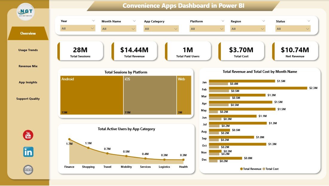
1. Overview Page
The Overview Page is the executive summary of the dashboard. At the top, cards show Total Sessions, Total Revenue, Total Paid Users, Total Cost, and Net Revenue so managers can quickly understand usage and profitability.
Total Sessions by Platform: This chart compares session volume across platforms such as mobile, web, Android, iOS, or desktop. It helps product teams understand where users are spending the most time.
Total Revenue and Total Cost by Month Name: This chart shows monthly revenue beside monthly cost. It helps teams see whether growth is profitable or whether costs are rising too quickly.
Total Active Users by App Category: This chart highlights which app categories have the strongest active user base. It is useful for roadmap planning, campaign prioritization, and feature investment.
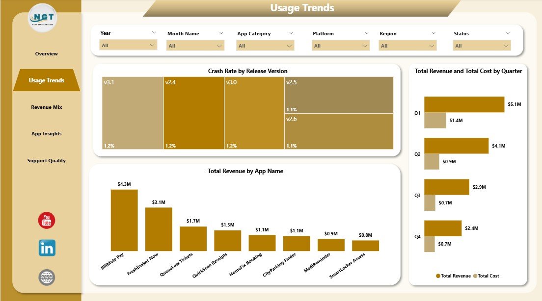
2. Usage Trends
The Usage Trends page focuses on release quality, app revenue contribution, and quarter-level financial movement. Crash Rate by Release Version helps teams identify unstable releases that may need investigation. Total Revenue by App Name ranks individual apps by revenue, making it easier to see which products drive the most value. Total Revenue and Total Cost by Quarter compares quarterly revenue with cost so leaders can monitor margin direction over time.
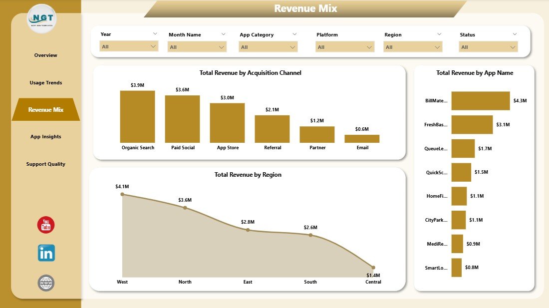
3. Revenue Mix
The Revenue Mix page explains how revenue is distributed across acquisition channels, app names, and regions. Total Revenue by Acquisition Channel compares channels such as organic, paid, referral, partner, or marketplace traffic. Total Revenue by App Name shows the biggest app-level contributors. Total Revenue by Region helps managers compare geographic performance and spot regions that need more attention.
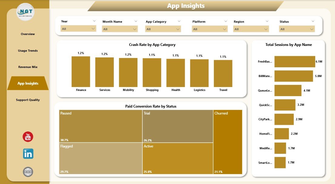
4. App Insights
The App Insights page brings together product quality, conversion, and usage. Crash Rate by App Category helps QA and product teams find categories with higher stability risk. Paid Conversion Rate by Status shows which lifecycle statuses convert best into paid users. Total Sessions by App Name compares app-level engagement and helps teams identify the most-used apps in the portfolio.
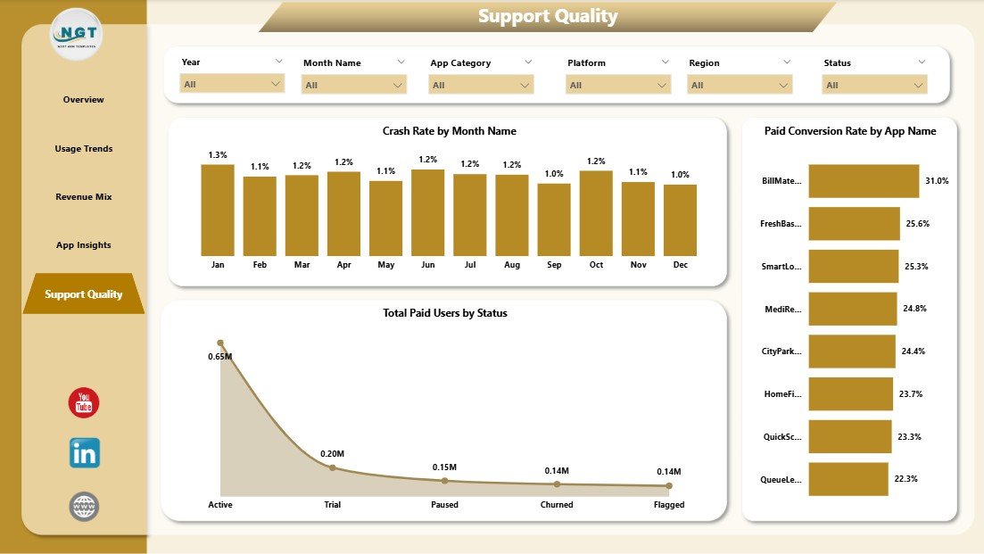
5. Support Quality
The Support Quality page helps connect user experience with paid user behavior. Crash Rate by Month Name gives a trend view of stability over time. Total Paid Users by Status shows how paid users are distributed across statuses. Paid Conversion Rate by App Name identifies which apps are converting free or active users into paying customers most effectively.
Convenience Apps Dashboard in Power BI vs. Tableau vs. Paid CRM/SaaS – Feature Comparison
| Feature | Convenience Apps Dashboard in Power BI | Tableau Alternative | Paid App Analytics SaaS |
|---|---|---|---|
| Cost | $17.99 one-time | License cost plus build time | $50-$500+ per month |
| Platform | Power BI Desktop | Tableau Desktop or Cloud | Vendor cloud app |
| Setup time | Open file, connect data, refresh | Manual dashboard design needed | Onboarding and configuration needed |
| Real-time team collaboration | Available through Power BI Service if published | Available with Tableau Cloud | Usually available by user seat |
| Mobile access | Available if published to Power BI Service | Available in cloud plans | Usually available |
| Customizable fields | Editable model and report pages | Editable with design work | Limited by vendor settings |
| Share with link | Possible through Power BI Service | Possible through Tableau Cloud | Often requires login |
| Year-1 cost at 5 users | $17.99 for the template | Higher license and setup cost | $3,000-$30,000+ |
| App stability reporting | Crash rate by version, category, and month | Possible with custom setup | Usually available in advanced plans |
Who Should Use This Template
This dashboard is useful for app founders, mobile app operators, SaaS teams, product managers, growth analysts, support leaders, and Power BI consultants. It works best when your team already exports app data from analytics tools, billing systems, support platforms, app stores, or internal databases and wants a polished report layer for recurring reviews.
It is not a replacement for a real-time event analytics SDK, crash monitoring platform, support desk, billing system, or data warehouse. If your team needs live API sync, push notification analysis, cohort retention modeling, or user-level event streams, use this report as a management dashboard after exporting prepared data.
Real-World Use Cases
Priya, product manager: She opens the Overview page before the monthly review and uses the KPI cards to explain sessions, revenue, paid users, cost, and net revenue.
Daniel, growth analyst: He uses Revenue Mix to compare acquisition channels, regions, and app names before recommending campaign changes.
Meera, support lead: She studies Support Quality and App Insights to connect crash trends, paid conversion, and user status with customer experience work.
Advantages of Convenience Apps Dashboard in Power BI
Fast reporting: The dashboard gives you a finished Power BI layout instead of starting from a blank report canvas.
Better app visibility: Usage, revenue, cost, paid users, crash rate, conversion, and support indicators are visible across one report.
Lower cost: A one-time template purchase is easier to approve than another monthly analytics subscription.
Editable design: Power BI users can customize visuals, colors, relationships, measures, and report pages.
Opportunities for Improvement
The dashboard does not include live data connectors, automatic API refresh, role-level security setup, user-level funnels, or embedded app instrumentation. Teams with advanced analytics needs can extend the model in Power BI Desktop, connect it to Power Query sources, or publish it to Power BI Service for scheduled refresh and sharing.
Best Practices
- Keep source column names consistent when replacing sample data.
- Refresh the report after each data update.
- Validate revenue, cost, paid user, crash rate, and conversion definitions before presenting results.
- Use slicers during meetings to answer follow-up questions quickly.
- Save a backup before changing the model, relationships, or calculated measures.
Explore Relevant Templates
Convenience Apps Dashboard in Power BI – purchase the Power BI dashboard template on NextGenTemplates.
Convenience Apps Dashboard in Excel – Excel version for spreadsheet-based reporting.
Catering Services Dashboard in Power BI – service business analytics in Power BI.
Browse all Power BI Dashboard templates.
Frequently Asked Questions
What does the Convenience Apps Dashboard in Power BI track?
It tracks sessions, revenue, paid users, cost, net revenue, active users, app category, platform, app name, acquisition channel, region, release version, crash rate, status, and paid conversion rate.
Do I need Power BI Pro?
No. You can use the .pbix file locally in Power BI Desktop. Power BI Pro may be needed if you publish and share the report through Power BI Service.
Can I use my own app data?
Yes. Replace the sample source data with your own app records using the same structure, then refresh the report.
Can I customize the report?
Yes. You can edit visuals, titles, measures, fields, colors, filters, and page layouts in Power BI Desktop.
Does it connect directly to Firebase, App Store Connect, Google Play, Stripe, or Zendesk?
No direct connector is included. Export data from those systems first, then use the exported data as the dashboard source.
Is this useful for both mobile and web apps?
Yes. It can be adapted for mobile apps, web apps, utility apps, service apps, subscription apps, and convenience platforms that track usage and revenue data.
About the Author
Built by PK – Microsoft Certified Professional with 15+ years of Excel, Google Sheets, and Power BI experience. Founder of NextGenTemplates, reaching 300K+ subscribers across YouTube channels. Every template is hand-built and tested before release.
Conclusion
The Convenience Apps Dashboard in Power BI gives app teams a practical way to review usage, revenue, paid users, costs, crash rate, conversion, and support quality without designing a report from scratch. If you want a clean Power BI starting point for app performance reporting, this template gives you a structured and editable foundation.
Click here to purchase the Convenience Apps Dashboard in Power BI
Visit our YouTube channel for step-by-step Excel, Power BI, and dashboard tutorials: Youtube.com/@PKAnExcelExpert
Last updated: May 20, 2026