Global trade teams handle shipment status updates, provider fees, documentation errors, compliance checks, clearance delays, and country-level trade values every month. When those numbers live in separate files, leaders often see the problem after margin has already been lost. The Cross-border Trade Services Dashboard in Excel gives import-export, customs brokerage, freight, and trade services teams a structured way to monitor these metrics in one workbook.
This Excel dashboard template is designed for practical reporting. You can replace the sample data, refresh the workbook, and review multiple dashboard pages covering overview metrics, providers, lanes, compliance, financials, raw data, and pivot support. For teams that already use Microsoft Excel for operations reporting, this is a faster route than building a reporting model from scratch.
Click here to purchase Cross-border Trade Services Dashboard in Excel
Key Features of Cross-border Trade Services Dashboard in Excel
The workbook includes seven sheets designed around a typical trade services reporting process. Instead of only showing one summary page, it separates the analysis into focused views so users can move from executive overview to provider review, lane analysis, compliance tracking, and financial reporting.
- Overview page with KPI cards and interactive slicers.
- Provider View page for shipments, service type, origin country, and commodity analysis.
- Lane Analysis page for quarter, transport mode, compliance status, and destination-country reporting.
- Compliance page for compliance percentage, clearance bands, net fee trends, and documentation errors.
- Financials page for yearly net fee, service fee, compliance cost, and provider trade value.
- Data sheet for entering or replacing source records.
- Support sheet with pivot tables that feed the full dashboard.
- Click here to purchase Cross-border Trade Services Dashboard in Excel
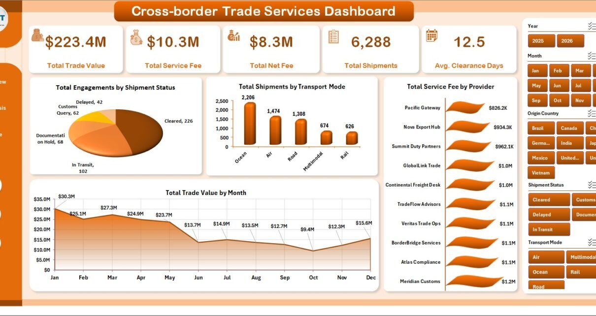
The main KPI cards include Total Trade Value, Total Service Fee, Total Net Fee, Total Shipments, and Avg. Clearance Days. These are the headline measures many trade services teams need before they investigate deeper chart-level patterns.
Dashboard Pages Explanation
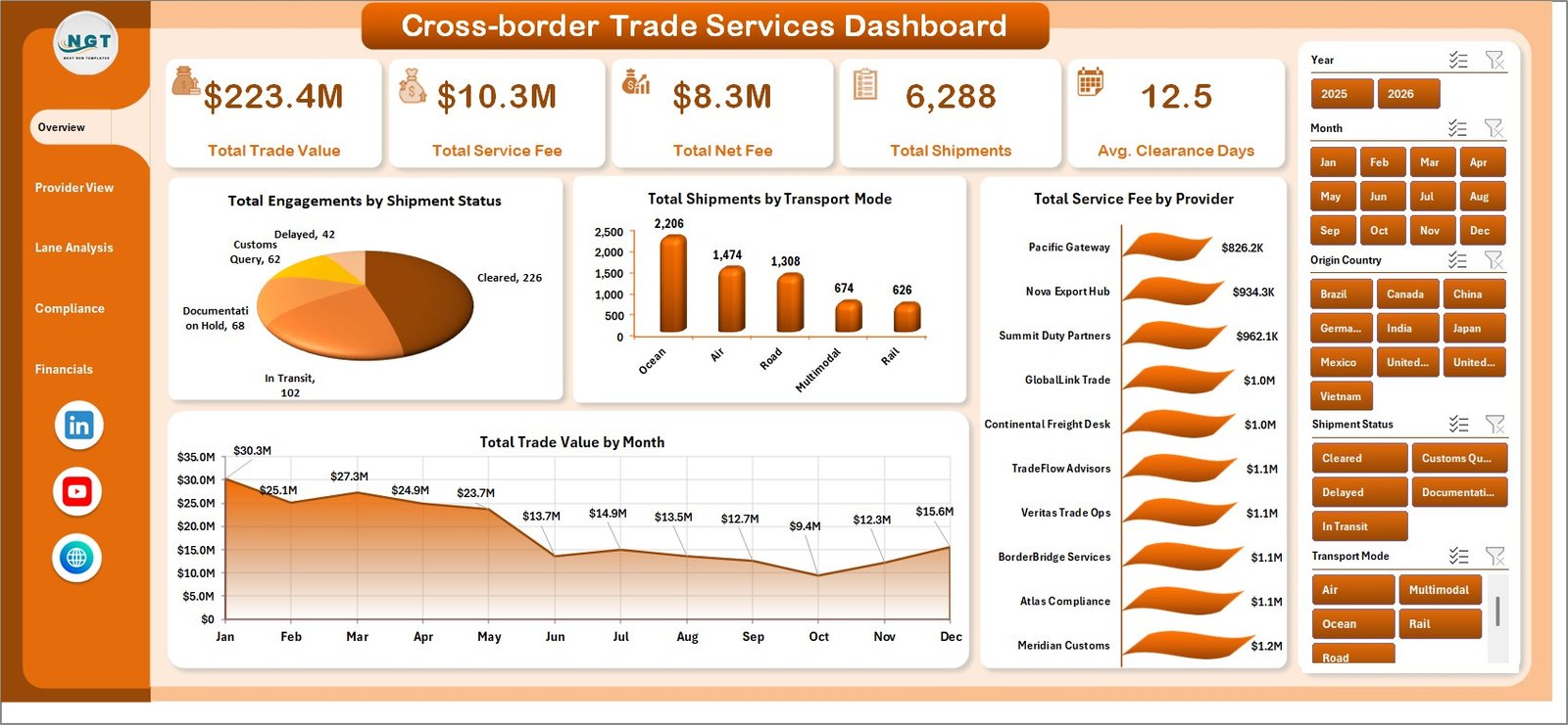
1. Overview Page
The Overview page acts as the control center of the dashboard. At the top, KPI cards summarize Total Trade Value, Total Service Fee, Total Net Fee, Total Shipments, and Avg. Clearance Days. These cards help leaders understand the scale of trade activity and service performance before drilling into detailed charts.
Total Engagements by Shipment Status shows how trade activities are distributed by operational status, helping users spot pending, completed, delayed, or exception-heavy areas. Total Shipments by Transport Mode compares shipment volume across available transport modes so teams can understand whether air, sea, road, rail, or other modes dominate movement.
Total Service Fee by Provider shows which service providers contribute the highest fee totals, making it useful for provider performance and contract review. Total Trade Value by Month shows month-wise trade value movement, helping finance and operations teams identify seasonality or unusual spikes.
Click here to purchase Cross-border Trade Services Dashboard in Excel
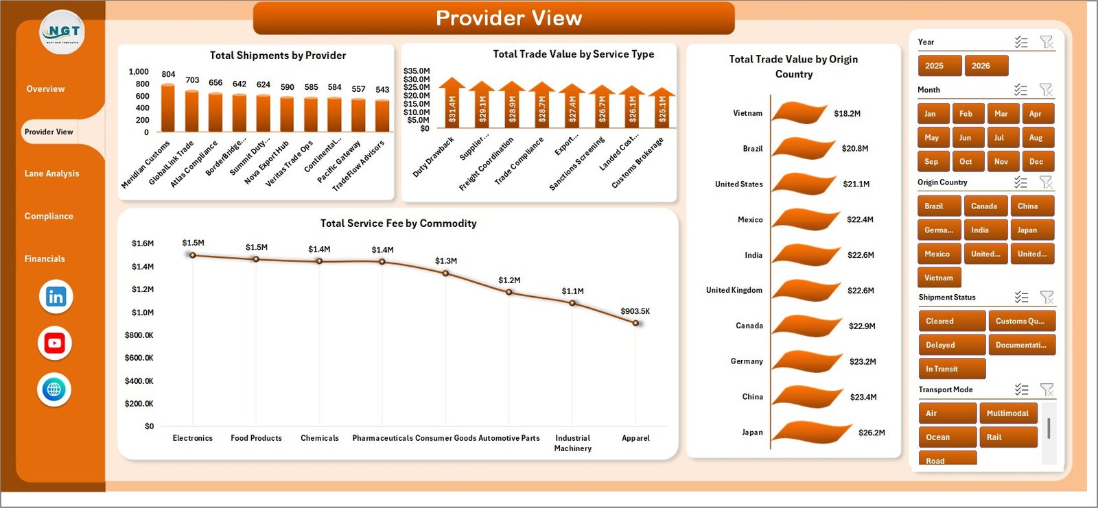
2. Provider View
The Provider View sheet focuses on supplier and service performance. Total Shipments by Provider helps identify high-volume providers and potential concentration risk. Total Trade Value by Service Type shows which trade services drive the highest value.
Total Trade Value by Origin Country helps teams compare sourcing or export markets, while Total Service Fee by Commodity highlights which commodity groups generate the highest service fee. This page is useful for procurement teams, logistics managers, and finance analysts reviewing provider cost behavior.
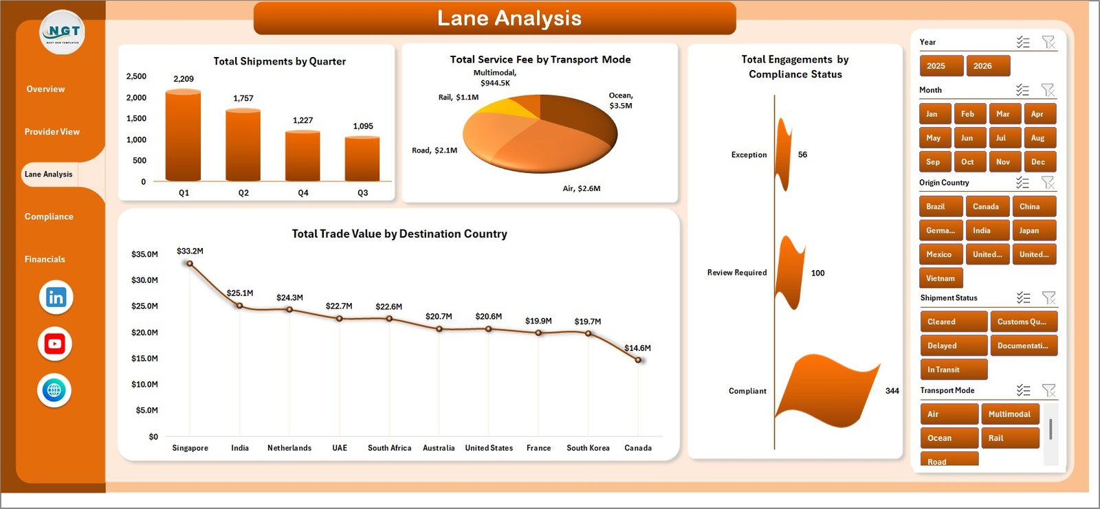
3. Lane Analysis
The Lane Analysis page is built for understanding shipment flows across time, transport, compliance, and destination markets. Total Shipments by Quarter helps teams compare seasonal shipment demand. Total Service Fee by Transport Mode shows whether certain modes create higher service fee exposure.
Total Engagements by Compliance Status helps compliance teams quickly see how many records fall into compliant, non-compliant, pending, or review categories. Total Trade Value by Destination Country shows where the largest trade value is landing, which helps with market-level reporting and risk review.
Click here to purchase Cross-border Trade Services Dashboard in Excel
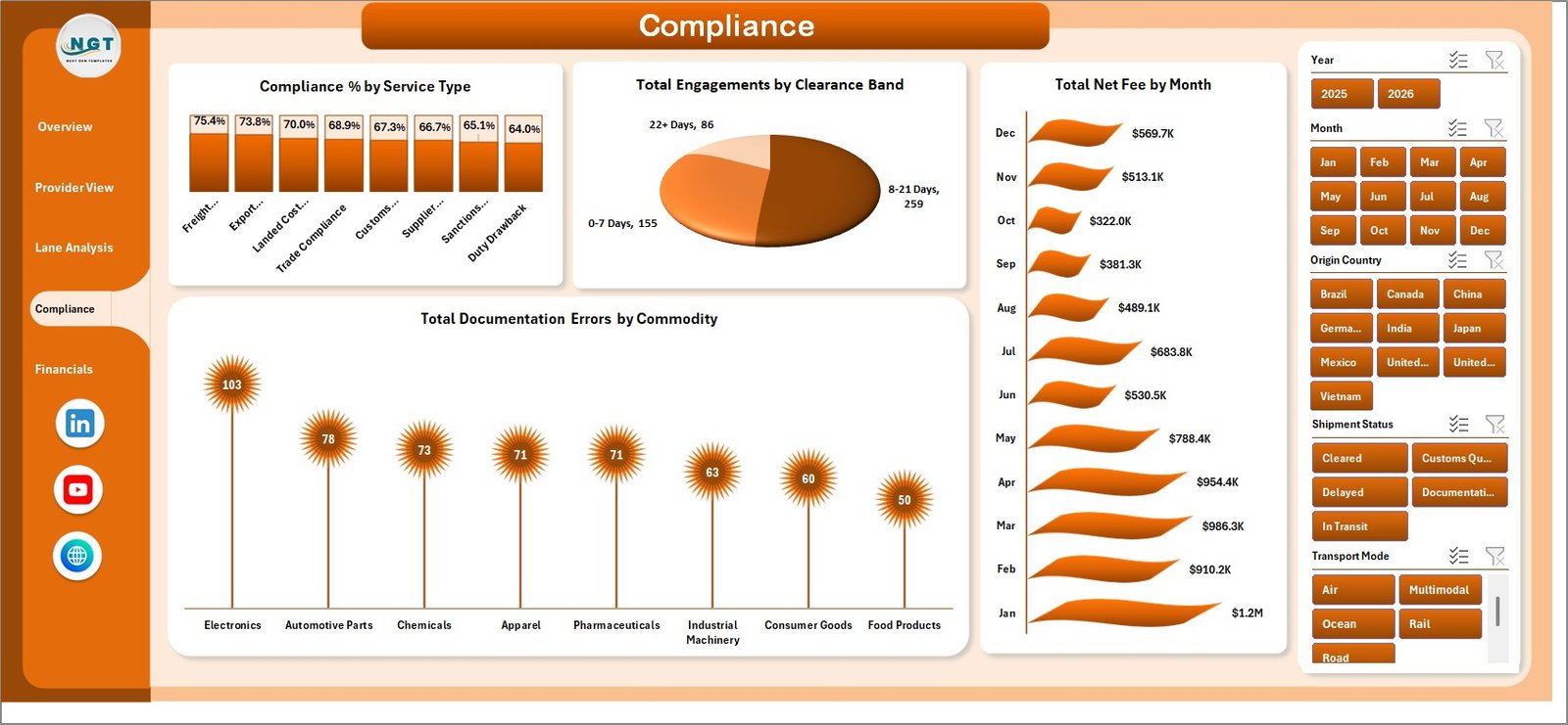
4. Compliance
The Compliance sheet is where trade operations and regulatory teams can review process quality. Compliance % by Service Type compares compliance performance across service categories. Total Engagements by Clearance Band helps users see how quickly shipments are clearing and where delays may exist.
Total Net Fee by Month connects compliance and finance outcomes over time. Total Documentation Errors by Commodity helps teams identify commodity groups that create more documentation issues, making this page useful for training, process improvement, and audit preparation.
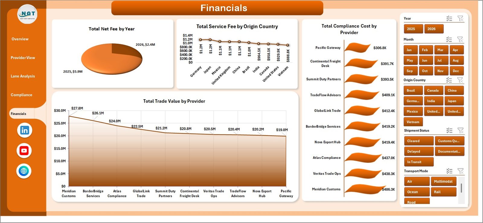
5. Financials
The Financials page is designed for fee, cost, and trade value analysis. Total Net Fee by Year shows long-term fee performance. Total Service Fee by Origin Country compares fee exposure across source markets.
Total Compliance Cost by Provider helps management review which providers carry higher compliance-related costs. Total Trade Value by Provider shows provider-level contribution to overall trade value, which can support negotiations and performance reviews.
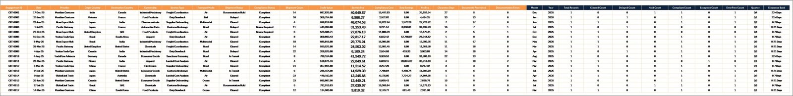
6. Data Sheet Tab
The Data sheet is where users add records in the same format as the sample data. This structure is important because the dashboard, support pivots, and charts depend on consistent columns. After updating records, users should refresh the workbook to update the dashboard.
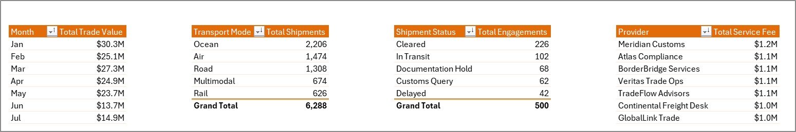
7. Support Sheet Tab
The Support sheet contains multiple pivot tables used to create the dashboard dynamically. After updating the Data sheet, go to the Data tab in the Excel ribbon and click Refresh All. The pivot tables and dashboard charts will refresh. You can keep this sheet hidden during regular use.
Click here to purchase Cross-border Trade Services Dashboard in Excel
Cross-border Trade Services Dashboard in Excel vs. Google Sheets vs. Paid Logistics SaaS – Feature Comparison
| Feature | This Excel Dashboard | Google Sheets Alternative | Paid Logistics SaaS |
|---|---|---|---|
| Cost | One-time template purchase | Low monthly workspace cost may apply | Monthly or annual subscription |
| Platform | Microsoft Excel | Browser-based spreadsheet | Cloud trade/logistics platform |
| Setup time | Replace data and refresh | Requires building dashboard structure | Requires vendor setup and onboarding |
| Collaboration | Best for file-based reporting | Better for live multi-user editing | Strong collaboration and permissions |
| Custom fields | Editable in Excel | Editable in Sheets | Depends on vendor configuration |
| Year-1 cost at 5 users | Template price only | Workspace subscription may apply | Often hundreds or thousands of dollars |
| Trade service analysis | Provider, lane, compliance, and financial pages included | Must be built manually | Usually available in higher-tier plans |
Who Should Use This Template
This template is useful for trade service providers, import-export businesses, customs brokers, freight forwarders, logistics analysts, finance teams, and compliance teams. It is especially helpful when your organization already captures shipment and service records but needs a cleaner way to summarize them.
It is also a good fit for consultants who prepare trade performance reports for clients, and for managers who need an Excel-based dashboard that can be customized internally.
Real-World Use Cases
Operations Manager: Reviews shipment status, transport mode, and clearance days to identify delays and improve operational flow.
Compliance Lead: Tracks compliance percentage, clearance bands, and documentation errors by commodity to prepare for audit discussions.
Finance Analyst: Reviews service fee, net fee, compliance cost, and trade value by provider, origin country, and year.
Advantages of Cross-border Trade Services Dashboard in Excel
- Works in Microsoft Excel without requiring a separate SaaS subscription.
- Gives managers multiple analysis pages instead of one static chart sheet.
- Uses slicers and pivot-based reporting for fast filtering.
- Includes Data and Support sheets so the model can be refreshed after updates.
- Combines operations, provider, lane, compliance, and financial analysis in one workbook.
- Click here to purchase Cross-border Trade Services Dashboard in Excel
Opportunities for Improvement
This workbook is intentionally Excel-based, so it does not automatically connect to live customs, shipping, ERP, or TMS systems. Teams with high transaction volume may want to extend it with Power Query, database exports, or a Power BI version.
You can learn more about Excel data tools from Microsoft here: Microsoft Excel help and learning.
Best Practices
- Keep the Data sheet column structure unchanged.
- Use consistent provider, country, commodity, and service type names.
- Refresh all pivot tables after updating records.
- Keep the Support sheet protected or hidden for regular users.
- Review compliance and documentation errors monthly to reduce repeated issues.
Explore Relevant Templates
You may also find these templates useful: Port Logistics Dashboard in Power BI, Cross-border Trade Services KPI Dashboard in Excel, and Export Compliance KPI Dashboard in Excel.
Frequently Asked Questions
What is the Cross-border Trade Services Dashboard in Excel used for?
It is used to track trade value, service fees, net fees, shipments, clearance days, provider performance, lane activity, compliance status, documentation errors, and financial results.
Can I replace the sample data?
Yes. Replace the records in the Data sheet while keeping the same format, then refresh all pivot tables and charts.
Can I add more providers or countries?
Yes. Add new providers, origin countries, destination countries, commodities, and service types in the Data sheet. They can appear in the dashboard after refresh.
Do I need macros?
No macros are required for normal dashboard use. The workbook is designed around Excel sheets, slicers, charts, and pivot tables.
Can the Support sheet be hidden?
Yes. The Support sheet powers the dashboard with pivot tables and can be kept hidden after setup.
About the Author
Built by PK – Microsoft Certified Professional with 15+ years of Excel, Google Sheets, and Power BI experience. Founder of NextGenTemplates, reaching 300K+ subscribers across YouTube channels. Every template is hand-built and tested before release.
Conclusion
The Cross-border Trade Services Dashboard in Excel is a practical workbook for teams that want better visibility into international trade service activity without moving everything into a paid platform. With pages for overview reporting, provider analysis, lane analysis, compliance, financials, source data, and pivot support, it gives managers a clear reporting base they can update and refresh.
Click here to purchase Cross-border Trade Services Dashboard in Excel
Visit our YouTube channel for Excel dashboard tutorials: Youtube.com/@PKAnExcelExpert