Running a Chamber of Commerce or trade association means juggling membership rosters, fee collection, event ROI, regional growth, sponsorship pipelines, and a board that wants every number on one slide. The Chamber of Commerce Dashboard in Power BI brings all of it into one interactive report — 5 connected pages, 5 KPI cards, 15 pre-built charts, and synchronized slicers across every page. Setup takes under 10 minutes.
This blog walks through every page of the Chamber of Commerce Dashboard in Power BI, compares it against Tableau and paid chamber-SaaS platforms like GrowthZone and ChamberMaster, and answers the questions chamber operations managers ask before they install Power BI Desktop. By the end you’ll know exactly whether this Power BI Dashboard Template fits your chamber, and how to set it up.
Key Features of the Chamber of Commerce Dashboard in Power BI
- 5 fully connected report pages — Overview, Membership Mix, Event Performance, Regional Reach, and Financials. Slicers on every page filter all 5 simultaneously, so the dashboard never goes out of sync.
- 5 headline KPI cards on the Overview — Total Members, Total Membership Fees, Total Chamber Income, Total Event Attendances, and Net Surplus. These are the numbers boards open every quarterly review with.
- 15 pre-built charts spanning membership tier mix, sponsorship trends, event lead generation, regional reach, payment method analysis, and net surplus by tier.
- Editable data model — replace the sample member roster, payments log, and events log with your own (Excel, CSV, SharePoint, SQL) and refresh. The dashboard updates automatically.
- Free Power BI Desktop compatible — no Power BI Pro license needed to open and edit the file. Download Power BI Desktop free from Microsoft Learn.
- Board-ready exports — push individual visuals or full pages to PowerPoint and PDF for quarterly board reviews and member town halls.
Dashboard Pages Explanation
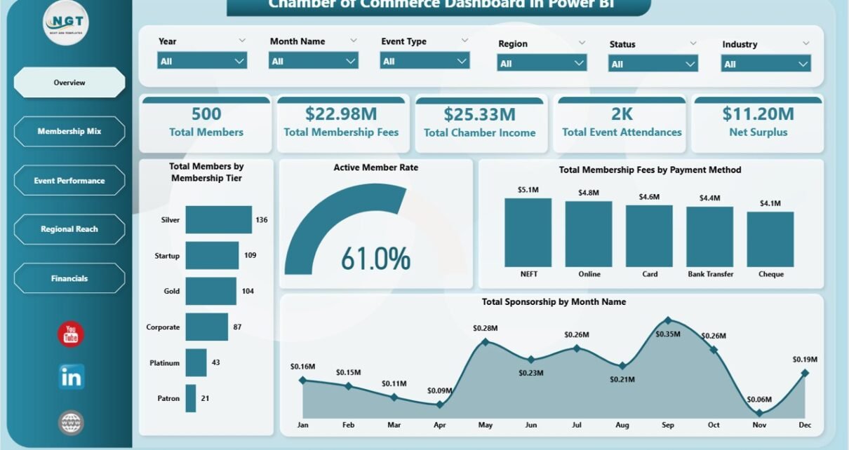
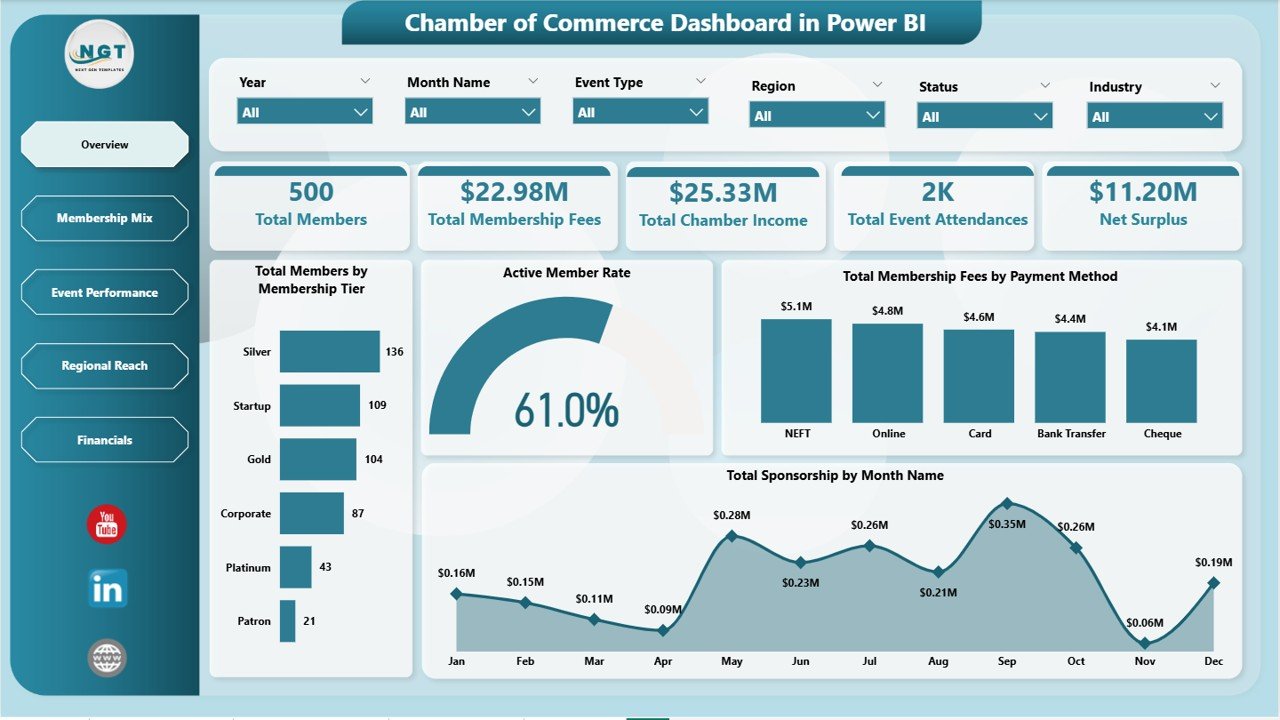
Page 1: Overview
The Overview page opens the report with 5 headline KPI cards — Total Members, Total Membership Fees, Total Chamber Income, Total Event Attendances, and Net Surplus — followed by 4 distribution charts that show how the chamber’s membership and revenue are shaped.
- Total Members by Membership Tier — headcount across Basic, Silver, Gold, and Platinum tiers so leadership sees which tier dominates the roster.
- Active Member Rate by Members — engagement health across the active member base, flagging at-risk segments before renewal season.
- Total Membership Fees by Payment Method — dues collected by card, bank transfer, cheque, and online wallet.
- Total Sponsorship by Month Name — sponsorship revenue month-by-month, exposing seasonality and renewal peaks.
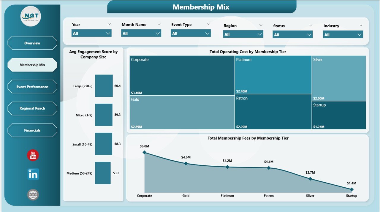
Page 2: Membership Mix
The Membership Mix page reveals how revenue and cost structure change across tiers and company sizes — useful when leadership debates new tier pricing, premium-tier benefits, or which segment to target for next year’s renewal campaign. Charts include Avg Engagement Score by Company Size, Total Operating Cost by Membership Tier, and Total Membership Fees by Membership Tier.
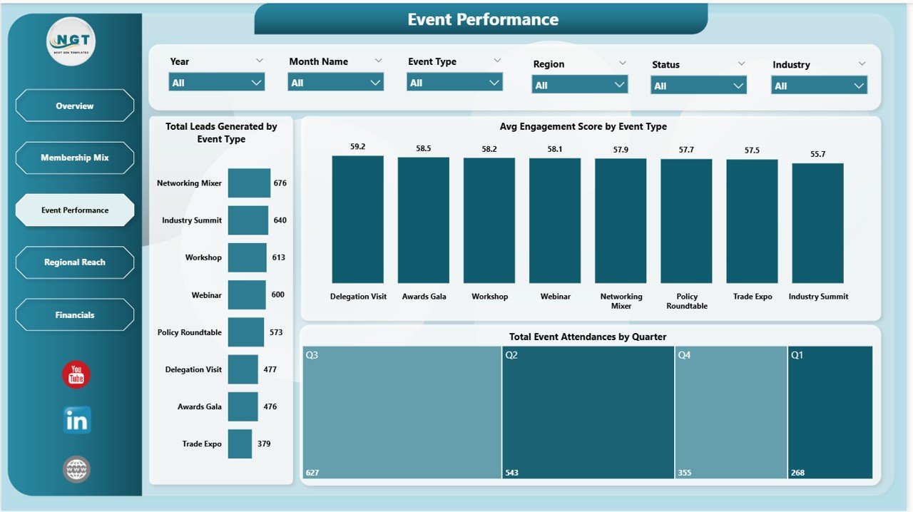
Page 3: Event Performance
The Event Performance page measures how well networking events, conferences, workshops, and trade shows generate leads and engagement for member businesses. Charts include Total Leads Generated by Event Type, Avg Engagement Score by Event Type, and Total Event Attendances by Quarter.
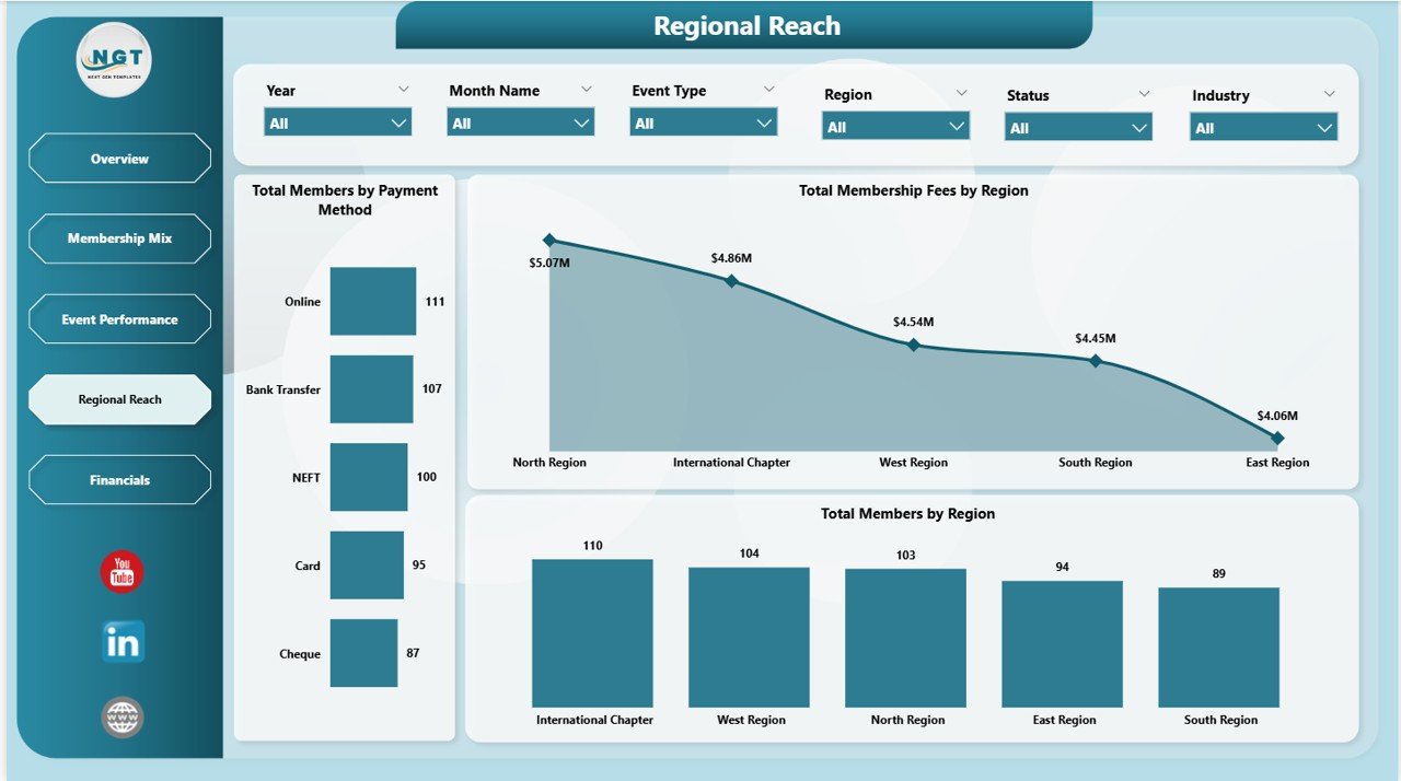
Page 4: Regional Reach
The Regional Reach page maps the chamber’s geographic footprint by member count, fee collection, and payment method — useful for chambers expanding into new districts or launching regional chapters. Charts include Total Members by Payment Method, Total Membership Fees by Region, and Total Members by Region.
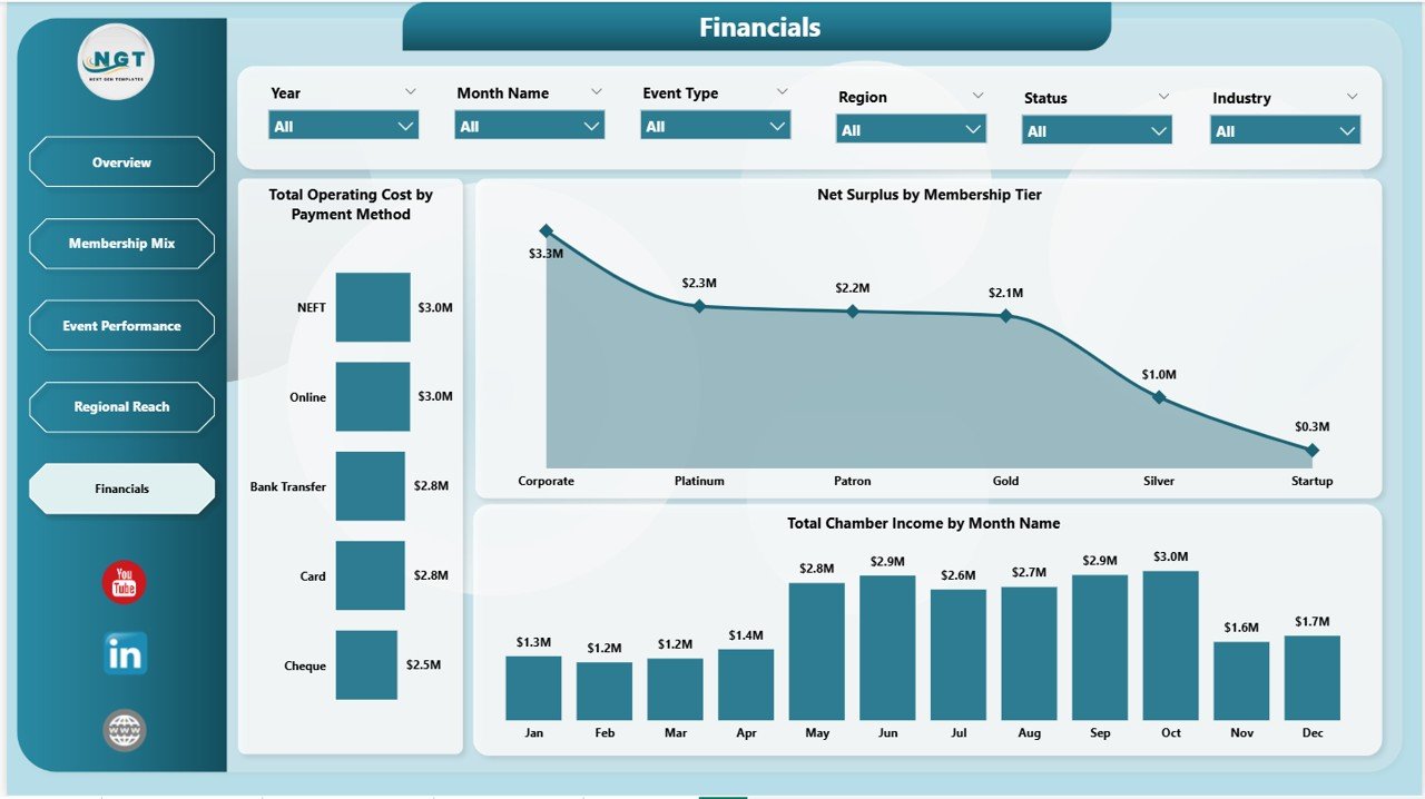
Page 5: Financials
The Financials page closes the report with operating cost, surplus, and income trend visuals — the numbers the board reviews in the annual audit and budget vote. Charts include Total Operating Cost by Payment Method, Net Surplus by Membership Tier, and Total Chamber Income by Month Name.
Chamber of Commerce Dashboard in Power BI vs. Tableau vs. Paid Chamber SaaS — Feature Comparison
| Feature | Chamber of Commerce Dashboard in Power BI | Tableau / Qlik Sense | GrowthZone / ChamberMaster / WildApricot |
|---|---|---|---|
| Cost | $17.99 one-time | $70 / user / month | $120-450 / month |
| Platform | Power BI Desktop (free) | Tableau Desktop / Cloud | Cloud SaaS only |
| Setup time | Under 10 minutes ✅ | 2-6 hours | 2-4 weeks |
| Pre-built membership KPIs | 5 cards + 15 charts ready ✅ | Build from scratch | Built-in (vendor-locked) |
| Membership tier analysis | Yes ✅ | Build from scratch | Yes |
| Event performance tracking | Yes ✅ | Build from scratch | Yes (extra module) |
| Customizable visuals | Full edit access ✅ | Full edit access | Limited templates |
| Year-1 cost at 5 users | $17.99 lifetime ✅ | $4,200 | $1,440-5,400 |
| Data ownership | Your file, your control ✅ | Your file | Vendor-locked |
For chambers that want board-ready reporting without paying $1,400-5,400 a year to GrowthZone or ChamberMaster, the Chamber of Commerce Dashboard in Power BI sits in the sweet spot.
Who Should Use This Template
Perfect for:
- Chamber of Commerce executive directors and operations managers running chambers with 50-5,000 members
- Trade association leaders tracking sponsorship income, tier mix, and event ROI in one Power BI report
- Business networking groups, BNI-style organizations, and industry guilds needing quarterly board-ready KPI reporting
- Membership-based non-profits and civic groups replacing the reporting modules of GrowthZone, ChamberMaster, or WildApricot
Not a fit if:
- You need a full member management platform with built-in CRM, email automation, payment processing, and member portals
- You don’t yet have a structured Excel or CSV roster of members, payments, and events — the dashboard refreshes on data, not paper
- Your team is unwilling to install the free Power BI Desktop application and spend 15 minutes learning the interface
Real-World Use Cases
Rachel directs operations at a regional Chamber of Commerce with 420 members. Before adopting the Chamber of Commerce Dashboard in Power BI, she emailed her board four separate spreadsheets every quarter — one for membership, one for fees, one for events, one for finance. After 25 minutes of setup, she replaced all four with the dashboard’s Overview page. Her board reviews one report now, and Rachel reclaimed roughly 4 hours per quarter previously spent reconciling figures across sheets.
Marcus runs a state-level Trade Association covering manufacturers across 12 districts. He uses the Regional Reach page to flag districts where membership has stagnated — the Total Members by Region chart made it obvious which two districts needed renewal-campaign attention. He uses the Financials page to defend the annual budget; the Net Surplus by Membership Tier chart was decisive in a board vote to raise Platinum-tier dues by 12%.
Priya leads a Women in Business Network with 180 founding members. Her sponsorship pipeline depended on proving event ROI to corporate sponsors. She uses the Event Performance page — Total Leads Generated by Event Type alongside Avg Engagement Score by Event Type — to renew three Gold-tier sponsorships in one cycle. The dashboard replaced a 30-slide pitch deck with one Power BI page.
Advantages of the Chamber of Commerce Dashboard in Power BI
- One-time cost vs. recurring SaaS fees — $17.99 once vs. $1,440-5,400/year for GrowthZone or ChamberMaster.
- Setup in minutes, not weeks — replace sample data with your own roster, click Refresh, and the entire 5-page dashboard updates. No vendor onboarding calls.
- Board-ready out of the box — KPI cards and tier-mix charts are sized for the executive director’s quarterly review slide deck.
- Data stays under your control — your .pbix file lives on your laptop or SharePoint, not on a SaaS vendor’s server. Critical for chambers with member-confidentiality obligations.
- Power BI ecosystem advantage — push to the Power BI service later, embed in your chamber website, or build mobile views. Microsoft’s Power BI documentation covers every extension path.
Opportunities for Improvement
- No built-in member portal or CRM — the dashboard is a reporting layer, not a full chamber management platform. Pair it with a CRM like HubSpot or a simple Google Form for member onboarding.
- Data prep still required — you’ll spend the first 30 minutes mapping your existing member roster columns to the template’s expected column names.
- Single-currency by default — if your chamber operates across multiple currencies, add a currency conversion column in the source data.
- No automated email reminders — renewal alerts and payment reminders still need to be handled by your existing CRM or email tool.
Best Practices
- Schedule a quarterly refresh ritual — pick a fixed Monday after quarter-end, refresh the dashboard, and circulate the Overview page screenshot to your board.
- Use the bookmark feature — Power BI bookmarks let you save filtered views (e.g., “Gold Tier only”, “Q4 events only”) and switch between them in one click during board calls.
- Pair with a Power BI service workspace — once the .pbix is stable, publish it to a Power BI workspace and grant view-only access to board members.
- Document your data source columns — keep a one-page README of which column in your member roster feeds which dashboard visual.
- Layer in a row-level security model — for chambers with regional staff, use Power BI’s row-level security so each district lead sees only their region’s data.
Explore Relevant Templates
- Also available as: Chamber of Commerce Dashboard in Excel — same 5 pages, Excel-native pivot model.
- Chamber of Commerce Dashboard in Power BI — the full template covered in this post.
- Chamber of Commerce KPI Dashboard in Power BI — focused KPI scorecard variant.
- Trade Associations KPI Dashboard in Power BI — sister template for industry trade associations.
- Event Management Analysis Dashboard in Power BI — drill deeper into conference and trade-show performance.
- Browse all Power BI Dashboards on NextGenTemplates.
Frequently Asked Questions
What KPIs does the Chamber of Commerce Dashboard in Power BI track?
The Chamber of Commerce Dashboard in Power BI tracks 5 headline KPIs — Total Members, Total Membership Fees, Total Chamber Income, Total Event Attendances, and Net Surplus — plus 15 supporting charts covering tier mix, event performance, regional reach, sponsorship trends, and operating costs across 5 connected pages.
Do I need a Power BI Pro license to use this dashboard?
No — the Chamber of Commerce Dashboard in Power BI opens in free Microsoft Power BI Desktop. You only need a Power BI Pro license if you want to publish the report to the Power BI online service and share it with other licensed users in your organization.
How does this compare to GrowthZone or ChamberMaster?
GrowthZone and ChamberMaster are full chamber management platforms costing $120-450/month with built-in CRM, email, and member portals. The Chamber of Commerce Dashboard in Power BI is a one-time $17.99 reporting layer that visualizes your existing member data — pair it with any roster source for board-ready reporting without subscription fees.
How long does setup take?
Setup takes under 10 minutes for a chamber with up to 1,000 members. Download, unzip, open in Power BI Desktop, replace sample data with your own member roster, payments log, and events log, then click Refresh. All 5 pages and 15 charts update automatically.
Can I customize the membership tiers and chart colors in the dashboard?
Yes — every chart, KPI card, slicer, and color scheme in the Chamber of Commerce Dashboard in Power BI is fully editable. Add or rename tiers (Basic, Silver, Gold, Platinum, Diamond), change the brand palette via View → Themes, and add new measures using DAX.
Is the Chamber of Commerce Dashboard in Power BI a one-time purchase?
Yes — the Chamber of Commerce Dashboard in Power BI is a one-time payment of $17.99 with lifetime access, no subscription, and no per-user fees. Download instantly after purchase and use it across unlimited devices and team members in your chamber.
About the Author
Built by PK — Microsoft Certified Professional with 15+ years of Excel, Google Sheets, and Power BI experience. Founder of NextGenTemplates, reaching 300K+ subscribers across YouTube channels. Every template is hand-built and tested before release. Visit YouTube.com/@PK-AnExcelExpert for step-by-step Power BI tutorials.
Conclusion
If your chamber currently tracks members, fees, events, and finances across four different spreadsheets — or worse, pays $200-450/month for a chamber-SaaS platform you barely use 30% of — the Chamber of Commerce Dashboard in Power BI is the one-time investment that consolidates it all into a single board-ready report. 5 connected pages, 5 headline KPIs, 15 charts, and synchronized slicers, all editable in free Power BI Desktop.
👉 Click here to Purchase the Chamber of Commerce Dashboard in Power BI
✅ Instant download · One-time payment · No subscription · Lifetime access
📅 Last updated: May 2026