Last-mile delivery is one of the most sensitive stages in logistics because it affects delivery cost, customer experience, service reliability, and repeat purchase behavior. When delivery managers rely only on raw exports, it becomes difficult to see which regions are expensive, which service types are slow, which drivers receive weaker ratings, and where incidents are increasing. The Last-mile Delivery Dashboard in Power BI solves that reporting problem with 5 interactive Power BI pages built for delivery performance analysis.
This ready-to-use Power BI template helps courier companies, ecommerce operations teams, 3PL providers, regional logistics managers, and supply chain analysts review packages, delivery cost, revenue, delivery hours, delivery success rate, incidents, regional performance, driver quality, vehicle type performance, and customer rating in one place.
Click here to purchase the Last-mile Delivery Dashboard in Power BI
Last-mile Delivery Dashboard in Power BI
Key Features of Last-mile Delivery Dashboard in Power BI
- 5 interactive report pages: Overview Page, Delivery Trend, Region Ops, Driver Quality, and Exception Watch.
- High-level KPI cards: Total Packages, Total Delivery Cost, Total Deliveries, Avg Delivery Hours, and Avg Customer Rating.
- Cost and revenue analysis: Compare Total Delivery Cost and Total Delivery Revenue by month and by region.
- Success rate tracking: Analyze Delivery Success Rate by Overall Performance, Region, and Priority.
- Incident monitoring: See Incident Count by Region to identify where operational issues are concentrated.
- Driver and service quality: Review Avg Customer Rating by Driver and Avg Customer Rating by Service Type.
- Vehicle and city analysis: Compare Total Deliveries by Vehicle Type and Total Packages by City.
- Power BI flexibility: Edit visuals, model logic, slicers, themes, and measures in Power BI Desktop.
Dashboard Pages Explanation
The dashboard contains five pages, and each page answers a different operational question. The Overview page answers, “How are we performing overall?” Delivery Trend answers, “Where are cost, revenue, delivery hours, and package volume changing?” Region Ops answers, “Which cities, vehicles, and drivers need attention?” Driver Quality answers, “How strong is service quality by driver, service type, month, and priority?” Exception Watch answers, “Where are profit, delivered count, and vehicle delivery hours creating follow-up actions?”
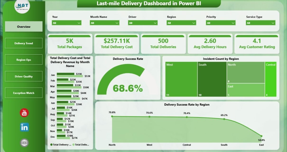
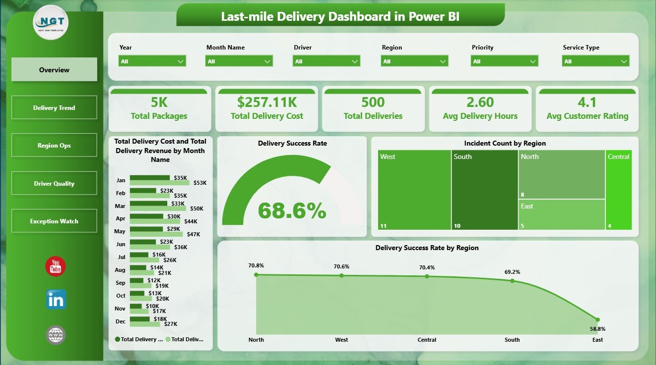
1 – Overview Page
The Overview Page shows the main delivery performance story at a glance. The KPI cards summarize Total Packages, Total Delivery Cost, Total Deliveries, Avg Delivery Hours, and Avg Customer Rating so leaders can quickly understand volume, cost, speed, and service quality.
The Total Delivery Cost and Total Delivery Revenue by Month Name chart compares monthly cost against revenue, which helps managers see whether delivery operations are profitable or becoming expensive. Delivery Success Rate by Overall Performance separates strong and weak outcomes so teams can identify performance bands that need attention.
Incident Count by Region shows where operational exceptions are concentrated. Delivery Success Rate by Region helps managers compare regional reliability and focus improvement work on weaker areas.
Overview Page
2 – Delivery Trend
The Delivery Trend page focuses on movement over regions, service types, and months. Total Delivery Cost and Total Delivery Revenue by Region helps compare financial performance across territories and identify regions where cost is higher than expected.
Avg Delivery Hours by Service Type shows how long different service categories take to complete. Total Packages by Month Name reveals package volume seasonality and helps managers prepare for peak periods, staffing changes, or capacity pressure.
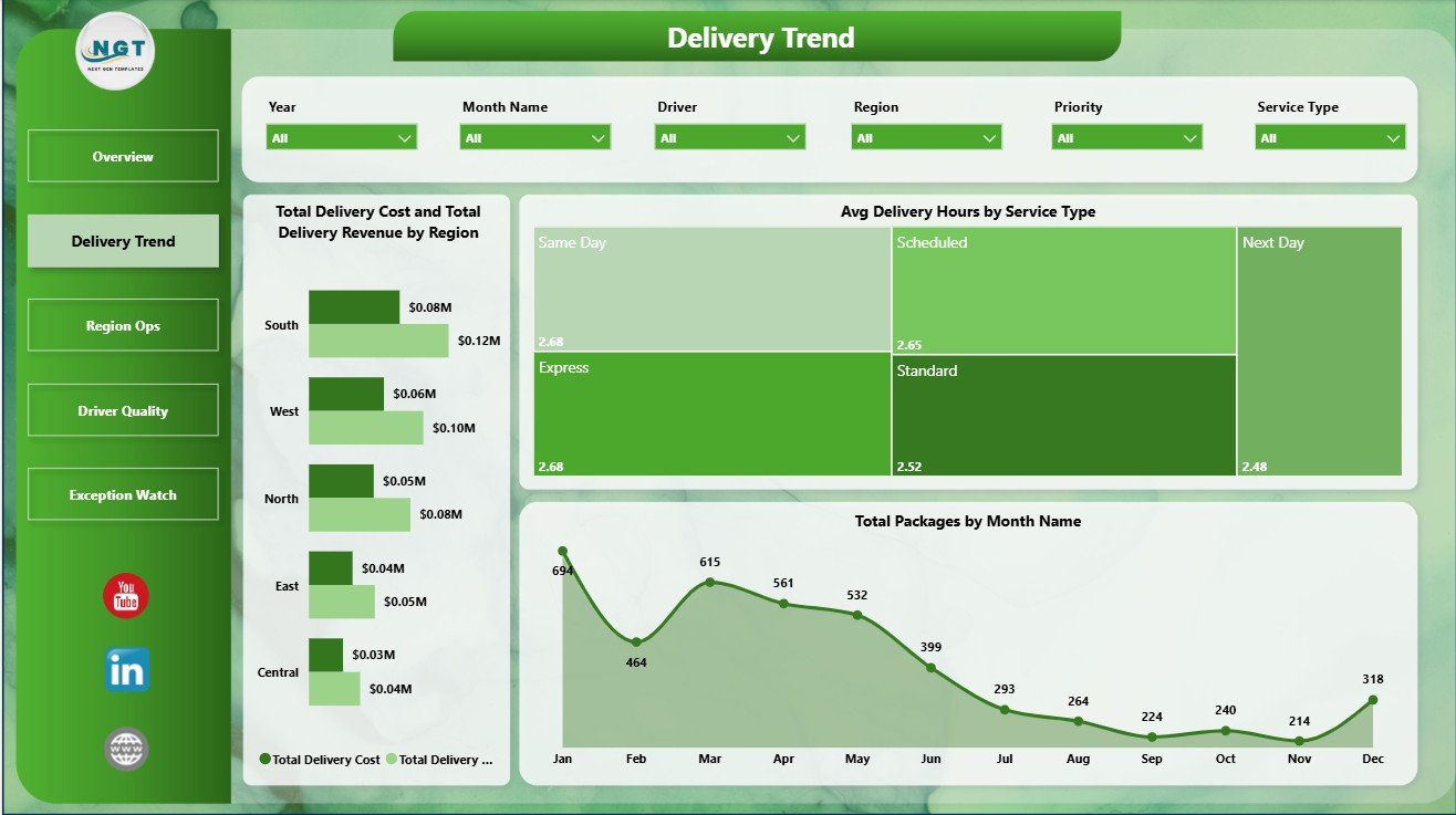
Delivery Trend
3 – Region Ops
The Region Ops page is designed for local operating review. Total Packages by City shows where delivery workload is highest and helps teams compare city-level demand.
Total Deliveries by Vehicle Type shows how different delivery modes contribute to completed work. Avg Customer Rating by Driver helps supervisors identify strong performers and drivers who may need additional support, coaching, or route review.
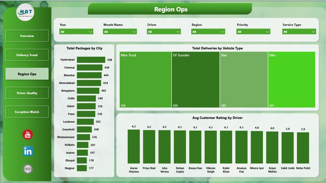
Region Ops
4 – Driver Quality
The Driver Quality page connects revenue, service type, customer rating, and priority handling. Total Delivery Revenue by Month Name shows how revenue changes across the reporting period.
Avg Customer Rating by Service Type helps managers compare service promises against actual customer experience. Delivery Success Rate by Priority shows whether high-priority deliveries are receiving the reliability they require.
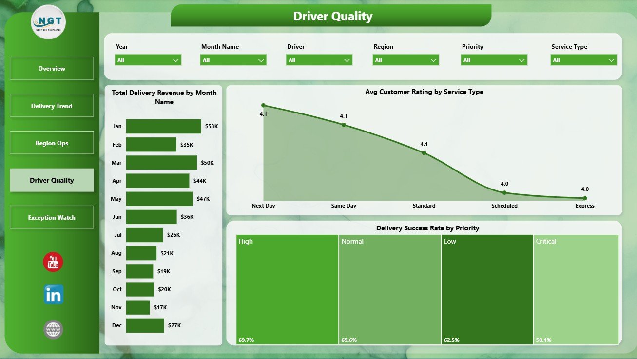
Driver Quality
5 – Exception Watch
The Exception Watch page helps teams identify operational follow-up areas. Net Delivery Profit by Region shows where delivery operations are profitable and where margin pressure may exist.
Delivered Count by Region compares completed delivery output across territories. Avg Delivery Hours by Vehicle Type helps managers understand whether a vehicle category is slowing down delivery speed or needs a better route assignment strategy.
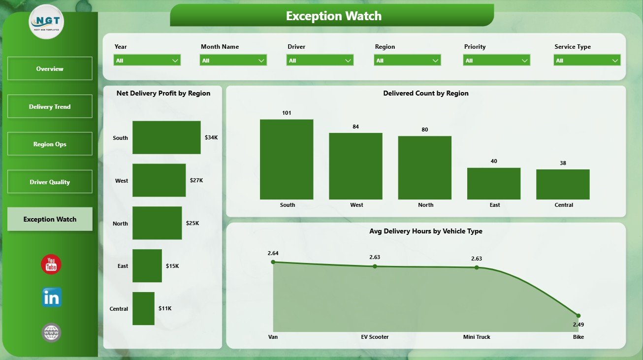
Exception Watch
Last-mile Delivery Dashboard in Power BI vs. Tableau vs. Paid CRM/SaaS – Feature Comparison
| Feature | Last-mile Delivery Dashboard in Power BI | Tableau alternative | Paid delivery SaaS |
|---|---|---|---|
| Cost | $17.99 one-time | Requires Tableau setup and licensing | Monthly or annual subscription |
| Platform | Power BI Desktop | Tableau Desktop or Cloud | Vendor-hosted system |
| Setup time | Open PBIX, connect data, refresh | Build or customize workbook | Implementation and onboarding |
| Real-time team collaboration | Available through Power BI Service | Available through Tableau Cloud/Server | Usually included |
| Mobile access | Power BI mobile after publishing | Tableau mobile after publishing | Usually included |
| Customizable fields | Editable model, pages, visuals, and measures | Editable if you own the workbook | Depends on vendor plan |
| Share with link | Available through Power BI Service | Available through Tableau sharing | Login controlled |
| Year-1 cost at 5 users | $17.99 plus Microsoft licensing if shared online | Software and implementation cost | Often hundreds or thousands |
| Delivery-specific reporting | 5 ready-made pages | Must be built or purchased | Depends on vendor module |
For teams already using Microsoft tools, this dashboard sits between raw spreadsheets and expensive delivery software. It does not replace live dispatching, but it gives managers a clean reporting layer for recurring delivery performance reviews. You can learn more about Power BI Desktop on Microsoft Learn.
Who Should Use This Template
- Ecommerce operations managers tracking delivery cost, revenue, and customer experience.
- Courier companies reviewing delivery success, packages, drivers, and service types.
- 3PL analysts preparing weekly or monthly delivery performance reports.
- Regional logistics leaders comparing city workload, incidents, and vehicle output.
- Power BI consultants building dashboards for delivery and supply chain clients.
Real-World Use Cases
Ravi manages ecommerce fulfillment. He reviews the Overview and Delivery Trend pages every Monday to understand package volume, delivery cost, revenue, and delivery hours.
Meera leads regional delivery operations. She uses Region Ops and Exception Watch to compare city workload, vehicle deliveries, incidents, profit, and delivery hours.
Daniel is a 3PL reporting consultant. He adapts the PBIX file for client reporting and uses driver rating, service type, and priority success visuals for service review meetings.
Advantages of Last-mile Delivery Dashboard in Power BI
- Fast setup: Start with a ready-made PBIX file instead of building every page manually.
- Clear operational story: Each page is designed around a specific delivery management question.
- Power BI flexibility: Edit visuals, slicers, measures, relationships, colors, and report pages.
- Better review meetings: Use the same report for weekly performance checks and monthly business reviews.
- No heavy SaaS commitment: Buy once and adapt the report to your own delivery dataset.
Opportunities for Improvement
This template is a reporting dashboard, not an operational execution platform. It does not provide GPS tracking, driver mobile apps, proof-of-delivery capture, barcode scanning, or automated route optimization. Teams that need those workflows should use a delivery management system and then connect exported data into Power BI for analysis.
Best Practices
- Keep city, region, driver, service type, and vehicle type names consistent.
- Refresh the report on a fixed schedule before review meetings.
- Review incident-heavy regions separately from high-volume regions.
- Compare delivery success rate with customer rating to avoid looking at speed alone.
- Publish to Power BI Service only when your organization has the right sharing and access permissions.
Explore Relevant Templates
Explore related Power BI templates from NextGenTemplates: Third-Party Logistics (3PL) Dashboard in Power BI, Trucking and Logistics Dashboard in Power BI, Cold Chain Logistics Dashboard in Power BI, and Last-mile Delivery Dashboard in Excel.
Frequently Asked Questions
What is the Last-mile Delivery Dashboard in Power BI?
It is a ready-to-use Power BI dashboard template for analyzing delivery cost, revenue, packages, success rate, incidents, ratings, delivery hours, regions, drivers, service types, and vehicle types.
How many pages are included?
The report includes 5 pages: Overview Page, Delivery Trend, Region Ops, Driver Quality, and Exception Watch.
Do I need advanced Power BI skills?
No. You can use the template by opening the PBIX file, replacing or connecting data, and refreshing the report. Advanced users can also customize measures and visuals.
Can I customize the dashboard?
Yes. You can edit report pages, charts, slicers, colors, data model relationships, and DAX measures in Power BI Desktop.
Is this a live delivery tracking system?
No. It is an analytics and reporting template. It does not include dispatching, GPS tracking, route planning, or proof-of-delivery workflows.
Can I share it with my team?
Yes, you can publish it to Power BI Service if your Microsoft account and organization licensing support sharing.
About the Author
Built by PK – Microsoft Certified Professional with 15+ years of Excel, Google Sheets, and Power BI experience. Founder of NextGenTemplates, reaching 300K+ subscribers across YouTube channels. Every template is hand-built and tested before release.
Conclusion
The Last-mile Delivery Dashboard in Power BI gives delivery teams a practical way to monitor cost, revenue, package volume, delivery success, incidents, region performance, driver quality, customer rating, and vehicle delivery hours. If your team already collects delivery data but needs a clearer reporting layer, this template can save setup time and make performance reviews easier.
Click here to purchase the Last-mile Delivery Dashboard in Power BI
Visit our YouTube channel to learn step-by-step video tutorials.