Online Therapy Apps Dashboard in Excel is a ready-to-use Excel dashboard for digital mental health teams that need to monitor revenue, net revenue, clinician cost, booked sessions, completed sessions, session completion percentage, satisfaction score, care plan completion, subscription plan performance, acquisition channel mix, therapy type, app name, and region.
Online therapy has become a normal operating model for many mental health providers. The American Psychological Association reported that by 2023, 89% of psychologists used telehealth, while SAMHSA reported that mental health facilities offering telemedicine increased from 22.2% in 2015 to 68.7% in 2020. That growth creates a reporting problem: therapy app data often sits in exports from booking systems, payment tools, clinician platforms, CRM systems, and support tools. This Excel dashboard gives you a repeatable way to bring those records into one workbook and review performance without building every PivotTable, slicer, and chart from the beginning.
Key Features of Online Therapy Apps Dashboard in Excel
- Five dashboard pages: Overview, Sessions, Revenue Mix, Care Quality, and App Insights.
- Five top KPI cards: Total Revenue, Net Revenue, Total Clinician Cost, Session Completion %, and Avg. Satisfaction Score.
- Twenty analysis charts: Review revenue, cost, sessions, completion percentage, satisfaction, care plan completion, channel, app name, plan, status, therapy type, severity level, region, age band, therapist tier, and month trends.
- Multiple slicers: Filter dashboard pages quickly during weekly performance reviews and leadership meetings.
- Editable Data sheet: Replace the sample records with your own app data using the same format.
- Pivot-powered Support sheet: Refresh All updates the PivotTables and connected charts.
- Excel workflow: Use a familiar spreadsheet environment instead of paying for another reporting SaaS just to review exported data.
Dashboard Pages Explanation
1. Overview Page
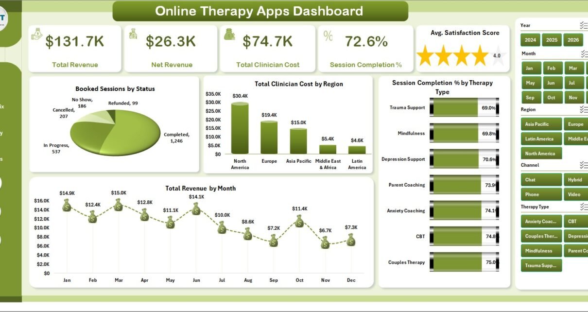
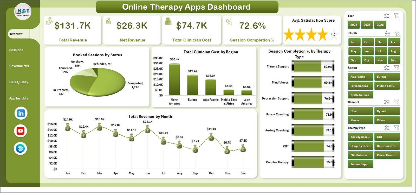
The Overview page gives leadership a high-level snapshot of the online therapy app business. The cards show Total Revenue, Net Revenue, Total Clinician Cost, Session Completion %, and Avg. Satisfaction Score, so finance, operations, and care quality signals are visible at the top of the workbook.
Booked Sessions by Status: This chart separates booked sessions by status. It helps operations teams compare completed, cancelled, pending, no-show, or other status groups and identify where follow-up or workflow improvement may be needed.
Total Clinician Cost by Region: This visual compares clinician cost across regions. It is useful for reviewing staffing cost, provider mix, service rates, or geography-specific delivery expense.
Session Completion % by Therapy Type: This chart compares completion percentage across therapy types. It helps clinical and product teams see which care programs convert scheduled sessions into completed sessions more consistently.
Total Revenue by Month: This monthly trend shows revenue movement over time. It helps teams spot seasonality, campaign impact, pricing changes, or months where growth slowed.
2. Sessions
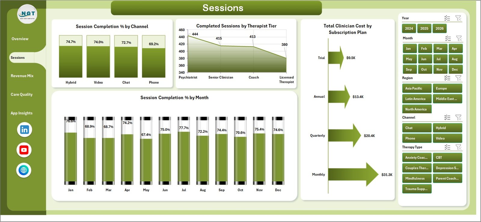
The Sessions page focuses on care delivery and session follow-through. It is useful for operations managers who want to understand which channels, tiers, plans, and months are producing stronger completion performance.
Session Completion % by Channel: This chart compares completion percentage across user channels. It helps reveal whether app users, web users, partner referrals, paid acquisition, or other channels complete sessions at different rates.
Completed Sessions by Therapist Tier: This chart shows completed session volume by therapist tier. It helps managers compare clinician workload and contribution by tier.
Total Clinician Cost by Subscription Plan: This chart connects clinician cost with subscription plan. It helps finance and product teams understand which plans carry more delivery cost.
Session Completion % by Month: This trend tracks completion rate month by month. It helps teams investigate dips after changes in product experience, clinician availability, pricing, or acquisition quality.
3. Revenue Mix
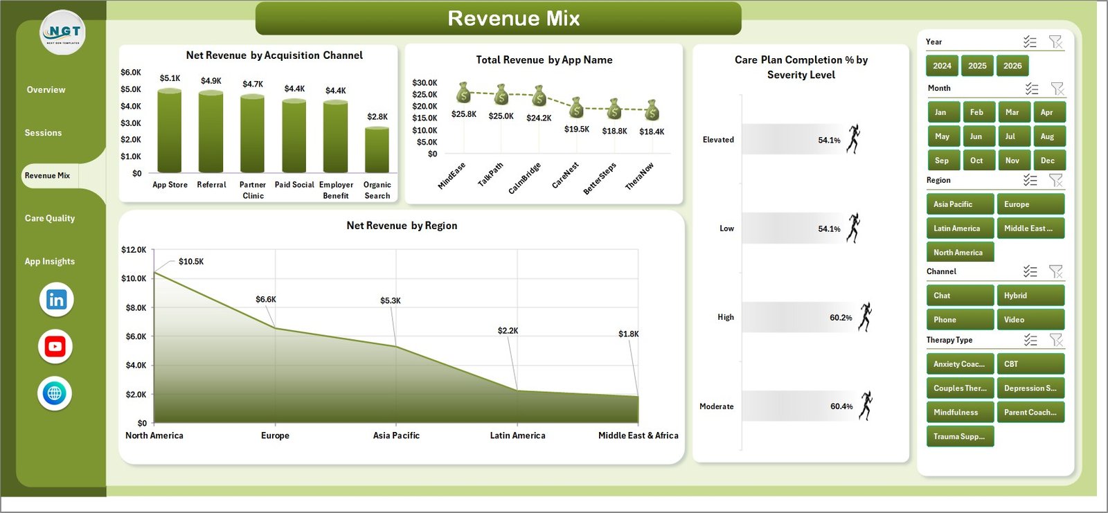
The Revenue Mix page helps teams understand where revenue and net revenue are coming from. It is especially useful for growth, finance, and product teams working together on user acquisition, pricing, and portfolio decisions.
Net Revenue by Acquisition Channel: This chart compares net revenue by acquisition channel. It helps teams identify which channels bring higher-value users after delivery cost is considered.
Total Revenue by App Name: This visual compares revenue across app names or brands. It helps portfolio managers understand which app contributes the most top-line revenue.
Care Plan Completion % by Severity Level: This chart compares care plan completion across severity levels. It helps care teams review whether higher-severity users are progressing through planned care as expected.
Net Revenue by Region: This chart shows net revenue by region. It supports regional growth, marketing, pricing, and clinician capacity discussions.
4. Care Quality
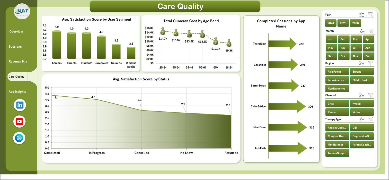
The Care Quality page brings satisfaction and care delivery views together. It is helpful for clinical leads, support teams, and product managers who want to understand user experience patterns.
Avg. Satisfaction Score by User Segment: This chart compares satisfaction across user segments. It helps teams identify whether some groups experience the service differently and where support improvements may be needed.
Total Clinician Cost by Age Band: This visual compares clinician cost by age band. It helps analysts review whether certain age groups require more expensive service delivery.
Completed Sessions by App Name: This chart compares completed session volume by app. It helps teams understand utilization across a multi-app portfolio.
Avg. Satisfaction Score by Status: This chart links satisfaction score with status. It helps teams compare satisfaction for completed, active, cancelled, pending, or inactive groups.
5. App Insights
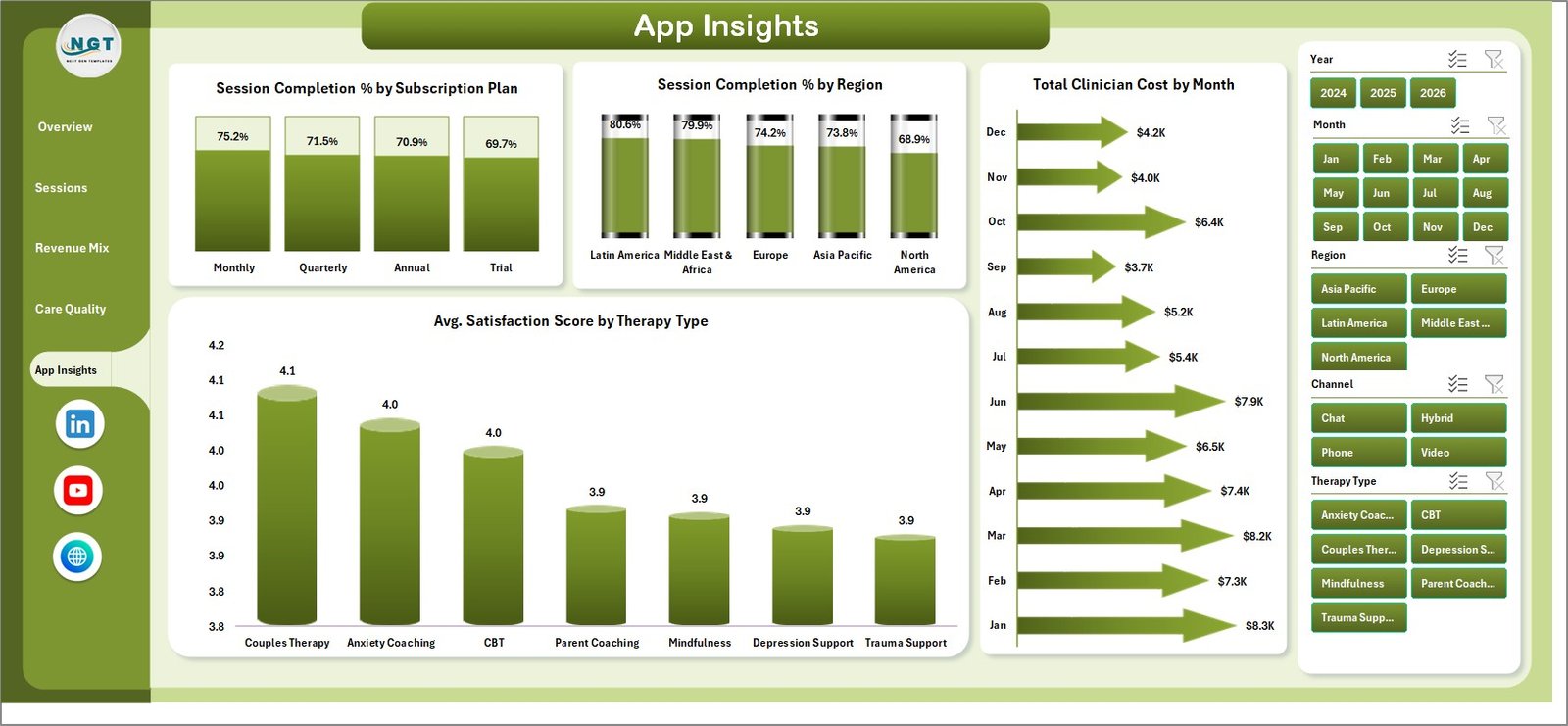
The App Insights page is a practical review page for product, finance, and operations teams. It connects plan, region, month, and therapy type views so teams can compare engagement, cost, and satisfaction from several angles.
Session Completion % by Subscription Plan: This chart compares completion percentage by subscription plan. It helps teams evaluate whether plan design or included benefits influence session follow-through.
Session Completion % by Region: This visual compares completion rate across regions. It helps operations teams identify regional delivery or engagement gaps.
Total Clinician Cost by Month: This monthly chart tracks clinician cost movement. It helps finance teams monitor cost spikes and compare expense trends against revenue trends.
Avg. Satisfaction Score by Therapy Type: This chart compares satisfaction score across therapy types. It helps clinical leaders find services with stronger or weaker user experience outcomes.
6. Data Sheet Tab
The Data sheet is the source sheet. Add your online therapy app data in the same format, keep the column headers consistent, and avoid mixing summary rows with raw records. A clean source table makes the dashboard easier to refresh and audit.

7. Support Sheet
The Support sheet contains the PivotTables used to power the dashboard charts. After updating the Data sheet, go to the Data tab in the Excel Ribbon and click Refresh All. All connected pivots and charts will refresh. You can keep this sheet hidden for normal use.

Online Therapy Apps Dashboard in Excel vs. Google Sheets vs. Paid CRM/SaaS – Feature Comparison
| Feature | This Excel Dashboard | Google Sheets Alternative | Paid Healthcare SaaS |
|---|---|---|---|
| Cost | One-time template purchase | Low cost, but requires build time | Monthly or annual subscription |
| Platform | Microsoft Excel | Browser-based spreadsheet | Vendor cloud platform |
| Setup time | Replace data and refresh | Build formulas, pivots, charts, and filters | Implementation and onboarding |
| Real-time team collaboration | Possible through OneDrive or SharePoint | Strong native collaboration | Plan-dependent |
| Mobile access | Limited editing on mobile | Available through Google Sheets app | Usually included |
| Customizable fields | Fully editable workbook | Fully editable sheet | Limited by vendor configuration |
| Share with link | Use Microsoft 365 sharing | Native link sharing | Login-controlled sharing |
| Year-1 cost at 5 users | Template cost plus existing Microsoft licensing | Workspace cost plus build time | Often hundreds or thousands per year |
| Therapy app metrics | Pre-built for sessions, revenue, cost, satisfaction, channels, plans, and regions | Must be designed manually | Depends on vendor reporting access |
Who Should Use This Template
This template is a good fit for online therapy app founders, digital health operators, therapy platform analysts, care quality teams, finance managers, growth marketers, customer success leads, and consultants who need a fast reporting workbook for app-level performance.
It is not a replacement for an EHR, billing system, patient portal, clinical documentation system, HIPAA compliance tool, or live production database. It works best as a reporting layer after your app, CRM, payment, or scheduling data has been exported into a structured spreadsheet format.
Real-World Use Cases
Monthly founder review: A founder filters the Overview and Revenue Mix pages to review revenue, net revenue, clinician cost, and region performance before a board or investor meeting.
Operations improvement: A therapy operations manager uses the Sessions page to compare completion percentage by channel, therapist tier, subscription plan, and month.
Care quality monitoring: A clinical lead reviews satisfaction by user segment, status, and therapy type to decide where training, product changes, or user support should be improved.
Advantages of Online Therapy Apps Dashboard in Excel
- It brings financial, operational, and care quality metrics into one workbook.
- It uses familiar Excel features such as PivotTables, charts, and slicers.
- It can be updated by replacing sample data and refreshing the workbook.
- It avoids a separate reporting subscription for teams that already work in spreadsheets.
- It supports fast review meetings because slicers make filtered views easy to create.
Opportunities for Improvement
As your data grows, you may want to connect Excel to Power Query, Power BI, or a database so reporting becomes more automated. You may also want to add data validation checks, protected sheets, or a formal KPI dictionary. For sensitive healthcare data, use the template only with your organization’s privacy, security, and compliance policies in mind.
Best Practices
- Keep one row per source record in the Data sheet.
- Do not rename key columns unless you also update the connected pivots and charts.
- Refresh all PivotTables after each data update.
- Use consistent names for regions, channels, subscription plans, app names, and therapy types.
- Review revenue and clinician cost together, not separately, because top-line growth can hide delivery cost increases.
- Use Microsoft guidance for PivotTables and slicers if you plan to customize the workbook.
Explore Relevant Templates
If you work with therapy, healthcare, or clinical operations data, these related templates may also help:
- Online Therapy Apps Dashboard in Excel
- Occupational Therapy Dashboard in Excel
- Occupational Therapy Dashboard in Power BI
- Patient Appointment Data Entry System in Excel
You can also browse more Excel Dashboard Templates and Health and Safety Excel Templates.
Frequently Asked Questions
What is included in the Online Therapy Apps Dashboard in Excel?
The workbook includes Overview, Sessions, Revenue Mix, Care Quality, App Insights, Data, and Support sheets. It includes KPI cards, slicers, PivotTables, and charts for revenue, cost, sessions, completion rate, satisfaction, channel, plan, therapy type, app, region, and monthly analysis.
Can I use my own online therapy app data?
Yes. Replace the sample records on the Data sheet while keeping the same format, then click Refresh All from the Excel Data tab.
Do I need advanced Excel skills?
No advanced setup is required for normal use. You only need to replace data, refresh the workbook, and use slicers. Advanced users can customize charts, pivots, formulas, colors, and fields.
Does this dashboard require macros?
No. The dashboard workflow is based on Excel tables, PivotTables, charts, and slicers.
Is this template HIPAA compliant?
The template is an analytics workbook, not a compliance product. If you use real patient or client information, follow your organization’s privacy and security requirements.
Can this replace therapy practice software?
No. It is designed for reporting and analysis, not scheduling, billing, clinical notes, messaging, or medical record management.
About the Author
Built by PK – Microsoft Certified Professional with 15+ years of Excel, Google Sheets, and Power BI experience. Founder of NextGenTemplates, reaching 300K+ subscribers across YouTube channels. Every template is hand-built and tested before release.
Conclusion
The Online Therapy Apps Dashboard in Excel gives digital mental health teams a practical way to monitor app revenue, clinician cost, completed sessions, completion percentage, satisfaction, care plan completion, channel performance, plan mix, app performance, and regional trends from one workbook. It is especially useful when you already export structured data and need a repeatable Excel reporting layer.
Download the Online Therapy Apps Dashboard in Excel and start reviewing therapy app performance in a clean, editable Excel dashboard.
For tutorials and template walkthroughs, visit YouTube.com/@PKAnExcelExpert.