Prop Tech Dashboard in Excel is a ready-to-use Excel dashboard template for property technology teams that want to track revenue, net profit, managed units, support tickets, customer ratings, operating cost, implementation days, active unit percentage, regions, channels, property segments, and business models in one workbook. PropTech reporting often spreads across CRM exports, support tools, account lists, onboarding files, and finance sheets. This template brings those fields into a 7-sheet Excel structure with KPI cards, slicers, pivot-supported charts, a raw data sheet, and a support sheet that can refresh after the source data changes.
For teams already working in Microsoft Excel, this is a practical reporting layer before investing in a larger BI or CRM system. Microsoft’s own Excel documentation explains the scale and limits of worksheets here: Microsoft Excel support. The point of this workbook is not only storing data; it is helping founders, customer success managers, and operations teams turn that data into faster weekly decisions.
Key Features of Prop Tech Dashboard in Excel
- 7 worksheet tabs covering Overview, Revenue Mix, Unit Growth, Customer Health, Segment Insights, Data Sheet, and Support Sheet.
- 5 high-level KPI cards for Total PropTech Revenue, Net Profit, Total Managed Units, Total Support Tickets, and Avg. Customer Rating.
- 22 chart views for revenue, operating cost, profit, managed units, active units, customer ratings, implementation days, account status, sales channels, regions, property segments, and company performance.
- Interactive slicers so users can filter the dashboard quickly without rebuilding formulas or charts.
- Editable Data Sheet where users add records in the same format as the sample file.
- Support Sheet with pivot tables that powers the dashboard dynamically after users click Refresh All from the Excel Data ribbon.
Dashboard Pages Explanation
1 – Overview Page
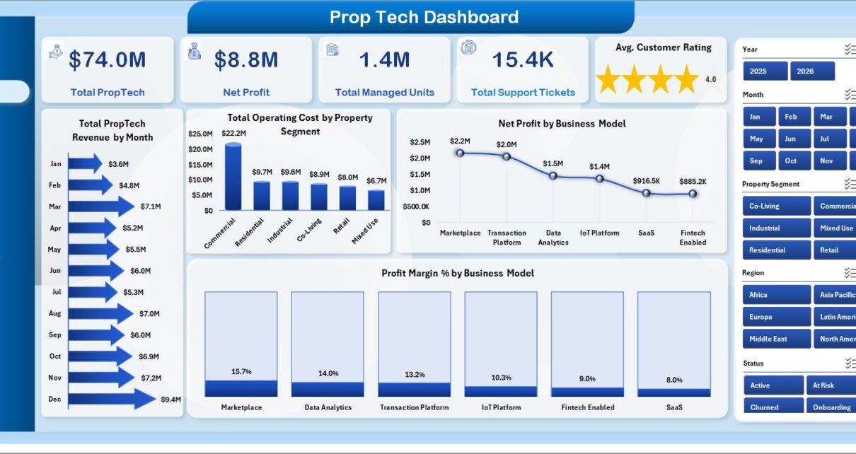
The Overview page is the executive summary of the workbook. At the top, it displays Total PropTech Revenue, Net Profit, Total Managed Units, Total Support Tickets, and Avg. Customer Rating. These cards give the team a quick read on growth, profitability, scale, service load, and customer experience before looking deeper into the charts.
Total PropTech Revenue by Month: This chart shows monthly revenue movement. It helps leaders identify stronger sales periods, slower months, and possible seasonality in the PropTech business.
Total Operating Cost by Property Segment: This chart compares cost by property segment. It is useful for seeing whether one segment is more expensive to serve than another.
Net Profit by Business Model: This view compares profit across business models. It helps founders and finance teams understand where the business is actually making money.
Profit Margin % by Business Model: This chart compares margin efficiency. A model with lower revenue can still be attractive if its margin percentage is higher.
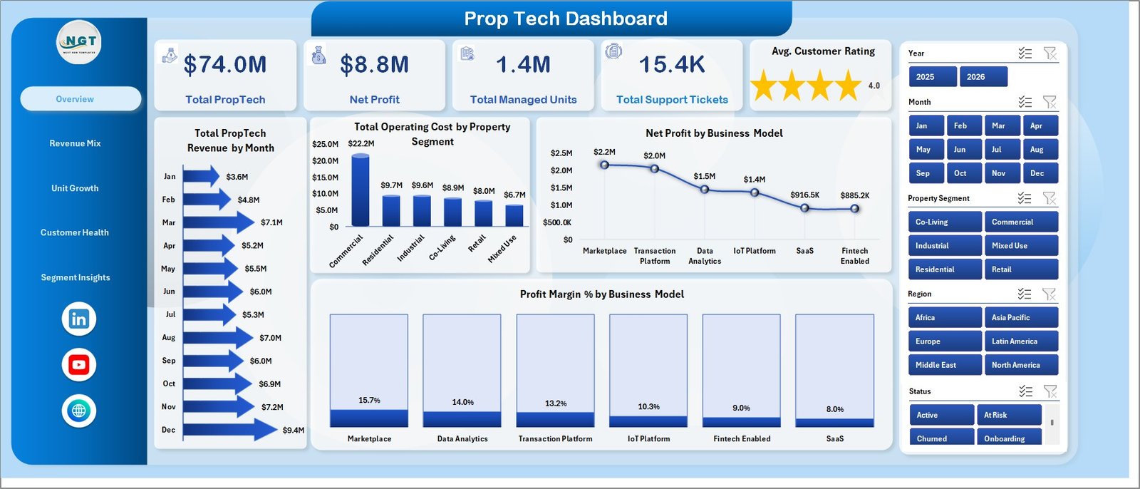
Prop Tech Dashboard in Excel
2 – Revenue Mix
The Revenue Mix page explains where revenue comes from and where operating cost is concentrated. It is especially useful for sales, finance, and operations reviews.
Total PropTech Revenue by Sales Channel: This chart compares revenue across channels such as direct sales, partners, referrals, or online acquisition. It helps the team see which channels deserve more investment.
Total Operating Cost by Region: This chart compares cost across regions. It helps identify markets where implementation, support, or service effort may be higher.
Total Managed Units by Property Segment: This chart shows how managed units are distributed by segment. It connects customer base size to the property categories served.
Total Operating Cost by Month: This view shows monthly cost movement. It helps spot cost spikes and compare them with monthly revenue growth.
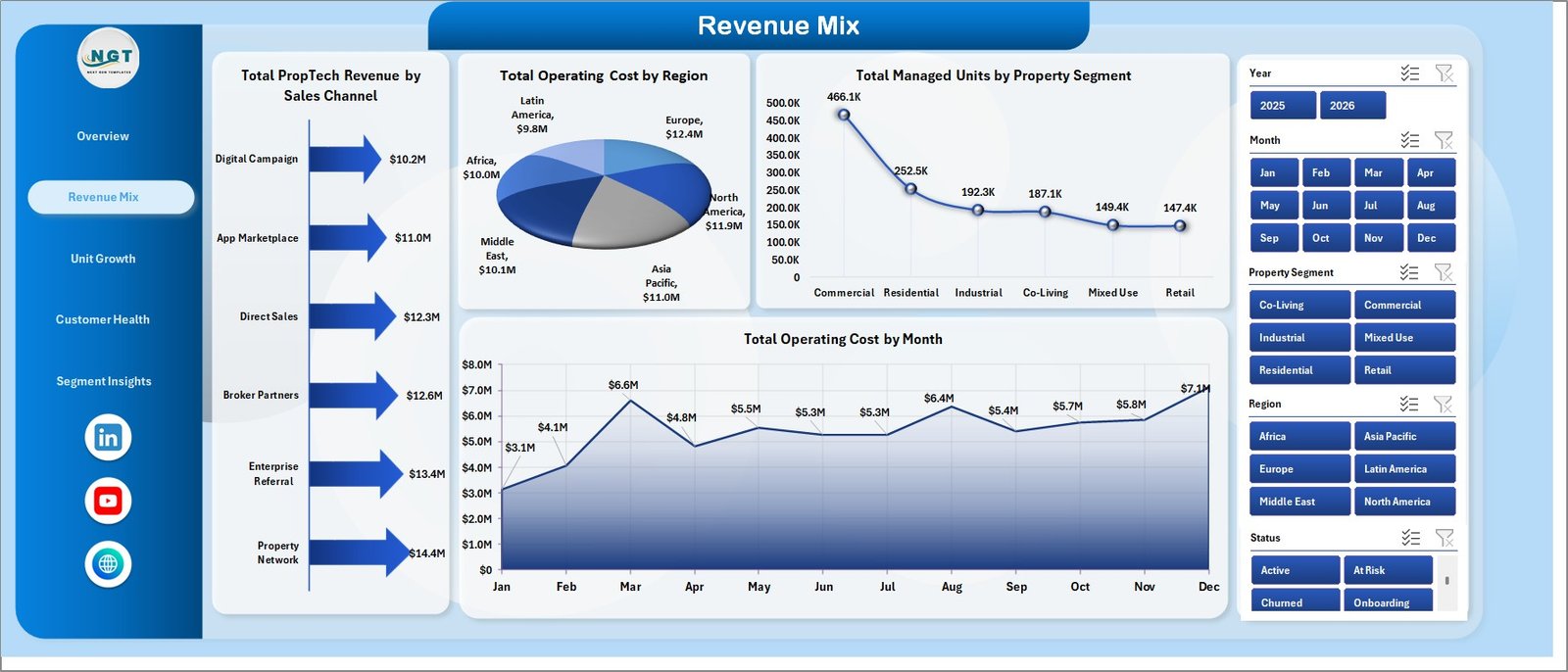
Revenue Mix
3 – Unit Growth
The Unit Growth page focuses on adoption and account scale. PropTech companies may win accounts, but managed units and active units show whether the product is expanding in practice.
Total PropTech Revenue by Property Segment: This chart compares revenue by property segment. It helps show whether revenue is concentrated in one market or spread across several segments.
Total Active Units by Region: This chart shows active usage by region. It helps customer success teams identify strong regions and regions that may need adoption support.
Total Managed Units by Quarter: This chart tracks managed unit movement over quarters. It is useful for quarterly reviews and investor reporting.
Account Records by Status: This chart groups account records by status. It helps separate active, pending, onboarding, churned, or inactive accounts.
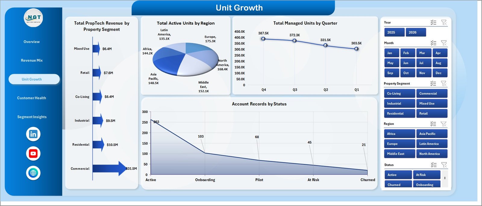
Unit Growth
4 – Customer Health
The Customer Health page connects ratings, implementation time, active unit percentage, and operating cost. It helps customer-facing teams compare account experience with service effort.
Avg. Customer Rating by Company Name: This chart compares customer rating by company. It helps teams quickly identify accounts that may need attention or accounts that could become advocates.
Total Operating Cost by Business Model: This view compares the operating cost behind each business model. It supports conversations about pricing, support effort, and service profitability.
Avg. Implementation Days by Region: This chart compares implementation speed across regions. Longer implementation periods can point to training, data, or process issues.
Active Unit % by Property Segment: This chart shows how much of the managed unit base is active by segment. It helps separate signed volume from real adoption.
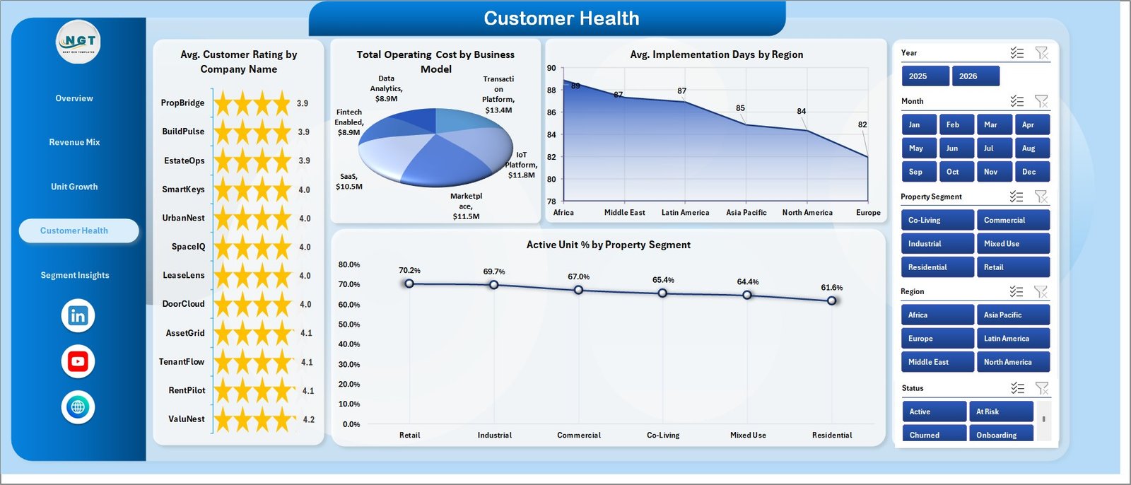
Customer Health
5 – Segment Insights
The Segment Insights page gives a compact look at sales-channel adoption, company revenue contribution, and account activity over time.
Active Unit % by Sales Channel: This chart compares usage quality by sales channel. If one channel brings accounts with weaker activation, onboarding or targeting may need adjustment.
Total PropTech Revenue by Company Name: This chart ranks revenue by company. It helps account managers identify key customers and expansion opportunities.
Account Records by Month: This chart shows account record activity by month. It helps explain whether account creation, onboarding, or customer activity is increasing.

Segment Insights
6 – Data Sheet Tab
The Data Sheet is where users add PropTech records in the same format as the sample data. The column structure should be kept consistent so the pivot tables, slicers, and charts continue working properly.

Data Sheet tab
7 – Support Sheet Tab
The Support Sheet contains the pivot tables used to create the full dashboard dynamically. After users update the Data Sheet, they can go to the Data tab in the Excel Ribbon and click Refresh All. All pivots and charts will refresh, and the Support Sheet can be kept hidden.

Support sheet tab
Prop Tech Dashboard in Excel vs. Google Sheets vs. Paid CRM/SaaS – Feature Comparison
| Feature | Prop Tech Dashboard in Excel | Google Sheets alternative | Paid CRM/SaaS |
|---|---|---|---|
| Cost | $17.99 one-time sale price | Template cost or internal build time | Recurring monthly or annual fee |
| Platform | Microsoft Excel | Browser spreadsheet | Vendor-hosted cloud platform |
| Setup time | Replace data and refresh pivots | Build formulas and charts manually | Implementation and onboarding |
| Real-time team collaboration | Possible through OneDrive or SharePoint | Native Google collaboration | Usually included by plan |
| Mobile access | Limited compared with SaaS | Good through Google Sheets app | Usually included |
| Customizable fields | Editable workbook and data sheet | Editable sheet | Often controlled by vendor settings |
| Share with link | Possible through Microsoft cloud storage | Yes, with Drive permissions | Usually login based |
| Year-1 cost at 5 users | $17.99 plus any Microsoft licensing | Template plus setup time | Can become hundreds or thousands |
| PropTech reporting focus | Revenue, units, support, ratings, costs, channels, regions, segments | Must be built or adapted | Depends on selected modules |
Who Should Use This Template
This template is a good fit for PropTech founders, property management software teams, real estate technology consultants, customer success managers, sales operations analysts, and finance teams that need a structured Excel reporting workbook. It is especially useful when the team already exports data from CRM, support, onboarding, or finance systems and wants a repeatable review format.
It is not the right fit if you need live API sync, automated ticket ingestion, user-level app permissions, role-based workflows, in-product customer messaging, or a managed data warehouse. In those cases, use your operational system as the data source and treat this Excel dashboard as a reporting layer.
Real-World Use Cases
Maya, a PropTech founder, uses the Overview and Revenue Mix pages before investor updates to explain monthly revenue, profit by business model, and cost by region.
Daniel, a customer success manager, reviews the Customer Health page each week to identify accounts with lower ratings, longer implementation days, or weak active unit percentages.
Priya, an operations analyst, uses Unit Growth and Segment Insights to prepare quarterly commentary on managed units, account status, channel quality, and company-level revenue.
Advantages of Prop Tech Dashboard in Excel
- Fast setup: Replace the sample data and refresh the workbook.
- Clear page structure: Each tab answers a specific business question instead of placing every chart on one crowded page.
- Excel-native workflow: Analysts can edit formulas, pivots, labels, colors, and chart layouts.
- One-time cost: The template is a downloadable file, not a monthly analytics subscription.
- Useful for recurring reviews: The same workbook can support weekly operating reviews, customer health meetings, and quarterly updates.
Opportunities for Improvement
This workbook still depends on good input data. If CRM exports, support-ticket logs, customer rating files, or finance records are incomplete, the dashboard will reflect those gaps. The template also does not replace a live CRM, support desk, data warehouse, or SaaS analytics layer. Teams that need automatic refresh from multiple systems may eventually want Power Query, Power BI, or a custom integration.
Best Practices
- Keep the Data Sheet column names and order consistent when replacing sample records.
- Refresh the workbook after every data update using the Excel Data ribbon.
- Validate the KPI cards against your source system before sharing the dashboard.
- Use slicers for recurring review questions, such as region, segment, channel, and business model.
- Hide the Support Sheet after setup if you want a cleaner user-facing workbook.
- Save dated copies before major data changes so you can compare historical review periods.
Explore Relevant Templates
- Prop Tech Dashboard in Excel – product page and download.
- Property Enquiry Data Entry System in Excel – useful for real estate lead tracking.
- Hotel Revenue RevPAR Dashboard in Excel – useful for property and hospitality revenue analysis.
- Mutual Funds Dashboard in Excel – another Excel dashboard with multi-page pivot analysis.
- Browse more Excel Dashboard Templates.
Frequently Asked Questions
What does the Prop Tech Dashboard in Excel track?
It tracks revenue, net profit, managed units, support tickets, customer rating, operating cost, implementation days, active unit %, regions, sales channels, property segments, business models, companies, and account status.
How many worksheet tabs are included?
The workbook includes 7 worksheet tabs: Overview, Revenue Mix, Unit Growth, Customer Health, Segment Insights, Data Sheet, and Support Sheet.
Can I add my own data?
Yes. Add or replace records in the Data Sheet using the same format as the sample data, then click Refresh All in Excel.
Does the dashboard update automatically?
The dashboard updates after the source data is changed and the pivots are refreshed. Use the Excel Data ribbon and click Refresh All.
Can I hide the Support Sheet?
Yes. The Support Sheet contains pivot tables used to power the dashboard and can be hidden after setup.
Do I need Power BI?
No. This is an Excel dashboard template and can be used directly in Microsoft Excel.
About the Author
Built by PK – Microsoft Certified Professional with 15+ years of Excel, Google Sheets, and Power BI experience. Founder of NextGenTemplates, reaching 300K+ subscribers across YouTube channels. Every template is hand-built and tested before release.
Conclusion
The Prop Tech Dashboard in Excel gives real estate technology teams a structured way to review revenue, profit, unit growth, customer health, support load, and segment performance without starting from a blank workbook. Use it as a weekly or monthly reporting file, keep the Data Sheet updated, and refresh the pivot-supported dashboard pages whenever new data is added.
Click here to view the Prop Tech Dashboard in Excel.
For Excel dashboard tutorials and walkthroughs, visit YouTube.com/@PK-AnExcelExpert.
Last updated: July 28, 2026.