Public private partnerships are used for roads, utilities, hospitals, schools, transit systems, urban renewal, and many other capital-intensive public projects. These programs usually involve long timelines, layered funding, public agencies, private operators, performance milestones, and formal risk allocation. Without a clear reporting system, teams can lose visibility over lifecycle cost, delivery delay, risk score, compliance status, and milestone progress.
The Public Private Partnerships Dashboard in Excel is built to make that reporting easier. It gives PPP teams a ready-to-use workbook with executive cards, analytical pages, slicers, charts, a structured Data sheet, and a pivot-driven Support sheet. Instead of starting from a blank workbook, you can replace the sample data, refresh the pivots, and use the dashboard for project reviews, funding discussions, risk meetings, and portfolio reporting.
Click here to purchase Public Private Partnerships Dashboard in Excel
Public Private Partnerships Dashboard in Excel
Key Features of Public Private Partnerships Dashboard in Excel
This Excel dashboard is designed for practical PPP monitoring. It includes five main reporting pages: Overview, Funding Mix, Delivery Progress, Risk Compliance, and Project Portfolio. The workbook also includes a Data Sheet tab for source records and a Support Sheet tab where pivot tables power the dynamic dashboard.
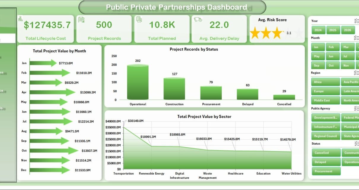
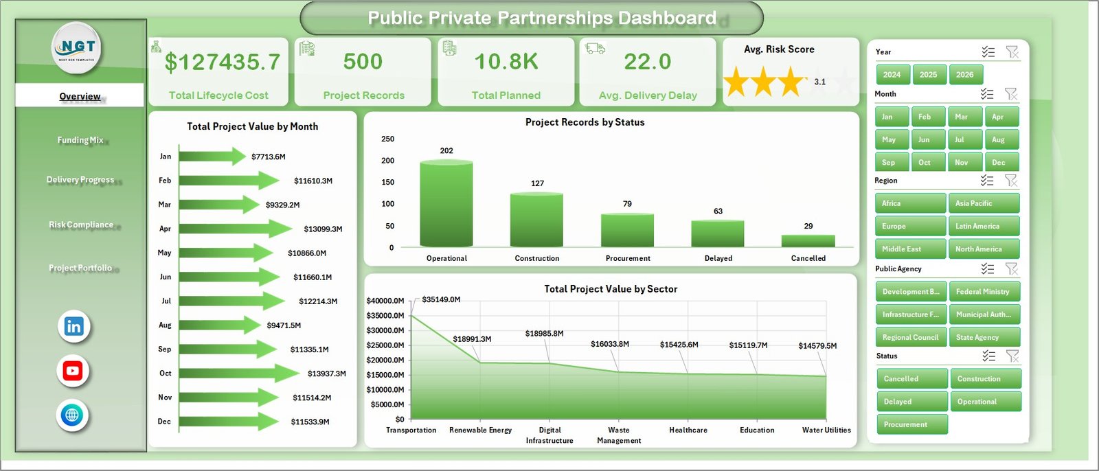
The Overview page uses five high-level KPI cards: Total Lifecycle Cost, Project Records, Total Planned, Avg. Delivery Delay, and Avg. Risk Score. These cards give management a quick read on the portfolio before they move into detailed charts.
The dashboard also uses multiple slicers so users can filter the report quickly. This is important for PPP portfolios because a stakeholder may want to review one sector, one region, one public agency, one status group, or one partnership model without creating a separate report.
Dashboard Pages Explanation
Overview Page
The Overview Page is the executive summary of the workbook. It combines KPI cards with charts so users can understand the overall PPP position within seconds.
Total Project Value by Month shows how project value is distributed across the timeline. This helps users spot months with heavier financial exposure, planned activity, or reporting concentration.
Project Records by Status shows how many projects sit in each status. It helps management understand whether the portfolio is mainly planned, active, delayed, completed, or in another lifecycle stage.
Total Project Value by Sector compares PPP value across sectors. This chart is helpful when agencies need to see whether transport, energy, health, education, utilities, or other sectors dominate the portfolio.
Overview Page
Funding Mix
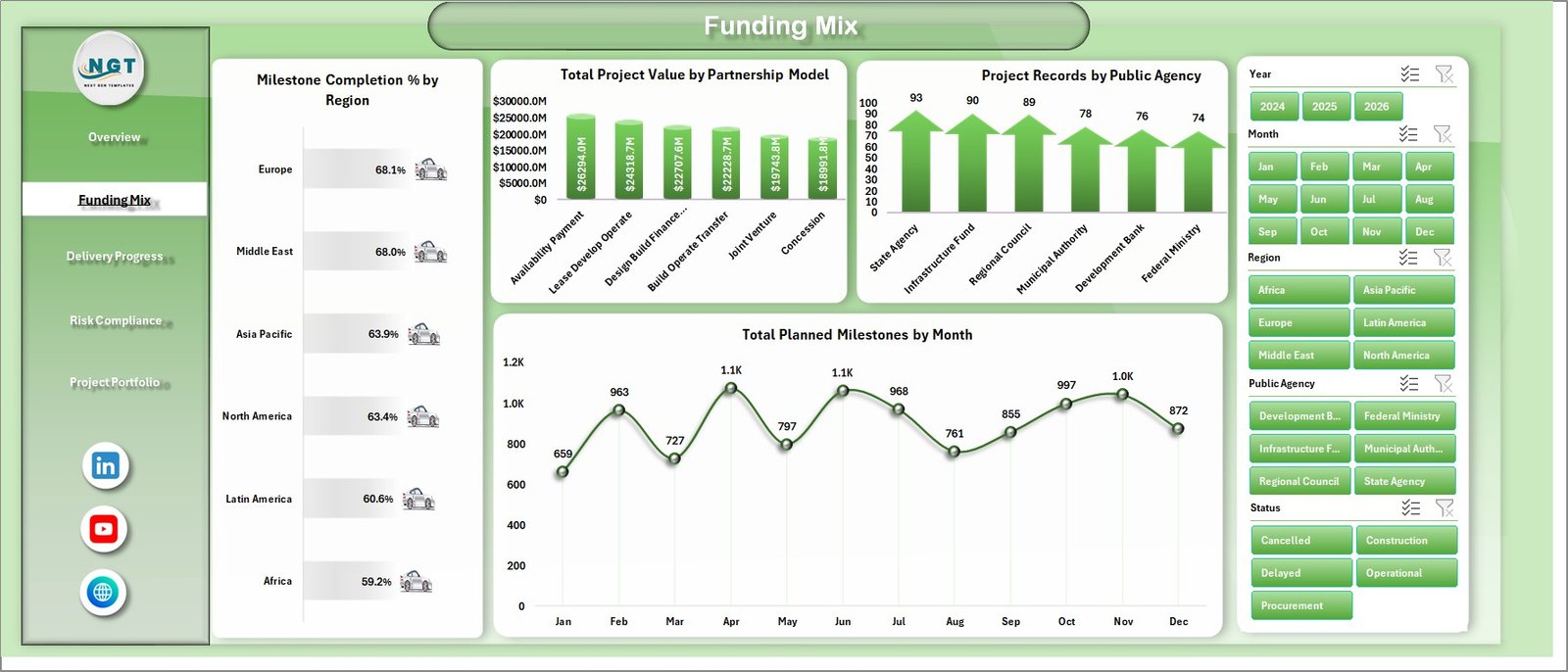
The Funding Mix tab focuses on how PPP value and milestones are distributed across regions, partnership models, public agencies, and months.
Milestone Completion % by Region compares progress across regions, making it easier to identify areas that are moving faster or slower. Total Project Value by Partnership Model shows the financial weight of each model, such as concession, BOT, BOOT, lease, or other structures in your dataset.
Project Records by Public Agency shows which agencies manage the highest number of records. Total Planned Milestones by Month helps teams understand when milestone workload is expected to peak.
Funding Mix
Delivery Progress
The Delivery Progress tab is useful for PMO reviews because it focuses on completion, delay, achieved milestones, and regional value.
Milestone Completion % by Sector compares completion performance by sector. Avg. Delivery Delay Days by Status shows where delays are concentrated and whether specific status groups need urgent follow-up.
Total Achieved Milestones by Quarter summarizes delivery output over quarterly periods. Total Project Value by Region shows where high-value project responsibility sits geographically.

Delivery Progress
Risk Compliance
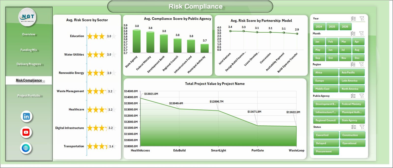
The Risk Compliance tab turns governance metrics into visual analysis. PPP projects often involve risk transfer, compliance requirements, public accountability, private operator obligations, and long-term service performance, so this page is especially useful for review meetings.
Avg. Risk Score by Sector highlights sector-level risk patterns. Avg. Compliance Score by Public Agency compares agency compliance performance. Avg. Risk Score by Partnership Model shows whether specific partnership models carry higher risk in the data. Total Project Value by Project Name helps users identify the largest projects that may require closer governance attention.
Risk Compliance
Project Portfolio
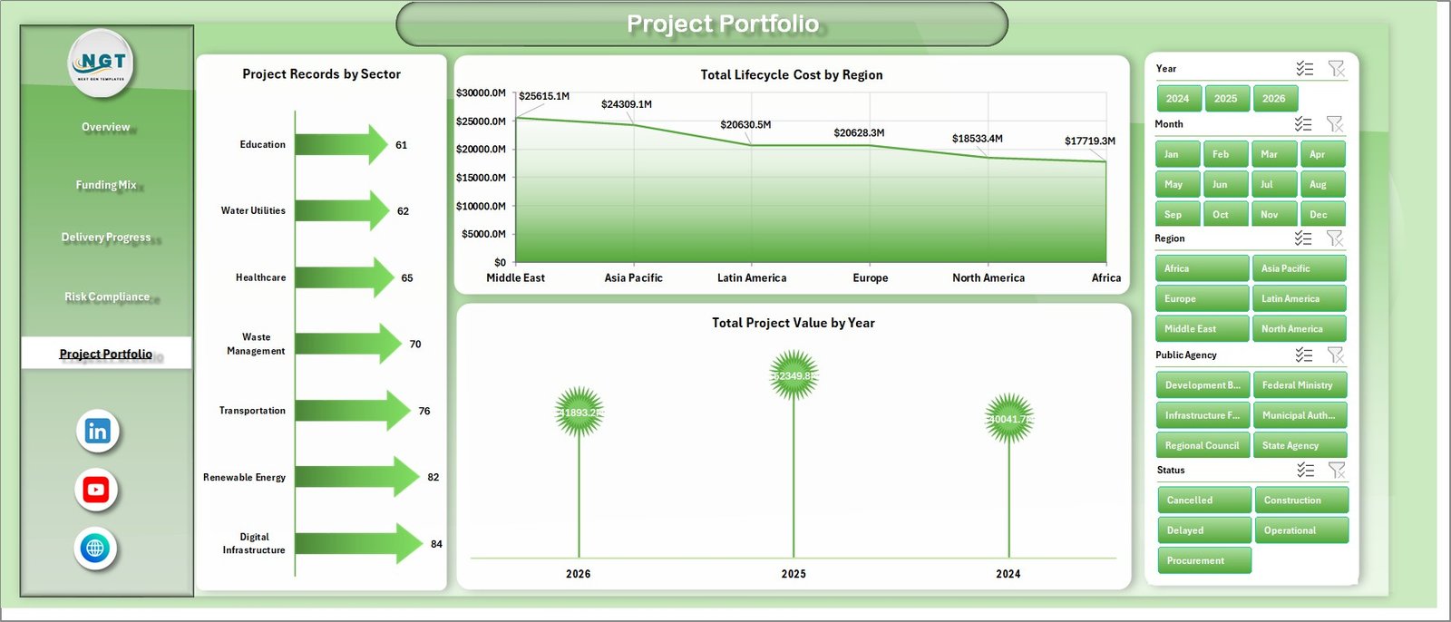
The Project Portfolio page gives a broader view of the project book. It is useful for annual planning, board packs, ministry reporting, and portfolio reviews.
Project Records by Sector shows how project activity is distributed. Total Lifecycle Cost by Region compares long-term cost exposure by geography. Total Project Value by Year gives a yearly view of PPP investment, helping teams discuss future budget needs and delivery priorities.
Project Portfolio
Data Sheet Tab
The Data Sheet tab is where you add your own PPP records. Keep the same column structure and replace the sample data with your actual project information. This sheet is the backbone of the dashboard, so clean dates, consistent sector names, clear status values, and complete milestone fields will improve reporting quality.

Data Sheet tab
Support Sheet Tab
The Support Sheet contains the pivot tables that make the dashboard dynamic. After updating the data, go to the Data tab in the Excel Ribbon and click Refresh All. The pivots and dashboard charts will refresh together. You can keep this support sheet hidden once the workbook is ready for regular users.

Support Sheet tab
Public Private Partnerships Dashboard in Excel vs. Google Sheets vs. Paid CRM/SaaS – Feature Comparison
| Feature | This Excel Dashboard | Google Sheets Alternative | Paid SaaS Alternative |
|---|---|---|---|
| Cost | One-time purchase | Low software cost but manual build effort | Recurring subscription |
| Platform | Microsoft Excel | Browser-based spreadsheet | Vendor-hosted application |
| Setup time | Replace data and refresh | Build layout, charts, and formulas | Configuration and onboarding required |
| Real-time team collaboration | Best with controlled file sharing | Strong collaboration | Usually strong by user role |
| Mobile access | Good for viewing, limited for editing | Good for lightweight access | Usually included |
| Customizable fields | Fully editable workbook | Editable but easier to break | Depends on subscription and admin permissions |
| Year-1 cost at 5 users | $17.99 sale price | Low cash cost, higher setup time | Often hundreds or thousands of dollars |
| PPP reporting fit | Best for monthly portfolio reporting | Best for shared data entry | Best for workflow automation |
Who Should Use This Template
This template is useful for PPP units, infrastructure agencies, government departments, urban development authorities, public finance teams, PMOs, consultants, and private concession teams. It is also a practical learning file for analysts who want to understand how PPP performance can be modeled in Excel.
It may not be enough if your organization needs automated approvals, contract document management, live ERP integration, or role-based case workflows. In those situations, this Excel dashboard can still work as a reporting prototype or management pack.
Real-World Use Cases
PPP program review: A program director uses the Overview page to explain lifecycle cost, project volume, planned milestones, and risk trends before a monthly steering meeting.
Funding review: A finance analyst uses the Funding Mix page to compare partnership models, public agencies, and monthly milestone plans before budget discussions.
Governance audit: A consultant uses the Risk Compliance page to identify sectors or agencies with higher risk scores and lower compliance scores.
Advantages of Public Private Partnerships Dashboard in Excel
The biggest advantage is speed. Instead of designing a reporting pack from scratch, users get a workbook that already contains the analytical structure. Excel also keeps the template familiar for public agencies and project teams that already manage many records in spreadsheet format.
The dashboard improves visibility, reduces manual reporting effort, supports better review meetings, and creates a consistent structure for portfolio monitoring. Because the pages are separated by theme, users can move from executive summary to funding, delivery, risk, and portfolio analysis without overcrowding one screen.
Opportunities for Improvement
Like any Excel-based tool, the quality of the dashboard depends on the quality of the source data. Teams should standardize region, sector, status, agency, and partnership model names before using the file for live reporting. If the organization needs live integrations, automated notifications, role-based access, or approval workflows, those requirements should be handled in a dedicated system.
Best Practices
Keep the Data Sheet clean and avoid changing column names unless you also update the pivot source logic. Refresh all pivots after every major data update. Use consistent date formats, review blank cells, and keep status values standardized.
Microsoft has helpful guidance on working with pivot tables in Excel. You can review the official documentation here: Create a PivotTable to analyze worksheet data.
Explore Relevant Templates
For related reporting needs, explore Smart Cities Contract Management Dashboard in Excel, Data Analyst’s Chart & Visualization Pack, and more Excel dashboard templates from NextGenTemplates.
Frequently Asked Questions
What is a Public Private Partnerships Dashboard in Excel?
It is an Excel dashboard template used to track PPP project value, lifecycle cost, milestones, delivery delay, risk, compliance, sectors, public agencies, regions, and partnership models.
Can I use it for different PPP sectors?
Yes. You can use it for transportation, energy, healthcare, education, housing, utilities, urban development, and other PPP sectors as long as your data follows the dashboard structure.
Do I need advanced Excel knowledge?
No. You mainly update the Data Sheet, refresh pivots, and use slicers. Basic Excel skills are enough for standard use.
Can I customize the dashboard?
Yes. The workbook can be edited, so you can adjust chart names, colors, formulas, layouts, fields, and reporting categories as needed.
How do I refresh the dashboard after updating data?
Go to the Data tab in the Excel Ribbon and click Refresh All. This refreshes the pivot tables and the charts connected to them.
Can I hide the Support Sheet?
Yes. The Support Sheet contains pivot tables and helper calculations. You can hide it after setup so users focus on the dashboard pages.
About the Author
Built by PK – Microsoft Certified Professional with 15+ years of Excel, Google Sheets, and Power BI experience. Founder of NextGenTemplates, reaching 300K+ subscribers across YouTube channels. Every template is hand-built and tested before release.
Conclusion
The Public Private Partnerships Dashboard in Excel gives PPP and infrastructure teams a practical way to turn complex project records into readable management insights. With pages for overview, funding mix, delivery progress, risk compliance, and project portfolio analysis, the workbook supports better review meetings and more consistent reporting.
Click here to purchase Public Private Partnerships Dashboard in Excel
Visit our YouTube channel to learn step-by-step Excel dashboard tutorials.