Every climate tech fund, accelerator and corporate venture team eventually builds the same report by hand. Where did the capital go. What is the portfolio worth now. Which sectors actually earn their operating cost back. How much carbon does the portfolio claim to have abated, and per dollar deployed, is that good. Four questions, four rebuilt-from-scratch charts, every quarter.
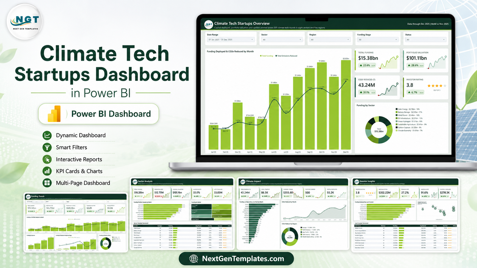
The Climate Tech Startups Dashboard in Power BI is that report, already built. Five analysis pages, page-synced slicers, a hidden drillthrough and two tooltip pages, all driven from a single flat table in an Excel workbook you can replace with your own rounds.
Analytical dashboard, not a KPI scorecard
Worth clearing up before anything else, because NextGenTemplates publishes both families and the names look alike.
This is the analytical Power BI dashboard. Five exploratory pages, five slicers on each, drillthrough to the underlying rounds, tooltip pages on hover. You use it to ask why something happened.
A KPI scorecard dashboard is a different product: a month picker, a KPI table with targets and red/amber/green traffic lights, a KPI Trend page and a KPI Analysis page. You use it to report whether you are on target this month.
If your partner meeting is a variance-to-target review, you want the scorecard family. If it is a portfolio walkthrough, you want this one.
What the five pages actually show
Page 1 – Climate Tech Startups Overview
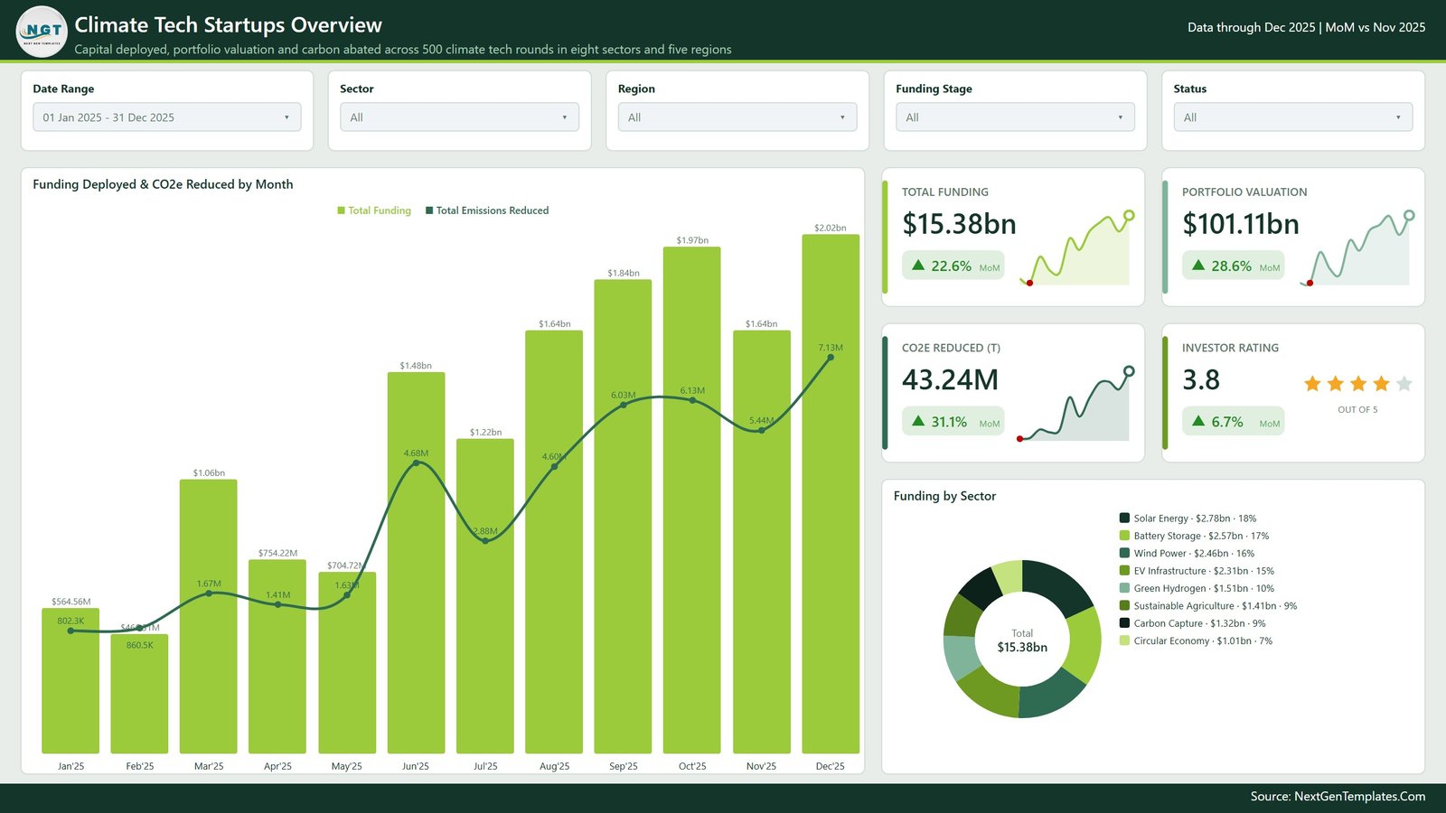
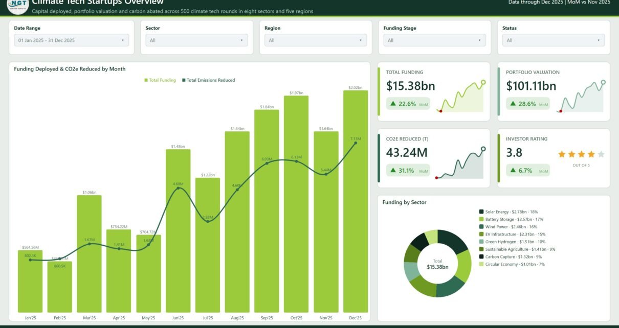
The one-screen answer. The main visual, Funding Deployed & CO2e Reduced by Month, puts capital as columns and carbon abated as a line on the same chart, so the relationship between the two is the first thing you see rather than something you have to reconstruct across two tabs.
Four KPI cards run down the right – Total Funding, Portfolio Valuation, CO2e Reduced (T) and Investor Rating – each with its month-on-month change and a sparkline. Below them, Funding by Sector is a donut whose legend prints the dollar value and the share beside every sector name, so the split reads without hovering.
Five slicers sit across the top: Date Range, Sector, Region, Funding Stage and Status.
Page 2 – Funding Trends
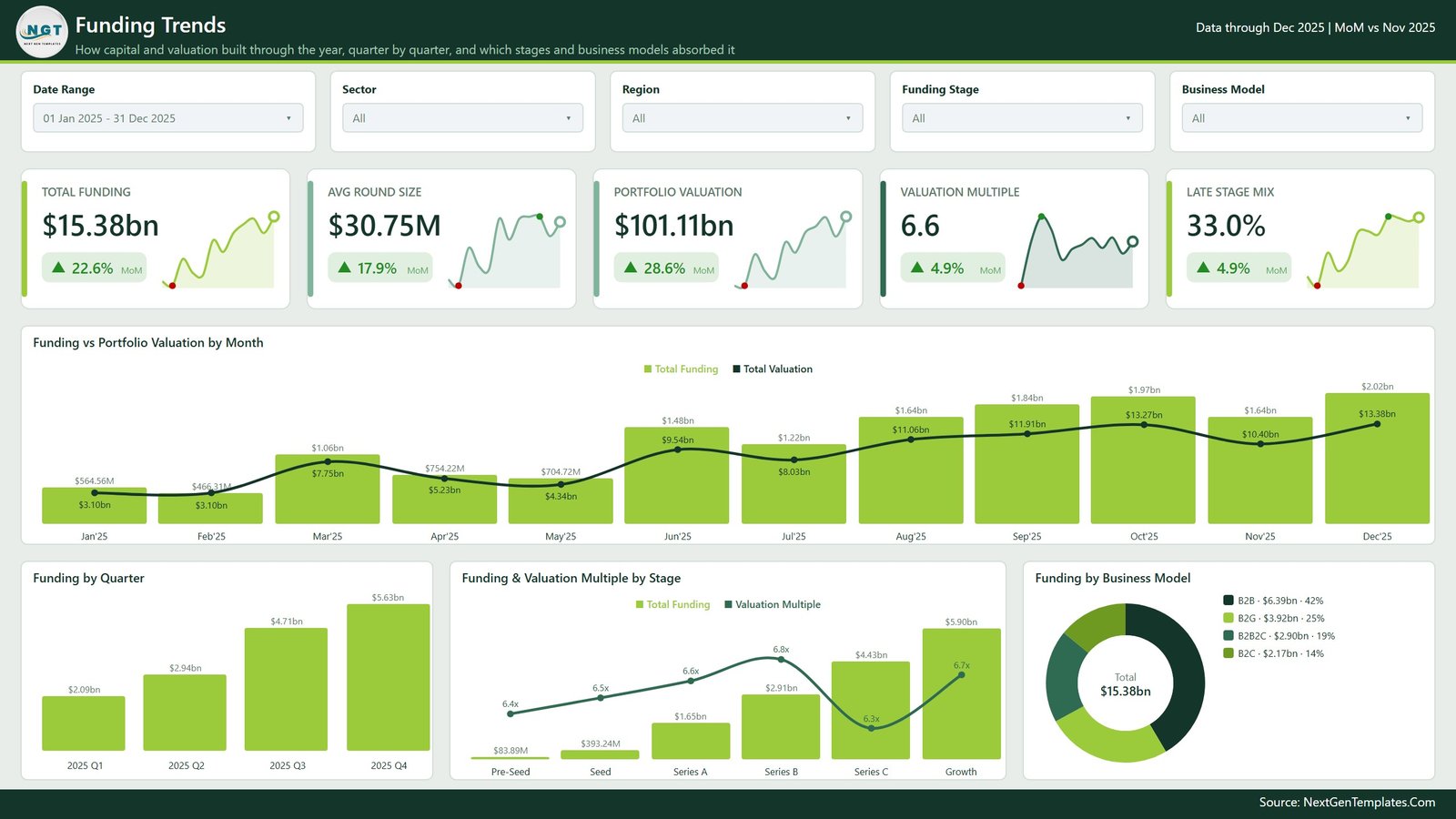
How capital and valuation built through the year. Five cards – Total Funding, Avg Round Size, Portfolio Valuation, Valuation Multiple and Late Stage Mix – sit above Funding vs Portfolio Valuation by Month, which shows the two series together so you can see valuation lagging or leading deployment.
The bottom row breaks the same total three ways: Funding by Quarter, Funding & Valuation Multiple by Stage across Pre-Seed, Seed, Series A, Series B, Series C and Growth, and Funding by Business Model across B2B, B2G, B2B2C and B2C. The stage chart is the interesting one – it pairs the money going in with the multiple coming out at each stage.
Page 3 – Sector Analysis
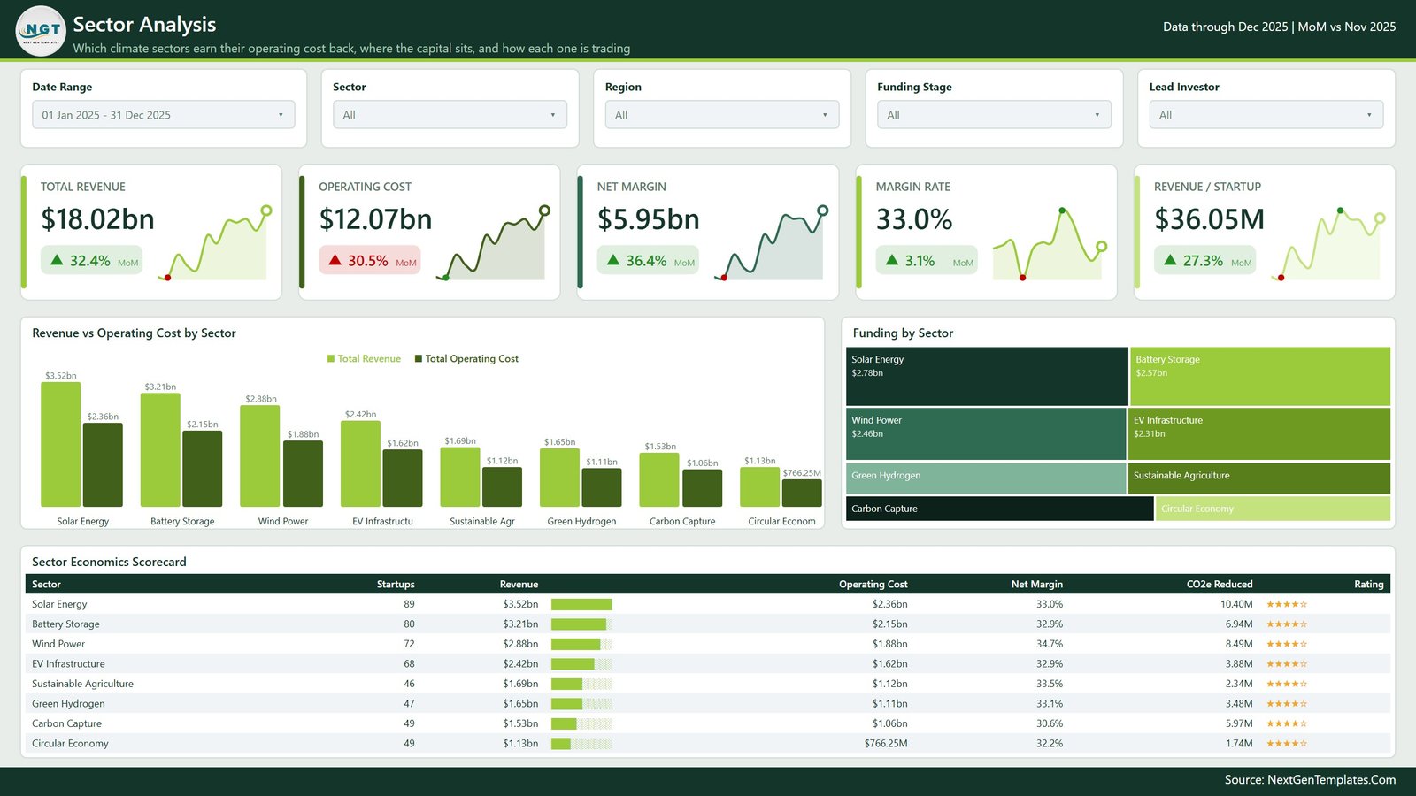
Which sectors earn their operating cost back. Revenue vs Operating Cost by Sector puts the two bars side by side for all eight sectors, so the margin gap is visible per sector rather than buried in a percentage. A Funding by Sector treemap sits beside it showing where the capital actually concentrates.
Across the bottom, the Sector Economics Scorecard lists every sector with its startup count, revenue, operating cost, net margin, CO2e reduced and rating, with in-cell data bars on the revenue column. Headline cards cover Total Revenue, Operating Cost, Net Margin, Margin Rate and Revenue per Startup.
Page 4 – Climate Impact
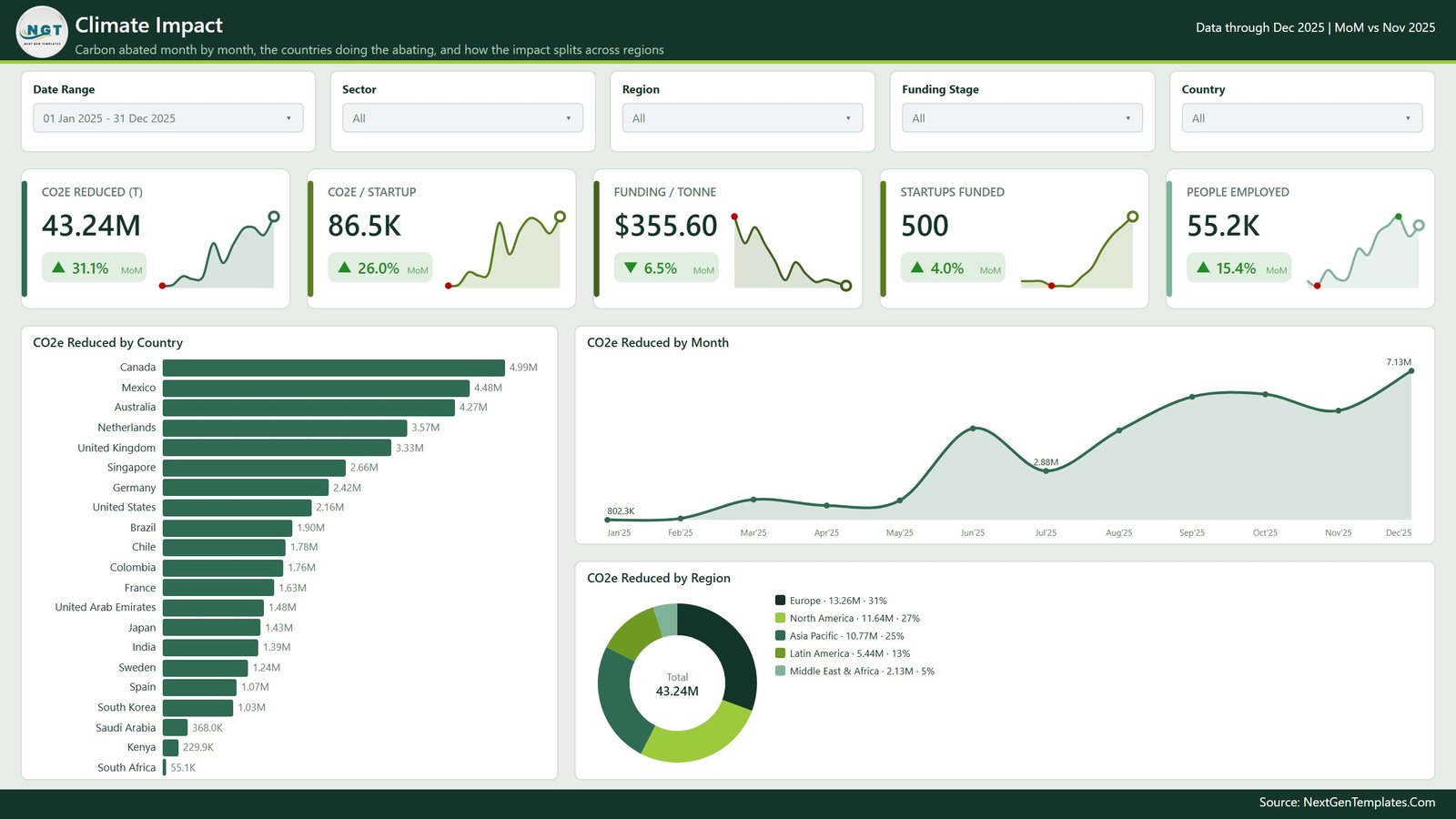
The carbon page. A long horizontal bar ranks CO2e Reduced by Country down the full country list, an area line tracks CO2e Reduced by Month, and a donut splits CO2e Reduced by Region across Europe, North America, Asia Pacific, Latin America and Middle East & Africa.
The KPI row is where this page earns its place: alongside CO2e Reduced it carries CO2e per Startup, Funding per Tonne, Startups Funded and People Employed. Funding per Tonne is the efficiency question nobody asks until an LP does.
A note on this page, said plainly: these are figures you enter. The dashboard presents them. It does not calculate or verify them.
Page 5 – Investor Insights
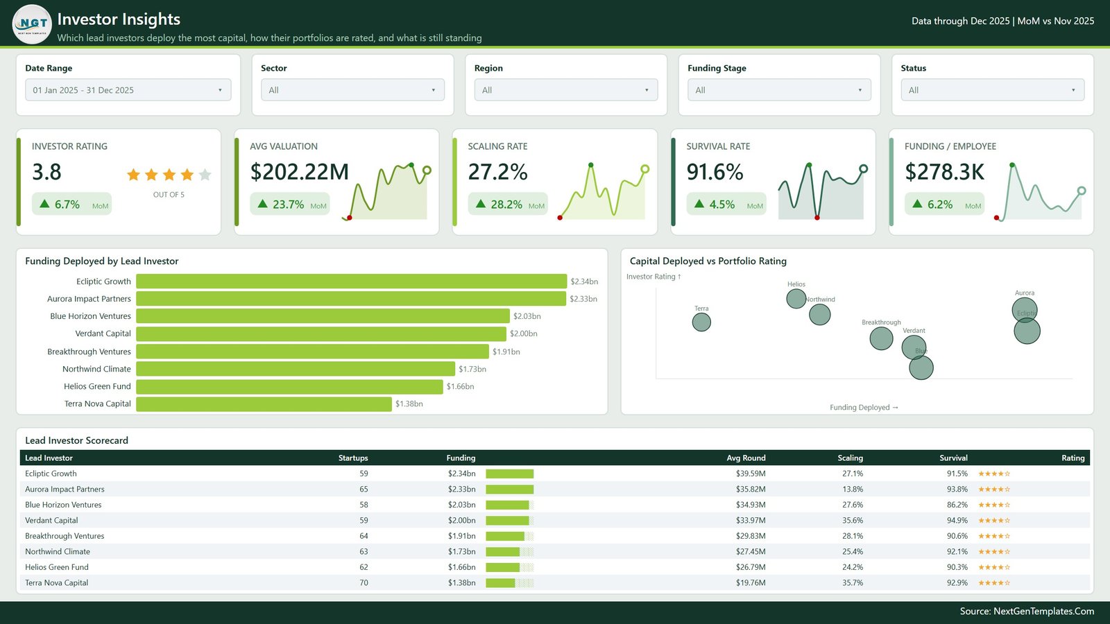
Which lead investors deploy the most and how their portfolios are rated. Funding Deployed by Lead Investor ranks the eight funds in the demo data, and Capital Deployed vs Portfolio Rating plots them as a bubble scatter so an outlier – a fund deploying a lot at a mediocre rating, or the reverse – shows up as a position rather than a row you have to notice.
The Lead Investor Scorecard carries startups, funding, average round, scaling rate, survival rate and rating. Cards cover Investor Rating, Avg Valuation, Scaling Rate, Survival Rate and Funding per Employee.
Under the hood
- Nine report pages – the five above, a Get More Dashboards page, a hidden Details drillthrough page, and two 280×360 tooltip pages (Category Detail and Trend Detail).
- An import model over one flat table plus a generated Date table – no relationships to untangle, no DirectQuery, no gateway.
- DAX measures for the totals, the averages, the ratios and the month-on-month deltas, so the KPI cards recalculate under every slicer combination rather than hard-coding a number.
- SVG KPI cards – value, MoM delta with a direction arrow, and a sparkline, in one tile.
- A theme JSON, so rebranding the whole report from the green palette to yours is one file rather than sixty visual edits.
- 500 rows of synthetic demo data across 8 sectors, 5 regions, 21 countries, 6 funding stages, 4 business models and 8 lead investors.
Power BI version vs Excel version
The same analysis ships in both tools. Which one you want depends less on features than on what your team already opens.
| Power BI version | Excel version | |
|---|---|---|
| Software needed | Power BI Desktop (free) | Microsoft Excel |
| Analysis pages | 5 plus drillthrough and tooltips | 5 dashboard sheets |
| Filtering | Page-synced slicers | Slicers on the workbook |
| Drill to underlying rows | Yes – right-click drillthrough | Via pivot drill-down |
| Hover tooltips with charts | Yes – two tooltip pages | No |
| Share as a live report | Publish to your Power BI tenant | Send the file |
| Rebrand the palette | One theme JSON | Per-sheet formatting |
| Data source | Included Excel workbook | Data sheet in the workbook |
If your firm already reports through Power BI, take this one. If Excel is where the fund actually works, the Excel version covers the same ground.
Setting it up with your own data
- Unzip the download – you get the PBIX, the
Data.xlsxsource workbook and a setup PDF. - Open the PBIX in Power BI Desktop and click around the demo data first. Filter a sector, right-click a bar and drill through, hover a column. Ten minutes tells you whether the layout fits how you report.
- Open
Data.xlsxand replace the 500 demo rows with your own rounds. Keep the column headers exactly as they are – the model binds to them by name. - Back in Power BI Desktop: Transform data > Data source settings, and point the query at your copy of the workbook.
- Refresh. New sectors, regions, countries and investors appear in the slicers automatically.
- Optional – open the theme JSON and swap the palette, or replace the logo image in the page header.
What it does not do
This matters more on a climate template than most, so it is worth being blunt.
- It does not measure, model, calculate or verify emissions. Every CO2e figure is a number you type into the workbook. There is no measurement methodology and no lifecycle assessment inside this file.
- It is not aligned to any disclosure framework and produces no compliance output – not the GHG Protocol, SBTi, CDP, ISSB, CSRD, TCFD or any national scheme.
- It makes no claim about carbon credit validity, additionality, registry status or offset quality, and it is not a carbon accounting or MRV system.
- It is not investment advice and offers no valuation opinion. Valuation Multiple, Scaling Rate, Survival Rate and Investor Rating are arithmetic on your inputs; Investor Rating is a label you assign, not an independent assessment.
- It does not connect to fund administration software, a cap table platform, a CRM or any data provider. One Excel workbook is the only source.
- It is not a KPI scorecard – no target column, no traffic lights, no variance page.
- All demo data, including the eight lead investor names, is synthetic. No real fund, startup or transaction is represented.
Frequently asked questions
Does it calculate my portfolio’s carbon impact?
No. It reports CO2e values that you enter. There is no emissions model and no verification step. Measured or assured data comes from your measurement provider; this dashboard presents it afterwards.
Is this the KPI scorecard version?
No. This is the analytical dashboard – exploratory pages, slicers, drillthrough and tooltips. The scorecard family is a separate template with a month picker, targets and traffic lights.
Do I need a paid Power BI licence?
Not to use the file. Power BI Desktop is free and opens, refreshes and edits everything. A Pro or Premium licence only matters if you want to publish and share through the Power BI Service in your own tenant.
Will it break if I add more rows?
No. The model imports the table as a whole, so 500 rows or 5,000 rows behave the same way. New sector, region or investor values appear in the slicers on refresh.
Can I recolour it for my firm?
Yes. The palette lives in a theme JSON, and the header logo is a normal image you can replace in Power BI Desktop.
Can I publish it to the Power BI Service?
Yes, the same way you would publish any PBIX you built yourself. Scheduled refresh against a workbook in OneDrive or SharePoint is standard Power BI setup and is not preconfigured here.
Related templates
- Climate Tech Startups Dashboard in Excel – the same analysis in a workbook
- Carbon Trading Dashboard in Power BI – for desks tracking traded volumes rather than a venture portfolio
- Carbon Footprint KPI Dashboard in Google Sheets – the scorecard approach, if targets and traffic lights are what you actually need
- Business Transformation Dashboard in Power BI – a sibling analytical build with the same page architecture
Get the template
Instant download, ready to open. Grab the Climate Tech Startups Dashboard in Power BI, swap in your own rounds, and have a five-page portfolio report ready before your next partner meeting.