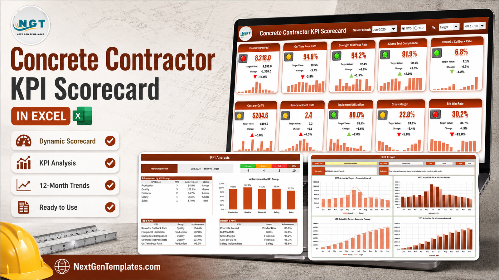
A concrete contractor’s numbers are never missing. They are scattered. Cubic yards placed sit on the batch tickets, 28-day breaks come back from the testing lab as PDFs, pump and mixer hours live on the equipment log, callbacks are in the superintendent’s head, and the bid results are somewhere in an inbox. Every one of those is measured. None of them are ever in the same place at the same time.
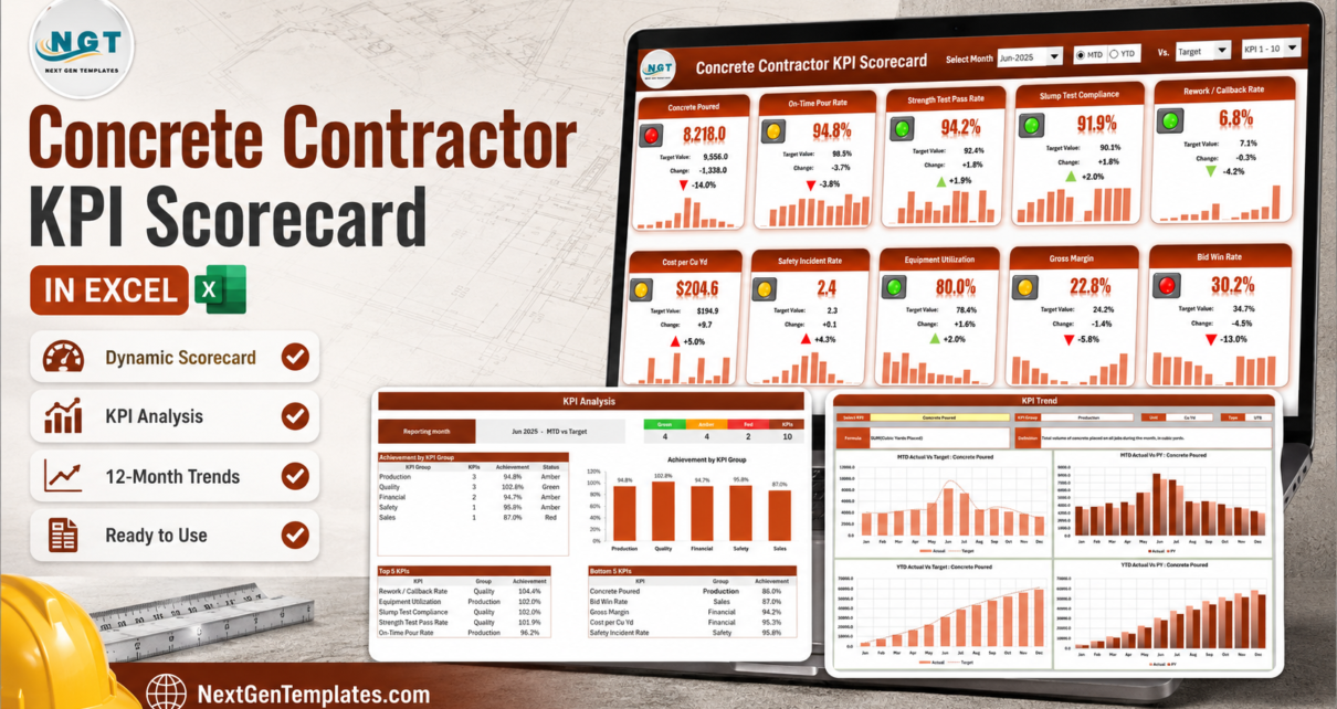
The Concrete Contractor KPI Scorecard in Excel is the page that puts them together. Ten concrete KPIs across five groups, a month picker, an MTD/YTD switch, and traffic lights that know which direction is good. The file ships with a complete 2025 sample year loaded: pick Jun-2025 and you get 4 Green, 4 Amber and 2 Red, with Concrete Poured at 8,218.0 cubic yards against a 9,556.0 target and Bid Win Rate sitting at the bottom of the Bottom 5 table on 87.0% achievement. It is 100% formulas – no macros, no Power Query, no add-ins – and it opens on any Excel from 2016 onward.
One thing worth naming up front, because three NextGenTemplates families carry almost the same title: this is the KPI Scorecard line. It is a monthly reporting page built around a month picker and a KPI Definition sheet you rename. It is not the slicer-driven Excel KPI Dashboard line, which is built for interactive analysis across a dataset, and it is not the analytical Excel Dashboard line either. Different tools, different questions.
Key Features of the Concrete Contractor KPI Scorecard
- Ten concrete KPIs on one page, grouped into Production, Quality, Financial, Safety and Sales.
- A month picker with an MTD / YTD toggle – report the month or the year to date from the same tiles.
- Three comparison bases – Target, the same period last year (PY), or the Prior Month.
- Direction-aware traffic lights – seven Upper-the-Better and three Lower-the-Better KPIs. A rising Safety Incident Rate or Cost per Cu Yd goes red, never green.
- A 12-month sparkline on every tile, so the month and the year are visible at the same time.
- A KPI Analysis page with achievement by group, a matching column chart, RAG counts and Top 5 / Bottom 5 tables.
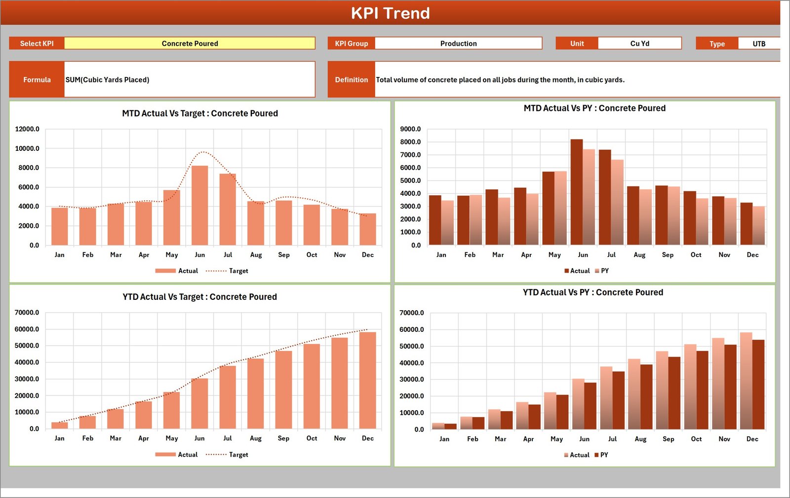
- A KPI Trend page with four charts for any single KPI, and its unit, direction, formula and definition printed above them.
- Room for 20 KPIs, ten already filled, with a duplicate-name check on the definition sheet.
- Editable RAG bands for Upper-the-Better and Lower-the-Better KPIs independently.
- Zero macros. A plain .xlsx with the user manual PDF in the same ZIP.
The Ten Concrete KPIs, and Why They Are the Ten

Every KPI on the sheet is a label you can overwrite, so the ten it ships with are a starting position rather than a prescription. They were chosen because between them they answer the four questions a concrete business actually gets asked: did we place the work, was it any good, did we make money, and did anyone get hurt.
| # | KPI | Group | Unit | Direction | What it answers |
|---|---|---|---|---|---|
| 1 | Concrete Poured | Production | Cu Yd | Upper the better | Volume placed across all jobs this month. |
| 2 | On-Time Pour Rate | Production | % | Upper the better | Share of scheduled pours hit inside the promised window. |
| 3 | Strength Test Pass Rate | Quality | % | Upper the better | 28-day cylinders meeting the specified psi. |
| 4 | Slump Test Compliance | Quality | % | Upper the better | Slump tests inside tolerance at the point of placement. |
| 5 | Rework / Callback Rate | Quality | % | Lower the better | Jobs needing patching, grinding or a re-pour. |
| 6 | Cost per Cu Yd | Financial | USD | Lower the better | Fully-loaded placement cost – material, labour and pumping. |
| 7 | Safety Incident Rate | Safety | Rate | Lower the better | OSHA recordable rate (TRIR) per 200,000 labour hours. |
| 8 | Equipment Utilization | Production | % | Upper the better | Billable pump and mixer hours as a share of available hours. |
| 9 | Gross Margin | Financial | % | Upper the better | Margin after direct material and labour cost. |
| 10 | Bid Win Rate | Sales | % | Upper the better | Submitted bids that became awarded contracts. |
The direction column is the part worth pausing on. Three of these ten are Lower-the-Better, and a scorecard that gets that wrong is worse than no scorecard at all – it congratulates you for a rising incident rate. Here it is an explicit field on the KPI Definition sheet, and both the traffic light and the arrow on the tile respect it.
Page by Page: What Each Sheet Does
Nine visible sheets, plus two hidden calculation sheets you never open. You type on exactly two of them.
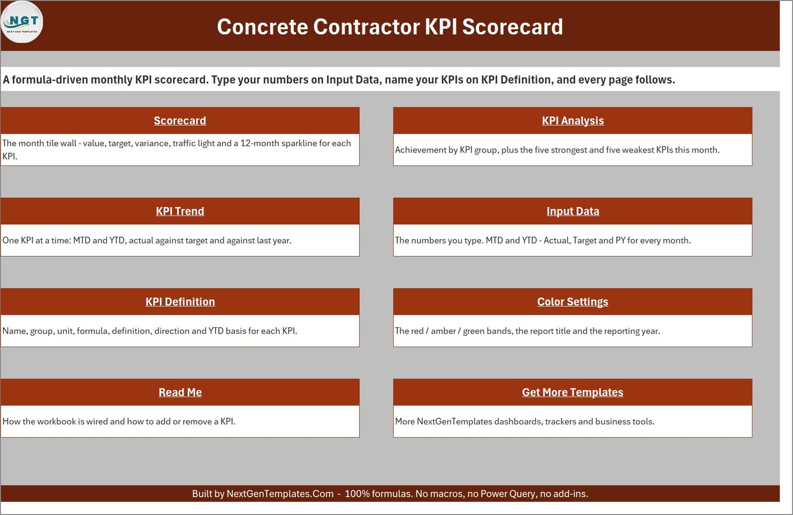
Scorecard
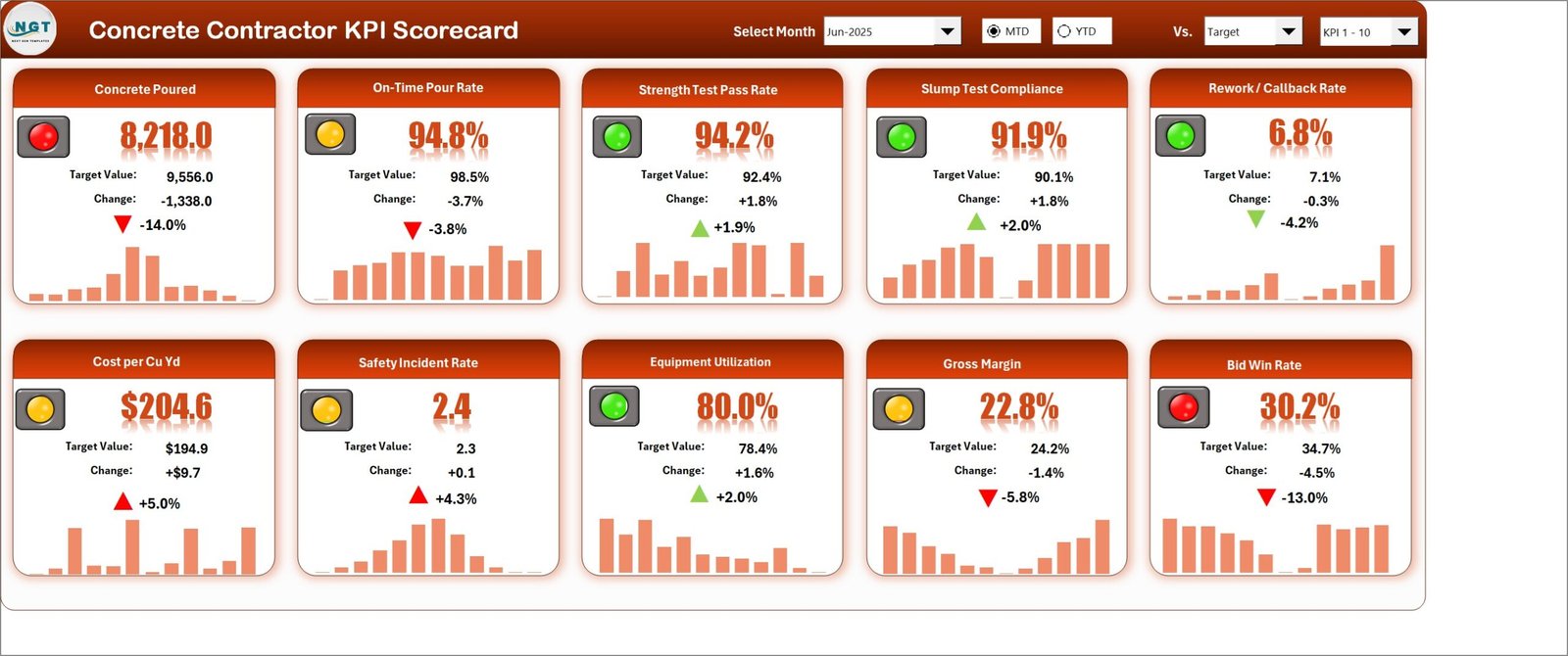
The month tile wall, and the page you will spend your time on. Each of the ten tiles carries a traffic light, the value, the target value, the absolute change, the percentage change with a coloured arrow, and a 12-month sparkline. The header strip holds four controls: Select Month, an MTD / YTD option pair, a Vs. dropdown for Target, PY or Prior Month, and a KPI 1 – 10 / KPI 11 – 20 set picker.
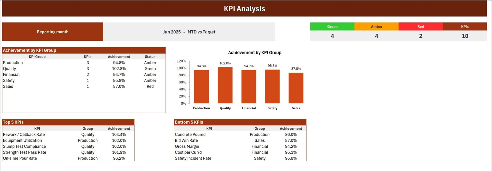
KPI Analysis
The group story. A table and a matching column chart give achievement by KPI group, a coloured strip counts Green, Amber and Red against the total, and two tables list the Top 5 and Bottom 5 KPIs for the selected month. This is the page for the meeting where somebody asks “so where are we actually losing?”
KPI Trend
One KPI at a time. Pick it from the yellow dropdown and the page prints its group, unit, direction and formula, restates the definition in plain English, then draws four charts: MTD Actual vs Target, MTD Actual vs PY, YTD Actual vs Target and YTD Actual vs PY. It is the page you open when a number is challenged, because it shows immediately whether the month is an outlier or the shape of the whole year.
Input Data
The one sheet you maintain every month. A numbered twelve-month block per KPI with MTD Actual, Target and PY columns, and the matching YTD trio beside them. The blocks run out to the twentieth KPI, which is where the twenty-KPI capacity comes from.
KPI Definition
The other sheet you maintain, but usually only once. Name, group, unit, formula, definition, Type (UTB or LTB) and YTD Basis for each KPI, with a Check column that turns red the moment you create a duplicate name – which matters, because every other page looks a KPI up by its name.
Color Settings, Read Me and Get More Templates
Color Settings holds the RAG bands – separate thresholds for Upper-the-Better and Lower-the-Better KPIs – plus the report title and the reporting year. Read Me is nine short sections explaining how the workbook is wired. Get More Templates is the catalogue page.
Reading the June 2025 Sample Month
The sample year is worth walking through once, because it shows the scorecard doing the job it is for. June 2025, MTD vs Target:
- Two red. Concrete Poured at 8,218.0 Cu Yd against a 9,556.0 target – 1,338 yards short, 14.0% down. And Bid Win Rate at 30.2% against 34.7%, 13.0% down. Those two are connected, and the scorecard makes the connection visible without anyone having to argue for it.
- Four amber. On-Time Pour Rate 94.8% against 98.5%; Cost per Cu Yd $204.6 against $194.9; Safety Incident Rate 2.4 against 2.3; Gross Margin 22.8% against 24.2%.
- Four green. Strength Test Pass Rate 94.2% against 92.4%; Slump Test Compliance 91.9% against 90.1%; Rework / Callback Rate 6.8% against a 7.1% ceiling; Equipment Utilization 80.0% against 78.4%.
On KPI Analysis the same month resolves into a one-line diagnosis: Quality is the only green group at 102.8%, Production sits at 94.8%, Financial 94.7%, Safety 95.8%, and Sales is red at 87.0%. In other words, the crews are pouring good concrete – they just do not have enough of it to pour. That is a bidding conversation, not a field conversation, and the page gets you there in about fifteen seconds.
Note what the Lower-the-Better logic does here. Rework / Callback Rate fell 4.2% and shows a green down arrow. Cost per Cu Yd rose 5.0% and shows a red up arrow. Safety Incident Rate rose 4.3% and is red and amber-lit. None of those three would read correctly on a scorecard that treated every metric as bigger-is-better.
How to Set It Up for Your Own Business
- Color Settings first. Report title and reporting year. The year feeds the month picker, so it reads Jun-25 rather than a bare Jun. Decide your Amber and Red thresholds while you are there.
- Then KPI Definition, before you type a single figure. Names, groups, units, formulas, direction and YTD basis. Renaming later is safe; re-deciding direction after three months of reading the lights is not.
- Then Input Data. Fill the twelve-month block for each KPI – MTD and YTD, Actual, Target and PY. This is the only recurring work.
- Then never touch anything else. Scorecard, KPI Analysis and KPI Trend are entirely formula-driven off those two sheets.
Who Should Buy This – and Who Should Not
Buy it if you run a small-to-mid concrete business – flatwork, foundations, tilt-up, decorative – and you report monthly to an owner, a partner, a bank or a bonding company. Buy it if you are an operations manager who is tired of rebuilding the same summary every month, or an estimator who wants bid win rate on the same page as margin.
Do not buy it if what you actually need is live job costing out of your accounting system, a batch-plant control system, or OSHA recordkeeping software. This is a reporting page. Every figure on it is a figure you type.
Limitations You Should Know Before Buying
It does not calculate YTD for you. You type the finished year-to-date figures alongside the monthly ones. This is deliberate – a sum is the right roll-up for cubic yards and an average is the right one for a pass rate – but it is more typing than a workbook that guessed on your behalf. The YTD Basis column exists so the next person fills it the same way.
No integrations of any kind. There is no connector to Procore, Buildertrend, Knowify or QuickBooks, no import routine, no API, and no alerts or reminders. Monthly data entry is the workflow.
It is a single-user desktop file. Two people cannot edit it simultaneously. If shared editing matters more than offline use and macro-free portability, a Google Sheets scorecard is the better shape.
It makes no compliance claim. Safety Incident Rate is defined as TRIR per 200,000 hours, but the workbook maintains no 300 log and files nothing. It is a number, tracked.
Two cosmetic notes, disclosed rather than hidden. The two callout bubbles on the Color Settings sheet read “Change these number as per your requirements” – a missing “s”, purely cosmetic, and easily edited or deleted since they are floating shapes. And on the square product cover image, the small KPI Trend inset panel was re-typeset by the image generator: it labels a field “Chart” where the sheet says “Unit”, shows “YTD” where the sheet says “UTB”, and garbles the formula text. The workbook itself is correct on all three – as the wide image above and the KPI Trend screenshot in this post both show.
Best Practices
- Set the bands before you set the targets. Ten percent either way is a sensible default, but a 10% miss on Strength Test Pass Rate is not the same event as a 10% miss on Concrete Poured. Many contractors tighten the bands for the quality and safety groups.
- Close the month the same way every time. Same source for yardage, same source for labour cost, same cut-off day. A KPI that quietly changes its own definition mid-year is worse than no KPI.
- Present with two pages, not nine. Scorecard for the month, KPI Analysis for the group story. Open KPI Trend only when a number is challenged.
- Use the Prior Month comparison in a growth year. When targets ratchet upward everything looks amber against Target; against Prior Month you can see whether the crews are genuinely improving.
- Keep one file per year. The reporting year is a single cell, so January is a save-as, not a rebuild. Microsoft’s guide to sparklines in Excel is worth ten minutes if you want to restyle the tile trends.
Explore Relevant Templates
The same scorecard for neighbouring trades, all live: Masonry Contractor KPI Scorecard in Excel, Drywall Contractor KPI Scorecard in Excel, Carpentry Workshop KPI Scorecard in Excel, Welding Shop KPI Scorecard in Excel, Painting Contractor KPI Scorecard in Excel and Flooring Installation KPI Scorecard in Excel. Each ships its own KPI set – they are not the same ten metrics with the trade name swapped. An Insulation Contractor edition is in preparation and not on sale yet.
If you want slicers and an interactive dataset rather than a month picker, the Masonry Contractor KPI Dashboard in Excel and the Roofing Contractor KPI Dashboard in Excel are good samples of that line.
Frequently Asked Questions
Does it connect to Procore, Buildertrend, Knowify or QuickBooks?
No – to all four. There is no connector, no import and no API. You type each month’s figures on Input Data.
Do I need to enable macros?
No. It is 100% formulas, conditional formatting, camera pictures and sparklines, delivered as a .xlsx. Nothing to enable and nothing to trust.
Which Excel versions work?
Excel 2016 and later on Windows, and Microsoft 365. It opens on Excel for Mac and Excel mobile for reading; the header dropdowns and option buttons are most comfortable on desktop.
Can I use my own KPIs instead of these ten?
Yes. Overwrite the rows on KPI Definition and every page follows. There is room for twenty, and the Scorecard’s KPI 1 – 10 / KPI 11 – 20 picker switches between the two sets.
Does it handle metric units?
Yes – the unit is a free-text field. Change “Cu Yd” to “m3” and rename Cost per Cu Yd to Cost per m3, and the workbook simply reports whatever you type. It does no unit conversion, so convert your figures before entering them.
Is this the same as your Concrete-related KPI Dashboards?
No. This is the KPI Scorecard line – a monthly page driven by a month picker and a fixed KPI list. The KPI Dashboard line is slicer-driven and analytical. They look similar in a search result and behave very differently in use.
Does it track OSHA compliance or ACI certification?
No. Safety Incident Rate is a number you calculate elsewhere and type in. The workbook keeps no log, files nothing, and makes no compliance or certification claim.
What is in the download?
One ZIP containing the .xlsx workbook and the Excel KPI Scorecard user manual as a PDF. Nothing else.
Conclusion
Most concrete contractors do not need more data. They need the data they already have arranged so that a month can be judged in a glance rather than reconstructed in an afternoon. That is a narrow job, and this workbook does exactly it: ten KPIs, a month picker, direction-aware lights, and two sheets to type on.
It will not pull a number out of your accounting system, and it does not pretend to. What it will do is turn a scattered month into one page you can hand to an owner, a bank or a crew – and do it for less than the price of an hour of a superintendent’s time.
Get it here: Concrete Contractor KPI Scorecard in Excel on NextGenTemplates – instant download, .xlsx plus user manual PDF, no macros, no subscription.