The power generation industry is one of the most critical sectors in the global economy. From ensuring reliable electricity supply to optimizing plant operations, companies in this sector must consistently monitor and improve their performance. Key Performance Indicators (KPIs) help businesses measure success, identify inefficiencies, and make data-driven decisions.
However, many organizations still rely on scattered spreadsheets or manual reporting systems, which often leads to delays and inaccuracies. This is where a Power Generation KPI Dashboard in Excel becomes a game-changer.
A well-designed Excel dashboard consolidates all power generation metrics in one place. It provides visual insights, automated calculations, and interactive features that make performance tracking faster and more effective. In this article, we will explore everything you need to know about a Power Generation KPI Dashboard in Excel—its structure, key features, benefits, advantages, best practices, and practical applications.
Click to Purchases Power Generation KPI Dashboard in Excel
What Is a Power Generation KPI Dashboard in Excel?
A Power Generation KPI Dashboard in Excel is a ready-to-use template that helps power plants and energy companies monitor critical KPIs such as energy output, efficiency, downtime, and environmental compliance.
Unlike traditional reports, this dashboard is interactive. You can select months, view trends, compare actual vs. target data, and analyze year-to-date (YTD) and month-to-date (MTD) performance—all within Excel.
It eliminates the complexity of building reports from scratch and provides a clear, structured view of operations, enabling managers to act quickly on insights.
Key Features of the Power Generation KPI Dashboard
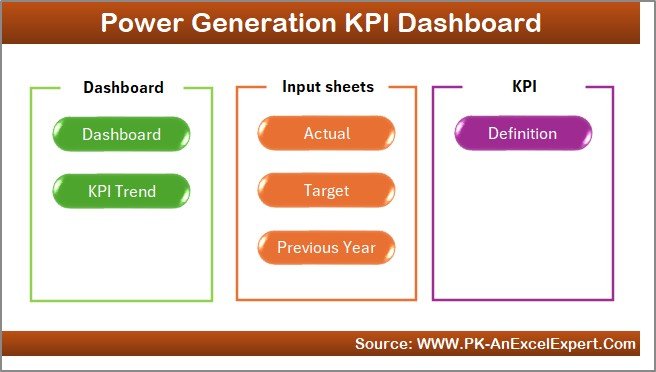
This dashboard is designed with seven key worksheets, each serving a specific purpose. Let’s explore them in detail:
1. Home Sheet: Navigation Made Simple
The Home sheet acts as the index page of the dashboard. It contains six clickable buttons that allow users to jump directly to other sheets.
-
This makes navigation fast and intuitive.
-
Users don’t need to scroll or search through multiple tabs.
-
It provides a professional, user-friendly interface.
2. Dashboard Sheet Tab: The Heart of the System
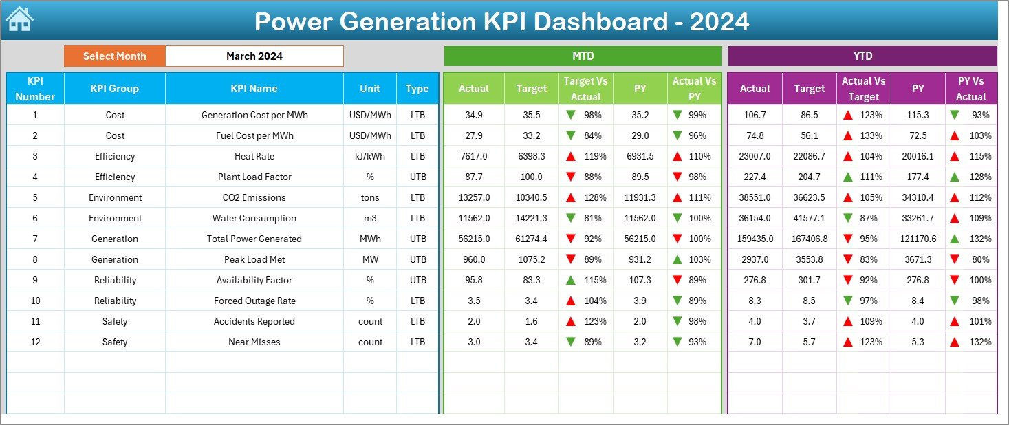
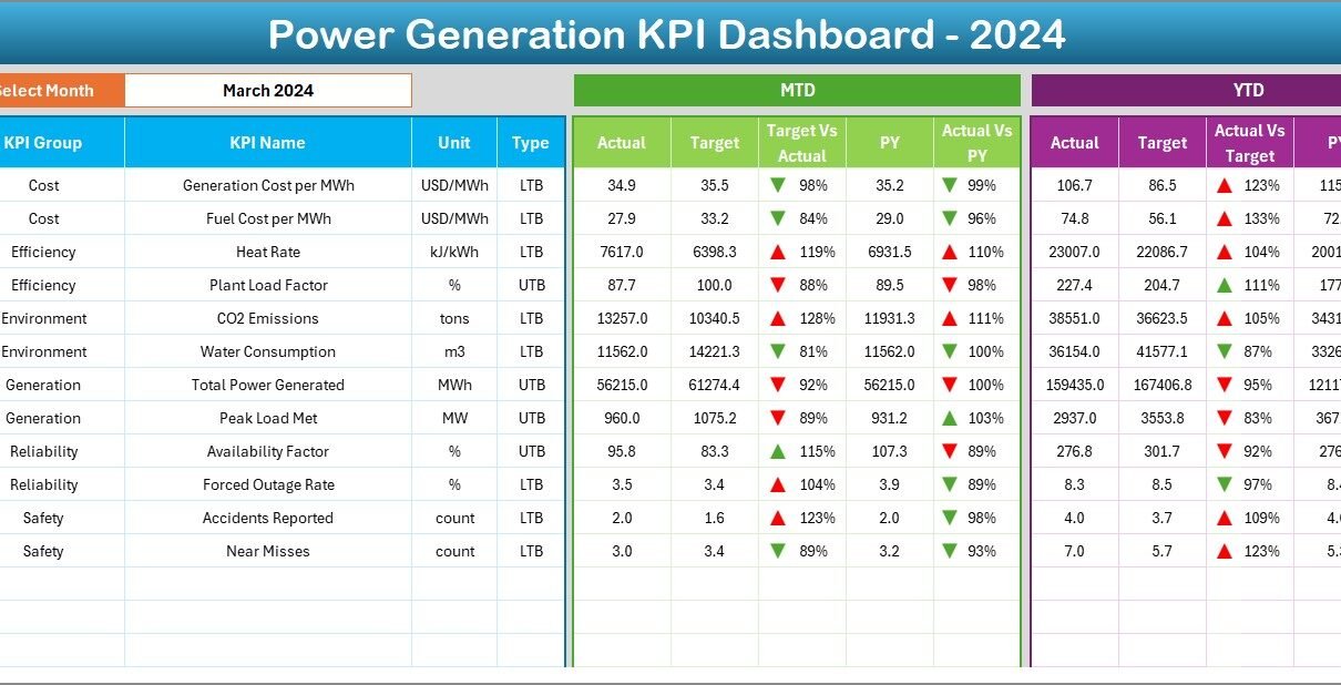
The Dashboard sheet is the main display where all KPIs come together.
-
A drop-down menu (cell D3) allows users to select the month they want to analyze.
-
Once a month is selected, the entire dashboard updates automatically.
-
Metrics shown include:
-
MTD Actual vs. Target with arrows (up or down) to show performance.
-
MTD Actual vs. Previous Year (PY) comparison.
-
YTD Actual vs. Target with conditional formatting indicators.
-
YTD Actual vs. PY comparison.
-
This sheet provides an instant snapshot of performance, helping decision-makers see whether goals are being met.
3. KPI Trend Sheet Tab: Analyze Performance Over Time
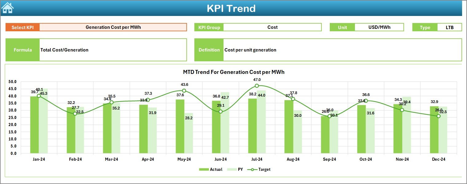
The KPI Trend sheet allows users to analyze trends for specific KPIs.
-
Select a KPI from the drop-down list in cell C3.
-
View details such as:
-
KPI Group
-
KPI Unit
-
KPI Type (Lower the Better or Upper the Better)
-
Formula used for calculation
-
Definition of the KPI
-
Additionally, the sheet shows trend charts comparing Actual, Target, and Previous Year values for both MTD and YTD. This makes it easy to spot patterns and deviations.
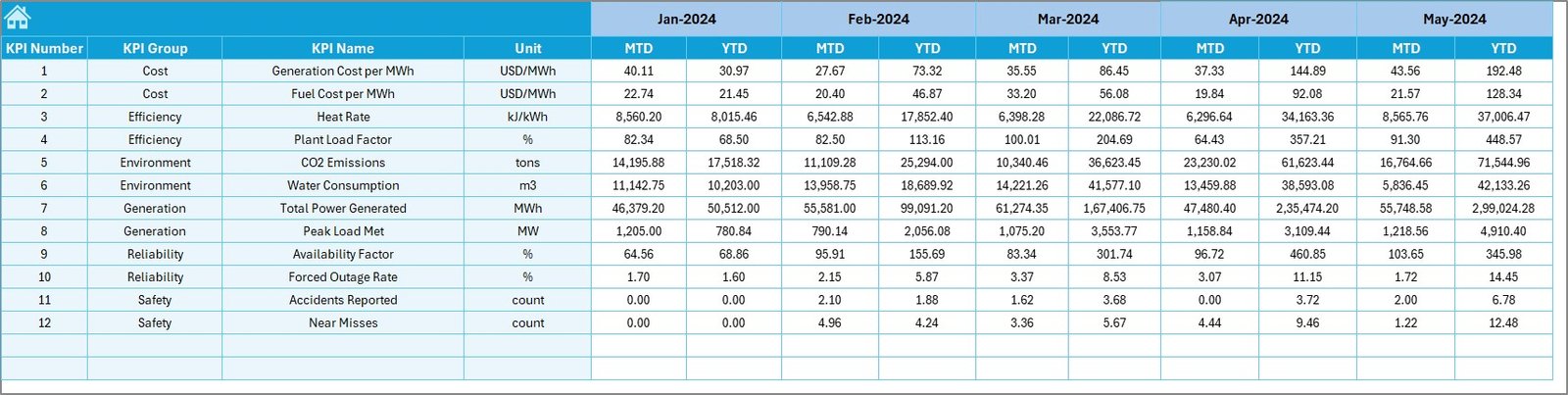
4. Actual Numbers Input Sheet: Data Entry Made Easy
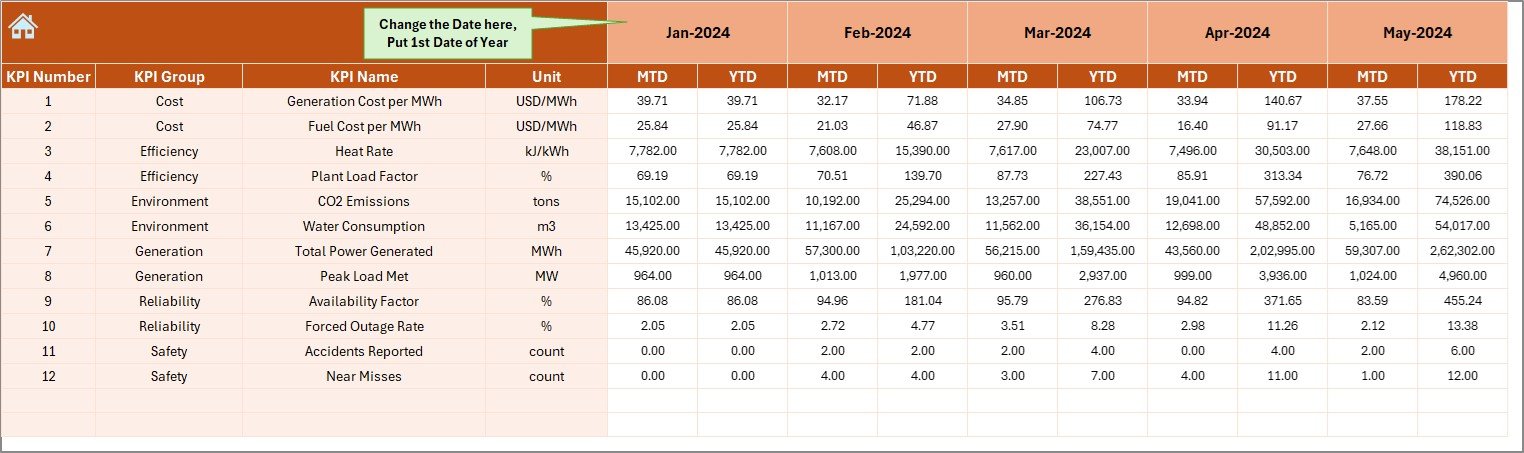
This sheet is where actual performance numbers are entered.
-
Enter data for each KPI, month by month.
-
A simple control in cell E1 allows you to set the starting month of the year.
-
Both MTD and YTD numbers can be entered.
Since the dashboard automatically pulls this data, it reduces manual reporting errors.
5. Target Sheet Tab: Define Your Goals
In the Target sheet, you enter the target values for each KPI.
-
Data can be set for each month.
-
Includes both MTD and YTD targets.
-
Ensures clear benchmarking against actual performance.
This helps management define realistic goals and track how close the plant is to achieving them.
6. Previous Year Numbers Sheet: Historical Benchmarking
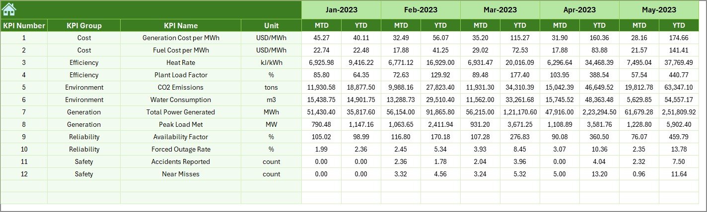
This sheet contains performance data from the previous year.
-
Enter the same type of data as in the Actual Numbers Input sheet.
-
Enables year-over-year (YoY) analysis.
-
Helps track long-term improvements or recurring issues.
7. KPI Definition Sheet Tab: Standardization of Metrics
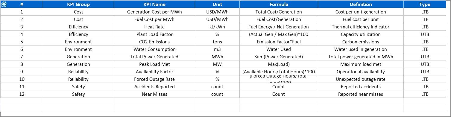
The KPI Definition sheet acts as a reference library.
-
Includes KPI Name, Group, Unit, Formula, and Definition.
-
Ensures everyone in the organization interprets KPIs consistently.
-
Useful for new team members and for maintaining clarity across departments.
Why Do You Need a Power Generation KPI Dashboard?
The energy sector is complex, and small inefficiencies can lead to major losses. A KPI dashboard addresses these challenges by providing:
-
Centralized data in one place.
-
Instant performance tracking with automatic updates.
-
Improved decision-making with trend analysis.
-
Consistency in KPI definitions across the organization.
-
Time savings, since no manual calculations are required.
Advantages of Power Generation KPI Dashboard in Excel
Here are the top benefits businesses gain:
-
📊 Real-Time Visibility: Get instant insights on whether targets are being met.
-
🔄 Comparative Analysis: Compare Actual vs. Target vs. Previous Year seamlessly.
-
⏱ Saves Time: Eliminates manual report creation.
-
📈 Trend Monitoring: Spot performance patterns early.
-
🏭 Operational Efficiency: Helps improve plant reliability and reduce downtime.
-
🌍 Sustainability Tracking: Monitor energy efficiency and environmental KPIs.
Best Practices for Using the Dashboard
To maximize value from this dashboard, follow these best practices:
✅ Keep Data Updated: Enter actual numbers regularly to maintain accuracy.
✅ Standardize KPI Definitions: Use the KPI Definition sheet as a guide for consistency.
✅ Set Realistic Targets: Ensure targets are achievable but challenging.
✅ Use Conditional Formatting: Visual signals make data interpretation faster.
✅ Train Team Members: Ensure all users understand how to navigate and update the dashboard.
✅ Review Trends Monthly: Regular trend reviews help identify issues before they grow.
Real-World Applications of the Dashboard
A Power Generation KPI Dashboard can be used in multiple contexts:
-
Thermal Power Plants: Track fuel consumption, heat rate, and downtime.
-
Hydropower Plants: Monitor water flow, turbine efficiency, and seasonal variations.
-
Solar Power Stations: Analyze generation vs. irradiation levels and weather patterns.
-
Wind Farms: Measure turbine performance, maintenance schedules, and grid availability.
-
Energy Regulators: Monitor compliance with environmental standards and emission limits.
Conclusion
The Power Generation KPI Dashboard in Excel is more than just a spreadsheet—it is a complete performance management system. By consolidating key data, providing instant comparisons, and enabling trend analysis, it empowers energy companies to make smarter, faster, and more strategic decisions.
Whether you manage a small renewable energy plant or a large thermal power station, this dashboard can streamline your reporting, reduce inefficiencies, and drive continuous improvement.
Click to Purchases Power Generation KPI Dashboard in Excel
Frequently Asked Questions (FAQs)
1. What are KPIs in power generation?
KPIs in power generation are measurable values that track performance, such as output, efficiency, fuel usage, downtime, and environmental compliance.
2. Can I customize the Power Generation KPI Dashboard in Excel?
Yes, the dashboard is fully customizable. You can add new KPIs, modify formulas, or update visuals to match your business needs.
3. How often should I update the actual numbers?
You should update them monthly or weekly, depending on your reporting cycle. Regular updates ensure accurate performance tracking.
4. Is this dashboard suitable for renewable energy plants?
Absolutely. The dashboard works for solar, wind, hydro, and thermal plants. KPIs can be customized for each energy source.
5. Do I need advanced Excel skills to use this dashboard?
No. The dashboard is designed to be user-friendly with drop-downs, automated charts, and easy data entry sections.
Visit our YouTube channel to learn step-by-step video tutorials
Click to Purchases Power Generation KPI Dashboard in Excel
Watch the step-by-step video tutorial: