Agriculture drives economies, supports livelihoods, and feeds millions every day. However, farmers, agribusiness owners, and agriculture consultants often struggle with scattered spreadsheets and delayed reports. As a result, they lose clarity on revenue, cost, and profit.So, how can you track farm performance in real time without confusion?You need an Agriculture Dashboard in Power BI.This powerful, ready-to-use dashboard helps you monitor revenue, total cost, profit, production, cultivated area, and profit margin — all in one interactive system. Moreover, it allows you to filter data by region, crop, soil type, season, fertilizer type, and month. Therefore, you gain deep insights instantly and take faster decisions.
In this detailed guide, you will learn:
- What an Agriculture Dashboard in Power BI is
- Why modern farming needs data visualization
- A complete explanation of all 5 dashboard pages
- Advantages of Agriculture Dashboard in Power BI
- Best practices for implementation
- Frequently Asked Questions with answers
Click to buy Agriculture Dashboard in Power BI
What Is an Agriculture Dashboard in Power BI?
An Agriculture Dashboard in Power BI is a data visualization and reporting solution designed to track farm operations and financial performance in a structured way.
Instead of manually checking Excel sheets, you can:
- Monitor revenue in USD
- Track total cost in USD
- Measure profit in USD
- Analyze profit margin %
- Evaluate production in quintals
- Compare area cultivated in acres
Moreover, Power BI updates visuals instantly when you apply filters. As a result, you save hours of manual effort.
Why Do Agriculture Businesses Need a Power BI Dashboard?
Agriculture operations involve multiple variables. For example:
- Different crops
- Multiple soil types
- Various fertilizer types
- Seasonal variations
- Regional differences
Therefore, managing data manually becomes difficult.
However, when you use an Agriculture Dashboard in Power BI:
- You identify high-profit crops quickly
- You control cost fluctuations
- You compare seasonal performance
- You analyze yield efficiency
- You improve decision-making
In addition, you reduce dependency on static reports.
Complete Breakdown of the 5 Pages in Agriculture Dashboard in Power BI
Now, let us explore each page in detail.
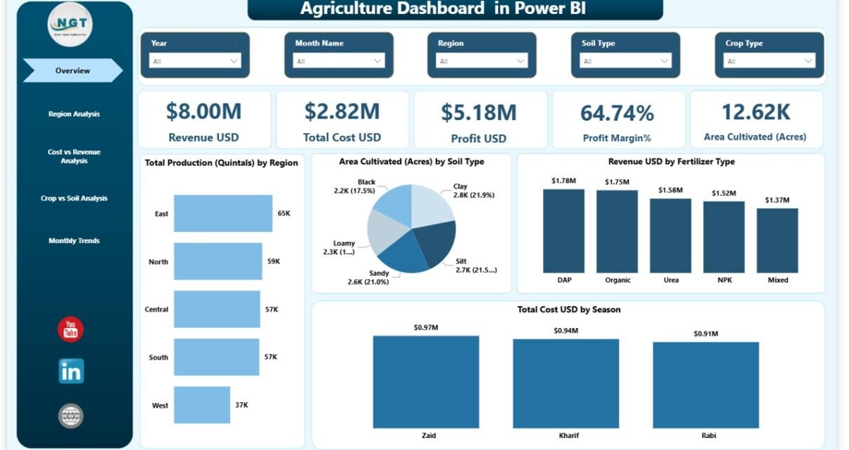
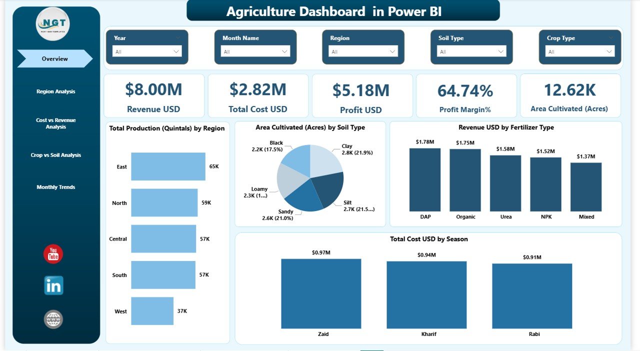
Overview Page – How Does It Give Instant Business Clarity?
The Overview Page acts as the main control center of the dashboard. As soon as you open the file, you see a summary of farm performance.
Slicers (Filters)
You can filter data by:
- Region
- Season
- Crop Type
- Soil Type
- Fertilizer Type
- Month
Because of these slicers, you analyze specific segments instantly.
Key KPI Cards
The page includes 5 major KPI cards:
- Revenue (USD)
- Total Cost (USD)
- Profit (USD)
- Profit Margin (%)
- Area Cultivated (Acres)
- Production (Quintals)
These cards give a quick financial snapshot. Therefore, you understand overall performance within seconds.
Key Visuals on Overview Page
- Area Cultivated (Acres) by Soil Type
- Revenue (USD) by Fertilizer Type
- Total Cost (USD) by Season
These visuals help you understand:
- Which soil type supports higher cultivation
- Which fertilizer generates higher revenue
- Which season increases cost
As a result, you can adjust strategies accordingly.
Click to buy Agriculture Dashboard in Power BI
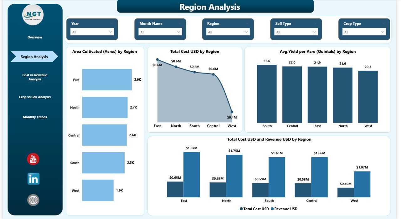
Region Analysis Page – Which Region Performs Best?
Regional performance plays a major role in agriculture profitability. Therefore, this page focuses entirely on region-based analysis.
Charts Included:
- Area Cultivated (Acres) by Region
- Total Cost (USD) by Region
- Average Yield per Acre (Quintals) by Region
- Revenue (USD) and Total Cost (USD) by Region
Why Is This Page Important?
Because different regions have:
- Different climate conditions
- Different soil quality
- Different irrigation systems
As a result, yield and cost vary significantly.
With this page, you can:
- Identify top-performing regions
- Compare cost efficiency
- Detect underperforming zones
- Plan regional expansion
Click to buy Agriculture Dashboard in Power BI
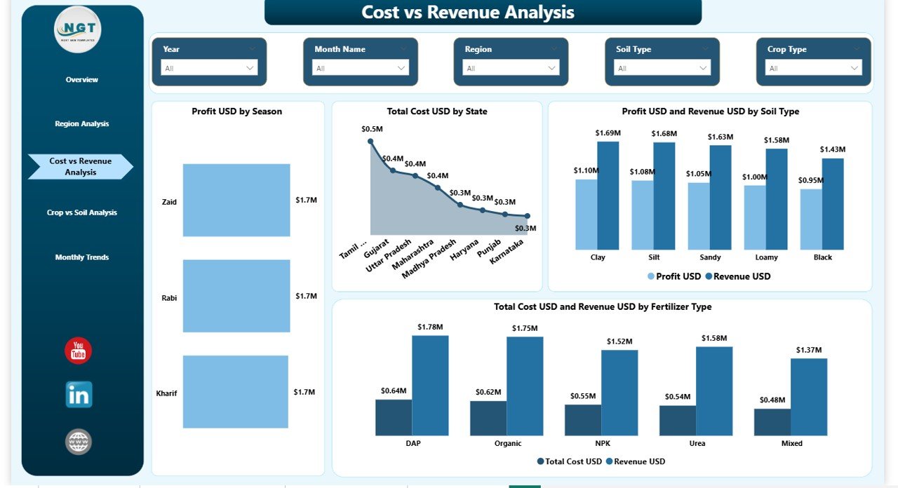
Cost vs Revenue Analysis – Are You Actually Making Profit?
Many agriculture businesses focus only on revenue. However, revenue alone does not guarantee profitability. Therefore, this page analyzes cost and revenue together.
Charts Included:
- Profit (USD) by Season
- Total Cost (USD) by State
- Revenue (USD) and Profit (USD) by Soil Type
- Total Cost (USD) and Revenue (USD) by Fertilizer Type
What Insights Can You Get?
- Which season gives the highest profit
- Which state incurs maximum cost
- Which soil type increases profitability
- Which fertilizer improves ROI
Therefore, you can optimize spending and maximize margins.
Click to buy Agriculture Dashboard in Power BI
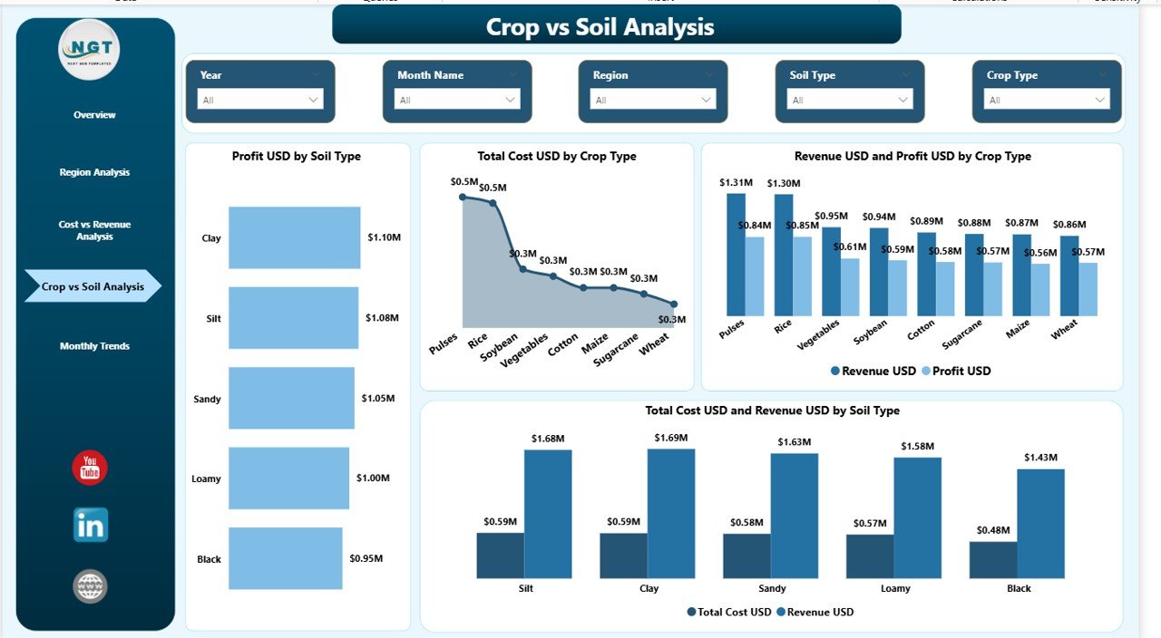
Crop vs Soil Analysis – Which Crop Works Best with Which Soil?
Crop selection affects overall profitability. However, soil compatibility plays an equally important role.
This page helps you align crop strategy with soil type.
Charts Included:
- Profit (USD) by Soil Type
- Total Cost (USD) by Crop Type
- Revenue (USD) and Profit (USD) by Crop Type
- Total Cost (USD) and Revenue (USD) by Soil Type
Why This Page Matters
Because:
- Some crops thrive better in specific soils
- Some soils reduce fertilizer cost
- Some combinations increase yield
As a result, you can:
- Improve crop planning
- Reduce unnecessary cost
- Increase production efficiency
Click to buy Agriculture Dashboard in Power BI
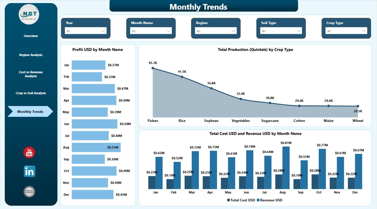
Monthly Trends – How Does Performance Change Over Time?
Seasonal and monthly fluctuations affect agriculture heavily. Therefore, trend analysis becomes critical.
Charts Included:
- Profit (USD) by Month
- Total Production (Quintals) by Crop Type
- Total Cost (USD) and Revenue (USD) by Month
Benefits of Monthly Trend Analysis
- Track seasonal profitability
- Monitor production spikes
- Identify cost increase patterns
- Plan future cultivation cycles
Moreover, monthly visuals help you forecast future performance.
Click to buy Agriculture Dashboard in Power BI
Advantages of Agriculture Dashboard in Power BI
Now, let us discuss the major advantages.
Real-Time Performance Tracking
You can update Excel data and instantly refresh the dashboard. Therefore, you always see updated numbers.
Better Profit Analysis
You compare revenue and cost visually. As a result, you identify profit gaps quickly.
Improved Cost Control
You analyze cost by season, state, fertilizer, and crop. Therefore, you reduce unnecessary expenses.
Higher Productivity Planning
You evaluate yield per acre by region. Consequently, you plan better cultivation strategies.
Easy Decision-Making
Because visuals present clear comparisons, you make faster decisions.
Centralized Data Management
Instead of multiple sheets, you manage everything in one interactive dashboard.
Best Practices for the Agriculture Dashboard in Power BI
To get maximum value, follow these best practices.
Maintain Clean Data
Ensure accurate entries in Excel. Therefore, your dashboard stays reliable.
Update Data Regularly
Upload monthly production and cost data. As a result, trends remain accurate.
Use Slicers Smartly
Filter by region, crop, and season to discover hidden insights.
Monitor Profit Margin %
Do not focus only on revenue. Always analyze margin percentage.
Compare Soil and Crop Combination
Use the Crop vs Soil page to optimize yield.
Review Monthly Trends
Identify repeating patterns and plan future cycles accordingly.
How Does This Dashboard Improve Strategic Planning?
When you combine region analysis, soil analysis, and monthly trends, you create a complete 360-degree performance view.
Therefore, you can:
- Expand high-performing crops
- Reduce cost in low-performing regions
- Improve fertilizer planning
- Increase profit margin
- Optimize seasonal farming strategy
As a result, you build a data-driven agriculture business.
Who Can Use the Agriculture Dashboard in Power BI?
This dashboard suits:
- Large-scale farm owners
- Agribusiness companies
- Agriculture consultants
- Farming cooperatives
- Agriculture project managers
- Government agriculture departments
Moreover, it works perfectly for both small and large operations.
How Does Power BI Make Agriculture Data More Powerful?
Power BI offers:
- Interactive visuals
- Drill-through capability
- Cross-filtering
- Dynamic slicers
- Real-time refresh
Therefore, you move beyond static reporting and embrace interactive analytics.
Conclusion: Why Should You Invest in an Agriculture Dashboard in Power BI?
Agriculture today requires smart decisions. Moreover, rising input costs and unpredictable weather demand better monitoring. Therefore, relying on manual spreadsheets limits growth.
An Agriculture Dashboard in Power BI provides:
- Complete cost visibility
- Profit tracking
- Regional analysis
- Soil and crop comparison
- Monthly performance trends
As a result, you gain clarity, control, and confidence.
If you want to modernize your agriculture operations and increase profitability, this dashboard offers the perfect solution.
Frequently Asked Questions (FAQs)
What data do I need for an Agriculture Dashboard in Power BI?
You need data related to revenue, total cost, production (quintals), area cultivated (acres), crop type, soil type, region, state, fertilizer type, season, and month.
Can small farms use this dashboard?
Yes. Small farms can use it easily. Moreover, they benefit from better cost control and profit monitoring.
How often should I update the dashboard?
You should update it monthly. However, you can also update it weekly if required.
Does this dashboard help improve profit margin?
Yes. Because you analyze revenue and cost together, you can identify margin improvement areas quickly.
Can I customize the dashboard?
Yes. You can modify visuals, add new KPIs, or include additional regions and crops.
Why should I choose Power BI over Excel charts?
Power BI provides interactive filters, drill-down analysis, and better visual clarity. Therefore, it supports advanced analytics.
Does the dashboard support seasonal analysis?
Yes. The Cost vs Revenue and Monthly Trends pages allow detailed seasonal analysis.
Visit our YouTube channel to learn step-by-step video tutorials
Watch the step-by-step video tutorial:
Click to buy Agriculture Dashboard in Power BI