Continuing Education Programs KPI Dashboard in Excel is a professionally designed, ready-to-use template that empowers training institutes, corporate learning departments, adult education centers, and professional development managers to monitor enrollment metrics, track learner progress, measure certification completion rates, and evaluate overall program effectiveness from one interactive Excel workbook. Whether you manage compliance training, professional certification programs, or lifelong learning initiatives, this Excel KPI Dashboard gives you complete visibility into every performance metric that matters.Continuing Education Programs KPI Dashboard in Excel
In this article, we will walk you through every sheet, feature, and functionality of this Continuing Education Programs KPI Dashboard in Excel so you can understand exactly how it works and how to make the most of it for your organization.Continuing Education Programs KPI Dashboard in Excel
Click here to Purchase Continuing Education Programs KPI Dashboard in Excel
Key Features of Continuing Education Programs KPI Dashboard in Excel
This Education KPI Dashboard Excel template is packed with powerful features that make it easy to track, compare, and analyze your continuing education program performance without any complex setup or VBA macros.
- MTD and YTD Performance Tracking — Every KPI is tracked for both Month-to-Date and Year-to-Date periods, giving you granular monthly insights as well as cumulative annual performance at a glance.
- Target vs Actual Comparison — Automatically compare your actual performance against pre-set targets for each KPI. Conditional formatting arrows visually indicate whether a KPI is above, below, or on par with expectations.
- Previous Year vs Actual Analysis — Enable year-over-year comparisons by entering your previous year data, allowing you to measure growth, identify declining areas, and spot emerging trends.
- Dynamic Month Selector — A simple drop-down on the Dashboard sheet lets you switch between any month and the entire dashboard updates instantly, making it effortless to review current or historical performance.
- Individual KPI Trend Analysis — The dedicated KPI Trend sheet lets you deep-dive into any single KPI with trend charts showing Actual vs Target vs Previous Year across all months for both MTD and YTD periods.
- KPI Metadata Display — For every selected KPI, the Trend sheet also displays its Group, Unit of Measurement, Type (Lower the Better or Upper the Better), Formula, and Definition, ensuring complete context for analysis.
- 7 Organized Worksheets — The workbook is structured into Dashboard, KPI Trend, Actual Numbers Input, Target Numbers Input, Previous Year Numbers, KPI Definition, and Support sheets for maximum clarity and ease of use.
- Flexible Fiscal Year Configuration — Set your fiscal year starting month on the Actual Numbers Input sheet, and all monthly columns adjust accordingly, making this template usable regardless of your organization’s fiscal calendar.
- No VBA or Macros — Built entirely on native Excel formulas, conditional formatting, and data validation, this template is compatible with Excel for Microsoft 365, Excel 2021, Excel 2019, and Excel Online.
- Fully Customizable — Replace the sample KPIs with your own continuing education metrics, adjust targets, and tailor the dashboard to fit your specific programs and reporting needs.
Dashboard Pages and Sheets Explained
This Continuing Education Programs KPI Dashboard in Excel contains 7 carefully structured worksheets. Let us walk you through each one in detail so you know exactly what to expect and how to use it.
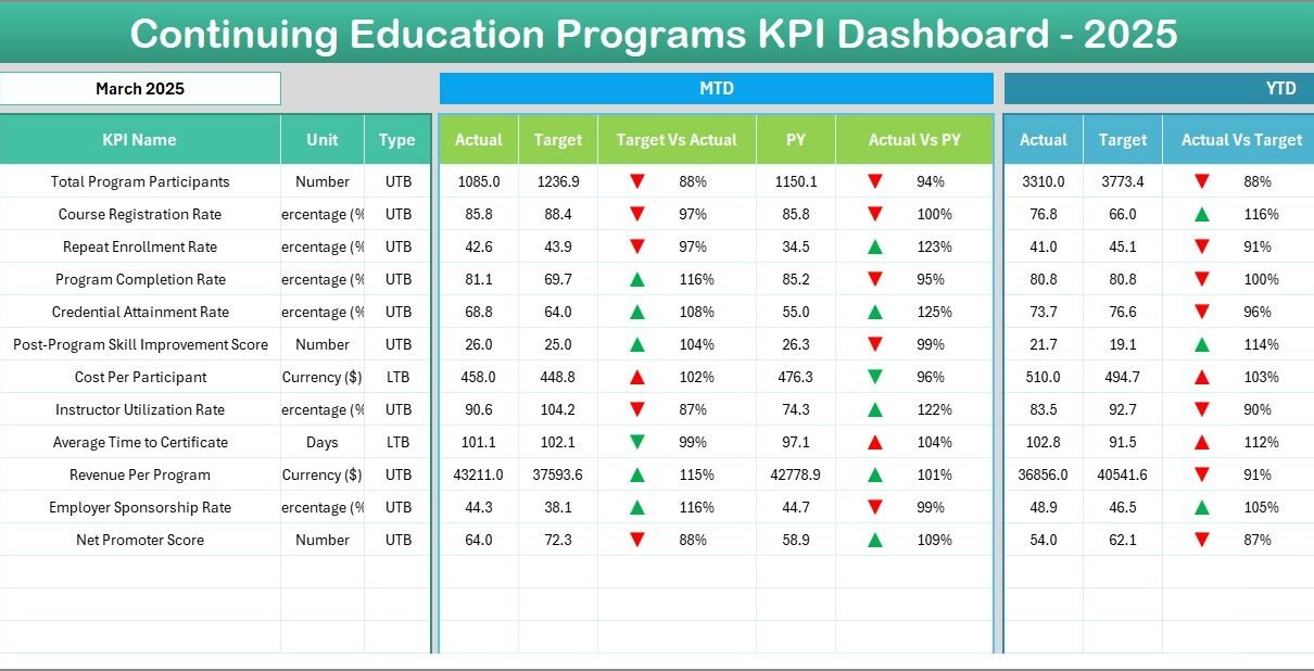
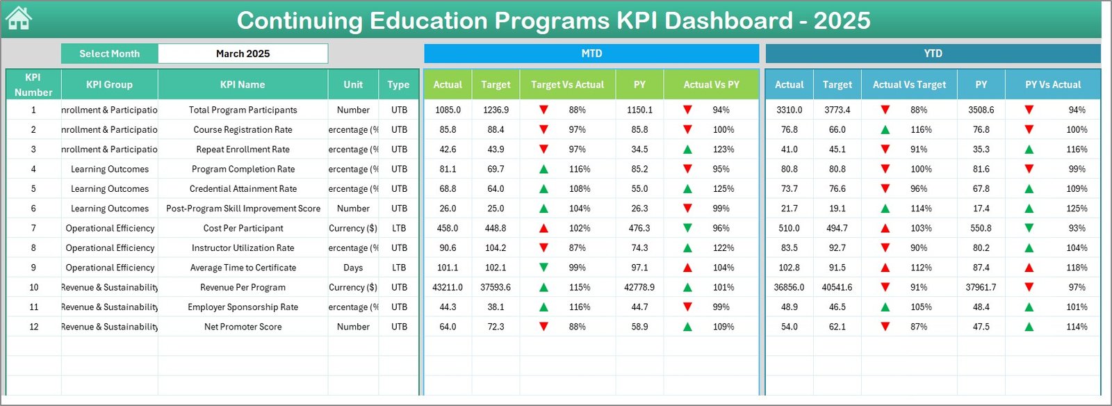
1. Dashboard Sheet
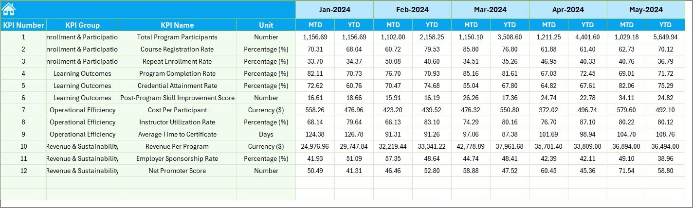
This is the main sheet of the workbook. It displays all of your continuing education KPIs in a comprehensive scorecard format. On cell D3, you can select any month from the drop-down, and the entire dashboard updates for that period.
The Dashboard shows MTD Actual, Target, and Previous Year data along with Target vs Actual and Previous Year vs Actual comparisons. It also displays the corresponding YTD Actual, Target, and Previous Year data with the same variance comparisons. Conditional formatting arrows (up and down) are applied throughout, making it instantly clear which KPIs are on track and which need attention.
Click here to Purchase Continuing Education Programs KPI Dashboard in Excel
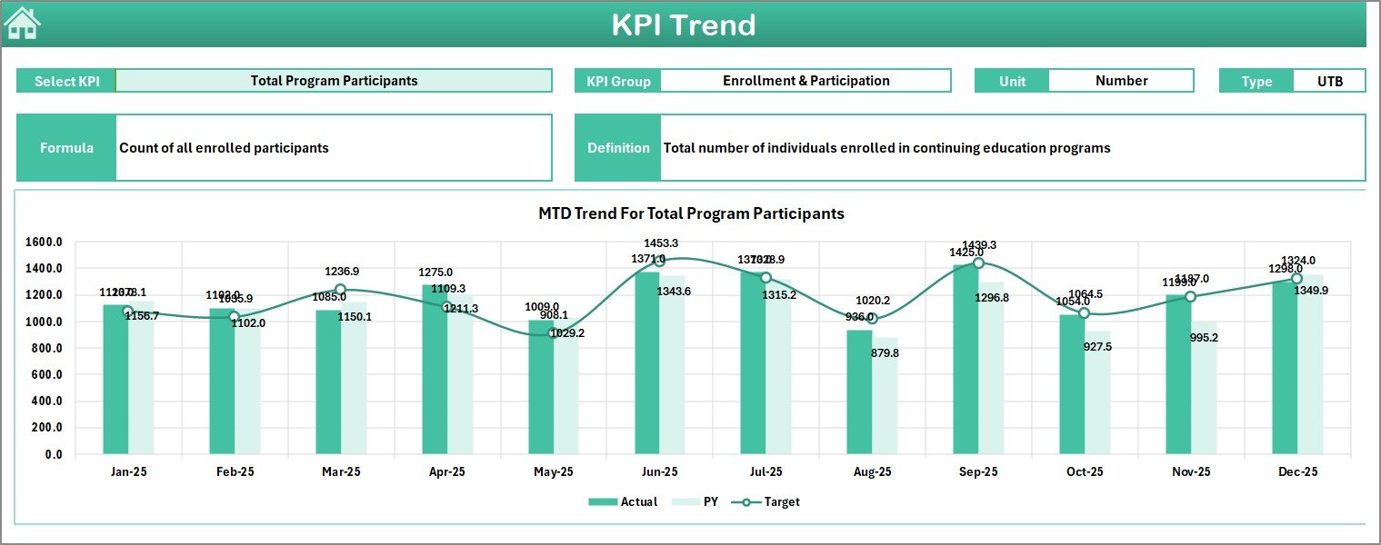
2. KPI Trend Sheet
This sheet allows you to select any individual KPI from the drop-down available on cell C3. Once selected, the sheet displays the KPI Group, Unit, Type (LTB or UTB), Formula, and Definition of the chosen KPI. Below this metadata, you will find MTD and YTD trend charts that plot Actual, Target, and Previous Year numbers across all months, making it easy to identify patterns, seasonal dips, and performance trajectories over time. This is similar to the trend analysis available in the STEM Education Centers KPI Dashboard in Excel.
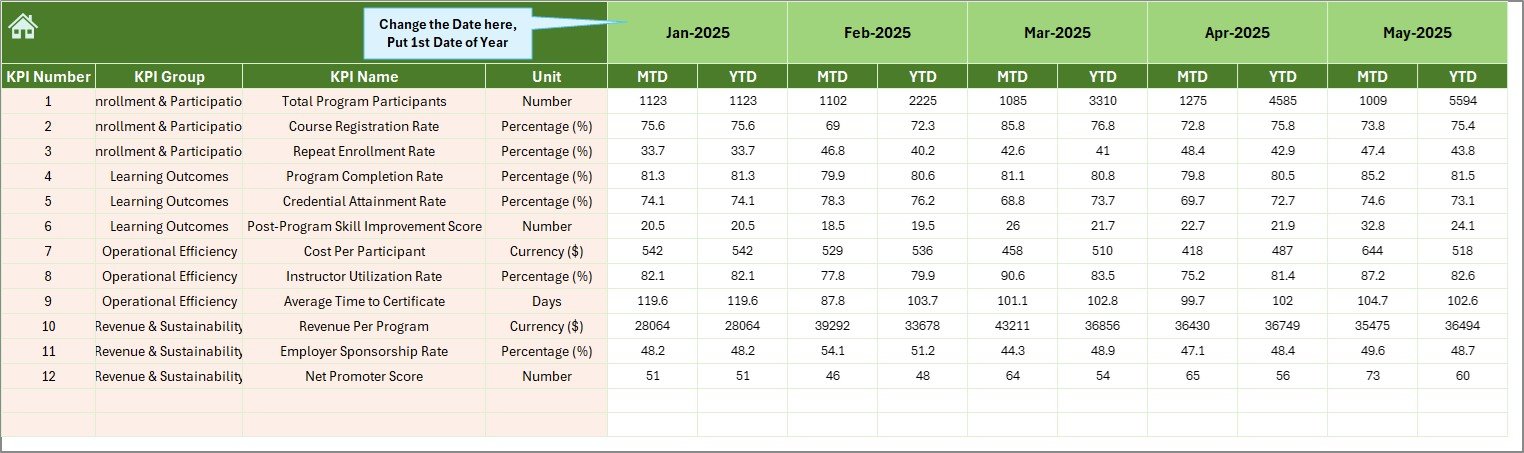
3. Actual Numbers Input Sheet
This is where you enter your actual performance numbers. For each KPI, enter the MTD and YTD actual values for every month. You can change the fiscal year starting month from cell E1, and all month columns will adjust accordingly. This sheet feeds directly into the Dashboard and KPI Trend sheets, so accurate data entry here is essential for reliable reporting.
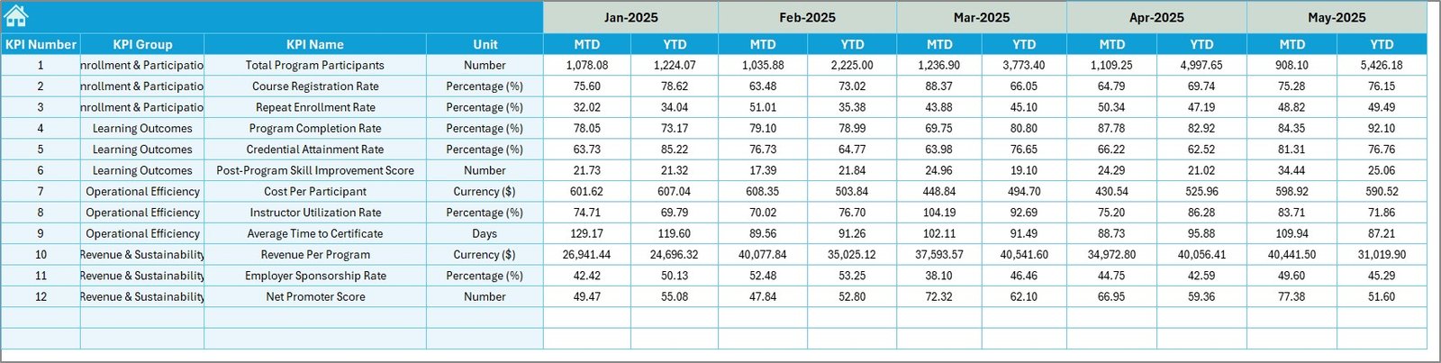
4. Target Number Input Sheet
Enter your target numbers for each KPI across all months in this sheet. Both MTD and YTD target values should be entered here. These targets are used by the Dashboard sheet to calculate Target vs Actual variances and to trigger the conditional formatting arrows that indicate performance status.
5. Previous Year Number Sheet
Enter your previous year’s performance data in the same format as the current year. This enables the year-over-year comparison on both the Dashboard and KPI Trend sheets, helping you measure growth and identify areas that may have regressed compared to the prior period.
Click here to Purchase Continuing Education Programs KPI Dashboard in Excel
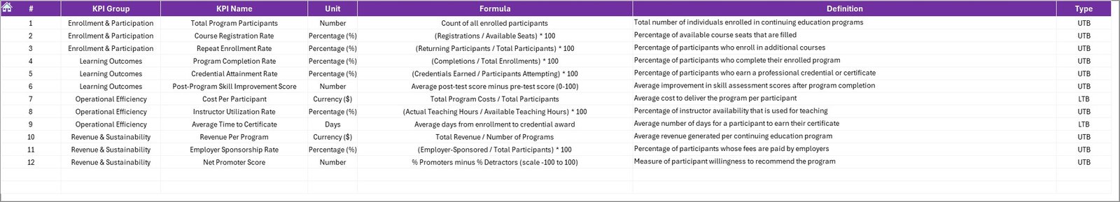
This sheet is where you define each KPI in detail. Enter the KPI Name, KPI Group, Unit of Measurement, Formula, and KPI Definition. In the last column, specify the KPI Type as either LTB (Lower the Better) or UTB (Upper the Better). This information feeds into the KPI Trend sheet and provides important context when analyzing individual KPI performance, much like the setup in the Space Education Programs KPI Dashboard in Excel.
Advantages of Continuing Education Programs KPI Dashboard in Excel
Click here to Purchase Continuing Education Programs KPI Dashboard in Excel
This template offers several meaningful advantages for anyone managing continuing education programs:
- Saves Hours of Manual Work — All formulas, conditional formatting, and variance calculations are pre-built, eliminating the need for manual spreadsheet construction from scratch.
- Centralized Performance Monitoring — Instead of tracking KPIs across multiple files, emails, and systems, this dashboard brings everything into one clean, professional view.
- Supports Data-Driven Decisions — With clear MTD/YTD comparisons, trend charts, and year-over-year analysis, you have the data you need to make informed decisions about program improvements, budget allocation, and strategic planning.
- Professional Presentation Ready — The clean layout and polished design make this dashboard suitable for executive presentations, board meetings, accreditation reviews, and stakeholder reports.
- Universal Compatibility — No macros or add-ins required, so it works across all modern Excel versions and can even be used in Excel Online for cloud-based collaboration.
Opportunities for Improvement
While this Continuing Education Dashboard Template is highly functional and comprehensive, here are a few areas where users could enhance it further based on specific needs:
- Automated Data Import — Currently, data is entered manually. Organizations with existing LMS or CRM systems could add Power Query connections to automatically pull data from external sources.
- Additional Visualization Types — Users who prefer gauge charts, sparklines, or heat maps could extend the Dashboard sheet with additional visual elements for richer at-a-glance analysis.
- Multi-Year Comparison — The current template supports current year vs previous year. Adding additional columns for two or three prior years would enable longer-term trend analysis.
- Role-Based Views — For larger organizations, creating filtered views for different departments or program managers could help personalize the reporting experience.
Best Practices for Using This KPI Dashboard
Click here to Purchase Continuing Education Programs KPI Dashboard in Excel
To get the most value out of this Continuing Education Programs KPI Dashboard in Excel, follow these best practices:
- Start with KPI Definitions — Before entering any numbers, carefully fill out the KPI Definition sheet. Clear definitions, units, and formulas ensure consistency and accurate reporting across your team.
- Update Data Monthly — For the dashboard to remain relevant and actionable, commit to entering your actual numbers at the end of each month. Stale data leads to stale decisions.
- Set Realistic Targets — Use historical data, industry benchmarks, and organizational goals to set achievable yet challenging targets on the Target Number Input sheet.
- Review Trends Regularly — Do not just look at the Dashboard sheet. Make a habit of reviewing the KPI Trend sheet monthly to catch emerging patterns before they become problems.
- Customize for Your Programs — Replace the sample KPIs with metrics specific to your continuing education programs such as CEU credits earned, instructor ratings, course dropout rates, or program-level ROI.
Explore Relevant Templates
If you found this Continuing Education Programs KPI Dashboard in Excel useful, you may also be interested in these related templates from our collection:
- Online Universities KPI Dashboard in Excel — Track enrollment, graduation rates, and student satisfaction for online university programs.
- Space Education Programs KPI Dashboard in Excel — Monitor STEM outreach, participation rates, and program impact for space education initiatives.
- STEM Education Centers KPI Dashboard in Excel — Analyze student enrollment, lab utilization, and instructor performance for STEM education centers.
- Coding Bootcamps KPI Dashboard in Power BI — A Power BI version for coding bootcamp operators tracking placement rates, course completions, and revenue.
Frequently Asked Questions
Click here to Purchase Continuing Education Programs KPI Dashboard in Excel
What KPIs can I track with this Continuing Education Programs KPI Dashboard?
You can track any KPIs relevant to continuing education such as Enrollment Rate, Completion Rate, Certification Pass Rate, Learner Satisfaction Score, Revenue per Program, Cost per Learner, Instructor Utilization Rate, Course Dropout Rate, CEU Credits Earned, and more. The KPI Definition sheet lets you fully customize the metrics.
Do I need VBA or macros to use this template?
No. This Excel KPI Dashboard for Education Programs is built entirely on native Excel formulas, data validation, and conditional formatting. No VBA, macros, or add-ins are required, and it works with Excel for Microsoft 365, Excel 2021, Excel 2019, and Excel Online.
Can I change the fiscal year starting month?
Yes. On the Actual Numbers Input sheet, cell E1 controls the fiscal year starting month. Simply change it to your preferred start month and all monthly columns will adjust automatically throughout the workbook.
How many KPIs can I track in this dashboard?
The template is pre-configured with a set of sample KPIs, but you can add, remove, or modify them freely. There is no hard limit — you can track as many KPIs as your continuing education program requires by extending the rows in the input sheets and KPI Definition sheet.
Is this template compatible with Google Sheets?
This template is optimized for Microsoft Excel. While you can open it in Google Sheets, some conditional formatting and advanced formula features may not render perfectly. For a Google Sheets version, check out our NextGenTemplates.com store for dedicated Google Sheets KPI Dashboards.
Can I share this dashboard with my team?
Absolutely. Since this is a standard Excel file, you can share it via email, cloud storage (OneDrive, SharePoint, Dropbox), or even use Excel Online for real-time collaboration with multiple team members.
Conclusion
Click here to Purchase Continuing Education Programs KPI Dashboard in Excel
The Continuing Education Programs KPI Dashboard in Excel is the perfect tool for anyone who wants to track, analyze, and improve the performance of their continuing education programs with a professional, easy-to-use, and fully customizable Excel template. From MTD and YTD scorecard comparisons to individual KPI trend analysis, this dashboard gives you everything you need to make data-driven decisions and present polished reports to stakeholders.
Click here to Purchase Continuing Education Programs KPI Dashboard in Excel
Visit our YouTube channel for step-by-step video tutorials on how to use this and other Excel dashboard templates:
Click here to Purchase Continuing Education Programs KPI Dashboard in Excel