Tracking organizational performance across departments, roles, and KPIs often becomes challenging when data stays scattered across spreadsheets and static reports. However, modern businesses now demand clarity, speed, and actionable insights. That is exactly where an Annual Performance Summary Dashboard in Power BI plays a critical role.
In this in-depth guide, you will learn what an Annual Performance Summary Dashboard in Power BI is, how it works, its key features, advantages, best practices, and frequently asked questions. Moreover, this article explains each dashboard page in detail so that you clearly understand how decision-makers can use it to evaluate performance effectively.
By the end of this article, you will know why this dashboard becomes an essential tool for management, HR teams, and business leaders.
Click to buy Annual Performance Summary Dashboard in Power BI
What Is an Annual Performance Summary Dashboard in Power BI?
An Annual Performance Summary Dashboard in Power BI is an interactive reporting solution designed to analyze yearly performance across KPIs, departments, designations, and time periods.
Instead of manually reviewing annual reports or static charts, this dashboard presents real-time, visual, and data-driven insights in one centralized Power BI file. As a result, leaders quickly identify strong performers, improvement areas, and performance trends across the organization.
Moreover, Power BI slicers allow users to filter data dynamically, which ensures faster and more accurate analysis.
Why Do Organizations Need an Annual Performance Summary Dashboard?
Organizations generate massive performance data every year. However, without proper visualization, insights often remain hidden.
Here is why businesses actively adopt an Annual Performance Summary Dashboard in Power BI:
- It consolidates annual performance data in one place
- It reduces manual reporting efforts
- It improves transparency across departments
- It highlights excellent, good, average, and poor performance instantly
- It supports data-driven decision-making
Therefore, companies gain better control over performance management and strategic planning.
How Does an Annual Performance Summary Dashboard in Power BI Work?
The dashboard works by connecting structured performance data—often stored in Excel or databases—to Power BI. After that, Power BI transforms the data into interactive visuals, KPI cards, and trend charts.
Users can then:
- Apply slicers to filter by department, designation, KPI status, or time
- View rating distributions instantly
- Compare performance across teams and months
- Identify problem areas without manual calculations
As a result, performance evaluation becomes faster, clearer, and more reliable.
Key Features of the Annual Performance Summary Dashboard in Power BI
This ready-to-use dashboard contains five powerful pages, each designed to answer specific performance-related questions. Let us explore each page in detail.
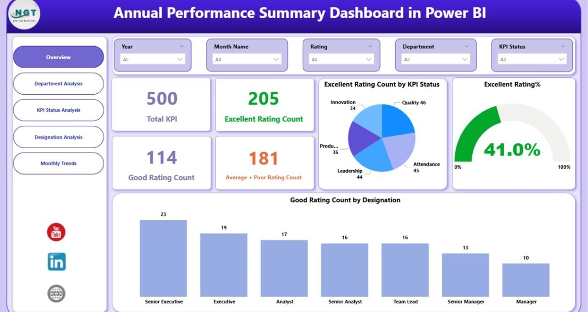
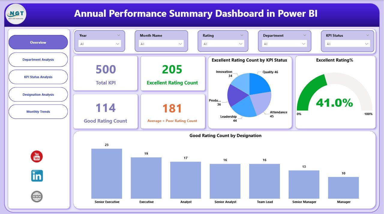
Overview Page: How Does the Dashboard Summarize Overall Performance?
The Overview Page acts as the main landing page of the dashboard. It provides a high-level snapshot of annual performance across the organization.
Key Elements of the Overview Page
- Interactive slicers for quick filtering
- Five KPI cards showing:
Total KPI count
Excellent rating count
Good rating count
Average + Poor rating count
Visuals such as:
Excellent rating count by KPI status
Excellent rating distribution
Good rating count by designation
Why Is the Overview Page Important?
This page allows leadership to instantly understand how the organization performed overall. Moreover, decision-makers quickly identify whether performance leans toward excellence or requires corrective action.
Click to buy Annual Performance Summary Dashboard in Power BI
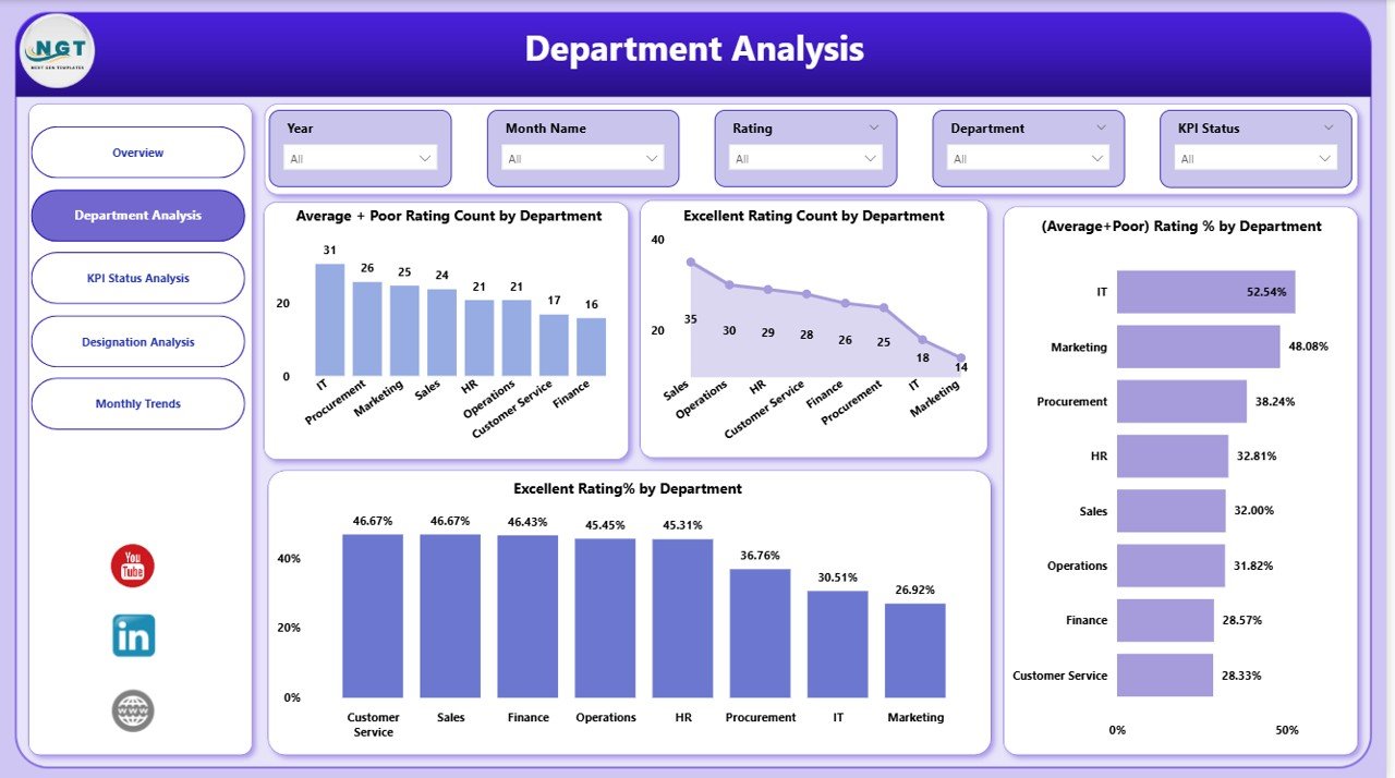
Department Analysis Page: Which Departments Perform Better?
The Department Analysis Page focuses on performance comparison across departments.
Key Visuals in Department Analysis
- Average + Poor rating count by department
- Excellent rating count by department
- Average + Poor rating percentage by department
- Excellent rating percentage by department
How Does Department Analysis Help?
This page helps managers:
- Identify high-performing departments
- Detect departments that need training or support
- Allocate resources more effectively
- Encourage healthy performance competition
Consequently, leadership improves operational efficiency using factual data.
Click to buy Annual Performance Summary Dashboard in Power BI
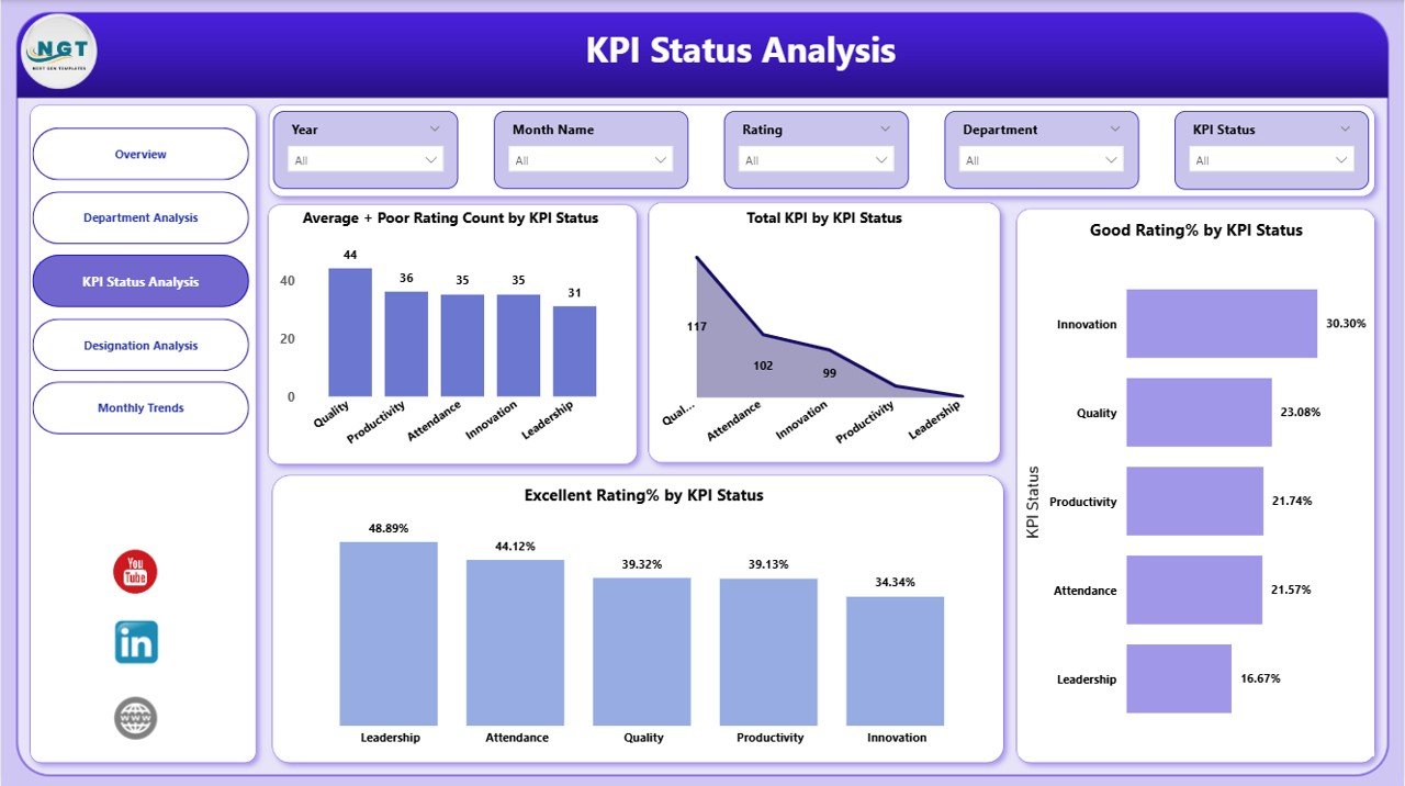
KPI Status Analysis Page: How Do KPIs Perform Overall?
The KPI Status Analysis Page evaluates performance based on KPI status categories.
Charts Included in KPI Status Analysis
- Average + Poor rating count by KPI status
- Total KPI count by KPI status
- Good rating count by KPI status
Why Is KPI Status Analysis Valuable?
This analysis highlights which KPIs consistently underperform and which ones drive excellence. Therefore, organizations can refine KPIs, set realistic targets, and align goals with strategy.
Click to buy Annual Performance Summary Dashboard in Power BI
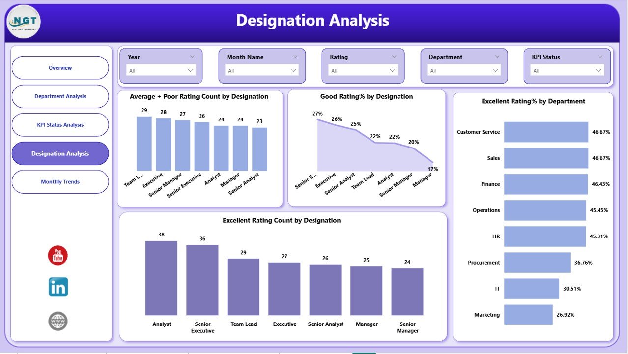
Designation Analysis Page: How Do Different Roles Perform?
The Designation Analysis Page focuses on performance distribution across job roles or designations.
Key Visuals on Designation Analysis
- Average + Poor rating count by designation
- Good rating percentage by designation
- Excellent rating percentage by department
- Excellent rating count by designation
What Insights Does This Page Deliver?
This page helps HR teams and managers:
- Understand role-based performance trends
- Identify leadership or skill gaps
- Design targeted training programs
- Support fair performance evaluations
As a result, employee development becomes more structured and transparent.
Click to buy Annual Performance Summary Dashboard in Power BI
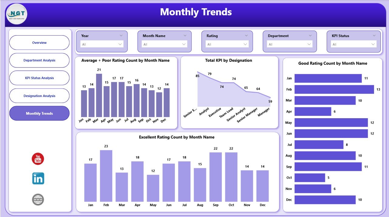
Monthly Trends Page: How Does Performance Change Over Time?
The Monthly Trends Page provides time-based performance insights.
Key Monthly Trend Visuals
- Average + Poor rating count by month
- Total KPI count by designation
- Good rating count by month
- Excellent rating count by month
Why Are Monthly Trends Crucial?
Monthly analysis helps organizations:
- Detect seasonal performance patterns
- Track improvement or decline over time
- Measure impact of training or policy changes
- Plan future strategies proactively
Therefore, leadership gains long-term visibility into performance behavior.
Click to buy Annual Performance Summary Dashboard in Power BI
Advantages of Annual Performance Summary Dashboard in Power BI
An Annual Performance Summary Dashboard in Power BI offers several practical advantages.
- Centralized Performance View
- All annual performance data stays in one dashboard
- Users avoid switching between multiple reports
- Real-Time Interactive Analysis
- Slicers update visuals instantly
- Users explore data without technical skills
- Better Decision-Making
- Leaders act on insights instead of assumptions
- Data-backed strategies reduce risks
- Improved Transparency
- Departments and roles see clear performance metrics
- Trust and accountability increase
- Time and Cost Efficiency
- Automated visuals reduce manual reporting
- Teams save hours every reporting cycle
Who Should Use an Annual Performance Summary Dashboard?
This dashboard suits multiple roles across industries.
- Business owners
- Senior management
- HR managers
- Department heads
- Performance analysts
- Strategy teams
Any organization that tracks KPIs annually benefits from this solution.
Best Practices for the Annual Performance Summary Dashboard in Power BI
Following best practices ensures accuracy, clarity, and usability.
- Use Clean and Structured Data
- Maintain consistent KPI names
- Avoid duplicate records
- Validate rating categories
- Define Clear Rating Criteria
- Standardize Excellent, Good, Average, and Poor ratings
- Align criteria with business goals
- Limit Visual Clutter
- Use only meaningful charts
- Keep layout clean and readable
- Use Slicers Strategically
- Add slicers for department, designation, and time
- Avoid unnecessary filters
- Review Data Regularly
- Update data periodically
- Validate trends before decisions
How Does Power BI Improve Annual Performance Reporting?
Power BI enhances reporting by offering:
- Interactive dashboards
- Automated calculations
- Drill-down analysis
- Secure data sharing
- Scalable performance tracking
As a result, organizations shift from static reporting to dynamic analytics.
Conclusion: Why Is an Annual Performance Summary Dashboard Essential?
An Annual Performance Summary Dashboard in Power BI transforms raw performance data into meaningful insights. It empowers organizations to evaluate KPIs, departments, designations, and trends with confidence.
Moreover, the five-page dashboard structure ensures clarity, depth, and usability. When businesses adopt this dashboard, they improve transparency, accountability, and strategic planning.
Ultimately, this dashboard supports smarter decisions and sustained performance improvement.
Frequently Asked Questions (FAQs)
What is the main purpose of an Annual Performance Summary Dashboard in Power BI?
The main purpose is to analyze and visualize yearly performance data across KPIs, departments, designations, and time periods in one interactive dashboard.
Can this dashboard work with Excel data sources?
Yes, Power BI easily connects with Excel files, making it simple to integrate existing performance data.
Who can use this dashboard effectively?
Managers, HR teams, analysts, and business leaders can all use this dashboard without advanced technical skills.
Does this dashboard support filtering and slicing?
Yes, interactive slicers allow users to filter data dynamically by department, designation, KPI status, and time.
How often should organizations update this dashboard?
Organizations should update it monthly or quarterly to ensure accurate and relevant insights.
Is this dashboard suitable for all industries?
Yes, any industry that tracks KPIs and performance metrics can customize and use this dashboard effectively.
Visit our YouTube channel to learn step-by-step video tutorials
Watch the step-by-step video tutorial:
Click to buy Annual Performance Summary Dashboard in Power BI