Modern software teams move fast. However, without the right metrics, even the best API teams lose direction. You may release endpoints on time. Yet you may still miss performance targets. You may push updates weekly. Still, clients may complain about latency or downtime.
So, how do you track API performance clearly, consistently, and professionally?
The answer is simple.
You need an API Development KPI Dashboard in Excel.
In this detailed guide, you will learn:
-
What an API Development KPI Dashboard in Excel is
-
Why API teams need structured KPI tracking
-
A complete explanation of all 7 worksheets
-
Advantages of using this dashboard
-
Best practices for API KPI management
-
Frequently Asked Questions with Answers
Let us explore everything step by step.
Click to Purchases API Development KPI Dashboard in Excel
What Is an API Development KPI Dashboard in Excel?
An API Development KPI Dashboard in Excel is a ready-to-use performance tracking template designed specifically for API development teams.
It helps you:
-
Track Monthly (MTD) performance
-
Monitor Year-to-Date (YTD) results
-
Compare Target vs Actual
-
Compare Current Year vs Previous Year
-
Identify underperforming KPIs quickly
Instead of using scattered sheets, this dashboard centralizes all data into one structured system. As a result, you gain clarity. Moreover, you improve decision-making.
Why Do API Teams Need KPI Tracking?
APIs power modern applications. However, poor API performance affects:
-
Application speed
-
User experience
-
System reliability
-
Revenue
-
Customer trust
Therefore, you must track performance regularly.
For example:
-
If API Response Time increases from 200ms to 450ms, users notice delays.
-
If API Error Rate rises above 2%, integrations may fail.
-
If Deployment Success Rate drops below 95%, release stability suffers.
Consequently, without KPI tracking, small issues grow into large problems.
That is why this Excel dashboard becomes essential.
What Are the 7 Worksheets in the API Development KPI Dashboard?
This ready-to-use template includes 7 structured worksheets. Each sheet plays a specific role in performance tracking.
Let us break them down.
1️⃣ Home Sheet – The Navigation Hub
The Home Sheet acts as an index page.
Here, you will find:
-
6 navigation buttons
-
Clean layout
-
Easy access to other worksheets
Therefore, users can jump directly to:
-
Dashboard
-
KPI Trend
-
Actual Input
-
Target Sheet
-
Previous Year Sheet
-
KPI Definition
As a result, you save time and avoid confusion.
Click to Purchases API Development KPI Dashboard in Excel
2️⃣ Dashboard Sheet – The Main Performance Overview
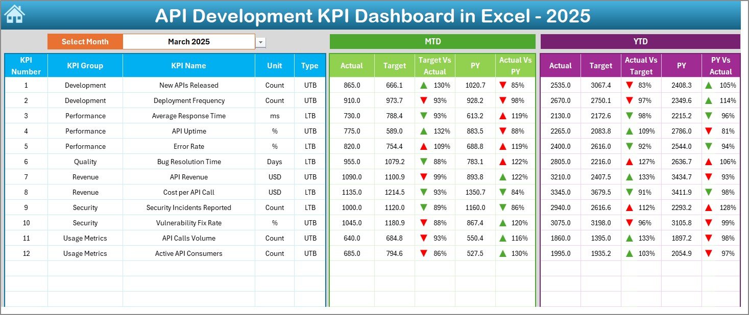
This sheet works as the core of the system.
What Makes This Sheet Powerful?
On cell D3, you can select the Month from a drop-down list. Once you select the month:
-
All MTD values update automatically
-
All YTD values update automatically
-
Target vs Actual recalculates
-
Previous Year comparisons update instantly
What Metrics Does the Dashboard Show?
For each KPI, you see:
-
MTD Actual
-
MTD Target
-
MTD Previous Year
-
Target vs Actual (with up/down arrows)
-
PY vs Actual (with up/down arrows)
-
YTD Actual
-
YTD Target
-
YTD Previous Year
-
YTD Target vs Actual
-
YTD PY vs Actual
Because of conditional formatting arrows, you instantly know:
-
Green arrow → Performance improving
-
Red arrow → Performance declining
Therefore, leaders can make faster decisions.
3️⃣ KPI Trend Sheet – Deep Analysis View
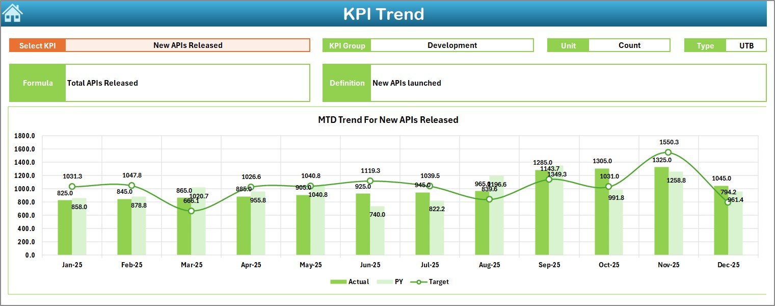
While the Dashboard gives summary insights, the KPI Trend Sheet offers detailed KPI analysis.
How Does It Work?
On cell C3, you select a KPI name from the drop-down.
Once selected, the sheet displays:
-
KPI Group
-
Unit of KPI
-
KPI Type (Lower the Better or Upper the Better)
-
KPI Formula
-
KPI Definition
In addition, it shows:
-
MTD Trend Chart (Actual vs Target vs PY)
-
YTD Trend Chart (Actual vs Target vs PY)
Therefore, you can analyze performance patterns over months.
For example:
-
If API Availability drops in March and April, you can investigate server capacity.
-
If Deployment Frequency increases steadily, you confirm DevOps improvement.
Thus, this sheet supports strategic analysis.
Click to Purchases API Development KPI Dashboard in Excel
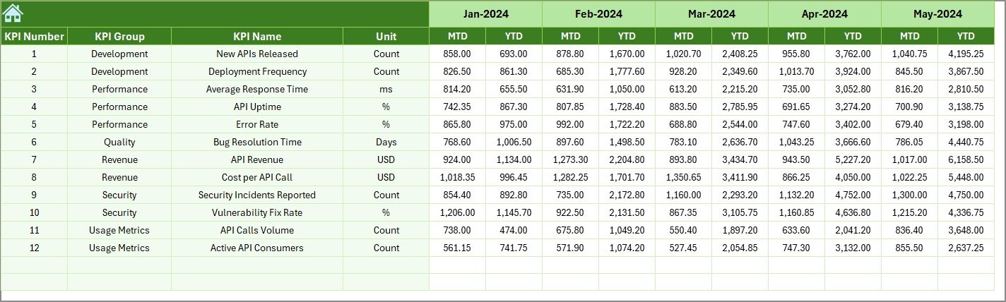
4️⃣ Actual Numbers Input Sheet – Data Entry Section
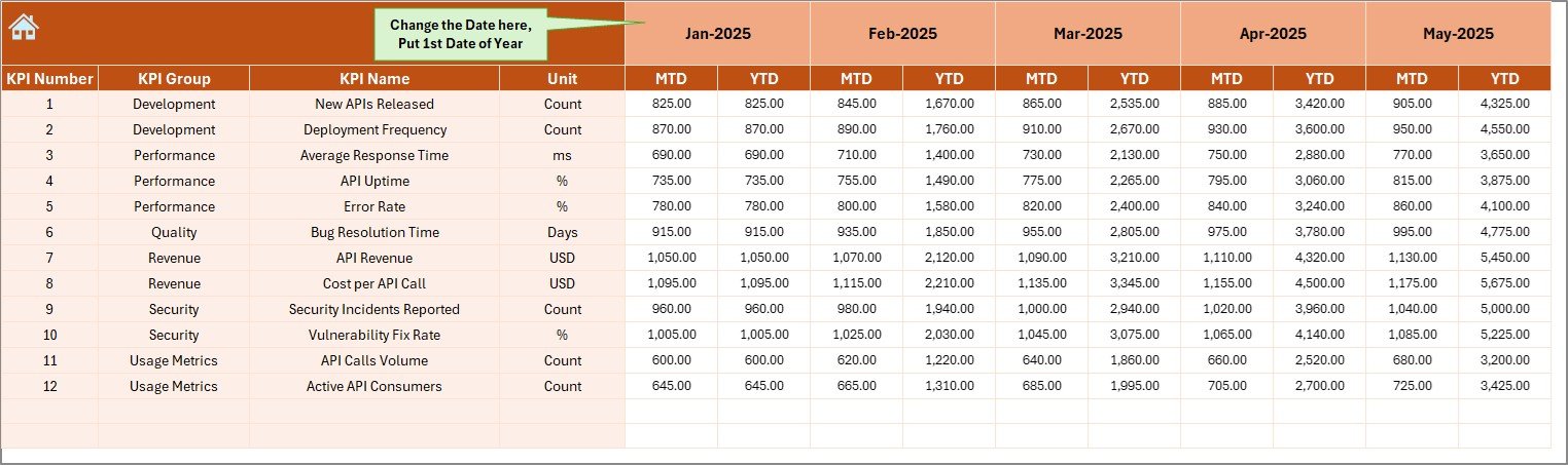
This sheet stores current year actual performance data.
How to Use It?
-
Enter the first month of the year in cell E1.
-
Change the month from cell E1 when needed.
-
Enter MTD and YTD values for each KPI.
Because this sheet drives the dashboard, you must update it carefully.
Moreover, structured data entry ensures accurate reporting.
5️⃣ Target Sheet – Performance Benchmarks
The Target Sheet contains:
-
Monthly MTD targets
-
Monthly YTD targets
Here, you enter target numbers for each KPI.
For example:
-
API Uptime Target → 99.9%
-
Average Response Time Target → 250ms
-
Error Rate Target → Below 1%
Once entered, the dashboard compares actual vs target automatically.
Therefore, you can track goal achievement clearly.
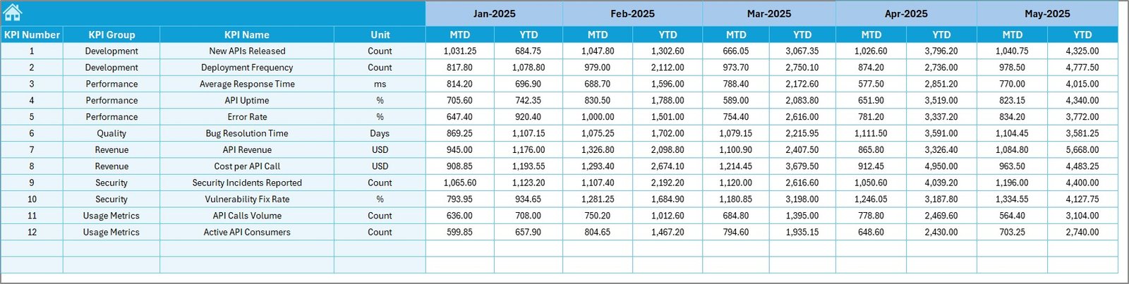
6️⃣ Previous Year Numbers Sheet – Historical Comparison
This sheet stores last year’s data.
Why does this matter?
Because performance improvement depends on comparison.
For example:
-
If YTD API Traffic increased 30% compared to last year, you show growth.
-
If Security Incidents reduced by 40%, you prove stability.
Thus, year-over-year comparison builds context.
7️⃣ KPI Definition Sheet – KPI Documentation Center
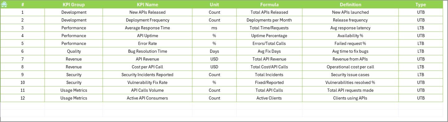
This sheet defines each KPI clearly.
It includes:
-
KPI Name
-
KPI Group
-
Unit
-
Formula
-
KPI Definition
Because every team member reads KPIs differently, documentation ensures consistency.
For example:
-
API Error Rate = (Failed Requests / Total Requests) × 100
-
Deployment Success Rate = (Successful Deployments / Total Deployments) × 100
Therefore, confusion reduces significantly.
Click to Purchases API Development KPI Dashboard in Excel
What KPIs Can You Track in an API Development Dashboard?
You can track several technical and operational KPIs such as:
-
API Response Time
-
API Uptime %
-
Error Rate %
-
Throughput (Requests per second)
-
Deployment Frequency
-
Deployment Success Rate
-
Mean Time to Recovery (MTTR)
-
Security Incident Count
-
API Adoption Rate
-
Documentation Coverage %
Because these KPIs cover performance, reliability, and adoption, they give a complete picture.
Advantages of API Development KPI Dashboard in Excel
Now let us explore the key advantages.
1️⃣ Centralized Performance Tracking
Instead of multiple sheets, you get one structured system. As a result, reporting becomes simple.
2️⃣ Real-Time Monthly Analysis
Since you select the month from D3, you instantly switch reports. Therefore, meetings become more efficient.
3️⃣ MTD and YTD Visibility
Many teams track only monthly data. However, this dashboard tracks both short-term and long-term performance.
4️⃣ Target vs Actual Monitoring
Because you compare targets clearly, you identify gaps quickly.
5️⃣ Previous Year Comparison
Year-over-year analysis shows improvement trends. Consequently, you measure growth accurately.
6️⃣ No Complex Tools Required
Excel remains widely used. Therefore, you avoid expensive software.
7️⃣ Professional Reporting
Conditional formatting arrows make the dashboard executive-friendly.
Best Practices for the API Development KPI Dashboard
To get maximum value, follow these best practices.
1️⃣ Define Clear KPIs First
Do not track too many KPIs. Instead, focus on:
-
Performance
-
Reliability
-
Security
-
Adoption
2️⃣ Update Data Regularly
Update Actual and Target sheets monthly. Otherwise, reports become outdated.
3️⃣ Validate Data Before Entry
Check data accuracy. Because wrong inputs lead to wrong insights.
4️⃣ Review Trends, Not Just Numbers
Do not focus only on one month. Instead, analyze trends from the KPI Trend sheet.
5️⃣ Align KPIs with Business Goals
If your company focuses on scalability, then prioritize throughput and uptime.
6️⃣ Conduct Monthly KPI Review Meetings
Use the Dashboard sheet during meetings. Discuss:
-
Target missed KPIs
-
Improving metrics
-
Action plans
7️⃣ Keep KPI Definitions Updated
When you modify formulas, update the KPI Definition sheet immediately.
How Does This Dashboard Improve Decision-Making?
This dashboard improves decision-making because:
-
It shows performance clearly.
-
It highlights underperforming KPIs quickly.
-
It supports monthly review meetings.
-
It provides historical context.
Therefore, leaders move from reactive management to proactive management.
Conclusion
API performance directly impacts application success. However, without structured tracking, teams struggle to measure progress.
The API Development KPI Dashboard in Excel solves this problem.
It provides:
-
Centralized tracking
-
MTD and YTD reporting
-
Target comparison
-
Previous year comparison
-
Trend analysis
-
Clear KPI definitions
As a result, API teams gain clarity, control, and confidence.
If you want structured performance monitoring without complexity, this ready-to-use Excel dashboard becomes your ideal solution.
Frequently Asked Questions with Answers
1️⃣ What is the main purpose of the API Development KPI Dashboard in Excel?
It helps API teams track performance metrics like response time, uptime, error rate, and deployment success rate in a structured and visual way.
2️⃣ Can I customize the KPIs in the dashboard?
Yes. You can edit the KPI Definition sheet and update formulas according to your requirements.
3️⃣ Does the dashboard support both MTD and YTD reporting?
Yes. It shows both Month-To-Date and Year-To-Date metrics automatically.
4️⃣ How do I change the reporting month?
You can select the month from the drop-down in cell D3 on the Dashboard sheet.
5️⃣ Is this dashboard suitable for DevOps teams?
Yes. DevOps teams can track deployment frequency, failure rate, and MTTR using this dashboard.
6️⃣ Do I need advanced Excel knowledge to use it?
No. Since it is ready-to-use, you only need basic Excel knowledge for data entry.
7️⃣ Can I present this dashboard to management?
Yes. The clean layout and conditional formatting make it ideal for executive presentations.
Visit our YouTube channel to learn step-by-step video tutorials