In today’s competitive world, architecture and design teams handle multiple projects across different regions, departments, and clients. Tracking all this data manually can be challenging and time-consuming. That’s why you need a smart, visual, and interactive tool — the Architecture & Design Dashboard in Excel.
This dashboard is a ready-to-use Excel template that helps professionals monitor project progress, analyze departmental performance, and compare actual costs with budgets — all in one place. It turns raw data into meaningful insights through colorful charts, slicers, and KPIs that make decision-making faster and smarter.
Click to Purchases Architecture & Design Dashboard in Excel
Let’s explore how this dashboard works, its structure, features, benefits, and best practices for using it effectively.
What Is the Architecture & Design Dashboard in Excel?
The Architecture & Design Dashboard in Excel is a digital reporting solution designed to track key performance indicators (KPIs) for architectural and design projects.
It helps project managers, designers, and executives visualize performance metrics like:
-
Project completion rates
-
Budget versus actual cost
-
On-track and delayed project counts
-
Department and regional analysis
Instead of navigating through scattered sheets or complex software, you get a clean, interactive Excel workbook where every page focuses on a specific aspect of your organization’s performance.
This dashboard offers a data-driven foundation for better project tracking, budgeting, and resource allocation.
Structure of the Dashboard
The Architecture & Design Dashboard includes five main analytical pages and a support sheet.
Each page focuses on a specific area of analysis, making navigation intuitive and insights easy to find.
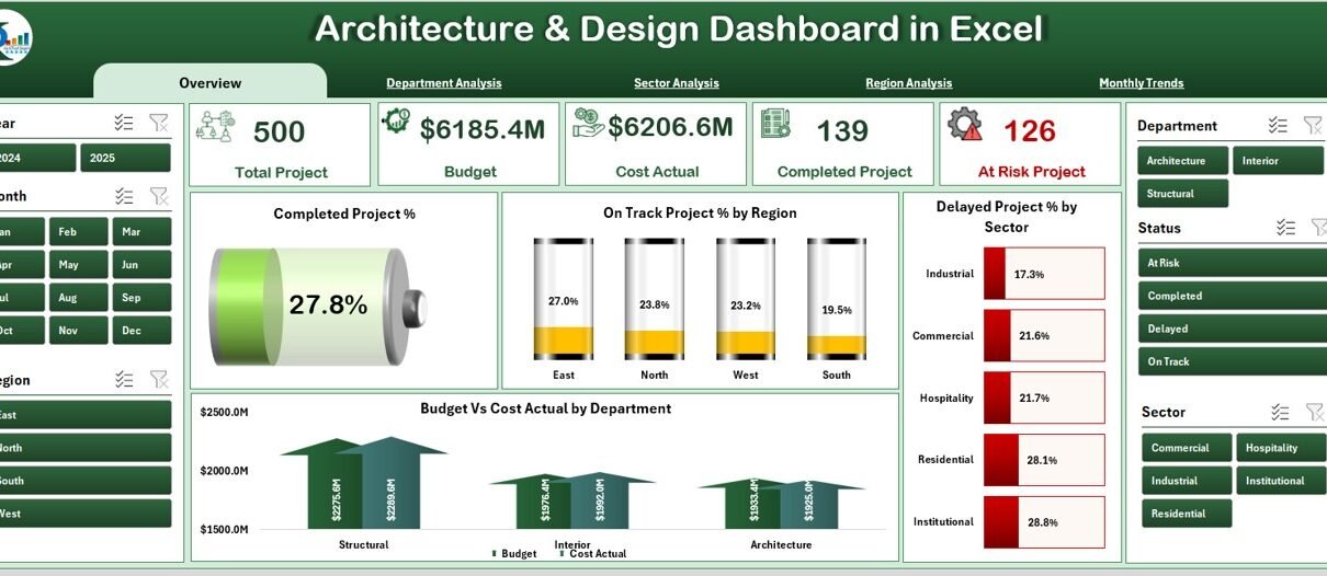
Overview Page
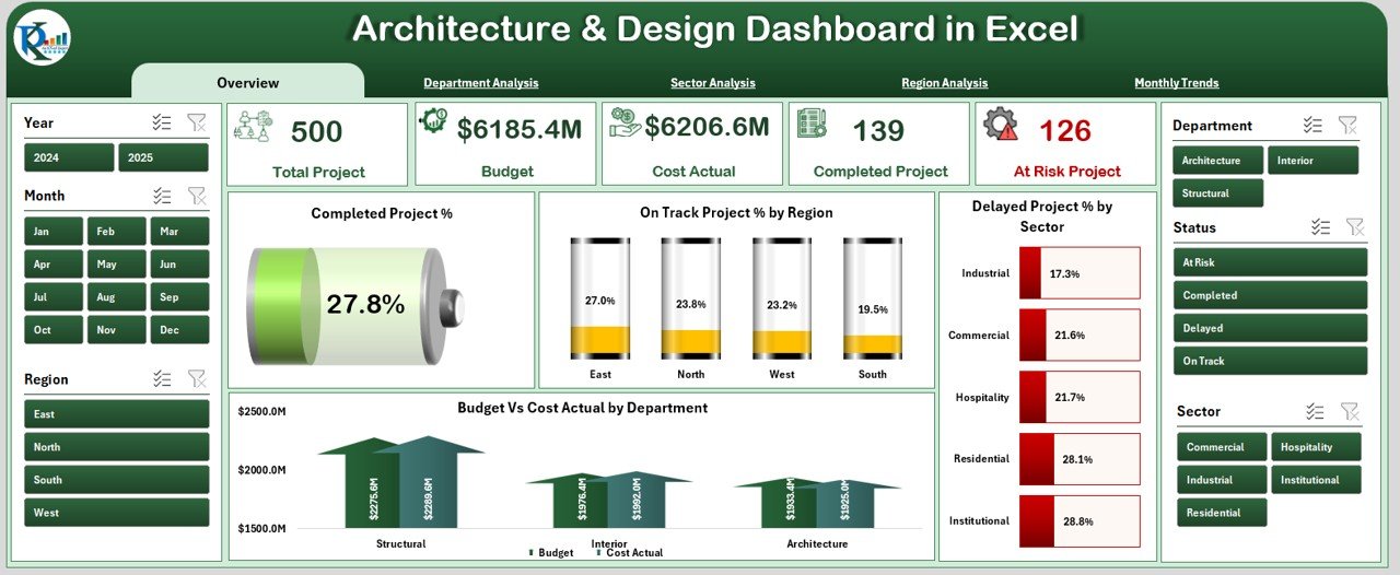
The Overview Page serves as the main control center of the dashboard.
It includes a left-side page navigator for quick access to other sheets and five key cards that summarize performance indicators.
On this page, you’ll find:
✅ Completed Project % — shows the overall project completion ratio.
📊 On-Track Project % by Region — highlights regional efficiency.
⏳ Delayed Project % by Sector — identifies sectors where timelines slip.
💰 Budget vs Cost Actual by Department — compares planned vs actual spending.
With just a glance, stakeholders can assess overall performance across departments, regions, and sectors.
Department Analysis
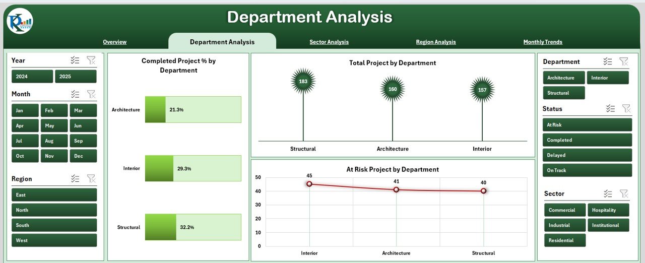
The Department Analysis page provides deeper insights into each department’s performance.
It includes:
-
Completed Project % by Department — evaluates departmental productivity.
-
Total Project by Department — tracks workload and project volume.
-
At-Risk Projects by Department — flags potential issues early.
A slicer on the right side allows users to filter data by department, project status, or time period.
This makes it easy to identify which departments need more resources or process improvements.
Click to Purchases Architecture & Design Dashboard in Excel
Sector Analysis
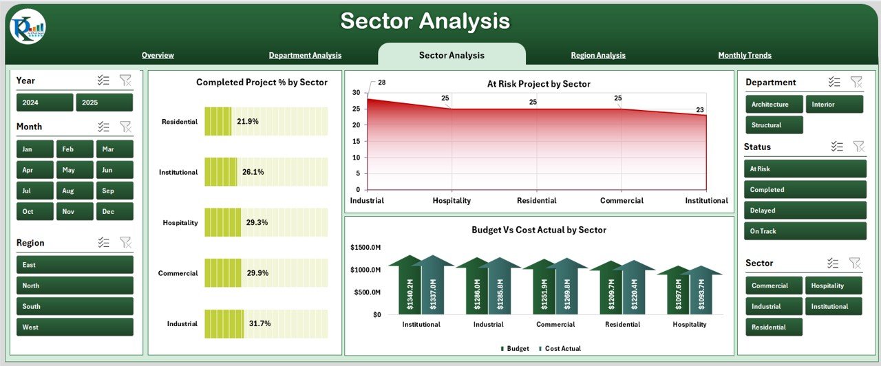
Architecture firms often work across different sectors like residential, commercial, industrial, and government projects.
The Sector Analysis page focuses on evaluating project health and performance within each sector.
It includes the following visualizations:
-
Completed Project % by Sector — measures delivery success rates.
-
At-Risk Project % by Sector — highlights sectors facing execution challenges.
-
Budget vs Cost Actual by Sector — helps compare financial efficiency across sectors.
This section allows leadership to decide which sectors bring consistent success and which require strategic adjustments.
Region Analysis
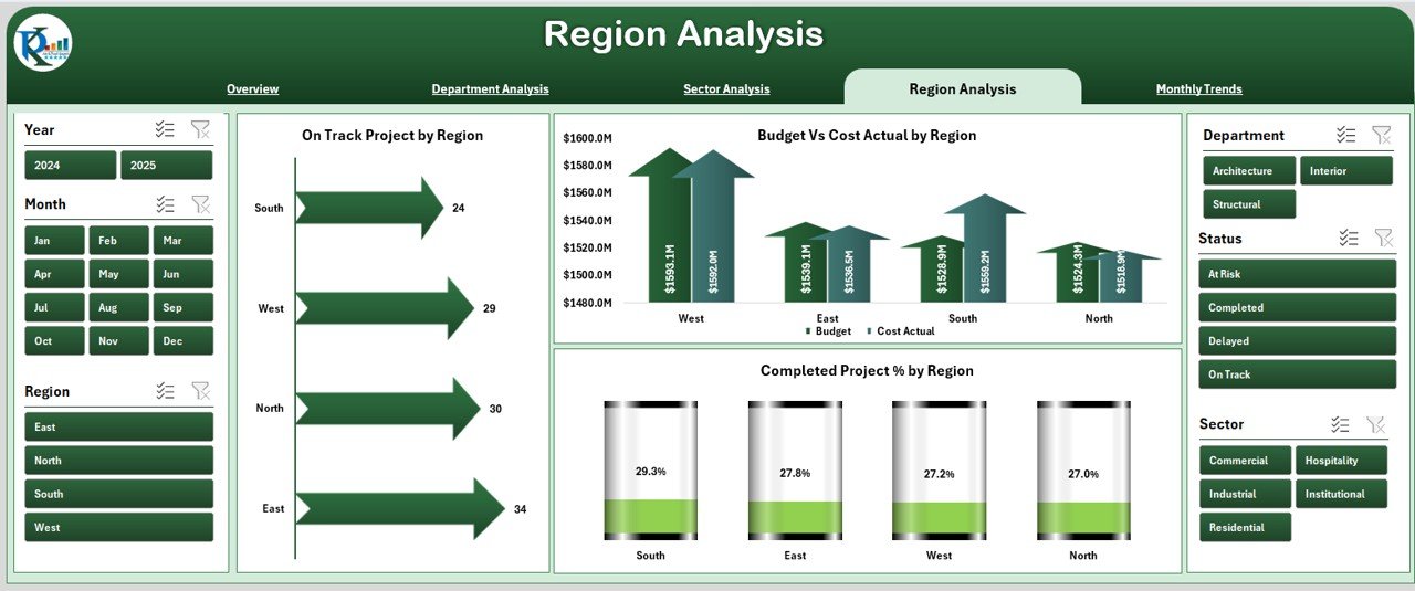
For firms working across multiple locations or regions, this section provides valuable geographic insights.
The Region Analysis page features:
-
On-Track Project % by Region — evaluates timeliness and progress.
-
Budget vs Cost Actual by Region — compares financial performance by region.
-
Completed Project % by Region — shows the percentage of completed projects regionally.
With these charts, you can quickly identify which regions deliver on time and within budget — and where intervention is needed.
Monthly Trends
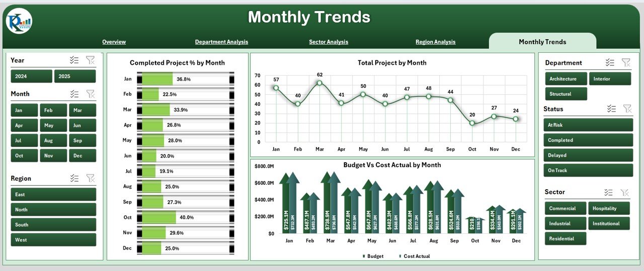
Trends over time are critical to understanding performance patterns.
The Monthly Trends page in the dashboard presents time-based analysis to uncover such insights.
It includes:
-
Completed Project % by Month — helps track progress trends.
-
Total Project by Month — displays workload distribution across months.
-
Budget vs Cost Actual by Month — shows monthly cost management performance.
The page slicer enables filtering by department, sector, or region to focus on specific data trends.
This view helps leadership plan future projects and allocate resources based on seasonal or workload fluctuations.
Support Sheet
The Support Sheet acts as the database and configuration section of the dashboard.
It stores master lists, data validation items, and formulas that keep the dashboard running smoothly.
This sheet is hidden from general users to protect formulas but remains accessible for administrators who update data.
Key Features of the Architecture & Design Dashboard in Excel
Here’s a quick summary of the most useful features:
🧭 Page Navigator – jump between analysis pages instantly.
📈 Interactive Charts – visualize KPIs with dynamic graphs and comparisons.
🧩 Slicers and Filters – view data by month, region, or department.
💡 Conditional Formatting – track performance using visual indicators like green (good), yellow (moderate), and red (needs attention).
🧾 Budget vs Actual Analysis – compare spending patterns to improve cost efficiency.
🕒 Monthly and YTD (Year-to-Date) Views – monitor short-term and long-term performance.
🔐 Support Sheet – maintain consistent data without affecting dashboard visuals.
Why Every Architecture and Design Firm Needs This Dashboard
Modern architectural projects involve tight budgets, strict deadlines, and multiple teams.
Managing this complexity with standard spreadsheets or manual tracking can cause delays and cost overruns.
The Architecture & Design Dashboard in Excel solves these challenges by:
-
Providing real-time project visibility.
-
Streamlining departmental and regional comparisons.
-
Helping teams identify at-risk projects early.
-
Making financial management transparent and measurable.
Whether you’re running a small design studio or a large architecture firm, this dashboard helps you move from guesswork to data-driven decision-making.
How to Use the Dashboard Effectively
Follow these steps to get the most out of your Architecture & Design Dashboard:
-
Input Data in the Support Sheet:
Enter project details, budgets, and actual costs in structured tables. -
Refresh the Pivot Tables:
After adding new data, refresh all pivot tables to update visualizations. -
Use the Page Navigator:
Click on navigation buttons to move between pages quickly. -
Apply Filters or Slicers:
Use slicers to analyze performance by department, region, or month. -
Interpret the Charts:
Identify trends such as increased delays, rising costs, or improved completion rates. -
Take Action:
Use these insights to make decisions about staffing, budgets, or timelines.
Advantages of the Architecture & Design Dashboard in Excel
The dashboard provides numerous benefits that help architectural firms stay organized, informed, and efficient.
🎯 1. Centralized Data Management
All project data stays in one place — no more juggling between multiple spreadsheets. This structure ensures consistency and accuracy.
💹 2. Visual Project Tracking
Charts and KPIs turn data into visuals that are easy to understand, helping teams spot trends or problems instantly.
🕒 3. Real-Time Insights
With monthly and YTD comparisons, leaders can analyze performance trends and make quick decisions based on live data.
💰 4. Financial Transparency
Budget vs actual cost analysis highlights overspending and helps maintain financial control across departments and sectors.
🔍 5. Better Resource Allocation
Department and region analysis make it easier to assign resources where they matter most, improving productivity.
🧠 6. Informed Decision-Making
Managers can confidently plan next steps using real insights rather than assumptions.
Opportunities for Improvement
Even though this dashboard is powerful, there are areas where users can enhance functionality further:
🔄 Automate Data Entry: Link Excel with project management tools or databases for live updates.
📧 Add Notification Alerts: Set conditional alerts for delayed projects or overspending.
☁️ Integrate Cloud Storage: Host the file on OneDrive or SharePoint for multi-user access.
📅 Add Forecasting Models: Use Excel formulas or Power Query for predictive trends.
-
🧾 Include Project Details Pop-Ups: Add hyperlinks or buttons for detailed reports.
These small upgrades can turn a static dashboard into a live project intelligence system.
Best Practices for Using the Architecture & Design Dashboard
Follow these proven tips to maintain accuracy and efficiency:
✅ Update Data Weekly: Keep information current to maintain reliability.
✅ Standardize Data Entry: Use consistent project names and categories.
✅ Back Up the Dashboard Regularly: Prevent data loss during updates.
✅ Use Clear Naming Conventions: Label sheets and charts clearly.
✅ Protect Formulas: Lock critical cells to avoid accidental edits.
✅ Train Users: Ensure every team member understands how to use filters, slicers, and navigation buttons.
✅ Review Trends Monthly: Discuss performance metrics in monthly meetings for continuous improvement.
Real-World Use Cases
Here are some practical ways teams use the Architecture & Design Dashboard:
-
Project Managers: Track project progress and financial health.
-
Design Leads: Compare departmental performance and allocate resources.
-
Finance Teams: Monitor budget utilization and highlight cost deviations.
-
Executives: Review overall firm performance in a single visual snapshot.
-
Clients: Share progress updates visually without exposing backend data.
How This Dashboard Enhances Business Efficiency
This Excel-based solution goes beyond standard spreadsheets.
It introduces automation, visualization, and strategic focus into daily project monitoring.
With minimal setup, it delivers:
-
Instant data-driven reports
-
Clear visualizations of KPIs
-
Reduced manual errors
-
Improved collaboration between departments
Over time, using this dashboard helps firms deliver projects faster, control costs better, and improve client satisfaction.
Why Use Excel for Architecture Dashboards?
While many project management tools exist, Excel remains a universal and affordable choice for architecture and design firms.
Here’s why:
-
It’s accessible to everyone — no extra software needed.
-
It supports customization with formulas, charts, and pivot tables.
-
It allows integration with Power Query and Power BI for future scalability.
-
It’s lightweight and flexible, ideal for small to mid-sized teams.
Thus, Excel provides the perfect balance between simplicity, control, and analytical power.
Future Enhancements You Can Add
As your organization grows, you can scale this dashboard easily.
Here are some optional features you may add later:
-
Power BI Integration for advanced visual storytelling.
-
Macros or VBA Automation for data refresh and navigation.
-
Performance Forecast Models using regression or moving averages.
-
Role-based Access Controls for data security.
-
Dashboard Theme Customization to match company branding.
Conclusion
The Architecture & Design Dashboard in Excel is more than just a spreadsheet — it’s a strategic decision-support tool for architecture and design firms.
It converts raw data into meaningful insights, simplifies reporting, and helps teams make informed choices.
With its powerful visuals, interactive features, and clear structure, this dashboard transforms how you track performance, manage budgets, and deliver results.
Whether you’re managing a few design projects or hundreds across multiple regions, this Excel dashboard offers the clarity and confidence you need to achieve operational excellence.
Frequently Asked Questions (FAQs)
1. What is the Architecture & Design Dashboard in Excel?
It’s an interactive Excel template designed to monitor architectural and design project KPIs like completion %, delays, budgets, and departmental performance.
2. Who can use this dashboard?
Project managers, architects, designers, finance analysts, and executives can all benefit from using this tool to track performance and financial metrics.
3. Is the dashboard easy to customize?
Yes, you can edit sheet names, update KPIs, and add company branding or colors easily.
4. Does this dashboard require coding knowledge?
No, it’s completely Excel-based. You can use formulas, slicers, and charts without any coding or VBA.
5. How often should I update the data?
It’s best to update project and cost data weekly or monthly to maintain accurate insights.
6. Can I link this dashboard to live data sources?
Yes, using Power Query or Excel’s data connection tools, you can link it to external databases or project management software.
7. Is this template suitable for beginners?
Absolutely. It’s designed with simplicity and usability in mind, even for users with basic Excel knowledge.
8. Can I use this dashboard for client reporting?
Yes, the visual layout and charts make it perfect for sharing updates with clients or management teams.
Visit our YouTube channel to learn step-by-step video tutorials