Bridge construction projects require precise planning, strict monitoring, and continuous performance tracking. However, many construction companies still rely on scattered spreadsheets and manual reports. As a result, project managers often struggle to analyze performance metrics, monitor progress, and identify operational issues in time.
Therefore, organizations increasingly adopt business intelligence tools like Power BI to manage construction performance more effectively. A well-designed dashboard helps teams visualize data, analyze key performance indicators, and make faster decisions.
That is exactly where the Bridge Construction KPI Dashboard in Power BI becomes an essential analytical solution.
This ready-to-use Power BI dashboard allows infrastructure teams to monitor key performance indicators such as project progress, cost efficiency, safety performance, and operational productivity. Instead of reviewing multiple reports manually, managers can evaluate bridge construction KPIs through one interactive dashboard.
In this comprehensive guide, you will learn:
-
What a Bridge Construction KPI Dashboard in Power BI is
-
Why construction projects require KPI dashboards
-
Key features of this Power BI dashboard
-
Advantages of using the dashboard
-
Best practices for implementation
-
Frequently asked questions
Let’s explore everything step by step.
Click to Purchases Bridge Construction KPI Dashboard in Power BI
What Is a Bridge Construction KPI Dashboard in Power BI?
A Bridge Construction KPI Dashboard in Power BI is an interactive data visualization tool designed to track key performance indicators related to bridge construction projects.
Instead of manually reviewing multiple project reports, the dashboard consolidates KPI data into a centralized visual interface. As a result, project managers, engineers, and infrastructure teams can monitor performance quickly and accurately.
The dashboard displays important construction metrics such as:
-
Project progress
-
Budget performance
-
Productivity levels
-
Safety indicators
-
Target vs actual performance
-
Year-over-year comparison
Moreover, Power BI provides powerful visualization features such as interactive charts, KPI indicators, slicers, and drill-through analysis. Consequently, construction teams gain deeper insights into project performance.
Because the dashboard uses Excel as the data source, organizations can easily update the KPI data while Power BI automatically refreshes the visual reports.
Click to Purchases Bridge Construction KPI Dashboard in Power BI
Why Do Bridge Construction Projects Need KPI Dashboards?
Bridge construction projects involve multiple teams, large budgets, and strict deadlines. Therefore, project managers must track performance indicators carefully.
Without a structured monitoring system, construction projects often face:
-
Project delays
-
Budget overruns
-
Resource mismanagement
-
Low productivity
-
Safety incidents
However, KPI dashboards help organizations monitor project performance in a clear and structured way.
For example, the Bridge Construction KPI Dashboard in Power BI allows managers to:
-
Monitor KPIs in real time
-
Compare actual results with targets
-
Identify risks early
-
Improve project transparency
-
Make data-driven decisions
As a result, organizations can improve project efficiency and deliver infrastructure projects successfully.
Click to Purchases Bridge Construction KPI Dashboard in Power BI
Key Features of the Bridge Construction KPI Dashboard in Power BI
This ready-to-use dashboard includes several powerful features that help infrastructure teams track project performance efficiently.
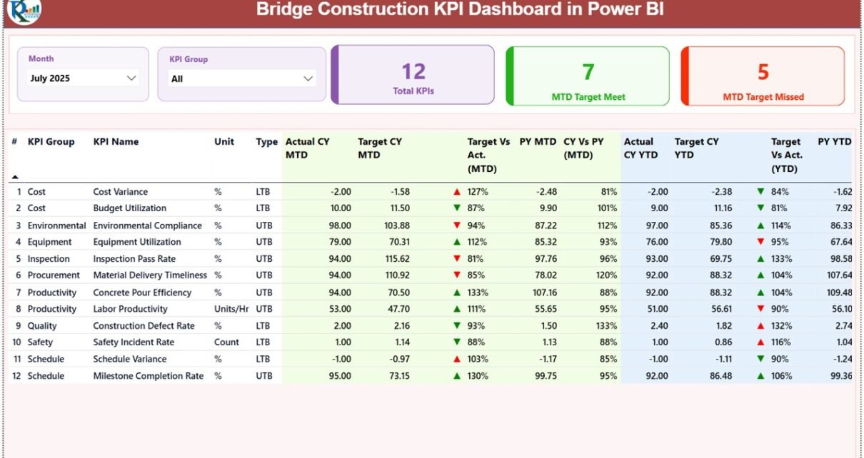
The dashboard contains three pages inside the Power BI Desktop application.
1. Summary Page – Main Performance Monitoring Page
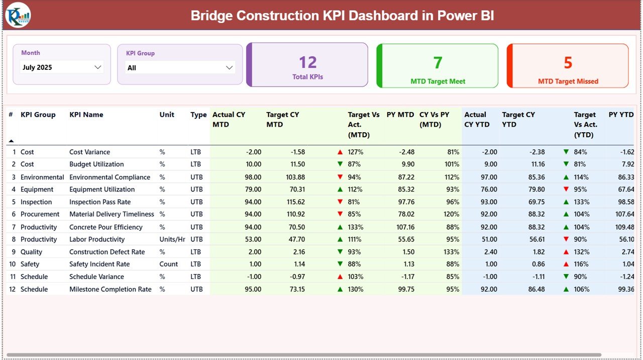
The Summary Page serves as the central analytics page of the dashboard.
Here users can quickly review overall bridge construction performance.
Interactive Filters
At the top of the dashboard, two slicers allow users to filter the data easily:
-
Month Slicer
-
KPI Group Slicer
Therefore, users can analyze specific months or KPI categories instantly.
KPI Performance Cards
The dashboard displays three important KPI cards:
-
Total KPIs Count
-
MTD Target Meet Count
-
MTD Target Missed Count
These cards provide a quick overview of KPI performance.
For example, managers can instantly see how many KPIs meet targets and how many miss targets.
Detailed KPI Performance Table
Below the KPI cards, the dashboard displays a detailed KPI performance table.
The table contains the following fields:
KPI Number
This field shows the sequence number of the KPI.
KPI Group
This identifies the category of the KPI such as productivity, safety, cost, or operational performance.
KPI Name
This column displays the specific name of the performance indicator.
Unit
This shows the measurement unit used for the KPI.
KPI Type
This field defines whether the KPI follows:
-
LTB – Lower the Better
-
UTB – Upper the Better
MTD Performance Indicators
The dashboard tracks Month-to-Date (MTD) performance.
The following metrics appear in the table:
-
Actual CY MTD – Current year actual value for the month
-
Target CY MTD – Target value for the month
MTD Icon Indicator
The dashboard shows visual icons:
-
▲ Green arrow for positive performance
-
▼ Red arrow for negative performance
Therefore, managers can instantly understand KPI status.
Target vs Actual (MTD)
This metric shows the performance percentage calculated using the formula:
Actual MTD / Target MTD
As a result, users can easily evaluate whether performance meets targets.
Previous Year Comparison (MTD)
The dashboard also compares current performance with historical data.
The following fields appear:
-
PY MTD – Previous year performance for the same period
-
CY vs PY (MTD) – Comparison percentage between current year and previous year
This comparison helps teams analyze long-term performance improvements.
YTD Performance Monitoring
In addition to monthly tracking, the dashboard also monitors Year-to-Date (YTD) performance.
The table displays the following metrics:
-
Actual CY YTD
-
Target CY YTD
YTD Performance Indicator
Similar to MTD metrics, the dashboard shows visual indicators:
-
▲ Green arrow for strong performance
-
▼ Red arrow for weak performance
Target vs Actual (YTD)
This metric compares actual performance with the target.
Formula used:
Actual YTD / Target YTD
This helps teams evaluate yearly project performance.
Previous Year Comparison (YTD)
The dashboard also includes historical comparison:
-
PY YTD – Previous year YTD performance
-
CY vs PY (YTD) – Current year vs previous year comparison
As a result, project managers can understand long-term performance trends.
Click to Purchases Bridge Construction KPI Dashboard in Power BI
2. KPI Trend Page – Performance Trend Analysis
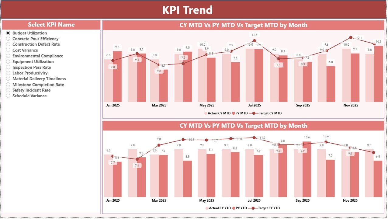
The KPI Trend Page helps users analyze KPI performance trends over time.
This page includes two powerful combo charts.
These charts display:
-
Current year actual values
-
Previous year actual values
-
Target values
Trend Analysis for MTD
The first chart shows Month-to-Date trends.
Users can evaluate whether KPI performance improves or declines during the year.
Trend Analysis for YTD
The second chart displays Year-to-Date performance trends.
Therefore, managers can analyze overall project performance growth.
KPI Selection Slicer
On the left side of the page, a KPI Name slicer allows users to select a specific KPI.
Once selected, the dashboard automatically updates the charts.
Consequently, managers can analyze detailed performance trends for any KPI.
Click to Purchases Bridge Construction KPI Dashboard in Power BI
3. KPI Definition Page – Drill-Through KPI Details
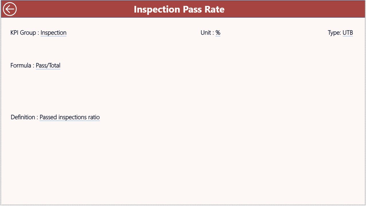
The KPI Definition Page provides detailed information about each KPI.
This page remains hidden and works as a drill-through page.
Users can access it directly from the Summary page.
KPI Information Available on This Page
The page displays detailed KPI information such as:
-
KPI Formula
-
KPI Definition
-
KPI Group
-
KPI Unit
-
KPI Type
Because this page provides detailed KPI explanations, users can understand performance metrics more clearly.
Navigation
Users can easily return to the main page by clicking the Back Button located in the top left corner.
Therefore, navigation inside the dashboard remains smooth and user-friendly.
Excel Data Source Used in This Dashboard
The Power BI dashboard uses Excel as the data source.
The Excel file contains three worksheets where users enter data.
1. Input_Actual Sheet
In this worksheet, users enter actual KPI performance numbers.
Required fields include:
-
KPI Name
-
Month (first date of the month)
-
MTD value
-
YTD value
Once users enter the data, Power BI automatically updates the dashboard.
2. Input_Target Sheet
This worksheet stores KPI target values.
Users enter:
-
KPI Name
-
Month
-
Target MTD value
-
Target YTD value
These targets help compare expected performance with actual results.
3. KPI Definition Sheet
The KPI Definition Sheet contains the master information for all KPIs.
Users enter the following fields:
-
KPI Number
-
KPI Group
-
KPI Name
-
Unit
-
Formula
-
Definition
-
KPI Type (LTB or UTB)
Because all KPI details remain centralized, the dashboard becomes easier to maintain and update.
Click to Purchases Bridge Construction KPI Dashboard in Power BI
Advantages of Bridge Construction KPI Dashboard in Power BI
Organizations gain several benefits when they use this dashboard.
1. Centralized Performance Monitoring
The dashboard consolidates all KPI data into one visual interface.
Therefore, project managers can review performance without searching through multiple reports.
2. Powerful Data Visualization
Power BI provides advanced visualizations such as:
-
KPI cards
-
Interactive tables
-
Combo charts
-
Drill-through analysis
As a result, users understand data faster.
3. Real-Time Insights
Once Excel data updates, Power BI refreshes the dashboard automatically.
Therefore, managers can monitor project performance in real time.
4. Improved Decision Making
Clear data visualization allows managers to identify risks early.
Consequently, teams can take corrective action before problems grow.
5. Easy Performance Comparison
The dashboard compares:
-
Target vs Actual
-
Current Year vs Previous Year
-
MTD vs YTD performance
These comparisons provide deeper insights into project performance.
Click to Purchases Bridge Construction KPI Dashboard in Power BI
Best Practices for the Bridge Construction KPI Dashboard
To maximize the benefits of the dashboard, organizations should follow several best practices.
1. Define Relevant KPIs
Select KPIs that directly measure construction performance.
Examples include:
-
Construction completion rate
-
Cost variance
-
Safety incident rate
-
Equipment utilization
-
Labor productivity
2. Update Data Regularly
Teams should update Excel data frequently.
Regular updates ensure accurate reporting.
3. Use Trend Analysis
Instead of focusing on single values, managers should analyze KPI trends.
Trend analysis provides better performance insights.
4. Train Team Members
Organizations should train employees to interpret dashboard data correctly.
Training improves decision-making accuracy.
5. Integrate the Dashboard into Project Reviews
Project managers should use the dashboard during:
-
Weekly project reviews
-
Monthly performance meetings
-
Strategic planning sessions
This ensures consistent performance monitoring.
Conclusion
Bridge construction projects require continuous monitoring, efficient resource management, and accurate performance tracking. However, manual reporting systems often slow down decision-making.
The Bridge Construction KPI Dashboard in Power BI provides a powerful solution to monitor infrastructure performance.
This dashboard allows project managers to:
-
Track KPI performance
-
Monitor project progress
-
Compare targets with actual results
-
Analyze historical performance
-
Identify risks early
Because the dashboard combines Power BI visual analytics with Excel data sources, organizations can easily manage and update project performance data.
Therefore, companies that adopt this dashboard can significantly improve construction efficiency, reduce project risks, and deliver successful infrastructure projects.
Click to Purchases Bridge Construction KPI Dashboard in Power BI
Frequently Asked Questions (FAQs)
What is a Bridge Construction KPI Dashboard?
A Bridge Construction KPI Dashboard is a performance monitoring system that tracks key metrics related to bridge construction projects such as productivity, cost efficiency, and safety performance.
Why should construction companies use Power BI dashboards?
Power BI dashboards help construction companies visualize performance data, monitor KPIs, and make faster data-driven decisions.
Can Power BI connect with Excel for KPI dashboards?
Yes, Power BI easily connects with Excel data sources. Users can update data in Excel and refresh the dashboard in Power BI.
Click to Purchases Bridge Construction KPI Dashboard in Power BI
Visit our YouTube channel to learn step-by-step video tutorials