Financial performance becomes clear when you track the right KPIs. The Debt-to-Equity Ratio is one of the most important financial indicators because it shows the stability and long-term strength of a business. When you track this KPI inside a powerful analytics tool like Power BI, you unlock deeper insights, faster decisions, and more control over your financial health.
In this article, you will learn everything about the Debt-to-Equity Ratio KPI Dashboard in Power BI, why companies use it, how each page works, and how to get the most out of it.
Let us explore all details step by step.
Click to Purchases Debt-to-Equity Ratio KPI Dashboard in Power BI
What Is a Debt-to-Equity Ratio KPI Dashboard in Power BI?
A Debt-to-Equity Ratio KPI Dashboard in Power BI is a ready-to-use financial dashboard that helps you monitor how much debt your business holds compared to shareholder equity. It uses Excel as the backend data source and Power BI for visualization and analysis.
Since Power BI presents the KPI visually, you understand your financial strength quickly, compare results across months, and track improvement over time.
You also navigate across KPI categories, monitor MTD and YTD trends, and analyze performance using built-in icons, charts, and slicers.
This dashboard works perfectly for finance managers, business analysts, startup founders, CFOs, and investors who want real-time insights about leverage and financial risk.
Why Is the Debt-to-Equity Ratio Important?
The Debt-to-Equity Ratio shows how much financing comes from lenders and how much comes from owners. Because of this, it becomes one of the strongest indicators of long-term stability.
The ratio helps you:
-
Measure financial risk
-
Compare leverage with previous years
-
Track how fast debt grows compared to equity
-
Understand whether you rely more on borrowing
-
Make better credit and investment decisions
Since Power BI updates data automatically, you get accurate and real-time insights without manual calculations.
Key Features of the Debt-to-Equity Ratio KPI Dashboard in Power BI
This dashboard includes 3 powerful pages, each designed to give specific insights with clarity and speed. All calculations use data stored in an Excel file with three input sheets:
Click to Purchases Debt-to-Equity Ratio KPI Dashboard in Power BI
-
Input_Actual
-
Input_Target
-
KPI Definition
Now, let us explore each page in detail.
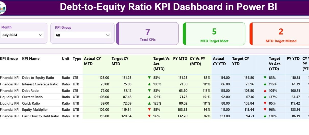
1. Summary Page: Your Main Financial Overview
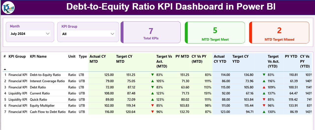
The Summary Page is the main landing page of the dashboard. It gives you a clear and structured view of all KPIs related to the Debt-to-Equity Ratio and other financial metrics.
Important elements of the Summary Page
✓ Month and KPI Group Slicer
You select the month or KPI group easily and instantly slice the entire dashboard.
✓ KPI Cards Section
You get three important cards:
-
Total KPIs Count
-
MTD Target Meet Count
-
MTD Target Miss Count
Because of these cards, you see overall performance at a glance.
✓ Detailed KPI Table
A detailed performance table gives complete clarity of every KPI. It includes:
-
KPI Number – Sequence number of the KPI
-
KPI Group – Category of the KPI
-
KPI Name – Metric name
-
Unit – Measurement unit
-
Type (LTB or UTB) – Lower the Better / Upper the Better
-
Actual CY MTD – Actual current-year Month-To-Date
-
Target CY MTD – Target current-year Month-To-Date
-
MTD Icon – ▲ or ▼ in color to show status
-
Target vs Actual (MTD) – % comparison
-
PY MTD – Previous Year Month-To-Date
-
CY vs PY (MTD) – % comparison
-
Actual CY YTD – Actual current-year Year-To-Date
-
Target CY YTD – Target current-year Year-To-Date
-
YTD Icon – ▲ or ▼ to show YTD performance
-
Target vs Actual (YTD) – % comparison
-
PY YTD – Previous Year YTD
-
CY vs PY (YTD) – % comparison
Since everything appears in one place, you understand financial performance in seconds.
2. KPI Trend Page: Visual Comparison of MTD and YTD
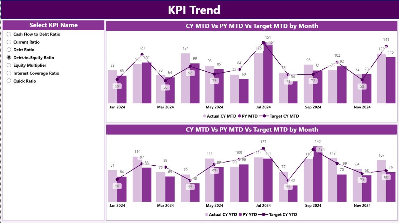
The KPI Trend Page helps you analyze how your Debt-to-Equity Ratio changes over months. You get two effective combo charts:
✓ MTD Trend Chart
Shows:
-
Current Year Actual
-
Target
-
Previous Year Actual
✓ YTD Trend Chart
Shows:
-
Current Year Actual
-
Target
-
Previous Year Actual
These charts help you track:
-
Monthly improvements
-
Long-term YTD growth
-
Target achievement
-
Performance gaps
-
Risk areas
KPI Name Slicer
On the left side, a slicer helps you select any KPI and instantly update the charts.
Because of these visuals, your financial decision-making becomes fast, accurate, and easy.
Click to Purchases Debt-to-Equity Ratio KPI Dashboard in Power BI
3. KPI Definition Page: Drill-Through for Understanding Metrics
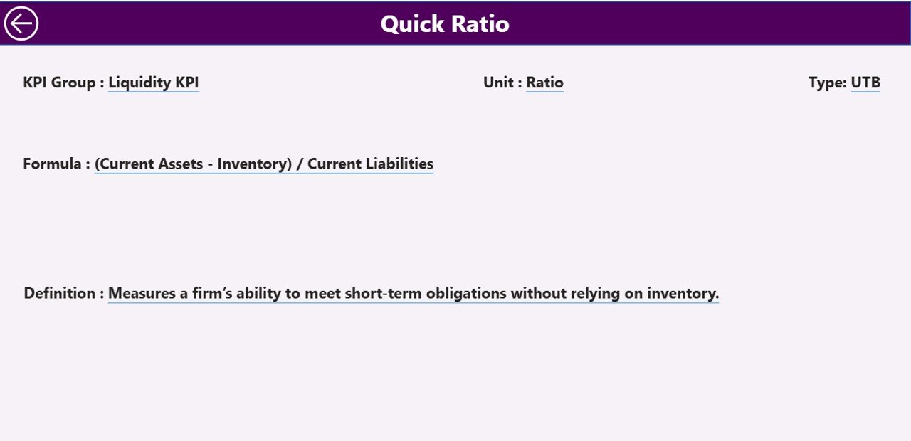
This page remains hidden because you access it through drill-through. When you click on any KPI in the Summary Page, you instantly view:
-
KPI Number
-
KPI Group
-
KPI Name
-
Unit
-
Formula
-
Definition
-
Type (LTB or UTB)
This creates transparency and helps new team members understand KPIs without confusion.
Back Button
A simple back button on the top-left corner takes you back to the Summary Page.
Excel Data Structure Behind the Dashboard
Your dashboard uses Excel as the data source. You fill data into three structured worksheets:
1. Input_Actual Sheet
You enter:
-
KPI Name
-
Month (use 1st date of month)
-
Actual MTD
-
Actual YTD
This sheet stores all actual values.
2. Input_Target Sheet
You enter:
-
KPI Name
-
Month (use 1st date of month)
-
Target MTD
-
Target YTD
This sheet stores all planned values.
3. KPI Definition Sheet
You enter:
-
KPI Number
-
KPI Group
-
KPI Name
-
Unit
-
Formula
-
Definition
-
Type (LTB or UTB)
These sheets work together and automatically update the Power BI visuals when you refresh.
How the Dashboard Helps You Analyze Debt-to-Equity More Effectively
This Power BI dashboard helps you perform deeper analysis using MTD, YTD, and PY comparisons.
You can analyze:
-
How fast the company adds new debt
-
How much equity growth offsets the debt
-
Whether leverage becomes risky
-
Whether performance beats or misses targets
-
How current results compare to previous years
-
How stable the business remains during the period
Since Power BI updates everything instantly, you avoid manual work and save hours every month.
Advantages of a Debt-to-Equity Ratio KPI Dashboard in Power BI
The dashboard gives many benefits that support better financial control and business planning.
1. Better Financial Visibility
You understand debt trends effortlessly and see how they impact your capital structure.
2. Faster Decision-Making
Since all calculations appear visually, finance teams take action faster.
3. Improved Target Tracking
MTD and YTD icons highlight performance instantly.
4. Easy Comparison with Last Year
You check whether leverage improves or increases over time.
5. Accurate, Real-Time Data
Power BI refreshes data from Excel in seconds.
6. Strong Support for Investors and Auditors
The dashboard gives clear reports for presentations, reviews, and audits.
7. Simple for New Users
The slicers, charts, and icons make the dashboard easy for anyone to use.
Best Practices for Using the Debt-to-Equity Ratio KPI Dashboard
You get the best results when you follow some essential guidelines.
1. Update Actual Numbers Frequently
Enter MTD and YTD values regularly to keep the dashboard fresh.
2. Maintain Consistent KPI Naming
Keep KPI names identical across all sheets to avoid errors.
3. Use the First Date of Every Month
This ensures alignment in Power BI charts.
4. Review Variances Daily
Monitor icon colors and variance percentages for early risk detection.
5. Compare CY vs PY Trends
This helps you track long-term stability.
6. Validate KPI Formulas
Check Definition and Formula fields in the KPI Definition sheet.
7. Use Drill-Through Frequently
It helps you understand KPIs deeply before making decisions.
8. Refresh the Dashboard After Every Update
Power BI works best when refreshed regularly.
Common Challenges and How This Dashboard Solves Them
❌ Manual calculations consume time
✔ The dashboard automates everything.
❌ Hard to compare many KPIs at once
✔ The Summary Page table shows all metrics together.
❌ Difficult to monitor monthly and yearly performance
✔ MTD and YTD values appear side-by-side.
❌ No quick way to analyze trends
✔ Trend charts solve this instantly.
Conclusion
The Debt-to-Equity Ratio KPI Dashboard in Power BI is a powerful tool for any organization that wants to improve financial health, monitor leverage, and make data-driven decisions with confidence. Because it includes slicers, KPI cards, trend charts, icons, and drill-through features, it becomes an advanced yet easy-to-use solution for both finance and leadership teams.
This dashboard saves time, improves accuracy, and ensures smarter financial planning. When you use it regularly, you gain a clear picture of risk, stability, and performance across the entire financial year.
Frequently Asked Questions (FAQs)
1. What is a Debt-to-Equity Ratio?
It is a financial ratio that compares total debt to total shareholder equity. It shows how much of your business is financed by debt.
2. Why should I track the Debt-to-Equity Ratio in Power BI?
Power BI gives instant visual insights, real-time updates, and easy comparison across months, years, and KPI groups.
3. What data do I need for this dashboard?
You need actual MTD/YTD values, target MTD/YTD values, and KPI definitions with formulas.
4. Can beginners use this dashboard?
Yes. The layout is simple, slicers are easy to use, and icons show performance clearly.
5. Does the dashboard work with Excel?
Yes. Excel acts as the data source, and Power BI imports all sheets automatically.
6. Can I add more KPIs?
Yes. Just update the KPI Definition sheet and enter matching data in the Actual and Target sheets.
7. Does this dashboard support monthly and yearly trends?
Yes. The KPI Trend page gives clear MTD and YTD visuals.
Visit our YouTube channel to learn step-by-step video tutorials