Digital Twin Services Dashboard in Power BI is built for digital twin service providers, IoT consulting teams, engineering delivery groups, and operations leaders who need a clear way to monitor revenue, cost, license fees, net profit, project completion, regional performance, service categories, twin types, and quality indicators. Digital twin initiatives can touch manufacturing, energy, construction, healthcare, logistics, and smart infrastructure, and the reporting workload can become messy when project data is spread across spreadsheets, service systems, and delivery notes. This Power BI template gives teams 5 focused report pages, KPI cards, slicers, and ready-made visuals so they can review service performance without designing the dashboard from a blank canvas.
For Microsoft guidance on the platform itself, see the official Microsoft Power BI documentation.
Key Features of Digital Twin Services Dashboard in Power BI
- 5 report pages: Overview, Service Insights, Regional Analysis, Operations, and Quality & CSAT.
- High-level KPI cards: Total Revenue, Total Projects, Total License Fee, Total Cost, and Net Profit.
- Interactive slicers: Filter report pages quickly by selected business dimensions.
- Financial views: Analyze profit margin, monthly revenue, net profit by industry, and cost patterns.
- Service views: Review revenue by deployment model, service category, and twin type.
- Delivery views: Compare completion rate by complexity, projects by engineer, and revenue by engagement manager.
- Editable Power BI file: Adjust visuals, measures, relationships, labels, colors, and source connections in Power BI Desktop.
Dashboard Pages Explanation
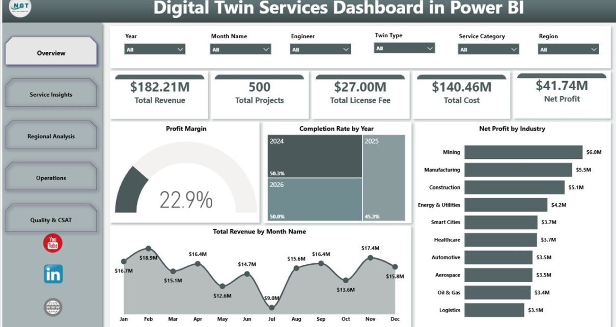
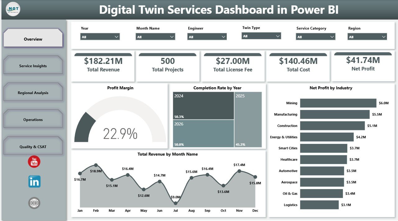
1. Overview Page
The Overview Page is the executive summary layer of the dashboard. It starts with KPI cards for Total Revenue, Total Projects, Total License Fee, Total Cost, and Net Profit, so leaders can review commercial performance before moving into detailed analysis.
Profit Margin explains whether the service portfolio is converting revenue into profit after cost and license fee impact. This is useful for pricing review, delivery control, and leadership reporting.
Completion Rate by Year shows how project completion performance changes year by year. It helps teams see whether delivery governance and execution maturity are improving.
Net Profit by Industry compares profit contribution across industries. This helps sales and delivery leaders identify high-return sectors and industries that may need cost or pricing review.
Total Revenue by Month Name tracks revenue across months. This makes seasonal demand, sales cycles, and delivery billing patterns easier to understand.
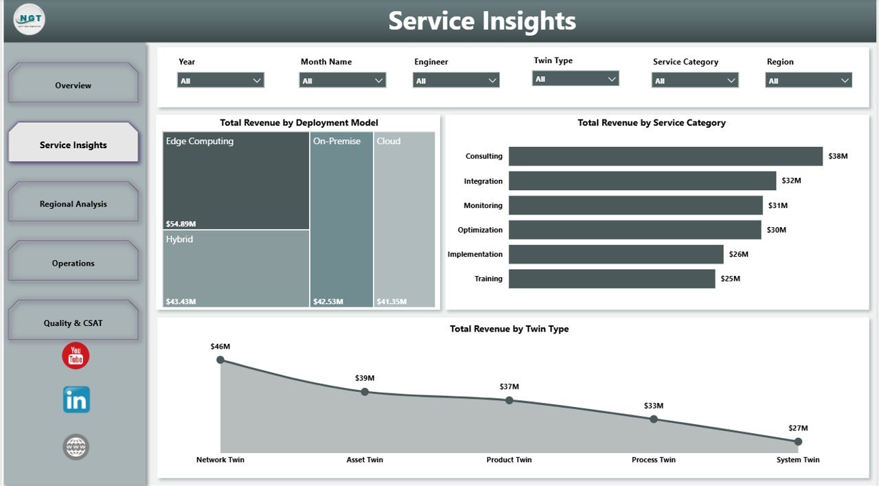
2. Service Insights
The Service Insights page focuses on the commercial mix of digital twin services. It helps teams understand which service lines, deployment choices, and twin types are generating revenue.
Total Revenue by Deployment Model compares cloud, on-premise, hybrid, or similar deployment models. This helps leaders connect architecture preferences with revenue performance.
Total Revenue by Service Category compares revenue across consulting, implementation, monitoring, simulation, support, or other service categories. It helps identify which parts of the service portfolio drive the most value.
Total Revenue by Twin Type shows which twin offerings generate the strongest revenue. Product and delivery teams can use this to prioritize solution development and sales focus.
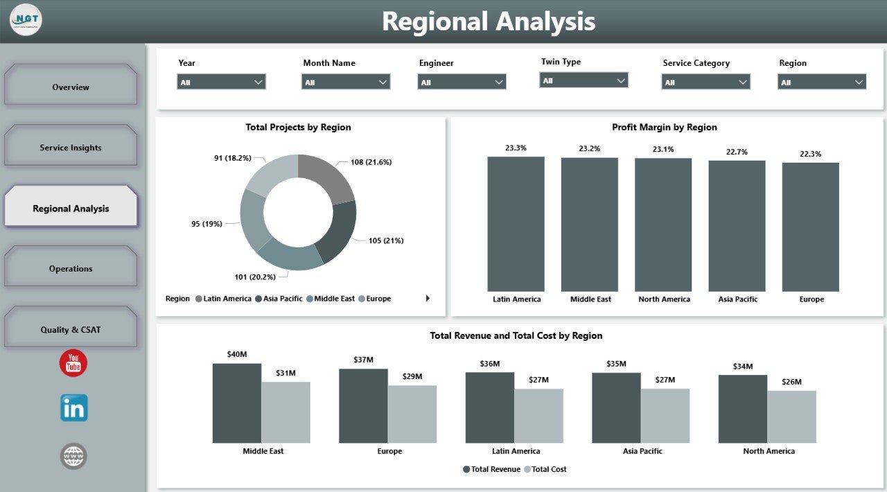
3. Regional Analysis
The Regional Analysis page helps managers compare delivery scale and profitability across territories. This page is useful when teams serve multiple geographies or run region-based client portfolios.
Total Projects by Region shows where project delivery volume is concentrated. It supports staffing plans, capacity review, and regional delivery prioritization.
Profit Margin by Region compares profitability across regions. It helps leaders find areas with strong margin and regions where cost, staffing, or pricing may require attention.
Total Revenue and Total Cost by Region places revenue and cost together for easier comparison. This view helps explain regional performance in a practical management format.
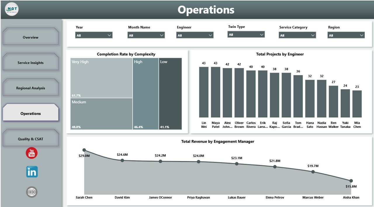
4. Operations
The Operations page supports delivery review. It connects complexity, engineer workload, and engagement manager revenue so operational leaders can understand execution effort.
Completion Rate by Complexity shows whether complex projects are completed at the same rate as simpler work. This helps teams identify where scope, staffing, or technical planning needs improvement.
Total Projects by Engineer compares workload or contribution by engineer. Managers can use it to balance assignments and avoid overloading key technical resources.
Total Revenue by Engagement Manager shows revenue contribution by client-facing owner. It helps leaders review account ownership and commercial responsibility.
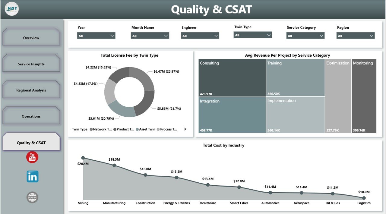
5. Quality & CSAT
The Quality & CSAT page helps teams review the service portfolio from a quality and customer perspective. It connects cost, average revenue, license fee, service category, twin type, and industry.
Total License Fee by Twin Type shows license fee contribution by twin type. This is useful for understanding which solutions carry the strongest platform or subscription-related value.
Avg Revenue Per Project by Service Category compares average project value across service categories. It helps teams identify premium service areas and categories where pricing may be too low.
Total Cost by Industry shows cost concentration by sector. Leaders can use it to identify industries that require more technical effort or stronger cost controls.
Digital Twin Services Dashboard in Power BI vs. Tableau vs. Paid Digital Twin SaaS – Feature Comparison
| Feature | This Power BI template | Tableau alternative | Paid digital twin SaaS |
|---|---|---|---|
| Cost | $17.99 one-time | License plus dashboard build time | Subscription or implementation fee |
| Platform | Power BI Desktop | Tableau Desktop or Cloud | Vendor-hosted platform |
| Setup time | Open .pbix and replace or connect data | Build model and visuals manually | Configuration project required |
| Customizable fields | Editable visuals, fields, model, and measures | Editable with Tableau skills | Depends on vendor plan |
| Real-time team collaboration | Possible through Power BI Service permissions | Possible through Tableau Cloud | Usually built in |
| Mobile access | Possible after publishing to Power BI Service | Possible through Tableau mobile options | Usually built in |
| Share with link | Available if your Power BI tenant allows sharing | Available with Tableau publishing | Usually available |
| Digital twin service analytics | Built in across 5 report pages | Must be designed | Usually built in but less editable |
| Year-1 cost at 5 users | $17.99 plus any Microsoft licensing | Often much higher | Often hundreds or thousands |
Who Should Use This Template
This template is a good fit for digital twin consulting firms, IoT solution providers, smart manufacturing teams, digital transformation managers, engineering services companies, operations analytics teams, and Power BI consultants building a reporting layer for service performance. It is also useful for managers who already have digital twin project data but need a faster way to visualize revenue, delivery, cost, region, and quality patterns.
It is not a replacement for a live simulation platform, sensor pipeline, industrial IoT system, ERP, CRM, or data warehouse. It is best used as a reporting template that sits on top of prepared digital twin service records.
Real-World Use Cases
Arjun, digital twin program manager: Arjun uses the Overview page to prepare monthly performance notes for leadership. The KPI cards and profit charts help him explain where revenue is growing and where cost control needs attention.
Maya, engineering delivery lead: Maya reviews the Operations page to compare engineer workload and completion rate by complexity. This helps her assign upcoming work more fairly and identify project types that need stronger delivery planning.
Daniel, IoT consulting director: Daniel studies the Service Insights and Regional Analysis pages to decide which industries, regions, deployment models, and twin types should receive more sales focus.
Advantages of Digital Twin Services Dashboard in Power BI
The biggest advantage is speed. Instead of starting with blank Power BI pages, teams get a ready-made structure for executive KPIs, service analysis, regional performance, operations, and quality review. The dashboard is also editable, so experienced Power BI users can adapt the model, visuals, and fields to match their own data.
The second advantage is cost control. A one-time template is not the same as a full SaaS platform, but it can be a practical reporting layer for teams that already have data and only need a clear management dashboard.
Opportunities for Improvement
Users should connect the template to clean, approved source data for the best results. If your organization tracks live sensor signals, simulation data, and operational telemetry in separate systems, you may need additional data preparation before connecting everything to Power BI. Teams can also add more pages for SLA tracking, sensor uptime, incident response, client renewal risk, or resource utilization.
Best Practices
- Validate revenue, cost, license fee, and net profit totals before sharing the dashboard.
- Keep field names consistent so slicers and visuals remain easy to maintain.
- Use Power BI Desktop for edits and Power BI Service only after access rules are reviewed.
- Separate client-sensitive data from public demo files.
- Document any custom measures you add so future users understand the logic.
Explore Relevant Templates
You can get the template here: Digital Twin Services Dashboard in Power BI. You may also like the related Digital Twin Services Dashboard in Excel, IT Asset Management Dashboard in Power BI, and Digital Microloans Dashboard in Power BI.
Frequently Asked Questions
What is included in this Power BI template?
It includes 5 report pages covering overview KPIs, service insights, regional analysis, operations, and quality or CSAT analysis.
What KPI cards are shown on the Overview page?
The Overview page includes Total Revenue, Total Projects, Total License Fee, Total Cost, and Net Profit.
Can I customize this dashboard?
Yes. You can edit visuals, fields, measures, relationships, labels, colors, and data source connections in Power BI Desktop.
Does the dashboard connect to live IoT sensors?
No. It is a reporting template, not a live IoT connector or digital twin runtime platform.
Who is this dashboard best for?
It is best for digital twin service providers, IoT consultants, engineering teams, delivery managers, operations leaders, and Power BI analysts.
Can I publish it to Power BI Service?
Yes, if your Microsoft licensing and tenant permissions allow it. Always review data privacy and client access rules before publishing.
About the Author
Built by PK – Microsoft Certified Professional with 15+ years of Excel, Google Sheets, and Power BI experience. Founder of NextGenTemplates, reaching 300K+ subscribers across YouTube channels. Every template is hand-built and tested before release.
Conclusion
The Digital Twin Services Dashboard in Power BI gives teams a practical way to review digital twin service performance across revenue, projects, license fees, cost, profit, regions, service categories, operations, and quality indicators. It is ideal when you want a ready-made Power BI reporting structure that can be edited for your own data and business process.
For more tutorials and template walkthroughs, visit PK An Excel Expert on YouTube.