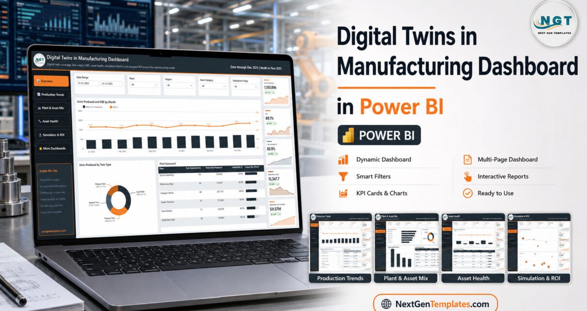
The Digital Twins in Manufacturing Dashboard in Power BI is a five-page report that turns a digital-twin programme into numbers a plant director can act on. The sample model covers 500 twin deployments across 6 plants and 4 regions, 1,103,896 units produced, 31,642 simulation runs and $11.57M of downtime cost avoided over a full year of data (January to December 2025). It carries 25 KPI cards drawn from 20 distinct metrics, 16 charts and scorecards, and 25 slicer controls.
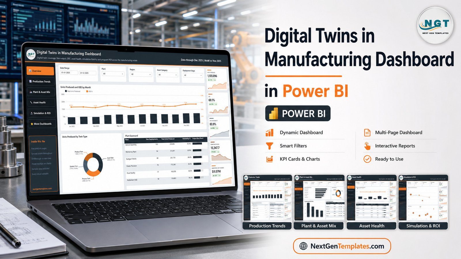
Most manufacturers who invest in digital twins hit the same wall about a year in: the twins exist, the simulations run, and nobody can say what the programme returned. Sensor data sits in a historian, twin status sits in a separate asset register, and the finance team sees only the invoice. This template closes that gap by reporting twin coverage, asset health, production output and programme ROI in one Power BI model that refreshes from a single spreadsheet.
Key Features of the Digital Twins Dashboard
- 20 distinct metrics across 25 cards. Units Produced, OEE, Line Availability, Units Per Hour, First Pass Yield, Defect Rate, Downtime Hours, Downtime Rate, Downtime Cost Avoided, Twin Deployments, Active Twins %, Avg Twin Fidelity, Energy Consumed kWh, Failures Predicted, Failures Prevented, Failure Prevention %, Simulation Runs, Simulation Success %, Twin Program Cost and Twin ROI %.
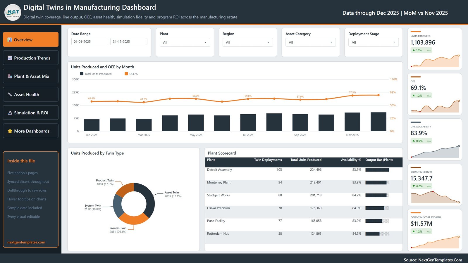
- Every card shows a month-on-month delta and a sparkline. The report header reads “Data through Dec 2025 | MoM vs Nov 2025”, so Downtime Hours 15,347.7 also reports its 6.0% fall and the twelve-month trend behind it.
- Five synced slicers per page. Date Range, Plant, Region and Asset Category are on all five pages, plus a page-specific slicer — Deployment Stage, Twin Type, Twin Status or Data Source.
- Four twin types modelled separately. Asset Twin (409K units, 37.1%), Process Twin (288K, 26.1%), System Twin (219K, 19.8%) and Product Twin (188K, 17.0%), each with its own simulation-run count.
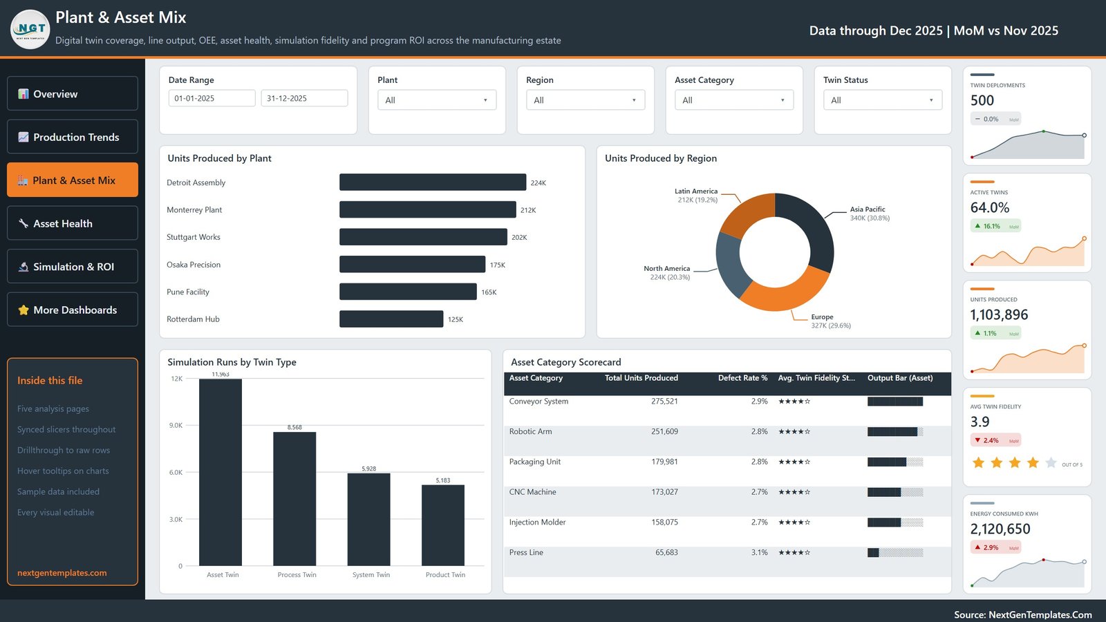
- Six plants and six asset categories. Detroit Assembly, Monterrey Plant, Stuttgart Works, Osaka Precision, Pune Facility and Rotterdam Hub; Conveyor System, Robotic Arm, Packaging Unit, CNC Machine, Injection Molder and Press Line.
- Drillthrough to raw rows and hover tooltips are wired on the visuals, and every chart, measure and colour is editable in Power BI Desktop.
Dashboard Pages Explanation
Page 1: Overview
The landing page carries Units Produced 1,103,896, OEE 69.1%, Line Availability 83.9%, Downtime Hours 15,347.7 and Downtime Cost Avoided $11.57M. Its visuals are Units Produced and OEE by Month, Units Produced by Twin Type, and a Plant Scorecard giving twin deployments, total units produced and availability % for each of the six plants — Detroit Assembly leads on volume with 224,496 units from 105 twins.
Page 2: Production Trends
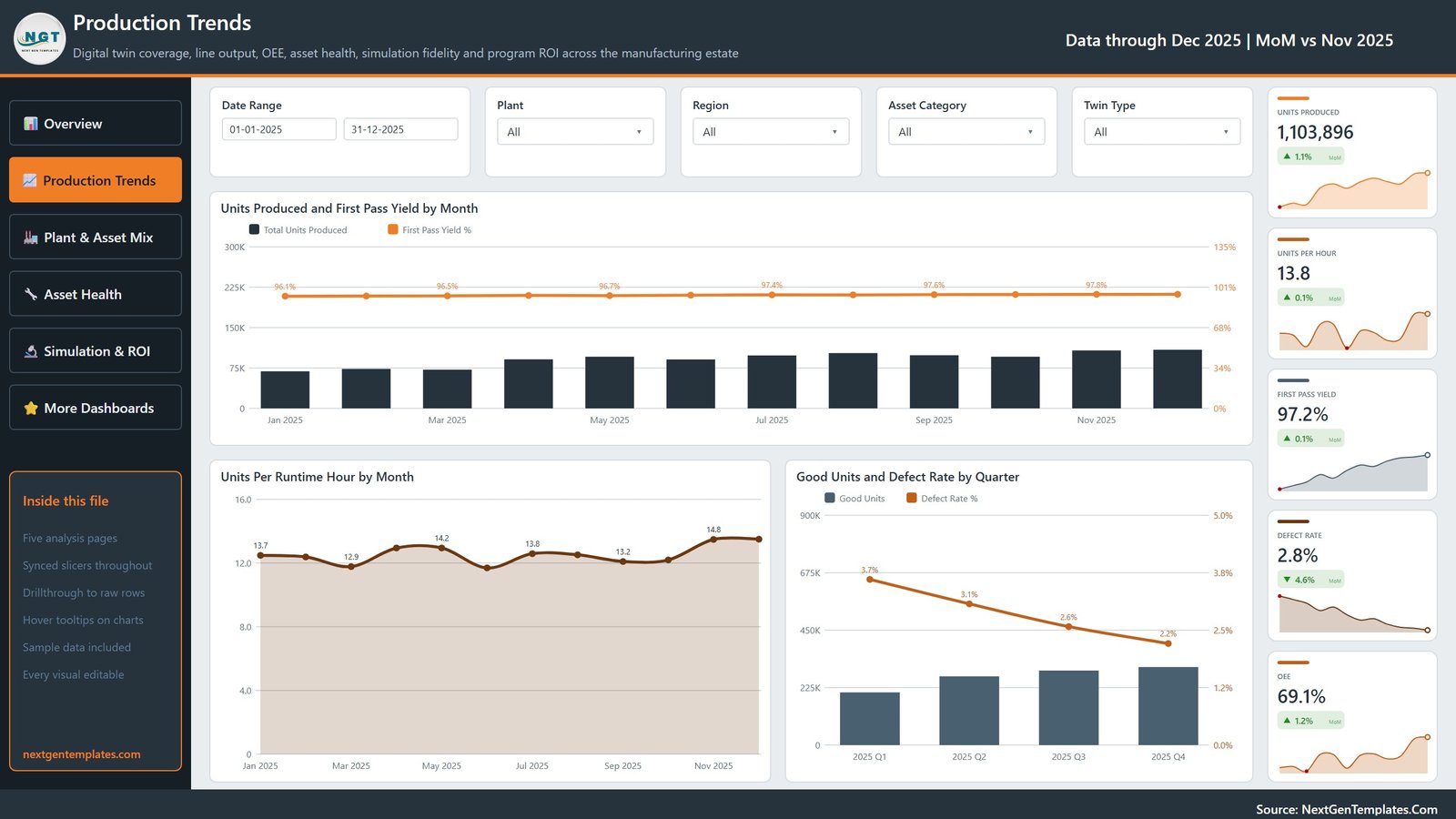
The quality and throughput page. Cards read Units Produced, Units Per Hour 13.8, First Pass Yield 97.2%, Defect Rate 2.8% and OEE 69.1%. Charts are Units Produced and First Pass Yield by Month, Units Per Runtime Hour by Month, and Good Units and Defect Rate by Quarter — where the defect rate falls from 3.7% in Q1 2025 to 2.2% in Q4, the clearest single picture of the twin programme working.
Page 3: Plant & Asset Mix
Coverage and fidelity live here: Twin Deployments 500, Active Twins 64.0%, Units Produced, Avg Twin Fidelity 3.9 out of 5 and Energy Consumed 2,120,650 kWh. Visuals are Units Produced by Plant, Units Produced by Region (Asia Pacific 30.8%, Europe 29.6%, North America 20.3%, Latin America 19.2%), Simulation Runs by Twin Type, and an Asset Category Scorecard with defect rate and a star fidelity rating per asset class.
Page 4: Asset Health
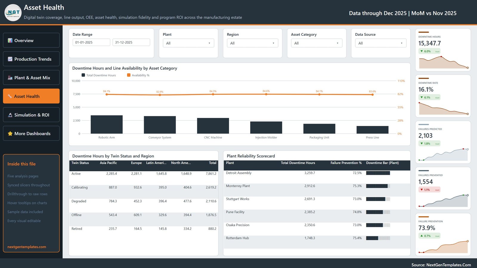
The reliability page reports Downtime Hours, Downtime Rate 16.1%, Failures Predicted 2,103, Failures Prevented 1,554 and Failure Prevention 73.9%. Visuals are Downtime Hours and Line Availability by Asset Category, a Downtime Hours by Twin Status and Region matrix separating Active, Calibrating, Degraded, Offline and Retired twins, and a Plant Reliability Scorecard ranking sites by downtime hours and prevention rate.
Page 5: Simulation & ROI
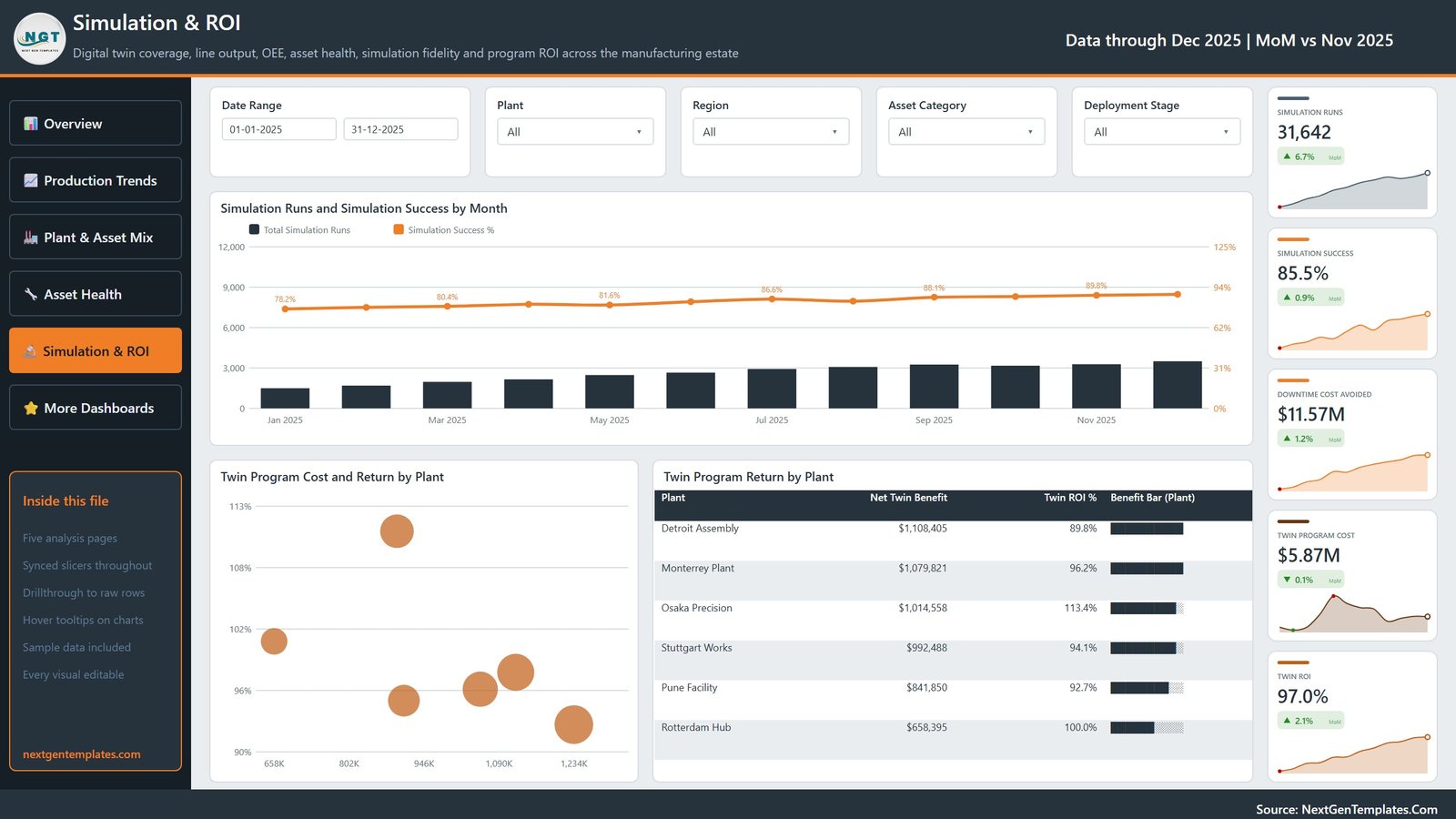
The business-case page: Simulation Runs 31,642, Simulation Success 85.5%, Downtime Cost Avoided $11.57M, Twin Program Cost $5.87M and Twin ROI 97.0%. Charts are Simulation Runs and Simulation Success by Month — success climbing from 78.2% in January to 89.8% in November — Twin Program Cost and Return by Plant, and Twin Program Return by Plant, where Osaka Precision returns 113.4% against a net benefit of $1,014,558.
Digital Twins Dashboard vs. Tableau / Qlik vs. an IIoT Platform — Feature Comparison
| Feature | This Power BI Template | Tableau / Qlik build | IIoT platform (PTC ThingWorx / Siemens Insights Hub) |
|---|---|---|---|
| Cost | $17.99 one-time ✅ | $75 / user / month plus build time | $2,000–$15,000 / month |
| Platform | Power BI Desktop (free) ✅ | Tableau Desktop or Qlik Sense licence | Vendor cloud, locked in |
| Setup time | Under 15 minutes ✅ | 2–5 days of developer work | 6–12 week implementation |
| Report pages included | 5, already built ✅ | Blank canvas | Configurable, consultant-led |
| Twin fidelity & simulation ROI views | Built in ✅ | Must be modelled from scratch | Included |
| Customisable fields | Every visual and measure editable ✅ | Editable | Vendor-defined schema |
| Share with a link | Publish to Power BI Service | Server licence needed | ✅ Native |
| Year-1 cost at 5 users | $17.99 ✅ | ~$4,500 | $24,000+ |
For plant teams that want digital-twin reporting without a six-figure IIoT contract, this template sits in the sweet spot.
Who Should Use This Template
Perfect for:
- Plant managers and production heads running 1–10 sites who already export data from an MES or historian
- Industry 4.0 and digital transformation leads who have to defend twin spend at a quarterly review
- Reliability and maintenance engineers watching predicted versus prevented failures
- Power BI analysts who want a working model to adapt instead of a blank canvas
Not a fit if:
- You need live streaming telemetry — this is a scheduled-refresh report, not a real-time monitor
- You want 3D twin visualisation or physics simulation; this reports twin outcomes, it does not run the simulation
- You have no access to Power BI Desktop or a Windows machine to open the .pbix file
Real-World Use Cases
Marcus runs operations for a four-plant automotive supplier. He refreshes the model every Monday morning, opens the Plant Scorecard to see which site lost availability, then drills into Asset Health to find out whether a robotic arm or a press line caused it — all before the weekly production call starts.
Priya leads Industry 4.0 at a contract electronics manufacturer. Her board approved 500 twin deployments and now wants evidence. The Simulation & ROI page puts twin program cost against downtime cost avoided per plant, which is the one slide she takes into the quarterly review.
Ade is a reliability engineer at a packaging plant. He tracks Failures Predicted against Failures Prevented and uses the Downtime Hours by Twin Status and Region matrix to catch twins that have quietly slipped to Degraded or Offline while the asset kept running.
Advantages of This Dashboard
The obvious saving is licence cost: a comparable Tableau or Qlik build costs roughly $4,500 in year one for a five-person team before anyone writes a measure, and an IIoT platform subscription starts around $24,000. This is a one-time purchase that opens in free Power BI Desktop.
The bigger saving is time. The five pages already answer the four questions a twin programme gets asked — how much are we producing, how good is the output, how healthy are the assets, and did the programme pay back — so an analyst spends an afternoon repointing queries instead of a fortnight designing a report. Because the model reads a plain spreadsheet, a plant with no data warehouse can still get a working report on Monday.
It also puts fidelity and coverage in front of leadership. Avg Twin Fidelity 3.9 out of 5 and Active Twins 64.0% are the numbers that explain why a twin programme underperforms, and they are usually invisible in an operations report.
Opportunities for Improvement
It is worth being straight about what this template is not. It refreshes on a schedule, so it will not replace a real-time line monitor or an alerting system — if an asset fails at 02:00, the report tells you tomorrow, not tonight. There is no 3D or geospatial twin visualisation; plants are reported as rows and bars, not as a factory model.
The financial model is deliberately simple: twin program cost and net twin benefit are inputs you supply, not values derived from a full cost allocation, so the ROI figures are only as good as the cost data you feed them. And with 500 deployments in the sample, very large estates (tens of thousands of assets) will want the source moved from the bundled Data.xlsx to a database before the model stays comfortable.
Best Practices
- Keep the column headers in Data.xlsx exactly as shipped. Rename a header and the measures break; add columns to the right instead.
- Load a full twelve months before you judge a trend. Several visuals are month-on-month or quarterly, and a two-month extract makes them look flat.
- Agree the twin status vocabulary first. Active, Calibrating, Degraded, Offline and Retired drive the Asset Health matrix — if two plants use the words differently, the page misleads.
- Repoint the source once you outgrow the spreadsheet. Use Transform Data to swap Data.xlsx for SQL Server, Azure or a historian export; the visuals keep working. Microsoft documents the process in the Power BI data sources guide.
- Publish to the Power BI Service for sharing rather than emailing the .pbix, so everyone reads the same refresh.
Explore Relevant Templates
- Digital Twins in Manufacturing Dashboard in Excel — the same five-page design built as a workbook, for teams that would rather stay in Excel.
- IoT Services Dashboard in Power BI — sensor and connected-device reporting for a service business.
- 4D Printing Dashboard in Power BI — advanced manufacturing analytics on the same report pattern.
- Digital Compliance Tools Dashboard in Power BI — for the governance side of a digital programme.
- Container Tracking Dashboard in Power BI — logistics reporting that pairs well with plant output.
- Carpentry Workshop KPI Dashboard in Power BI — a smaller-scale workshop KPI view.
💎 Also worth a look: the Manufacturing Excellence Bundle — 8 Premium Templates (Excel + Power BI).
Frequently Asked Questions
What KPIs does the Digital Twins in Manufacturing Dashboard in Power BI track?
It tracks 20 distinct metrics across 25 cards, including Units Produced, OEE, Line Availability, First Pass Yield, Defect Rate, Downtime Hours, Twin Deployments, Active Twins, Avg Twin Fidelity, Failures Predicted, Failures Prevented, Simulation Success, Twin Program Cost and Twin ROI.
How long does setup take?
Under 15 minutes. Unzip the download, open the .pbix in Power BI Desktop, paste your own records into Data.xlsx with the headers unchanged, and press Refresh. All five pages repopulate from the same model straight away.
Do I need a paid Power BI licence?
No. Power BI Desktop is free from Microsoft and opens, refreshes and edits the whole report. A Pro licence is only needed if you want to publish the report to the Power BI Service and share it with colleagues through a workspace.
Can it read live data from an MES or historian?
Out of the box it reads the bundled Data.xlsx. Because it is a standard Power BI model, you can repoint the query to SQL Server, Azure, a historian export or any supported connector using Transform Data, and every visual keeps working.
How does it compare to an IIoT platform like ThingWorx?
A platform subscription costs $2,000–$15,000 a month and takes months to implement. This dashboard is a $17.99 one-time reporting layer over data you already export. It will not run simulations, but it reports twin coverage, fidelity, downtime avoided and ROI on day one.
Is there an Excel version of this dashboard?
Yes. The same five pages ship as the Digital Twins in Manufacturing Dashboard in Excel, with identical KPIs and charts built with pivot tables and slicers instead of a Power BI model.
About the Author
Built by PK — Microsoft Certified Professional with 15+ years of Excel, Google Sheets and Power BI experience. Founder of NextGenTemplates, reaching 300K+ subscribers across YouTube channels. Every template is hand-built and tested before release.
Conclusion
A digital-twin programme is only as persuasive as the report behind it. This template gives you the four views that argument needs — output, quality, asset health and return — already built, already filtered, and refreshing from one spreadsheet you control.
👉 Click here to purchase the Digital Twins in Manufacturing Dashboard in Power BI
Instant download · One-time payment · No subscription · Lifetime access
🎥 For step-by-step Power BI tutorials, visit YouTube.com/@PK-AnExcelExpert.
Last updated: September 2026